
@a11y-ngx/icon
v1.0.0
Published
A polymorphic icon wrapper that enables your Angular libraries to accept and render any icon format (HTML, images, Components, or TemplateRefs).
Downloads
37
Maintainers
 ldv
ldvReadme
Icon
An Angular core utility library designed to normalize icon rendering across UI components. It provides a unified <a11y-icon> wrapper that seamlessly handles icons provided as raw strings, image paths, components or TemplateRefs, decoupling the rendering logic from the consuming libraries.
👀 IMPORTANT: This is a low-level utility library. It is not meant to be used as a direct wrapper for
mat-iconorfa-iconin your daily application code.✨ Its primary purpose is to be consumed by other UI component libraries that need icons (like accessible Menus, Tree views, or Dropdowns). It provides library authors with a standardized, decoupled way to accept any icon format from the end-user, delegating the rendering strategy to the host application without forcing a specific icon pack.
This library was generated with Angular CLI version 12.2.0 to ensure compatibility with a wide range of Angular versions. It has been tested up to v21.
Index
- Installation
- What is a "Strategy"?
- The Global Config
- The Component
- Configure The Strategies
- Real-World Use Case
- Examples
- Direct Inputs (Passing values directly to the component):
- String Strategies (Resolving string values via providers):
Installation
Install npm package:
npm install @a11y-ngx/icon --saveImport
A11yIconModuleinto your module or standalone component:import { A11yIconModule } from '@a11y-ngx/icon'; @NgModule({ declarations: [...], imports: [ ... A11yIconModule, ], }) export class AppModule {}
What is a "Strategy"?
You can provide different types of icons to the <a11y-icon> component: strings, components or TemplateRefs.
When you pass a simple string (e.g., icon="home" or icon="/assets/icon-home.png"), the library needs to know how to render it. By default, a string will be rendered as raw HTML (using innerHTML).
The strategy defines the default wrapper for that string:
IconDefaultComponent(e.g.,MatIcon): The string will be used (via input or content projection) inside the given component:<!-- Input: --> <a11y-icon icon="home"></a11y-icon> <!-- Output: In this case, Material Icon uses content projection --> <mat-icon>home</mat-icon>'image': The string will be treated as a path/URL and bound to an image tag:<!-- Input: --> <a11y-icon icon="/assets/icons/home.png"></a11y-icon> <!-- Output: --> <img src="/assets/icons/home.png" alt="">TemplateRef: The string will be used as its implicit context.
🛠️ Check how to configure the strategies.
The Global Config
Use the rootConfig() method or provideA11yIcon to establish the global behavior for your icons across the entire application.
⚠️ IMPORTANT: ❗❗ DO NOT use it on a library or a low-level module/component within your app, since this method is meant to be called only once at a root level on the main app.
On a library, sub-module or component, check how to provide the custom strategy.
The Strategy
See how to configure the Global Strategy.
The Base Path
If you are using the Image Strategy to load local or external images, you can define a basePath in your global configuration object. This prefix will be automatically prepended to all your icon strings, keeping your HTML templates clean and avoiding repetitive folder paths.
On Angular v12 - v14:
import { MatIcon } from '@angular/material/icon';
import { A11yIconModule } from '@a11y-ngx/icon';

@NgModule({
    ...,
    imports: [
        A11yIconModule.rootConfig({
            strategy: 'image',
            basePath: '/assets/icons/',
        }),
    ],
})
export class AppModule {}
On Angular v15+:
import { provideA11yIcon } from '@a11y-ngx/icon';

export const appConfig: ApplicationConfig = {
    ...,
    providers: [
        provideA11yIcon({
            strategy: 'image',
            basePath: '/assets/icons/',
        }),
    ],
};
Template:
<!-- ❌ Without "basePath": -->
<a11y-icon icon="/assets/icons/settings.svg"></a11y-icon>

<!-- ✔️ With "basePath" configured: -->
<a11y-icon icon="settings.svg"></a11y-icon>
💡 If you need to bypass the global
basePathfor a specific icon, you can use theignoreBasePathproperty within theIconInputImageobject:<a11y-icon [icon]="{ src: '/assets/another-folder/settings.svg', ignoreBasePath: true }"> </a11y-icon>
The Component
The core of this library is the <a11y-icon> component. It acts as a universal wrapper designed to easily render any icon type, keeping your components independent from specific icon packs like Material or FontAwesome.
Key capabilities:
- Polymorphic Input: Seamlessly renders raw HTML,
Components,TemplateRefs, or static images.- 💡 Even with a strategy set, you can override the rendered type per-instance on the fly. Just pass the corresponding object payload (
IconInputImage,IconInputComponent, etc.) to the input and the component will adapt automatically.
- 💡 Even with a strategy set, you can override the rendered type per-instance on the fly. Just pass the corresponding object payload (
- Global Strategies: Automatically falls back to your configured global or custom strategy when receiving simple strings.
- A11y Ready: Provides sensible accessibility defaults (like
aria-hidden="true") for decorative icons, while fully supporting customaria-labelandrole="img"for meaningful ones.
💡 Icon Sizing:
By default, the component sets the icon size to
1remusing a CSS variable. You can easily override this behavior by redefining the--icon-sizevariable at any level of your DOM tree.
Global Override: Set it in your global stylesheet to change the default size for the entire application.
:root {
    --icon-size: 24px;
}
Scoped Override: Apply it to a parent container to affect all icons inside it.
<div class="my-toolbar" style="--icon-size: 1.5rem;">
    <a11y-icon icon="edit"></a11y-icon>
    <a11y-icon icon="delete"></a11y-icon>
</div>
The Component Inputs
| Name | Type | Description |
| :--- | :--- | :---------- |
| icon | Icon | See the Icon Input |
| label | string | See the Label Input |
The Icon Input
The core payload to be rendered.
- Input:
icon - Type:
Icon, which accepts:string: Renders as raw HTML or according to the active strategy.IconInputHTML: Renders the given text as raw HTML.{ html: '<i class="fa-solid fa-star"></i>' }IconInputImage: Renders a standard<img>tag pointing to the given path.{ src: '/assets/icons/star.png' }IconInputComponent: Dynamically instantiates the provided Angular Component.// For "content projection" components: { component: MatIcon, content: 'info' } // For "input" components: { component: AppIconComponent, inputs: { icon: 'fa-solid fa-info' } }IconInputTemplate: Renders the provided<ng-template>.
The Label Input
An optional string to define the accessible name for meaningful (informative) icons.
- Input:
label - Type:
string
✔️ When provided: It applies the
aria-labelattribute to the icon, ensuring it is properly announced by screen readers.❌ When omitted: The component assumes the icon is purely decorative and automatically applies
aria-hidden="true"to hide it from assistive technologies.
Configure The Strategies
You can configure the strategy globally or locally (custom).
💡 Please check the section what is a "strategy"?
👉 REMEMBER: When a strategy is defined, the
stringvalue set in theiconinput acts as its main value.There are three types of strategies:
IconDefaultComponent(object): The string will be used (via input or content projection) inside the given component.| Property | Type | Mandatory | Description | | :------- | :--- | :-------: | :---------- | |
component|Type<unknown>| ✔️ Yes | The main target component | |mainEntry|'input'or'content'| ✔️ Yes | How the target component receives the icon value | |inputName|string| Only formainEntry='input'| The input that receives the icon's string | |inputs|Record<string, unknown>| ❌ No | Any inputs the component might need |
IconInputTemplate(akaTemplateRef<unknown>): The string will be used as its implicit context. ⚠️ (Only available for custom strategies, not global)
'image': The string will be treated as a path/URL and bound to an image tag.
Configure the Global Strategy
⚠️ REMEMBER: ❗❗ App-level use only! Must be called at the root.
On a library, sub-module or component, check how to provide the custom strategy.
Accepts a single parameter config of type IconConfig.
On Angular v12 - v14:
import { MatIcon } from '@angular/material/icon';
import { A11yIconModule } from '@a11y-ngx/icon';

@NgModule({
    ...,
    imports: [
        A11yIconModule.rootConfig({
            strategy: {
                component: MatIcon,
                mainEntry: 'content',
            },
        }),
    ],
})
export class AppModule {}
On Angular v15+:
import { MatIcon } from '@angular/material/icon';
import { provideA11yIcon } from '@a11y-ngx/icon';

export const appConfig: ApplicationConfig = {
    ...,
    providers: [
        provideA11yIcon({
            strategy: {
                component: MatIcon,
                mainEntry: 'content',
            },
        }),
    ],
};
Configure the Custom Strategy
The custom strategy is meant to be used in libraries, low-level modules or components to scope all its children.
⚠️ It will override the global strategy, if any.
Accepts two parameters:
factoryof type(args) => IconDefaultComponent | IconInputTemplate | 'image'.deps(optional) of typeany[].
Provide a static value
import { provideCustomA11yIcon } from '@a11y-ngx/icon';

@Component({
    ...,
    providers: [
        provideCustomA11yIcon(() => 'image'),
    ],
})
export class MyComponent {}
Provide via Dependency Injection
On Angular v12 - v14:
import { provideCustomA11yIcon } from '@a11y-ngx/icon';

@Component({
    ...,
    providers: [
        provideCustomA11yIcon(
            (service: MyService) => service.iconStrategy,
            [MyService]
        ),
    ],
})
export class MyComponent {}
On Angular v15+:
import { provideCustomA11yIcon } from '@a11y-ngx/icon';

@Component({
    ...,
    providers: [
        provideCustomA11yIcon(() => inject(MyService).iconStrategy),
    ],
})
export class MyComponent {}
💡 Let's assume you have chosen the service approach, and the configured strategy is
'image'so, when you define anyiconinput string within that component, it will be treated as the image's source path for an<img>tag.
Template:
<a11y-icon icon="/assets/icons/home.png"></a11y-icon>Will Render As:
<a11y-icon aria-hidden="true">
    <img src="/assets/icons/home.png" alt="" />
</a11y-icon>
Real-World Use Case
Imagine you are creating a custom DropdownComponent to be published as an open-source UI library. You don't know (and shouldn't care) if the developer consuming your library uses Material Icons, FontAwesome, or custom SVG images in their application.
By using <a11y-icon>, your component becomes completely agnostic. The end-user configures their icon strategy once at the root level, and your library automatically adapts to use their preferred icon system.
Your Dropdown Config:
import { Icon, IconGlobalStrategy } from '@a11y-ngx/icon';

export type MyDropdownItem = {
    label: string;
    icon?: Icon;
    ...;
};
export type MyDropdownConfig = Partial<{
    iconChevron: Icon;
    iconStrategy: IconGlobalStrategy;
    ...,
}>;
NOTE:
IconGlobalStrategy: Includes the use of Components and'image'.IconCustomStrategy: Includes also the use of TemplateRefs.
Your Dropdown Provider:
🛠️ Your library should expose a mechanism (like a configuration object or a provider function), allowing developers to define their preferred icon strategy. Store that config in a global service.
export function provideMyDropdownConfig(config: MyDropdownConfig): Provider {
    ...
}
Your Dropdown Service:
@Injectable({ providedIn: 'root' })
export class MyDropdownService {
    readonly config: MyDropdownConfig = {};

    // Save the main config from a provider or a "forRoot()" method
    setConfig(config: MyDropdownConfig): void {
        Object.assign(this.config, config);
    }
}
Your Dropdown Component:
@Component({
    selector: 'my-dropdown',
    template: `
        <button type="button" class="dropdown-trigger" (click)="...">
            {{ label }}
            <a11y-icon [icon]="config.iconChevron"></a11y-icon>
        </button>

        <div class="dropdown-menu" [hidden]="..." style="--icon-size: 20px;">
            <div *ngFor="let item of items" class="dropdown-item">
                <a11y-icon [icon]="item.icon"></a11y-icon>
                {{ item.label }}
            </div>
        </div>
    `,
    providers: [
        provideCustomA11yIcon(
            // We consume the icon strategy from the service
            (service: MyDropdownService) => service.config.iconStrategy,
            [MyDropdownService]
        ),
    ],
})
export class MyDropdownComponent {
    @Input() label: string = 'Menu';
    @Input() items: MyDropdownItem[] = [];

    get config(): MyDropdownConfig {
        return this.service.config;
    };

    constructor(private service: MyDropdownService) {}
}
Consumer's Application (End-User):
This particular app uses MatIcon, so it should set it to the Dropdown's provider:
import { MatIcon } from '@angular/material/icon';
import { provideMyDropdownConfig } from 'my-dropdown-lib';

export const appConfig: ApplicationConfig = {
    ...,
    providers: [
        ...,
        provideMyDropdownConfig({
            iconStrategy: { component: MatIcon, mainEntry: 'content' },
            iconChevron: 'expand_more',
        }),
    ],
};
Then uses the dropdown component wherever they need:
import { MyDropdownItem } from 'my-dropdown-lib';

@Component({ ... })
export class PaymentMethodComponent {
    items: MyDropdownItem[] = [
        { label: 'Credit Card', icon: 'credit_card' },
        { label: 'Bank Transfer', icon: 'account_balance' },
        { label: 'Cryptocurrency', icon: 'currency_bitcoin' },
    ];
}
<my-dropdown [items]="items" label="Payment Method"></my-dropdown>Result:
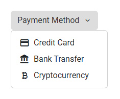
Examples
💡 A note on the examples below: Some of the following snippets might seem a bit trivial or oversimplified for a real-world application (check the real-world use case). Their sole purpose is to demonstrate the flexibility of the
<a11y-icon>API and the wide variety of ways it can ingest and render.
- Direct Inputs (Passing values directly to the component):
- String Strategies (Resolving string values via providers):
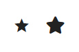
Raw HTML Source
There are two ways to render plain HTML snippets (like SVG vectors or FontAwesome tags):
- As a raw string: Only works if there is NO strategy defined (global or custom). The string will be injected as
innerHTML. - Using the HTML object: The
{ html: '...' }object explicitly forces the component to render raw HTML, safely bypassing any active strategy.
Typescript:
readonly starIconRegular: IconInputHTML = { html: '<i class="fa-regular fa-star"></i>' };Template:
<!-- 1. Works only if no strategy is defined -->
<a11y-icon icon='<i class="fa-solid fa-star"></i>'></a11y-icon>
<!-- 2. Guaranteed to render raw HTML, bypassing any strategy -->
<a11y-icon [icon]="starIconRegular"></a11y-icon>
Will Render As:
<a11y-icon aria-hidden="true">
    <span>
        <i class="fa-solid fa-star"></i>
    </span>
</a11y-icon>

<a11y-icon aria-hidden="true">
    <span>
        <i class="fa-regular fa-star"></i>
    </span>
</a11y-icon>
Result:
Image Source
Pass an object containing a src property to render a standard <img> tag.
💡 Always use absolute paths (e.g., starting with
/assets/) to prevent broken images when the route changes.
Template:
<a11y-icon [icon]="{ src: '/assets/icons/star.png' }"></a11y-icon>Will Render As:
<a11y-icon aria-hidden="true">
    <img src="/assets/icons/star.png" alt="" />
</a11y-icon>
Result:
Component Source
Pass an Angular component class reference. The library will dynamically instantiate and render it.
💡 Check later the Component with Inputs example in the strategies section to see the full code of the
AppIconComponentcomponent.
Typescript:
import { IconInputComponent } from '@a11y-ngx/icon';
import { MatIcon } from '@angular/material/icon';
import { AppIconComponent } from '../app-icon.component';

@Component({ ... })
export class MyComponent {
    readonly iconMaterial: IconInputComponent = {
        component: MatIcon,
        content: 'star', // Content Projection method
    };
    readonly iconFontAwesome: IconInputComponent = {
        component: AppIconComponent,
        inputs: { iconClass: 'fa-solid fa-star' }, // Input method
    };
}
Template:
<a11y-icon [icon]="iconMaterial"></a11y-icon>
<a11y-icon [icon]="iconFontAwesome"></a11y-icon>
Will Render As:
<a11y-icon aria-hidden="true">
    <mat-icon ...>star</mat-icon>
</a11y-icon>
<a11y-icon aria-hidden="true">
    <app-icon class="fa-solid fa-star"></app-icon>
</a11y-icon>
Result:
TemplateRef Source
Pass an <ng-template> reference. This is particularly useful for complex DOM structures that require context from the parent component.
Typescript:
@Component({ ... })
export class MyComponent {
    notificationsCount: number = 4;
}
Template:
<ng-template #notificationIcon>
    <svg
        viewBox="0 0 24 24"
        stroke-width="2"
        stroke="#c21515"
        [style.fill]="notificationsCount > 0 ? '#c21515' : 'transparent'">
        <path d="M12 17.27L18.18 21l-1.64-7.03L22 9.24l-7.19-.61L12 2 9.19 8.63 2 9.24l5.46 4.73L5.82 21z" />
    </svg>
</ng-template>
...
<button type="button">
    Notifications
    <a11y-icon
        [icon]="notificationIcon"
        [label]="notificationsCount + ' unread messages'">
    </a11y-icon>
</button>
Will Render As:
🌟 Because a label was provided, the
aria-hiddenattribute is removed. The component automatically appliesrole="img"and the specifiedaria-labelso it can be properly announced by screen readers.
<a11y-icon role="img" aria-label="4 unread messages">
    <svg>...</svg>
</a11y-icon>
Result:
Component Strategy
Set an Angular component class reference and its main entry type to the token.
You can configure the component to use:
Component with Content Projection
For any icon component that works with content projection, like Material Icons, you have to configure it like this:
Component:
providers: [
    provideCustomA11yIcon(() => ({
        component: MatIcon,
        mainEntry: 'content',
    })),
],
Now, when you define the icon input string, it will be treated as content projection for that MatIcon component.
Template:
<a11y-icon icon="star"></a11y-icon>Will Render As:
<a11y-icon aria-hidden="true">
    <mat-icon ...>star</mat-icon>
</a11y-icon>
Component with Inputs
For any icon component that works with inputs, like the one we are creating next that works with class names (like FontAwesome), you have to configure it like this:
Your Custom Icon Component:
import { Component, Input } from '@angular/core';

@Component({
    selector: 'app-icon',
    template: '',
    host: {
        // Since FontAwesome is based on 'class names',
        // we'll apply them to the host
        '[class]': 'iconClass',
    },
})
export class AppIconComponent {
    @Input() iconClass!: string;
}
Component:
providers: [
    provideCustomA11yIcon(() => ({
        component: AppIconComponent,
        mainEntry: 'input',
        inputName: 'iconClass',
    })),
],
Now, when you define the icon input string, it will be treated as the input for the AppIconComponent component.
Template:
<a11y-icon icon="fa-regular fa-file"></a11y-icon>Will Render As:
<a11y-icon aria-hidden="true">
    <app-icon class="fa-regular fa-file"></app-icon>
</a11y-icon>
Image Strategy
This strategy tells the component to treat any string passed to the icon input as an image path/URL.
💡 Check also how to configure the Base Path.
Component:
providers: [
    provideCustomA11yIcon(() => 'image'),
],
Now, when you define the icon input string, it will be treated as the image source.
Template:
<a11y-icon icon="/assets/icon-home.png"></a11y-icon>Will Render As:
<a11y-icon aria-hidden="true">
    <img src="/assets/icon-home.png" alt="">
</a11y-icon>
Template Strategy
You can pass a TemplateRef as the default strategy.
Because <a11y-icon> handles the template instantiation, it exposes the original icon payload back to the template via the $implicit context variable. The consumer must use "let-something" to access it.
IMPORTANT: Unlike the component or image strategies, a
TemplateRefcannot be provided directly because it only exists after the HTML is rendered. To use it as a strategy, you must first capture the template instance at runtime (for example, via an@Input(),@ContentChild()or retrieving it from an injected Service) and then return it through the provider's factory function.
Template Strategy via Input
For this example we'll use <mat-icon> within the template.
Custom List Component:
@Component({
    selector: 'my-list',
    template: `
        <div *ngFor="let item of items">
            <a11y-icon [icon]="item.icon"></a11y-icon>
            {{ item.name }}
        </div>
    `,
    providers: [
        provideCustomA11yIcon(
            (comp: MyListComponent) => comp.iconTemplate,
            [forwardRef(() => MyListComponent)]
        ),
    ],
})
export class MyListComponent {
    @Input() iconTemplate: TemplateRef<unknown> | undefined;

    readonly items: Item[] = [
        { name: 'Contrast', icon: 'contrast' },
        { name: 'Brightness', icon: 'brightness_6' },
        ...
    ];
}
Parent Template:
<ng-template #matIconTemplate let-icon>
    <mat-icon>{{ icon }}</mat-icon>
</ng-template>

<my-list [iconTemplate]="matIconTemplate"></my-list>
Will Render As:
<my-list>
    <div>
        <a11y-icon aria-hidden="true">
            <mat-icon ...>contrast</mat-icon>
        </a11y-icon>
        Contrast
    </div>
    <div>
        <a11y-icon aria-hidden="true">
            <mat-icon ...>brightness_6</mat-icon>
        </a11y-icon>
        Brightness
    </div>
    ...
</my-list>
Result:
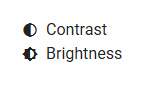
Template Strategy via Content Child
For this example we'll use FontAwesome within the template.
Custom List Component:
@Component({
    selector: 'my-list',
    template: `
        <ng-container *ngIf="iconTemplate">
            <div *ngFor="let item of items">
                <a11y-icon [icon]="item.icon"></a11y-icon>
                {{ item.name }}
            </div>
        </ng-container>
    `,
    providers: [
        provideCustomA11yIcon(
            (comp: MyListComponent) => comp.iconTemplate,
            [forwardRef(() => MyListComponent)]
        ),
    ],
})
export class MyListComponent {
    @ContentChild(TemplateRef) iconTemplate!: TemplateRef<unknown>;

    readonly items: Item[] = [
        { name: 'Contrast', icon: 'fa-solid fa-circle-half-stroke' },
        { name: 'Brightness', icon: 'fa-regular fa-sun' },
        ...
    ];
}
Parent Template:
<my-list>
    <ng-template let-iconClass>
        <i [class]="iconClass"></i>
    </ng-template>
</my-list>
Will Render As:
<my-list>
    <div>
        <a11y-icon aria-hidden="true">
            <i class="fa-solid fa-circle-half-stroke"></i>
        </a11y-icon>
        Contrast
    </div>
    <div>
        <a11y-icon aria-hidden="true">
            <i class="fa-regular fa-sun"></i>
        </a11y-icon>
        Brightness
    </div>
    ...
</my-list>
Result:
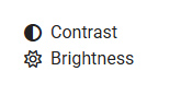