
@a11y-ngx/keyboard-navigation
v1.0.0
Published
An Angular keyboard navigation engine with preset strategies (menu, dropdown, tabs, trees) to implement in your custom components
Maintainers
 ldv
ldvReadme
Keyboard Navigation
A flexible keyboard navigation system designed for modern Angular applications.
IMPORTANT: This is a navigation engine, not a UI component.
Keyboard Navigation, hereafter "KeyNav", provides a comprehensive solution for implementing keyboard controls.
Whether you're building menus, dropdowns, trees, or custom interactive components, this library handles the complexity of keyboard interaction patterns for you.
It centralizes all keyboard interaction logic (Arrow keys, Home/End, Enter, Escape, etc.) and exposes a clean API that can be used as:
- A directive attached to any element
- A core utility inside higher-level UI libraries (menus, dropdowns, trees, tabs, toolbars, etc.)
The core idea is simple: provide the engine an array of flat or nested items and, as the user interacts with the allowed keys for the desired navigation type, the engine emits the relevant data the user is navigating from and to (e.g. moving to the previous item, opening an item, etc.).
This library was generated with Angular CLI version 12.2.0 to ensure compatibility with a wide range of Angular versions. It has been tested up to v21.
Changelog
See the complete changelog for details on updates and breaking changes.
Index
Installation
Install the npm package:
npm install @a11y-ngx/keyboard-navigation --saveImport the Module or Service as needed:
To use the directive, import
A11yKeyboardNavigationModuleinto your module or standalone component.To use the service, add
KeyboardNavigationServiceto your component's or directive'sprovidersarray.
The KeyNav Config
- Type:
KeyboardNavigationConfig.- Directive Input:
[a11yKeyNavConfig]. - Service Method:
setConfig().
- Directive Input:
| Property | Type | Default | Description |
| :------- | :--- | :-----: | :---------- |
| type | KeyboardNavigationType | 'menu' | See the Navigation Type |
| throttleMs | number | 100 | See the Throttle |
| pageSize | number | 10 | See the Page Size |
| disabledProperty | string | 'disabled' | See the Disabled Property |
| childrenProperty | string | 'children' | See the Children Property |
| customStrategy | KeyboardNavigationStrategy | undefined | See the Custom Strategy |
| orientation | 'horizontal' or 'vertical' | 'horizontal' | See the Orientation |
| allowNavigateDisabled | boolean | false | See Allow Navigate Disabled Items |
| allowSelectFirstChild | boolean | false | See Allow Select First Child |
| allowRepeatedEventsFor | KeyboardNavigationKey[] | [] | See Allow Repeated Events |
The Navigation Type
The engine already has some predefined strategies ready to be used, or you can define your own (see the Custom Strategy).
- Config Property:
type. - Type:
KeyboardNavigationType. - Default:
'menu'. - You can use:
'custom','dropdown','menu','menubar','radio','tree','tabs','toolbar','slider'.
The Throttle
Throttle to prevent rapid key-repeat events (in milliseconds).
- Config Property:
throttleMs. - Type:
number. - Default:
100.
The Page Size
The amount of items to page up or down.
- Config Property:
pageSize. - Type:
number. - Default:
10.
The Disabled Property
Since the item could be anything, when it is an object, you can have a property that indicates that the item is disabled.
Based on what you need for your UX, you might want to include or skip those items from the navigation, depending on allowNavigateDisabled property.
- Config Property:
disabledProperty. - Type:
string. - Default:
'disabled'.
💡 Let's say:
- Your item looks like
{ name: 'Save', blocked: true }.- Where "blocked" is your property to indicate that is disabled.
- So you'll set the config as
{ disabledProperty: 'blocked' }.
The Children Property
When your items are objects, this value defines whether the item has that property with children (an array of child items) or not.
For those cases where you need to navigate nested items (such as menus), you probably have a property defined with those "children" within your item.
For the engine to understand the structure, and to properly update the state when an open/close action is executed, you have to set the correct value of that property.
- Config Property:
childrenProperty. - Type:
string. - Default:
'children'.
💡 Let's say:
- Your item looks like
{ name: 'Edit', subitems: [...] }.- Where "subitems" is your property to indicate that it contains a sublevel of items.
- So you'll set the config as
{ childrenProperty: 'subitems' }.
The Custom Strategy
To provide a custom strategy (map of keys and their actions) for navigation.
📘 NOTE: You have to define the
typeas'custom'for this to work.
- Config Property:
customStrategy. - Type:
KeyboardNavigationStrategy. - Default:
undefined.
The Orientation
To define the orientation of the navigation, if the strategy keys allow it.
Usually a 'horizontal' orientation allows left and right keys to navigate, while 'vertical' allows up and down.
- Config Property:
orientation. - Type:
'horizontal'or'vertical'. - Default:
'horizontal'.
Allow Navigate Disabled Items
To allow navigate through disabled items.
When false, disabled items are skipped during navigation.
- Config Property:
allowNavigateDisabled. - Type:
boolean. - Default:
false.
Allow Select First Child
To allow auto-selecting first available child item when open a sublist of items.
- Config Property:
allowSelectFirstChild. - Type:
boolean. - Default:
false.
Let's say you are building a menu system.
- When navigated by keyboard, menus are supposed to auto-select the first available child item of a submenu as soon as it opens.
- When navigated by mouse, this does not happen:
- User hovers over an item with submenu
- The submenu opens, but it won't auto-select its first child.
So, you can set this option at runtime whenever you need.
Allow Repeated Events
By default, the engine does not emit repeated navigation events when the resolved action would result in no state change. This prevents emitting repeated events that would produce the same movement or action.
- Config Property:
allowRepeatedEventsFor. - Type:
KeyboardNavigationKey[]. - Default:
[].
For example:
- When a strategy does not allow looping and you have reached the last item using
ArrowRight, if you keep pressing the same key, the engine does not have any "next" item to go to, so it will not emit the same event again. - When a strategy allows "open" nested items, but the current item does not contain any children, the event will be emitted once (maybe you need to know the user's intention), but will be ignored on subsequent attempts.
📘 NOTE: In some cases, you may need to allow specific keys to trigger actions repeatedly as the user continues pressing them. For those scenarios, set those keys within this option.
{
    allowRepeatedEventsFor: ['ArrowDown', 'ArrowLeft']
}
The Navigation State
The navigation state is an object that describes what just happened during a keyboard interaction.
Whenever something changes in the state, the engine will emit a new event.
This allows you to react to navigation changes, update UI focus, track user position, and implement any custom behavior based on:
- Which item they navigated from and to
- Which item they open or close
- Which item they select or deselect
See also: allowRepeatedEventsFor.
Type:
KeyboardNavigationEvent<T = unknown>.Properties:
| Property | Type | Description | | :------- | :--- | :---------- | |
key|KeyboardNavigationKey| The pressed key. See the Strategy: Keys | |action|KeyboardNavigationAction| The action taken. See the Strategy: Keys | |itemFrom|Torundefined| The previous item | |itemTo|Torundefined| The current item | |indexFrom|number| The previous index | |indexTo|number| The current index | |pathFrom|number[]| The previous path | |pathTo|number[]| The current path |
See also how the Strategy works to better understand how "item", "index" and "path" are established.
The Strategies
A navigation strategy defines how keyboard input is translated into navigation behavior for a specific component type.
It defines:
- A map of the allowed keys associated to their corresponding actions.
- Optionally, you can define maps for horizontal vs vertical navigations.
- How navigation behaves at boundaries (looping or clamping).
- How nested items are handled (open / close).
Predefined strategies are ready to be used, such as 'dropdown', 'menu', 'menubar', 'radio', 'tree', 'tabs', 'toolbar' and 'slider'. All of those are simply presets that encode common and well-known navigation patterns. See the Preset Strategies.
IMPORTANT: The engine itself is unaware of UI concepts such as menus or trees. It only applies the rules defined by the selected navigation strategy and keeps a record of the state.
Type:
KeyboardNavigationStrategy.Properties:
| Property | Mandatory | Type | Description | | :------- | :-------: | :--- | :---------- | |
loop| ✔️ Yes |boolean| See the Strategy: Loop | |keys| ✔️ Yes |Record<Key, Action>| See the Strategy: Keys | |keysHorizontal| ❌ No |Record<Key, Action>| See the Strategy: Orientation Keys | |keysVertical| ❌ No |Record<Key, Action>| See the Strategy: Orientation Keys |
For instance, if you want to create your own custom "radio buttons" component, you can simply set the type: 'radio', which translates to:
{
    loop: true,  // radio buttons should loop
    keys: {      // these are the only allowed keys for radio buttons
        ArrowUp: 'previous',
        ArrowDown: 'next',
        ArrowLeft: 'previous',
        ArrowRight: 'next',
    },
}
How the Strategy Works
The state is the result of pressing a key and the action associated doing something.
That something can take place and modify the current position (index and path) of the navigation inside the service, or just return a "dummy" action for you to execute (like 'select' and 'deselect').
Once the engine processes everything, it will emit an event of type KeyboardNavigationEvent or null (if no valid key was found).
From that event, we can find:
- The "key" and "action".
- The "item", "index" and "path":
- These 3 have a "from" (previous) and "to" (current) states.
Example on a nested navigation:
For this example we won't use any specific strategy, only the logic on how it navigates based on the action:
// Our items
const items = [
    { name: 'Save' },
    { name: 'Undo' },
    { name: 'Redo' },
    { name: 'Find' },
    {
        name: 'Edit',
        subitems: [
            { name: 'Cut' },
            { name: 'Copy' },
            { name: 'Paste' },
        ],
    },
]
Let's say our very first action executed is 'next', we get:
{   ...,
    itemFrom: undefined,
    itemTo: { name: 'Save' },
    indexFrom: -1,
    indexTo: 0,
    pathFrom: [], // root level
    pathTo: [],   // root level
}
Our next action is 'last', we get:
{   ...,
    itemFrom: { name: 'Save' },
    itemTo: { name: 'Edit', subitems: [...] },
    indexFrom: 0,
    indexTo: 4,
    pathFrom: [],
    pathTo: [],
}
Our next action now is 'open', we get:
{   ...,
    itemFrom: { name: 'Edit', subitems: [...] },
    itemTo: { name: 'Cut' },
    indexFrom: 4,
    indexTo: 0,
    pathFrom: [], // root level
    pathTo: [4],  // item 4 in root level
}
We repeat the 'open' action, we get:
{   ...,
    itemFrom: { name: 'Cut' },
    itemTo: { name: 'Cut' },
    indexFrom: 0,
    indexTo: 0,
    pathFrom: [4],
    pathTo: [4],
}
👆 NOTE: Since there's nothing else to open for that last action, the event still emits and the "from" and "to" data are identical.
📘 NOTE 2: The paths represent the "open" indices.
- If a path is
[4, 0, 2], it means the current item is inside (is child of) index 2, inside index 0, inside index 4 (root level).- If
pathFromis different thanpathTo, means that you either opened or closed a sublevel of items.
Example on a flat navigation:
Let's say now we use the strategy 'radio' and we are navigating a simple flat array of 3 items: ['Red', 'Green', 'Blue'].
- Since that strategy only uses 4 keys for navigation (
ArrowUp,ArrowDown,ArrowLeftandArrowRight), any other key will be ignored. - Since those 4 keys are associated with 2 "movement" actions (
previousandnext), the engine will try to move to any "previous" or "next" item from the current position (the index). - Let's assume we already are positioned in the first item (index 0, aka "Red").
- Now, either we press
ArrowRightorArrowDown, the engine will process the actionnextand will find the next available item.So, we will get the event emitted as:
{
    key: 'ArrowRight', // The pressed key
    action: 'next',    // The action taken
    itemFrom: 'Red',   // The previous item
    itemTo: 'Green',   // The current item
    indexFrom: 0,      // The previous index
    indexTo: 1,        // The current index
    pathFrom: [],      // The previous path (for nested objects)
    pathTo: [],        // The current path (for nested objects)
}
Once we press
ArrowRightagain, we'll get:{ ..., itemFrom: 'Green', // The previous item itemTo: 'Blue', // The current item indexFrom: 1, // The previous index indexTo: 2, // The current index }We press
ArrowRightagain:{ ..., itemFrom: 'Blue', // The previous item itemTo: 'Red', // The current item (index 0) indexFrom: 2, // The previous index (last item) indexTo: 0, // The current index (first item) }
The Strategy: Loop
It defines whether navigation wraps or stops when reaching the first/last item. For instance, 'radio' and 'menu' strategies should loop, while 'dropdown' should not.
- Property:
loop. - Type:
boolean.
The Strategy: Keys
The "keys" are a map between the pressed key (coming from the KeyboardEvent.code) and its associated action.
Depending on the action, the engine will consider what to do based on the items it has and it will update the state accordingly.
Property:
keys.Type:
Record<Key, Action>.Available Keys:
| Key | Common Use | | :-- | :--------- | | 'ArrowUp' | Navigation | | 'ArrowDown' | Navigation | | 'ArrowLeft' | Navigation | | 'ArrowRight' | Navigation | | 'Home' | Navigation | | 'End' | Navigation | | 'PageUp' | Navigation | | 'PageDown' | Navigation | | 'Escape' | Action | | 'Space' | Action | | 'Enter' | Action |
Available Actions:
| Action | What it does | | :----- | :----------- | | 'previous' | Looks for the previous available (*) item | | 'next' | Looks for the next available (*) item | | 'first' | Looks for the first available (*) item | | 'last' | Looks for the last available (*) item | | 'pageUp' | Looks for the first available (*) item in the previous page | | 'pageDown' | Looks for the first available (*) item in the next page | | 'open' | Enters a sublevel of items (if any) and moves current index to the first available (**) item | | 'close' | Leaves the current sublevel and moves current index at parent's item index | | 'select' | Does nothing, just emits the action for you to decide what to do | | 'deselect' | Does nothing, just emits the action for you to decide what to do |
(*) Available means that it depends on if the item is disabled or not and how
allowNavigateDisabledis configured.(**) First available means that it depends on if
allowSelectFirstChildis set totrue.IMPORTANT: Remember that the predefined strategies have the map of keys and actions already set, meaning that:
- For a
'menu':
- The
ArrowRightwill always'open'.- The
ArrowLeftwill always'close'.- For a
'dropdown':
- The
ArrowRightandArrowLeftdo not exist.- The
Homewill always go to'first'.- The
Endwill always go to'last'.Now, if you want to see the world burn 🔥🔥🔥, you can set your own custom strategy and establish that:
- The
Homekey executes'open'.- The
Endkey executes'previous'.- The
ArrowRightkey executes'pageUp'.- And so on...
The Strategy: Orientation Keys
This comes in handy when you want to provide an oriented navigation set of keys (such as in components like a 'toolbar' or 'tabs'), which can be used either as horizontal or vertical.
For horizontal navigation (default), use:
- Property:
keysHorizontal. - Type:
Record<Key, Action>.
For vertical navigation, use:
- Property:
keysVertical. - Type:
Record<Key, Action>.
📘 NOTE: If both navigations share common keys with common actions, use the
keysproperty.Example: You decide to embrace the idea of building your own toolbar component.
The
'toolbar'strategy includes both orientations.This is the strategy definition keys:
{
    loop: true,
    keys: {
        Home: 'first',         // Shared key/action
        End: 'last',           // Shared key/action
    },
    keysHorizontal: {          // For horizontal navigation
        ArrowLeft: 'previous', // Left = previous
        ArrowRight: 'next',    // Right = next
    },
    keysVertical: {            // For vertical navigation
        ArrowUp: 'previous',   // Up = previous
        ArrowDown: 'next',     // Down = next
    },
}
- Set the KeyNav config as
{ type: 'toolbar' }.- You will provide the user the option to choose between
horizontalandverticalorientations.
- Let's assume the user chose
vertical, then you'll set the config once again with{ orientation: 'vertical' }.- The user starts pressing keys:
- When the engine gets
ArrowLeft, it won't find any actions associated, since it's not amongkeysnorkeysVertical, then emitsnull.- When the engine gets
ArrowDown, it will find the action associated withinkeysVertical, then emits the event.
The Preset Strategies
Here is the default key mapping for each preset. If these do not fit your needs, you can build your own custom strategy.
{
    loop: false,
    keys: {
        ArrowUp: 'previous',
        ArrowDown: 'next',
        Home: 'first',
        End: 'last',
        PageUp: 'pageUp',
        PageDown: 'pageDown',
    },
}
{
loop: true,
keys: {
Enter: 'open',
Home: 'first',
End: 'last',
},
keysHorizontal: {
ArrowLeft: 'previous',
ArrowRight: 'next',
ArrowUp: 'open',
ArrowDown: 'open',
},
keysVertical: {
ArrowUp: 'previous',
ArrowDown: 'next',
ArrowLeft: 'open',
ArrowRight: 'open',
},
}{
loop: true,
keys: {
ArrowUp: 'previous',
ArrowDown: 'next',
ArrowLeft: 'close',
ArrowRight: 'open',
Escape: 'close',
Enter: 'open',
Home: 'first',
End: 'last',
},
}{
loop: true,
keys: {
Home: 'first',
End: 'last',
Space: 'open',
Enter: 'open',
},
keysHorizontal: {
ArrowLeft: 'previous',
ArrowRight: 'next',
},
keysVertical: {
ArrowUp: 'previous',
ArrowDown: 'next',
},
}{
loop: true,
keys: {
Home: 'first',
End: 'last',
},
keysHorizontal: {
ArrowLeft: 'previous',
ArrowRight: 'next',
},
keysVertical: {
ArrowUp: 'previous',
ArrowDown: 'next',
},
}{
loop: true,
keys: {
ArrowUp: 'previous',
ArrowDown: 'next',
ArrowLeft: 'previous',
ArrowRight: 'next',
},
}{
loop: false,
keys: {
ArrowLeft: 'previous',
ArrowDown: 'previous',
ArrowUp: 'next',
ArrowRight: 'next',
Home: 'first',
End: 'last',
PageUp: 'pageDown',
PageDown: 'pageUp',
},
}{
loop: false,
keys: {
ArrowUp: 'previous',
ArrowDown: 'next',
ArrowLeft: 'close',
ArrowRight: 'open',
Home: 'first',
End: 'last',
},
}The Directive
Apply the directive to any element to enable keyboard navigation. When the element (or any of its children) receives focus, the directive automatically listens for keyboard input and handles navigation accordingly.
- Selector:
[a11yKeyNav]. - Exported As:
a11yKeyNav.
See also:
The Directive Inputs
| Name | Type | Description |
| :--- | :--- | :---------- |
| a11yKeyNav | unknown[] | The array of items to navigate |
| a11yKeyNavType | KeyboardNavigationType | See the Navigation Type |
| a11yKeyNavConfig | Partial<KeyboardNavigationConfig> | See the Configuration |
| a11yKeyNavCurrent | number or KeyboardNavigationCurrent | See set the current |
The Directive Outputs
| Name | Type | Description |
| :--- | :--- | :---------- |
| navigate | EventEmitter<KeyboardNavigationEvent> | See the navigation state |
The Service
Use the service for programmatic control of the engine.
The service is more helpful when:
- You need programmatic control over navigation logic.
- You need your own
(keydown)logic before the engine's. - You need to conditionally enable/disable specific configuration at runtime.
- You need to block certain keys before the engine analyzes anything.
- Etc.
📘 NOTE: This is not a singleton service; each component or directive gets its own instance when injected.
The Service Public Methods
| Name | Type | Return Type | Description |
| :--- | :--- | :---------- | :---------- |
| manageKeyDown() | method | KeyboardNavigationEvent or null | See the manageKeyDown() Method |
| executeKey() | method | KeyboardNavigationEvent or null | See the executeKey() Method |
| resetLastNavigationState() | method | void | See the resetLastNavigationState() Method |
| init() | method | void | See the init() Method |
| getItems() / setItems() | method | (T \| unknown)[] | See the getItems() and setItems() Methods |
| getConfig() / setConfig() | method | KeyboardNavigationConfig | See the getConfig() and setConfig() Methods |
| getCurrent() / setCurrent() | method | KeyboardNavigationCurrent | See the getCurrent() and setCurrent() Methods |
The Service: manageKeyDown() Method
Processes the keyboard keydown event and calculates navigation target through the executeKey() method.
- Returns
KeyboardNavigationEventif the key/action are valid, ornullotherwise. - Handles throttling to prevent rapid repeated events.
Accepts a single parameter event of type KeyboardEvent.
📘 NOTE: To strongly type the
currentandpreviousitems in the returned state, pass your item type as a generic:const state = this.keyNav.manageKeyDown<MyType>(event);
The Service: executeKey() Method
To manually execute the pressing of a key (ArrowDown, Home, etc).
- Returns
KeyboardNavigationEventif the key/action are valid, ornullotherwise. - Prevents duplicate events from being emitted.
- Updates the navigation state with the latest index and path.
Accepts a single parameter key of type KeyboardNavigationKey.
📘 NOTE: To strongly type the
currentandpreviousitems in the returned state, pass your item type as a generic:const state = this.keyNav.executeKey<MyType>('ArrowDown');💡 TIP: Synchronizing state with mouse and touch events
Because
executeKey()accepts aKeyboardNavigationKeyinstead of a realKeyboardEvent, it is the perfect tool for handling different input methods too. If a user interacts with your menu component using a mouse (e.g., clicking to open a submenu), you can programmatically call the equivalent key action likethis.keyNav.executeKey('ArrowRight').This keeps the engine's internal state perfectly in sync, ensuring a seamless handoff if the user switches back to the keyboard. Check the example: The Use of the Service.
The Service: resetLastNavigationState() Method
To reset the last navigation state.
📘 NOTE: Current index and path are not modified. For that use the setCurrent() method.
The Service: init() Method
To initialize the strategy and current items (only if you have not specified a navigation type in your config).
💡 IMPORTANT: If you set a configuration including a
type, this method will be invoked automatically, no need to do it manually.
The Service: getItems() and setItems() Methods
To get/set the items to be navigated.
- The getter returns
(T | unknown)[].- You can set your item type:
this.keyNav.getItems<MyType>()
- You can set your item type:
- The setter accepts a single parameter
itemsof typeunknown[].
The Service: getConfig() and setConfig() Methods
To get/set the configuration.
- The getter returns
KeyboardNavigationConfig. - The setter accepts a single parameter
configof typePartial<KeyboardNavigationConfig>.
The Service: getCurrent() and setCurrent() Methods
To get/set the current index and path to navigate.
The getter returns
KeyboardNavigationCurrent.The setter accepts a single parameter
currentof typenumberorKeyboardNavigationCurrent.currentcould be:- A simple
number: the index you want to define as current, or - A partial object
{ index: number; path: number[]; }: Where you can define either one or both values.
⚠️ IMPORTANT: The setter method will only validate that the given path and/or index are valid within the items to be navigated. It won't consider disabled states.
const items = [
    {
        val: 'a',
        children: [
            { val: 'a-0', disabled: true },
        ],
    },
    { val: 'b' },
    {
        val: 'c',
        children: [
            { val: 'c-0' },
            { val: 'c-1' },
        ],
    },
    { val: 'd', children: [] },
]
Let's say your current position is item
'a'(index0in root path[]):- Now you set
{ path: [2], index: 1 }(aka children from item'c'):- ✔️ path exists 👉
'c'👉 it contains children 👉 path[2] - ✔️ index exists in path 👉 index
1items[2].children[1].val👉'c-1'
- ✔️ path exists 👉
- Now you set
{ path: [0] }(aka children from item'a'):- ✔️ path exists 👉
'a'👉 it contains children 👉 path[0] - ❌ previous index
1is out of range in items within this path 👉 index-1items[0].children[-1].val👉undefined
- ✔️ path exists 👉
- Now you set
{ path: [1], index: 0 }(aka children from item'b'):- ❌ path exists 👉
'b'👉 it doesn't contain children 👉 path[] - ✔️ index exists in root path 👉 index
0items[0].val👉'a'
- ❌ path exists 👉
- Now you set
{ path: [0], index: 3 }(aka children from item'a'):- ✔️ path exists 👉 path
[0] - ❌ index
3is out of range in items within this path 👉 index-1items[0].children[-1].val👉undefined
- ✔️ path exists 👉 path
- Now you set
{ path: [3], index: 3 }(aka children from item'd'):- ❌ path exists 👉
'd'👉 it doesn't contain children (empty array) 👉 path[] - ✔️ index exists in root path 👉 index
3items[3].val👉'd'
- ❌ path exists 👉
🔑 Even if disabled navigation is not allowed and you set
{ path: [0], index: 0 }, your item will be'a-0', the path and index are valid values for the engine.- A simple
Examples
The Use of the Directive
A couple of examples for the directive:
The Radio Buttons Component
This is a really quick example of a custom radio-button component:
IMPORTANT: Radio buttons are a bit more complex to implement, this is just a basic example.
The Component:
- We define our
RadioButtontype. - We define our array of items in
radioButtonItems. - We define our current initial state in
radioButtonCurrentas-1. - Once the user presses any arrow key, the KeyNav directive executes the
keydownevent, the engine processes the key/action and emits the event andselectSize()gets invoked:- We update the
radioButtonCurrentvalue with the current index fromindexTo. - We set focus manually to the radio item through the
radioButtonschildren.
- We update the
- When the user clicks on an item,
clickSize()gets invoked:- If the item is disabled, we don't do anything.
- We notify the directive of the new "current" index state through the
radiosKeyNavinstance. - We update the
radioButtonCurrentvalue with the clicked index.
import { A11yKeyboardNavigationModule, KeyboardNavigationEvent } from '@a11y-ngx/keyboard-navigation';

type RadioButton = {
    label: string;
    value: string;
    disabled?: boolean;
};

@Component({
    ...
    imports: [A11yKeyboardNavigationModule],
})
export class MyRadioComponent {
    radioButtonItems: RadioButton[] = [
        { label: 'Extra Small', value: 'xs' },
        { label: 'Small', value: 'sm' },
        { label: 'Medium', value: 'md', disabled: true },
        { label: 'Large', value: 'lg' },
        { label: 'Extra Large', value: 'xl' },
    ];
    radioButtonCurrent: number = -1;

    @ViewChild('radiosKeyNav') private radiosKeyNav!: KeyboardNavigationDirective;
    @ViewChildren('radioButton') private radioButtons!: QueryList<ElementRef<HTMLElement>>;

    selectSize(event: KeyboardNavigationEvent<RadioButton>): void {
        this.radioButtonCurrent = event.indexTo;
        this.radioButtons.toArray()[event.indexTo].nativeElement.focus();
    }

    clickSize(index: number): void {
        if (this.radioButtonItems[index].disabled) return;

        this.radiosKeyNav.current = index;
        this.radioButtonCurrent = index;
    }
}
The Template:
📘 NOTE: The
role,aria-labelandaria-checkedattributes are for accessibility purposes.
- The radio group:
- Provide the array of items through the
[a11yKeyNav]input. - Provide the navigation type (strategy) through the
a11yKeyNavTypeinput. - Provide a one-time tabindex value of
0only if there is no radio selected.- This serves the purpose of setting focus the first time so the user can start interacting with the keyboard.
- ⚠️ This is not the normal behavior for the first focus on radio buttons, it's just for the example to work.
- We save the directive instance in
#radiosKeyNav.- This is to update the current index state when user interacts with the mouse.
- We process the emitted event through the
selectSize()method.
- Provide the array of items through the
- The radio item:
- Provide a
tabindexof0for the current item, or-1otherwise. - We select the item on
(click)and(keydown.space)through theclickSize()method. - We save the item instance in
#radioButton(to set focus manually).
- Provide a
<div
    role="group"
    aria-label="Select Size"
    [attr.tabindex]="radioButtonCurrent === -1 ? 0 : null"
    [a11yKeyNav]="radioButtonItems"
    a11yKeyNavType="radio"
    #radiosKeyNav="a11yKeyNav"
    (navigate)="selectSize($event)">
    <span
        *ngFor="let radio of radioButtonItems; let idx = index"
        [tabindex]="idx === radioButtonCurrent ? 0 : -1"
        [attr.aria-checked]="idx === radioButtonCurrent"
        [attr.aria-disabled]="radio.disabled"
        (click)="clickSize(idx)"
        (keydown.space)="clickSize(idx)"
        #radioButton
        role="radio">
        {{ radio.label }}
    </span>
</div>
Result:
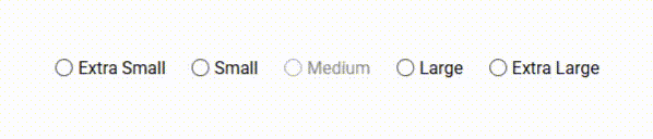
Once the focus is set in the radio group.
ArrowRight=> Extra Small selected.ArrowRight=> Small selected.ArrowDown=> Large selected.- Medium gets ignored since
allowNavigateDisabledis set tofalseby default (and it should, for this type of component).
- Medium gets ignored since
ArrowLeft=> Small selected.ArrowUp=> Extra Small selected.ArrowUp=> Extra Large selected (looping).- Etc.
The Volume Control
Another quick example on how easy we can create a slider for keyboard navigation (mouse is not covered in this code).
The Component:
import { A11yKeyboardNavigationModule, KeyboardNavigationEvent } from '@a11y-ngx/keyboard-navigation';

@Component({
    ...
    imports: [A11yKeyboardNavigationModule],
})
export class MyRadioComponent {
    // An array from 0 to 100 => [0, 1, 2, ..., 99, 100]
    volumeSlider: number[] = Array.from({ length: 101 }, (_, i) => i);
    // Initial value 70
    volumeSliderInitial: number = 70;
    volumeSliderCurrent: number = 70;

    volumeChanged(event: KeyboardNavigationEvent<number>): void {
        this.volumeSliderCurrent = event.item;
    }
}
The Template:
<div
    role="slider"
    aria-label="Volume"
    tabindex="0"
    [attr.aria-valuemin]="0"
    [attr.aria-valuemax]="100"
    [attr.aria-valuenow]="volumeSliderCurrent"
    [a11yKeyNav]="volumeSlider"
    [a11yKeyNavCurrent]="volumeSliderInitial"
    a11yKeyNavType="slider"
    (navigate)="volumeChanged($event)">
    <i class="fa-solid fa-volume-high"></i>
    <div class="slider" [style.--current-volume]="volumeSliderCurrent + '%'">
        <span>{{ volumeSliderCurrent }}%</span>
    </div>
</div>
Result:
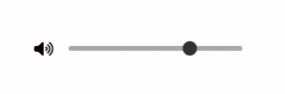
REMEMBER: Any other interaction you add (the use of mouse
clickorwheel), you'll have to manage your own calculations and update the current index in the KeyNav directive instance, so when the user decides to use the keyboard after the mouse, the values are the right ones.
The Use of the Service
Let's say we want to build a menu system.
Since the KeyNav accepts nested item navigation, you can bind the keydown event in a wrapper component and just show/hide the menus within as they open/close. Since focus will be contained by the "wrapper", the KeyNav will work without a problem.
REMEMBER:
- This is just a quick example, menus are far more complex, but with this you'll have all the keyboard scenarios covered.
- Mouse is not covered in this code.
- Since different keys execute the same action, you have to understand what the user is trying to do:
ArrowRightandEnterexecutes the'open'action:
ArrowRightexpands a submenu if the item has subitems, does nothing otherwise.Enterexpands a submenu if the item has subitems, selects (emits) the item otherwise.ArrowLeftandEscapeexecutes the'close'action:
ArrowLeftcollapses a submenu if we are at a higher sublevel (not root), does nothing otherwise (root level).Escapecollapses a submenu if we are at a higher sublevel (not root), closes the main menu and set focus on the trigger otherwise (we were at root level).
The Component:
import { Component, ViewChild, ViewChildren, ElementRef, QueryList, Output, EventEmitter } from '@angular/core';

import { KeyboardNavigationEvent, KeyboardNavigationService } from '@a11y-ngx/keyboard-navigation';

type MenuItem = {
    name: string;
    subitems?: MenuItem[];
    blocked?: boolean;
    menuOpen?: boolean;
};

@Component({
    selector: 'menu-button',
    templateUrl: '...',
    providers: [KeyboardNavigationService],
    host: {
        '(keydown)': 'onKeyDown($event)',
    },
})
export class MenuButtonComponent {
    // The items for our menu
    items: MenuItem[] = [
        { name: 'Save', blocked: true },
        {
            name: 'File',
            subitems: [
                { name: 'New' },
                { name: 'Open' },
                { name: 'Share', subitems: [{ name: 'Email' }, { name: 'WhatsApp' }, { name: 'Facebook' }] },
            ],
        },
        {
            name: 'Edit',
            subitems: [{ name: 'Cut' }, { name: 'Copy' }, { name: 'Paste' }],
        },
    ];

    @Output() itemSelected: EventEmitter<MenuItem> = new EventEmitter<MenuItem>();

    // Main menu visibility
    showMainMenu: boolean = false;

    // The current ID, based on the current state
    private get currentId(): string {
        const { pathTo, indexTo } = this.state ?? {};
        return pathTo === undefined || indexTo === undefined ? '' : this.itemId(pathTo, indexTo);
    }

    // Current state
    private state: KeyboardNavigationEvent | undefined;

    // Trigger element, to set focus when menu closes
    @ViewChild('trigger') private trigger!: ElementRef<HTMLButtonElement>;
    // Menus, to set focus to the main menu when opens
    @ViewChildren('menu') private menus!: QueryList<ElementRef<HTMLElement>>;

    constructor(private keyNav: KeyboardNavigationService) {
        // Set the config
        this.keyNav.setConfig({
            // our "disabled" property
            disabledProperty: 'blocked',
            // our "children" property
            childrenProperty: 'subitems',
            // we do want to navigate disabled items
            allowNavigateDisabled: true,
            // we do want to auto-select first child when a submenu opens
            allowSelectFirstChild: true,
        });
        // We pass the items to the KeyNav Service
        this.keyNav.setItems(this.items);
        // We initialize the Strategy
        this.keyNav.init();
    }

    // To get the item's ID (path + index) => 'menu-item-0-1'
    itemId(path: number[], index: number): string {
        return `menu-item-${this.menuPath(path, index).join('-')}`;
    }

    // To get the menu path for submenus
    menuPath(path: number[], index: number): number[] {
        return [...path, index];
    }

    // To know if the given ID is active
    // (so we can visually follow the "active" item path as we open new submenus)
    isActiveItem(id: string): boolean {
        return !this.currentId ? false : this.currentId.startsWith(id);
    }

    // The main entry for the `keydown` event
    protected onKeyDown(event: KeyboardEvent): void {
        // If the main menu is not visible
        if (!this.showMainMenu) {
            // If the pressed key is Enter or Space
            if (['Enter', 'Space'].includes(event.code)) {
                // We set the menu as visible
                this.showMainMenu = true;
                // We set focus on the menu
                setTimeout(() => this.menus.get(0)!.nativeElement.focus(), 10);
            }

            return;
        }

        // When the menu is open, we block the Tab key and close the menu
        if (event.code === 'Tab') {
            event.preventDefault();
            this.closeMenu();
            return;
        }

        // We pass the event to the KeyNav to get the state
        const state: KeyboardNavigationEvent<MenuItem> | null = this.keyNav.manageKeyDown<MenuItem>(event);
        this.manageAction(state);
    }

    // To execute some states manually
    private manageAction(state: KeyboardNavigationEvent<MenuItem> | null): void {
        // If no state (no allowed key/action), do nothing
        if (!state) return;

        // We save the state
        this.state = state;

        const { key, action, itemFrom, itemTo, pathFrom, pathTo } = state;

        // To know if it's the same path (means that key/action have changed),
        // but inside the same menu level
        const isSamePath: boolean = pathFrom.join('-') === pathTo.join('-');

        // If "open"
        if (action === 'open') {
            // If the key was "Enter" and we are in the same path
            // (meaning that the item has no submenu)
            if (key === 'Enter' && isSamePath) {
                // If there is no "itemFrom" (meaning that nothing is yet selected)
                // we manually "execute" the 'ArrowDown' key so the first element gets highlighted
                if (!itemFrom) {
                    this.manageAction(this.keyNav.executeKey('ArrowDown'));
                    return;
                }

                // If item is disabled, do not emit
                if (itemFrom.blocked) return;

                // Emit the item
                this.itemSelected.emit(itemFrom);
                // We close the menu
                this.closeMenu();
                return;
            }

            // If not in the same path (meaning the item has submenu)
            // we update our "previous" item
            if (!isSamePath) itemFrom!.menuOpen = true;
        }
        // If "close"
        else if (action === 'close') {
            // If the key was "Escape" and we are in the same path
            // (meaning that we are at root level, there's nothing else to close but the main menu)
            if (key === 'Escape' && isSamePath) {
                // We close the menu
                this.closeMenu();
                return;
            }

            // Otherwise the key was "Escape"/"ArrowLeft", we update our "current" item
            itemTo!.menuOpen = false;
        }

        // We set focus on our "current" item
        setTimeout(() => document.getElementById(this.currentId).focus(), 10);
    }

    // When closing the menu
    private closeMenu(): void {
        // We set the menu as not visible
        this.showMainMenu = false;
        // We clear our local state
        this.state = undefined;
        // We tell the KeyNav to reset the state
        this.keyNav.resetLastNavigationState();
        // We tell the KeyNav to reset the current index and path
        this.keyNav.setCurrent({ index: -1, path: [] });
        // We set focus on our trigger
        this.trigger.nativeElement.focus();
    }
}
The Template:
<!-- The trigger -->
<button type="button" class="btn trigger" #trigger>
    <i class="fa-solid fa-ellipsis-vertical"></i>
</button>

<!-- The root menu -->
<ng-container *ngIf="showMainMenu">
    <ng-container *ngTemplateOutlet="menuTemplate; context: { $implicit: items, path: [] }"></ng-container>
</ng-container>

<!-- The menu template -->
<ng-template #menuTemplate let-items let-path="path">
    <div role="menu" tabindex="-1" #menu>
        <!-- The item -->
        <div
            *ngFor="let item of items; let index = index"
            role="menuitem"
            tabindex="-1"
            [id]="itemId(path, index)"
            [class.blocked]="item.blocked"
            [class.active]="isActiveItem(itemId(path, index))">
            <span>{{ item.name }}</span>
            <span *ngIf="item.subitems" aria-hidden="true">></span>

            <!-- The submenu, when item.menuOpen = true -->
            <ng-container *ngIf="item.menuOpen">
                <ng-container
                    *ngTemplateOutlet="
                        menuTemplate;
                        context: { $implicit: item.subitems, path: menuPath(path, index) }
                    "></ng-container>
            </ng-container>
        </div>
    </div>
</ng-template>
Result:
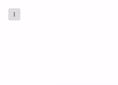
📘 NOTE: When the menu opens the first time, focus is set to the entire menu.
At this point, the user can press any of the allowed keys and the menu should respond (or not).
These are the allowed keys for the first time it opens (since focus is set to the entire menu wrapper):
Escape=> closes the menu
ArrowDown/Home=> go to first available item
ArrowUp/End=> go to last available item
ArrowRight/ArrowLeft=> does nothing
Enter=> we decide to highlight the first available item by "executing" theArrowDownkey (through theexecuteKey()method)Our first step when the menu opened was to press
Enter.At this point, the KeyNav state doesn't have anything just yet (current index is set to
-1, so, no current item so far), and we pressedEnter(a valid key and action), you will get the state and you have to decide what to do with that action.So, since the action was "open", the key was "Enter" and there is no "itemFrom" (
undefined), we force the menu to go to the first item by feeding 'ArrowDown' directly intoexecuteKey():if (action === 'open') { if (key === 'Enter' && isSamePath) { if (!itemFrom) { this.manageAction(this.keyNav.executeKey('ArrowDown')); return; } ... } ... } ...