
@a11y-ngx/overlay
v1.0.7
Published
A floating overlay-style element that stays within the visible area of the viewport or a given custom boundary (like containers with overflow), preventing it from going off-screen during scroll or window resize
Maintainers
 ldv
ldvReadme
Overlay
- An Angular directive and component to show any content within a floating overlay-style element, seamlessly positioned relative to its trigger.
- The overlay automatically repositions itself on scroll or window resize to remain fully visible within the viewport or its boundary.
The main goal of this library is to prevent any common accessibility pitfalls, like losing the opened element within containers with overflow, not being automatically repositioned on scroll or window resize (specially for keyboard users), etc.
This library was generated with Angular CLI version 12.2.0 to ensure compatibility with a wide range of Angular versions. It has been tested up to v20.
Index
- Installation
- The Configuration Object
- Configuration of the Module
- The Overlay Config
- The Types
- The Directive or the Component?
- The Overlay Directive
- The Overlay Component
- The Overlay Arrow Component
- The Overlay Create Service
- The Color Schemes
- Examples
Installation
Install npm package:
npm install @a11y-ngx/overlay --saveImport
A11yOverlayModuleinto your module or standalone component:
import { A11yOverlayModule } from '@a11y-ngx/overlay';

@NgModule({
    declarations: [...],
    imports: [
        ...
        A11yOverlayModule,
    ],
})
export class AppModule { }
CHECK ALSO: The rootConfig() and customConfig() methods.
The Configuration Object
Check the Types to better understand each property.
Configuration of the Module
The module can be configured at a:
- Root Level:
Using the
rootConfig()method and providing a config object of typeOverlayRootConfig. - Custom Level:
Using the
customConfig()method and providing a config object of typeOverlayCustomConfig.
The rootConfig() method
Serves to establish and override the global default configuration.
⚠️ IMPORTANT:
❗❗ DO NOT use it on a library or a low level component within your app, since this method is meant to be called only once, the idea is to use it at a root level on the main app.
On a library or sub-module, you can use the
customConfig()method.
Accepts a single parameter config of type OverlayRootConfig.
On Angular v12 - v14:
A11yOverlayModule.rootConfig({
    arrowSize: 5,
    offsetSize: 10,
    safeSpace: { top: 65, left: 50 },
}),
On Angular v15+:
provideA11yOverlay({
    arrowSize: 5,
    offsetSize: 10,
    safeSpace: { top: 65, left: 50 },
}),
The customConfig() method
Serves to establish a sub level configuration based on a given selector.
IMPORTANT: Everything established within a
customConfig()it's going to look back for missing properties. Meaning that, if you only set (as the example below) only 2 values, the rest will be filled out checking the globals (set in therootConfig(), if any) and then the defaults.
Accepts a single parameter config of type OverlayCustomConfig.
On Angular v12 - v14:
A11yOverlayModule.customConfig({
    selector: 'my-custom-component',
    arrowSize: 0,
    positionStrategy: 'absolute',
}),
On Angular v15+:
provideA11yOverlayFeature({
    selector: 'my-custom-component',
    arrowSize: 0,
    positionStrategy: 'absolute',
}),
Use case:
In the above example, by providing the selector
'my-custom-component', it will create a sub set of custom properties and styles for all overlays rendered inside that selector.In this particular case, those overlays will not have an arrow, while the rest (outside that selector) will have arrows of
5px, since that was the value set inrootConfig().
The Overlay Config
OverlayRootConfig is a Partial<> of OverlayConfig.
It extends from 4 other types:
- The Config Base Type.
- The Config Behavior Type.
- The Config Styles Type.
- The Config Color Scheme Type.
Some other config types:
- The Internal Config Type.
- The Custom Config Type.
The Base Config
Dependency:
Overlay Base abstract class.Type:
OverlayBaseConfig.Properties:
| Property | Type | Description | | :------- | :--- | :---------- | |
position|OverlayPositionInput| See the Position Input | |positionStrategy|OverlayPositionStrategy| See the Position Strategy | |positionsAllowed|OverlayPositionsAllowedInput| See the Positions Allowed Input | |alignmentsAllowed|OverlayAlignmentsAllowedInput| See the Alignments Allowed Input | |safeSpace|OverlaySafeSpace| See the Safe Space | |fluidAlignment|boolean| See the Fluid Alignment | |fluidSize|boolean| See the Fluid Size | |allowScrollListener|boolean| See the Page Scroll Listener (from the Base Class library) |
The Behavior Config
Type:
OverlayConfigBehavior.Properties:
| Property | Type | Description | | :------- | :--- | :---------- | |
allowClose|OverlayAllowCloseorboolean| See the Close Listeners | |allowTabCycle|boolean| See the Tab-Cycle Listener | |firstFocusOn|'first'or'last'orundefined| See the Tab-Cycle Focus First |
The Styles Config
All color related default values (★) are coming from the variables set within the Color Scheme global configuration.
Type:
OverlayConfigStyles.Properties:
| Property | Type | Description | | :------- | :--- | :---------- | |
arrowSize|number| See the Arrow Size | |offsetSize|number| See the Offset Size | |fadeMs|number| See the Fade Timeout | |fadeDelayMs|number| See the Fade Delay Timeout | |zIndex|number| See the zIndex | |padding|string| See the Padding | |shadow★ |string| See the Shadow | |shadowColor★ |string| See the Shadow | |backgroundColor★ |string| See the Background Color | |textColor★ |string| See the Text Color | |borderSize|number| See the Border Size | |borderColor★ |string| See the Border Color | |borderRadius|number| See the Border Radius | |className|stringorstring[]| See the Class Names | |maxWidth|string| See the Max Width | |maxHeight|string| See the Max Height |
The Color Scheme Config
Dependency: Color Scheme library.
Type:
ColorSchemeStylesConfig.Properties:
| Property | Type | Description | | :------- | :--- | :---------- | |
colorSchemes|Object| See how to Configure the Color Schemes | |forceScheme|ColorScheme| See how to Force a Scheme |
The Overlay Internal Config
This type contains properties that are mostly being used inside the Overlay Base Config Object.
- Type:
OverlayInternalConfig. - Properties:
trigger.position.positionStrategy.boundary.safeSpace.offsetSize.fluidAlignment.fluidSize.positionsAllowed.alignmentsAllowed.allowScrollListener(from the Base Class library).
The Trigger Element
It is the area from which the overlay will be relatively positioned.
- Input / Config Property:
trigger. - Type:
HTMLElementorDOMRect.
When HTMLElement is provided (such as a <button>), it will be used as the base element to calculate where to position the overlay.
When DOMRect is provided (such as a PointerEvent), those x and y coordinates are the base to calculate where to position the overlay.
The Position Input
To input, in a simple way, either position or position & alignment (hyphen separated if string is used).
- Input / Config Property:
position. - Type:
OverlayPositionInput. - From the Base library
enum:POSITIONandALIGNMENT. - Default:
['top', 'center']. - You can use:
OverlayPosition: e.g.:POSITION.BOTTOM.[OverlayPosition, OverlayAlignment]: e.g.:[POSITION.RIGHT, ALIGNMENT.START].string: e.g.:'left'or'left-start'.
See the Overlay Position and the Overlay Alignment.
NOTE: In case alignmentsAllowed is set to
edgesand no alignment is provided here,'start'will be established as default.
The Positions Allowed Input
To establish which positions are allowed.
- Input / Config Property:
positionsAllowed. - Type:
OverlayPositionsAllowedInput. - Default:
'auto'. - You can use:
'auto': means all sides are allowed.'opposite': means that the provided (or default) position and its opposite are only allowed. So if the overlay is set to the top, the allowed positions are'top'and'bottom'.string: accepts a comma separated values, e.g.:'top, right'.OverlayPosition: means that it will allow a single position, e.g.:POSITION.RIGHTor'right'.- ⚠️ IMPORTANT: avoid using this option unless you'll be 100% sure the overlay won't need repositioning!
OverlayPosition[]: an array of values, e.g.:[POSITION.TOP, POSITION.RIGHT]or['top', 'right'].
The Alignments Allowed Input
To establish which alignments are allowed.
- Input / Config Property:
alignmentsAllowed. - Type:
OverlayAlignmentsAllowedInput. - Default:
'auto'. - You can use:
'auto': means all alignments are allowed.'center': means that only center alignment is allowed (and it will only work if Fluid Alignment is set totrue).'edges': means that onlystartandendalignments are allowed.- 📘 NOTE: if no alignment was provided,
startwill be set as default.
- 📘 NOTE: if no alignment was provided,
OverlayAlignment: means that it will allow a single alignment, e.g.:ALIGNMENT.STARTor'start'.- ⚠️ IMPORTANT: avoid using this option unless you'll be 100% sure the overlay will be within the visible area at that alignment!
OverlayAlignment[]: an array of values, e.g.:[ALIGNMENT.CENTER, ALIGNMENT.END]or['center', 'end'].
The Position Strategy
To establish whether a fixed or absolute strategy positioning is used in CSS.
- Input / Config Property:
positionStrategy. - Type:
OverlayPositionStrategy. - From the Base library
enum:POSITION_STRATEGY. - Default:
'fixed'. - Values:
'fixed'.'absolute'.
The absolute strategy was designed mainly to be utilized inside containers with overflow (such as responsive tables) and to avoid the overlay to be seen in case of scrolling and the trigger being visually hidden.
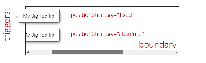
A11yOverlayModule.rootConfig({
    positionStrategy: 'absolute',
}),
The Custom Boundary
A custom boundary can be interpreted as a wrapper/container, and the overlay will consider that boundary as the new limits for its positioning.
NOTE: You can establish a
stringwith the element's selector or an HTML element.
- Input / Config Property:
boundary. - Type:
stringorHTMLElement. - Default:
<body>.
<div class="main-boundary" #myBoundary> <!-- The Boundary -->
    <!-- left side -->
    <button type="button"
        #overlayTriggerLeft
        (click)="overlayElementLeft.toggle()">
        My Button
    </button>
    <a11y-overlay
        #overlayElementLeft="a11yOverlay"
        [trigger]="overlayTriggerLeft"
        [boundary]="myBoundary"> <!-- We pass the boundary to the overlay -->
        My Big Tooltip
    </a11y-overlay>

    <!-- right side -->
    <button type="button"
        #overlayTriggerRight
        (click)="overlayElementRight.toggle()">
        My Button
    </button>
    <a11y-overlay
        #overlayElementRight="a11yOverlay"
        [trigger]="overlayTriggerRight">
        My Big Tooltip
    </a11y-overlay>
</div>
In the above example, the overlay at the left has the [boundary] set with the element myBoundary and the one at the right has not.
Now, considering that the default position/alignment is set to top-center, the one at the left it's contained by the boundary limits and will be repositioned at the bottom, and since is wider than the trigger and can't be centered, it will be aligned to the start.
The one at the right will ignore the boundary completely and, therefore, will be positioned at top and aligned to the center.
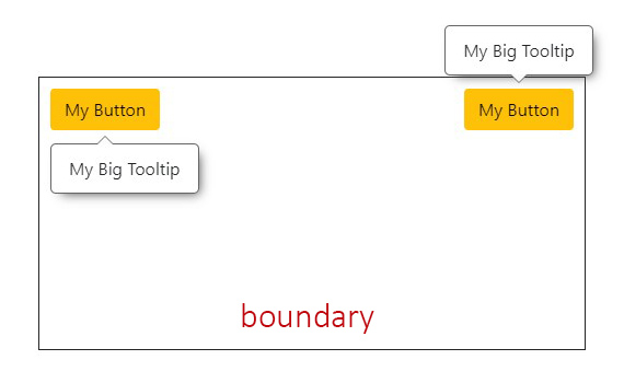
The use of boundaries can be helpful when we have containers with overflow (such as responsive tables).
⚠️ IMPORTANT: for the given example below, and because of the possibility of an overflow, the boundary should be styled with
position: relative;and the overlays inside should usepositionStrategy="absolute". See The Position Strategy and the Responsive Table example.
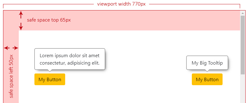
The Safe Space
To establish an extra safe space to the viewport's edges in case some fixed areas are present, such as headers, side menus or footers.
This way, the overlay will consider this area as the edge limit and reposition itself if reached. Most useful use cases are related to scroll events.
- Input / Config Property:
safeSpace. - Type:
OverlaySafeSpace:objectwith each side as a property of typenumber.
- Default:
{ top: 0, bottom: 0, left: 0, right: 0 }.
The Safe Space Off
In this scenario we can see two different overlays with the default position/alignment (top-center) when the safe space is not set at all.
Both overlays have enough space at the top and can be centered.
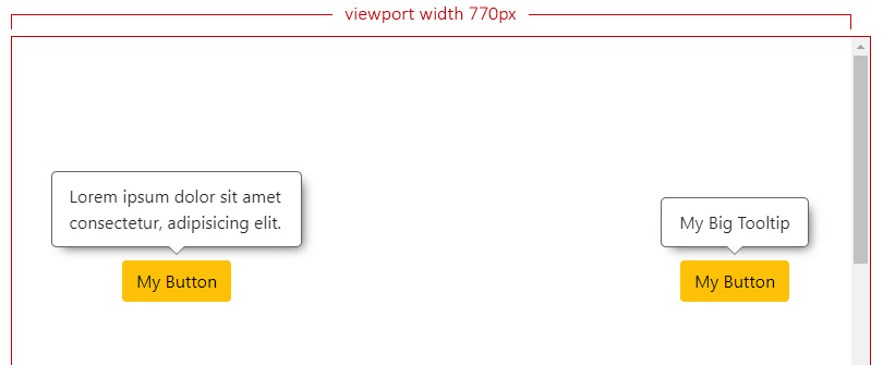
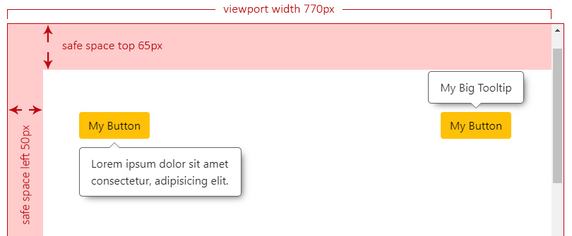
The Safe Space On
Let's say we have a header at the top (65px) and a left side menu (50px), both fixed to the page.
Now we set the safe space with the desired values for our fixed landmarks:
A11yOverlayModule.rootConfig({
safeSpace: { top: 65, left: 50 },
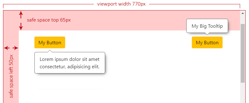
}),NOTE: For the next examples, we have forced the right overlay to ignore the safe space.
The overlay at the left doesn't have enough space to be centered anymore and it will analyze where can be aligned, which will result at start.
Now we start scrolling down and, the moment the left overlay reaches the top safe space limit, it will need to check the best side to reposition itself, which will result at bottom.
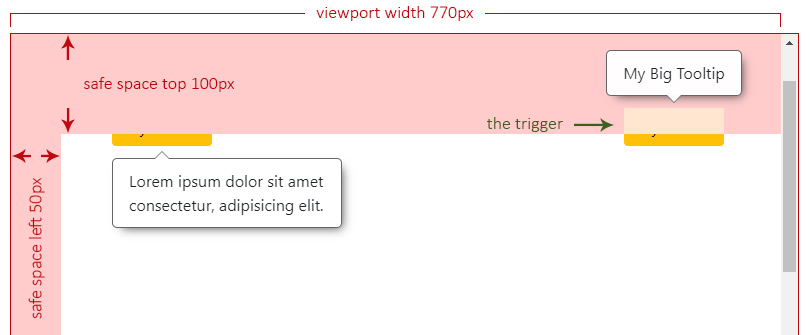
We keep scrolling down and we can see the right overlay not repositioning and overlapping the header. This can be an issue depending on what z-index your landmarks are set. See the Safe Space and zIndex Issues.
The Safe Space and zIndex Issues
The overlay z-index value is set to 9999 by default.
This means that if, for instance, your header is also set to z-index: 9999;, it will lead to leave the trigger behind, but not the overlay.
NOTE: For this particular scenario, lets change the header and the top safe space to
100px.
So, while the overlay has not reached the viewport's top edge limit, we can still see it, but only a third of the trigger:
And if we keep scrolling down, now the overlay has repositioned to the bottom, is still over the header but it doesn't seem to be "visually" attached to any trigger.
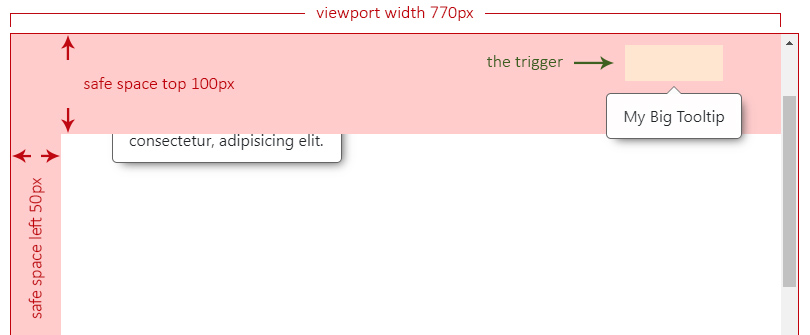
To avoid this issue, we can globally set the z-index to a lower value than our landmarks by using the rootConfig() method.
The Fluid Alignment
To establish whether the overlay's alignment will stick to the edges of the viewport/boundary (if set to true) or make jumps between start, center or end (if set to false).
- Input / Config Property:
fluidAlignment. - Type:
boolean. - Default:
false.
The Fluid Alignment On or Off
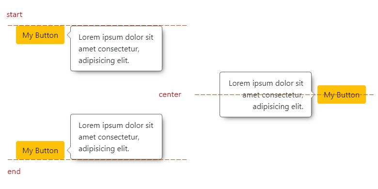
If fluidAlignment is on, and the overlay width (or height) exceeds both, the trigger's size and the free space to be centered, it will stick to the closest viewport/boundary edge. If not (is off), it will use one of the edges of the trigger to align itself (start or end).
In the next example, the overlay on the left is the only one that has fluidAlignment set to true, which means that it's going to be aligned to the left side of the viewport, while the one on the right should respect either start, center or end (in this case) of its trigger.
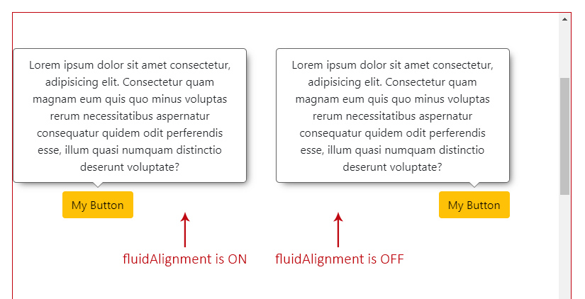
When this option is on, and the overlay is sticked to one of the sides (the left one in this case), as shown in the example above, you can access the property overlayOutside with the side that it is out, as its value ('left').
The Fluid Size
To establish whether the overlay size will adjust to the free space (if set to true) or stay as its original size, with the possibility of being out of the visible area, if larger (if set to false).
- Input / Config Property:
fluidSize. - Type:
boolean. - Default:
true.
The size adjustment will depend of the overlay's position:
- if
toporbottom, theheightof the overlay will be adjusted to the free space of any of those sides. - if
leftorright, thewidthof the overlay will be adjusted to the free space of any of those sides.
The Fluid Size On or Off
If fluidSize is on, and the overlay is bigger than the chosen side free space, it will auto adapt its size. If not (is off), it will respect the original size and could be partially off screen.
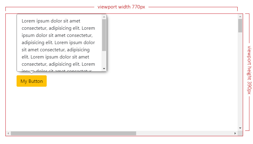
In the next example, both overlays have the same maxWidth value of 300px, but only the one on the left has fluidSize set to true. The maxHeight is not set, which will result on automatic calculation based on its content.
This means that the one on the left it's going to auto adapt its size to the maximum top space (193px of height, without the arrow/offset sizes into consideration), while the one on the right will be partially off the screen, since its max content makes it 262px of height.
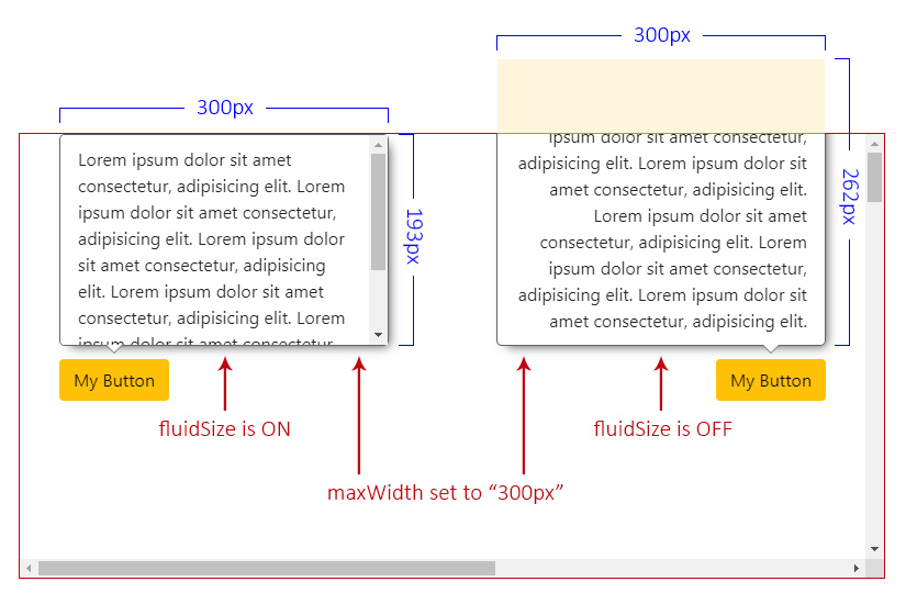
Check also the square areas to better understand how the free space is calculated in case the overlay size exceeds it.
The Viewport Size
The viewport size (without the scrollbars into consideration).
- Type:
ViewportSize:objectwithwidthandheightas a property of typenumber.
- Default: viewport's width and height.
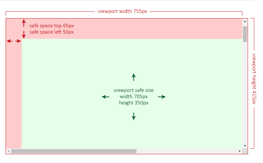
The Viewport Safe Size
The viewport safe size is the result of how many free space (width and height) the overlay can consider to be positioned.
It will be the calculation between the viewport size, a given custom boundary (also without the scrollbars into consideration, if any) and/or the safe space.
- Type:
ViewportSize.
In the following two examples, the green area is the so called viewport safe size, meaning that the overlay will consider only that area to establish its position and alignment.
The Viewport Safe Size Without a Boundary
Imagine having a viewport of 755px of width and 415px of height and two safe spaces, one at the top of 65px and another at the left of 50px.
In this case, the safe size will be the result of:
- the viewport's
widthminus theleftsafe space:755 - 50 = 705px. - the viewport's
heightminus thetopsafe space415 - 65 = 350px.
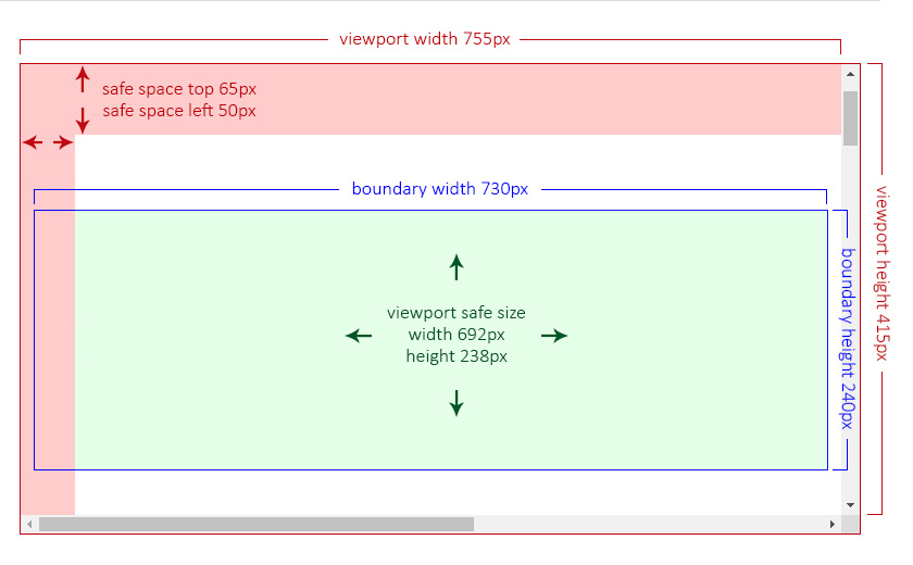
The Viewport Safe Size With a Boundary
Now imagine having the same viewport (755px by 415px), the same safe spaces (65px and 50px) and a custom boundary of 730px of width and 240px of height. This boundary is, in this examnple, by design, partially behind the left safe space.
The safe size will be the result of the custom boundary size minus the safe space area that is overlapping at its left side.
The Overlay Custom Config
This type contains properties to customize the overlay and it is used in the customConfig() method and inside either the Component or the Directive.
It also extends the properties from the Overlay Config and the Internal Config.
- Type:
OverlayCustomConfig. - Properties:
The Selector
It defines the selector of the element where all behavior and styles will be applied to.
- Config Property:
selector. - Type:
string.
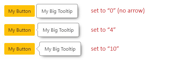
The Arrow Size
It defines the size of the arrow.
- Input / Config Property:
arrowSize. - Type:
number. - Default:
7. - Accepts: zero or greater.
- Translated to: pixels.
- CSS Variable:
--overlay-arrow.
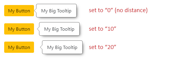
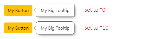
The Offset Size
It defines the space between the overlay and its trigger.
- Input / Config Property:
offsetSize. - Type:
number. - Default:
5. - Accepts: positives and negatives.
- Translated to: pixels.
NOTE: Even if this property could be considered as a "style", it is actually used as an internal calculation within the Overlay Base Class, it doesn't contain a CSS variable.
The Fade Timeout
It defines the timeout to fade in or out the overlay.
NOTE: The value will result on the combination between this value and
fadeDelayMsvalue.
- Input / Config Property:
fadeMs. - Type:
number. - Default:
150. - Translated to: milliseconds.
- CSS Variable:
--overlay-fade-ms.
The Fade Delay Timeout
It is the time it will take to start to fade in or out after the overlay is shown or hidden.
- Input / Config Property:
fadeDelayMs. - Type:
number. - Default:
0. - Translated to: milliseconds.
The zIndex
It defines the z-index CSS value.
This can be helpful for scenarios where the page contains fixed landmarks. See the Safe Space and zIndex issues.
- Input / Config Property:
zIndex. - Type:
number. - Default:
9999. - CSS Variable:
--overlay-zindex.
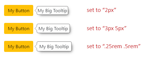
The Padding
It defines the padding CSS value.
- Input / Config Property:
padding. - Type:
string. - Default:
'10px 16px'(10pxtop & bottom,16pxleft & right). - CSS Variable:
--overlay-padding.
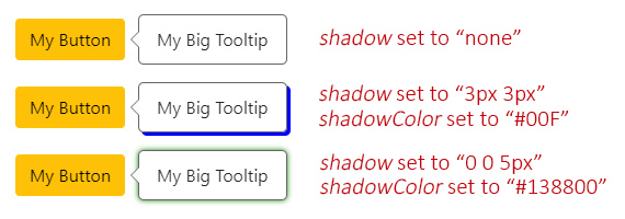
The Shadow
It defines the box-shadow CSS value, by combining two properties:
- Input / Config Property:
shadow.- Type:
string. - Default:
var(--a11y-shadow)(coming from the Color Scheme library). - CSS Variable:
--overlay-shadow.
- Type:
- Input / Config Property:
shadowColor.- Type:
string. - Default:
var(--a11y-shadow-color)(coming from the Color Scheme library). - CSS Variable:
--overlay-shadow-color.
- Type:
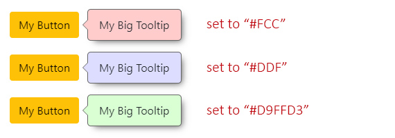
The Background Color
It defines the background-color CSS value.
- Input / Config Property:
backgroundColor. - Type:
string. - Default:
var(--a11y-bg-color)(coming from the Color Scheme library). - CSS Variable:
--overlay-bg-color.
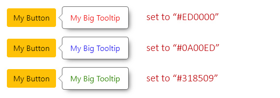
The Text Color
It defines the color CSS value.
- Input / Config Property:
textColor. - Type:
string. - Default:
var(--a11y-text-color)(coming from the Color Scheme library). - CSS Variable:
--overlay-text-color.
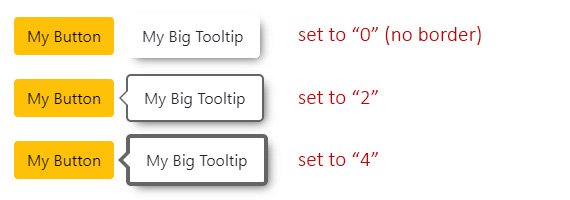
The Border Size
It defines the border-width CSS value.
- Input / Config Property:
borderSize. - Type:
number. - Default:
1. - Translated to: pixels.
- CSS Variable:
--overlay-border-size.
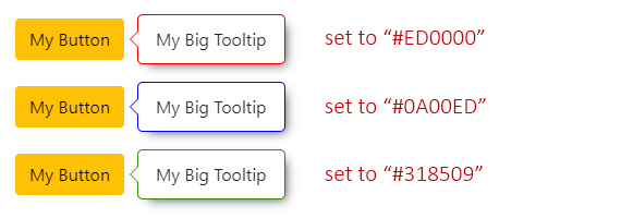
The Border Color
It defines the border-color CSS value.
- Input / Config Property:
borderColor. - Type:
string. - Default:
var(--a11y-border-color)(coming from the Color Scheme library). - CSS Variable:
--overlay-border-color.
The Border Radius
It defines the border-radius CSS value.
- Input / Config Property:
borderRadius. - Type:
number. - Default:
5(same for each corner). - Translated to: pixels.
- CSS Variable:
--overlay-border-radius.
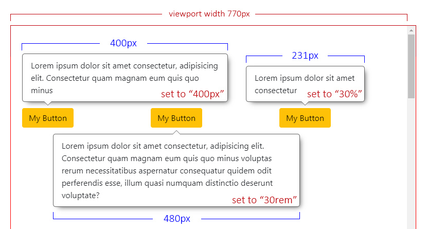
The Max Width
It defines the maximum width allowed for the overlay.
NOTE: The width of the viewport/boundary are also considered as the maximum width allowed by default, but it's really important that, if the overlay contains a big amount of text or dynamic content (in terms of width), you set a specific
maxWidthvalue.
- Input / Config Property:
maxWidth. - Type:
string. - Default:
'auto'. - You can use:
px,em,%, etc.
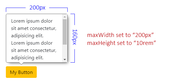
The Max Height
It defines the maximum height allowed for the overlay.
- Input / Config Property:
maxHeight. - Type:
string. - Default: unset.
- You can use:
px,em,%, etc.
NOTE: The height of the viewport/boundary are also considered as the maximum height allowed by default. When you set a
maxHeightvalue and the content exceeds it, a vertical overflow will appear (this behavior applies only for the Component, since is the one that contains a template with a stylesheet).If you plan on using the Directive, please consider adding
overflowto an element within the main wrapper.
The Class Names
It defines custom class names for your overlay element.
- Config Property:
className. - Type:
stringorstring[]. - Default: unset.
NOTE: This can be useful for custom styles or specific scenarios where the overlays are created outside the given selector.
The Types
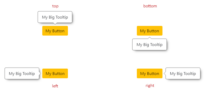
The Overlay Position
Means the relative position to the trigger.
- Type:
OverlayPosition. - From the Base library
enum:POSITION. - Default:
'top'. - Values:
'top'.'bottom'.'left'.'right'.
The Overlay Reposition
The repositioning will depend on the chosen position.
For instance, if the overlay position is set to 'top', it will check if there is enough space to be placed there. If not, it will try at 'bottom', then at 'left' and finally at 'right'.
The order would be:
'top'->'bottom'->'left'->'right'.'bottom'->'top'->'left'->'right'.'left'->'right'->'top'->'bottom'.'right'->'left'->'top'->'bottom'.
NOTE: If at any point, the overlay (especially when
resizeevent occurs on the page) doesn't have enough space at any of the allowed sides to fit its maximum size, it will choose the one with more square area.Check also the
fluidSizeOn or Off.
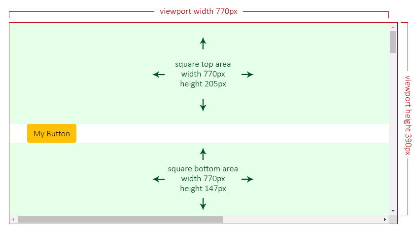
The Overlay Reposition by Square Areas
In the next scenario, the overlay has a top position with positionsAllowed set to 'opposite', which means only top or bottom are allowed.
Given the current overlay's maximum size is set to 300px by 262px, its height exceeds both allowed sides (205px at top and 147px at bottom), so the overlay will choose the one with more available square area:
- top:
770 x 205 = 157850✔️. - bottom:
770 x 147 = 113190❌.
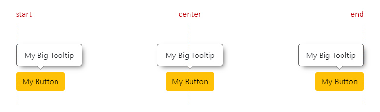
The Overlay Alignment
Means the relative alignment to the trigger.
- Type:
OverlayAlignment. - From the Base library
enum:ALIGNMENT. - Default:
'center'(or'start'ifalignmentsAllowedis set to'edges'). - Values:
'start'.'center'.'end'.
The Overlay Alignment Horizontally
This applies for top and bottom positions.
start: means aligned to the left side of the trigger.center: means aligned to the center of the trigger.end: means aligned to the right side of the trigger.
The Overlay Alignment Vertically
This applies for left and right positions.
start: means aligned to the top side of the trigger.center: means aligned to the center of the trigger.end: means aligned to the bottom side of the trigger.
The Overlay Realignment
The realignment will depend on the chosen alignment.
For instance, if the overlay alignment is set to 'center', it will check if there is enough space to be placed there. If not, it will try at 'start' and finally at 'end'.
Now, if alignmentsAllowed is set to 'edges', checking for 'center' alignment will be completelly ignored, checking first at 'start' and finally at 'end'.
The Directive or the Component?
While I strongly recommend using the component, there could be scenarios where you need/want to use the directive.
Here are the main differences between the component and the directive:
- The Component:
- It will handle the content and calculations better, since it contains a template and a stylesheet that already covers all possible scenarios.
- All styles are applied through CSS variables.
- Check the Component Use example.
- The Directive:
- It will apply all styles to the host element as inline CSS.
- Check the Directive Use example.
The Overlay Directive
The OverlayDirective extends from the OverlayBase class library.
- Selector:
[a11yOverlay]. - Exported As:
a11yOverlay.
Behind the scenes, this one will take care of:
- Save/update all the configurations.
- The logic to show, hide and/or toggle.
- Set the position of the overlay when calculated.
- It will create the Arrow Component within the host element, if
arrowSizeis set with a value greater than zero.
The Directive Inputs
| Name | Type | Description |
| :--- | :--- | :---------- |
| config | OverlayCustomConfig or string | See the Overlay Custom Config or the Config Input through a string |
| trigger | HTMLElement | See the Trigger element |
| boundary | HTMLElement | See the Custom Boundary |
| position | OverlayPositionInput | See the Position Input |
| positionsAllowed | OverlayPositionsAllowedInput | See the Positions Allowed Input |
| alignmentsAllowed | OverlayAlignmentsAllowedInput | See the Alignments Allowed Input |
| fluidAlignment | boolean | See the Fluid Alignment |
| fluidSize | boolean | See the Fluid Size |
| positionStrategy | OverlayPositionStrategy | See the Position Strategy |
| safeSpace | OverlaySafeSpace | See the Safe Space |
| arrowSize | number | See the Arrow Size |
| offsetSize | number | See the Offset Size |
| fadeMs | number | See the Fade Timeout |
| fadeDelayMs | number | See the Fade Delay Timeout |
| zIndex | number | See the zIndex |
| padding | string | See the Padding |
| shadow | string | See the Shadow |
| shadowColor | string | See the Shadow |
| backgroundColor | string | See the Background Color |
| textColor | string | See the Text Color |
| borderSize | string | See the Border Size |
| borderColor | string | See the Border Color |
| borderRadius | number | See the Border Radius |
| maxWidth | string | See the Max Width |
| maxHeight | string | See the Max Height |
| allowScrollListener | boolean | See the Page Scroll Listener in the Base Class library |
| allowClose | boolean or OverlayAllowClose | See the Directive Close Listeners |
| allowTabCycle | boolean | See the Tab Cycle Listener |
| firstFocusOn | 'first' or 'last' or undefined | See the Directive Focus on Overlay First |
| forceScheme | string | See how to Force a Scheme |
The Config Input
Is the given OverlayCustomConfig object or string that you could pass on for that specific overlay.
- Input / Config Property:
config. - Type:
OverlayCustomConfigorstring.
The object will contain all the needed properties, while the string will be treated as the selector, and make a reference for a sub level configuration (previously set in the customConfig() Method).
NOTE: The
objectcan also contain theselectorproperty, which means that you can set that "sub level" configuration inside the object, plus some extra other configs for that instance.
The Config Input Examples
Whenever you create an overlay, either by using a directive, a component or the create service, you can pass a configuration object or a string into the [config] input.
The Config Input through an Object
The object will contain the needed properties for customization. Optionally, if needed, you can also make use of the selector property, to define the specific configuration sub set established within the customConfig() method.
import { OverlayCustomConfig } from '@a11y-ngx/overlay';

...

@ViewChild('overlayTrigger', { static: true }) overlayTrigger: ElementRef<HTMLButtonElement>;

overlayConfig: OverlayCustomConfig = {
    selector: 'my-custom-component',
    trigger: this.overlayTrigger.nativeElement,
    position: ['right', 'end'],
    arrowSize: 0,
};
<button #overlayTrigger>My Button</button>
<a11y-overlay [config]="overlayConfig" maxWidth="300px">...</a11y-overlay>The Config Input through a String
When a string is passed as a config, it is going to be treated as the selector that was set within the config when customConfig() Method was used, to configure a sub level of overlays that will live under that selector in the DOM.
<a11y-overlay config="my-custom-component" ...>...</a11y-overlay>The Config Input through the OverlayCreateService
Is the third parameter for the createOverlay() method from the Overlay Create Service.
You can follow the examples above, and pass either an Object or a String.
The Directive Outputs
| Name | Type | Description |
| :--- | :--- | :---------- |
| overlayOpen | EventEmitter<void> | Will emit when show() method is invoked |
| overlayClose | EventEmitter<void> | Will emit when hide() method is invoked, and right after the fade timeout has completed |
| overlayToggle | EventEmitter<string> | Will emit values of 'open' or 'close', accordingly |
The Directive public Methods, Properties, Getters and Setters
| Name | Type | Of Type | Description |
| :--- | :--- | :------ | :---------- |
| nativeElement | get | HTMLElement | The host element: <a11y-overlay> for the component or the HTML element for the directive |
| isVisible | get | boolean | It means that the host element is reachable within the DOM.It doesn't mean is "visually visible" |
| isOpaque | get | boolean | The Overlay is "visually visible", is fully opaque. |
| borderSize | get/set | number | See the Border Size |
| arrowSize | get/set | number | See the Arrow Size |
| fadeMs | get/set | number | See the Fade Timeout |
| fadeDelayMs | get/set | number | See the Fade Delay Timeout |
| zIndex | get/set | number | See the zIndex |
| setOverlayConfig() | method | void | See how to set the Overlay Config |
| setStyles() | method | void | See how to set the Directive Styles |
| setCustomSelector() | method | void | See how to set the Directive Custom Selector |
| show() | method | void | See the Directive Show method |
| hide() | method | void | See the Directive Hide method |
| toggle() | method | void | See the Directive Toggle method |
| overlayUpdated$ | property | Subject<OverlayBaseCalculatedPosition> | To listen to the data when the directive updates the host's position. See the calculated position (from the Base Class library) |
| destroy$ | property | Subject<void> | To listen to for when the directive gets destroyed |
The Directive setOverlayConfig() Method
Serves to set the directive's config.
Accepts a single parameter config of type OverlayCustomConfig.
It is executed every time a directive is created and on change life cycle.
The Directive setStyles() Method
Serves to set the custom given styles into the host element.
Accepts a single parameter theStyles of type OverlayCustomConfig, which will only process the properties meant for styling.
It is executed on the directive's change life cycle, right after the setOverlayConfig() method.
The Directive setCustomSelector() Method
To be used when an instance of a custom component is created extending the directive as a base.
This way you can set your custom component's selector so the directive can make use of the Color Scheme service properly.
Accepts a single parameter selector of type string.
The Directive show() Method
Shows the overlay and sets its position.
This means that:
- It will replace the
display: none;fordisplay: flex;CSS property: This is the first step so the Base Class can have access to the overlay'sDOMRectdata to calculate its current size. - It will set focus on the overlay element (if
allowTabCycleis set totrue). - It will emit
overlayOpenandoverlayToggle. - It will attach the overlay and listen for changes (window resize and/or scroll) to update its coordinates and/or max sizes.
- It will start to fade in the host element after n milliseconds (established by the
fadeDelayMsproperty). - It will push the calculated position into
overlayUpdated$subject.
The Directive hide() Method
Hides the overlay.
This means that:
- It will fade out the host element.
- It will detach the overlay.
- It will set focus back on the trigger element (if
allowTabCycleis set totrue) and the trigger is an instance ofHTMLElement(not aDOMRect). - After those n milliseconds (established by the fadeMs property and the
fadeDelayMsproperty) it will:- Add the
display: none;CSS property. - Emit
overlayCloseandoverlayToggle.
- Add the
The Directive toggle() Method
It will switch between show() or hide() methods, based on the isVisible getter.
The Directive Listeners
Since the main idea of this library is to help on accessibility matters, for those that can have specific content where the user needs to explore with their keyboards, both tab cycle and close on escape listeners are available.
The Directive Close Listeners
Allows to set the "on close" listeners: Escape and/or Click Outside.
- Input / Config Property:
allowClose. - Type:
booleanorOverlayAllowClose. - Default:
true.
If a boolean is passed, then both "close on escape" and "close on click outside" are going to be configured with that value.
On the other hand, if the OverlayAllowClose type is used, you can find 2 properties to set individually:
escapeof typeboolean.clickOutsideof typeboolean.
⚠️ IMPORTANT: Be careful about this option, do not set this to
falseby default, specially whenallowTabCycleis set totrue, otherwise the focus will remain inside the overlay and keyboard users won't be able to close it.This option should be considered when you are providing other ways to close the overlay, such as custom listeners (
mouseleaveorblur) or custom buttons, like "Close" or "Confirm & Cancel".
The Directive Close on Escape Listener
Allows to close the overlay by pressing the escape key, either if the tab cycle is on or off.
- Input / Config Property:
allowCloseorallowClose.escape. - Type:
boolean. - Default:
true.
NOTE: The
escapelistener will be attached to different elements according to:
- If
allowTabCycleis set totrue, the listener will be in the overlay element.- If
allowTabCycleis set tofalse, the listener will be in the trigger element.- If no trigger element is present (because a DOMRect was provided instead), the listener will be in the document element.
The Directive Close on Click Outside Listener
Allows to close the overlay when the user clicks outside of it.
- Input / Config Property:
allowCloseorallowClose.clickOutside. - Type:
boolean. - Default:
true.
The Directive Tab Cycle Listener
If the content has interactive/tabbable elements, it is highly recommended that the focus is set to the overlay and remains within. So, whenever the user uses the tab key, the cycle will be among all focusable elements and should not be lost outside.
The same way focus is set within the overlay, it will return to the trigger when the overlay closes, either by using the escape key or the hide() method (because you must implement another way to close it via keyboard, like a close button).
- Dependency: Tab Cycle package.
- Input / Config Property:
allowTabCycle. - Type:
boolean. - Default:
true.
NOTE: When set to
true, a set of attributes will be established automatically to the overlay element:
tabindex="-1"(if no value was provided)role="dialog"aria-modal="true"This way, screen reader users can have the full and addecuate experience when navigate with their keyboards.
⚠️ IMPORTANT: This feature does not apply if you are, for instance, creating a context menu since they are navigated using the arrow keys and the
roleshould be of typemenuandmenuitemalong with other aria attributes.
The Directive Focus on Overlay First
If allowTabCycle is set to true, this property will define where the first focus is going to be set.
- Input / Config Property:
firstFocusOn. - Type:
'first','last'orundefined. - Default:
undefined.
By default, focus will be set on the overlay element. If is set to 'first', focus goes to the first tabbable element; if set to 'last' then goes to the last tabbable element (or the overlay, if none were found).
Regarding Accessibility: There has been a big discussion on if the focus should be set on the main container element or the first interactive element.
Most people recommend to set focus on the first interactive element, expecting to be a "close button".
Now imagine that you have some explainatory text and then a couple of buttons to "accept" or "cancel". By setting the focus to the first interactive element (the "accept" button in this case), the screen reader users will lost the context of the message, since they are going to be standing at the end of the container.
Please choose wisely if you change this option to
'first'or'last'.
The Overlay Component
The OverlayComponent extends from the OverlayDirective class.
- Selector:
'a11y-overlay'. - Exported As:
a11yOverlay.
Behind the scenes, this one will take care of using all the styles through the stylesheet.
The stylesheet will make use of the values established within the Config Styles Type for:
fadeMs.padding.shadow.shadowColor.backgroundColor.textColor.borderSize.borderColor.borderRadius.zIndex.
The Overlay Arrow Component
- Selector:
'a11y-overlay-arrow'.
This component has no template, it only contains a stylesheet to show an arrow-like shape "visually attached" on the overlay, pointing to the trigger.
The component will subscribe to the overlayUpdated$ property from the directive to update the arrow's position.
The stylesheet will make use of the values established within the Config Styles Type for:
The Arrow Component inside the Directive
If you are going to use an overlay directive, instead of a component, and specially if your intention is to use overflow, please consider wrapping the content within a new <div> element and apply the overflow to that div, to avoid issues with the arrow.
See an example of the Directive Use.
The Overlay Create Service
This service becomes useful when you want to use a TemplateRef content for the overlay.
It provides a method to create the overlay and a method to destroy it, if needed.
The Service Create Method
The createOverlay() method creates (and returns) an OverlayComponent instance and uses the given template as its content. The <ally-overlay> element will be rendered right after the trigger in the DOM (if given) or within a container at the end of the <body> (if DOMRect was provided).
Accepts three parameters:
triggerof typeHTMLElementorDOMRect.contentof typeTemplateRef<unknown>orstring.config(optional) of type OverlayCustomConfig or string.
NOTE: If you need to remove the rendered
<ally-overlay>element at any point, you can use the Overlay Destroy method from the returned component instance.
The Service Create Method using an HTMLElement Trigger
import { OverlayComponent, OverlayCreateService } from '@a11y-ngx/overlay';

...

@ViewChild('overlayTrigger') overlayTrigger: ElementRef<HTMLButtonElement>;
@ViewChild('overlayTemplate') overlayTemplate: TemplateRef<any>;

private myOverlay: OverlayComponent;

constructor(private overlayCreateService: OverlayCreateService) {}

toggleOverlay(): void {
    if (!this.myOverlay) {
        this.myOverlay = this.overlayCreateService.createOverlay(
            this.overlayTrigger.nativeElement, // trigger
            this.overlayTemplate,              // content
            {                                  // config
                position: ['bottom', 'end'],
                fadeMs: 500,
            });
    }

    this.myOverlay.toggle();
}
<button #overlayTrigger (click)="toggleOverlay()">My Button</button>
<ng-template #overlayTemplate>...</ng-template>The Service Create Method using a DOMRect Trigger
Since there is no actual trigger HTML element, another service will attach the overlay to a container in the <body>.
These scenarios can be useful for overlays that are not visually attached to anything, such as context menus, where only x and y coordinates (the clicked point) are needed to position the overlay.
📘 NOTE: You can see the extended version of the following code in the Context Menu example
@HostListener('document:contextmenu', ['$event'])
    private onContextMenu(event: PointerEvent): void {
        event.preventDefault();

        if (!this.myOverlay) {
            this.myOverlay = this.overlayCreateService.createOverlay(
                new DOMRect(event.x, event.y, 0, 0), // trigger
                this.overlayTemplate,                // content
                '.context-menu'                      // config's selector
            );
        }

        this.myOverlay.toggle();
    }
The Service Destroy Method
The destroyOverlay() method serves the purpose of destroying the rendered <ally-overlay> element from the DOM.
It can be invoked from the component instance generated in the Service Create method.
this.myOverlay.destroyOverlay();
this.myOverlay = undefined;
The Color Schemes
This library uses Color Scheme package as a dependency so you can make use of the two basic color schemes: light and dark (or more).
How to Configure the Color Schemes
You can establish all the color related stuff for the preset schemes (light and dark) or any other you may have added when using the rootConfig() method.
- Config Property:
colorSchemes. - Properties:
light.dark.- 'code-name' (any other).
Let's say you don't like the default text color for the light scheme (#222), then you can change it like this:
A11yOverlayModule.rootConfig({
    ...
    safeSpace: { top: 65, left: 50 },
    borderSize: 2,
    ...
    colorSchemes: {
        light: {
            textColor: '#000',
        },
        dark: {...},
        'red-velvet': {...}, // being 'red-velvet' the code-name
    },
}),
NOTES:
- You can add any other generic style value from the config (not related to color) at the root level of the object provided, as shown for the
borderSizeproperty.- If you add a color-related property at the root level, it will be treated as generic and will affect all overlays.