@a11y-ngx/overlay-base
v1.2.2
Published
An overlay positioning system that allows them to remain within the visible area of the viewport or a given custom boundary (such as containers with overflow) and thus prevent being out of the screen
Downloads
583
Maintainers
 ldv
ldvReadme
Overlay Base
An overlay positioning system that allows them to remain within the visible area of the viewport or a given custom boundary (such as containers with overflow) and thus, prevent being out of the screen.
You can use this library to create your own custom overlay-type stuff, such as:
- Tooltips
- Dropdowns
- Menus / Context Menus
- Popovers
- And much more!
This library was generated with Angular CLI version 12.2.0 to ensure compatibility with a wide range of Angular versions. It has been tested up to v21.
Changelog
See the complete changelog for details on updates and breaking changes.
Index
- Installation
- The Configuration Object
- The Types
- The Overlay Base Class
- Example
Installation
Install npm package:
npm install @a11y-ngx/overlay-base --saveUse
OverlayBaseabstract class to extend your component/directive.
The Configuration Object
- Type:
OverlayBaseConfig. - Properties:
The Trigger Element
It is the area from which the overlay will be relatively positioned.
- Property:
trigger. - Type:
HTMLElementorDOMRect.
When HTMLElement is provided (such as a <button>), it will be used as the base element to calculate where to position the overlay.
When DOMRect is provided (such as a PointerEvent), those x and y coordinates are the base to calculate where to position the overlay.
The Position Input
To input, in a quick-simple way, either position or position & alignment (hyphen separated if string is used).
- Property:
position. - Type:
OverlayBasePositionInput. - From the
enum:POSITIONandALIGNMENT. - Default:
['top', 'center']. - You can use:
OverlayBasePosition: e.g.:POSITION.BOTTOM.[OverlayBasePosition, OverlayBaseAlignment]: e.g.:[POSITION.RIGHT, ALIGNMENT.START].string: e.g.:'left'or'left-start'.
See the Overlay Position and the Overlay Alignment.
NOTE: In case alignmentsAllowed is set to
edgesand no alignment is provided here,'start'will be established as default.
The Positions Allowed Input
To establish which positions are allowed.
- Property:
positionsAllowed. - Type:
OverlayBasePositionsAllowed. - Default:
'auto'. - You can use:
'auto': means all sides are allowed.'opposite': means that the provided (or default) position and its opposite are only allowed. So if the overlay is set to the top, the allowed positions are'top'and'bottom'.string: accepts a comma separated values, e.g.:'top, right'.OverlayBasePosition: means that it will allow a single position, e.g.:POSITION.RIGHTor'right'.- ⚠️ IMPORTANT: avoid using this option unless you'll be 100% sure the overlay won't need repositioning!
OverlayBasePosition[]: an array of values, e.g.:[POSITION.TOP, POSITION.RIGHT]or['top', 'right'].
The Alignments Allowed Input
To establish which alignments are allowed.
- Property:
alignmentsAllowed. - Type:
OverlayBaseAlignmentsAllowed. - Default:
'auto'. - You can use:
'auto': means all alignments are allowed.'center': means that only center alignment is allowed (and it will only work if Fluid Alignment is set totrue).'edges': means that onlystartandendalignments are allowed.- 📘 NOTE: if no alignment was provided,
startwill be set as default.
- 📘 NOTE: if no alignment was provided,
OverlayBaseAlignment: means that it will allow a single alignment, e.g.:ALIGNMENT.STARTor'start'.- ⚠️ IMPORTANT: avoid using this option unless you'll be 100% sure the overlay will be within the visible area at that alignment!
OverlayBaseAlignment[]: an array of values, e.g.:[ALIGNMENT.CENTER, ALIGNMENT.END]or['center', 'end'].
The Alignment Order
To establish the alignment order priority.
- Property:
alignmentOrder. - Type:
OverlayBaseAlignment[]. - Default:
['center', 'start', 'end'].
The Position Strategy
To establish whether a fixed or absolute strategy positioning is used in CSS.
- Property:
positionStrategy. - Type:
OverlayBasePositionStrategy. - From the
enum:POSITION_STRATEGY. - Default:
'fixed'. - Values:
'fixed'.'absolute'.
The absolute strategy was designed mainly to be utilized inside containers (aka the boundary) with overflow and to avoid the overlay to be visible in case of scrolling and the trigger being visually hidden.
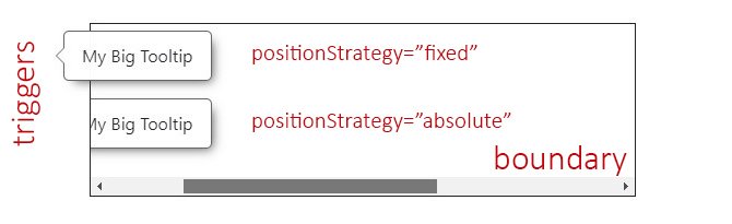
The Custom Boundary
A custom boundary can be interpreted as a wrapper/container, and the overlay will consider that boundary as the new limits for its positioning.
NOTE: You can establish a
stringwith the element's selector or an HTML element.
- Property:
boundary. - Type:
stringorHTMLElement. - Default:
<body>.
See the example.
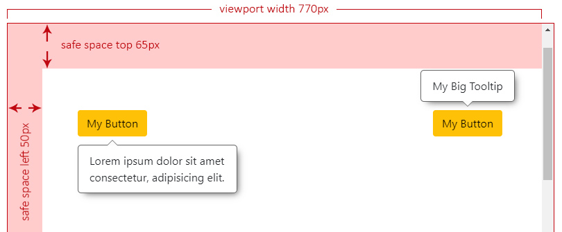
The Safe Space
To establish an extra safe space to the viewport's edges in case some fixed areas are present, such as headers, side menus or footers.
This way, the overlay will consider this area as the edge limit and reposition itself if reached. Most useful use cases are related to scroll events.
- Property:
safeSpace. - Type:
OverlayBaseSafeSpace:objectwith each side as a property of typenumber.
- Default:
{ top: 0, bottom: 0, left: 0, right: 0 }.
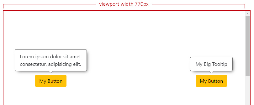
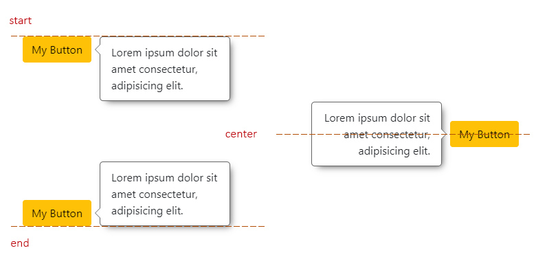
The Safe Space Off
In this scenario we can see two different overlays with the default position/alignment (top-center) when the safe space is not set at all.
Both overlays have enough space at the top and can be centered.
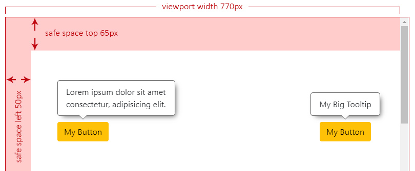
The Safe Space On
Let's say we have a header at the top (65px) and a left side menu (50px), both fixed to the page.
Now we set the safe space with the desired values for our fixed landmarks:
this.setBaseConfig({
    safeSpace: { top: 65, left: 50 },
    ...
}),
NOTE: For the next examples, we have forced the right overlay to ignore the safe space.
The overlay at the left doesn't have enough space to be centered anymore and it will analyze where can be aligned, which will result at start.
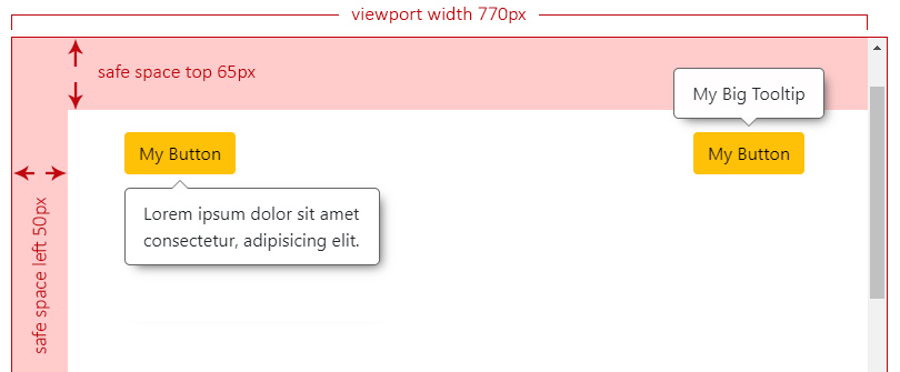
Now we start scrolling down and, the moment the left overlay reaches the top safe space limit, it will need to check the best side to reposition itself, which will result at bottom.
We keep scrolling down and we can see the right overlay not repositioning and overlapping the header. This can be an issue depending on what z-index your landmarks are set.
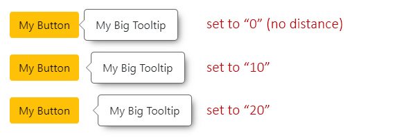
The Offset Size
It defines the space between the overlay and its trigger.
- Property:
offsetSize. - Type:
number. - Default:
5. - Accepts: positives and negatives.
- Translated to: pixels.
The Initial Scale
It defines the initial scale factor for the overlay to properly calculate its final position.
After the first calculation, if repositioning is needed, it will use the scale factor as 1 by default.
NOTE: This comes in handy when you want to provide a scaling animation to the overlay.
Let's say you want to use a "scale down" effect: having the overlay with an initial CSS
scale(1.2)and ending atscale(1), then:
- You set
initialScaleto1.2.- This will tell the calculations that the actual overlay is oversized by
0.2.- When your animation ends, it will be positioned in the right place.
- If repositioning is needed, the next calculations will use a scale factor of
1.
- Property:
initialScale. - Type:
number. - Default:
1. - Accepts:
0.1and above.
The Fluid Alignment
To establish whether the overlay's alignment will stick to the edges of the viewport/boundary (if set to true) or make jumps between start, center or end (if set to false).
IMPORTANT: This option will gain priority when the desired alignment is
center(default) and, most importantly, that alignment is also allowed.So, even if the overlay lacks enough space to be properly centered, if
fluidAlignmentistrue, it will stick to the nearest edge of the viewport/boundary.
- Property:
fluidAlignment. - Type:
boolean. - Default:
false.
The Fluid Alignment On or Off
If fluidAlignment is on, and the overlay width (or height) exceeds both, the trigger's size and the free space to be centered, it will stick to the closest viewport/boundary edge. If not (is off), it will use one of the edges of the trigger to align itself (start or end).
In the next example, both overlays can't be centered and they have to decide where to be aligned. The one on the left is the only one that has fluidAlignment set to true, which means that it's going to be aligned to the left side of the viewport, while the one on the right should respect either start, center or end (in this case) of its trigger.
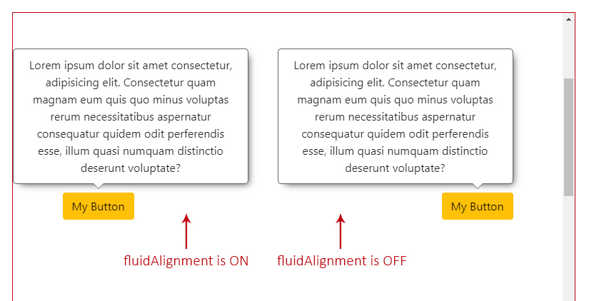
When this option is on, and the overlay is sticked to one of the viewport's sides (the left one in this case), as shown in the example above, you can access the property overlayOutside with the side that it is out, as its value ('left').
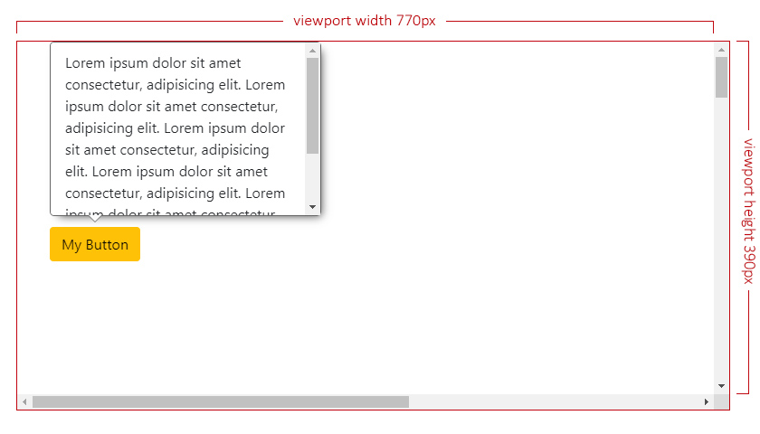
The Fluid Size
To establish whether the overlay size should adjust to the free space (if set to true) or stay as its original size, with the possibility of being out of the visible area, if larger (if set to false).
- Property:
fluidSize. - Type:
boolean. - Default:
true.
The size adjustment will depend of the overlay's position:
- if
toporbottom, theheightof the overlay will be adjusted to the free space of any of those sides. - if
leftorright, thewidthof the overlay will be adjusted to the free space of any of those sides.
The Fluid Size On or Off
If fluidSize is on, and the overlay is bigger than the chosen side free space, it will return the max width and height within maxSize (as part of the Calculated Position).
At this point, is up to you to force either the width or height of your overlay to those "max" values, and handle any possible overflow inside of it.
If it's off, maxSize will return undefined.
Check also the square areas to better understand how the free space is calculated in case the overlay size exceeds it.
The Keep In Viewport
Determines whether the overlay should remain visible within the viewport when scrolling.
💡 Scrolling Behavior:
- When
true(default): Forces the overlay to remain inside the visible viewport.
- If the trigger element scrolls off-screen, the overlay will stay on-screen (accessibility-first approach: so the user doesn't lose context of what is currently open).
- When
false: Anchors the overlay strictly to its trigger.
- If the trigger scrolls out of view, the overlay will follow it off-screen. Recommended for dropdowns, menus, etc.
- Property:
keepInViewport. - Type:
boolean. - Default:
true.
The Types
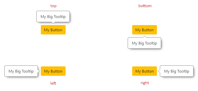
The Overlay Position
Means the relative position to the trigger.
- Type:
OverlayBasePosition. - From the
enum:POSITION. - Default:
'top'. - Values:
'top'.'bottom'.'left'.'right'.
The Overlay Reposition
The repositioning will depend on the chosen position.
For instance, if the overlay position is set to 'top', it will check if there is enough space to be placed there. If not, it will try at 'bottom', then at 'left' and finally at 'right'.
The order would be:
'top'->'bottom'->'left'->'right'.'bottom'->'top'->'left'->'right'.'left'->'right'->'top'->'bottom'.'right'->'left'->'top'->'bottom'.
NOTE: If, at any point, the overlay (especially when
resizeevent occurs on the page) doesn't have enough space at any of the allowed sides to fit its maximum size, it will choose the one with more square area.Check also the
fluidSizeOn or Off.
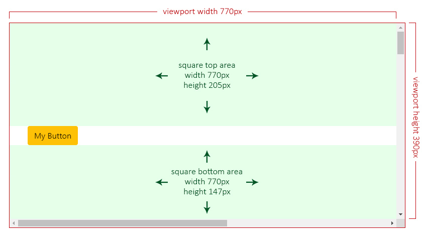
The Overlay Reposition by Square Areas
In the next scenario, the overlay has a top position with positionsAllowed set to 'opposite', which means that only top or bottom are allowed.
Given the current overlay's maximum size is set to 300px by 262px, its height exceeds both allowed sides (205px at top and 147px at bottom), so the overlay will choose the one with more available square area:
- top:
770 x 205 = 157850✔️. - bottom:
770 x 147 = 113190❌.
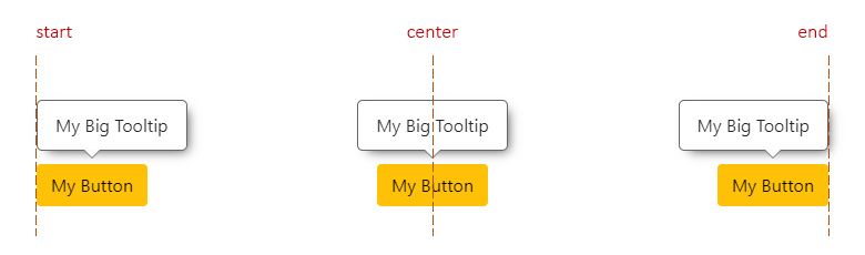
The Overlay Alignment
Means the relative alignment to the trigger.
- Type:
OverlayBaseAlignment. - From the
enum:ALIGNMENT. - Default:
'center'(or'start'ifalignmentsAllowedis set to'edges'). - Values:
'start'.'center'.'end'.
The Overlay Alignment Horizontally
This applies for top and bottom positions.
start: means aligned to the left side of the trigger.center: means aligned to the center of the trigger.end: means aligned to the right side of the trigger.
The Overlay Alignment Vertically
This applies for left and right positions.
start: means aligned to the top side of the trigger.center: means aligned to the center of the trigger.end: means aligned to the bottom side of the trigger.
The Overlay Realignment
The realignment will depend on the chosen alignment.
For instance, if the overlay alignment is set to 'center', it will check if there is enough space to be placed there. If not, it will try at 'start' and finally at 'end'.
Now, if alignmentsAllowed is set to 'edges', checking for 'center' alignment will be completelly ignored, checking first at 'start' and finally at 'end'.
The Overlay Base Class
This is an abstract class, which is the base of all the main calculations for the overlay to be positioned in the most adequate space.
You can create your own components and/or directives and extend them from this class.
import { OverlayBase } from '@a11y-ngx/overlay-base';

@Directive({ ... })
export class MyCustomOverlay extends OverlayBase {
    constructor(private hostElement: ElementRef) {
        super();
    }
    /* Implement your own logic... */
}
The setBaseConfig() Method
To set the main config, it accepts a single parameter customConfig of type OverlayBaseConfig.
The attachOverlay() Method
To establish the overlay HTMLElement to base all calculations on, start the listeners and receive the final position and alignment for rendering (along with the maxSize).
If a custom boundary was set in the config, a scroll event will be additionally attached to it.
Accepts two parameters:
overlayElementof typeHTMLElement.debounceTimeMs(optional) of typenumber(set to10by default).
Returns an Observable of type OverlayBaseCalculatedPosition which will be returning data every time the listeners are triggered.
The Calculated Position
Type:
OverlayBaseCalculatedPosition.Properties:
| Property | Type | Description | | :------- | :--- | :---------- | |
position|OverlayBasePosition| The final position for the overlay | |alignment|OverlayBaseAlignment| The final alignment for the overlay | |render|OverlayBaseRenderPosition| The (top, bottom, left or right) coordinates depending on the chosen Position Strategy | |maxSize|OverlayBaseMaxSize| The possible max size (widthandheight) iffluidSizeis set totrue|
The detachOverlay() Method
To stop and complete all the listeners (Subject() and BehaviorSubject()).
This will also complete the isDetached$ subject, ideally so you can listen and kill your attachOverlay() subscription.
The updateOverlaySize() Method
IMPORTANT: The overlay original size is calculated only once, the first time.
Since the overlay content could dynamically change (and so its size), in these cases you can make use of this method, to update the overlay ClientRect data and calculations will be more precise for its final position and alignment.
This will trigger the recalculate() method.
The recalculate() Method
To update on demand and return recalculated position/alignment data.
The triggerBoundaryDistance() Method
Accepts a single parameter position of type OverlayBasePosition and returns a number that means the distance (in pixels) between the trigger and the boundary/viewport for that given side.
This will take into consideration a given Custom Boundary and/or Safe Space.
The public Properties, Getters and Setters
| Name | Type | Of Type | Description |
| :--- | :--- | :------ | :---------- |
| uid | property | number | A unique auto-incremented value for each overlay created |
| getCurrentPosition | get | OverlayBasePosition | The position after all calculations. See the Overlay Position |
| getCurrentAlignment | get | OverlayBaseAlignment | The alignment after all calculations. See the Overlay Alignment |
| isTop | get | boolean | The position is top |
| isBottom | get | boolean | The position is bottom |
| isLeft | get | boolean | The position is left |
| isRight | get | boolean | The position is right |
| isTopBottom | get | boolean | The position is top or bottom |
| isStart | get | boolean | The alignment is start |
| isCenter | get | boolean | The alignment is center |
| isEnd | get | boolean | The alignment is end |
| viewportSize | get | ViewportSize | See the Viewport Size |
| viewportSizeSafe | get | ViewportSize | See the Viewport Safe Size |
| positionStrategy | get/set | OverlayBasePositionStrategy | See the Position Strategy |
| safeSpace | get/set | OverlayBaseSafeSpace | See the Safe Space |
| offsetSize | get/set | number | See the Offset Size |
| fluidSize | get/set | boolean | See the Fluid Size |
| fluidAlignment | get/set | boolean | See the Fluid Alignment |
| triggerElement | get/set | HTMLElement | See the Trigger element |
| overlayElement | get/set | HTMLElement | The overlay element |
| boundaryElement | get/set | HTMLElement | See the Custom Boundary |
| overlayOutside | property | OverlayBasePosition | Provides the side of the viewport/boundary where the overlay would be out of in case fluidAlignment is set to true. See the Fluid Alignment On or Off |
| maxSize | property | OverlayBaseMaxSize | To save the overlay max size and provide a better calculation for the maxSize values returned in the attachOverlay() Method |
| isDetached$ | property | Subject<void> | So you can use it to kill the attachOverlay() subscription. See the example |
The Viewport Size
The viewport size (without the scrollbars into consideration).
- Property:
viewportSize. - Type:
ViewportSize:objectwithwidthandheightas a property of typenumber.
- Default: viewport's width and height.
The Viewport Safe Size
The viewport safe size is the result of how many free space (width and height) the overlay can consider to be positioned.
It will be the calculation between the viewport size, a given custom boundary (also without the scrollbars into consideration, if any) and/or the safe space.
- Property:
viewportSizeSafe. - Type:
ViewportSize.
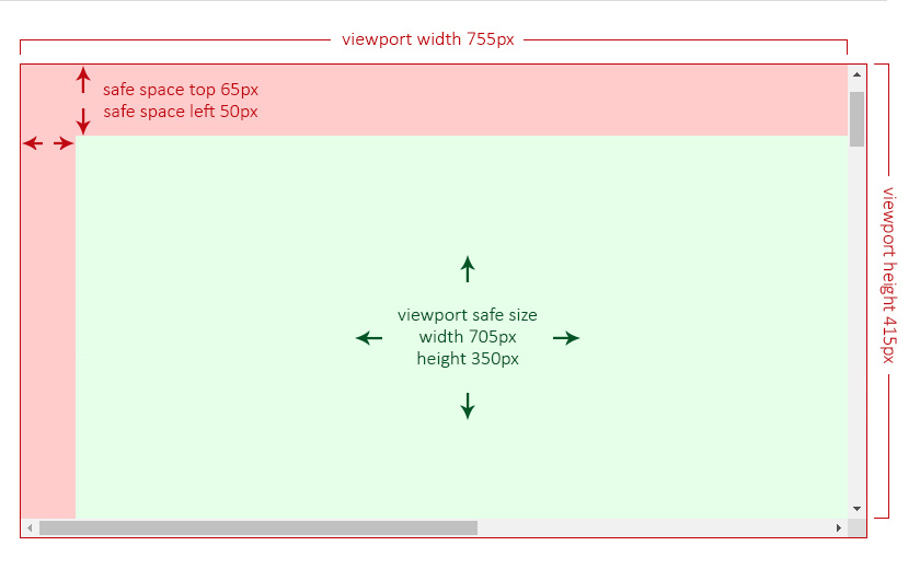
In the following two examples, the green area is the so called viewport safe size, meaning that the overlay will consider only that area to establish its position and alignment.
The Viewport Safe Size Without a Boundary
Imagine having a viewport of 755px of width and 415px of height and two safe spaces, one at the top of 65px and another at the left of 50px.
In this case, the safe size will be the result of:
- the viewport's
widthminus theleftsafe space:755 - 50 = 705px. - the viewport's
heightminus thetopsafe space415 - 65 = 350px.
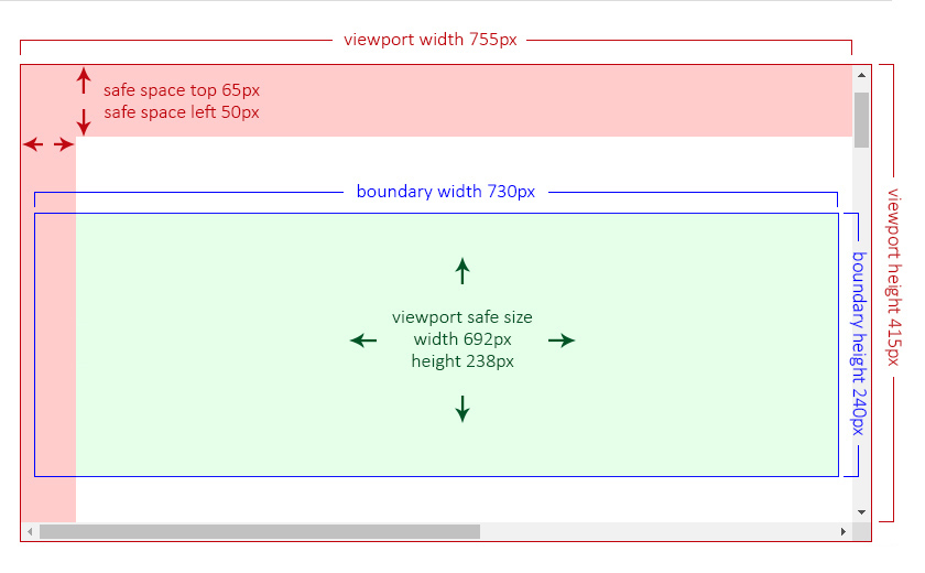
The Viewport Safe Size With a Boundary
Now imagine having the same viewport (755px by 415px), the same safe spaces (65px and 50px) and a custom boundary of 730px of width and 240px of height. This boundary is, in this examnple, by design, partially behind the left safe space.
Now, the safe size will be the result of the custom boundary size minus the safe space area that is overlapping at its left side.
The Listeners
These are the listeners that will be approperly triggered so the overlay can reposition and/or realign.
| Listener | Default | Description |
| :------- | :------ | :---------- |
| Window resize | Always listening | The window changes its size |
| Page scroll | true | See allow scroll listener |
| Custom Boundary scroll | Always listening (if any) | See the Custom Boundary Scroll listener |
| Force update | Always listening | If the recalculate() method is invoked |
The Page Scroll Listener
To allow listening for page scrolling.
- Property:
allowScrollListener. - Type:
boolean. - Default:
true.
This option can be set to false (to avoid extra listeners) in case you are absolutely sure the trigger won't change its position, such as within a fixed landmark.
Whenever allowScrollListener is set to true and there is a trigger of type HTMLElement present, the listener will execute the repositioning in case the page gets scrolled.
IMPORTANT: If a
DOMRectis established as the trigger, the page scroll will not be used as a listener.
The Custom Boundary Scroll Listener
If a custom boundary was set and, at some point, has overflow and gets scrolled, the listener will be executed to check if the overlay reached any of the boundary limits and will reposition itself, if necessary.
Example
This is a quick example on how to crate a basic tooltip directive extending the OverlayBase class.
IMPORTANT: Although a tooltip needs a lot more logic to be accessible, you can get an idea on how to start to implement it.
Tooltip Directive:
import { Directive, Input, ElementRef, OnDestroy } from '@angular/core';
import { Subject, merge } from 'rxjs';
import { takeUntil } from 'rxjs/operators';

import { OverlayBase } from '@a11y-ngx/overlay-base';

@Directive({
    selector: '[tooltip]',
    standalone: true,
    host: {
        '(mouseenter)': 'createTooltip()',
        '(mouseleave)': 'destroyTooltip()',
        '(focus)': '...',
        '(blur)': '...',
        '[attr.aria-labelledby]': 'tooltipElement ? id : null',
    },
})
export class MyCustomTooltip extends OverlayBase implements OnDestroy {
    @Input() tooltip: string;

    protected get id(): string {
        return `my-custom-tooltip-${this.uid}`;
    }

    private readonly destroy$: Subject<void> = new Subject<void>();

    protected tooltipElement: HTMLDivElement | undefined = undefined;

    constructor(private hostElement: ElementRef) {
        super();

        // 1. We set the basic config needed for our tooltip
        this.setBaseConfig({
            // Trigger: mandatory, it is where the overlay will calculate its position from
            trigger: this.hostElement.nativeElement,
            // Position: We want it to open at bottom
            position: 'bottom',
            // Offset: We want a 10px distance between trigger & overlay
            offsetSize: 10,
            // Boundary: We want the <main> element as the boundary
            boundary: 'main',
        });
    }

    ngOnDestroy(): void {
        this.destroy$.next();
        this.destroy$.complete();
        this.destroyTooltip();
    }

    // 2. We create the tooltip on (mouseenter) event
    protected createTooltip(): void {
        // We create a new <div> element and set the id and inner text
        this.tooltipElement = document.createElement('div');
        this.tooltipElement.id = this.id;
        this.tooltipElement.innerText = this.tooltip;

        // We use 'opacity' instead of 'display' so the Base class
        // can check the dimensions for a proper positioning
        this.tooltipElement.style.opacity = '0';
        // 'positionStrategy' is already set to 'fixed' by default
        this.tooltipElement.style.position = this.positionStrategy;
        // We set some other basic styles
        this.tooltipElement.style.border = '1px solid #0c0b46';
        this.tooltipElement.style.backgroundColor = '#bab6ff';
        this.tooltipElement.style.color = '#0c0b46';
        this.tooltipElement.style.padding = '5px 10px';
        this.tooltipElement.style.borderRadius = '5px';

        // We append it to the body
        document.body.appendChild(this.tooltipElement);

        // We tell the Base class to attach the overlay and
        // we will subscribe to handle set the position
        this.attachOverlay(this.tooltipElement)
            // We kill the subscription when the overlay is detached
            // or this directive gets destroyed
            .pipe(takeUntil(merge(this.destroy$, this.isDetached$)))
            .subscribe(({ render: { top, bottom, left, right } }) => {
                this.tooltipElement.style.top = top !== null ? `${top}px` : '';
                this.tooltipElement.style.bottom = bottom !== null ? `${bottom}px` : '';
                this.tooltipElement.style.left = left !== null ? `${left}px` : '';
                this.tooltipElement.style.right = right !== null ? `${right}px` : '';

                // We make the overlay fully visible now
                this.tooltipElement.style.opacity = '1';
            });
    }

    // 3. We destroy the tooltip on (mouseleave) event
    protected destroyTooltip(): void {
        this.detachOverlay();
        this.tooltipElement.remove();
        this.tooltipElement = undefined;
    }
}
On your component:
Add MyCustomTooltip to your component or module import array, and add it to a button.
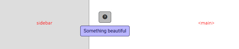
<button type="button" class="btn btn-dark" tooltip="Something beautiful">
    <i class="fa-solid fa-circle-question"></i>
</button>
Result:
The tooltip will open with position 'bottom' (as it was defined in the config) and alignment 'start' because it's respecting the boundary limit.
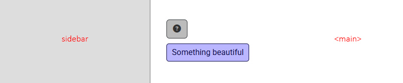
If we had chosen not to set the boundary, the tooltip alignment would have been centered by default.