@a11y-ngx/tab-cycle
v1.0.2
Published
An Angular directive to allow focus trap within a DOM element
Maintainers
 ldv
ldvReadme
Tab Cycle (aka Focus Trap)
An Angular directive to allow focus trap within a DOM element.
The main idea of this library is to facilitate any type of work related to possible accessibility issues, like when accessing a modal or modal-like element (such as a popover), the tab-cycle should be enclosed within, so either the keyboard or screen reader users can have enough context of where they stand.
IMPORTANT: This will manage the internal tab-cycle when tabbing. It can help you on set the first focus (if needed), but considering there are tons of possible scenarios, you as a developer should return the focus (if apply) to whatever element that was triggered in the first place.
This library was generated with Angular CLI version 12.2.0.
Index
Installation
Install npm package:
npm install @a11y-ngx/tab-cycle --saveImport
A11yTabCycleModuleinto your module or standalone component:
import { A11yTabCycleModule } from '@a11y-ngx/tab-cycle';

@NgModule({
    declarations: [...],
    imports: [
        ...
        A11yTabCycleModule,
    ]
})
export class AppModule { }
The Directive
- Selector:
[a11yTabCycle]. - Exported As:
a11yTabCycle.
By using the a11yTabCycle directive on any HTML element, it will create a focus trap the moment that the element or any of its children receives focus.
- It will create a
keydownevent listener on the host element to check whenever the user presses theTABorSHIFT+TABcombination keys. - It will check for any tabindex value already set on the host and, if none were found, a
-1value will be automatically assigned. - By considering the host a "focus trap", a couple of attributes will be also assigned to help Screen Reader users to have more context:
- The
roleattribute set to'dialog'. - The
aria-modalattribute set totrue.
- The
- When
TABorSHIFT+TABkeys are pressed, it will look for every possible tabbable (and visible) element within the host and:- If none were found, it will set focus on the host itself, preventing going outside.
- If any tabbable elements are detected, and:
- The user is standing on the last one and press
TAB, it will set focus on the first element found. - The user is standing on the first one and press
SHIFT+TAB, it will set focus on the last element found.
- The user is standing on the last one and press
Accessibility Considerations: Since this is an actual trap, please do provide a way to exit the host using the keyboard, such as by adding a close button or pressing the Escape key.
Public Properties, Getters, Setters and Methods
| Name | Type | Of Type | Description |
|:-----|:-----|:--------|:------------|
| enabled | get/set | string or boolean | See how to set On or Off the Tab-Cycle |
| tabindex | get/set | string or number | To specify a custom tabindex value |
| nativeElement | get | HTMLElement | The host element |
| tabbableElements | get | HTMLElement[] | See the tabbable elements |
| manageKeyDown() | method | void | It handles the main logic of the tab-cycle |
| focus() | method | void | See how to set the initial focus |
Set On or Off the Tab-Cycle
Given a11yTabCycle is the main attribute entry of the directive, by its single presence, it will be considered as a string (empty in this case) and, therefor, it enables the tab-cycle.
It can also be established by using a boolean if you need to enable/disable on demand.
<div a11yTabCycle></div>            <!-- Enabled (empty string) -->
<div a11yTabCycle="false"></div>    <!-- Enabled (string) -->
<div [a11yTabCycle]="false"></div>  <!-- Disabled (boolean) -->
Set Initial Focus
The idea of this method is to set the initial focus on the first or last tabbable elements, or the host itself (by default).
IMPORTANT: The host must be accessible for all asistive technologies, that's why allowing setting focus on any other element is not recommended, you have to be extra careful deciding where to set the initial focus.
Accepts a single parameter where (optional) of type 'first' or 'last'.
- If the method is invoked without the
where, it will set focus on the host element. - If
'first'is used, it will look for the first tabbable element and set focus on it. - If
'last'is used, it will look for the last tabbable element and set focus on it. - If no tabbable elements were found, it will set focus on the host element.
The Tabbable Elements
Every element that could receive focus is considered "tabbable", which will allow to decide where to set focus when the start or end limit of the host has been reached when tabbing.
An element is considered tabbable/focusable when it can receive focus and is visible.
You can find the list of all possible tabbable elements here.
- Dependency: DOM Helper package.
Use Example
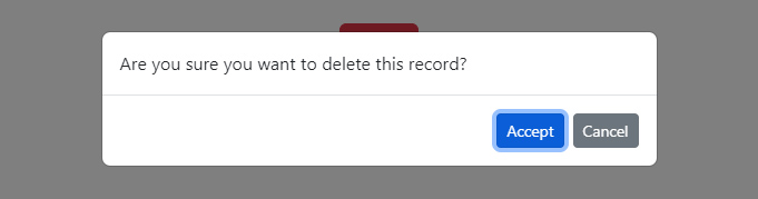
In the next example we are simulating a dialog modal, with a message and a couple of action buttons.
📘 NOTE: The styles used for the modal's template are from Bootstrap website.
⚠️ Accessibility Consideration: Modals are far more complex than the following code, this is just an example of how the tab-cycle would work in a simple scenario where you have to trap the keyboard navigation and not allowing the user to go outside until they choose an action.
This is because the modal is causing the rest of the website to be behind it and visually not reachable.
- When the "Delete" button is triggered, the modal is shown and we tell the directive to set focus on the first tabbable element using the
focus('first')method. - When we start to
TABorSHIFT+TAB, it will set focus only on the buttons, since they are the only tabbable elements within. - Once we action either "Accept" or "Cancel" buttons, the modal is hidden and (super important) we return the focus to the main button.
import { TabCycleDirective } from '@a11y-ngx/tab-cycle';
...
@Component({...})
export class MyComponent {
    @ViewChild('myButton') private myButton!: ElementRef<HTMLButtonElement>;
    @ViewChild('myModal') private myModal!: TabCycleDirective;

    showModal: boolean = false;

    openModal(): void {
        this.showModal = true;
        setTimeout(() => this.myModal.focus('first'));
    }

    closeModal(action: string): void {
        console.log(action);
        this.showModal = false;
        this.myButton.nativeElement.focus();
    }
}
<button type="button" #myButton (click)="openModal()" class="btn btn-danger">Delete</button>
<div
a11yTabCycle
#myModal="a11yTabCycle"
[style.display]="showModal ? 'block' : 'none'"
class="modal fade show"
aria-labelledby="modal-body">
<div class="modal-dialog">
<div class="modal-content">
<div class="modal-body" id="modal-body">
Are you sure you want to delete this record?
</div>
<div class="modal-footer">
<button type="button"
class="btn btn-sm btn-primary"
(click)="closeModal('accept')">
Accept
</button>
<button type="button"
class="btn btn-sm btn-secondary"
(click)="closeModal('cancel')">
Cancel
</button>
</div>
</div>
</div>
</div>Result: