
@a4ui/core
v0.37.1
Published
A4ui — Spatial Glass design system & component library for SolidJS (Kobalte behavior + Tailwind glass tokens + motion).
Downloads
9,357

Maintainers
 luinix
Readme
A4ui
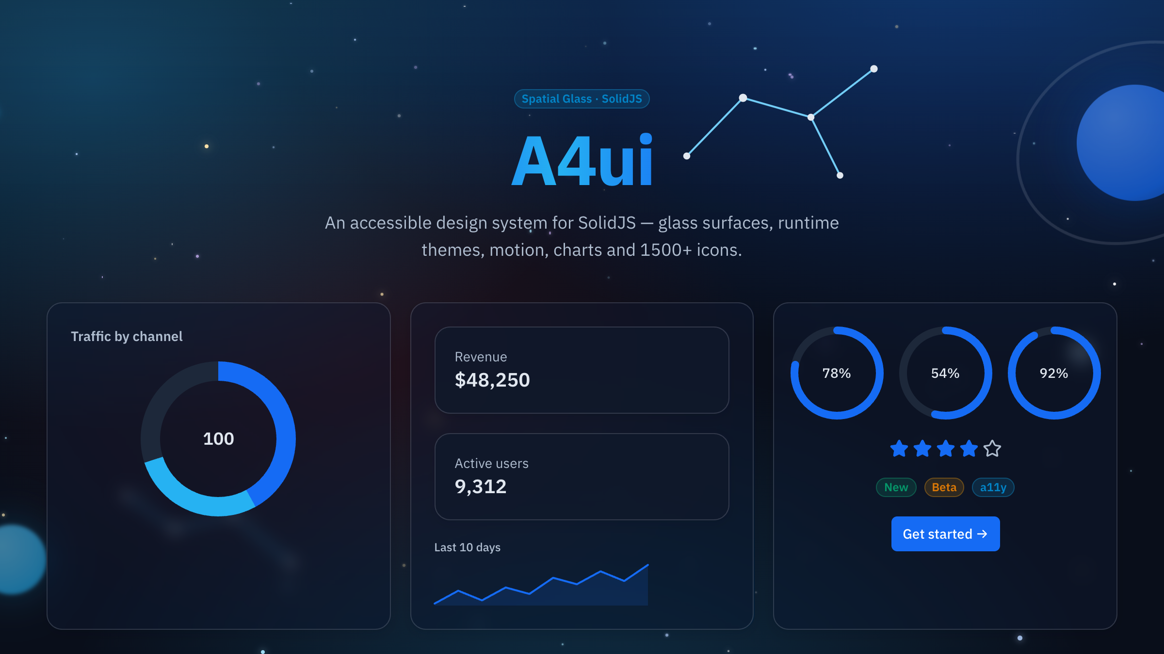







Accessible SolidJS Spatial Glass component library — 75+ components, layouts, runtime themes, a motion system, 1500+ icons (lucide), and framework-agnostic Web Components. Named after the 4 people in the Rivera family. 🙂
📚 Docs & live examples: https://a4ui.pages.dev/ · 🔒 Stability: STABILITY.md · ⬆️ Upgrading: MIGRATION.md
Three layers, one identity:
| Layer | What it gives | Tech |
| --------------- | --------------------------------------- | ---------------------------------- |
| Behavior / a11y | focus, keyboard, ARIA, portals | Kobalte |
| Motion | transitions, count-up, calm mode | Motion (motion.dev) |
| Visual | glass surfaces, tokens, glow, starfield | Tailwind preset + styles.css |
Install
npm install @a4ui/corePeer dependency: solid-js (>= 1.9).
Starting fresh? Scaffold a preconfigured Solid + Vite + A4ui app (with or without Tailwind):
npm create a4ui@latest my-app
# then: cd my-app && npm install && npm run dev
Use
With Tailwind (recommended) — add the A4ui preset so the components'
utilities and glass classes (bg-primary/90, .card, .glow-edge) resolve
against A4ui's tokens, and import the token stylesheet once:
// tailwind.config.js
import a4ui from '@a4ui/core/preset'

export default {
  presets: [a4ui],
  content: ['./index.html', './src/**/*.{ts,tsx}', './node_modules/@a4ui/core/dist/**/*.js'],
}
import '@a4ui/core/styles.css' // tokens + motion + starfield
import { Button } from '@a4ui/core'
export default () => <Button variant="primary">Save</Button>Without Tailwind — import @a4ui/core/full.css instead of styles.css.
It's fully precompiled (the tokens plus every utility the components use), so
components render styled with no Tailwind build:
import '@a4ui/core/full.css'
import { Button } from '@a4ui/core'(styles.css ships only the CSS variables + motion keyframes — it needs the
Tailwind preset to generate the component utilities; full.css is the
self-contained alternative. The framework-agnostic elements bundle ships its
own precompiled CSS too.)
Dark is the default; add data-theme="light" on <html> (or use the exported
toggleTheme() / <ThemeToggle />) for the light palette.
Icons
A4ui depends on lucide-solid, so its 1500+ icons
are ready to use — no extra install. Import any icon and drop it in; size it with
h-/w- and color it with text-*. It's tree-shakeable: importing one icon
ships only that icon (~0.3 kB), never the whole set.
import { Heart, Star, Rocket } from 'lucide-solid'
import { Button } from '@a4ui/core'

;<Star class="h-5 w-5 text-primary" />
;<Button>
  <Rocket class="h-4 w-4" /> Launch
</Button>
Browse the full set at lucide.dev/icons.
Bundle size & mounting (partial vs full)
A4ui is tree-shakeable — sideEffects is ["**/*.css"], so the only thing
that lands in your bundle is what you actually import. You never pay for the
75+ components you don't use, and adding components to the library doesn't grow
your app. Import à la carte:
import { Button, Card } from '@a4ui/core' // just these twoApproximate gzipped weights (measured on 0.13.0; JS excludes the solid-js,
@kobalte/core, lucide-solid and motion externals your app already has):
| Part | gzip | Notes |
| ----------------------------------------------------- | ------------------------ | ----------------------------------------------------------------------------------------------------------------------------------------------------------------------------------------------------------------------------------------------------------------------------------------------------------------------------------------------------------------------------------------------------------------------------------------------------------------------------------------------------------------------------------------------------------------------- |
| First component (e.g. Button + the cn helper) | ~10–11 kB | One-time baseline (includes tailwind-merge). Shared by every component. |
| Typical extra primitive | ~0.1–0.5 kB | Button alone 10.7 kB → Button + Card + Badge + Input 11.1 kB. Heavier ones (DataGrid, Calendar, Combobox, Tour) cost more via their Kobalte/behavior deps. |
| Whole barrel (@a4ui/core, all 75+ used) | ~53.0 kB | Only if you literally import everything — the realistic ceiling. |
| @a4ui/core/commerce | ~3.0 kB | ProductCard, CartSummary, PriceTag… |
| @a4ui/core/charts | ~2.5 kB | Sparkline, BarChart, DonutChart (native SVG). |
| @a4ui/core/styles.css | ~5.3 kB | Tokens + motion keyframes (needs the Tailwind preset for utilities). |
| @a4ui/core/full.css | ~14.1 kB | Every utility precompiled — for no-Tailwind apps. With Tailwind, your own purge ships far less. |
| @a4ui/core/elements (Web Components) | ~63.9 kB JS + ~14 kB CSS | Self-contained (Solid + motion compiled in). For React/Vue/vanilla. |
| motion (the animation engine) | ~45 kB | External / opt-in — pulled in only if you import an animated component (Stat, HoldToConfirm, Curtain, Parallax, ScrambleText, FillText, TextReveal, NotificationStack, MultiStateBadge, Expandable, Magnetic, ScrollProgress, GradientText, SpeedDial, or the flyToCart/animate/createCountUp helpers). Engine-free ones (LoadingDots, NowPlaying, Typewriter, Spotlight, Ripple, TiltCard — CSS/WAAPI) and static UIs never load it; that's also why <Button ripple> and <Card tilt spotlight> cost nothing. |
Performance note (Lighthouse / Cloudflare): because motion is external and
everything is tree-shaken, a page that uses only static components ships ~10–15 kB
of A4ui JS + your purged CSS — the animation engine is loaded lazily and shared
only when an animated component is on the page. Keep animations off the critical
path (or behind motionReduced) and the design system stays Lighthouse-friendly.
Install footprint (dev-time, not your bundle): npm i @a4ui/core solid-js
in an empty project pulls ~36 packages, ~105 MB on disk, 0 vulnerabilities.
Most of that (~76 MB) is lucide-solid — which is also a perk: A4ui
bundles it, so 1500+ icons are ready to use with no extra install (see
Icons). It ships every icon as its own module, but tree-shaking means
only the icons you actually use reach your bundle — the disk size is
node_modules only and never reaches your users.
Customization
Colors, radius and fonts are driven by CSS variables (the @a4ui/core/preset
maps Tailwind's semantic names to them, if you use it). Override any token in
your own CSS — scope it to :root (or :root[data-theme='light']) after
importing the styles:
@import '@a4ui/core/styles.css';

:root {
  --primary: 262 83% 58%; /* HSL channels — makes everything primary purple */
  --radius-xl: 0.75rem;
}
Themes
A theme is a full color palette (all 15 tokens, dark + light). A4ui ships
several — space (the default), dino, doctor, scientist, soccer,
snow, christmas — and you can swap them at runtime; the whole UI recolors
instantly and the choice is remembered:
import { initTheme, selectTheme, themes } from '@a4ui/core'

initTheme() // once at startup — restores the saved theme (or Space)
selectTheme('dino') // switch by name; also accepts a ThemeDefinition
Build your own in the docs — open the ⚙︎
theme-settings drawer (top bar), pick a color for any token and the whole site
recolors live, then copy the exported CSS or JSON and apply it as a
ThemeDefinition. This is separate from the light/dark setTheme/toggleTheme
mode switch — a theme recolors underneath either mode.
Components
75+ components across nine categories (this is a sample — see the
docs site or src/index.ts for the
full list):
| Category | Representative components |
| -------------- | ------------------------------------------------------------------------------------------------------------------------------------------------------------------------------------------------------------------------------------------------------------------------------------------------------------------------------------------------- |
| Forms | Input, Select, Checkbox, DateField, Combobox, TagInput, Slider, NumberInput, PromptComposer, InlineSelect, PillSearch |
| Overlays | Modal, Drawer, Popover, Tooltip, AlertDialog, ContextMenu, HoverCard, SlashMenu |
| Data & display | Table, DataGrid, Tree, Calendar, Timeline, Stat, Descriptions, SpecSheet, RatingsSummary, LogoWall, ChatThread, Message, Citation, CodeTabs, DataView, BalanceCard, TransactionFeed, KpiBlock, BlockEditor, CalendarHeatmap |
| Navigation | Tabs, Breadcrumb, Pagination, Command, Anchor, Stepper, BottomNavigation, CategoryStrip, Spaces, SideRail |
| Feedback | Alert, AnnouncementBar, Toast, Progress, Skeleton, Empty, Result, NotificationCenter |
| Layout | AppShell, SpaceBackground, ThemedScenery, Card, Splitter, Affix, NavGroup, FloatingToolbar, ArtifactPanel, MasterDetail |
| Commerce | ProductCard, ProductGrid, PriceTag, PriceBlock, QuantityStepper, CartLine, CartSummary, FilterGroup, FacetSidebar, ConditionScale |
| Charts | Sparkline, BarChart, DonutChart (native SVG, theme-tinted) |
| Motion | ScrambleText, TextReveal, Typewriter, GradientText, HoldToConfirm, LoadingDots, FillText, Curtain, Parallax, ScrollProgress, Ripple, Magnetic, TiltCard, Spotlight, NotificationStack, MultiStateBadge, NowPlaying, Expandable, StreamingText, PageTransition, ScrollScene, StickyReveal, flyToCart |
Domain-specific sets ship as subpath entries so the base package stays lean — e.g. commerce and chart components import from their own paths:
import { ProductCard, CartSummary } from '@a4ui/core/commerce'
import { DonutChart, Sparkline } from '@a4ui/core/charts'
Example pages
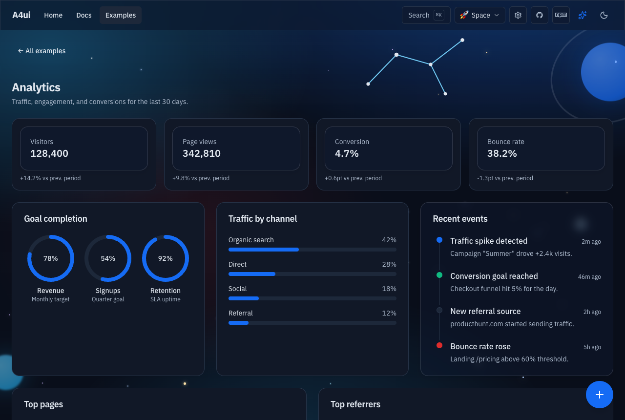
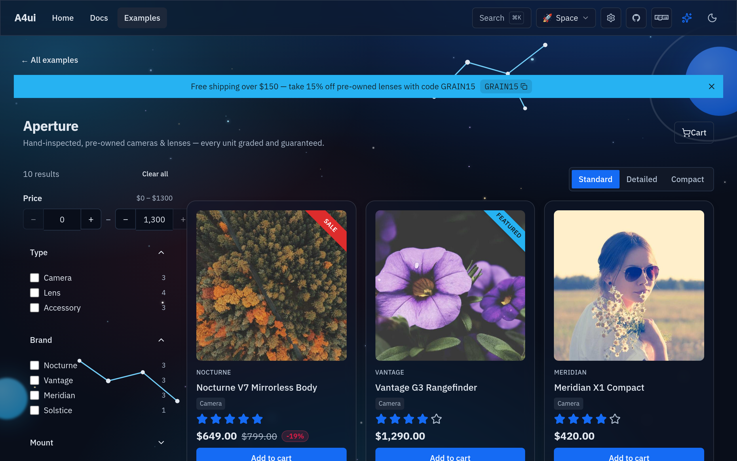
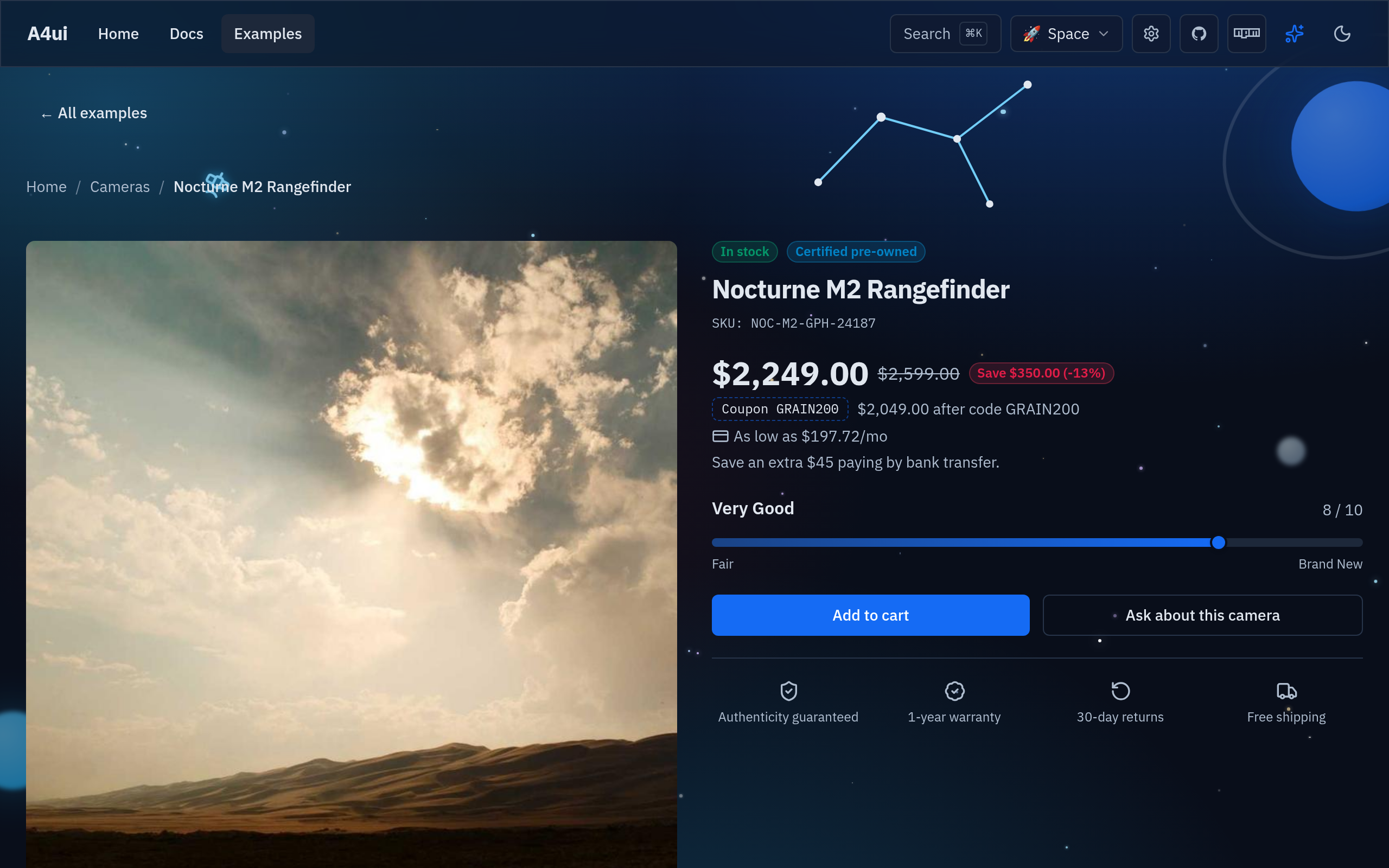
Full-page templates built entirely with the components above — browse the whole gallery at a4ui.pages.dev/#/examples. Each one reskins under every theme.
Why A4ui
| | A4ui | Kobalte | shadcn-solid | Hope UI |
| ----------------------- | -------------------------------------------------- | ---------------------- | --------------------------------- | ---------------------- |
| Styled components | ✅ ships styled, ready to use | ❌ unstyled primitives | ⚠️ copy-paste into your repo | ✅ styled |
| Web Components bundle | ✅ @a4ui/core/elements, framework-agnostic | ❌ | ❌ | ❌ |
| Built-in runtime themes | ✅ multiple palettes + live theme builder | ❌ | ❌ (edit CSS vars by hand) | ⚠️ static theme config |
| Motion system | ✅ transitions, count-up, calm/reduced-motion mode | ❌ (behavior only) | ❌ | ⚠️ minimal |
| AI-agent docs | ✅ llms.txt + JSDoc @example in .d.ts | ❌ | ❌ | ❌ |
| Glass visual identity | ✅ signature Spatial Glass look | ❌ (no visuals) | ⚠️ depends on your Tailwind theme | ❌ |
Kobalte is what A4ui builds on for behavior/a11y — not a competitor so much as a foundation. shadcn-solid and Hope UI are solid choices if you want a different look or prefer owning the component source directly.
Framework integration
A4ui is a SolidJS library. It works natively in Vite + Solid,
SolidStart (SSR), and Astro (as Solid islands). For React / Next.js,
Vue, or plain HTML, ship the self-contained Web Components bundle
(@a4ui/core/elements — Solid is compiled in, no Solid toolchain needed):
<link rel="stylesheet" href="https://unpkg.com/@a4ui/core/dist/elements.css" />
<script type="module" src="https://unpkg.com/@a4ui/core/dist/elements.js"></script>
<a4-button variant="primary" label="Save"></a4-button>
Full setup for each stack — including the honest React/Next caveat and the SSR notes — is in INTEGRATIONS.md.
Server rendering
A4ui ships a solid export condition (its source), so SolidStart and any
vite-plugin-solid app compile the components for the server — they
server-render, then hydrate. Importing the package server-side is safe (no DOM
at module load). The starfield/scenery backdrops are the exception (they build
DOM imperatively) — wrap those in clientOnly(). See
INTEGRATIONS.md.
Using with AI agents
Everything an AI coding agent (Claude Code, Codex, Cursor, …) needs to use A4ui
ships in the package, so it works from node_modules without visiting the docs:
- Typed API + examples — every export has JSDoc with an
@examplein the shipped.d.ts(node_modules/@a4ui/core/dist/index.d.ts), so editor autocomplete and agents get the props and usage inline. llms.txt— a machine-readable summary of every component plus the "Spatial Glass" recipe: https://a4ui.pages.dev/llms.txt- Spatial Glass guide — how to get the A4ui look (Aurora backdrop, glass surfaces, the cursor light, tasteful motion, Expandable), not just wire up components. Read this before building a page.
Drop this into your project's AGENTS.md / CLAUDE.md to prime your agent:
This project uses @a4ui/core (SolidJS "Spatial Glass" design system). Import components as named exports from
@a4ui/core; import@a4ui/core/styles.cssonce in the app entry; add@a4ui/core/presettotailwind.config(optional). Props are typed with JSDoc/@examplein the package's.d.ts. For the A4ui look, follow the Spatial Glass recipe (inllms.txtand https://a4ui.pages.dev/#/guide-spatial-glass): put an<Aurora/>backdrop behind a transparent root, use<Card glass>surfaces (glass reads only over a colored backdrop), keeppointerGlowon for the cursor light, add restrained motion, and useExpandablefor galleries. Full component list + recipe: https://a4ui.pages.dev/llms.txt
Develop
npm install
npm run preview      # docs site (dev server)
npm run typecheck
npm run lint         # ESLint  ·  npm run format to auto-format
npm run test:unit    # Vitest — helper unit tests
npm test             # Playwright — docs render + behavior (desktop + mobile)
npm run build        # library build (ESM + .d.ts + styles.css)
See CONTRIBUTING.md and AGENTS.md.
License
MIT © Luis Alfredo Rivera Acuña