
@adapttable/shadcn
v3.2.3
Published
shadcn/ui adapter for AdaptTable — a fully-styled React data table in one import, built on the headless @adapttable/core engine and shadcn's design tokens.

Maintainers
 orwa.mahmoud
Readme
@adapttable/shadcn
📖 Documentation · 🚀 Live demo · Get started · ⚡ Try in StackBlitz
The shadcn/ui adapter for AdaptTable —
a fully-styled React data table in one import, with sorting, filtering,
URL-synced state, selection + bulk actions, column management, RTL, and dark
mode. It's a thin wrapper over @adapttable/unstyled that applies the shadcn
class preset for you, built on the headless @adapttable/core engine.
pnpm add @adapttable/shadcn @adapttable/core react react-domRequires shadcn/ui set up in your app (its CSS variables + Tailwind config) — this adapter only references shadcn's design tokens (
bg-card,text-muted-foreground,border-border,bg-primary, …).The preset ships utility classes in this package, so let Tailwind scan it or they won't compile. In Tailwind v4, add it as a source in your CSS:
@source "../node_modules/@adapttable/shadcn/dist/**/*.js";
Requires Node.js 22.12.0 or newer; packed releases are tested on Node 22.12 and Node 24.
Quickstart
import { DataTable, useFrontendData, type ColumnDef } from "@adapttable/shadcn";

interface Person {
  id: string;
  name: string;
  city: string;
}

const columns: ColumnDef<Person>[] = [
  { key: "name", header: "Name", accessor: (r) => r.name, sortable: true },
  { key: "city", header: "City", accessor: (r) => r.city },
];

export function People({ data }: { data: Person[] }) {
  const source = useFrontendData<Person>({ data, columns });
  return <DataTable source={source} columns={columns} rowKey={(r) => r.id} />;
}
That's it — a styled shadcn table, no class wiring. Swap useFrontendData for
useQuerySource to drive it from a server-paginated query; the component doesn't
change.
Features
- Automatic mobile cards — below the mobile breakpoint every row renders as a shadcn-styled card (same filters, search, selection and URL state) and infinite scroll replaces the pager; tune per column with
mobileLabel/hideOnMobile, pin either layout withforceMobile. See it flip live. - Client or server data through one
TableSourcecontract — same props either way. - Global search box — debounced; matches each row's searchable text on client data and hands the term to the backend on a server tier. Turn it off with
searchable={false}. - URL-synced search / sort / filters / page — shareable, deep-linkable links.
- Sorting via sortable headers.
- Filtering — a
SheetorPopoverof filters plus removableBadgechips, with a filter count on the trigger. Nested AND/OR filter tree in the same panel. - Header filters (
headerFilters()) — a funnel in each filtered column's header opens the same field as the Filters panel, bound to the same state, URL params and chips. - Custom filter types (
filterTypes([...])) — register aFilterTypeSpecwith its own widget, operators and predicate; it gets the form field, header funnel, URL params and chips. - Selection + bulk actions using shadcn
Checkboxes, composed withbulkActions(...). - Row actions with optional confirm,
isHidden/isDisabledper row. - Row expansion — inline detail panels via
rowDetail(...). - Nested tables (
nestedTable(...)) — a fullDataTablewith its own columns, sorting and paging inside an expanded row. - Inline cell editing (
editing(handler)+editablecolumns) — text, number and select editors; Enter commits, Escape cancels, Tab moves on. Omit the handler and no cell opens. - Row reordering (
rowReorder(handler)) — drag handle, Space-lift keyboard, dataset-relative indices. - Row pinning (
rowPinning(...)) — sticky top and bottom rows outside the virtual window. - Pinned summary rows (
pinnedSummaryRows(...)) — host-owned totals stuck outside sort, filter, grouping, pagination and selection, including on grouped and tree tables. - Row and column spanning (
cellSpan(...)) — one cell list per row; covered cells are omitted. - Full-width and separator rows (
extraRows(...)) — host-injected slots spliced in bybeforeRowId. - Row styling and heights (
rowAppearance(...)) — conditional inline style and per-row height. - Keyboard cell navigation (
cellNavigation()) — one tab stop, arrow keys, ARIA grid semantics and screen-reader announcements. It is also the gate for cell-range selection, clipboard copy/paste of a range, and the fill handle. - Row grouping (
grouping(...)orgroupingPanel(...)) — one column key or an ordered list to nest, with per-group aggregates. - Aggregation — a footer
summaryRow, group subtotals fromaggregatablecolumns, and built-in or customaggregate()operations; totals recompute from the filtered rows. - Pivot tables — rows, columns and measures with subtotals, from the optional
@adapttable/core/pivotentry. - Tree data (
tree(...)) — hierarchical rows with expand/collapse, on desktop and on cards. - Column management — show/hide, reorder, pin (sticky) and resize, plus collapsible column groups.
- Sparkline columns (
@adapttable/react/sparkline) — bar, line and area as inline SVG. The base bundle never pays for it. - PDF export and print layout (
@adapttable/core/pdf) — optional entry;pdfWriter()onexportCsv,printTablefor the browser dialog. - Formula engine (
@adapttable/core/formula) — spreadsheet formulas over rows and aggregates; circular refs report#CYCLE!. - Feature composition (
features={[rowReorder(fn)]}) from@adapttable/shadcn/row-reorder-style subpaths — the import is the switch, andstandardFeatures()on the/presetentry is the one-import path. Host plugins share the samesetup(host)surface. - Saved views — name a filter/sort/column arrangement and switch between them.
- CSV export (
exportCsv(...)) — current page, the full filtered set, or the selected rows; choose the columns, or hand the whole thing to your backend. - XLSX export (
@adapttable/core/xlsx) — optional entry;xlsxWriter()onexportCsvwrites a real.xlsxworkbook with no extra dependency. - Command palette and context menus (
commandPalette(),contextMenu()) — Cmd/Ctrl+K opens a searchable list of table actions; right-click opens a menu for the header, row or cell. - View controls —
densityChooser(),fullscreen(),print(...),statusBar(),selectionStats(),sidePanel(...)andundoRedoButtons(), each an opt-in toolbar control from its own subpath. - Virtualization (
virtualize(...)) — opt-in row/card windowing for very large lists. - Pagination — numbered pagination, or infinite scroll (auto by device).
- SSR & server components — renders with no DOM; the client boundary is already in the build, so it drops straight into the Next.js App Router. Docs.
- States —
Skeletonloading, error with retry, and an empty state. - RTL via
dir; dark mode via your Tailwinddark:class strategy. - Customisation — the components are copied into your project — edit them directly, plus
slots,className, injectableconfirm, and the full headless escape hatch via@adapttable/react.
Customizing
Restyle any part by passing your own classNames — they're merged over the
preset, per part, so you only override what you name:
<DataTable
  source={source}
  columns={columns}
  rowKey={(r) => r.id}
  classNames={{ root: "rounded-2xl border-2 border-primary" }} // only the root changes
/>
Need the raw class map (e.g. to spread into your own @adapttable/unstyled
table)? It's exported:
import { shadcnClassNames } from "@adapttable/shadcn";See it work
Each clip is the real adapter, recorded on the live demo.
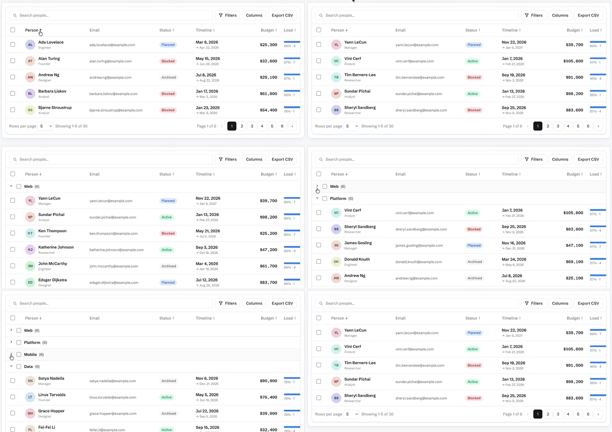
Row grouping — group rows by a column with per-group subtotals
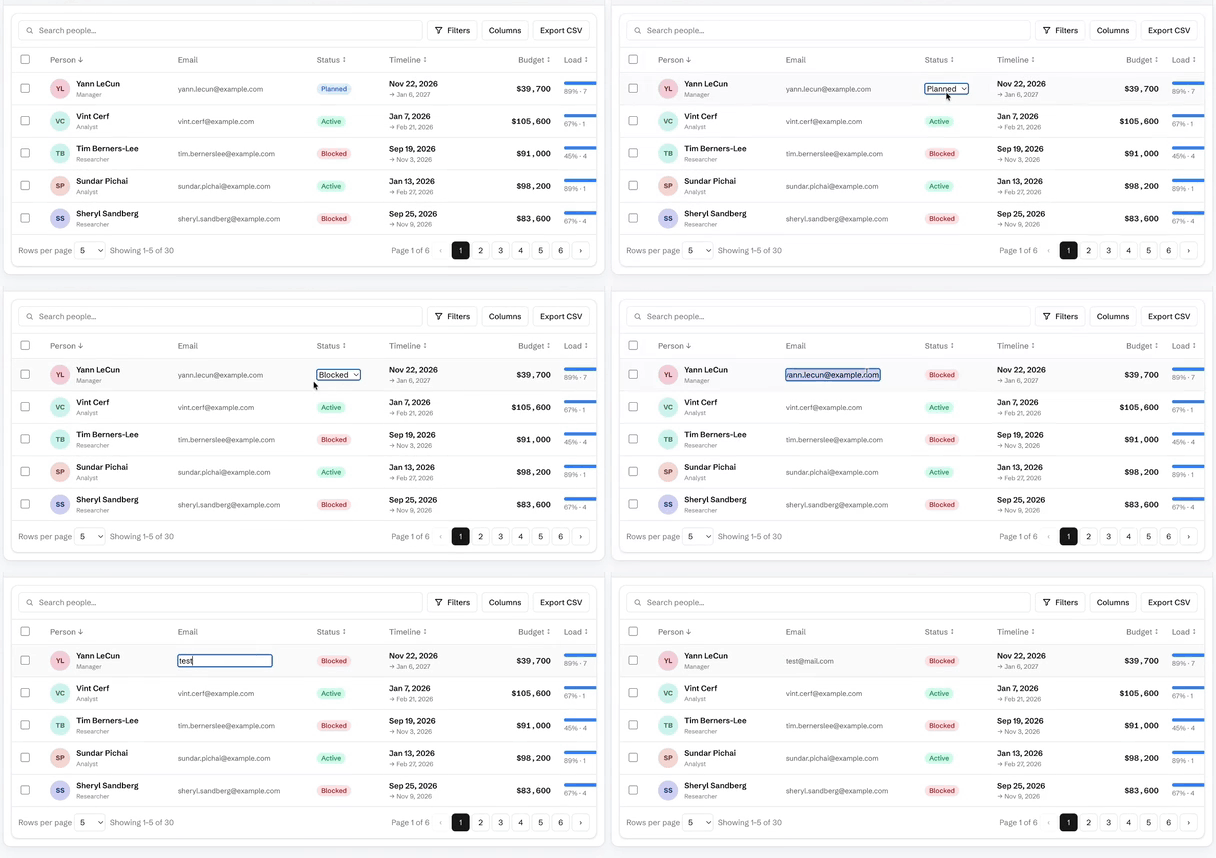
Inline cell editing — double-click a cell; text, number and select editors
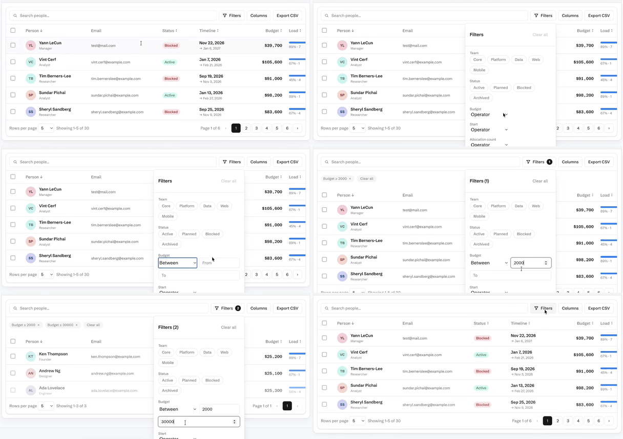
Filtering — type a bound and the table answers as you type
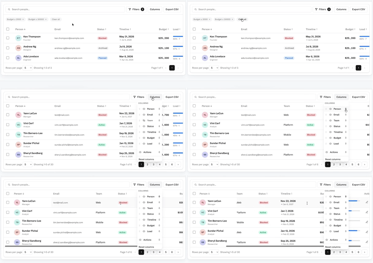
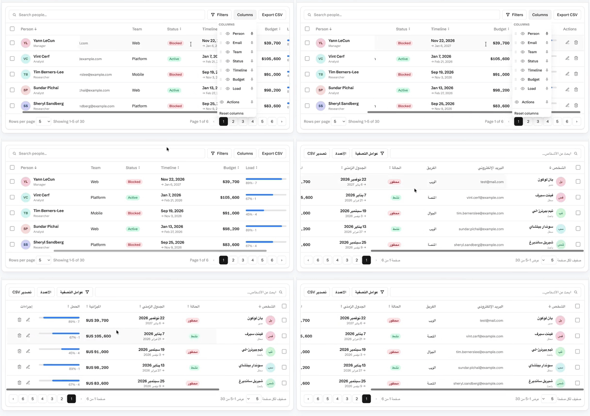
Column management — show, hide, reorder, pin and resize
RTL / Arabic — the whole table mirrors, not just the text
Documentation
Getting started · Live demo · Comparison vs ag-Grid · MUI X · TanStack
- Data — client vs server tiers · pagination & infinite scroll · URL-synced state
- Interaction — filtering · sorting · selection & bulk actions · row expansion · inline cell editing
- Columns — show/hide · reorder · pin · resize · row grouping & aggregates · CSV export
- More — i18n & RTL · virtualization · customization · API · FAQ