
@ai-node-editor/core
v0.4.0
Published
Production-ready React AI workflow node editor and TypeScript graph engine for RAG, agents, automation, and multimodal pipelines.

Maintainers
 shivansh_shrivastava
Readme
@ai-node-editor/core




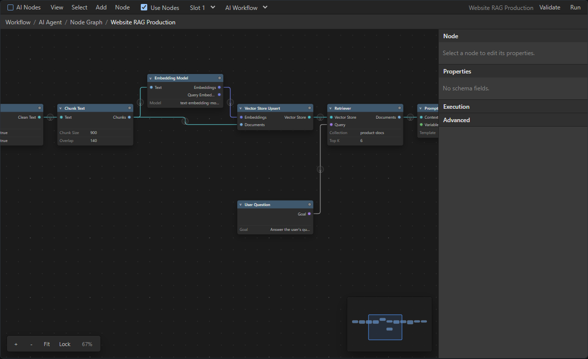
A reusable React and TypeScript package for building AI workflow node editors. It provides a Blender-inspired dark node graph interface plus a pure TypeScript graph engine for AI pipelines, RAG workflows, agents, prompt engineering, fine-tuning, training, media processing, automation, evaluation, and deployment flows.
Important legal note: this project is Blender-inspired, but it does not include Blender logos, trademarks, icons, assets, source code, or proprietary UI resources. The components, CSS, SVG-style visuals, graph model, and implementation are original.
Start Here
| I want to... | Read... | | --- | --- | | Install and render the editor | Installation and Quick Start | | Keep graph state in my application | Controlled Usage | | Build domain-specific nodes | Creating A Custom Node | | Add resizable flowchart shapes | Diagram Shape Nodes | | Configure paths, markers, labels, or animations | Edge Paths And Presentation | | Start from a complete AI workflow | Free Workflow Templates | | Save, validate, and execute workflows | Serialization, Validation, and Execution Engine | | Understand privacy-safe editor events | Privacy And Local Events and Observability Guide | | Brand or replace editor visuals | Styling And Theming and Custom Node Rendering | | Find public APIs | Package Exports |
New In 0.4.0
- Privacy-first typed editor events and diagnostics with no bundled analytics provider or automatic network telemetry
- Stable machine-readable codes across connections, validation, execution, and common integration problems
- Compatible socket highlighting, accessible connection feedback, rejection explanations, and intermediary-node suggestions
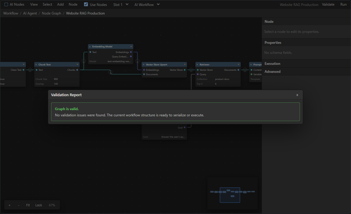
- Actionable validation suggestions, starter-template empty states, and richer execution status, retry, cancellation, and duration UI
- Schema-aware secret omission and secret references for safer graph serialization
- Node 24 LTS and Node 26 Current CI coverage, plus complete event/privacy documentation
New In 0.3.0
- Ten resizable shape nodes with editable labels, four-side handles, palettes, toolbars, and shape-aware minimap rendering
- Straight, step, smooth-step, Bezier, simple-Bezier, polyline, smart-routed, freeform, floating, and self-loop edges
- Edge markers, labels, toolbars, reconnection, editable waypoints, temporary endpoints, auto-insertion, and multiple animation modes
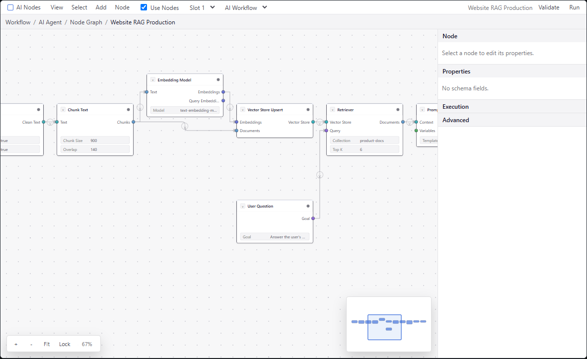
- Refined Blender dark, flow light, flow dark, and system-aware themes with aligned half-outside sockets
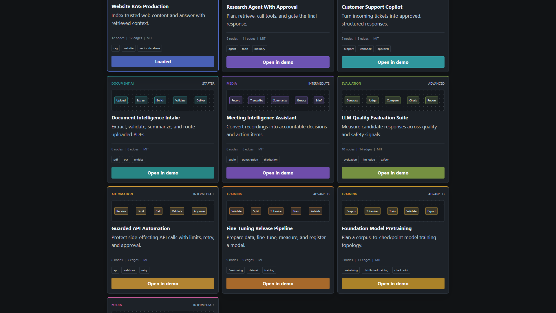
- Ten free provider-neutral workflow templates and a searchable, customizable template gallery
- Smart pasted-text rendering for HTTP methods, API routes, headings, lists, and inline code
- Public editor context, hooks, panels, render overrides, CSS variables, and graph geometry helpers
What You Get
- React node editor component:
AINodeEditor - Pure TypeScript graph model and graph utilities
- Node and plugin registries
- Port compatibility and validation logic
- Serialization and deserialization helpers
- Traversal helpers such as topological sort and upstream/downstream lookup
- Command stack foundation for undo/redo
- Async graph execution engine with logs, statuses, cancellation, retries, and dry-run validation
- Schema-driven node config UI
- Blender-inspired dark theme plus React Flow-style light, dark, and system themes
- Built-in AI node definitions for RAG, LLMs, agents, training, media, automation, evaluation, and outputs
- Ten resizable diagram shapes with four-side duplex handles, arrow routing, color controls, and shape-aware minimap rendering
- Ten free MIT-licensed, provider-neutral AI workflow templates with a reusable gallery component
- Demo workflows and Vite playground
Screenshots
Flow Light Theme
Free Workflow Templates
Validation Feedback
Installation
Install the package and peer dependencies:
npm install @ai-node-editor/core react react-domImport the editor and theme CSS:
import { AINodeEditor, builtinAINodes, createGraph } from "@ai-node-editor/core";
import "@ai-node-editor/core/styles/blender-dark.css";
React and React DOM are peer dependencies so the package can be used inside existing React apps without bundling a second React copy.
Quick Start
import { AINodeEditor, builtinAINodes, instantiateWorkflowTemplate } from "@ai-node-editor/core";
import "@ai-node-editor/core/styles/blender-dark.css";

const initialGraph = instantiateWorkflowTemplate("customer-support-copilot");

export function App() {
  return (
    <AINodeEditor
      nodes={builtinAINodes}
      initialGraph={initialGraph}
      theme="blender-dark"
      onGraphChange={(graph) => console.log(graph)}
    />
  );
}
For a blank graph, use createGraph() instead. The built-in empty state still offers starter templates and a first-node picker; disable it with options={{ showEmptyState: false }} when the consuming application owns onboarding.
import { AINodeEditor, createGraph } from "@ai-node-editor/core";

<AINodeEditor initialGraph={createGraph({ name: "Blank Workflow" })} />;
The editor fills its parent. Give the parent a real height:
html,
body,
#root {
  width: 100%;
  height: 100%;
  margin: 0;
}
Controlled Usage
Use controlled mode when your app owns the graph state.
import { useState } from "react";
import { AINodeEditor, builtinAINodes, createGraph, type Graph } from "@ai-node-editor/core";
import "@ai-node-editor/core/styles/blender-dark.css";

export function WorkflowBuilder() {
  const [graph, setGraph] = useState<Graph>(() =>
    createGraph({
      name: "Production RAG Pipeline"
    })
  );

  return (
    <AINodeEditor
      nodes={builtinAINodes}
      graph={graph}
      onGraphChange={setGraph}
      onNodeSelect={(node) => console.log("Selected node", node)}
      theme="blender-dark"
    />
  );
}
Uncontrolled Usage
Use uncontrolled mode when you only need to provide an initial graph.
<AINodeEditor
  nodes={builtinAINodes}
  initialGraph={createGraph({ name: "Draft Workflow" })}
  onGraphChange={(graph) => saveDraft(graph)}
  theme="blender-dark"
/>
Editor Props
type EditorThemeName =
  | "blender-dark"
  | "react-flow-light"
  | "react-flow-dark"
  | "react-flow-system"
  | "light"
  | "dark"
  | "system";

interface AINodeEditorProps {
  nodes?: NodeDefinition[];
  initialGraph?: Graph;
  graph?: Graph;
  onGraphChange?: (nextGraph: Graph) => void;
  onNodeSelect?: (node: NodeInstance | undefined) => void;
  onSelectionChange?: (selection: SelectionState) => void;
  onExecute?: (graph: Graph) => void | Promise<void>;
  onSave?: (graph: Graph) => void | Promise<void>;
  onValidate?: (issues: ValidationIssue[]) => void;
  onError?: (error: unknown) => void;
  onEvent?: (event: EditorEvent) => void;
  onDiagnostic?: (diagnostic: EditorDiagnostic) => void;
  theme?: EditorThemeName | string;
  colorMode?: "light" | "dark" | "system";
  readonly?: boolean;
  plugins?: Plugin[];
  className?: string;
  style?: React.CSSProperties;
  themeVariables?: EditorThemeVariables;
  nodeClassName?: (node: NodeInstance, definition?: NodeDefinition) => string | undefined;
  nodeStyle?: (node: NodeInstance, definition?: NodeDefinition) => React.CSSProperties | undefined;
  edgeClassName?: (edge: Edge, graph: Graph) => string | undefined;
  edgeStyle?: (edge: Edge, graph: Graph) => React.CSSProperties | undefined;
  edgeRenderers?: Record<string, (edge: Edge, context: RenderEdgeContext) => React.ReactNode>;
  renderNode?: (node: NodeInstance, definition: NodeDefinition | undefined, context: RenderNodeContext) => React.ReactNode;
  renderSocket?: (node: NodeInstance, port: PortDefinition, context: RenderSocketContext) => React.ReactNode;
  renderEdge?: (edge: Edge, context: RenderEdgeContext) => React.ReactNode;
  renderConnectionPreview?: (context: RenderConnectionPreviewContext) => React.ReactNode;
  renderInspectorField?: (fieldKey: string, field: ConfigField, node: NodeInstance) => React.ReactNode;
  executionEngine?: GraphEngine;
  registry?: NodeRegistry;
  options?: EditorOptions;
  onConnect?: (edge: Edge, graph: Graph) => void;
  onReconnectStart?: (edge: Edge, end: "source" | "target") => void;
  onReconnect?: (previousEdge: Edge, edge: Edge, graph: Graph) => void;
  onReconnectEnd?: (edge: Edge, successful: boolean) => void;
  onEdgesDelete?: (edges: Edge[]) => void;
}
Editor Options
interface EditorOptions {
  debug?: boolean;
  showEmptyState?: boolean;
  snapToGrid?: boolean;
  gridSize?: number;
  backgroundVariant?: "dots" | "lines" | "cross";
  showControls?: boolean;
  showMinimap?: boolean;
  showNodeToolbar?: boolean;
  showShapeToolbar?: boolean;
  showShapeLibrary?: boolean;
  showNodeLibrary?: boolean;
  showInspector?: boolean;
  showExecutionLog?: boolean;
  allowCycles?: boolean;
  allowSelfLinks?: boolean;
  readonly?: boolean;
  nodesDraggable?: boolean;
  nodesConnectable?: boolean;
  nodesSelectable?: boolean;
  edgesSelectable?: boolean;
  edgesReconnectable?: boolean;
  elementsSelectable?: boolean;
  nodesFocusable?: boolean;
  edgesFocusable?: boolean;
  disableKeyboardA11y?: boolean;
  panOnDrag?: boolean;
  zoomOnScroll?: boolean;
  selectionOnDrag?: boolean;
  selectionMode?: "full" | "partial";
  defaultEdgeType?: EdgePathType;
  defaultEdgeOptions?: Partial<Edge>;
  fitViewOnInit?: boolean;
  fitViewOnResize?: boolean;
  enableNodeResize?: boolean;
  enableEdgeAnimations?: boolean;
  enableEditableEdges?: boolean;
  enableFreeformEdges?: boolean;
  enableTemporaryEdges?: boolean;
  deleteEdgeOnReconnectDrop?: boolean;
  multiConnectionFromSelection?: boolean;
  enableAutoInsertOnEdge?: boolean;
  enableKeyboardShortcuts?: boolean;
  enableContextMenu?: boolean;
  enableAutoOffset?: boolean;
  enableRerouteNodes?: boolean;
  enableFrameNodes?: boolean;
}
Example:
<AINodeEditor
  nodes={builtinAINodes}
  initialGraph={graph}
  theme="blender-dark"
  options={{
    snapToGrid: true,
    gridSize: 24,
    backgroundVariant: "dots",
    showControls: true,
    showMinimap: true,
    showNodeToolbar: true,
    showShapeToolbar: true,
    showShapeLibrary: false,
    showInspector: true,
    nodesDraggable: true,
    nodesConnectable: true,
    edgesReconnectable: true,
    selectionMode: "partial",
    defaultEdgeType: "smoothstep",
    defaultEdgeOptions: { markerEnd: "arrow-closed" },
    fitViewOnInit: true,
    fitViewOnResize: true,
    enableNodeResize: true,
    enableEdgeAnimations: true,
    enableEditableEdges: true,
    enableTemporaryEdges: true,
    deleteEdgeOnReconnectDrop: true,
    enableContextMenu: true
  }}
/>
Privacy And Local Events
@ai-node-editor/core does not transmit analytics, workflow content, prompts, credentials, files, or editor activity to the package author. It bundles no PostHog, Mixpanel, Google Analytics, Amplitude, or other analytics client.
Applications may optionally subscribe to local typed lifecycle events and route them to their own system:
<AINodeEditor
  onEvent={(event) => {
    analytics.track(event.type, event);
  }}
/>
Events contain structural metadata such as node/port types, counts, stable diagnostic codes, durations, and interaction sources. They exclude graph/config values, node IDs and user labels, workflow names, prompts, responses, credentials, files, queries, payloads, private URLs, and serialized graphs.
Use onDiagnostic for integration problems such as zero-height containers, missing theme CSS, unknown node types, invalid edges/config, and missing execution setup. options={{ debug: true }} logs the same sanitized objects locally and never sends network traffic.
See Privacy-First Observability for every event property, code, metric pattern, and the exact privacy boundary.
React Flow Style Capabilities
The editor ships with familiar graph-builder primitives in the free package while staying AI-workflow focused:
- Background variants: dots, lines, and cross grids.
- Viewport controls: zoom in, zoom out, fit view, and interaction lock.
- Minimap with selected-node highlighting and click-to-center navigation.
- Panel primitive for pinned overlays.
- Node dragging, connection creation, edge selection/removal, copy/paste, duplicate, delete, and keyboard shortcuts.
- Shift-drag box selection with full or partial intersection modes.
- Bezier, simple-bezier, straight, step, smooth-step, orthogonal, smart-routed, editable, floating, and self-loop edges.
- Dashed, particle, pulse, packet, and node-following animation modes with reduced-motion support.
- SVG and HTML labels, custom markers, edge toolbars, draggable waypoints, and source/target reconnection.
- Optional incomplete edges, delete-on-reconnect-drop, multi-source connection previews, freeform drawing, and node insertion on edge drop.
- Keyboard-focusable nodes and edges with arrow-key node movement.
- Per-feature interaction toggles such as
nodesDraggable,nodesConnectable,elementsSelectable,panOnDrag, andzoomOnScroll. - Selected-node action toolbar, four-corner shape resizing, and normal node width resizing.
- Diagram shapes with boundary-aware handles, editable fill/stroke, shape-aware minimap silhouettes, and drag-from-palette creation.
The complete audited compatibility matrix is maintained in REACT_FLOW_PARITY.md. It separates implemented behavior from partial and planned work, including every current official component, hook, utility family, free example category, and Pro example category.
The React Flow parity roadmap is tracked in REACT_FLOW_PARITY.md; the goal is not to clone React Flow, but to provide the same product-building coverage with AI node definitions, validation, execution, schemas, and workflow-specific ergonomics built in.
Creating A Custom Node
import { createNodeDefinition } from "@ai-node-editor/core";

export const sentimentNode = createNodeDefinition({
  type: "custom.sentiment-analysis",
  label: "Sentiment Analysis",
  category: "Text",
  description: "Analyzes sentiment from text.",
  version: "1.0.0",
  inputs: [
    {
      id: "text",
      label: "Text",
      direction: "input",
      dataType: "text",
      required: true,
      multiple: false
    }
  ],
  outputs: [
    {
      id: "sentiment",
      label: "Sentiment",
      direction: "output",
      dataType: "json",
      required: false,
      multiple: true
    }
  ],
  configSchema: {
    model: {
      type: "string",
      label: "Model",
      default: "gpt-4.1-mini",
      required: true
    },
    temperature: {
      type: "slider",
      label: "Temperature",
      default: 0.2,
      min: 0,
      max: 2,
      step: 0.1
    }
  },
  async execute({ inputs, config, signal }) {
    if (signal.aborted) {
      throw new Error("Cancelled");
    }

    return {
      outputs: {
        sentiment: {
          label: "positive",
          score: 0.94,
          model: config.model,
          source: inputs.text
        }
      },
      metrics: {
        latencyMs: 12
      }
    };
  }
});
Register it with built-ins:
<AINodeEditor
  nodes={[...builtinAINodes, sentimentNode]}
  initialGraph={graph}
  theme="blender-dark"
/>
Diagram Shape Nodes
The free package includes ten original SVG shape presets: rounded rectangle, diamond, circle, hexagon, rectangle, arrow rectangle, cylinder, triangle, parallelogram, and plus. They use the normal NodeDefinition, NodeInstance, port compatibility, serialization, validation, commands, and execution contracts. No separate diagram graph model is involved.
builtinAINodes already contains the shape definitions. Enable the optional palette and shape appearance toolbar like this:
import { AINodeEditor, builtinAINodes } from "@ai-node-editor/core";
import "@ai-node-editor/core/styles/themes.css";

<AINodeEditor
  nodes={builtinAINodes}
  initialGraph={graph}
  theme="blender-dark"
  options={{
    showShapeLibrary: true,
    showShapeToolbar: true,
    showMinimap: true,
    defaultEdgeType: "smoothstep"
  }}
/>
Create a reusable shape definition with four duplex handles. Each visible handle owns one input port and one output port, so users can start or receive a validated connection on any side:
import {
  createNode,
  createShapeNodeDefinition,
  createShapePorts
} from "@ai-node-editor/core";

const ports = createShapePorts("control");

export const approvalShape = createShapeNodeDefinition({
  type: "custom.approval-decision",
  label: "Approval?",
  shape: "diamond",
  category: "Control Flow",
  dataType: "control",
  inputs: ports.inputs,
  outputs: ports.outputs,
  shapeStyle: {
    fill: "#d49b43",
    stroke: "#6f4d14",
    strokeWidth: 1.75,
    labelColor: "#1a192b"
  }
});

const approvalNode = createNode(approvalShape, {
  position: { x: 360, y: 180 },
  width: 132,
  height: 132,
  shapeStyle: { fill: "#e3c64e" }
});
For AI-specific shape nodes, pass your own inputs, outputs, and execute function to createShapeNodeDefinition. Set ui.position to left, right, top, or bottom; ui.offset is normalized from 0 to 1. Give one input and one output the same ui.handleId to render a single duplex handle.
Shape instances support:
type NodeShapeKind =
  | "round-rectangle"
  | "diamond"
  | "circle"
  | "hexagon"
  | "rectangle"
  | "arrow-rectangle"
  | "cylinder"
  | "triangle"
  | "parallelogram"
  | "plus";

interface NodeShapeStyle {
  fill?: string;
  stroke?: string;
  strokeWidth?: number;
  labelColor?: string;
  opacity?: number;
}
Public shape APIs include NodeShape, ShapeNodePalette, ShapeNodeToolbar, createShapeNodeDefinition, createShapePorts, shapeNodeDefinitions, nodeShapeKinds, nodeShapePresets, getNodeShapePath, getNodeShapeBoundaryPoint, getReadableTextColor, and getNodeVisualSize. Consumers can render the SVG primitive independently or replace node/socket rendering through the existing render props.
Select a shape to edit its text from the floating Shape label field or the inspector's Label field. The value is stored in node.label, so it is serializable and can also be changed programmatically with updateNode(graph, nodeId, { label: "Review required" }). Shape label colors are selected automatically for readable contrast when the fill is a hexadecimal color; set shapeStyle.labelColor to override that behavior.
NodeDefinition
interface NodeDefinition {
  type: string;
  label: string;
  category: NodeCategory;
  description?: string;
  icon?: string;
  version: string;
  inputs: PortDefinition[];
  outputs: PortDefinition[];
  configSchema?: ConfigSchema;
  defaultConfig?: NodeConfig;
  ui?: {
    headerColor?: string;
    width?: number;
    height?: number;
    minWidth?: number;
    minHeight?: number;
    maxWidth?: number;
    maxHeight?: number;
    iconLabel?: string;
    compact?: boolean;
    shape?: NodeShapeKind;
    shapeStyle?: NodeShapeStyle;
  };
  tags?: string[];
  deprecated?: boolean;
  allowCycles?: boolean;
  timeoutMs?: number;
  retryPolicy?: {
    retries: number;
    delayMs?: number;
  };
  validate?: (config: NodeConfig, node: NodeInstance, graph: Graph) => ValidationIssue[] | void;
  execute?: (context: NodeExecutionContext) => Promise<NodeExecutionResult> | NodeExecutionResult;
}
PortDefinition
interface PortDefinition {
  id: string;
  label: string;
  direction: "input" | "output";
  dataType: PortDataType;
  required: boolean;
  multiple: boolean;
  color?: string;
  description?: string;
  defaultValue?: unknown;
  accepts?: PortDataType[];
  ui?: {
    hidden?: boolean;
    compact?: boolean;
    inlineControl?: boolean;
    position?: "left" | "right" | "top" | "bottom";
    offset?: number;
    handleId?: string;
  };
}
Supported port data types:
type PortDataType =
  | "string"
  | "number"
  | "boolean"
  | "json"
  | "text"
  | "document"
  | "documents"
  | "image"
  | "images"
  | "video"
  | "audio"
  | "embedding"
  | "embeddings"
  | "vector-store"
  | "model"
  | "llm-response"
  | "dataset"
  | "training-config"
  | "metrics"
  | "prompt"
  | "tool"
  | "agent"
  | "control"
  | "any";
Compatibility rules:
anyconnects to any data type unless explicitly restricted.acceptscan widen accepted input or output types.- Input ports accept one connection unless
multiple: true. - Output ports can fan out to multiple inputs.
- Invalid links are rejected by
connectPortsand reported by validation.
Config Schema
Config schemas drive the right-side inspector UI and validation.
configSchema: {
  model: {
    type: "string",
    label: "Model",
    default: "gpt-4.1-mini",
    required: true,
    placeholder: "provider-model-name"
  },
  topK: {
    type: "number",
    label: "Top K",
    default: 5,
    min: 1,
    max: 50,
    step: 1
  },
  mode: {
    type: "select",
    label: "Mode",
    default: "balanced",
    options: [
      { label: "Fast", value: "fast" },
      { label: "Balanced", value: "balanced" },
      { label: "Careful", value: "careful" }
    ]
  }
}
Supported field types:
stringnumberbooleanselectmultiselecttextareajsoncodeslidersecretfilecolor
Field options include label, description, default, required, min, max, step, options, placeholder, visibleWhen, validation, and ui.
Smart Text And API Highlighting
Textarea and code fields can show a Notion-style formatted preview for pasted architecture notes, endpoint lists, markdown-like bullets, labels, inline code, URLs, and REST API calls.
configSchema: {
  architectureNotes: {
    type: "textarea",
    label: "Architecture Notes",
    default: "API Endpoints:\n  o POST /users/register: Register user\n  o GET /users/{userId}: Retrieve profile",
    ui: {
      smartText: "auto",
      smartTextMaxLines: 32
    }
  }
}
smartText: "auto" shows the preview only when the value looks structured. Use smartText: true to always render a preview for that field, or smartText: false to disable it. The feature is safe by default: the parser returns structured tokens and the React renderer outputs normal React text nodes, not injected HTML.
You can also use the parser and renderer directly in custom node UIs:
import {
  SmartTextPreview,
  parseSmartText,
  shouldRenderSmartText
} from "@ai-node-editor/core";

const parsed = parseSmartText(notes);
console.log(parsed.endpoints);

return shouldRenderSmartText(notes) ? <SmartTextPreview text={notes} /> : <pre>{notes}</pre>;
Plugins
Plugins are collections of node definitions and optional metadata.
import {
  createNodeRegistry,
  createPlugin,
  createPluginRegistry
} from "@ai-node-editor/core";

const plugin = createPlugin({
  id: "my-company-ai-pack",
  name: "My Company AI Pack",
  version: "1.0.0",
  description: "Private workflow nodes for internal tools.",
  nodes: [sentimentNode]
});

const nodeRegistry = createNodeRegistry();
const pluginRegistry = createPluginRegistry(nodeRegistry);

pluginRegistry.register(plugin);
Use the registry in the editor:
<AINodeEditor
  registry={nodeRegistry}
  nodes={nodeRegistry.list()}
  initialGraph={graph}
  theme="blender-dark"
/>
Graph Utilities
import {
  addNode,
  cloneGraph,
  connectPorts,
  createGraph,
  createNode,
  deserializeGraph,
  detectCycles,
  getDownstreamNodes,
  getUpstreamNodes,
  removeEdge,
  removeNode,
  serializeGraph,
  topologicalSort,
  updateNode,
  validateGraph
} from "@ai-node-editor/core";
Example:
const graph = createGraph({ name: "Website RAG" });
const urlNode = createNode(urlDefinition, { position: { x: 0, y: 0 } });
const scraperNode = createNode(scraperDefinition, { position: { x: 280, y: 0 } });

let nextGraph = addNode(graph, urlNode);
nextGraph = addNode(nextGraph, scraperNode);
nextGraph = connectPorts(
  nextGraph,
  builtinAINodes,
  urlNode.id,
  "url",
  scraperNode.id,
  "url"
);

const issues = validateGraph(nextGraph, builtinAINodes);
Change Sets And Graph Geometry
Controlled applications can apply granular node and edge changes without mutating their arrays:
import {
  applyEdgeChanges,
  applyNodeChanges,
  getIntersectingNodes,
  getNodesBounds,
  getViewportForBounds,
  reconnectEdge
} from "@ai-node-editor/core";

const nodes = applyNodeChanges(
  [
    { type: "position", id: "scraper", position: { x: 420, y: 160 } },
    { type: "select", id: "scraper", selected: true }
  ],
  graph.nodes
);

const bounds = getNodesBounds(nodes);
const viewport = getViewportForBounds(bounds, {
  width: 1280,
  height: 720,
  padding: 0.12
});
Available compatibility utilities include:
- Graph changes:
applyNodeChanges,applyEdgeChanges,applyGraphChanges - Connections:
addEdge,reconnectEdge,getConnectedEdges,getIncomers,getOutgoers - Geometry:
getNodeRect,getNodesBounds,getIntersectingNodes,isNodeIntersecting - Coordinates:
screenToGraphPosition,graphToScreenPosition,snapPosition,getViewportForBounds - Type guards:
isNode,isEdge - Workflow editing:
removeNodeAndReconnect
Edge Paths And Presentation
Set an edge's type to bezier, simplebezier, straight, step, smoothstep, orthogonal, smart, editable, floating, or self. The implementation is original SVG and TypeScript and does not depend on React Flow.
const edge: Edge = {
  id: "scrape-to-clean",
  sourceNodeId: "scraper",
  sourcePortId: "document",
  targetNodeId: "cleaner",
  targetPortId: "text",
  type: "smart",
  label: "Extracted content",
  labelShowBg: true,
  animation: {
    type: "particle",
    durationMs: 2000,
    color: "#ff0073",
    size: 10,
    count: 2
  },
  routing: {
    avoidNodes: true,
    padding: 24,
    gridSize: 20,
    borderRadius: 8
  },
  markerEnd: {
    type: "arrow-closed",
    color: "#ff0073",
    width: 18,
    height: 18
  },
  reconnectable: true,
  interactionWidth: 20
};
Animation modes
| Type | Behavior |
| --- | --- |
| dash | Moves a dashed stroke along the path. animated: true remains a shorthand for this mode. |
| particle | Moves one or more circles along the exact SVG path. |
| pulse | Moves circles while animating their size and opacity. |
| packet | Moves compact rounded packets along the path. |
| node | Moves an existing node identified by animation.nodeId along the path using CSS motion paths. |
All modes accept durationMs, delayMs, direction, color, size, count, opacity, and easing where relevant. Animation is disabled when enableEdgeAnimations is false, and CSS respects prefers-reduced-motion.
Editable, floating, and routed edges
const editable: Edge = {
  ...connection,
  id: "editable",
  type: "editable",
  editable: true,
  waypoints: [
    { id: "bend-a", x: 420, y: 180 },
    { id: "bend-b", x: 620, y: 320 }
  ],
  pathOptions: { borderRadius: 10 }
};

const floating: Edge = {
  ...connection,
  id: "floating",
  type: "floating",
  floating: "boundary" // use "side" for the nearest cardinal side
};

const routed: Edge = {
  ...connection,
  id: "routed",
  type: "smart",
  routing: { avoidNodes: true, padding: 20, gridSize: 24 }
};
Selected editable edges expose draggable control points. Double-click an editable edge to add a point. With enableFreeformEdges, hold Space while drawing a connection to record a freeform polyline. Smart routing runs only for edges whose type is smart; regular edges retain constant-time path calculation.
Labels, markers, and toolbars
label renders ordinary SVG text. labels renders multiple HTML labels at the source, center, target, or a numeric position from 0 to 1:
const labeled: Edge = {
  ...connection,
  id: "labeled",
  labels: [
    { text: "input", position: "source", offsetY: -20 },
    { text: "Inspect", position: "center", interactive: true },
    { text: "output", position: "target", offsetY: -20 }
  ],
  markerStart: "arrow",
  markerEnd: {
    type: "custom-triangle",
    path: "M 1 1 L 11 6 L 1 11 Z",
    viewBox: "0 0 12 12",
    color: "#477dca",
    width: 9,
    height: 9
  }
};
For custom SVG edges, import BaseEdge, EdgeText, EdgeLabelRenderer, EdgeToolbar, getBezierPath, getSmoothStepPath, getPolylinePath, getSelfLoopPath, getSmartEdgePath, getStraightPath, or getEdgePath. Register reusable renderers by edge type:
const edgeRenderers = {
  approval: (edge: Edge, context: RenderEdgeContext) => (
    <>
      {context.defaultEdge}
      <EdgeToolbar
        edgeId={edge.id}
        x={context.labelX}
        y={context.labelY}
        zoom={context.viewport.zoom}
        isVisible={edge.selected}
      >
        <button type="button">Approve</button>
      </EdgeToolbar>
    </>
  )
};

<AINodeEditor edgeRenderers={edgeRenderers} />;
Edge interaction options
enableTemporaryEdges: dropping a new connection on empty canvas creates a reconnectable temporary endpoint.deleteEdgeOnReconnectDrop: dropping a reconnected endpoint on empty canvas deletes that edge.multiConnectionFromSelection: drawing from one selected source also previews and creates links from compatible selected sources.enableAutoInsertOnEdge: dropping a compatible node over an edge splits the edge and inserts the node.enableEditableEdges: displays controls for selected edges witheditable: true.renderConnectionPreview: replaces the default valid/invalid connection preview while retaining compatibility data.
Pure graph helpers are also exported: planNodeInsertion, insertNodeIntoEdge, createTemporaryConnection, and removeTemporaryEndpointForEdge. Geometry helpers include getFloatingEdgePoints, getRectBoundaryPoint, and isPolylineIntersectingRect.
Serialization
Serialization produces a portable workflow definition and editor snapshot. It is not the result of executing the workflow. The JSON records node types, configuration, positions, typed port connections, viewport state, metadata, and schema version; executable functions stay in registered NodeDefinition objects.
Save a graph with schema-aware secret protection:
const json = serializeGraph(graph, {
  registry,
  pretty: true
});
localStorage.setItem("workflow", json);
Load a graph:
const restored = deserializeGraph(localStorage.getItem("workflow")!);The serialized envelope includes:
{
  "schema": "@ai-node-editor/graph",
  "schemaVersion": "1.0.0",
  "graph": {}
}
When registry is provided, raw values from fields with type: "secret" are omitted by default. A secret reference such as { $secretRef: "openai-production" } is preserved, and serialize: false omits any schema field. Raw secret values require an explicit secretPolicy: "preserve". Registry-free calls retain legacy serialization because a graph alone does not include config schemas.
Processing A Saved Workflow
A frontend can deserialize the graph and pass it back to AINodeEditor. A backend can register the same node definitions, validate the graph, and execute it:
import {
  GraphEngine,
  builtinAINodes,
  createNodeRegistry,
  deserializeGraph,
  validateGraph
} from "@ai-node-editor/core";

const graph = deserializeGraph(serializedWorkflow);
const registry = createNodeRegistry(builtinAINodes);

// Register the same custom node definitions used by your editor, when needed.
// registry.registerMany(applicationNodeDefinitions);

const issues = validateGraph(graph, registry, { strictConfig: true });
const errors = issues.filter((issue) => issue.severity === "error");

if (errors.length > 0) {
  throw new Error(errors.map((issue) => issue.message).join("\n"));
}

const engine = new GraphEngine({ registry });
const run = await engine.execute(graph);

console.log(run.success, run.outputs, run.logs);
The serialized node type is the stable link between data and code. For example, a node with type: "company.crm.lookup" is resolved through the registry to the matching definition and its execute() implementation. Validation reports an unknown type when the consumer has not registered the required node pack or plugin.
For production applications:
- Store the serialized envelope in a JSON column, object store, or versioned workflow document.
- Keep provider credentials out of graph JSON. Serialize a secret reference and resolve it on the trusted server.
- Store uploaded files and generated artifacts separately, then place stable asset IDs or URLs in node config.
- Treat
selected, viewport, and other visual fields as editor state; treat execution outputs, logs, and statuses as per-run records. - Validate untrusted graphs and enforce limits on node count, payload size, timeouts, and allowed node types before execution.
Validation
const issues = validateGraph(graph, builtinAINodes, {
  strictConfig: true,
  allowCycles: false,
  allowSelfLinks: false
});

const errors = issues.filter((issue) => issue.severity === "error");
Existing dotted issue codes remain stable for backward compatibility. When available, issue.diagnosticCode provides the uppercase aggregation code used by editor events, such as MISSING_REQUIRED_INPUT, UNKNOWN_NODE_TYPE, or INVALID_CONFIG.
Validation checks include:
- Missing required inputs
- Unknown node types
- Invalid ports
- Incompatible data types
- Duplicate node and edge IDs
- Dangling edges
- Input multiplicity violations
- Cycles when cycles are not allowed
- Deprecated nodes
- Unknown config fields
- Invalid config values
- Missing required output node types when configured
Execution Engine
Use GraphEngine to validate and execute a graph.
import { GraphEngine, builtinAINodes } from "@ai-node-editor/core";

const engine = new GraphEngine({
  registry: builtinAINodes,
  graphTimeoutMs: 120000,
  nodeTimeoutMs: 30000
});

const unsubscribe = engine.on((event) => {
  console.log(event.type, event.nodeId, event.error);
});

const result = await engine.execute(graph);

unsubscribe();

if (!result.success) {
  console.error(result.issues, result.logs, result.error);
}
Dry-run validation:
const result = await engine.execute(graph, {
  dryRun: true
});
Cancellation:
const controller = new AbortController();

const promise = engine.execute(graph, {
  signal: controller.signal
});

controller.abort();

const result = await promise;
Partial execution:
await engine.execute(graph, {
  fromNodeId: "node_123"
});

await engine.execute(graph, {
  toNodeId: "output_node_456"
});
Lifecycle events:
graph:startgraph:validategraph:errorgraph:successgraph:cancelnode:queuednode:startnode:retrynode:successnode:errornode:skippededge:data
Node retry/success/error events include attempt and duration metadata where available. When executionEngine is passed to AINodeEditor, the built-in execution panel consumes this stream and shows running, success, error, cancelled, retry, per-node duration, stable failure code, and local error details without mutating the saved graph.
Built-In Nodes
Import all built-ins:
import { builtinAINodes } from "@ai-node-editor/core";Or import grouped node packs:
import {
  audioNodes,
  controlNodes,
  dataNodes,
  evaluationNodes,
  imageNodes,
  llmNodes,
  outputNodes,
  ragNodes,
  scratchTrainingNodes,
  textNodes,
  trainingNodes,
  videoNodes
} from "@ai-node-editor/core";
Built-in categories:
- Data sources: website URL, web scraper, sitemap crawler, file upload, PDF extractor, CSV loader, JSON loader, database query, API request, webhook trigger
- Text processing: cleaner, chunker, entity extraction, summarization, translation, regex extraction, metadata extraction
- RAG: embedding model, vector store upsert/search, retriever, reranker, context builder, RAG answer generator
- LLM and agents: prompt template, system prompt, chat model, completion model, tool calling, structured output parser, JSON schema validator, routers, planner, executor, memory
- Training: dataset loader, validator, splitter, tokenizer, config, fine-tuning job, prompt tuning, LoRA config, metrics, registry push
- Training from scratch: corpus loader, tokenizer trainer, pretraining config, distributed config, checkpoint saver, loss monitor, validation loop, artifact export
- Image, video, and audio processing
- Automation and control flow
- Evaluation
- Output and deployment
Built-in executors are intentionally mock/stub implementations. Real providers should be injected through your own custom nodes or a plugin package.
Free Workflow Templates
The package includes ten complete workflow starters. They are part of the free MIT package, use only built-in node definitions, and are validated in the test suite against the same compatibility rules used by the editor.
| Template | Category | Level | | --- | --- | --- | | Website RAG Production | RAG | Intermediate | | Research Agent With Approval | Agents | Advanced | | Customer Support Copilot | Automation | Starter | | Document Intelligence Intake | Document AI | Starter | | Meeting Intelligence Assistant | Media | Intermediate | | LLM Quality Evaluation Suite | Evaluation | Advanced | | Guarded API Automation | Automation | Intermediate | | Fine-Tuning Release Pipeline | Training | Advanced | | Foundation Model Pretraining | Training | Advanced | | Multimodal Content Intelligence | Media | Intermediate |
Instantiate a fresh graph from a template ID:
import {
  AINodeEditor,
  builtinAINodes,
  instantiateWorkflowTemplate
} from "@ai-node-editor/core";
import "@ai-node-editor/core/styles/blender-dark.css";

const graph = instantiateWorkflowTemplate("website-rag-production", {
  name: "Acme Documentation Assistant"
});

export function App() {
  return (
    <AINodeEditor
      nodes={builtinAINodes}
      initialGraph={graph}
      theme="blender-dark"
    />
  );
}
instantiateWorkflowTemplate() deep-clones the source graph, creates a new graph ID and timestamps, clears selection
and execution status, and records templateId, templateName, and templateLicense in graph metadata. Editing one
instance never mutates the catalog or another user's workflow.
Search and filter templates in code:
import {
  filterWorkflowTemplates,
  freeWorkflowTemplates,
  getWorkflowTemplate
} from "@ai-node-editor/core";

const featured = filterWorkflowTemplates({ featured: true });
const training = filterWorkflowTemplates({ category: "Training" });
const pdfWorkflows = filterWorkflowTemplates({ search: "PDF" });
const rag = getWorkflowTemplate("website-rag-production");

console.log(freeWorkflowTemplates.length, featured, training, pdfWorkflows, rag);
Render the built-in responsive gallery in your own application:
import { useState } from "react";
import {
  AINodeEditor,
  WorkflowTemplateGallery,
  builtinAINodes,
  instantiateWorkflowTemplate,
  type Graph
} from "@ai-node-editor/core";
import "@ai-node-editor/core/styles/themes.css";

export function TemplateWorkspace() {
  const [graph, setGraph] = useState<Graph>(() =>
    instantiateWorkflowTemplate("customer-support-copilot")
  );

  return (
    <>
      <WorkflowTemplateGallery
        onUseTemplate={(_template, nextGraph) => setGraph(nextGraph)}
      />
      <div style={{ height: 700 }}>
        <AINodeEditor
          nodes={builtinAINodes}
          graph={graph}
          onGraphChange={setGraph}
          theme="react-flow-dark"
        />
      </div>
    </>
  );
}
Gallery props include templates, selectedTemplateId, showFilters, actionLabel, onSelect, onUseTemplate,
and renderTemplate. Use renderTemplate to replace each card while retaining the package's search and filtering
behavior.
The individual graph constants remain available for direct use and backward compatibility:
import {
  agentWorkflow,
  apiAutomationWorkflow,
  customerSupportWorkflow,
  documentIntelligenceWorkflow,
  fineTuningWorkflow,
  imageVideoWorkflow,
  meetingIntelligenceWorkflow,
  modelEvaluationWorkflow,
  ragWorkflow,
  sampleWorkflow,
  scratchTrainingWorkflow
} from "@ai-node-editor/core";
To author catalog entries with the same data model, use createWorkflowTemplate(). For code-defined graph starters,
buildTemplateGraph(), createNodeByType(), and configureTemplateNodes() run connections through the core
compatibility engine before the template is exposed.
Styling And Theming
Import one theme CSS file:
import "@ai-node-editor/core/styles/blender-dark.css";Available theme imports:
import "@ai-node-editor/core/styles/blender-dark.css";
import "@ai-node-editor/core/styles/react-flow-light.css";
import "@ai-node-editor/core/styles/react-flow-dark.css";
import "@ai-node-editor/core/styles/react-flow-system.css";
Import all built-in themes when your app lets users switch themes at runtime:
import "@ai-node-editor/core/styles/themes.css";Base-only import:
import "@ai-node-editor/core/styles/base.css";Use a named theme:
<AINodeEditor
  nodes={builtinAINodes}
  initialGraph={graph}
  theme="react-flow-dark"
/>
Or use React Flow-style color mode:
<AINodeEditor
  nodes={builtinAINodes}
  initialGraph={graph}
  colorMode="system"
/>
Supported built-in theme names are:
blender-darkreact-flow-lightreact-flow-darkreact-flow-system- aliases:
light,dark,system
The themes are based on CSS variables scoped to .aine-editor and named theme classes such as .aine-theme-blender-dark and .aine-theme-react-flow-dark. Override variables from your app:
.my-workflow-editor.aine-theme-react-flow-dark {
  --aine-bg: #101216;
  --aine-accent: #5b9cff;
  --aine-blue-selection: #5b9cff;
  --aine-node-bg: #20242b;
  --aine-edge-stroke: #8fa2bf;
}
Use a custom class:
<AINodeEditor
  className="my-workflow-editor"
  nodes={builtinAINodes}
  initialGraph={graph}
  theme="blender-dark"
/>
CSS classes are prefixed with aine- to reduce collisions.
You can also override theme variables directly from React:
<AINodeEditor
  nodes={builtinAINodes}
  initialGraph={graph}
  theme="blender-dark"
  themeVariables={{
    "--aine-bg": "#111315",
    "--aine-node-bg": "#25282c",
    "--aine-blue-selection": "#5b9cff",
    "--aine-socket-text": "#5fd0d6"
  }}
/>
Useful theme variables include:
- Canvas and grid:
--aine-bg,--aine-grid-dot,--aine-grid-major - Panels and controls:
--aine-toolbar-bg,--aine-panel-bg,--aine-panel-bg-2,--aine-floating-bg - Nodes and edges:
--aine-node-bg,--aine-node-header,--aine-node-selected,--aine-edge-stroke,--aine-edge-selected - Diagram shapes:
--aine-shape-fill,--aine-shape-stroke,--aine-shape-label,--aine-shape-selection,--aine-shape-handle,--aine-shape-toolbar-bg,--aine-shape-palette-bg - Text and status:
--aine-text,--aine-text-muted,--aine-text-dim,--aine-error,--aine-warning,--aine-success - Sockets:
--aine-socket-text,--aine-socket-json,--aine-socket-image,--aine-socket-model,--aine-socket-any
This mirrors React Flow's theming approach: import CSS once, choose light/dark/system with a prop or class, and override CSS variables for product-specific branding.
React Flow-style themes also switch the default node chrome: neutral node headers, colored top accents, protruding handle-like sockets, compact property rows, and neutral default edges. Blender stays denser with colored headers, while using the same half-outside socket placement. Every bundled theme preserves the canonical header, row, and body dimensions from base.css, so theme switching cannot shift measured socket centers or edge endpoints. All styles use the same NodeView component and the same renderNode, renderSocket, nodeClassName, nodeStyle, and CSS variable customization surface.
Custom Node Rendering
<AINodeEditor
  nodes={nodes}
  initialGraph={graph}
  nodeClassName={(node) => (node.status === "error" ? "my-node-error" : undefined)}
  nodeStyle={(node, definition) => ({
    borderColor: node.customColor ?? definition?.ui?.headerColor
  })}
  renderNode={(node, definition, ctx) => (
    <div className="my-node-shell">
      {ctx.renderDefaultNode()}
      <footer>{definition?.category}</footer>
    </div>
  )}
/>
renderNode receives a context object so custom nodes can keep first-class editor behavior:
ctx.renderDefaultNode()renders the package's default compact node UI.ctx.renderSocket(port)renders a socket with the correct data attributes and pointer handling.ctx.nodeKindisinput,default, oroutput, matching the React Flow-style node role used by the built-in themes.ctx.inputPortsandctx.outputPortslet you build a fully custom layout while preserving connection behavior.
Custom sockets and edges can be styled or replaced too:
<AINodeEditor
  nodes={nodes}
  initialGraph={graph}
  renderSocket={(node, port, ctx) => (
    <span className={`my-socket my-socket-${port.dataType}`}>
      {ctx.defaultSocket}
    </span>
  )}
  edgeStyle={(edge) => ({
    strokeWidth: edge.selected ? 4 : 2
  })}
  renderEdge={(edge, ctx) => (
    <>
      {ctx.defaultEdge}
      {edge.status === "running" ? <circle r={3} cx={ctx.source.x} cy={ctx.source.y} className="my-edge-pulse" /> : null}
    </>
  )}
/>
For data manipulation, keep graph state controlled with graph and onGraphChange, or use the pure graph helpers such as addNode, updateNode, connectPorts, removeEdge, validateGraph, serializeGraph, and GraphEngine.
Editor Context And Hooks
Components rendered anywhere inside AINodeEditor, including custom node components, can use the public editor API without prop drilling:
import {
  useAINodeEditor,
  useCurrentNodeId,
  useEditorNodeData,
  useNodeConnections
} from "@ai-node-editor/core";

function CustomAgentNode() {
  const editor = useAINodeEditor();
  const nodeId = useCurrentNodeId();
  const node = useEditorNodeData();
  const incoming = useNodeConnections({ direction: "input" });

  return (
    <button
      type="button"
      onClick={() => {
        if (nodeId) editor.updateNode(nodeId, { label: `${node?.label ?? "Agent"} (${incoming.length})` });
      }}
    >
      Refresh agent
    </button>
  );
}
Public hooks are useAINodeEditor, useEditorNodes, useEditorEdges, useEditorSelection, useCurrentNodeId, useEditorNodeData, and useNodeConnections. The AINodeEditorApi provides graph/node/edge getters, setters, adders, updateNode, updateEdge, reconnectEdge, and asynchronous deleteElements.
Custom Inspector Fields
<AINodeEditor
  nodes={nodes}
  initialGraph={graph}
  renderInspectorField={(fieldKey, field, node) => {
    if (fieldKey === "apiKey") {
      return <input type="password" aria-label={field.label} />;
    }

    return undefined;
  }}
/>
Command Stack
import {
  AddNodeCommand,
  CommandStack,
  MoveNodeCommand,
  type Graph
} from "@ai-node-editor/core";

const stack = new CommandStack<Graph>();

let graph = stack.execute(new AddNodeCommand(node), currentGraph);
graph = stack.execute(
  new MoveNodeCommand(node.id, node.position, { x: 240, y: 80 }),
  graph
);

graph = stack.undo(graph);
graph = stack.redo(graph);
Local Development
Clone the project and install dependencies:
npm installRun the demo playground:
npm run devCI validates the package on the latest Node.js 24 LTS and Node.js 26 Current release lines. The implementation uses stable AbortController, timers, ESM, CommonJS, and conditional package export APIs documented by Node.js 26.
Run tests:
npm testTypecheck:
npm run typecheckBuild the library:
npm run buildThe build emits:
dist/ai-node-editor.jsdist/ai-node-editor.cjsdist/index.d.tsdist/styles/base.cssdist/styles/blender-dark.cssdist/styles/react-flow-light.cssdist/styles/react-flow-dark.cssdist/styles/react-flow-system.cssdist/styles/themes.css
Marketing Site And Search Indexing
The public marketing and documentation site has a separate prerendered build so website media and SEO pages do not enter the npm library bundle.
Build and preview it locally:
npm run site:build:local
npm run site:preview
For production, configure SITE_URL with the final HTTPS domain and run npm run site:build. Deploy the generated site-dist/ directory.
See SEO_SETUP.md for the complete GitHub, hosting, package metadata, sitemap, and Google Search Console checklist.
Publishing To npm
The package is configured for public scoped npm publishing:
{
  "publishConfig": {
    "access": "public"
  }
}
Recommended release check:
npm run release:checkThis runs:
- TypeScript typecheck
- Vitest tests
- Clean production build
- Package artifact/export validation
npm pack --dry-run --ignore-scripts
Publish:
npm login
npm publish
For a scoped package like @ai-node-editor/core, the first public publish must use public access. This repository already sets publishConfig.access to public, so plain npm publish is enough.
To inspect the package before publishing:
npm run pack:dry-runUsing From A Local Checkout
Build and pack locally:
npm run build
npm pack
Install the generated tarball in another app:
npm install ../ai-node-editor/ai-node-editor-core-0.4.0.tgzThen import it normally:
import { AINodeEditor } from "@ai-node-editor/core";
import "@ai-node-editor/core/styles/blender-dark.css";
Package Exports
All supported runtime APIs and TypeScript types are centralized at the package root; consumers do not need deep imports.
| Area | Main exports |
| --- | --- |
| Editor UI | AINodeEditor, EditorPanel, NodeActionToolbar, NodeShape, ShapeNodePalette, ShapeNodeToolbar, WorkflowTemplateGallery, SmartTextPreview |
| Edge UI | BaseEdge, EdgeText, EdgeLabelRenderer, EdgeToolbar |
| Editor hooks | useAINodeEditor, useEditorNodes, useEditorEdges, useEditorSelection, useCurrentNodeId, useEditorNodeData, useNodeConnections |
| Graph construction | createGraph, createNode, addNode, updateNode, moveNode, removeNode, connectPorts, removeEdge, cloneGraph |
| Compatibility and traversal | checkConnectionCompatibility, arePortTypesCompatible, topologicalSort, detectCycles, getUpstreamNodes, getDownstreamNodes, getConnectedComponents, createPartialExecutionPlan |
| Graph changes and geometry | applyNodeChanges, applyEdgeChanges, applyGraphChanges, getNodesBounds, getViewportForBounds, screenToGraphPosition, graphToScreenPosition, getIntersectingNodes, snapPosition |
| Edge paths and operations | getEdgePath, getBezierPath, getSimpleBezierPath, getSmoothStepPath, getStepPath, getStraightPath, getPolylinePath, getSelfLoopPath, getSmartEdgePath, reconnectEdge, insertNodeIntoEdge, createTemporaryConnection |
| Shapes | createShapeNodeDefinition, createShapePorts, shapeNodeDefinitions, nodeShapeKinds, nodeShapePresets, getNodeShapePath, getNodeShapeBoundaryPoint |
| Persistence and validation | serializeGraph, deserializeGraph, GRAPH_SCHEMA, GRAPH_SCHEMA_VERSION, validateGraph, validateConfig, addValidationSuggestions |
| Observability and diagnostics | EditorEvent, EditorEventType, EditorDiagnostic, EditorDiagnosticCode, createEditorEvent, toEditorDiagnosticCode |
| Execution | GraphEngine, NODE_STATUSES, isTerminalStatus, EditorExecutionState |
| Extensibility | NodeRegistry, PluginRegistry, createNodeRegistry, createPluginRegistry, createNodeDefinition, createPlugin |
| Commands | CommandStack, AddNodeCommand, RemoveNodeCommand, MoveNodeCommand, ConnectPortsCommand, RemoveEdgeCommand, DuplicateSelectionCommand, PasteSelectionCommand, AddFrameCommand, AddRerouteCommand |
| Node packs | builtinAINodes plus dataNodes, textNodes, ragNodes, llmNodes, trainingNodes, imageNodes, videoNodes, audioNodes, controlNodes, evaluationNodes, and outputNodes |
| Templates | freeWorkflowTemplates, getWorkflowTemplate, filterWorkflowTemplates, instantiateWorkflowTemplate, createWorkflowTemplate, buildTemplateGraph |
| Smart text | parseSmartText, shouldRenderSmartText, SmartTextPreview |
The generated declaration file also exports the complete model and customization types, including Graph, NodeInstance, NodeDefinition, PortDefinition, Edge, EditorOptions, render contexts, shape and edge types, config schema types, execution types, and template types.
A representative combined import looks like this:
import {
  AINodeEditor,
  BaseEdge,
  EditorPanel,
  EdgeLabelRenderer,
  EdgeText,
  EdgeToolbar,
  GraphEngine,
  NodeActionToolbar,
  NodeRegistry,
  NodeShape,
  PluginRegistry,
  ShapeNodePalette,
  ShapeNodeToolbar,
  SmartTextPreview,
  WorkflowTemplateGallery,
  addEdge,
  addNode,
  applyEdgeChanges,
  applyGraphChanges,
  applyNodeChanges,
  builtinAINodes,
  cloneGraph,
  connectPorts,
  createGraph,
  createNode,
  createNodeDefinition,
  createNodeRegistry,
  createPlugin,
  createPluginRegistry,
  createShapeNodeDefinition,
  createShapePorts,
  createTemporaryConnection,
  createWorkflowTemplate,
  deserializeGraph,
  detectCycles,
  filterWorkflowTemplates,
  freeWorkflowTemplates,
  getBezierPath,
  getConnectedEdges,
  getDownstreamNodes,
  getEdgePath,
  getFloatingEdgePoints,
  getIntersectingNodes,
  getNodesBounds,
  getPolylinePath,
  getSelfLoopPath,
  getSmartEdgePath,
  getStepPath,
  getWorkflowTemplate,
  getSmoothStepPath,
  getStraightPath,
  getUpstreamNodes,
  getViewportForBounds,
  removeEdge,
  removeNode,
  insertNodeIntoEdge,
  planNodeInsertion,
  parseSmartText,
  reconnectEdge,
  instantiateWorkflowTemplate,
  serializeGraph,
  shouldRenderSmartText,
  shapeNodeDefinitions,
  topologicalSort,
  updateNode,
  useAINodeEditor,
  useCurrentNodeId,
  useEditorEdges,
  useEditorNodeData,
  useEditorNodes,
  useEditorSelection,
  useNodeConnections,
  validateGraph
} from "@ai-node-editor/core";
CSS exports:
import "@ai-node-editor/core/styles/base.css";
import "@ai-node-editor/core/styles/blender-dark.css";
import "@ai-node-editor/core/styles/react-flow-light.css";
import "@ai-node-editor/core/styles/react-flow-dark.css";
import "@ai-node-editor/core/styles/react-flow-system.css";
import "@ai-node-editor/core/styles/themes.css";
Commercial And Pro Kit
@ai-node-editor/core is the free public package. It is designed to build adoption and trust.
The planned paid offer is the AI Node Editor Pro Kit:
- enterprise provider and integration packs,
- premium editor themes,
- advanced validation and workflow panels,
- provider adapter starter interfaces,
- commercial starter apps,
- implementation and embedding guidance.
Suggested launch pricing:
| Plan | Price | Best For |
| --- | ---: | --- |
| Core | $0 | Open-source package adoption |
| Pro Kit Early Access | $99 | First customers and solo builders |
| Pro Kit Standard | $199 | Individual commercial app builders |
| Team | $499 | Small teams building products |
| Startup OEM | $2,500/year | Startups embedding the editor in a SaaS product |
The Pro Kit scaffold lives in pro-kit/. It is intentionally outside the public npm package files allowlist, so it does not ship with @ai-node-editor/core.
Before accepting payments, connect the landing page CTA to a real payment or waitlist provider such as Stripe, Lemon Squeezy, Gumroad, Polar, GitHub Sponsors, or a private sales form.
Current Implementation Status
Implemented:
- Package build and npm-ready exports
- Strict TypeScript graph engine
- Registries, commands, validation, compatibility, serialization, traversal
- Async execution engine
- Built-in AI node definitions and demo workflows
- Ten validated free workflow templates plus a searchable, customizable React gallery
- Ten resizable diagram shapes with editable text, palettes, resize controls, and shape-aware sockets
- React editor shell with toolbar, breadcrumbs, dark canvas, nodes, edges, inspector, and right-click Add menu
- Independent and multi-node dragging, click selection, additive selection, box selection, panning, canvas-confined wheel zoom, and schema-driven inspector fields
- Socket-to-socket connection dragging with compatibility checks and invalid-link feedback
- Advanced edge paths, markers, labels, animations, reconnection, temporary endpoints, editable waypoints, and themed removal controls
- Copy, cut, paste, duplicate, delete, and context-menu graph actions
- Run and Validate modals with serialized graph output and fix suggestions
- Four bundled themes plus public customization hooks for nodes, sockets, edges, panels, and CSS variables
- Smart pasted-text rendering for API endpoints, HTTP methods, headings, lists, and inline code
- Editor context hooks and React Flow-style graph change, geometry, viewport, and connection utilities
- Commercial landing/demo surface and Pro Kit scaffold
- Unit tests for core behavior
Planned next:
- Undo and redo wired into editor shortcuts
- Richer compatible socket highlighting
- Visual frame/group nodes and execution log UI wiring
- More React component tests
Troubleshooting
The editor is invisible
Make sure the parent element has a height:
#root {
  height: 100vh;
}
Styles are missing
Import one of the CSS exports:
import "@ai-node-editor/core/styles/blender-dark.css";Connections fail
Check port data types and accepts:
const result = checkConnectionCompatibility(
  graph,
  builtinAINodes,
  sourceNodeId,
  sourcePortId,
  targetNodeId,
  targetPortId
);

if (!result.compatible) {
  console.warn(result.reason);
}
Validation reports missing inputs
Required input ports must either have an incoming edge, a defaultValue, or a node config value matching that input ID.
npm publish fails for a scoped package
Confirm you are logged in and the package is public:
npm whoami
npm publish --access public
The package already includes publishConfig.access = "public".
License
MIT.