
@aicut/react
v0.7.3
Published
React wrapper for the AiCut video editor + lighting picker — thin declarative shells over @aicut/core.
Maintainers
 zzqinnpm
Readme
@aicut/react
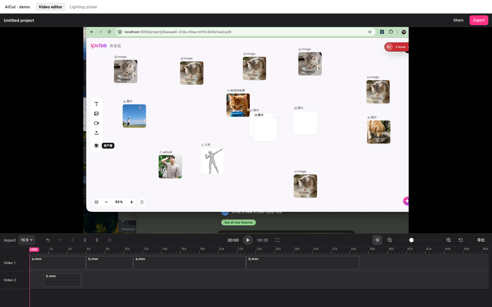
React wrapper for the AiCut video editor — canvas timeline, custom toolbar slots, theming, i18n, drop-in
<VideoEditor>.


Install
pnpm add @aicut/react @aicut/coreQuick start
import { useRef } from "react";
import {
  VideoEditor,
  type VideoEditorApi,
  type Project,
} from "@aicut/react";
import "@aicut/core/styles.css";

const project: Project = {
  version: 1,
  sources: [
    { id: "s1", url: "/media/a.mp4", kind: "video", name: "a.mp4" },
  ],
  tracks: [{
    id: "t1",
    kind: "video",
    clips: [{ id: "c1", sourceId: "s1", in: 0, out: 5000, start: 0 }],
  }],
};

export function Editor() {
  const apiRef = useRef<VideoEditorApi | null>(null);
  return (
    <VideoEditor
      apiRef={apiRef}
      defaultProject={project}
      onChange={(p) => console.log("autosave", p)}
      onExport={(p) => fetch("/api/export", {
        method: "POST",
        body: JSON.stringify({ project: p }),
      })}
      style={{ height: 600 }}
    />
  );
}
The component is uncontrolled for project state — the editor owns the current project. To restore from JSON later:
apiRef.current?.setProject(savedJson);Props
interface VideoEditorProps {
  defaultProject?: Project;

  theme?: Theme;                         // CSS-var overrides; reactive
  locale?: Partial<Locale>;              // EN default; pass localeZh for ZH

  headerLeft?: ReactNode;                // optional header row above
  headerRight?: ReactNode;               //   the preview — collapses
                                          //   when both are empty
  toolbarLeft?: ReactNode;               // host controls — left bookend
  toolbarRight?: ReactNode;              //                 right bookend

  playbackEngine?: PlaybackEngineFactory; // pluggable playback; default
                                           //   HtmlVideoEngine. Bound at
                                           //   mount — change + remount
                                           //   via `key` to re-apply.
  timelineHeight?: number;               // outer height of the bottom
                                           //   timeline area (default 240).
                                           //   Reactive; no remount needed.
  trackHeight?: number;                  // per-row height (default 56).
                                           //   Initial-only; process-wide.
  rulerHeight?: number;                  // time-label strip (default 24).

  apiRef?: Ref<VideoEditorApi | null>;

  onReady?: (api: VideoEditorApi) => void;
  onChange?: (project: Project) => void;
  onExport?: (project: Project) => void; // fired by api.requestExport()
  onTimeUpdate?: (ms: number) => void;
  onPlay?: () => void;
  onPause?: () => void;
  onSelectionChange?: (clipId: string | null) => void;
  onError?: (err: Error) => void;

  className?: string;
  style?: CSSProperties;
}
The apiRef value exposes the full EditorApi — play, pause, seek, split, trimLeft, trimRight, setProject, getProject, addSource, addTrack, removeClip, undo, redo, setTheme, setLocale, requestExport, and more. See @aicut/core for the complete surface.
Custom slots (header + toolbar)
The editor reserves four host-fillable slots — all empty by default with no chrome cost. The optional header above the preview auto-collapses when both header slots are empty, so the default layout is byte-for-byte identical to before they existed.
<VideoEditor
  // Header row above the preview — invisible when both null
  headerLeft={<strong>Untitled project</strong>}
  headerRight={
    <>
      <button onClick={share}>Share</button>
      <button onClick={() => apiRef.current?.requestExport()}>Export</button>
    </>
  }
/>
Toolbar bookends
<VideoEditor
  apiRef={apiRef}
  defaultProject={project}
  toolbarLeft={
    <select value={aspect} onChange={(e) => setAspect(e.target.value)}>
      <option value="16:9">16:9</option>
      <option value="9:16">9:16</option>
      <option value="1:1">1:1</option>
    </select>
  }
  toolbarRight={
    <button onClick={() => apiRef.current?.requestExport()}>Export</button>
  }
/>
api.requestExport() fires the export event with the current project JSON, which flows back through your onExport prop. Your handler decides whether to POST to a backend, download locally, etc.
Theming
<VideoEditor
  theme={{
    controlsBg: "#f6f6f8",
    controlsText: "rgba(0, 0, 0, 0.78)",
    controlsBorder: "rgba(0, 0, 0, 0.08)",
    controlsHover: "rgba(0, 0, 0, 0.06)",
    controlsActive: "rgba(0, 0, 0, 0.08)",
    previewBg: "#e4e4e7",      // letterbox colour around the video
  }}
  /* … */
/>
The theme prop is reactive — swap it any time and the editor calls setTheme internally.
i18n
import { VideoEditor, localeZh } from "@aicut/react";

// Whole-locale swap
<VideoEditor locale={localeZh} /* … */ />

// Partial override
<VideoEditor locale={{ undo: "Annuler" }} /* … */ />
locale is reactive too — runtime swap re-titles the toolbar and re-paints canvas labels in place.
Compact viewports
Default chrome is sized for desktop. For laptop side panels or embedded editors, shrink the bottom area to reclaim preview height:
const [timelineHeight, setTimelineHeight] = useState(160);

<VideoEditor
  defaultProject={project}
  timelineHeight={timelineHeight}   // reactive — drag a slider, the
                                    // editor recompacts in place
  trackHeight={40}                  // initial-only; needs remount to
                                    // change (key={trackHeight})
/>
Range guidance: timelineHeight ∈ [120, 480], trackHeight ∈ [28, 96], rulerHeight ∈ [18, 36]. The internal canvas scrolls vertically when tracks overflow.
Custom playback engine
The editor talks to playback through a single interface. The default is
HtmlVideoEngine (one hidden <video> per source, swap on clip
boundaries). To plug in a different one — WebCodecs, WebGL compositor,
desktop-wrapper IPC bridge — pass a factory:
import {
  VideoEditor,
  type PlaybackEngineFactory,
} from "@aicut/react";

const myEngine: PlaybackEngineFactory = ({ host, project }) =>
  new MyCustomEngine(host, project); // implements PlaybackEngine

<VideoEditor
  defaultProject={project}
  playbackEngine={myEngine}        // initial-only — bound at mount
  /* … */
/>PlaybackEngine, PlaybackEngineFactory, PlaybackEngineOptions, and
the built-in HtmlVideoEngine are re-exported from @aicut/react so
you don't need a separate @aicut/core import to write one.
See @aicut/core's playback section for the full interface contract.
WebCodecs engine (opt-in sub-entry)
For frame-accurate playback via the browser's VideoDecoder API, import from the sub-entry so mp4box.js (~200 KB) only loads when you ask for it:
import {
  WebCodecsEngine,
  isWebCodecsSupported,
} from "@aicut/react/webcodecs";

const factory = isWebCodecsSupported()
  ? (opts) => new WebCodecsEngine({ ...opts, debug: true })
  : undefined; // VideoEditor falls back to HtmlVideoEngine when undefined

<VideoEditor playbackEngine={factory} /* … */ />;
WebCodecsEngine v1 covers single-track MP4/MOV playback (H.264 / HEVC / VP9 / AV1 — whatever the browser's VideoDecoder supports). Multi-track compositing, audio, transitions land in follow-up releases.
Keyframes (panX / panY / scale animation)
Off by default. Flip the keyframes prop and all three playback engines (HTML5, Canvas, WebCodecs) start interpolating per-clip transforms between adjacent keyframes. Diamond markers appear on the timeline; drag them, edit values via the floating panel, snap them to each other.
const [kfEnabled, setKfEnabled] = useState(true);
const [edgeNav, setEdgeNav] = useState(true);

<VideoEditor
  defaultProject={project}
  keyframes={{ enabled: kfEnabled }}
  clipEdgeNav={{ enabled: edgeNav }} // adds the |◀ ▶| buttons + I/O shortcuts
  onKeyframeSelectionChange={(target) => console.log(target)}
  /* … */
/>

// Per-property mutators (panX / panY / scale animate independently).
apiRef.current?.addKeyframe("clip-1", "scale", { time: 0, value: 1 });
apiRef.current?.addKeyframe("clip-1", "scale", {
  time: 2000,
  value: 2.5,
  easing: "easeInOut",
});
apiRef.current?.setKeyframeValue("clip-1", kfId, 1.8);
apiRef.current?.setKeyframeEasing("clip-1", kfId, "easeOut");

// Toolbar-style "K at playhead" drops all 3 props at once.
apiRef.current?.setSelection("clip-1");
apiRef.current?.toggleKeyframeAtPlayhead();Keyframe, KeyframeProp, EasingKind, EffectiveTransform, getEffectiveTransform, getTransformAtTimelineTime, IDENTITY_TRANSFORM, isIdentityTransform are all re-exported from @aicut/react for thumbnail / preview rendering outside the editor.
Backend export: both @aicut/backend-ts and @aicut/backend-go compile keyframes to ffmpeg t-expressions (scale=…:eval=frame + overlay=…:eval=frame). Pass output: { width, height, fps } in the export request — required for the keyframe filter graph to apply.
See @aicut/core's keyframes section for the full API surface.
<LightingEditor> (opt-in sub-entry)
A 3D lighting director for AI relighting flows — separate component that doesn't pull three.js into the rest of your bundle.
import { useRef } from "react";
import {
  LightingEditor,
  type LightingEditorApi,
  type LightingConfig,
} from "@aicut/react/lighting";
import "@aicut/core/styles.css";

function Relight() {
  const apiRef = useRef<LightingEditorApi | null>(null);

  const onGenerate = (): void => {
    const cfg = apiRef.current?.getConfig();
    if (cfg) fetch("/relight", { method: "POST", body: JSON.stringify(cfg) });
  };

  // Library renders ONLY the picker (scene + controls). Host lays out
  // the Smart mode panel beside it in their own flex/grid.
  return (
    <div style={{ display: "flex", gap: 16 }}>
      <LightingEditor
        apiRef={apiRef}
        subjectImageUrl="/frames/subject.jpg"
        onChange={(cfg: LightingConfig) => console.log(cfg)}
        // Reset / Generate / save-preset / etc. buttons go into the
        // controls column's footer slot — the only host-supplied
        // surface the library reserves space for.
        controlsFooter={
          <button onClick={() => apiRef.current?.reset()}>Reset</button>
        }
      />
      <aside>
        <textarea placeholder="Describe the mood…" />
        <button onClick={onGenerate}>Generate</button>
      </aside>
    </div>
  );
}
Props: subjectImageUrl, defaultConfig, defaultView, theme, locale, controlsFooter, onChange.
Imperative API (apiRef.current): setConfig, getConfig, setSubjectImage, setView, getView, reset.
The library is intentionally focused on the picker — Smart mode UI, Generate buttons, close handling, layout all live in host code.
Standalone <Timeline>
Use the canvas timeline without the rest of the editor — frame-pickers, thumbnail strips, read-only previews.
import { Timeline, type TimelineApi } from "@aicut/react";

<Timeline
  apiRef={timelineRef}
  defaultProject={singleClipProject}
  showHeader={false}
  readOnly
  toolbar                                            // 36px top strip
  toolbarLeft={<span>Picked at {ms / 1000}s</span>}
  toolbarRight={<button onClick={pick}>Use frame</button>}
  onSeek={(ms) => setPicked(ms)}
/>