
@alicd/cone-ui-slider-bar-nav
v0.1.2
Published
slider bar nav
Downloads
54


Readme
slider-bar-nav
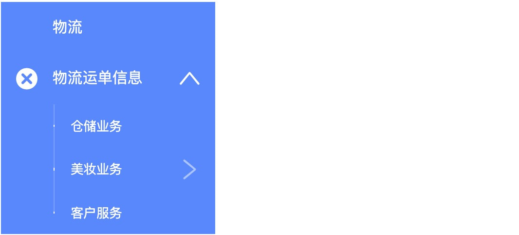
侧边导航
规则
- 组件规则
API
SliderBarNav
| 成员 | 说明 | 类型 | 默认值 |
|---|---|---|---|
|collapsed|是否收起导航栏|boolean|false|
|width|导航宽度|number/string|auto|
|className|自定义样式class|string|null|
|openKeys|展开的菜单 key 数组,受控属性,需要配合 onOpen 事件使用|string[]|N/A|
|defaultOpenKeys|默认状态下展开的 key 数组,仅在导航栏展开时有效|string[]|[]|
|onOpen|当菜单被收缩或展开时触发的回调函数,仅在导航栏展开时有效|(keys: string[]) => void|默认不执行任何操作|
|selectedKeys|选中的菜单 key 数组,受控属性,需要配合 onSelect 事件使用|string[]|N/A|
|defaultSelectedKeys|默认状态下选中的 key 数组|string[]|[]|
|onSelect|当被选择的菜单项发生变化时触发的回调函数|(selectedKeys: string[], navItem: SliderBarNav.Item) => void|默认不执行任何操作|
|selectMode|菜单选择的模式,支持单选("single")和多选("multiple"),默认为单选,空值则禁用选择功能|enum|"single"|
|cascadeOpenKeys|openKeys 中包含子节点时,会自动展开父节点|boolean|false|
|textIcon|为 true 时,若菜单内 Item 没有设置 icon 或 image,则默认取标题中的第一个字作为 icon。|boolean|false|
|dataSource|可以使用数据的形式配置菜单内的内容,指向一个对象树,详见 Demo。对象树中的节点包含 key 属性(对应 Item 的 key),title 属性(对应 Item 或 Category 的 title),type 属性(可用值 category,link,不填表示该节点为普通 Item)。|object[]|默认为空|
|itemOnClick|使用 dataSource 属性配置数据时,自定义节点点击事件。参数为被点击的 Item 对应的 dataSource 中的节点对象。|(node: object) => void|默认为空|
|dataRenderCallback|允许在使用 dataSource 属性配置数据时,自定义 dataSource 的格式(非特殊需求,不推荐使用)|(node: object, extraProps: object) => ReactElement|默认行为见 dataSource 属性描述|
SliderBarNav.Category
| 成员 | 说明 | 类型 | 默认值 |
|---|---|---|---|
|title|该类别的标题,仅在导航栏展开时有效|string|N/A|
SliderBarNav.Item
| 成员 | 说明 | 类型 | 默认值 |
|---|---|---|---|
|key|用于唯一标识菜单项的标识符,对于有子菜单的菜单项必须设置|string|N/A|
|title|菜单上显示的内容|ReactNode|N/A|
|icon|菜单左侧显示的图标,仅在第一级菜单有效|string 或组件|N/A|
|image|菜单左侧显示的图片 URI,仅在第一级菜单有效。当同时设置 icon 和 image 属性时,icon 属性无效。默认图片显示大小为 16x16 px。|string 或组件|N/A|
|onClick|点击菜单项的回调|(e: Event) => void|默认不执行任何操作|
|selected|当前的菜单项是否被选中, 优先级比 SliderBarNav 传入的 selectedKeys 要高|boolean|false|
|selecteable|设置该菜单项是否可以被选中|boolean|默认为空|
|textIcon|若菜单内 Item 没有设置 icon 或 image,则默认取标题中的第一个字作为 icon。该属性优先级高于 SliderBarNav 组件的 textIcon 属性,比如设置 SliderBarNav 组件 textIcon 属性为 true,但设置特定 Item 上的 textIcon 属性为 false,则会将该功能在相应 Item 上禁用。该属性还允许设置一个字符以自定义 icon 上显示的字符。|boolean|string|默认继承当前 SliderBarNav 组件的 textIcon 属性值|