
@antonlimar/react-color
v3.0.8
Published
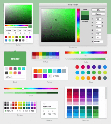
A Collection of Color Pickers from Sketch, Photoshop, Chrome & more
Downloads
2,493
Maintainers
 antonlimar
Readme
React Color


14 Different Pickers - Sketch, Photoshop, Chrome, Google and many more
Make Your Own - Use the building block components to make your own
Fork development
This tree is maintained as a modernization fork. Source layout, npm export names, and agent-oriented conventions are documented in AGENTS.md. Do not edit generated es/ by hand; use the build scripts from package.json.
Compatibility notes: the published API remains intentionally stable where practical, but repository internals have been modernized. In particular, runtime propTypes are no longer emitted, so JavaScript consumers should rely on docs and TypeScript typings rather than prop-types warnings during development.
Development workflow
The modernization branch now uses a TypeScript-based ESM emit for package builds, Vitest for tests, Storybook 10 for component work, and Vite for the GitHub Pages documentation site in site/.
| Command | Purpose |
| ------------------------------ | ------------------------------------------------------------------------------- |
| npm run build | Build the published ESM output in es/. |
| npm run test:unit | Run the unit/UI test suite through Vitest. |
| npm run test:site | Run the dedicated site interaction tests for navigation and shared color state. |
| npm run test:esm-consumption | Build the package and smoke-check Node ESM and bundler consumption paths. |
| npm run test:watch | Start Vitest in watch mode. |
| npm run eslint | Lint src, site, scripts, test, and repo tooling sources with ESLint. |
| npm run storybook | Start Storybook on port 6006. |
| npm run build-storybook | Emit the static Storybook site to .out/. |
| npm run site:dev | Start the GitHub Pages documentation site on http://localhost:4173/. |
| npm run site:build | Build the GitHub Pages documentation site into site/dist/. |
| npm run site:verify | Run site interaction tests, build the Pages app, and verify metadata/output. |
| npm run typecheck | Run the TypeScript check for src, site, scripts, and test. |
Published package artifacts are ESM-only. The package exposes main and module via es/index.js and exposes root typings via index.d.ts.
Packaging interop notes
The package ships an ESM-only main/module contract and an exports map for the root entry and shared common components. Generated component-local CSS artifacts are published under es/components and are pulled in by the component modules that need them.
- Bundlers and TypeScript toolchains should use root named imports such as
import { SketchPicker } from '@antonlimar/react-color'. - Native Node ESM can resolve the root entry through the package
exportsmap; plain Node execution still needs a CSS-aware loader because picker component modules import CSS side effects. - CommonJS
require('@antonlimar/react-color')andrequire('@antonlimar/react-color/lib/...')are no longer supported.
Demo
Installation & Usage
npm install @antonlimar/react-colorInclude the Component
import { SketchPicker } from '@antonlimar/react-color';

function Component() {
  return <SketchPicker />;
}
You can import AlphaPicker BlockPicker ChromePicker CirclePicker CompactPicker GithubPicker GooglePicker HuePicker MaterialPicker PhotoshopPicker SketchPicker SliderPicker SwatchesPicker TwitterPicker respectively.
Styling
The modernization fork ships component-scoped CSS automatically with each component entrypoint instead of relying on default picker UI from inline reactcss styles.
Root picker and shared primitive imports include the CSS they need.
All public pickers keep accepting className on the root node and still support the styles prop for runtime inline overrides. They now also support theme, classNames, and CSS custom properties for styling; new customizations should prefer classNames, CSS variables, and the published rc-* BEM hooks when possible.