
@aqualens/react
v3.0.1
Published
React bindings for @aqualens/core – A liquid glass effect components and hooks

Maintainers
 famence
Readme
@aqualens/react
React 18+ bindings for @aqualens/core: <Aqualens>, DOM and lens refs, and hooks backed by the shared renderer.
Requirements
- React and React DOM
>= 18 - WebGL2 (same as core)
html2canvas-pro— peer dependency; install it in your app for backdrop capture
Install
npm install @aqualens/react html2canvas-pro@aqualens/core is a dependency of this package. html2canvas-pro must still be listed in your app because core declares it as a peer.
Quick start
"use client";

import { useState } from "react";
import { Aqualens } from "@aqualens/react";

export function HeroGlass() {
  const [backdrop, setBackdrop] = useState<HTMLDivElement | null>(null);

  return (
    <div ref={setBackdrop} className="relative">
      <img
        src="/bg.jpg"
        alt=""
        className="absolute inset-0 size-full object-cover"
      />

      {backdrop ? (
        <Aqualens
          snapshotTarget={backdrop}
          className="absolute left-1/2 top-1/2 w-72 -translate-x-1/2 -translate-y-1/2 rounded-3xl p-6 bg-white/20"
          refraction={{ thickness: 22, factor: 1.4 }}
          glare={{ factor: 35, range: 20 }}
          blurRadius={4}
        >
          <p>Content inside the glass</p>
        </Aqualens>
      ) : null}
    </div>
  );
}
snapshotTarget — subtree to capture as the refracted backdrop (often the same wrapper as your background). If omitted, the shared renderer uses document.body.
Use a semi-transparent background-color for tint and border-radius for the silhouette.
Props (high level)
| Prop | Description |
| --- | --- |
| snapshotTarget | Snapshot root: HTMLElement or null |
| resolution | Capture scale 0.1–3.0 (default 2) |
| refraction, glare | Same shapes as core (RefractionOptions, GlareOptions) |
| blurRadius, blurEdge | Blur strength and edge clamping |
| opaqueOverlap | When true, lenses at different stacking levels clip lower ones against the original snapshot |
| powerSave | Use the lightweight power-save renderer instead of the full WebGL path |
| onInit | (lens) => void when the lens is ready |
| as | Polymorphic host element (default div) |
| (also) | Standard HTMLAttributes for the host (except children typing) |
Refs
<Aqualens> supports two refs:
ref— host DOM node; type followsas(defaultHTMLDivElement)lensRef— coreAqualensLensInstancewhen ready, ornullafter unmount / mode change
import { useRef } from "react";
import { Aqualens, type AqualensLensInstance } from "@aqualens/react";

function Glass() {
  const elementRef = useRef<HTMLDivElement>(null);
  const lensRef = useRef<AqualensLensInstance | null>(null);

  return <Aqualens ref={elementRef} lensRef={lensRef} />;
}
Hooks
useAqualens()
Access the shared core renderer after it resolves:
import { useAqualens } from "@aqualens/react";

function Toolbar() {
  const { renderer, ready, recapture, registerDynamic } = useAqualens();

  return (
    <button type="button" disabled={!ready} onClick={() => void recapture()}>
      Refresh backdrop
    </button>
  );
}recapture()— callsrenderer.captureSnapshot()when the shared instance existsregisterDynamic(el)— forwards toaddDynamicElement
useDynamicElement<T>()
Ref that registers its node with the shared renderer when mounted:
const motionRef = useDynamicElement<HTMLDivElement>();
return <div ref={motionRef}>…</div>;
Re-exported core API
You can import advanced helpers and types from @aqualens/react or @aqualens/core, for example:
AqualensRenderer, getSharedRenderer, updateSharedRendererConfig, setOpaqueOverlap, DEFAULT_OPTIONS, and the main TypeScript types.
Reveal attributes in React markup
Configure reveal layers on children with data attributes:
<Aqualens className="indicator" style={{ zIndex: 10 }}>
  <span
    data-aqualens-reveal-index={11}
    data-aqualens-reveal-mode="on-lens"
    className="text-red-500"
  >
    Genres
  </span>
</Aqualens>data-aqualens-reveal-index— numeric threshold (required for reveal logic)data-aqualens-reveal-mode— optional;under-lens(default) vson-lens(above tint within the lens shape, with that lens refraction applied)
See packages/core/README.md for HTML examples and behaviour detail.
Example project
Hosted demo: famence.github.io/aqualens.
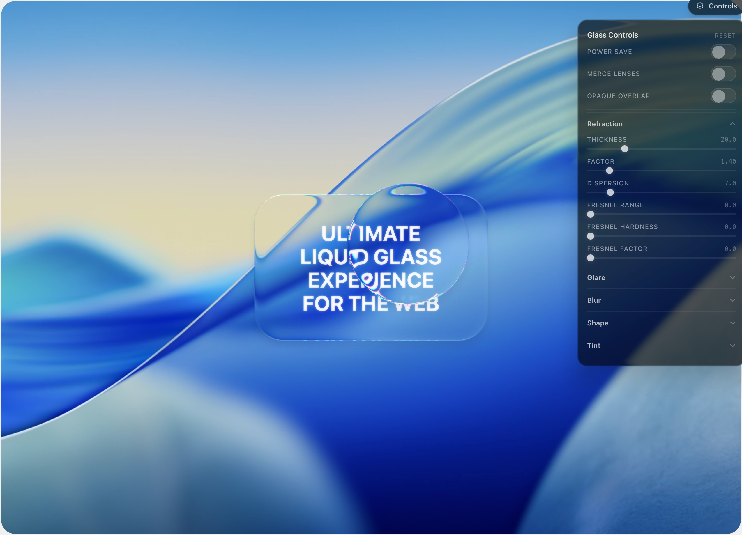
The demo/ Next.js app in this repo includes controls and toggles (opaqueOverlap, powerSave, and more)—use it as an integration reference.
Scripts
npm run build
npm run typecheck
License
MIT