
@arach/arc
v0.13.1
Published
A visual explanation toolkit for software systems — interactive diagrams, guided stories, animated flows, visual editing, and CLI + MCP tools

Maintainers
 arach
arachKeywords
Readme
Build explanations people can explore.
A visual explanation toolkit for software systems. Build interactive maps, playable sequences, and spatial views with a visual studio and developer tools. Start with Arc data or supported Mermaid source. Embed the result, or export PNG, SVG, GIF, and MP4.



Explore Arc · Browse 16 examples · Try a live explainer · Start building · Documentation
Trace a request, play an exchange between services, or open up the layers of an architecture. Build an onboarding walkthrough, interactive article, or design review that lets people explore how the system works. Author on the canvas, in code, or with an agent, and keep the source alongside your software.
A diagram in Figma can drift as the system changes. Keep its source in the repository so the diagram can be reviewed and updated in the same pull request.
Bring your source. Choose your output.
| Start with | What Arc supports |
| --- | --- |
| Arc JSON / TypeScript | Architecture diagrams, guided views, animated flow routes, and isometric views. |
| Mermaid flowcharts and state diagrams | Import into editable Arc architecture data with importMermaid() from @arach/arc-viewer. |
| Mermaid sequence diagrams | Native rendering and step-by-step playback with ArcMermaidPlayer from @arach/arc-viewer. |
| Mermaid source used with Pele or Beautiful Mermaid | Reuse the supported flowchart, state, and sequence syntax through those same Arc APIs. |
Pele and Beautiful Mermaid are Mermaid renderers. Bring the original Mermaid text to Arc; Arc applies its own layout, themes, and interactions. Their rendered SVGs, theme settings, and full diagram catalogs are not imported. Check the import coverage and sequence guide for supported syntax and diagnostics.
| Output | Use it for | | --- | --- | | PNG | Still images for documents, chat, and social posts. | | SVG | Scalable vector drawings, including animated flow routes. | | GIF | Looping flow animations for READMEs and demos. | | MP4 | Flow videos for presentations and announcements. | | React / HTML | Interactive components, iframe embeds, or a standalone SVG page. | | ASCII / Unicode | Diagrams in terminals and plain text. | | JSON / TypeScript | Editable source to version, review, and reuse. |
The file exports above use Arc architecture data. GIF and MP4 render authored flow routes through the CLI or MCP; they require Chrome/Chromium and ffmpeg. Native Mermaid sequence playback is available through the React viewer. Choose an export and see the commands →
Turn the map into a walkthrough
Start with services, databases, queues, and the connections between them. Arc provides semantic node kinds, icons, groups, relationship styles, and automatic layout to give the system a clear structure. Then make that structure explorable.
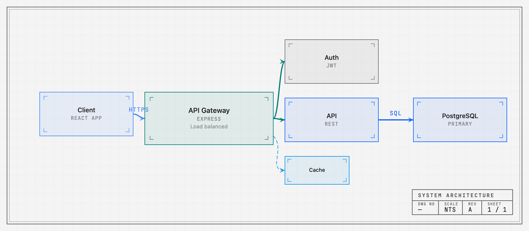
- Focus on the path that matters. Hover or select a component to reveal its relationships. Author a focus story with a caption and steps to explain a whole request path, boundary, or workflow.
- Guide the reader through chapters. Named views frame the relevant region and highlight its nodes and connections. Readers can step through the story or leave it to explore on their own.
- Put requests in motion. Send packets along multi-step routes, pause at a
service, follow the return path, and show trails. Set timing and repeats, or
control the exact instant with
flowTime.
Pan, zoom, fit, minimaps, and legends keep the system navigable. Chapters, focus stories, and animated routes are authored data that can be edited and reviewed alongside the drawing.
Guided views · Focus stories · Flow API · Source for the image
Play the conversation
Arc's native Mermaid sequence player makes an exchange something you can follow one message at a time. Actors, lifelines, self-calls, notes, branches, and loops retain their place in the story. Play the sequence, step backward or forward, focus a participant, or open it fullscreen.
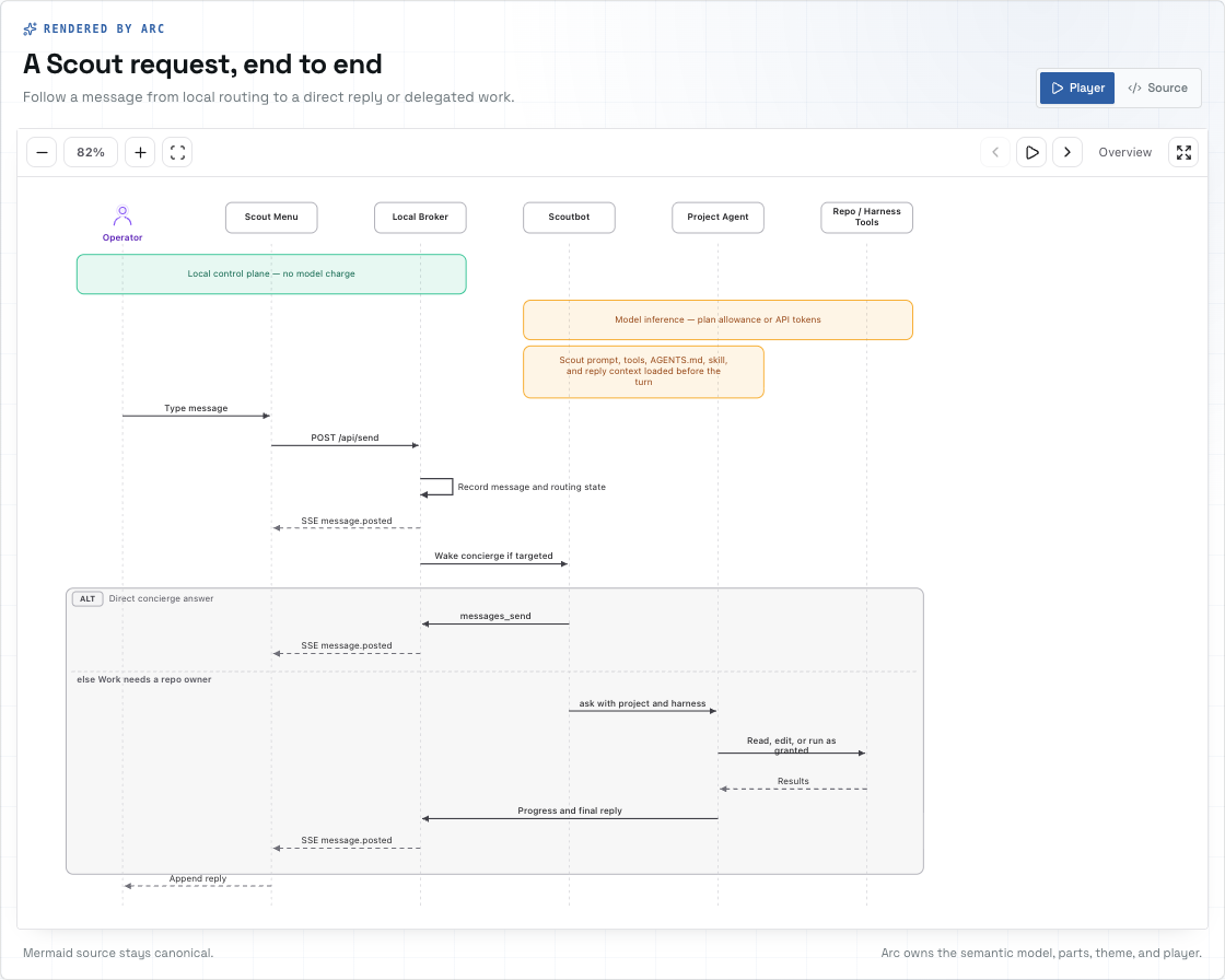
Mermaid text stays the source. Arc owns the typed sequence model, layout, SVG rendering, and playback. You can customize theme tokens and replace individual visual parts to fit your application. Mermaid.js is not required at runtime.
Existing Mermaid flowcharts and state diagrams have a separate import path into Arc's architecture format.
Native sequence guide · Supported Mermaid imports
Give the system depth
Use isometric views to make layers, boundaries, and hierarchy visible. Project an architecture into spatial blocks, or compose a tiered scene with elevated floors, staggered layers, translucent components, and pillars. Hover a layer to lift it out of the stack; use node and layer callbacks to connect the view to your application.
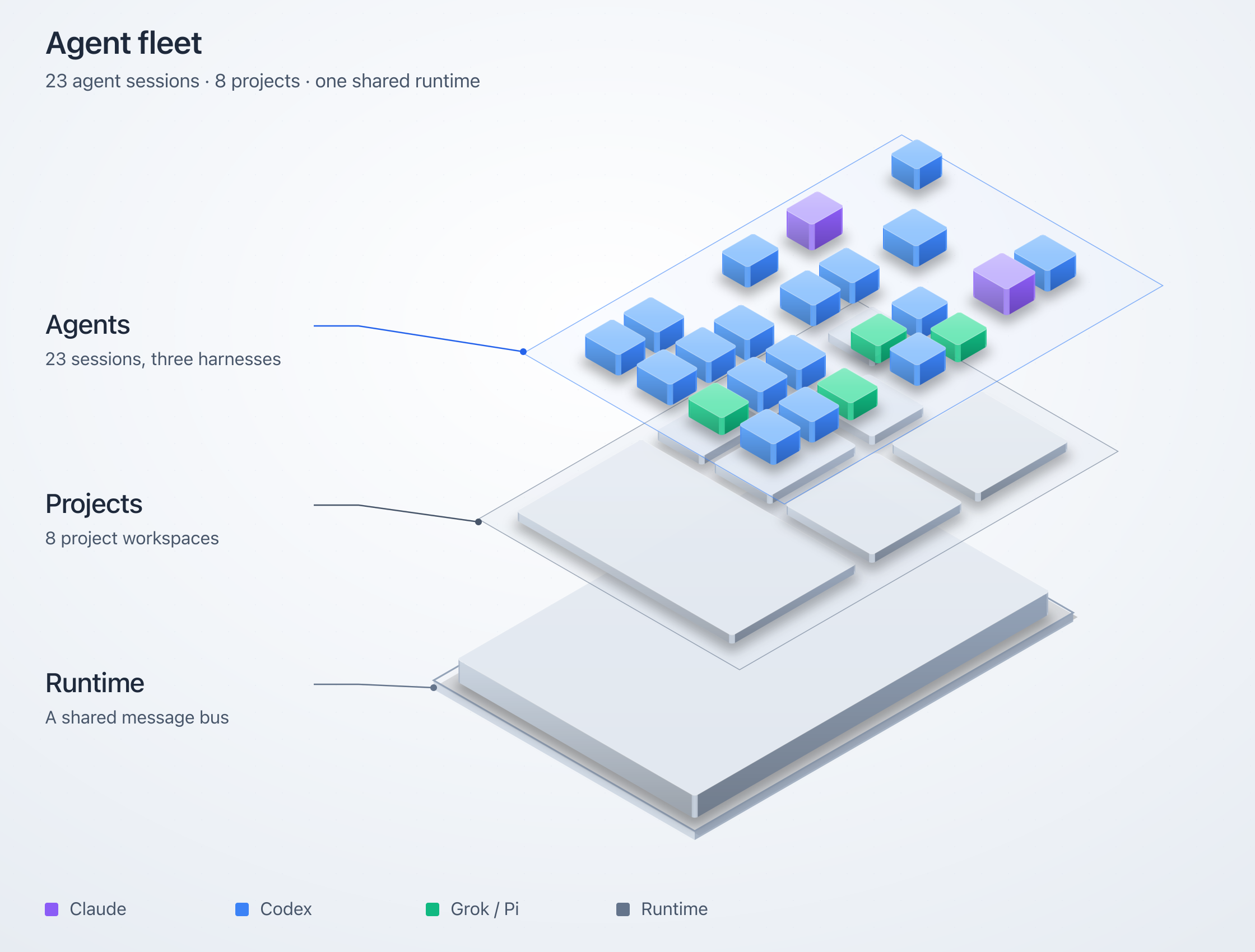
Choose shaded solids, hatched blueprint linework, cyanotype plates, or a retro-print material with mineral inks and deterministic stipple. The tiered renderer has React and static SVG APIs, including a vanilla JavaScript embed.
Isometric types and options · Example fleet composition
Let readers operate the explanation
Turn up demand in the connection-pool explainer. All four database connections fill, and requests start waiting. Step through a handoff to see which request gets the next connection. Stop arrivals and watch the queue drain.
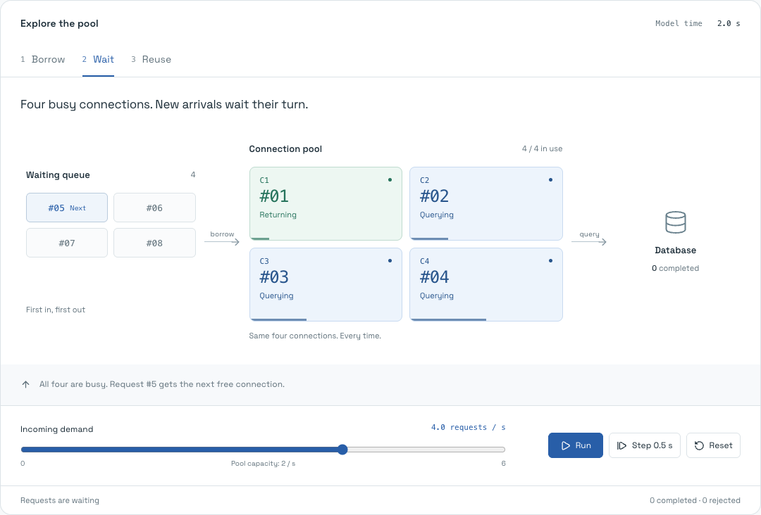
The queue, leases, counts, and handoffs come from the same deterministic model. This working example combines a custom mechanism view with an Arc diagram projection. It shows how to build an explanation that responds to the reader's actions and makes cause and effect visible.
Operate the pool · Read the model · See the Arc projection
Create on the canvas. Refine in code.
The studio puts the drawing and its source side by side. Drag components into place, connect their anchors, shape groups, and refine the result in the inspector. Edit the JSON and the canvas updates. Move a node and the source updates with it.
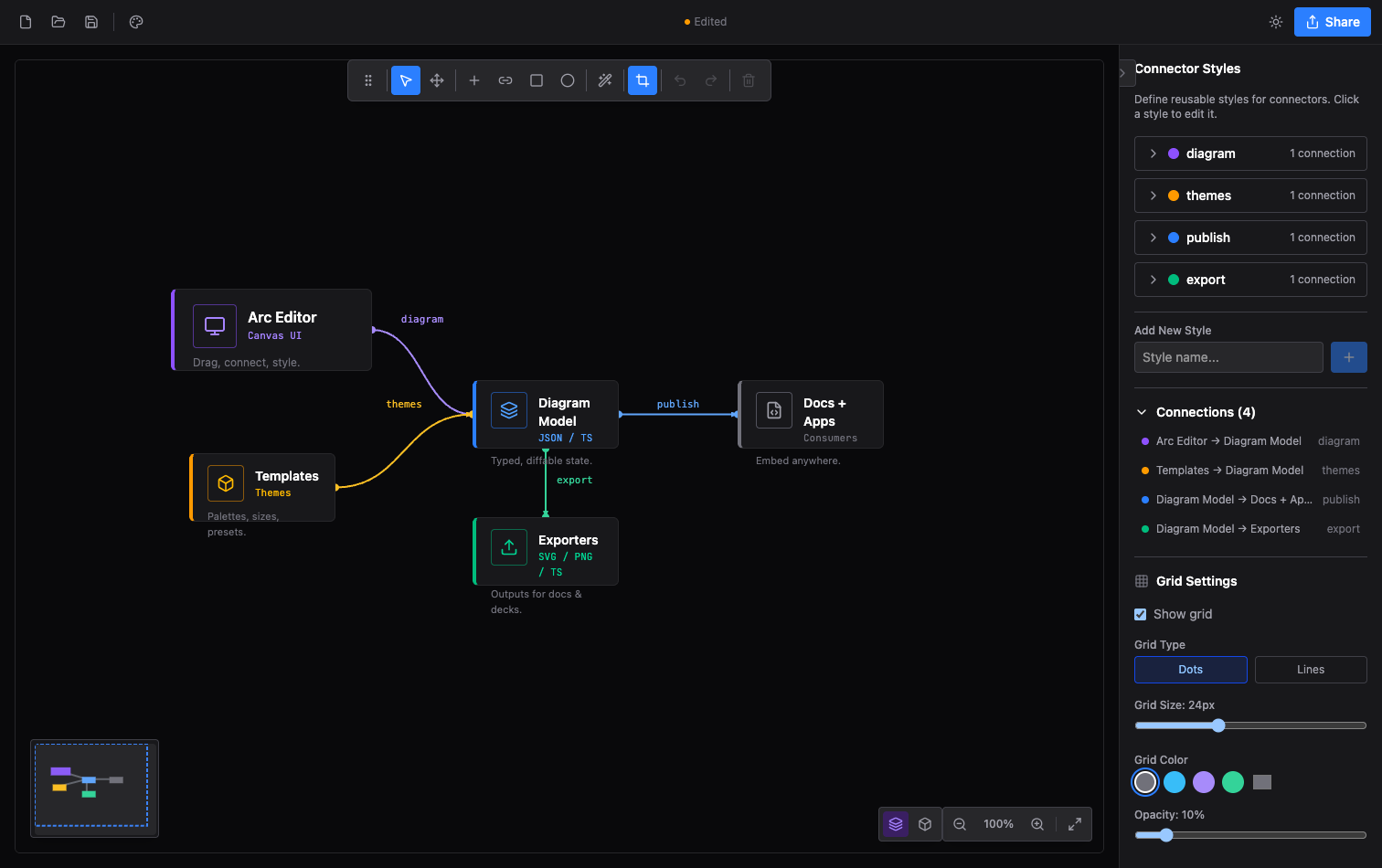
Multi-selection, keyboard shortcuts, undo/redo, templates, image layers, custom dimensions, connector routing, and export crops give you control over the finished composition. Switch between 2D and isometric editing. Save to a file, restore a local browser session, or copy a typed module into your app.
The editor's React components, context, and hooks are available for embedding. The player showcase lets you tune a viewer's appearance and controls, then copy the matching JSX.
Open the studio from Arc, or run it locally.
Give the drawing a visual identity
Eleven themes shape typography, node silhouettes, grids, frames, decoration, and title blocks as well as color. Choose an engineering plate, a quiet workbench, a tactical map, or a mission console. Every theme has light and dark modes; individual nodes and relationships can carry their own styling.
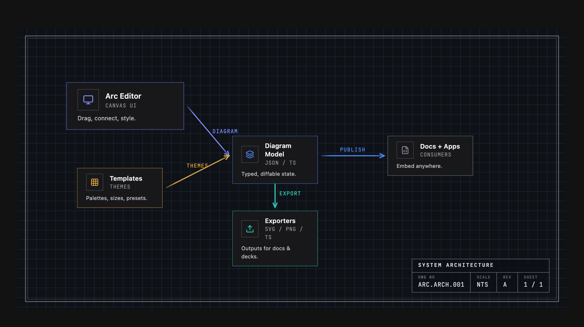
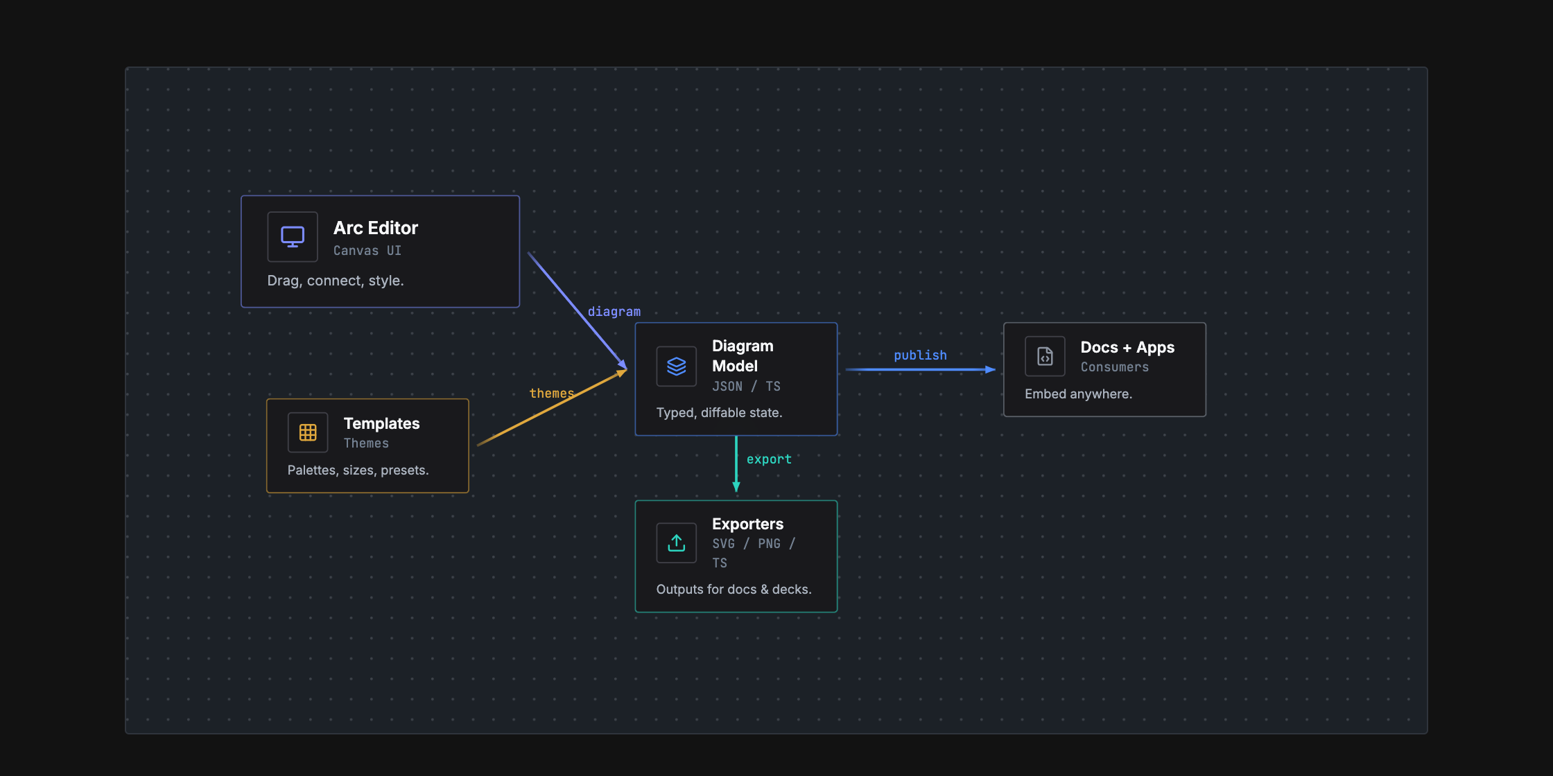
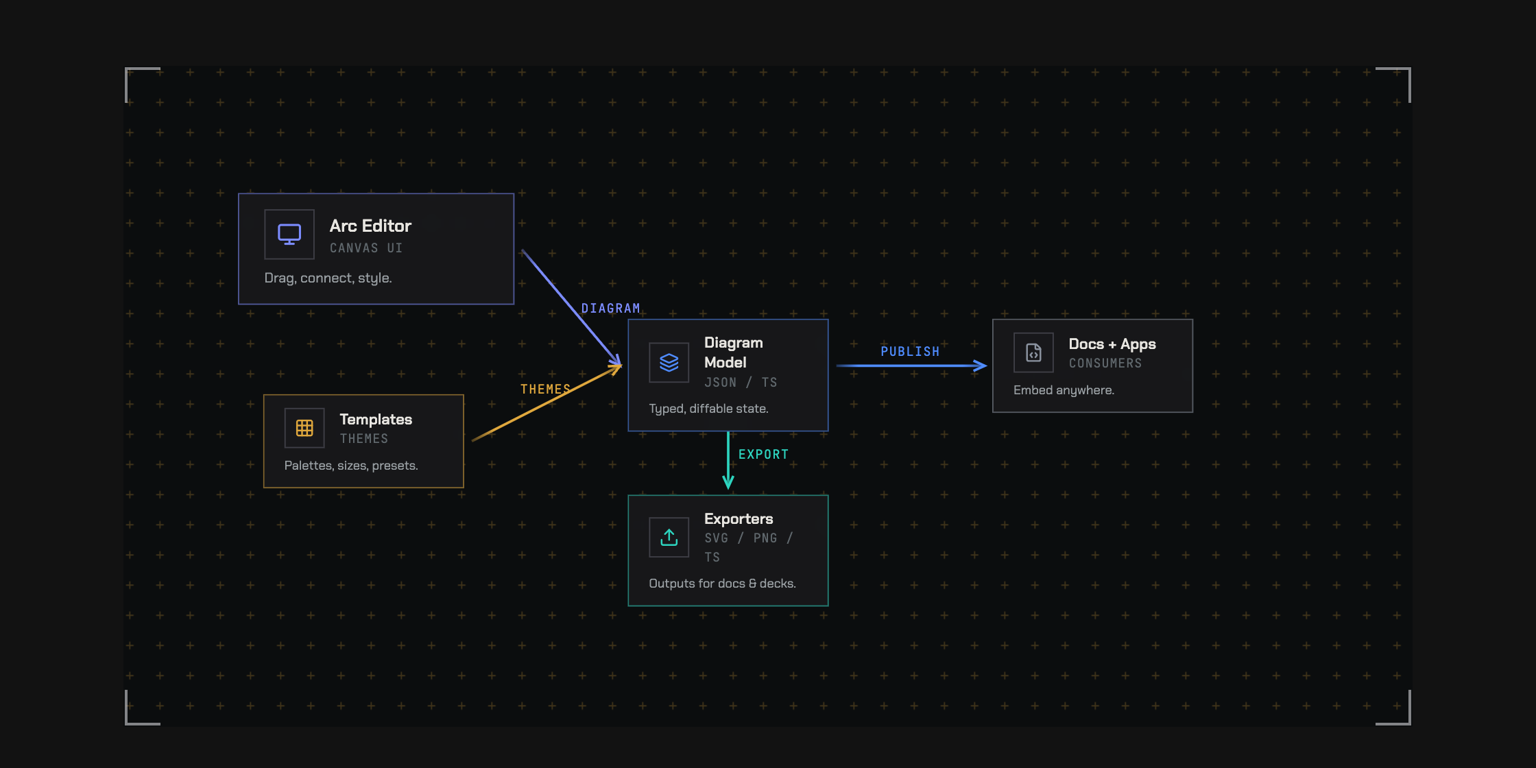
The themes are default, warm, cool, mono, engineering, workbench,
tactical, command, spacex, claude, and codex. Studio shell skins and
interface density are configurable independently of the diagram.
Build with agents. Review with people.
Arc gives agents a concrete authoring loop: write the document, arrange it, check it, render it, and revise it. Typed data and a closed JSON Schema define the format. Coded diagnostics identify problems such as dangling connections, overlaps, and invalid routes, with suggested fixes an agent can act on.
Together, the CLI and MCP server provide validation, automatic layout, rendering, diffs, and a handoff into the visual studio. A person can inspect the result and refine the drawing directly.
Attach repository paths, line ranges, and commits to the nodes they describe. Review structural changes on the diagram itself: highlight additions, ghost removed elements, and show where components moved.
import { ArcDiagram, diffDiagram } from '@arach/arc'

<ArcDiagram data={head} delta={diffDiagram(base, head)} />
That gives a code review both the changed source and a visual explanation of the changed structure.
Structural diffs · Agent guide · Authoring benchmarks
Take the explanation where it belongs
| Destination | What you can use | | --- | --- | | Your product or documentation | Interactive React diagrams, sequence players, and editor components. | | A design review | Guided views, source references, and structural diff overlays. | | A page, document, or deck | SVG, PNG, or standalone HTML with the rendered drawing. | | A demo or announcement | Animated SVG, GIF, or MP4 from authored flow routes. | | A terminal or Markdown file | ASCII and Unicode diagrams. | | An agent's workspace | CLI, MCP, schema, authoring skill, and machine-readable diagnostics. |
Flow timing is deterministic. Display an exact instant, export it as a still, or render a repeatable sequence of frames. The studio also copies source and creates URLs carrying diagram data; browser session links reopen work stored in that browser.
Get started
Try the experience: open Arc or operate the connection pool.
Build with React: install the main package in a React 18 or 19 project.
npm install @arach/arcImport the stylesheet once and give the diagram a container with a height. This complete example renders a request traveling from an app through an API to a database:
import { ArcDiagram, type ArcDiagramData } from '@arach/arc'
import '@arach/arc/arc.css'

const diagram: ArcDiagramData = {
  layout: { width: 640, height: 240 },
  nodes: {
    app: { x: 40, y: 80, size: 'm' },
    api: { x: 250, y: 80, size: 'm' },
    db:  { x: 460, y: 80, size: 'm' },
  },
  nodeData: {
    app: { name: 'Web app', kind: 'frontend' },
    api: { name: 'API', kind: 'service' },
    db:  { name: 'Database', kind: 'database' },
  },
  connectors: [
    { id: 'request', from: 'app', to: 'api', fromAnchor: 'right', toAnchor: 'left', style: 'data' },
    { id: 'query', from: 'api', to: 'db', fromAnchor: 'right', toAnchor: 'left', style: 'data' },
  ],
  connectorStyles: {
    data: { color: 'blue', strokeWidth: 2 },
  },
  flows: [
    { id: 'load', legs: [{ id: 'request' }, { id: 'query' }], duration: 2, marker: 'packet' },
  ],
}

export function Architecture() {
  return (
    <div style={{ height: 360 }}>
      <ArcDiagram data={diagram} theme="engineering" mode="dark" defaultZoom="fit" />
    </div>
  )
}
Arc bundles its other runtime code and CSS. No Tailwind configuration is
required. Use flowTime={1.25} to inspect a specific instant, or add views
and showViews to turn the diagram into a guided walkthrough.
Start with a Mermaid sequence
Install @arach/arc-viewer for the native sequence player:
npm install @arach/arc-viewerimport { ArcMermaidPlayer } from '@arach/arc-viewer'
const source = `sequenceDiagram
participant App
participant API
App->>API: Load architecture
API-->>App: Typed diagram`
export function RequestStory() {
return <ArcMermaidPlayer source={source} mode="light" />
}Connect an agent
Add the MCP server to a client that supports stdio:
{
  "mcpServers": {
    "arc": {
      "command": "npx",
      "args": ["-y", "@arach/arc-mcp"]
    }
  }
}
The repository's server provides ten tools: validation, structural diff,
automatic layout, ASCII/SVG/PNG/animation/HTML rendering, TypeScript generation,
and editor handoff. It also serves the schema, authoring skill, and LLM guide
as resources. Packages are versioned separately; use bun run mcp to run the
server from this checkout, or bun run mcp:http for self-hosted HTTP transport.
Use the terminal
The CLI requires Node.js 22 or newer. Run these commands in a project with
@arach/arc installed:
npx arc check diagram.json --json --strict
npx arc diff base.json head.json --summary
npx arc render diagram.json --out diagram.svg
npx arc render diagram.json --out flow.mp4 --duration 4 --fps 12
npx arc schema
npx arc-ascii diagram.json --charset ascii --max-width 80
arc check reports format, semantic, and composition problems. --strict also
fails on warnings. Render receipts include source and output hashes.
CLI PNG rendering needs Chrome or Chromium; GIF and MP4 also need ffmpeg.
Use ARC_CHROME and ARC_FFMPEG to select executables.
Choose your package
| Package | What it provides |
| --- | --- |
| @arach/arc | Main React renderer and editor components, themes, layout, validation, structural diffs, flow helpers, ASCII rendering, and the arc CLI. |
| @arach/arc-viewer | Lightweight architecture viewer, native Mermaid sequence renderer/player, and Mermaid import. |
| @arach/arc-iso | Tiered isometric rendering with React and vanilla JavaScript/static SVG APIs. |
| @arach/arc-mcp | Diagram tools and resources for MCP clients. |
Architecture uses ArcDiagramData; native sequences use ArcSequenceDocument;
tiered isometric scenes use DiagramConfig. Each model preserves the structure
its renderer needs. Animated flow markers, guided camera framing, and visual
delta overlays currently render in 2D. The sequence guide
and import guide document supported Mermaid syntax.
Explore the API
| Area | Reference | | --- | --- | | Nodes, relationships, groups, player controls, and flow timing | Component and CLI API | | Ordered walkthroughs and node-triggered explanations | Views · Focus stories | | Automatic placement and group layout | Group layout | | Native sequence playback and Mermaid migration | Sequences · Import | | Tiered scenes, materials, and spatial interaction | Isometric API | | Visual identity and output formats | Themes · Exports | | Source references, diagnostics, and change review | Schema · Diffs | | Agent authoring and verification | MCP · Benchmarks |
Where we're going
We want the agents changing a system to maintain its visual explanation in the same workflow. Arc already provides the format, source references, validation, rendering, and structural review. Automatic impact discovery and drift notifications are the next part of that loop.
The agent workflow and roadmap
Example output
The source of the microservices diagram in the walkthrough section:
const diagram: ArcDiagramData = {
  layout: { width: 850, height: 340 },
  nodes: {
    client:  { x: 40,  y: 130, size: 'm' },
    gateway: { x: 220, y: 130, size: 'l' },
    auth:    { x: 460, y: 40,  size: 'm' },
    api:     { x: 460, y: 140, size: 'm' },
    cache:   { x: 460, y: 240, size: 's' },
    db:      { x: 680, y: 140, size: 'm' },
  },
  nodeData: {
    client:  { icon: 'Monitor',  name: 'Client',      subtitle: 'React App', color: 'violet' },
    gateway: { icon: 'Server',   name: 'API Gateway', subtitle: 'Express', description: 'Load balanced', color: 'emerald' },
    auth:    { icon: 'Shield',   name: 'Auth',        subtitle: 'JWT', color: 'amber' },
    api:     { icon: 'Code',     name: 'API',         subtitle: 'REST', color: 'blue' },
    cache:   { icon: 'Zap',      name: 'Cache',       color: 'sky' },
    db:      { icon: 'Database', name: 'PostgreSQL',  subtitle: 'Primary', color: 'blue' },
  },
  connectors: [
    { from: 'client',  to: 'gateway', fromAnchor: 'right',       toAnchor: 'left', style: 'https' },
    { from: 'gateway', to: 'auth',    fromAnchor: 'right',       toAnchor: 'left', style: 'internal' },
    { from: 'gateway', to: 'api',     fromAnchor: 'right',       toAnchor: 'left', style: 'internal' },
    { from: 'gateway', to: 'cache',   fromAnchor: 'bottomRight', toAnchor: 'left', style: 'cache' },
    { from: 'api',     to: 'db',      fromAnchor: 'right',       toAnchor: 'left', style: 'sql' },
  ],
  connectorStyles: {
    https:    { color: 'violet',  strokeWidth: 2, label: 'HTTPS' },
    internal: { color: 'emerald', strokeWidth: 2 },
    cache:    { color: 'sky',     strokeWidth: 1, dashed: true },
    sql:      { color: 'blue',    strokeWidth: 2, label: 'SQL' },
  },
}
Development
The repository uses Bun, React, TypeScript, and Vite.
git clone https://github.com/hudsonkit/arc
cd arc
bun install
bun dev
Open localhost:5188/editor for the studio.
The local site also includes /examples (16 live diagrams with source), /showcase, /iso-examples, and
/examples/connection-pool for exploring the players and examples.
bun run typecheck
bun test scripts
bun run visual       # compare the SVG fixtures
bun run build:site   # build the library, site, and documentation pages
The site resolves the latest published @arach/arc version from npm during
Vite startup and build. dist/version.json records the resolved release. For a
reproducible or offline build, set ARC_SITE_VERSION to a verified release,
for example ARC_SITE_VERSION=0.12.1 bun run build:site. A failed registry
lookup stops generation instead of displaying the older checkout version.
See the visual regression guide for fixture updates and optional PNG comparisons.