
@aravind13/datepicker
v1.1.1
Published
A lightweight, zero-config React date picker suite — DatePicker, DateRangePicker, and MonthPicker.

Maintainers
 aravind13
Readme
@aravind13/datepicker



A lightweight, reusable React date picker suite — featuring DatePicker, DateRangePicker, and MonthPicker — with full CSS variable customization and dark mode support.
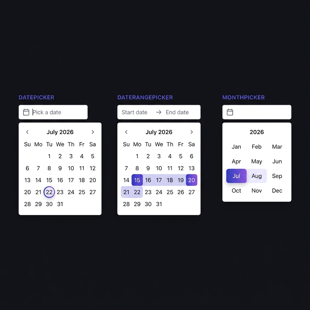
Installation
The package can be installed via npm:
npm install @aravind13/datepicker lucide-reactOr via yarn:
yarn add @aravind13/datepicker lucide-reactNote: react (>=16.8.0), react-dom (>=16.8.0), and lucide-react (>=0.300.0) are peer dependencies.
CDN / Direct Usage (One-Line Import)
For simple setups, prototyping, or direct HTML usage, you can drop the compiled CSS and JavaScript directly into your HTML using the UNPKG CDN:
<!-- Stylesheet -->
<link rel="stylesheet" href="https://unpkg.com/@aravind13/datepicker/dist/style.css" />

<!-- UMD Script (Exposes global window.Aravind13DatePicker) -->
<script src="https://unpkg.com/@aravind13/datepicker/dist/index.umd.js"></script>
Security & Reliability
- Zero Runtime Dependencies: Built entirely from scratch without loading heavy or risky third-party date engines (like
moment,date-fns, ordayjs), making your app completely immune to external dependency supply-chain attacks. - Strict Package Contents: Sensitive files like local tests, configurations, or credentials are explicitly excluded from the npm package bundle to guarantee zero credential leak risks.
- Regular Audit & Scan: Fully audited and verified clean of any known security vulnerabilities.
Quick Start
Import the stylesheet from this package in your application:
import '@aravind13/datepicker/dist/style.css'Below is an example of how to use the components in a React view:
import React, { useState } from 'react'
import { DatePicker, DateRangePicker, MonthPicker } from '@aravind13/datepicker'

const Example = () => {
  const [date, setDate] = useState('')
  const [range, setRange] = useState({ start: '', end: '' })
  const [month, setMonth] = useState('')

  return (
    <div>
      <DatePicker value={date} onChange={setDate} />
      <DateRangePicker value={range} onChange={setRange} />
      <MonthPicker value={month} onChange={setMonth} />
    </div>
  )
}

export default Example
API Reference
DatePicker
Single date selector accepting and returning dates in DD-MM-YYYY format.
| Prop | Type | Default | Description |
|---|---|---|---|
| value | string | '' | Selected date string (DD-MM-YYYY). |
| onChange | (str: string) => void | | Callback function triggered when a date is selected. |
| placeholder | string | 'Pick a date' | Input placeholder text. |
| className | string | '' | Additional class names for container element. |
| align | 'left' \| 'right' | 'left' | Popup dropdown alignment. |
| minDate | string | | Minimum selectable date (DD-MM-YYYY). |
| maxDate | string | | Maximum selectable date (DD-MM-YYYY). |
<DatePicker
  value={date}
  onChange={setDate}
  minDate="01-01-2024"
  maxDate="31-12-2026"
/>
DateRangePicker
Two-click range selector with hover preview and range highlighting.
| Prop | Type | Default | Description |
|---|---|---|---|
| value | { start: string, end: string } | { start: '', end: '' } | Selected range (DD-MM-YYYY). |
| onChange | ({ start, end }: { start: string, end: string }) => void | | Callback function triggered when range changes. |
| placeholder | { start: string, end: string } | { start: 'Start date', end: 'End date' } | Placeholder text for start and end inputs. |
| className | string | '' | Additional class names for container element. |
| align | 'left' \| 'right' | 'left' | Popup dropdown alignment. |
<DateRangePicker
  value={range}
  onChange={setRange}
/>
MonthPicker
Month and year selector accepting and returning strings in MM-YYYY format.
| Prop | Type | Default | Description |
|---|---|---|---|
| value | string | '' | Selected month string (MM-YYYY). |
| onChange | (str: string) => void | | Callback function triggered when month is selected. |
| placeholder | string | 'Pick a month' | Input placeholder text. |
| className | string | '' | Additional class names for container element. |
| align | 'left' \| 'right' | 'left' | Popup dropdown alignment. |
| minYear | number | 1900 | Minimum selectable year. |
| maxYear | number | 2100 | Maximum selectable year. |
<MonthPicker
  value={month}
  onChange={setMonth}
/>
Theming
Components use CSS custom properties for styling. Define or override --dp-* variables in your CSS:
:root {
  --dp-bg-trigger: #ffffff;
  --dp-bg-surface: #ffffff;
  --dp-bg-elevated: #f1f5f9;

  --dp-border: #e2e8f0;
  --dp-border-focus: #6366f1;
  --dp-border-radius: 10px;
  --dp-border-radius-sm: 6px;

  --dp-text-primary: #1e293b;
  --dp-text-secondary: #64748b;
  --dp-text-muted: #94a3b8;

  --dp-primary: #6366f1;
  --dp-primary-gradient: linear-gradient(135deg, #6366f1, #8b5cf6);
  --dp-primary-text: #ffffff;

  --dp-range-bg: #eef2ff;
  --dp-range-text: #4338ca;

  --dp-shadow: 0 8px 32px rgba(99, 102, 241, 0.12);
  --dp-width: 288px;
  --dp-font-family: 'Inter', system-ui, sans-serif;
}
Dark Mode
Set data-theme="dark" on the <html> element or add class .dp-dark to a parent container:
<html data-theme="dark">Utility Functions
Exported date utility functions:
import {
  parseDate,
  formatDate,
  getTodayFormatted,
  toInputDate,
  fromInputDate,
  parseMonthYear,
  formatMonthYear,
  isSameDay,
  isBetween
} from '@aravind13/datepicker'
| Function | Description |
|---|---|
| parseDate(str) | Parses DD-MM-YYYY string into a JS Date object or null. |
| formatDate(date) | Formats a JS Date object into DD-MM-YYYY. |
| getTodayFormatted() | Returns today's date formatted as DD-MM-YYYY. |
| toInputDate(str) | Converts DD-MM-YYYY to YYYY-MM-DD for HTML <input type="date">. |
| fromInputDate(str) | Converts YYYY-MM-DD to DD-MM-YYYY. |
| parseMonthYear(str) | Parses MM-YYYY into { month, year } or null. |
| formatMonthYear(month, year) | Formats month and year into MM-YYYY. |
| isSameDay(a, b) | Returns boolean indicating if two DD-MM-YYYY dates match. |
| isBetween(date, start, end) | Returns boolean indicating if JS Date falls between start and end. |
Development
npm run dev
npm run build
License
MIT