
@arisbh/svelte-mosaic
v1.1.3
Published
A responsive, draggable and resizable grid layout for Svelte 5. Full TypeScript, runes API, keyboard a11y, programmatic control, and more.

Maintainers
 arisbh
Readme
svelte-mosaic
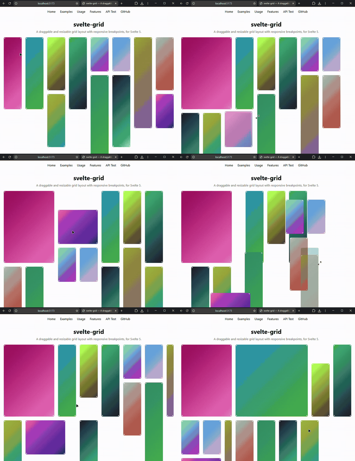
A responsive, draggable and resizable grid layout for Svelte 5, with full TypeScript support, keyboard accessibility, and a programmatic control API.
Based on vaheqelyan/svelte-grid (MIT). Svelte 5 migration, TypeScript rewrite, SvelteKit demo, and extended features by AristideBH.
v1 (formerly v6) is a breaking change from the original. See the migration guide below.
Features
- Svelte 5 runes API —
$state,$derived, snippets - Full TypeScript — exported types for all props and events
- Draggable and resizable widgets
- Fixed / static widgets
- Responsive breakpoints via
colsdefinition - Configurable gap between items
- Custom drag and resize handles
- Soft autoscroll during drag
- Fill-space mode
- Layout serializable as plain JSON
- No jQuery, no 3rd-party runtime dependencies
- Auto-height 1-D lists —
rowHeight="auto"for vertical sortable lists where each row sizes to its content - Auto-width 1-D lists —
colWidth="auto"for horizontal sortable lists where each item sizes to its content width - Fixed column width —
colWidth={number}for shrink-to-fit grid columns
Installation
npm i @arisbh/svelte-mosaicBasic Usage
<script lang="ts">
  import Grid from '@arisbh/svelte-mosaic';
  import { gridHelp } from '@arisbh/svelte-mosaic/helper';
  import type { GridItem, ColsDefinition } from '@arisbh/svelte-mosaic';

  const cols: ColsDefinition = [[1100, 12], [768, 6], [0, 3]];

  let items = $state<GridItem[]>([
    {
      id: '1',
      data: 'Widget 1',
      12: gridHelp.item({ x: 0, y: 0, w: 2, h: 2 }),
      6:  gridHelp.item({ x: 0, y: 0, w: 3, h: 2 }),
      3:  gridHelp.item({ x: 0, y: 0, w: 3, h: 2 }),
    },
    {
      id: '2',
      data: 'Widget 2',
      12: gridHelp.item({ x: 2, y: 0, w: 4, h: 3 }),
      6:  gridHelp.item({ x: 0, y: 2, w: 6, h: 3 }),
      3:  gridHelp.item({ x: 0, y: 2, w: 3, h: 3 }),
    },
  ]);
</script>

<Grid bind:items {cols} rowHeight={80} onchange={({ unsafeItem }) => console.log(unsafeItem)}>
  {#snippet children({ movePointerDown, dataItem, item })}
    <div onpointerdown={movePointerDown} style="height: 100%; padding: 12px;">
      <strong>{dataItem.data}</strong>
      <small>{item.w}×{item.h}</small>
    </div>
  {/snippet}
</Grid>
Grid Props
| Prop | Type | Default | Description |
|---|---|---|---|
| items | GridItem[] | required | Array of grid items. Use bind:items for two-way binding. |
| cols | ColsDefinition | required | Breakpoints: [[maxWidth, cols], ...] |
| rowHeight | number \| "auto" | required | Row height in px, or "auto" for content-driven height in a 1-D vertical list |
| colWidth | number \| "auto" | — | Column width in px (shrinks-to-fit), or "auto" for content-driven width in a 1-D horizontal list |
| gap | [number, number] | [10, 10] | [gapX, gapY] in pixels |
| fillSpace | boolean | false | Items rearrange around the active item during drag |
| fastStart | boolean | false | Hide grid until layout is computed on mount |
| throttleUpdate | number | 100 | Throttle (ms) for container resize recalculation |
| throttleResize | number | 100 | Throttle (ms) for matrix recalc during drag/resize |
| sensor | number | 20 | Autoscroll proximity sensor in pixels |
| scroller | HTMLElement | document.documentElement | Custom scroll container element |
| readOnly | boolean | false | Globally disable all drag and resize interactions |
| rows | number | 0 | Minimum number of visible rows (also the boundary for bounds) |
| bounds | boolean | false | Prevent items from being moved or resized past the rows limit |
| controller | GridController | — | Programmatic controller. Use bind:controller to access it |
| autoCompress | boolean | false | Automatically compact items upward on every external items change |
| compact | boolean | false | Compact items upward after every drag/resize |
| collision | "push"\|"none"\|"compress" | "push" | Collision mode: push others away, allow overlap, or push + compact |
| unstyled | boolean | false | Strip all cosmetic defaults (shadow, cursor, focus-ring) — ideal for Tailwind/shadcn theming |
Event Callbacks
| Prop | Payload | Description |
|---|---|---|
| onmount | { cols, xPerPx, yPerPx } | Fired once when the grid initialises and measures its container |
| onresize | { cols, xPerPx, yPerPx, width } | Fired when the container changes width |
| onchange | { unsafeItem, id, cols } | Fired continuously while dragging or resizing |
| onpointerup | { id, cols } | Fired when a drag or resize ends |
| ondragstart | { id, cols } | Fired when a drag begins |
| onresizestart | { id, cols } | Fired when a resize begins |
| onexternaldrop | { x, y, w, h, cols, data } | Fired when an external draggable is dropped onto the grid |
Snippet Parameters
The children snippet receives a single object:
| Parameter | Type | Description |
|---|---|---|
| movePointerDown | (e: PointerEvent) => void | Attach to your drag handle's onpointerdown |
| resizePointerDown | (e: PointerEvent) => void | Attach to a custom resize handle when customResizer: true |
| dataItem | GridItem | Full item object (all breakpoints + your data) |
| item | BreakpointItem | Item config for the active breakpoint |
| index | number | Index in the items array |
Item Data Structure
Each item in the items array is a GridItem:
interface GridItem<TData = unknown> {
  id: string;                          // unique identifier
  data?: TData;                        // your custom payload
  [cols: number]: BreakpointItem;      // layout config per column count
}

interface BreakpointItem {
  x: number;                  // column position (0-based)
  y: number;                  // row position (0-based)
  w: number;                  // width in columns
  h: number;                  // height in rows
  draggable?: boolean;        // default: true
  resizable?: boolean;        // default: true
  fixed?: boolean;            // prevent all interaction
  customDragger?: boolean;    // use your own drag handle
  customResizer?: boolean;    // use your own resize handle
  min?: { w?: number; h?: number };
  max?: { w?: number; h?: number; y?: number };
}
Helper Functions
import { gridHelp } from '@arisbh/svelte-mosaic/helper';| Function | Description |
|---|---|
| gridHelp.item(obj) | Create a BreakpointItem with defaults filled in |
| gridHelp.normalize(items, col) | Remove overlapping items at a given column count |
| gridHelp.adjust(items, col) | Pack items tightly (fill empty spaces) |
| gridHelp.compact(items, col) | Compact items upward (alias for compactY) |
| gridHelp.findSpace(item, items, cols) | Find the first free {x, y} position for an item |
| gridHelp.gridToPixel(item, xPerPx, yPerPx, gapX, gapY) | Convert grid coords to pixel rect |
| gridHelp.pixelToGrid(px, xPerPx, yPerPx, gapX, gapY) | Convert pixel rect to grid coords |
GridController
GridController provides a programmatic API for reading and mutating the grid without touching items directly. Obtain an instance with bind:controller:
<script lang="ts">
  import Grid, { GridController } from '@arisbh/svelte-mosaic';

  let controller = $state<GridController | undefined>(undefined);
</script>

<Grid bind:items {cols} {rowHeight} bind:controller>...</Grid>

<button onclick={() => controller?.addItem({ w: 2, h: 2, data: 'New' })}>Add</button>
<button onclick={() => controller?.compress()}>Compress</button>
| Method | Returns | Description |
|---|---|---|
| addItem(input) | void | Add a new item; auto-places it if x/y are omitted |
| compress() | void | Compact all items upward, removing gaps |
| getFirstAvailablePosition(w, h) | {x, y} \| null | Find the first free grid cell that fits w×h |
Responsive Breakpoints
cols is an array of [maxContainerWidth, columnCount] tuples, sorted descending:
const cols: ColsDefinition = [
  [1400, 12],  // ≤ 1400px wide → 12 columns
  [900,   6],  // ≤  900px wide →  6 columns
  [0,     3],  // any smaller  →  3 columns
];
Each item object has a key for every column count it should support:
{
  id: '1',
  12: gridHelp.item({ x: 0, y: 0, w: 4, h: 2 }),
   6: gridHelp.item({ x: 0, y: 0, w: 3, h: 2 }),
   3: gridHelp.item({ x: 0, y: 0, w: 3, h: 3 }),
}
Items without a breakpoint definition automatically inherit from the closest defined one.
Custom Drag Handle
Set customDragger: true on the item's breakpoint config, then attach movePointerDown to your handle:
<Grid bind:items {cols} rowHeight={80}>
  {#snippet children({ movePointerDown, dataItem, item })}
    <div style="height: 100%;">
      {#if item.customDragger}
        <div class="handle" onpointerdown={movePointerDown}>⠿ drag</div>
      {/if}
      <p>{dataItem.data}</p>
    </div>
  {/snippet}
</Grid>
CSS Custom Properties
All visual tokens are exposed as CSS custom properties. Override them on .svlt-grid-container (or any ancestor):
/* Plain CSS */
:global(.svlt-grid-container) {
  --svlt-handle-corner: 24px;   /* corner resize handle size */
  --svlt-handle-edge:   10px;   /* edge resize handle thickness */
  --svlt-shadow-bg:     rgba(99, 102, 241, 0.2);
  --svlt-shadow-radius: 6px;
  --svlt-active-opacity: 0.6;
  --svlt-cursor-grab:    grab;
  --svlt-cursor-grabbing: grabbing;
  --svlt-focus-ring:     #4a90e2;
  --svlt-handle-color:   rgba(0, 0, 0, 0.4);
}
Tailwind / shadcn-svelte — set unstyled={true} on the Grid to remove all opinionated cosmetic defaults, then style with Tailwind utilities or map shadcn tokens:
/* globals.css — map shadcn tokens to svelte-grid variables */
:root {
  --svlt-shadow-bg:     hsl(var(--muted));
  --svlt-shadow-radius: var(--radius);
  --svlt-focus-ring:    hsl(var(--ring));
  --svlt-handle-color:  hsl(var(--muted-foreground));
}
Svelte Context
Any component rendered inside a Grid snippet can call getGridContext() to access live grid metrics without extra prop-drilling:
<script>
  import { getGridContext } from '@arisbh/svelte-mosaic';
  const grid = getGridContext(); // returns undefined outside a Grid
</script>

<p>Column width: {grid?.xPerPx()}px — {grid?.cols()} cols</p>
<p>Read-only: {grid?.readOnly()}</p>
| Property | Type | Description |
|---|---|---|
| xPerPx() | number | Pixels per column |
| yPerPx() | number | Pixels per row (rowHeight) |
| cols() | number | Active column count |
| gapX() / gapY() | number | Gap in pixels |
| readOnly() | boolean | Current readOnly state |
| collision() | string | Current collision mode |
Styling
Use :global(...) to style internal elements:
<style>
  :global(.svlt-grid-shadow)        { background: rgba(0,0,0,0.12); border-radius: 6px; }
  :global(.svlt-grid-container)     { background: #f5f5f5; }
  :global(.svlt-grid-resizer::after){ border-color: white !important; }
  :global(.svlt-grid-active)        { opacity: 0.8; }
</style>
| Class | Element |
|---|---|
| .svlt-grid-container | Outer container div |
| .svlt-grid-item | Wrapper around each item |
| .svlt-grid-shadow | Drop-target indicator during drag/resize |
| .svlt-grid-resizer | Built-in resize handle (bottom-right corner) |
| .svlt-grid-active | Item currently being dragged or resized |
TypeScript
All types are exported from the main entry point:
import type {
  GridItem, BreakpointItem, ColsDefinition, Gap, SnippetArgs,
  ResizeDir, ExternalDropEvent, CollisionBehavior,
  GridControllerInterface, NewItemInput, PixelRect, GridRect,
} from '@arisbh/svelte-mosaic';

import { getGridContext, type GridContext } from '@arisbh/svelte-mosaic';
1-D Auto Lists
Vertical — rowHeight="auto"
Each row sizes to its own content height. Useful for sortable lists with variable-height cards, wrapping text, or dynamic content. Resize handles are disabled (height is content-owned); drag reorders by midpoint swap.
<script lang="ts">
  import Grid, { gridHelp } from '@arisbh/svelte-mosaic';

  const COLS = 1;
  const cols = [[9999, COLS]];

  let items = $state([
    { id: '1', data: 'Short', [COLS]: gridHelp.item({ x: 0, y: 0, w: 1, h: 1 }) },
    { id: '2', data: 'A much longer item with wrapping text…', [COLS]: gridHelp.item({ x: 0, y: 1, w: 1, h: 1 }) },
  ]);
</script>

<Grid bind:items {cols} rowHeight="auto" gap={[0, 8]} fastStart>
  {#snippet children({ dataItem, movePointerDown })}
    <div onpointerdown={movePointerDown}>{dataItem.data}</div>
  {/snippet}
</Grid>
Constraints: 1-D (single column) only. Item
y= order index.autoCompressis supported.
Horizontal — colWidth="auto"
Each item sizes to its own content width. Useful for tag lists, nav bars, and chip rows. Container shrinks to fit total content width.
<script lang="ts">
  import Grid, { gridHelp } from '@arisbh/svelte-mosaic';

  const COLS = 4;
  const cols = [[9999, COLS]];

  let items = $state([
    { id: '1', data: 'Home',     [COLS]: gridHelp.item({ x: 0, y: 0, w: 1, h: 1 }) },
    { id: '2', data: 'About',    [COLS]: gridHelp.item({ x: 1, y: 0, w: 1, h: 1 }) },
    { id: '3', data: 'Services', [COLS]: gridHelp.item({ x: 2, y: 0, w: 1, h: 1 }) },
    { id: '4', data: 'Contact',  [COLS]: gridHelp.item({ x: 3, y: 0, w: 1, h: 1 }) },
  ]);
</script>

<Grid bind:items {cols} rowHeight={48} colWidth="auto" gap={[8, 0]} fastStart>
  {#snippet children({ dataItem, movePointerDown })}
    <div onpointerdown={movePointerDown}>{dataItem.data}</div>
  {/snippet}
</Grid>
Constraints: 1-D (single row) only. Item
x= order index.colsmust match the number of items.
Migration from svelte-grid v5
| v5 (Svelte 3) | v6 (Svelte 5) |
|---|---|
| on:change={handler} | onchange={handler} |
| on:mount={handler} | onmount={handler} |
| on:resize={handler} | onresize={handler} |
| on:pointerup={handler} | onpointerup={handler} |
| let:item let:index let:movePointerDown ... | {#snippet children({ item, index, movePointerDown, ... })} |
| import gridHelp from 'svelte-grid/build/helper' | import { gridHelp } from '@arisbh/svelte-mosaic/helper' |
| export let items (implicit bind) | bind:items (explicit two-way binding) |
License
MIT © Vahe Araqelyan (original library)
MIT © AristideBH (Svelte 5 migration & new features)