
@asafarim/booking-calendar
v0.5.4
Published
Google Calendar-style booking UI for FreelanceToolkit.Api

Maintainers
 asafarim.be
Readme
@asafarim/booking-calendar
Google Calendar-style booking UI for React, built with TypeScript, Vite, and ASafariM design tokens.

Current release: 0.5.4
Live demo · How to install and use · Changelog and roadmap
What it provides
@asafarim/booking-calendar is a responsive calendar component for displaying and managing bookings in month, week, and day views. It provides the calendar UI while your application owns the data and backend operations through async callbacks.
- Month, week, and day views
- Create, edit, and delete booking workflows
- Jump-to-Date navigation with year, month, and mini-calendar selection
- Drag-to-move and drag-to-resize interactions
- Pending, confirmed, cancelled, completed, and no-show statuses
- Delivery status indicators
- Client and meeting details
- Availability and backend callback types
- Responsive mobile layout and sheet-style dialogs
- Light and dark theme support through
@asafarim/design-tokens - Keyboard-accessible controls and semantic dialog structure
- TypeScript types and Vite-compatible ESM output
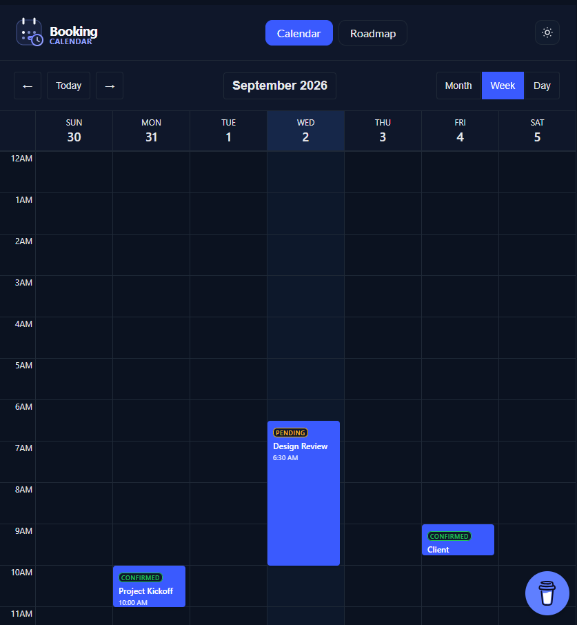
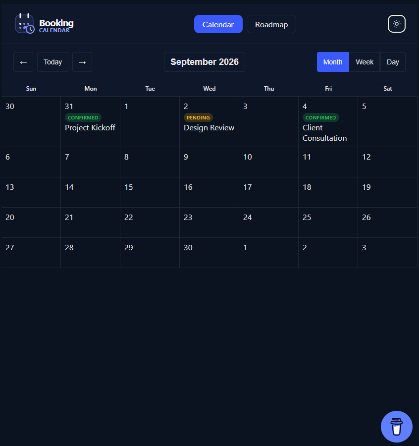
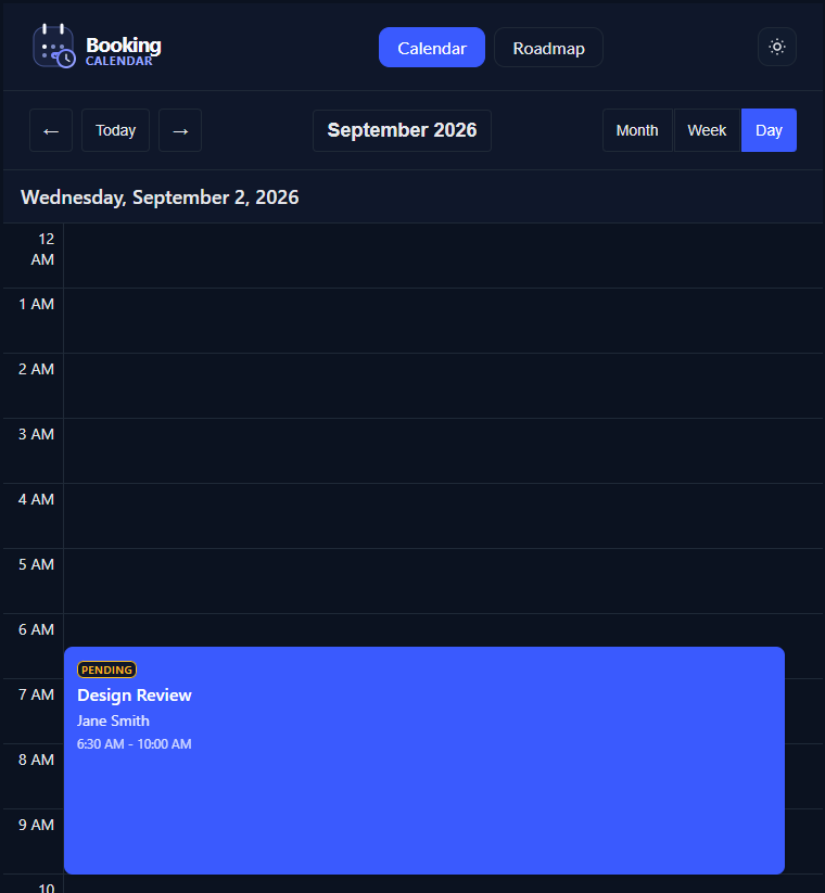
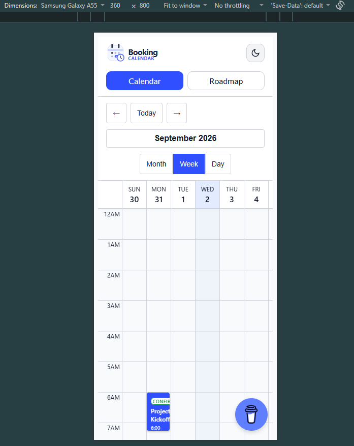
Demo and screenshots
The demo contains an interactive Calendar page and a Roadmap page with release notes, search, category filters, pagination, and theme switching.
Open the live demo to try the interactions.
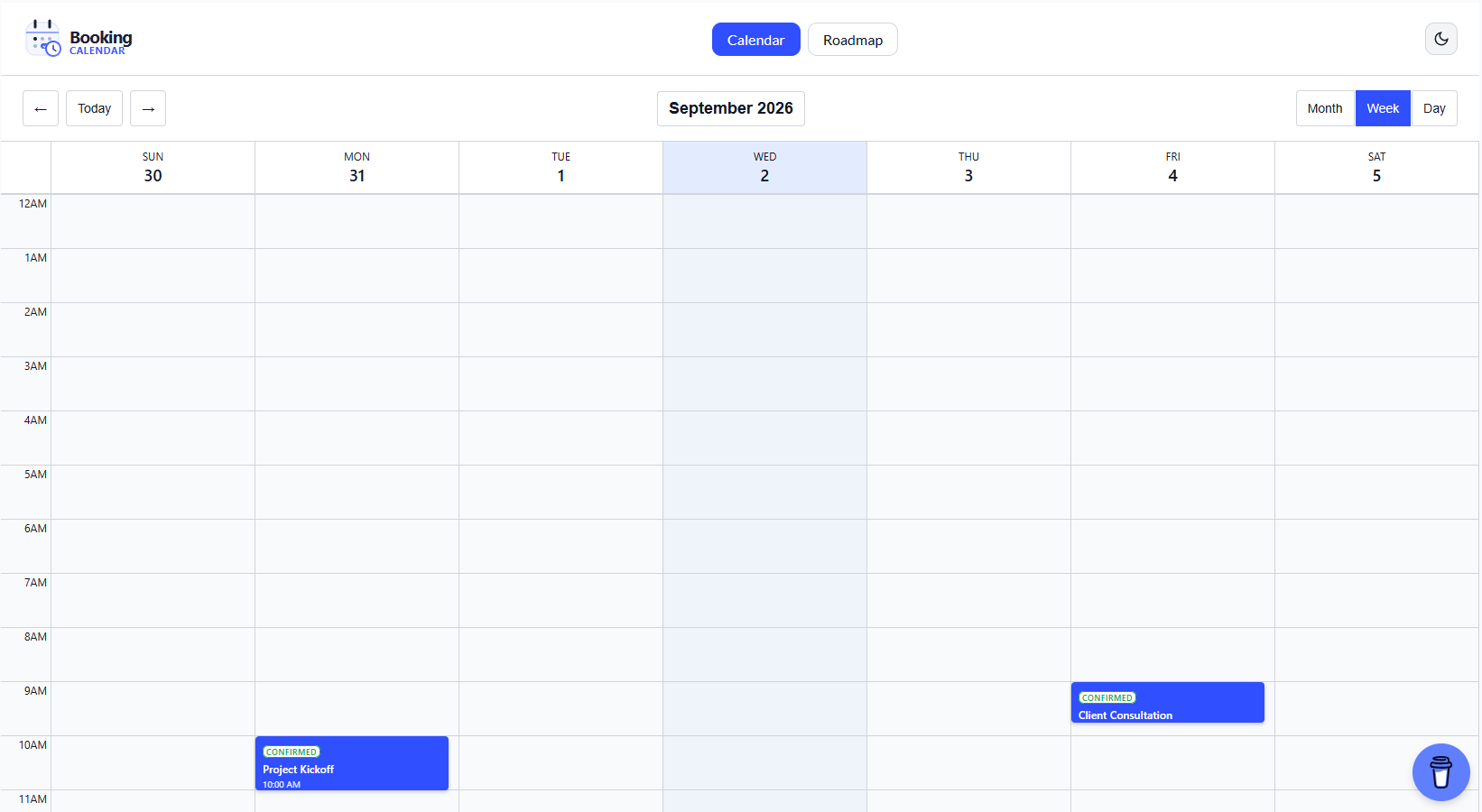
Desktop week view
Desktop month view
Desktop day view
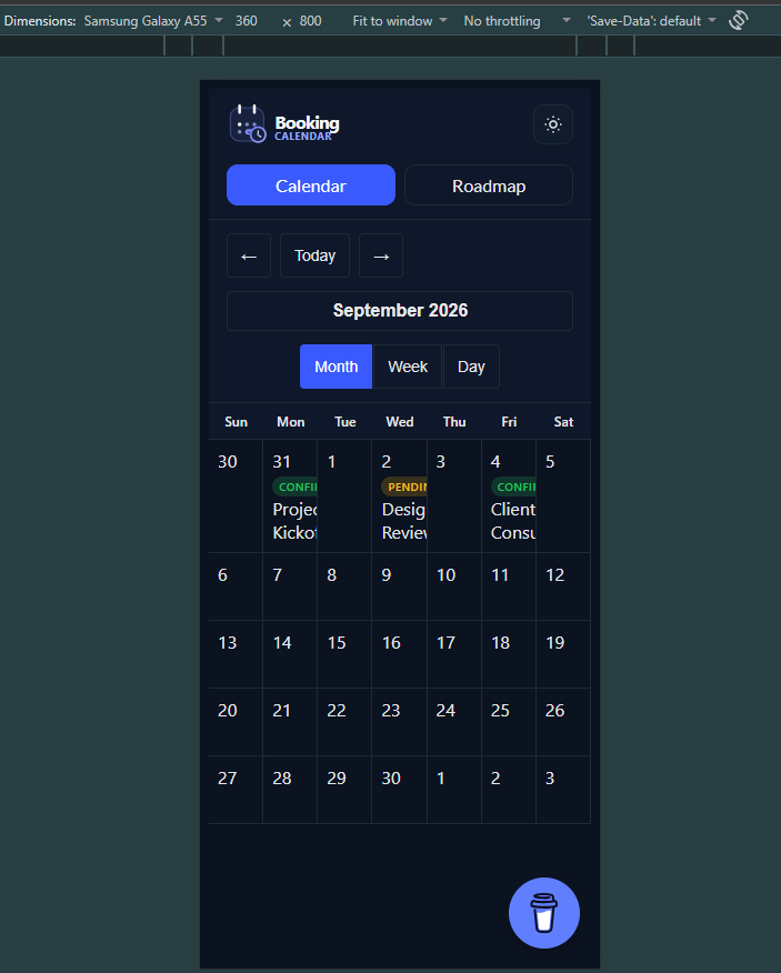
Mobile week view
Mobile dark theme
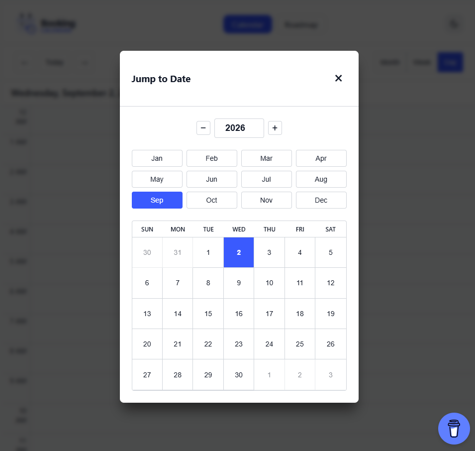
Jump-to-Date modal
Click the month/year button in the calendar header to open the date navigation dialog.
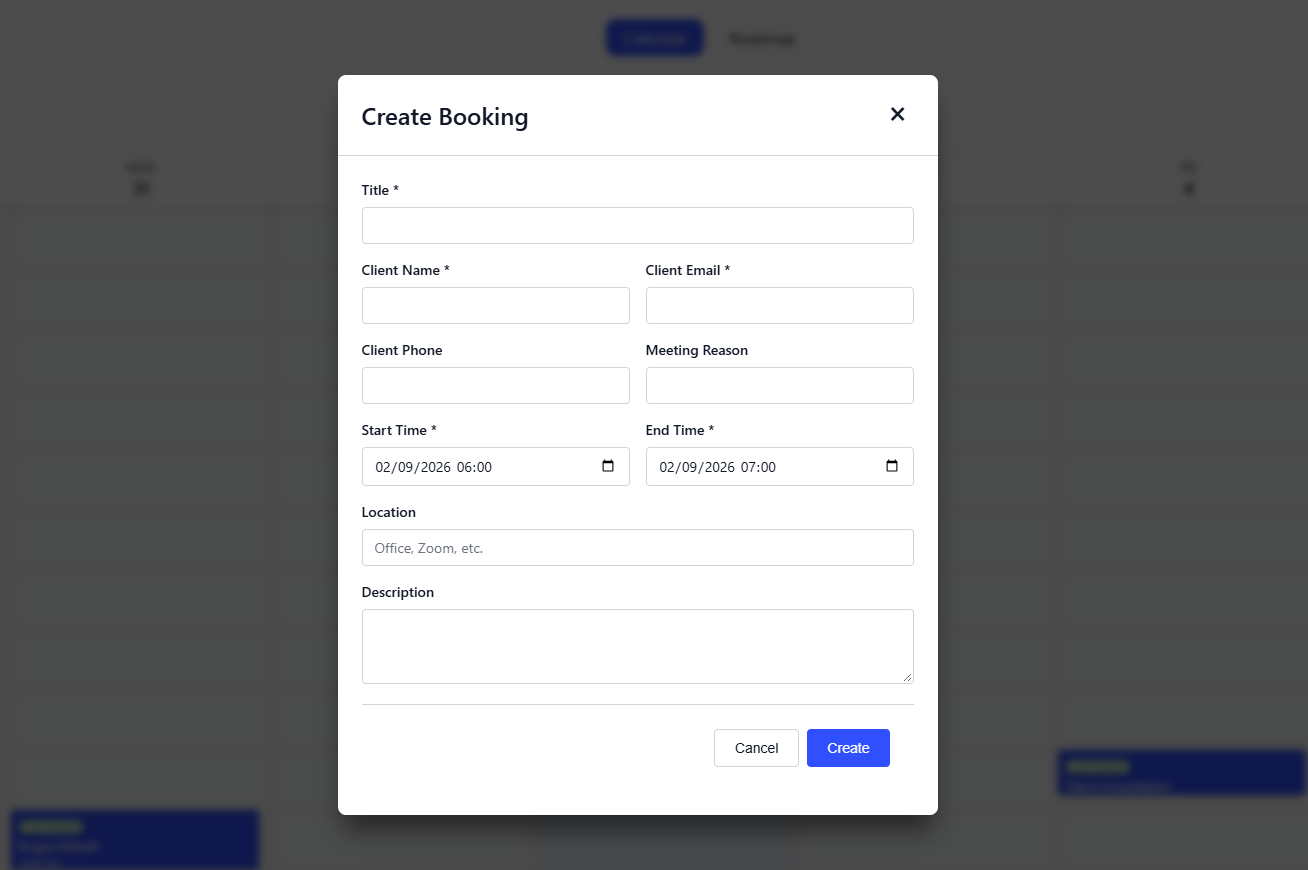
Create / update booking dialog
Open a slot or click an existing booking to open the form dialog. The same dialog handles both creating new bookings and editing existing ones, with client details, status, and scheduling fields.
Calendar overview
Installation
npm install @asafarim/booking-calendarpnpm add @asafarim/booking-calendarQuick start
import { useState } from 'react';
import { BookingCalendar, type BookingEvent } from '@asafarim/booking-calendar';
import '@asafarim/booking-calendar/styles';
import '@asafarim/design-tokens/css';

export function CalendarPage() {
  const [bookings, setBookings] = useState<BookingEvent[]>([]);

  return (
    <BookingCalendar
      bookings={bookings}
      onCreateBooking={async booking => {
        const response = await fetch('/api/calendar/bookings', {
          method: 'POST',
          headers: { 'Content-Type': 'application/json' },
          body: JSON.stringify(booking),
        });
        const created = await response.json() as BookingEvent;
        setBookings(current => [...current, created]);
      }}
      initialView="week"
    />
  );
}
API integration
The calendar is controlled by your application. Pass async callbacks that call your backend and update the bookings state after each successful operation.
<BookingCalendar
  bookings={bookings}
  onCreateBooking={async booking => {
    const created = await api.create(booking);
    setBookings(current => [...current, created]);
  }}
  onUpdateBooking={async (id, booking) => {
    const updated = await api.update(id, booking);
    setBookings(current => current.map(item => item.id === id ? updated : item));
  }}
  onDeleteBooking={async id => {
    await api.remove(id);
    setBookings(current => current.filter(item => item.id !== id));
  }}
/>
The repository demo includes a typed fetch client in demo/backendApi.ts with methods for:
load()— fetch bookingscreate(booking)— create a bookingupdate(id, booking)— update a bookingremove(id)— delete a bookingcheckAvailability(booking)— check a requested time range
Suggested endpoints:
GET    /api/calendar/bookings
POST   /api/calendar/bookings
PUT    /api/calendar/bookings/{id}
DELETE /api/calendar/bookings/{id}
POST   /api/calendar/bookings/check-availability
Component props
| Prop | Type | Required | Description |
| --- | --- | --- | --- |
| bookings | BookingEvent[] | Yes | Bookings displayed by the calendar |
| onCreateBooking | (booking: CreateBookingDto) => Promise<void> | No | Called when a booking is created |
| onUpdateBooking | (id: string, booking: UpdateBookingDto) => Promise<void> | No | Called when a booking is updated |
| onDeleteBooking | (id: string) => Promise<void> | No | Called when a booking is deleted |
| onRescheduleBooking | (id: string, dto: RescheduleBookingDto) => Promise<void> | No | Rescheduling callback type |
| onCheckAvailability | (dto: AvailabilityRequest) => Promise<AvailabilityResponse> | No | Availability callback type |
| onSendConfirmation | (id: string) => Promise<void> | No | Sends a booking confirmation |
| initialView | 'month' \| 'week' \| 'day' | No | Defaults to week |
| initialDate | Date | No | Defaults to the current date |
| className | string | No | Additional calendar class name |
Booking type
interface BookingEvent {
  id: string;
  title: string;
  description?: string;
  startTime: Date;
  endTime: Date;
  durationMinutes: number;
  status: 'Pending' | 'Confirmed' | 'Cancelled' | 'Completed' | 'NoShow';
  meetingLink?: string;
  location?: string;
  clientName: string;
  clientEmail: string;
  clientPhone?: string;
  meetingReason?: string;
  cancellationReason?: string;
  deliveryStatus?: 'Pending' | 'Sent' | 'Failed' | 'Retrying';
  retryCount: number;
  createdAt: Date;
  updatedAt: Date;
  clientId?: string;
}
Jump-to-Date navigation
The calendar header includes a clickable month/year button. It opens a modal with:
- Year increment and decrement controls
- A twelve-month selector
- A six-week mini calendar
- Keyboard and Escape-key support
Responsive behavior
The component is mobile-first:
- Small screens: compact controls, stacked form fields, and sheet-style modals
- Tablet screens: single-column modal form layout with comfortable controls
- Desktop screens: full calendar layout with side-by-side form fields
- Mobile week view: columns keep a readable minimum width and can scroll horizontally
The demo defaults to Day view on narrow screens so bookings remain readable. Desktop starts in Week view.
Styling and themes
Import the package styles and design tokens once in your application:
import '@asafarim/design-tokens/css';
import '@asafarim/booking-calendar/styles';
The component consumes @asafarim/design-tokens variables for colors, spacing, typography, motion, and radii. Set the active theme on the document root:
document.documentElement.dataset.theme = 'light';
document.documentElement.dataset.theme = 'dark';
Accessibility
- Semantic calendar and dialog markup
- ARIA labels on interactive controls
- Keyboard navigation and focus-visible states
- Escape-key dialog dismissal
- Native form controls and validation feedback
- Readable status and delivery indicators
Development
pnpm install
pnpm build
pnpm dev
The demo is served at /booking-calendar/ and includes dynamically generated sample bookings in the current week, so the initial view remains useful regardless of the month in which it is opened.
License
MIT © ASafariM