
@asafarim/simple-md-viewer
v1.5.2
Published
A professional markdown viewer with file tree navigation, directory content browsing, and advanced YAML front matter support
Maintainers
 asafarim.be
Readme
@asafarim/simple-md-viewer
A professional, responsive markdown viewer library for React applications that displays markdown files from a specified folder structure with an elegant file tree navigation and advanced YAML front matter support.
Click here to view Working Demo along with a how-to document to employ the package.
✨ Features
- 🎨 Modern UI with Theming: Built-in light/dark themes with glassmorphism effects and smooth animations
- 📱 Fully Responsive: Professional mobile-first design that works perfectly on all devices
- 🌳 Interactive File Tree: Collapsible folder navigation with persistent state and smooth transitions
- � Directory Content Browser: Advanced directory viewing with list, grid, and detailed table views including file sizes
- 📊 File Information Display: Real-time file sizes, modification dates, and comprehensive metadata
- �📖 Advanced Markdown Rendering: Complete GitHub Flavored Markdown support with tables, syntax highlighting, and custom styling
- 📄 YAML Front Matter Support: Professional front matter parsing and display with multiple modes and supporting Belgian date formatting
- 🚀 Zero Configuration: Works out of the box with minimal setup required
- 🔧 Highly Customizable: Flexible theming system and component composition
- 🎯 URL-based Navigation: Direct linking to specific markdown files with browser history support
- ⚡ High Performance: Built with React 18, Vite, and optimized for speed
- 🔗 Package Integration: Built-in support for npm package links and GitHub repository links
- 📐 Flexible Layout: Optional file tree hiding for full-width content display
- 🎛️ Minimalistic UI Options: Hide header and footer for clean embedding
- ♿ Accessibility: WCAG compliant with keyboard navigation and screen reader support
📄 What's New in v1.5.1
🔗 Customizable Package Links
Fully customizable package links in the header with comprehensive configuration options:
- Custom Package Name: Set your own npm package name for the header links
- Custom GitHub Path: Configure your own GitHub repository path
- Custom Demo URL: Set a custom demo site URL
- Toggle Visibility: Show or hide the package links section entirely
- Default Fallbacks: Sensible defaults if partial configuration is provided
// Example usage with custom package links
<MarkdownContent
  apiBaseUrl="http://localhost:3300"
  packageLinks={{
    packageName: "your-app-or-package-name",
    githubPath: "your-github-repo",
    demoPath: "https://your-live-demo-site.com",
    show: true  // Set to false to hide package links
  }}
/>
📄 What's New in v1.5.0
📂 Enhanced Directory Browsing
Professional directory content viewing with comprehensive file information:
- Multiple View Styles: Switch between list, grid, and detailed table views
- File Size Display: Real-time calculation and display of file and folder sizes
- Sorting & Filtering: Sort by name, type, size, or modification date with search filtering
- Responsive Design: Optimized layouts for desktop and mobile devices
- Breadcrumb Navigation: Easy navigation through directory hierarchies
- Loading States: Smooth loading indicators while fetching directory details
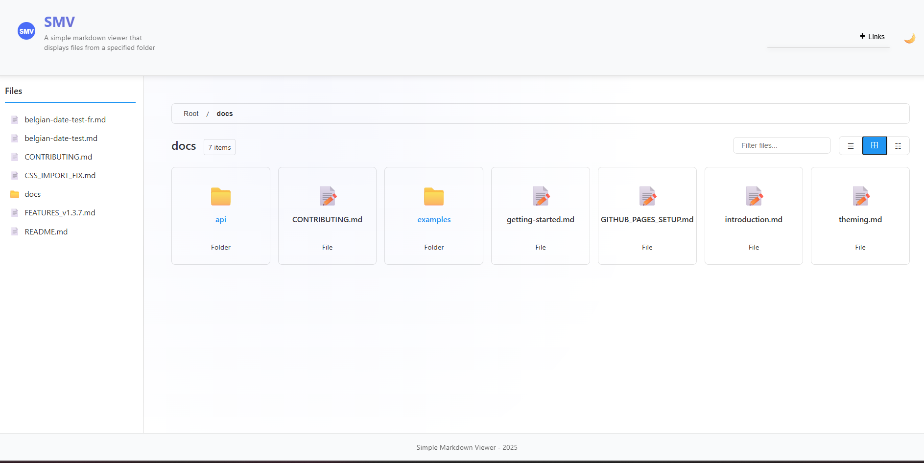 Desktop directory view showing grid and detailed table layouts
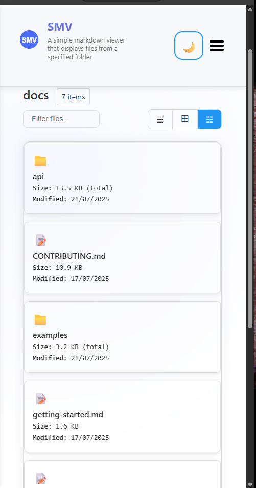 Mobile-optimized directory view with touch-friendly interface
Directory View Features
- List View: Clean, compact file listing with icons
- Grid View: Visual grid layout with larger icons and file types
- Detailed View: Comprehensive table with file sizes, modification dates, and metadata
- Smart Sorting: Intelligent sorting with folders prioritized over files
- Real-time Search: Instant filtering of directory contents
- Size Calculation: Automatic calculation of folder sizes and file counts
📄 What's New in v1.4.0
🎯 YAML Front Matter Support
Professional YAML front matter parsing and display with comprehensive metadata support:
- Multiple Display Modes: Choose from
full,minimal,header-only, orhiddendisplay modes - Rich Metadata Support: Title, description, author, dates, categories, tags, keywords, and more
- International Date Formatting: Built-in support for Belgian date formats (
nl-BE,fr-BE) - Navigation Integration: Automatic breadcrumbs and related page links from front matter
- Professional Styling: Clean, organized display with theme-aware styling
- GitHub Flavored Markdown: Enhanced table support and complete GFM compatibility
Example Front Matter
---
title: "API Documentation"
description: "Complete API reference guide"
author: "Your Name"
lastModified: "2025-01-20"
locale: "nl-BE"  # Belgian Dutch date formatting
category: "Documentation"
tags:
  - api
  - reference
breadcrumbs:
  - name: "Home"
    path: "/"
  - name: "API"
    path: "/api"
---
This will be beautifully rendered with proper styling, showing formatted dates, organized metadata, and navigation elements.
🎪 Live Demo
Experience the viewer in action: Live Demo
Demo Repository
Check out our Demo Repository for complete examples of how to integrate and use the Simple Markdown Viewer in your projects. This repository contains working examples with different configuration options and implementation patterns.
📦 Installation
npm install @asafarim/simple-md-viewerImport Styles
The package requires CSS styles to be imported. Choose one of these methods:
// Method 1: Import from dist (recommended)
import '@asafarim/simple-md-viewer/dist/style.css';

// Method 2: Alternative import path
import '@asafarim/simple-md-viewer/style.css';
TypeScript Support
If you encounter TypeScript errors with CSS imports, add this to your project's type declarations:
// In your global.d.ts or vite-env.d.ts
declare module '@asafarim/simple-md-viewer/dist/style.css';
declare module '@asafarim/simple-md-viewer/style.css';
🚀 Quick Start
Option 1: Complete Markdown Viewer (Recommended)
The easiest way to get started - includes everything you need:
import React, { useState, useEffect } from 'react';
import { HashRouter } from 'react-router-dom';
import { MarkdownContent, ThemeProvider } from '@asafarim/simple-md-viewer';
import '@asafarim/simple-md-viewer/dist/style.css';

function App() {
  const [theme, setTheme] = useState(() => {
    // Check localStorage for saved theme preference
    const savedTheme = localStorage.getItem('smv-theme');
    return savedTheme || 'light';
  });

  const toggleTheme = () => {
    setTheme(prevTheme => {
      const newTheme = prevTheme === 'light' ? 'dark' : 'light';
      localStorage.setItem('smv-theme', newTheme);
      return newTheme;
    });
  };

  // Apply theme to document root for global styling
  useEffect(() => {
    document.documentElement.setAttribute('data-theme', theme);
  }, [theme]);

  return (
    <ThemeProvider theme={theme} toggleTheme={toggleTheme}>
      <div className={`app ${theme}`}>
        <HashRouter>
          <MarkdownContent
            apiBaseUrl="http://localhost:3300"
            showHomePage={true}
            hideFileTree={false}
            packageLinks={{
              packageName: "@asafarim/simple-md-viewer",
              githubPath: "simple-md-viewer",
              demoPath: "https://alisafari-it.github.io/simple-md-viewer/#/README.md",
              show: true
            }}
          />
        </HashRouter>
      </div>
    </ThemeProvider>
  );
}

export default App;
Option 2: Individual Components
For more control, use individual components:
import React, { useState, useEffect } from 'react';
import {
  MarkdownViewer,
  FileTree,
  ThemeProvider
} from '@asafarim/simple-md-viewer';
import '@asafarim/simple-md-viewer/dist/style.css';

function CustomApp() {
  const [content, setContent] = useState('# Hello World\nYour markdown here...');
  const [theme, setTheme] = useState(() => {
    return localStorage.getItem('smv-theme') || 'light';
  });

  const toggleTheme = () => {
    setTheme(prevTheme => {
      const newTheme = prevTheme === 'light' ? 'dark' : 'light';
      localStorage.setItem('smv-theme', newTheme);
      return newTheme;
    });
  };

  // Apply theme globally
  useEffect(() => {
    document.documentElement.setAttribute('data-theme', theme);
  }, [theme]);

  return (
    <ThemeProvider theme={theme} toggleTheme={toggleTheme}>
      <div className={`app ${theme}`}>
        <MarkdownViewer content={content} />
      </div>
    </ThemeProvider>
  );
}
Option 3: Full-Width Content Viewer (No File Tree)
Perfect for embedded documentation, single-document viewing, or mobile-optimized reading:
import React, { useState, useEffect } from 'react';
import { HashRouter } from 'react-router-dom';
import { MarkdownContent, ThemeProvider } from '@asafarim/simple-md-viewer';
import '@asafarim/simple-md-viewer/dist/style.css';

function FullWidthViewer() {
  const [theme, setTheme] = useState('light');

  return (
    <ThemeProvider theme={theme} toggleTheme={() => setTheme(theme === 'light' ? 'dark' : 'light')}>
      <div className="full-width-container">
        <HashRouter>
          <MarkdownContent
            apiBaseUrl="http://localhost:3300"
            showHomePage={true}
            hideFileTree={true}  // 🎯 This hides the file tree for full-width content
            packageLinks={{
              show: false  // 🎯 Hide package links for cleaner interface
            }}
          />
        </HashRouter>
      </div>
    </ThemeProvider>
  );
}
Perfect for:
- 📱 Mobile-first applications - Maximum content space
- 🎯 Single document focus - Remove navigation distractions
- 🔧 Embedded viewers - Integrate into existing dashboards
- 📖 Blog post display - Clean, distraction-free reading
- 🎪 Presentation mode - Full-screen document viewing
Option 4: Minimalistic Embedded Viewer
Perfect for embedding in other applications with minimal UI chrome:
import React from 'react';
import { HashRouter } from 'react-router-dom';
import { MarkdownContent, ThemeProvider } from '@asafarim/simple-md-viewer';
import '@asafarim/simple-md-viewer/dist/style.css';

function MinimalViewer() {
  return (
    <ThemeProvider theme="light">
      <div className="embedded-viewer">
        <HashRouter>
          <MarkdownContent
            apiBaseUrl="http://localhost:3300"
            showHomePage={false}
            hideFileTree={true}   // 🎯 Hide file tree for clean layout
            hideHeader={true}     // 🎯 Hide header for minimal chrome
            hideFooter={true}     // 🎯 Hide footer for clean integration
            packageLinks={{
              show: false  // 🎯 Hide package links (though header is already hidden)
            }}
          />
        </HashRouter>
      </div>
    </ThemeProvider>
  );
}
Perfect for:
- 🔗 API documentation widgets - Embed docs in admin panels
- 📱 Mobile apps - Ultra-clean content display
- 🎛️ Dashboard integration - Content without competing UI elements
- 📖 Help systems - Context-sensitive documentation
- 🎯 Content-only views - Maximum focus on the markdown content
📚 Usage Examples
Here are some common usage examples (also available in our Demo Repository): showcasing the advanced YAML front matter capabilities:
Full-Featured Documentation with Front Matter
import React, { useState, useEffect } from 'react';
import { HashRouter } from 'react-router-dom';
import { MarkdownContent, MarkdownViewer, ThemeProvider } from '@asafarim/simple-md-viewer';
import '@asafarim/simple-md-viewer/dist/style.css';

function DocumentationSite() {
  const [theme, setTheme] = useState('light');

  // Complete setup with all front matter features enabled
  return (
    <ThemeProvider theme={theme} toggleTheme={() => setTheme(theme === 'light' ? 'dark' : 'light')}>
      <div className={`app ${theme}`}>
        <HashRouter>
          <MarkdownContent
            apiBaseUrl="http://localhost:3300"
            showHomePage={true}
            hideFileTree={false}
            hideHeader={false}
            hideFooter={false}
            // Front matter is automatically handled by MarkdownViewer inside MarkdownContent
          />
        </HashRouter>
      </div>
    </ThemeProvider>
  );
}
Direct MarkdownViewer with Front Matter Control
import React from 'react';
import { MarkdownViewer, ThemeProvider } from '@asafarim/simple-md-viewer';
import '@asafarim/simple-md-viewer/dist/style.css';

function CustomDocumentViewer() {
  const markdownWithFrontMatter = `---
title: "Advanced API Documentation"
description: "Complete guide to our REST API with authentication, rate limiting, and examples"
author: "Dev Team"
lastModified: "2025-01-20"
version: "2.1.0"
locale: "nl-BE"  # Belgian Dutch formatting
category: "API Documentation"
section: "Backend"
order: 1
tags:
  - api
  - rest
  - authentication
  - backend
keywords: ["API", "REST", "documentation", "guide"]
toc: true
sidebar: true
breadcrumbs:
  - name: "Home"
    path: "/"
  - name: "Documentation"
    path: "/docs"
  - name: "API"
    path: "/docs/api"
related:
  - title: "Authentication Guide"
    path: "/docs/auth"
  - title: "Rate Limiting"
    path: "/docs/rate-limits"
---

# API Documentation

This is your markdown content with professional front matter display above...

## Authentication

All API requests require authentication...

| Method | Endpoint | Description |
|--------|----------|-------------|
| GET    | /api/users | Get all users |
| POST   | /api/users | Create user |
`;

  return (
    <ThemeProvider theme="light">
      <div className="custom-viewer">
        {/* Full front matter display - shows everything */}
        <MarkdownViewer
          content={markdownWithFrontMatter}
          showFrontMatter={true}
          frontMatterMode="full"
        />
      </div>
    </ThemeProvider>
  );
}
Front Matter Display Mode Examples
// Minimal mode - shows only essential info
<MarkdownViewer
  content={markdownWithFrontMatter}
  showFrontMatter={true}
  frontMatterMode="minimal"  // Shows: author, date, version only
/>

// Header-only mode - shows title and description
<MarkdownViewer
  content={markdownWithFrontMatter}
  showFrontMatter={true}
  frontMatterMode="header-only"  // Shows: title, description only
/>

// Hidden mode - parses but doesn't display front matter
<MarkdownViewer
  content={markdownWithFrontMatter}
  showFrontMatter={false}
  frontMatterMode="hidden"  // Front matter parsed but not shown
/>

// Full mode (default) - shows all metadata in organized sections
<MarkdownViewer
  content={markdownWithFrontMatter}
  showFrontMatter={true}
  frontMatterMode="full"  // Shows: all metadata in sections
/>
Belgian Date Formatting Example
const belgianContentNL = `---
title: "Nederlandse Documentatie"
author: "Team België"
date: "2025-01-20"
lastModified: "2025-01-20T14:30:00Z"
locale: "nl-BE"  # Belgian Dutch
category: "Documentatie"
---

# Welkom bij onze documentatie!
`;

const belgianContentFR = `---
title: "Documentation Française"
author: "Équipe Belge"
date: "2025-01-20"
lastModified: "2025-01-20T14:30:00Z"
locale: "fr-BE"  # Belgian French
category: "Documentation"
---

# Bienvenue dans notre documentation!
`;

// Dates will be formatted according to Belgian conventions
<MarkdownViewer content={belgianContentNL} showFrontMatter={true} frontMatterMode="full" />
<MarkdownViewer content={belgianContentFR} showFrontMatter={true} frontMatterMode="full" />
Directory View Configuration Examples
// Enable directory browsing with detailed view by default
<MarkdownContent
  apiBaseUrl="http://localhost:3300"
  directoryViewEnabled={true}
  directoryViewStyle="detailed"  // Shows file sizes, dates, metadata
  showDirectoryBreadcrumbs={true}
  enableDirectorySorting={true}
/>

// Grid view for visual file browsing
<MarkdownContent
  apiBaseUrl="http://localhost:3300"
  directoryViewStyle="grid"  // Visual grid layout
  showDirectoryBreadcrumbs={true}
  enableDirectorySorting={true}
/>

// Minimal list view without breadcrumbs
<MarkdownContent
  apiBaseUrl="http://localhost:3300"
  directoryViewStyle="list"  // Clean, compact listing
  showDirectoryBreadcrumbs={false}
  enableDirectorySorting={false}
/>

// Disable directory view entirely (files only)
<MarkdownContent
  apiBaseUrl="http://localhost:3300"
  directoryViewEnabled={false}  // Directories won't show content
/>
Directory View Features Demonstrated:
- 📊 File size calculation: Real-time size display for files and folders
- 📅 Modification dates: Last modified timestamps with localized formatting
- 🔍 Search and filtering: Instant search through directory contents
- 🎯 Smart sorting: Sort by name, type, size, or date with folder prioritization
- 📱 Responsive layouts: Touch-friendly mobile interface with optimized views
- 🧭 Navigation: Breadcrumbs and related page links
**Front Matter Features Demonstrated:**
- 🏷️ **Rich Metadata**: Title, description, author, dates, version, categories, tags
- 🗓️ **Date Formatting**: Automatic Belgian locale support (`nl-BE`, `fr-BE`)
- 🧭 **Navigation**: Breadcrumbs and related page links
- 📊 **Organization**: Categories, sections, ordering, and table of contents flags
- 🎨 **Display Modes**: Four modes from full metadata to hidden
- 🔍 **SEO Support**: Keywords and structured data for better discoverability

## �🏗️ Backend Setup

Create a simple Express server to serve your markdown files:

```javascript
const express = require('express');
const fs = require('fs');
const path = require('path');
const cors = require('cors');

const app = express();
const PORT = 3300;
const mdDocsPath = path.join(__dirname, 'md-docs'); // Your markdown folder

app.use(cors({ origin: 'http://localhost:5173' }));

// API to return folder structure
app.get('/api/folder-structure', (req, res) => {
  const folderStructure = getFolderStructure(mdDocsPath);
  res.json({ nodes: folderStructure });
});

// API to serve markdown files
app.get('/api/file', (req, res) => {
  const filePath = path.join(mdDocsPath, req.query.path);
  if (fs.existsSync(filePath)) {
    const content = fs.readFileSync(filePath, 'utf-8');
    res.json({ content });
  } else {
    res.status(404).json({ error: 'File not found' });
  }
});

// API to get directory details with file sizes (NEW in v1.5.0)
app.get('/api/directory-details', (req, res) => {
  try {
    const directoryPath = req.query.path || '';
    const fullPath = path.join(mdDocsPath, directoryPath);

    if (!fs.existsSync(fullPath) || !fs.statSync(fullPath).isDirectory()) {
      return res.status(404).json({ error: 'Directory not found' });
    }

    const directoryDetails = getDirectoryDetails(fullPath, directoryPath);
    res.json(directoryDetails);
  } catch (error) {
    res.status(500).json({ error: 'Failed to read directory details' });
  }
});

function getFolderStructure(dirPath, relativePath = '') {
  const items = fs.readdirSync(dirPath);
  const result = [];

  for (const item of items) {
    const itemPath = path.join(dirPath, item);
    const stats = fs.statSync(itemPath);
    const itemRelativePath = path.join(relativePath, item).replace(/\\/g, '/');

    if (stats.isDirectory()) {
      result.push({
        name: item,
        path: itemRelativePath,
        type: 'folder',
        children: getFolderStructure(itemPath, itemRelativePath)
      });
    } else if (item.endsWith('.md')) {
      result.push({
        name: item,
        path: itemRelativePath,
        type: 'file'
      });
    }
  }

  return result;
}

// Helper functions for directory details (NEW in v1.5.0)
function getDirectoryDetails(dirPath, relativePath = '') {
  const items = fs.readdirSync(dirPath);
  const children = [];

  for (const item of items) {
    const itemPath = path.join(dirPath, item);
    const stats = fs.statSync(itemPath);
    const itemRelativePath = path.join(relativePath, item).replace(/\\/g, '/');

    if (stats.isDirectory()) {
      const folderSize = calculateFolderSize(itemPath);
      const itemCount = countItemsInFolder(itemPath);

      children.push({
        name: item,
        path: itemRelativePath,
        type: 'folder',
        size: folderSize,
        lastModified: stats.mtime.toISOString(),
        itemCount: itemCount
      });
    } else if (item.endsWith('.md')) {
      children.push({
        name: item,
        path: itemRelativePath,
        type: 'file',
        size: stats.size,
        lastModified: stats.mtime.toISOString(),
        extension: path.extname(item).substring(1)
      });
    }
  }

  return {
    name: path.basename(dirPath) || 'root',
    path: relativePath,
    type: 'folder',
    children: children
  };
}

function calculateFolderSize(folderPath) {
  let totalSize = 0;

  function traverse(currentPath) {
    const items = fs.readdirSync(currentPath);

    for (const item of items) {
      const itemPath = path.join(currentPath, item);
      const stats = fs.statSync(itemPath);

      if (stats.isDirectory()) {
        traverse(itemPath);
      } else {
        totalSize += stats.size;
      }
    }
  }

  traverse(folderPath);
  return totalSize;
}

function countItemsInFolder(folderPath) {
  let count = 0;

  function traverse(currentPath) {
    const items = fs.readdirSync(currentPath);
    count += items.length;

    for (const item of items) {
      const itemPath = path.join(currentPath, item);
      const stats = fs.statSync(itemPath);

      if (stats.isDirectory()) {
        traverse(itemPath);
      }
    }
  }

  traverse(folderPath);
  return count;
}

app.listen(PORT, () => {
  console.log(`🚀 Server running at http://localhost:${PORT}`);
});
🎨 Styling & Theming
Import Required Styles
import '@asafarim/simple-md-viewer/dist/style.css';Theme Customization
Override CSS custom properties to customize the appearance:
:root {
  /* Light theme colors */
  --bg-color-light: #ffffff;
  --text-color-light: #333333;
  --accent-primary-light: #2196f3;
  --header-bg-light: #f8f9fa;

  /* Dark theme colors */
  --bg-color-dark: #1e1e1e;
  --text-color-dark: #e0e0e0;
  --accent-primary-dark: #64b5f6;
  --header-bg-dark: #252526;

  /* Typography */
  --font-family-primary: 'Inter', -apple-system, sans-serif;

  /* Spacing */
  --spacing-xs: 0.25rem;
  --spacing-sm: 0.5rem;
  --spacing-md: 1rem;
  --spacing-lg: 1.5rem;
  --spacing-xl: 2rem;
}
📚 API Reference
Components
MarkdownContent
The main component providing a complete markdown viewer experience.
<MarkdownContent
  apiBaseUrl="http://localhost:3300"
  showHomePage={true}
  hideFileTree={false}
  hideHeader={false}
  hideFooter={false}
  showFrontMatter={true}
  frontMatterMode="full"
  directoryViewEnabled={true}
  directoryViewStyle="list"
  showDirectoryBreadcrumbs={true}
  enableDirectorySorting={true}
/>
Props:
apiBaseUrl?(string): Base URL for API endpoints (default: "http://localhost:3300")showHomePage?(boolean): Whether to show homepage when no file is selected (default: true)hideFileTree?(boolean): Hide the file tree sidebar and expand content to full width (default: false)hideHeader?(boolean): Hide the header section including logo, theme toggle, and menu (default: false)hideFooter?(boolean): Hide the footer section for a more minimalistic view (default: false)showFrontMatter?(boolean): Whether to show YAML front matter in markdown files (default: true)frontMatterMode?('full' | 'minimal' | 'header-only' | 'hidden'): How to display YAML front matter (default: 'full')directoryViewEnabled?(boolean): Enable directory content view when folders are selected (default: true)directoryViewStyle?('list' | 'grid' | 'detailed'): Default view style for directory content (default: 'list')showDirectoryBreadcrumbs?(boolean): Show breadcrumbs navigation in directory view (default: true)enableDirectorySorting?(boolean): Enable sorting and filtering in directory view (default: true)
ThemeProvider
Provides theme context to all child components.
<ThemeProvider theme="light" toggleTheme={() => setTheme('dark')}>
  {children}
</ThemeProvider>
Props:
theme("light" | "dark"): Current themetoggleTheme?(function): Optional theme toggle functionchildren(ReactNode): Child components
MarkdownViewer
Renders markdown content with syntax highlighting and YAML front matter support.
<MarkdownViewer
  content="# Hello World\nYour markdown content here..."
  showFrontMatter={true}
  frontMatterMode="full"
/>
Props:
content(string): Markdown content to render (required)showFrontMatter?(boolean): Whether to display YAML front matter (default: true)frontMatterMode?('full' | 'minimal' | 'header-only' | 'hidden'): Front matter display mode (default: 'full')
Front Matter Display Modes:
'full': Shows all front matter metadata in organized sections'minimal': Shows only basic info (author, date, version)'header-only': Shows only title and description'hidden': Hides front matter display entirely
FileTree
Interactive file tree navigation component.
<FileTree
  fileTree={fileTreeData}
  onFileSelect={(path) => handleFileSelect(path)}
  selectedFile="/current/file.md"
/>
Props:
fileTree(FileNode | null): File tree data structureonFileSelect(function): Callback when a file is selectedselectedFile(string | null): Currently selected file path
DirectoryView
Advanced directory content browser with multiple view styles and file information.
<DirectoryView
  directory={directoryNode}
  onFileSelect={(path) => handleFileSelect(path)}
  onDirectorySelect={(path) => handleDirectorySelect(path)}
  viewStyle="detailed"
  showBreadcrumbs={true}
  enableSorting={true}
  enableFiltering={true}
  loading={false}
/>
Props:
directory(FileNode): Directory node with children to display (required)onFileSelect(function): Callback when a file is selected (required)onDirectorySelect?(function): Callback when a directory is selectedviewStyle?('list' | 'grid' | 'detailed'): View style for displaying directory contents (default: 'list')showBreadcrumbs?(boolean): Show breadcrumb navigation (default: true)enableSorting?(boolean): Enable sorting controls (default: true)enableFiltering?(boolean): Enable search filtering (default: true)loading?(boolean): Show loading state (default: false)className?(string): Additional CSS classes
View Styles:
'list': Compact list view with file icons and names'grid': Grid layout with larger icons and file type labels'detailed': Table view with file sizes, modification dates, and comprehensive metadata
HomePage
Landing page component showing available documentation.
<HomePage
  fileTree={fileTreeData}
  findReadmeNode={findReadmeFunction}
  loading={false}
/>
Props:
fileTree(FileNode | null): File tree datafindReadmeNode(function): Function to find README fileloading(boolean): Loading state
FrontMatterDisplay
Displays parsed YAML front matter with professional styling.
<FrontMatterDisplay
  frontMatter={parsedFrontMatter}
  mode="full"
/>
Props:
frontMatter(FrontMatter): Parsed front matter object (required)mode?('full' | 'minimal' | 'header-only'): Display mode (default: 'full')
Example Usage:
import { parseFrontMatter, FrontMatterDisplay } from '@asafarim/simple-md-viewer';

const markdownWithFrontMatter = `---
title: "My Document"
author: "John Doe"
lastModified: "2025-01-20"
locale: "nl-BE"
---

# My Content
`;

const { frontMatter, content } = parseFrontMatter(markdownWithFrontMatter);

<FrontMatterDisplay frontMatter={frontMatter} mode="full" />
Types
FileNode
interface FileNode {
  name: string;
  path: string;
  type: 'file' | 'folder';
  children?: FileNode[];
}
ThemeContextType
interface ThemeContextType {
  theme: 'light' | 'dark';
  toggleTheme?: () => void;
}
FrontMatter
interface FrontMatter {
  title?: string;
  description?: string;
  author?: string;
  date?: string;
  lastModified?: string;
  version?: string;
  category?: string;
  section?: string;
  order?: number;
  tags?: string[];
  keywords?: string[];
  toc?: boolean;
  sidebar?: boolean;
  locale?: string; // Date formatting locale (e.g., 'en-US', 'nl-BE', 'fr-BE')
  breadcrumbs?: Array<{
    name: string;
    path: string;
  }>;
  related?: Array<{
    title: string;
    path: string;
  }>;
  [key: string]: any; // Allow additional custom properties
}
ParsedMarkdown
interface ParsedMarkdown {
  frontMatter: FrontMatter | null;
  content: string;
}
🔧 Complete Project Setup
1. Create Your Documentation Project
mkdir my-docs-site
cd my-docs-site
npm init -y
2. Install Dependencies
npm install @asafarim/simple-md-viewer react react-dom react-router-dom
npm install --save-dev vite @vitejs/plugin-react typescript
npm install express cors concurrently
3. Create Project Structure
my-docs-site/
├── package.json
├── vite.config.ts
├── server.js
├── src/
│   ├── main.tsx
│   ├── App.tsx
│   └── vite-env.d.ts
├── public/
│   └── index.html
└── md-docs/                    # Your markdown files
    ├── README.md
    ├── getting-started.md
    └── api/
        └── reference.md
4. Configure Vite
// vite.config.ts
import { defineConfig } from 'vite';
import react from '@vitejs/plugin-react';

export default defineConfig({
  plugins: [react()],
  server: {
    port: 5173,
  },
});
5. Setup Scripts
{
  "scripts": {
    "dev": "vite",
    "build": "vite build",
    "serve": "node server.js",
    "start": "concurrently \"npm run dev\" \"npm run serve\""
  }
}
6. Create Your App
// src/App.tsx
import React, { useState, useEffect } from 'react';
import { HashRouter } from 'react-router-dom';
import { MarkdownContent, ThemeProvider } from '@asafarim/simple-md-viewer';
import '@asafarim/simple-md-viewer/dist/style.css';

function App() {
  const [theme, setTheme] = useState(() => {
    return localStorage.getItem('smv-theme') || 'light';
  });

  const toggleTheme = () => {
    setTheme(prevTheme => {
      const newTheme = prevTheme === 'light' ? 'dark' : 'light';
      localStorage.setItem('smv-theme', newTheme);
      return newTheme;
    });
  };

  useEffect(() => {
    document.documentElement.setAttribute('data-theme', theme);
  }, [theme]);

  return (
    <ThemeProvider theme={theme} toggleTheme={toggleTheme}>
      <div className={`app ${theme}`}>
        <HashRouter>
          <MarkdownContent
            apiBaseUrl="http://localhost:3300"
            showHomePage={true}
          />
        </HashRouter>
      </div>
    </ThemeProvider>
  );
}

export default App;
// src/main.tsx
import React from 'react';
import ReactDOM from 'react-dom/client';
import App from './App';
ReactDOM.createRoot(document.getElementById('root')!).render(
<React.StrictMode>
<App />
</React.StrictMode>
);7. Run Your Documentation Site
npm startYour documentation site will be available at http://localhost:5173
📱 Mobile Responsiveness
The viewer is fully responsive with:
- Mobile (< 768px): Collapsible sidebar overlay with touch-friendly navigation
- Tablet (768px - 1024px): Optimized layout with compressed sidebar
- Desktop (> 1024px): Full sidebar and content layout
Mobile-Specific Features
- Touch-friendly navigation
- Collapsible sidebar with backdrop overlay
- Optimized typography scaling
- Gesture-friendly interface elements
- Proper viewport handling
🎯 Use Cases
1. 📖 Project Documentation
Perfect for API documentation, user guides, and technical specifications.
2. 🏢 Team Knowledge Base
Organize team processes, onboarding materials, and internal documentation.
3. 📝 Blog & Articles
Create a clean, navigable blog or article collection.
4. 🎓 Educational Content
Build course materials, tutorials, and learning resources.
5. 📋 Specification Documents
Document project requirements, architecture, and technical specifications.
6. 🎯 Full-Width Content Display (hideFileTree={true})
When you want to display markdown content without file navigation, perfect for:
Single Document Viewer
<MarkdownContent
  showHomePage={false}
  apiBaseUrl="http://localhost:3300"
  hideFileTree={true}
/>- Blog post viewer: Display a single article without navigation clutter
- Embedded documentation: Integrate into existing dashboards or applications
- Mobile-optimized reading: Maximize content space on small screens
- Presentation mode: Full-width display for presentations or demos
7. 🎨 Minimalistic UI (hideHeader={true}, hideFooter={true})
For ultra-clean integration into existing applications:
Embedded Widget Mode
<MarkdownContent
  showHomePage={false}
  apiBaseUrl="/api/docs"
  hideFileTree={true}
  hideHeader={true}
  hideFooter={true}
/>- API documentation widgets: Clean docs in admin panels
- Help system integration: Context-sensitive help without UI conflicts
- Mobile app embedding: Ultra-minimal chrome for mobile apps
- Dashboard content: Documentation that blends with existing UI
- White-label solutions: Remove branding for third-party integrations
- Mobile-optimized reading: Maximize content space on small screens
- Presentation mode: Full-width display for presentations or demos
Content-First Applications
// Perfect for applications where content is king
function DocumentReader() {
  return (
    <div className="full-screen-reader">
      <MarkdownContent
        showHomePage={true}
        apiBaseUrl="/api/docs"
        hideFileTree={true}
      />
    </div>
  );
}
When to Use hideFileTree={true}:
- ✅ Single document focus: When users should focus on one piece of content
- ✅ Embedded viewers: Integrating into existing applications with their own navigation
- ✅ Mobile-first experience: Maximizing content space on smaller screens
- ✅ Clean presentation: When file tree navigation would be distracting
- ✅ Dashboard integration: Embedding docs into admin panels or dashboards
🔧 Advanced Configuration
Environment Variables
# .env
VITE_API_BASE_URL=http://localhost:3300
VITE_DEFAULT_THEME=light
Custom Package Links
The viewer includes built-in support for package links:
import { CollapsiblePackageLinks } from '@asafarim/simple-md-viewer';

<CollapsiblePackageLinks
  packageName="@asafarim/simple-md-viewer"
  githubPath="AliSafari-IT/simple-md-viewer"
  demoPath="https://alisafari-it.github.io/simple-md-viewer/"
/>
Advanced Theme Configuration
import { ThemeProvider } from '@asafarim/simple-md-viewer';

function App() {
  const [theme, setTheme] = useState(() => {
    // Check localStorage and system preference
    const savedTheme = localStorage.getItem('smv-theme');
    if (savedTheme) return savedTheme;

    // Check system preference
    if (window.matchMedia && window.matchMedia('(prefers-color-scheme: dark)').matches) {
      return 'dark';
    }
    return 'light';
  });

  const toggleTheme = () => {
    setTheme(prevTheme => {
      const newTheme = prevTheme === 'light' ? 'dark' : 'light';
      localStorage.setItem('smv-theme', newTheme);
      document.documentElement.setAttribute('data-theme', newTheme);
      return newTheme;
    });
  };

  // Listen for system theme changes
  useEffect(() => {
    const mediaQuery = window.matchMedia('(prefers-color-scheme: dark)');
    const handleChange = (e) => {
      if (!localStorage.getItem('smv-theme')) {
        setTheme(e.matches ? 'dark' : 'light');
      }
    };

    mediaQuery.addEventListener('change', handleChange);
    return () => mediaQuery.removeEventListener('change', handleChange);
  }, []);

  return (
    <ThemeProvider theme={theme} toggleTheme={toggleTheme}>
      {/* Your app content */}
    </ThemeProvider>
  );
}
🎛️ Configuration Examples
Here are common configuration patterns for different use cases:
Full-Featured Documentation Site
<MarkdownContent
  apiBaseUrl="http://localhost:3300"
  showHomePage={true}
  hideFileTree={false}
  hideHeader={false}
  hideFooter={false}
/>
Mobile-Optimized Content Viewer
<MarkdownContent
  apiBaseUrl="/api/docs"
  showHomePage={true}
  hideFileTree={true}    // Maximize content space
  hideHeader={false}     // Keep theme toggle and branding
  hideFooter={true}      // Remove footer for more space
/>
Embedded Widget (Minimal Chrome)
<MarkdownContent
  apiBaseUrl="/api/help"
  showHomePage={false}   // Direct to content
  hideFileTree={true}    // No navigation needed
  hideHeader={true}      // Remove all chrome
  hideFooter={true}      // Ultra-clean integration
/>
Dashboard Documentation Panel
<MarkdownContent
  apiBaseUrl="/api/docs"
  showHomePage={false}
  hideFileTree={true}    // Clean layout
  hideHeader={true}      // Integrate with dashboard header
  hideFooter={false}     // Keep footer for branding
/>
Blog Post Reader
<MarkdownContent
  apiBaseUrl="/api/blog"
  showHomePage={true}
  hideFileTree={true}    // Focus on content
  hideHeader={false}     // Keep navigation
  hideFooter={false}     // Keep branding
/>
🚀 Deployment
GitHub Pages
# Build your project
npm run build

# Deploy to GitHub Pages
npm run deploy
Netlify/Vercel
Simply connect your repository and deploy the dist folder.
Docker
FROM node:18-alpine

WORKDIR /app
COPY package*.json ./
RUN npm install

COPY . .
RUN npm run build

EXPOSE 5173
CMD ["npm", "start"]
🛠️ Development
Local Development
git clone https://github.com/AliSafari-IT/simple-md-viewer.git
cd simple-md-viewer
npm install
npm start
Building the Library
npm run build:lib    # Build library for npm
npm run build        # Build demo application
🤝 Contributing
We welcome contributions! Please see our Contributing Guide.
Development Workflow
- Fork the repository
- Create your feature branch:
git checkout -b feature/amazing-feature - Commit your changes:
git commit -m 'Add amazing feature' - Push to the branch:
git push origin feature/amazing-feature - Open a Pull Request
📄 License
This project is licensed under the MIT License - see the LICENSE file for details.
🙏 Acknowledgments
- Built with React and Vite
- Powered by react-markdown with remark-gfm
- YAML parsing by js-yaml
- Syntax highlighting by react-syntax-highlighter
- Package links from @asafarim/shared
📞 Support & Links
- 📦 NPM Package: npmjs.com/package/@asafarim/simple-md-viewer
- 🌐 Live Demo: alisafari-it.github.io/simple-md-viewer
- 📂 GitHub Repository: github.com/AliSafari-IT/simple-md-viewer
- 🐛 Issues: GitHub Issues
- 💬 Discussions: GitHub Discussions
Made with ❤️ by Ali Safari
Transform your markdown files into a beautiful, professional documentation site! 📖✨