
@atom63/resume
v0.2.4
Published
Write resumes and CVs as MDX — a paginated, print-ready document engine + viewer for React, styled with a self-contained paper/document token system.

Maintainers
 atom63
Readme
@atom63/resume
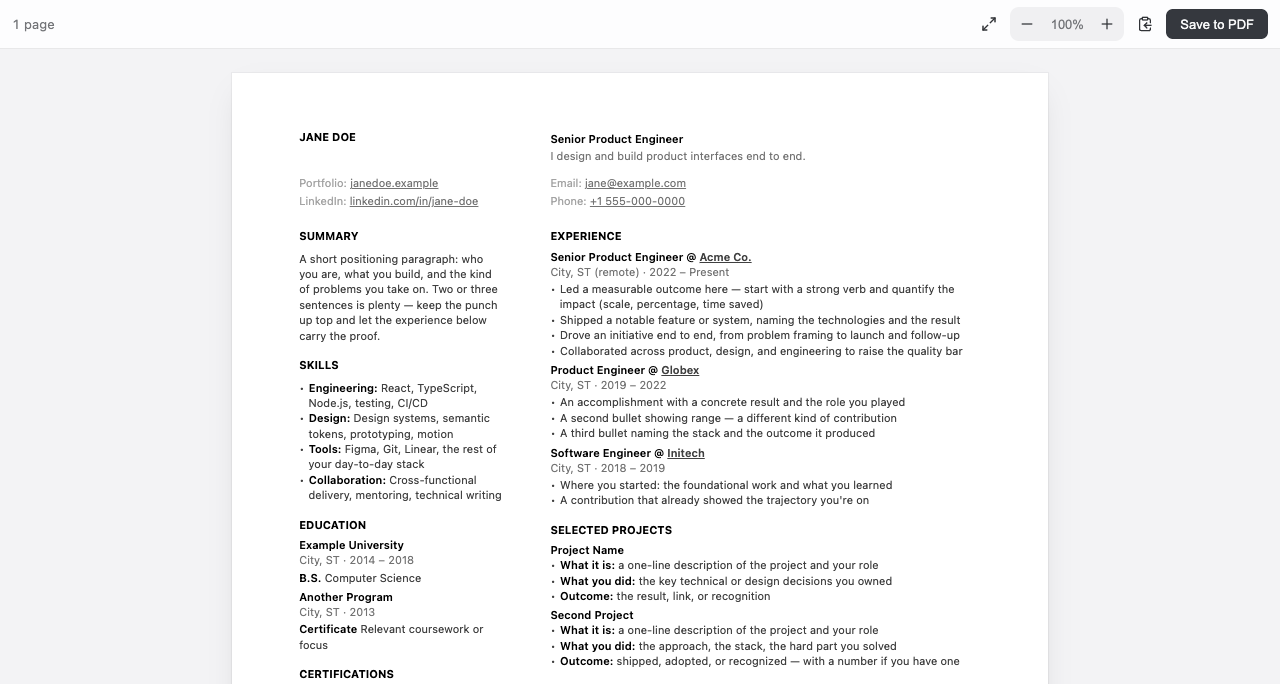
A render utility for resumes and CVs — you bring the content (from any LLM or coding agent), it makes the paginated, ATS-friendly PDF.
▸ Try it live — resume.atom63.io — edit MDX in the browser (by hand or with any LLM) and export a print-ready PDF.
What it is
- A render utility, not a resume maker. You bring the words — write them yourself or with any LLM / coding agent — and it typesets your MDX into real 8.5×11″ (or A4) pages, a zoom/pan viewer, and a clean, selectable-text (ATS-friendly) PDF.
- Made for the coding-agent workflow. The document is code built from a small grammar of primitives, so an agent can draft and revise it from your notes — and the
.mdxstays your source of truth. - Tailwind-free and token-themeable. Restyle the whole document — resume and CV together — by overriding the
--doc-*design tokens.
What it's not
- Not a resume writer or reviewer. It doesn't generate, score, critique, or proofread your content — that's on you and the LLM of your choice. It owns the render, not the resume.
- Not a WYSIWYG builder. You (or your agent) write MDX; there's no drag-and-drop canvas. An optional live-preview editor ships in
@atom63/resume/editor— the source is still MDX. - Not a hosted app. No account, backend, or template marketplace; it's a library you run in your own React/Vite project.
- Not a general page-layout engine. It paginates the resume/CV grammar (
<Header>,<Columns>,<Section>…), not arbitrary HTML.
Status:
0.2.x. The API may shift before1.0. See CHANGELOG.
Two ways to use it
1. Scaffold a project
npm create @atom63/resume@latest my-resume
cd my-resume && npm install && npm run dev
You get a standalone Vite app with starter src/resume.mdx (two-column) and
src/cv.mdx (single-column). Point a coding agent at those files to write the
content; Save to PDF from the viewer toolbar.
2. Add the module to a React app
npm i @atom63/resumeimport { ResumeViewer } from '@atom63/resume'
import '@atom63/resume/styles' // import the styles ONCE in your app
import Resume from './resume.mdx'
export default () => <ResumeViewer Content={Resume} pdfFilename="Resume" pageSize="letter" />Your app needs the MDX + raw-import Vite wiring shown in the scaffolded
vite.config.ts (@mdx-js/rollup + mdxRawPlugin from @atom63/resume/vite).
Exports
| Export | What it is |
|---|---|
| @atom63/resume | ResumeViewer, the PaginatedResume engine + MDX primitives, packIntoPages, useResumeViewport, getPageGeometry |
| @atom63/resume/editor | ResumeEditor + MdxLivePreview — optional in-app live MDX editor |
| @atom63/resume/vite | mdxRawPlugin (so import src from './resume.mdx?raw' works) + resumeWriteBackPlugin |
| @atom63/resume/styles | import-and-done stylesheet (tokens + document + viewer chrome) |
| @atom63/resume/tokens | just the --doc-* design tokens |
The MDX grammar
<ResumeDocument>
  <Header>
    <HeaderLeft># Jane Doe</HeaderLeft>
    <HeaderRight>Senior Product Engineer</HeaderRight>
  </Header>
  <Columns>
    <Sidebar>
      ### Skills
      - TypeScript, React
    </Sidebar>
    <Main>
      ### Experience
      <Group>
        #### Engineer @ Acme
        _2022 – Present_
        - Built things.
      </Group>
    </Main>
  </Columns>
  <Footer>[email protected]</Footer>
</ResumeDocument>
Single-column CVs put everything in <Main> and use <Section label="…"> +
<Entry year role> record rows.
Restyle (modify)
The look is a Tailwind-free token system. Override any token, scoped to
[data-resume-document] (in your app's CSS, loaded after @atom63/resume/styles):
[data-resume-document] {
  --doc-text: 11px; /* body size */
  --doc-ink: #111; /* headings + bold */
  --doc-ink-body: #404040; /* body copy */
  --doc-resume-cols: 1fr 2fr; /* sidebar : main ratio */
  --doc-font: 'Charter', Georgia, serif; /* or `inherit` to follow the host font */
}- Paper size is the
pageSizeprop ('letter' | 'a4'), not a token — it drives pagination, the on-screen page, and the PDF.
Extend
Add your own section types by passing a custom MDX component map to
ResumeViewer (it merges over the defaults):
import { ResumeViewer, resumeMdxComponents } from '@atom63/resume'

function SkillBar({ label, level }: { label: string; level: number }) {
  return (
    <div className="doc-meta-grid">
      <span className="doc-meta">{label}</span>
      <div style={{ background: '#eee', height: 4 }}>
        <div style={{ width: `${level}%`, height: 4, background: '#111' }} />
      </div>
    </div>
  )
}

<ResumeViewer
  Content={Resume}
  components={{ ...resumeMdxComponents, SkillBar }}
/>
Then use <SkillBar label="React" level={90} /> in your MDX. The .doc-* classes
(doc-meta-grid, doc-meta, doc-body, doc-heading, …) compose with the token
system, so custom components stay on-brand. Each top-level child of a <Sidebar>
/ <Main> is one pagination block, so pages can break between them.
Limitations
- Markdown tables render unstyled (the engine ships no table styling).
License
MIT