
@avalant/automationx-widgets
v0.0.17
Published
Embeddable widgets for AutomationX
Downloads
132


Readme
AutomationX Widgets
Introduction
AutomationX Widgets provides customizable UI components to seamlessly interact with your AutomationX workflows
One of the key features is the createChat function, which renders a fully-featured chat-like window.
- If using the UMD build, it is accessible via the
window.widgetsobject. - If using the ES Modules build, it is available as a named export. This function requires a webhook URL configuration for your workflow and allows customization through various theme options.
Sessions are persisted in local-storage to allow chat continuity
Display text supports markdown
Supports speech-to-text (Version 0.0.15 onward)
Usage
Prerequisites
The AutomationX flow must have the "webhook" trigger and the webhook's return response as the last step.
- Trigger input will be a JSON POST with a body format
{ message: <text>, sessionId: <UUID> } - Flow should return "raw" response with just the text content
This library requires the following peer dependencies:
- react (>= 18)
- react-dom (>= 18)
- showdown
Using with ES Modules (React)
To use the createChat function with React, follow this example:
Consider mounting this component higher on DOM so it does not conflict with other deeper nested components
import { ChatWidget } from '@avalant/automationx-widgets';
import { useEffect } from 'react';

export function App() {
  return (
    <ChatWidget
        webhookUrl="http://127.0.0.1:4200/api/v1/webhooks/2AeEyRaC5FyEp1WvBuaVK/sync"
        icon="https://www.gimp.org/theme/images/pp16.png"
        title="Support"
      />
    );
}
Using with UMD Module (HTML)
To use the UMD build directly in an HTML page, include the following script tags:
Notice the additional css link tag which is required
<script src="https://cdn.jsdelivr.net/npm/react@18/umd/react.production.min.js"></script>
<script src="https://cdn.jsdelivr.net/npm/react-dom@18/umd/react-dom.production.min.js"></script>
<script src="https://cdn.jsdelivr.net/npm/[email protected]/dist/showdown.min.js"></script>
<link rel="stylesheet" href="https://cdn.jsdelivr.net/npm/@avalant/automationx-widgets@latest/index.css" />
<script src="https://cdn.jsdelivr.net/npm/@avalant/automationx-widgets@latest/index.umd.js"></script>

<script>
  widgets.createChat({
    title: 'AutomationX Chat',
    welcomeMessage: 'Hi there',
    webhookUrl: 'http://127.0.0.1:4200/api/v1/webhooks/2AeEyRaC5FyEp1WvBuaVK/sync',
  });
</script>
Customization
Input Parameters
You can customize the chat component by modifying the available input parameters as shown below
Ones with "?" can be left empty as they will fallback to default values
{
  parent?: HTMLElement; // Element to attach the chat window as a child
  webhookUrl: string; // Published flow's live URL (Notice the /sync suffix)
  title?: string; // Shown on the chat header (expanded and collapsed)
  welcomeMessage?: string;
  avatar?: string; // Image URL to be shown alongside bot messages in expanded view
  icon?: string | React.ReactNode; // Icon URL (png, svg) or a <svg>...</svg> element when used in ES modules (React)
  theme?: {
    headerColor?: string; // #333
    headerTextColor?: string; // #fff
    backgroundColor?: string; // #fff
    userMessageColor?: string; // #ccc
    userMessageTextColor?: string; // #333
    botMessageColor?: string; // #333
    botMessageTextColor?: string; // #fff
    buttonColor?: string; // #333
    buttonTextColor?: string; // #fff
    inputBorderColor?: string; // #ccc
  };
  position?: {
    vertical: 'bottom' | 'top',
    horizontal: 'right' | 'left',
    offsetX?: number,
    offsetY?: number,
  };
}
Positioning
- Supports custom positioning of the chat widget "pill" and the expanded window at 4 locations that are handled by the "position" parameter.
- These positions include top-left, top-right, bottom-right and bottom-left with optional
offsetXandoffsetYparameters. - Default position is bottom-right with offset (24, 24)
Look & Feel
When collapsed, default, with no icon and title
When collapsed, themed, with icon and title
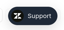
When collapsed, themed, with only icon
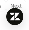
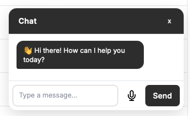
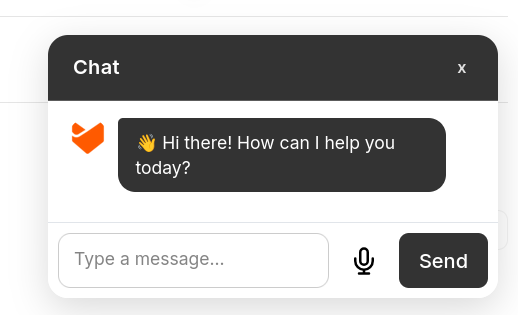
When expanded, default, with no icon and title
When expanded, themed, with icon and title
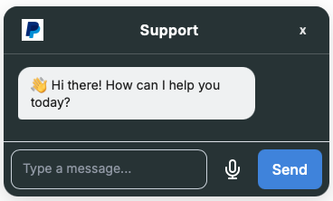
When expanded, themed, with avatar
Building
Run nx build widgets to build the library.