
@bclonan/softform
v1.3.1
Published
Tactile components for Vue, React, and browser-native custom elements

Maintainers
 bclonan
Readme
Softform
Softform is a library of 53 responsive components for Vue, React, and plain JavaScript. The components use native HTML controls, configurable motion, and a shared visual system. Each one has a prop reference, a live demo, and a Storybook story. The library also includes a data adapter registry and a component dictionary for agents.
Live examples · Component docs · Storybook · npm package
Screenshots
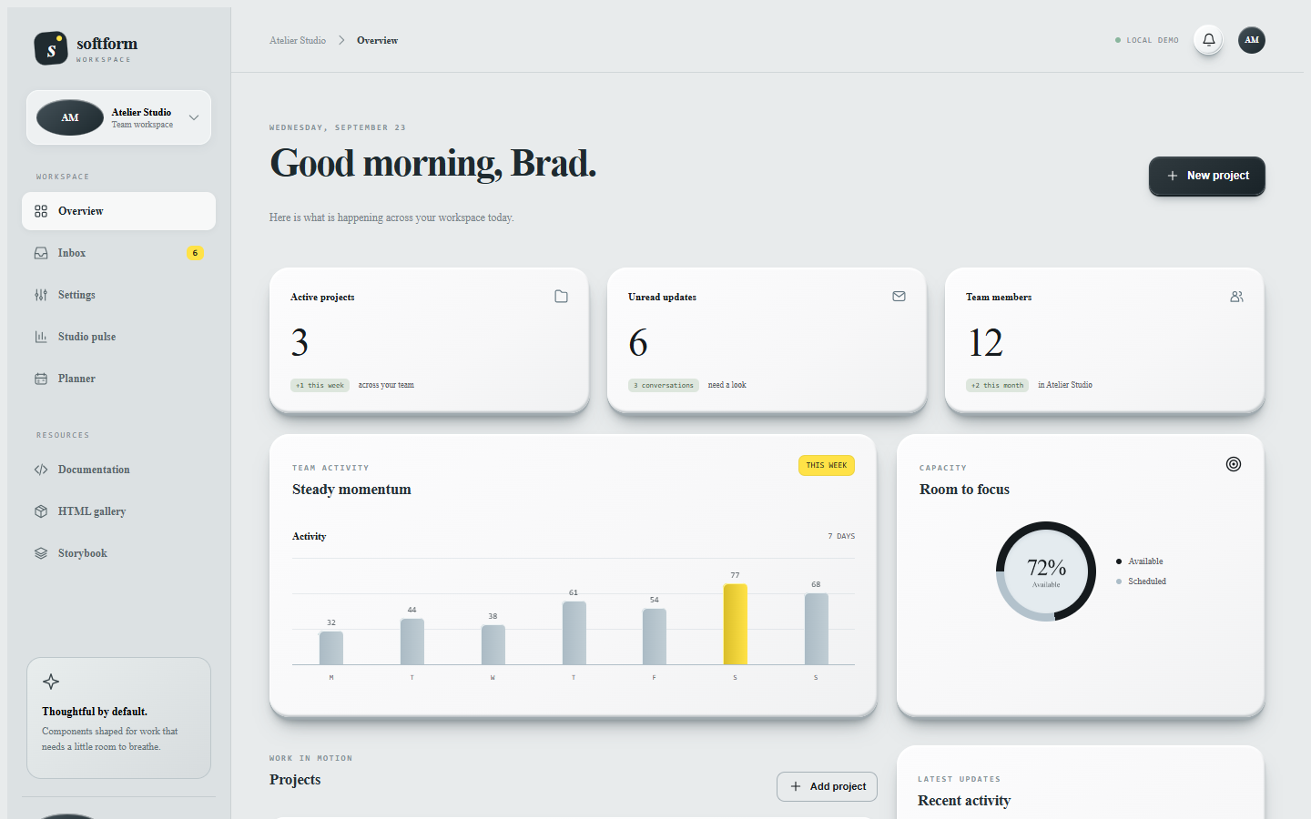
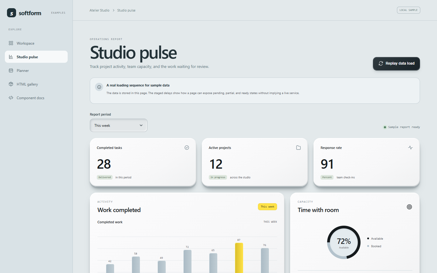
The examples use local sample data. The charts show staged loading and animate when values change.
Workspace dashboard
Analytics report
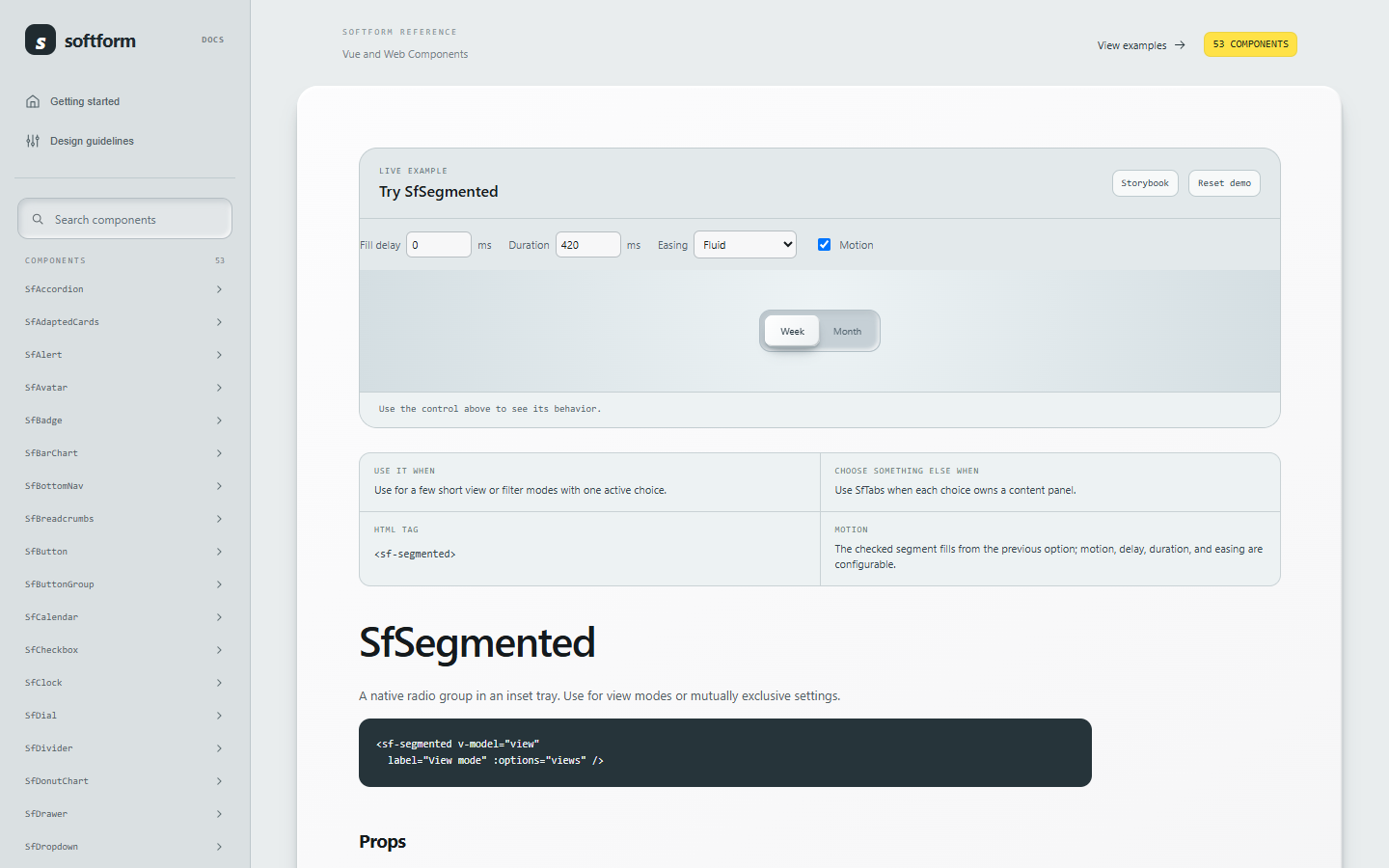
Component documentation
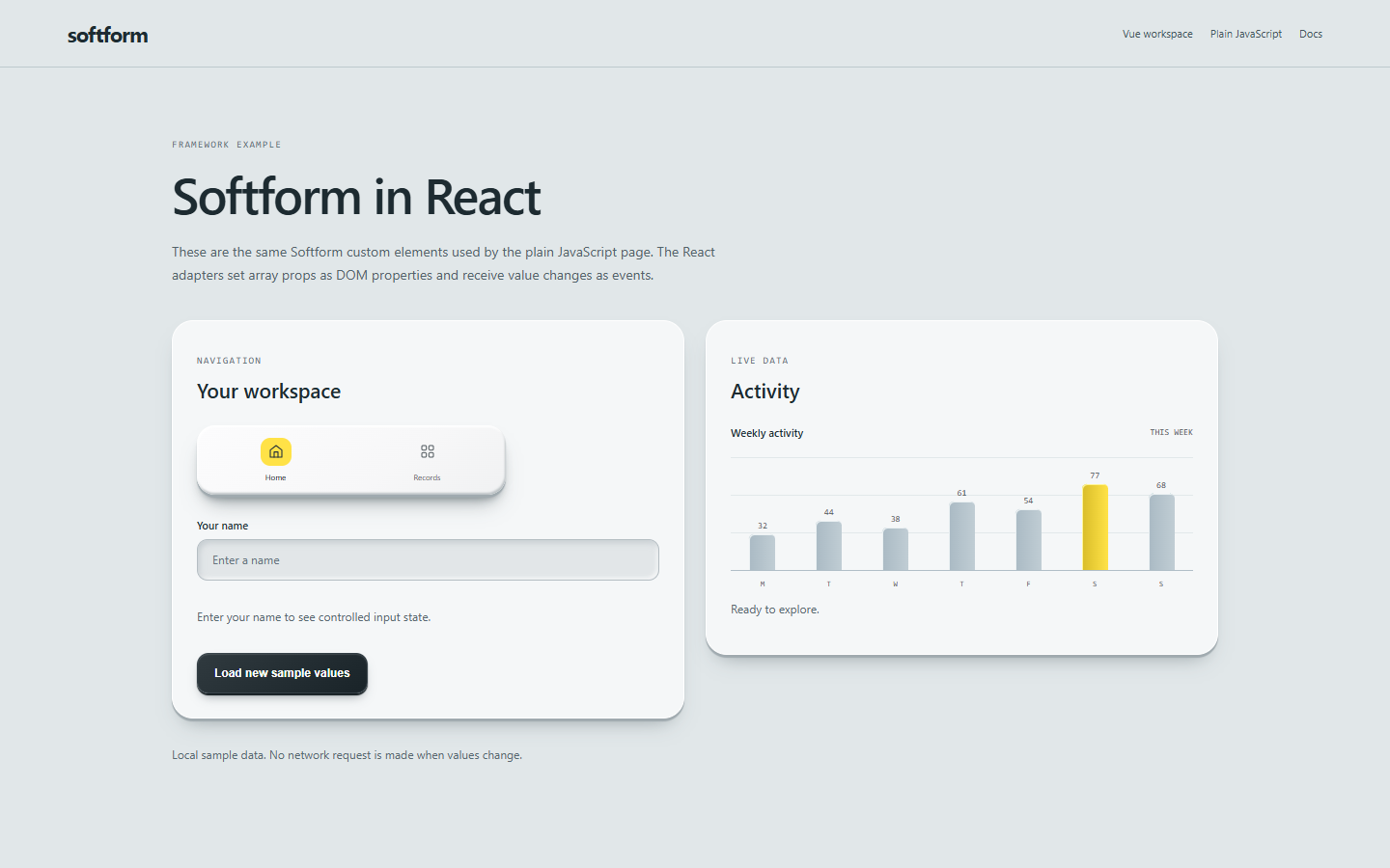
React example
Install
npm install @bclonan/softformInstall Vue 3.5 or React 18.3/19 if you use that framework. Both are optional peer dependencies. Plain JavaScript users can register custom elements without mounting a framework app.
Vue
<script setup>
import SfSurface from '@bclonan/softform/components/SfSurface';
import SfButton from '@bclonan/softform/components/SfButton';
import '@bclonan/softform/styles.css';
</script>

<template>
  <SfSurface as="section" aria-labelledby="project-heading">
    <h2 id="project-heading">Projects</h2>
    <SfButton variant="accent">Create project</SfButton>
  </SfSurface>
</template>
Import from the package root when you prefer named Vue exports. Import from components/SfName when you want a path for one component.
React
import { useState } from 'react';
import { SfInput } from '@bclonan/softform/react/SfInput';

function NameField() {
  const [name, setName] = useState('');
  return <SfInput label="Name" modelValue={name} onValueChange={value => setName(String(value))} />;
}
The React adapter registers the custom element, sets arrays and objects as DOM properties, and listens to its native events. Import only the adapters you use.
Plain JavaScript
import { registerSfSlider } from '@bclonan/softform/elements/SfSlider';

registerSfSlider();
document.querySelector('sf-slider').addEventListener('input', event => {
  console.log(event.detail.value);
});
<sf-slider label="Volume" min="0" max="100"></sf-slider>Custom element imports include their renderer and scoped styles. The Vue API imports CSS separately. Component JavaScript imports are tree shakable; custom elements share the library stylesheet.
Explore the examples
Dashboard · Inbox · Settings · Analytics · Planner · React · Plain HTML · 53-element gallery
Selection components expose motion, motionDelay, motionDuration, and motionEasing. Charts and metric components can animate data loading with configurable delays and durations. SfInput passes native input types and their matching attributes to the actual input. SfAdaptedCards accepts REST, GraphQL, legacy, or custom payload adapters.
See the package guide, design guidelines, and live component reference for props, events, and usage advice.
Develop locally
npm install
npm run dev
npm run storybook
npm run check
npm run check runs the tests, package and example builds, type checks, tree shaking smoke checks, and the Storybook build. The example sites use local sample data.
MIT licensed. See LICENSE.