
@brevitaz/brv-text-editor
v2.6.0
Published
A fully-featured React rich text editor and preview component built on Tiptap


Readme
@brevitaz/brv-text-editor
A fully-featured React rich text editor and preview component built on Tiptap (ProseMirror) + Lucide React icons.
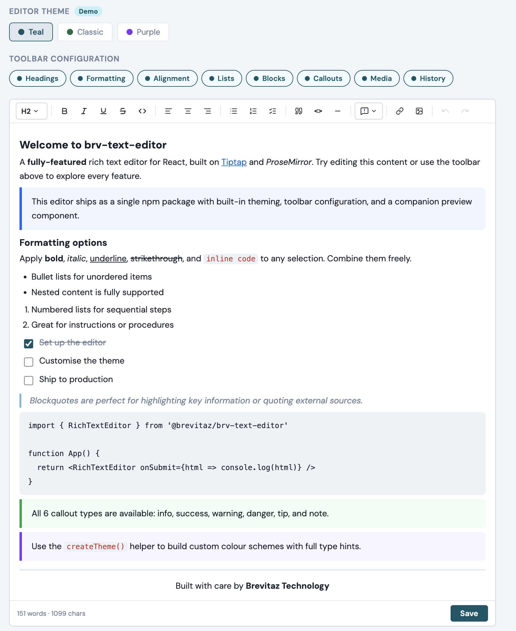
Features
| Feature | Details |
|---|---|
| Formatting | Bold, italic, underline, strikethrough, inline code |
| Headings | H1, H2, H3 via dropdown |
| Lists | Bullet, numbered, task (checkbox) lists |
| Blocks | Blockquote, fenced code block, horizontal rule |
| Tables | Insert/delete rows & columns, GFM-style tables in markdown mode |
| Callouts | 6 themed callout blocks — Info, Success, Warning, Danger, Tip, Note |
| Alignment | Left, center, right text alignment |
| Media | Insert links (with edit/remove popover) and images by URL |
| History | Undo / Redo |
| Markdown mode | Set format="markdown" to render a plain textarea/input that stores raw markdown — with optional live inline or split preview |
| Markdown shortcuts | Cmd/Ctrl+B/I/E/K, Enter-continues-list, Tab indent, paste-URL-on-selection |
| Configurable toolbar | Enable/disable toolbar groups via the toolbar prop |
| Word count | Live character and word count in the footer |
| Suggestion triggers | Generic @mentions, #hashtags, or any custom trigger — sync & async, with keyboard nav |
| Theming | Built-in presets + full CSS variable customisation via createTheme() |
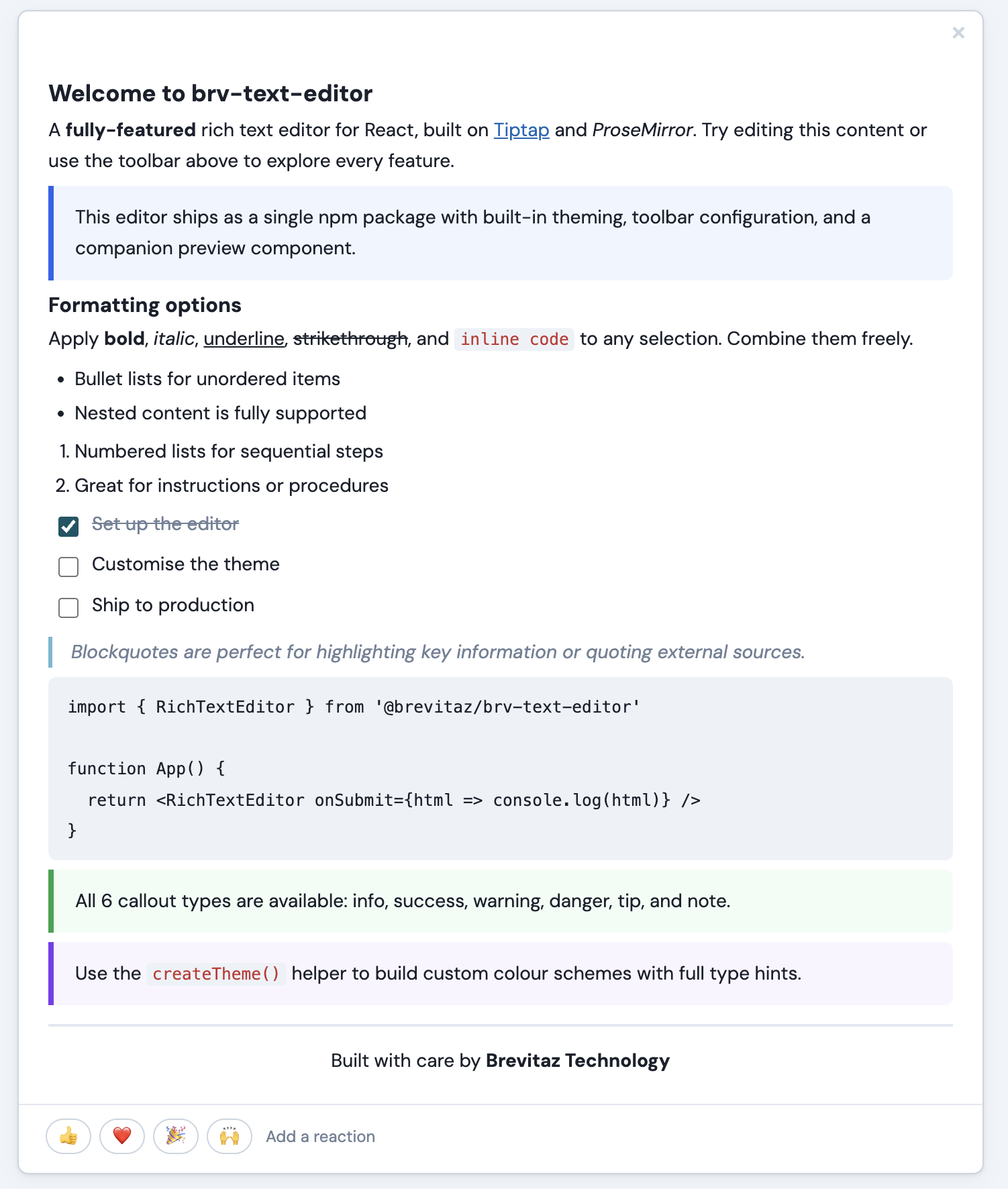
| Preview | RichTextPreview renders saved HTML or markdown in a styled card with emoji reactions |
Installation
npm install @brevitaz/brv-text-editorPeer dependencies — React 19 must already be installed in your project.
reactandreact-domare not bundled inside the package.
# If you don't have React yet:
npm install react react-dom
Quick start
1. Import the CSS (once, in your app entry)
// main.jsx / main.tsx / _app.jsx
import '@brevitaz/brv-text-editor/dist/brv-text-editor.css'
2. Use the editor
import { RichTextEditor } from '@brevitaz/brv-text-editor'

function MyPage() {
  const handleSave = (html) => {
    console.log('Saved HTML:', html)
    // send to your API, store in state, etc.
  }

  return (
    <RichTextEditor
      placeholder="Write something…"
      onSubmit={handleSave}
      submitLabel="Post note"
      showActions={true}
    />
  )
}
3. Show a preview after saving
import { useState } from 'react'
import { RichTextEditor, RichTextPreview } from '@brevitaz/brv-text-editor'

function NotesPage() {
  const [notes, setNotes] = useState([])

  const handleSave = (html) => {
    setNotes(prev => [
      { id: Date.now(), html },
      ...prev,
    ])
  }

  return (
    <>
      <RichTextEditor onSubmit={handleSave} submitLabel="Post" showActions />

      {notes.map(note => (
        <RichTextPreview key={note.id} html={note.html} />
      ))}
    </>
  )
}
API
<RichTextEditor />
| Prop | Type | Default | Description |
|---|---|---|---|
| initialContent | string | '' | Initial HTML content loaded into the editor |
| placeholder | string | 'Write something…' | Placeholder shown when editor is empty |
| onChange | (html: string) => void | — | Called on every change with the current HTML |
| onSubmit | (html: string) => void | — | Called when the submit button is clicked |
| onCancel | () => void | — | Called when the cancel button is clicked |
| submitLabel | string | 'Save' | Label for the submit button |
| showActions | boolean | true | Whether to show the footer Save/Cancel bar |
| minHeight | number | 140 | Minimum editor height in pixels |
| autofocus | boolean | false | Whether to focus the editor on mount |
| variant | string | 'default' | 'default' shows the card border/background; 'bare' removes them for embedding inside a custom container |
| toolbar | object | DEFAULT_TOOLBAR | Toggle toolbar groups (see below) |
| theme | string | 'unleashteams' | Built-in theme preset |
| themeVars | object | {} | CSS variable overrides for custom theming |
| triggers | TriggerConfig[] | [] | Suggestion trigger configurations (see Suggestion Triggers) |
| format | 'html' \| 'markdown' | 'html' | Storage/rendering format. 'markdown' switches the editor to a plain textarea/input that stores raw markdown (no Tiptap, no toolbar). See Markdown mode. |
| inputMode | 'textarea' \| 'input' | 'textarea' | Only used when format="markdown". 'input' renders a single-line <input> for titles; 'textarea' renders a multi-line <textarea>. |
| preview | 'none' \| 'inline' \| 'split' | 'none' | Only used when format="markdown". 'inline' shows the rendered preview directly below the field; 'split' shows it side-by-side. Updates live as the user types. |
| className | string | '' | Additional class for the root wrapper |
Toolbar groups
The toolbar prop accepts a partial object. Omitted keys default to true.
// Show only formatting and callouts
<RichTextEditor toolbar={{ headings: false, alignment: false, lists: false, blocks: false, media: false, history: false }} />

// Hide callouts only
<RichTextEditor toolbar={{ callouts: false }} />
| Group | Controls |
|---|---|
| headings | H1 / H2 / H3 dropdown |
| formatting | Bold, italic, underline, strikethrough, inline code |
| alignment | Left, center, right text alignment |
| lists | Bullet, numbered, task lists |
| blocks | Blockquote, code block, horizontal rule |
| tables | Insert table, add/delete row, add/delete column, delete table |
| callouts | Callout block dropdown (info, success, warning, danger, tip, note) |
| media | Link and image insert |
| history | Undo / redo |
Callout blocks
Six themed callout variants are available via the callout dropdown button in the toolbar. Each callout renders as a colored left-bordered block:
| Type | Color | Use case |
|---|---|---|
| info | Blue | General information |
| success | Green | Positive outcomes |
| warning | Amber | Caution / attention |
| danger | Red | Critical / breaking |
| tip | Purple | Helpful hints |
| note | Gray | Supplementary notes |
Callouts are stored as <div data-callout="type"> in the HTML output, so they render correctly in RichTextPreview as well.
Markdown mode
Pass format="markdown" to switch the editor into a plain textarea (or single-line input) that stores raw markdown instead of HTML. Tiptap, the toolbar, and the rich-text extensions are bypassed entirely. onChange and onSubmit receive the raw markdown string.
import { useState } from 'react'
import { RichTextEditor, RichTextPreview } from '@brevitaz/brv-text-editor'

function NotePage() {
  const [md, setMd] = useState('# Hello\n\nThis is **markdown**.')

  return (
    <>
      <RichTextEditor
        format="markdown"
        preview="inline"
        initialContent={md}
        onChange={setMd}
      />
      <RichTextPreview format="markdown" markdown={md} />
    </>
  )
}
Single-line markdown input (e.g. titles)
<RichTextEditor
  format="markdown"
  inputMode="input"
  preview="inline"
  placeholder="Title…"
  onChange={setTitle}
/>
inputMode="input" renders an <input> element. With preview="inline" or preview="split", the rendered output is generated via markdownToInlineHtml (no <p> wrappers) so it stays on one line.
Live preview modes
| preview | Layout |
|---|---|
| 'none' (default) | Just the textarea/input. No live preview. |
| 'inline' | Rendered preview pane sits below the field. |
| 'split' | Field on the left, rendered preview on the right (50/50). |
The preview updates on every keystroke. Use RichTextPreview with format="markdown" if you want a fully separate render surface (e.g. for the saved/published view).
Keyboard shortcuts
Wrap shortcuts toggle — pressing Cmd/Ctrl+B on a selection that's already inside **…** (whether the selection covers the inner text or includes the markers themselves) removes the markers. Same for Cmd/Ctrl+I (*) and Cmd/Ctrl+E (`). All shortcuts and smart paste work in both inputMode="textarea" and inputMode="input". List-aware Enter / Tab handling only applies to the multi-line textarea (no newlines in a single-line input).
| Shortcut | Mode | Action |
|---|---|---|
| Cmd/Ctrl+B | textarea + input | Toggle **…** around selection (wraps if not wrapped, unwraps if already wrapped) |
| Cmd/Ctrl+I | textarea + input | Toggle *…* around selection |
| Cmd/Ctrl+E | textarea + input | Toggle `…` around selection |
| Cmd/Ctrl+K | textarea + input | Wrap selection as [selection](url) with the url portion preselected |
| Paste a URL while text is selected | textarea + input | Replaces the selection with [selection](pasted-url) |
| Enter on a list line | textarea | Continues the list (-, *, +, or 1. auto-incremented) |
| Enter on an empty list marker | textarea | Exits the list (removes the marker) |
| Tab / Shift+Tab inside a list | textarea | Indent / outdent by two spaces |
All edits route through document.execCommand('insertText') so the browser's native undo (Cmd/Ctrl+Z) stays intact.
Supported markdown syntax in preview
The built-in markdownToHtml renderer covers common CommonMark + a handful of GFM constructs:
ATX headings (
#…######)Emphasis (
**bold**,*italic*,__bold__,_italic_,~~strike~~)Inline code (
`code`) and fenced code blocks (```)Links
[text](url)and imagesBullet (
-,*,+) and ordered (1.) listsBlockquotes (
>)Horizontal rules (
---,***,___)GFM tables with optional column alignment:
| Quarter | Revenue | Growth |
| ---     | ---:    | :---:  |
| Q1      | $120k   | 12%    |
User-supplied markdown is HTML-escaped before tokens are expanded, so raw HTML in the input is rendered as text rather than executed.
Bare variant (consumer-controlled styling)
Pass variant="bare" to drop all built-in field styling — padding, font-size, line-height, font-family, surface colors, the preview pane's border and background tint, and the wrapper's border and radius. Only structural props (sizing, min-height/max-height, resize: vertical) are emitted, so the consumer's wrapper class fully controls the look of both the textarea/input and any inline / split preview pane.
<div className="my-editor-skin">
  <RichTextEditor
    format="markdown"
    variant="bare"
    preview="inline"
    onChange={setMd}
  />
</div>
.my-editor-skin textarea,
.my-editor-skin input,
.my-editor-skin .rtp-content {
padding: 14px 18px;
font: 15px/1.7 'Inter', sans-serif;
}
.my-editor-skin .rtp-content {
border-top: 1px solid #e2e8f0;
background: #fafafa;
}The same applies to RichTextPreview with variant="bare" — the rendered card chrome (border, shadow, padding, max-width) is removed so the markup renders flush inside whatever container you wrap it in.
Standalone markdown helpers
The renderer is exported as a standalone function in case you want to render markdown outside of RichTextPreview:
import { markdownToHtml, markdownToInlineHtml } from '@brevitaz/brv-text-editor'

const html       = markdownToHtml('# Hello\n\nWorld')
const inlineHtml = markdownToInlineHtml('A short **title**')
<RichTextPreview />
| Prop | Type | Default | Description |
|---|---|---|---|
| html | string | '' | Raw HTML string to render (used when format="html") |
| markdown | string | — | Raw markdown string to render (used when format="markdown"). Falls back to html if not provided. |
| format | 'html' \| 'markdown' | 'html' | Treat input as HTML or convert markdown → HTML before rendering |
| variant | string | 'default' | 'default' shows the card border/shadow/background; 'bare' removes them and strips side padding for embedding in a custom container |
| showReactions | boolean | true | Whether to show the emoji reactions row |
| reactions | string[] | ['👍','❤️','🎉','🙌'] | Emoji list for the reactions row |
| theme | string | 'unleashteams' | Built-in theme preset |
| themeVars | object | {} | CSS variable overrides for custom theming |
| onSuggestionClick | (trigger, id, label) => void | — | Callback when a suggestion token (@mention, #tag) is clicked in the preview |
Suggestion Triggers
The triggers prop lets you add @mentions, #hashtags, or any custom trigger character to the editor. Each trigger is configured independently and supports both sync (local array) and async (API call) data sources.
Trigger config
| Property | Type | Required | Default | Description |
|---|---|---|---|---|
| char | string | ✅ | — | Trigger character (e.g. '@', '#', '/') |
| items | (query: string) => Item[] \| Promise<Item[]> | ✅ | — | Returns matching items — can be sync (return array) or async (return Promise) |
| onSelect | (item: Item) => void | — | — | Called when an item is selected |
| minChars | number | — | 0 | Minimum characters after trigger before showing suggestions |
| debounce | number | — | 0 | Debounce delay in ms for async data sources |
| renderItem | (item, selected) => ReactNode | — | — | Custom render for each dropdown row |
| renderList | ({ items, selectedIndex, command }) => ReactNode | — | — | Full override for the entire dropdown content |
Item shape
Each item must have this shape:
{ id: string, label: string, [key: string]: any }id is stored in the document; label is displayed in the token. You can attach any extra fields (e.g. email, avatar) for use in renderItem.
Example — Sync hashtags (local data)
import { RichTextEditor } from '@brevitaz/brv-text-editor'

const TAGS = [
  { id: 't1', label: 'roadmap' },
  { id: 't2', label: 'bug' },
  { id: 't3', label: 'feature' },
  { id: 't4', label: 'design' },
]

function Editor() {
  return (
    <RichTextEditor
      placeholder="Type # to add a tag…"
      triggers={[
        {
          char: '#',
          items: (query) =>
            TAGS.filter(t =>
              t.label.toLowerCase().includes(query.toLowerCase())
            ),
          minChars: 1,
        },
      ]}
      onSubmit={(html) => console.log(html)}
      showActions
    />
  )
}
Example — Async @mentions (API call)
import { RichTextEditor } from '@brevitaz/brv-text-editor'

const fetchUsers = async (query) => {
  const res = await fetch(`/api/users?search=${encodeURIComponent(query)}`)
  const users = await res.json()
  return users.map(u => ({
    id: String(u.id),
    label: u.name,
    email: u.email,
  }))
}

function Editor() {
  return (
    <RichTextEditor
      placeholder="Type @ to mention someone…"
      triggers={[
        {
          char: '@',
          items: fetchUsers,
          debounce: 300,
          onSelect: (item) => console.log('Mentioned:', item),
          renderItem: (item, selected) => (
            <div style={{ display: 'flex', alignItems: 'center', gap: 8 }}>
              <div style={{
                width: 28, height: 28, borderRadius: '50%',
                background: selected ? '#065666' : '#718096',
                color: '#fff', display: 'flex', alignItems: 'center',
                justifyContent: 'center', fontSize: 11, fontWeight: 600,
              }}>
                {item.label.split(' ').map(n => n[0]).join('')}
              </div>
              <div>
                <div>{item.label}</div>
                {item.email && (
                  <div style={{ fontSize: 11, color: '#718096' }}>
                    {item.email}
                  </div>
                )}
              </div>
            </div>
          ),
        },
      ]}
      onSubmit={(html) => console.log(html)}
      showActions
    />
  )
}
Example — Multiple triggers together
<RichTextEditor
  triggers={[
    { char: '@', items: fetchUsers, debounce: 300 },
    { char: '#', items: (q) => TAGS.filter(t => t.label.includes(q)), minChars: 1 },
  ]}
  onSubmit={handleSave}
  showActions
/>
Handling clicks in preview
When rendering saved HTML with RichTextPreview, you can respond to clicks on suggestion tokens:
<RichTextPreview
  html={savedHtml}
  onSuggestionClick={(trigger, id, label) => {
    if (trigger === '@') {
      navigate(`/users/${id}`)   // navigate to user profile
    } else if (trigger === '#') {
      navigate(`/tags/${label}`)  // navigate to tag page
    }
  }}
/>
HTML output
Suggestion tokens are stored as semantic HTML spans:
<span data-trigger="@" data-id="3" class="rte-suggestion">@Clementine Bauch</span>
<span data-trigger="#" data-id="t1" class="rte-suggestion">#roadmap</span>
Styling tokens
Suggestion tokens are styled via CSS variables:
| Variable | Description | Default |
|---|---|---|
| --rte-suggestion-bg | Token background color | var(--rte-color-primary-hover) |
| --rte-suggestion-color | Token text color | var(--rte-color-primary) |
Important notes
- The suggestion dropdown renders via a React portal to
document.body. CSS variables defined inside.rte-rootwon't reach it, so the dropdown uses hardcoded fallback values. - If you use a custom
renderItem, use hardcoded colors (not CSS variables) for the same reason. - Keyboard navigation (Arrow Up/Down, Enter, Escape) works out of the box.
- Async sources are automatically debounced; stale API responses are discarded.
Theming
Every color, font, border, and spacing value is driven by a CSS custom property. Override them at any scope.
Built-in presets
<RichTextEditor theme="classic" />Custom overrides via props
<RichTextEditor themeVars={{ '--rte-color-primary': '#7c3aed' }} />Using createTheme()
import { RichTextEditor, createTheme } from '@brevitaz/brv-text-editor'

const myTheme = createTheme({
  '--rte-color-primary':       '#7c3aed',
  '--rte-btn-active-bg':       '#ede9fe',
  '--rte-btn-active-color':    '#7c3aed',
  '--rte-color-primary-hover': '#faf5ff',
  '--rte-focus-border':        '#a78bfa',
  '--rte-focus-ring':          'rgba(124, 58, 237, 0.18)',
  '--rte-blockquote-border':   '#a78bfa',
  '--rte-checkbox-accent':     '#7c3aed',
  '--rte-selection-bg':        '#ede9fe',
})

<RichTextEditor themeVars={myTheme} />
Available CSS variables
| Variable | Description |
|---|---|
| --rte-color-primary | Primary action color |
| --rte-color-primary-hover | Primary hover state |
| --rte-btn-active-bg / --rte-btn-active-color | Active button styling |
| --rte-surface / --rte-surface-toolbar | Background colors |
| --rte-border / --rte-border-toolbar | Border colors |
| --rte-text / --rte-text-muted / --rte-text-placeholder | Text colors |
| --rte-code-bg / --rte-code-color | Code styling |
| --rte-blockquote-border / --rte-blockquote-color | Blockquote styling |
| --rte-checkbox-accent | Task list checkbox color |
| --rte-focus-border / --rte-focus-ring | Focus states |
| --rte-font-family | Font stack |
| --rte-radius / --rte-radius-sm / --rte-radius-lg | Border radii |
Local development
# Start the demo app
npm run dev

# Build the distributable library
npm run build:lib
Project structure
rich-text-editor/
├── dist/                         ← Library output
│   ├── brv-text-editor.es.js     ← ES module bundle
│   ├── brv-text-editor.umd.js    ← UMD/CJS bundle
│   └── brv-text-editor.css       ← Extracted stylesheet
├── src/
│   ├── index.js                  ← Library entry (exports both components)
│   ├── index.css                 ← All styles (editor + preview)
│   ├── components/
│   │   ├── RichTextEditor.jsx    ← Editor component
│   │   └── RichTextPreview.jsx   ← Preview card component
│   ├── extensions/
│   │   ├── Callout.js            ← Custom callout block extension
│   │   └── suggestion/
│   │       ├── SuggestionNode.js         ← TipTap node for inline tokens
│   │       ├── createSuggestionPlugin.js ← Factory for trigger plugins
│   │       └── SuggestionDropdown.jsx    ← Dropdown popup component
│   ├── App.jsx                   ← Demo application
│   └── main.jsx                  ← Demo entry point
├── vite.config.js                ← Demo app Vite config
├── vite.lib.config.js            ← Library build Vite config
└── package.json
Scripts
| Command | Description |
|---|---|
| npm run dev | Start the demo app dev server |
| npm run build | Build the demo app |
| npm run build:lib | Build the distributable library into dist/ |
| npm run preview | Preview the built demo app |
License
MIT — Brevitaz Systems