@bubbleup/stencil-my-data-form
v0.1.2
Published
Stencil Component Starter
Downloads
100
Readme
MyData Form Components
This is a collection of components which you can add to any <form> to conveniently
add custom MyData GDPR integration to your form. These
components are meant to be flexible and usage should be tailored to the unique requirements
of each form you add them to.
Getting Started
You can include and use these components on any arbitrary HTML page via the UNPKG CDN, or you may install them via NPM as a dependency in your Javascript/Typescript application.
Installation via UNPKG CDN
To include any of these components on a generic HTML page, simply include the following two
<script> tags in the <head> section of your page as seen below:
Ex:
<head>
  <!-- ... -->
  <script type="module" src="https://unpkg.com/@bubbleup/stencil-my-data-form/www/build/my-data-form.esm.js"></script>
  <script nomodule src="https://unpkg.com/@bubbleup/stencil-my-data-form/www/build/my-data-form.js"></script>
</head>
Installation via NPM
To include these components in your Javascript/Typescript application, run the following command to add this package as a dependency in your application:
Ex:
npm install --save @bubbleup/stencil-my-data-formStencilJS Integration
To use these components in another StencilJS app after installing this package as a dependency, you must
add an import to the top of the script you wish to add a <my-data-*> component to. Then, you may include
the components in the JSX in your render() method. See below:
Ex:
import from "@bubbleup/stencil-my-data-form";
/* ... */

@Component(/* ... */)
export class MyComponent {
  /* ... */
  render() {
    return (
      <my-data-form>
        ...
      </my-data-form>
    );
  }
}
Other JS Framework Integration
See the StencilJS docs for detailed instructions on including these components in another Javascript framework (e.g. Angular, React, Vue, etc.)
Components Included in this Package
Required Top-level Container
This component is required and must contain the relevant <form> element and any child <my-data-*> components.
Generic Element Wrappers
These low-level components are meant to be wrapped around individual HTML elements such as <input> or <label>.
These components control how text and input values from the form are mapped to the appropriate keys in the final
consent data JSON object that is submitted to MyData. These elements allow for fine-tuned control and can facilitate
MyData integration with highly customized or otherwise unique forms.
In most cases, you will probably only need the my-data-email-input component from this section.
Utility Components
These high-level components allow you to easily add complex or site-specific integrations with MyData. For instance,
the my-data-how-to-use component pulls down the "How we use your data" blurb
that is configured for the current site in MyData and displays it in a collapsible <div>. It also links the content
in that <div> to the appropriate keys in the consent data JSON that will be submitted to MyData.
In general, you should mostly be using these components in your forms. The generic components above can be used if your form requires extensive customization.
- my-data-age-verification
- my-data-how-to-contact
- my-data-how-to-share
- my-data-how-to-use
- my-data-revoke-consent-link
- my-data-signed-by
- my-data-terms-agreement
MyData Constants
Most of the generic element wrappers above have a required Prop named path. This property
determines how the content wrapped by these components will be mapped to the final consent data JSON object that will be
submitted to MyData. A full overview of how this process works is beyond the scope of this document, but you may reference the
available shorthand paths here.
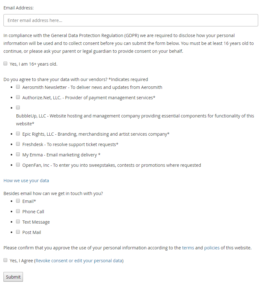
Sample Usage
<my-data-form>
  <form method="POST" action="/">

    <div class="form-group">
      <label for="email">Email:</label>
      <my-data-email-input>
        <input name="email" id="email" type="email" required />
      </my-data-email-input>
    </div>

    <my-data-how-to-use></my-data-how-to-use>
    <my-data-how-to-share></my-data-how-to-share>
    <my-data-how-to-contact></my-data-how-to-contact>
    <my-data-age-verification></my-data-age-verification>
    <my-data-terms-agreement></my-data-terms-agreement>

    <div class="form-group">
      <input type="submit" value="Submit" />
    </div>

  </form>
</my-data-form>
Preview

