
@bytecat/glide-data-grid-cells
v6.1.1
Published
Extra cells for glide-data-grid

Maintainers
 johan_bytecat
Readme
[!IMPORTANT] Bytecat fork notice
This package is the
@bytecat/glide-data-grid-cellsfork of upstream@glideapps/glide-data-grid-cells. It exists as part of the Bytecat fork to address dependency/security and compatibility updates while waiting for upstream to catch up. It is not affiliated with, sponsored by, or endorsed by Glide. Bytecat: https://bytecat.ai.
Before / after package usage
Before:
npm i @glideapps/glide-data-grid-cellsAfter:
npm i @bytecat/glide-data-grid-cellsimport { allCells } from "@bytecat/glide-data-grid-cells";Original upstream README
The section below is preserved from upstream for context. Its upstream badges, links, screenshots, and marketing text describe the original Glide project, not Bytecat ownership, affiliation, or endorsement.





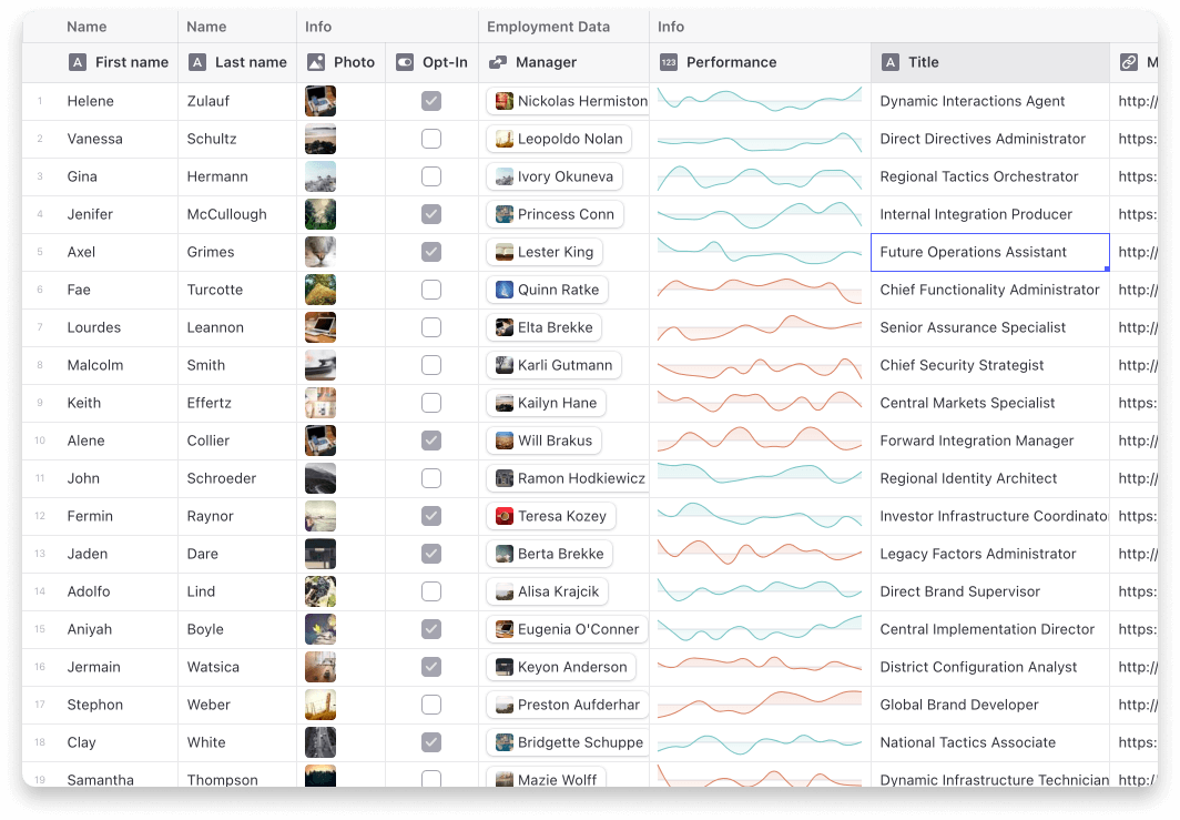
Current cells
- Star (Rating) Cell
- Sparklines
- Article
- Dropdown
- Range
- User profile
- Tags
Usage
Step 1: Import the cell renderers you want to use and pass them to the grid.
import { allCells } from "@glideapps/glide-data-grid-cells";

const Grid = () => {
    return <DataEditor customRenderers={allCells} {...rest} />;
};
Step 2: Use the cells in your getCellContent callback
import type { StarCell } from "@glideapps/glide-data-grid-cells";

const getCellContent = React.useCallback(() => {
    const starCell: StarCell = {
        kind: GridCellKind.Custom,
        allowOverlay: true,
        copyData: "4 out of 5",
        data: {
            kind: "star-cell",
            label: "Test",
            rating: 4,
        },
    };

    return starCell;
}, []);
Note on ArticleCell
The ArticleCell uses @toast-ui/editor to provide its editor. To make sure it works correctly your project will need to import the css file it depends on.
import "@toast-ui/editor/dist/toastui-editor.css";