
@chainlink/design-system
v0.2.8
Published
[image url]: https://smartcontract.imgix.net/examples/design-system-docs/image
Maintainers
 secure.ericz
 secure.javier
 secure.andrew
 notoriousenigma
 secure_handerson
 npmserviceaccount-cll
 m4us
m4us secure.thanh
Keywords
Readme
Chainlink Labs Design System Guidelines.
By Brian Boehlke & Alejandro Larumbe
Q3 2022
Status: In Progress
Table of Contents:
Background
As of Q3 2022, the Front End team released a public version of the Design System as an NPM package.
This document is a guide for importing the package and using the Design System files in a product external to the Product Design and FE teams.
What is the Chainlink Labs Design System?
A library of styles & components released as reusable code to make adopting teams more efficient and consistent in their execution. To make the system work for the largest number of users, the styles and classes are all written in CSS files.
Getting started
Install NPM package
The Design System's NPM package makes the underlying Chainlink Labs Product Design styles available to any team interested in using them.
Install latest version:
npm install @chainlink/design-systemInstall specific version:
npm install @chainlink/design-system@[version_number]
Import design system
To get started, import the Design System into one of your app’s top layer components:
require(@chainlink/design-system/global-styles.css)or
import '@chainlink/design-system/global-styles.css'Importing the design system in your application will apply out of the box styling to HTML tags and access to CSS variables, tokens, and class-based components.
Currently available in Chainlink Design System (CLDS)
The library is broken up into different groups: Values, Tokens, Global Tags, Classes, and Modules. Each group serves a different level of complexity.
For example:
Values are the lowest level variable in the Design System. Most point to hard coded values such as pixels, rem, percentages, or hex numbers.
--blue-600: #375bd2;Tokens assign semantically named variables that point to the individual values.
--color-text-link: var(--blue-600);Classes are more complex by combining multiple declarations into CSS classes that can be applied to HTML tags.
:where(.heading-600, h1) {
  font-size: 2rem;
  margin-bottom: var(--space-4x);
  letter-spacing: -0.04rem;
}

:where(.paragraph, .paragraph-100, .paragraph-200, .paragraph-300, body, p) {
  font-family: var(--font-family-text);
  line-height: 1.5;
  font-weight: var(--font-weight-normal);
  color: var(--color-text-primary);
}
Importing CLDS automatically applies classes to certain HTML tags.
For example, before importing CLDS:
<h1>Chainlink Data Feeds</h1>
<p>Explore the decentralized oracle networks powered by Chainlink</p>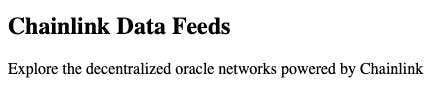
Becomes Chainlink styled when the Design System is imported:

Tokens
Semantically named variables and styles used in our frontend apps -such as Data, Faucets, and Automation- to help simplify implementation and reduce future maintenance.
The CLDS provides tokens in the form of CSS variables.
For example:
<div
  style={{
    margin: 'var(--space-4x)',
    backgroundColor: 'var(--color-background-secondary)',
  }}
>
  <h1>Chainlink Data Feeds</h1>
  <p>Explore the decentralized oracle networks powered by Chainlink</p>
</div>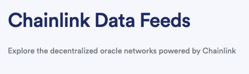
The tokens are split based on their proposed use:
- Background (colors)
- Border (colors, widths, radii, box-shadows)
- Fill (colors used for SVG icons)
- Shadow (colors and box-shadows)
- Typography (colors)
Background
Color
| Name | Intended use | | ---------------------------- | ------------------------------------ | | --color-background-primary | Body background | | --color-background-secondary | Section background | | --color-background-error | Alert error background | | --color-background-contrast | Banner background | | --color-background-warning | Alert warning background | | --color-background-success | Alert success background | | --color-background-info | Alert highlight background | | --color-background-disabled | Disabled button & control background |
Border
Color
| Name | Intended use | | ---------------------------------- | ------------------------------------------------------------------------ | | --color-border-primary | Cards, Tiles | | --color-border-secondary | Dropdown, Menu, use with --shadow-mid when combining borders and shadows | | --color-border-contrast | Banner border | | --color-border-interactive | Input & control borders resting state | | --color-border-interactive-focus | UI focus border | | --color-border-interactive-hover | Input & control border hover state | | --color-border-interactive-pressed | Input & control border pressed state | | --color-border-interactive-error | Interactive card pressed state | | --color-border-disabled | Disabled button & control border | | --color-border-separator | Horizontal rule |
Inner borders as box-shadow
| Name | Intended use | | -------------------- | ------------------------------------------------------------------------ | | --border-primary | Cards, Tiles | | --border-secondary | Dropdown, Menu, use with --shadow-mid when combining borders and shadows | | --border-interactive | Input & control borders resting state |
Radius
| Name | Intended use | | ------------------------- | -------------------- | | --border-radius-primary | Inputs, Buttons | | --border-radius-secondary | Cards | | --border-radius-reset | Border reset | | --border-radius-round | Rounded icon buttons |
Width
| Name | Intended use | | ------------------------ | ------------ | | --border-width-primary | Inputs | | --border-width-secondary | Buttons | | --border-width-reset | Border reset |
Fill
Color
| Name | Intended use | | -------------------- | --------------------------- | | --color-fill-success | Success icon fill and Alert | | --color-fill-error | Error icon fill and Alert | | --color-fill-warning | Warning icon fill and Alert | | --color-fill-info | Info icon fill and Alert |
Shadow
Color tints | Name | Intended use | | ---------------------- | ------------------------------------------- | | --shadow-color-primary | Shadows on background-primary and secondary | | --shadow-color-secondary | Shadows on gray backgrounds | | --shadow-color-contrast | Shadows on the dimmed/scrim background |
Shadows in form of layered box shadows
| Name | Intended use | | ----------------------- | -------------------------------------------------- | | --shadow-low | Tile, Tooltip | | --shadow-mid | Toast, Menu, Side Panel | | --shadow-high | Modal | | --shadow-low-secondary | Options for shadows on different background colors | | --shadow-mid-secondary | | | --shadow-high-secondary | |
Typography
| Name | Intended use | | ------------------------ | --------------------------------- | | --color-text-primary | Body text | | --color-text-secondary | Body text on secondary background | | --color-text-heading | Heading text | | --color-text-error | Error state text | | --color-text-warning | Warning text | | --color-text-success | Success text | | --color-text-info | Alert text | | --color-text-contrast | Banner text | | --color-text-link | Link text | | --color-text-link-hover | Link text hover | | --color-text-link-active | Link text pressed | | --color-text-disabled | Disabled text | | --color-text-placeholder | Form placeholder text | | --color-text-value | Form value text | | --color-text-label | Form label text |
Values
The base values of the design system. These tend to be hard-coded values like pixels, rem, hex numbers, etc. These values can be accessed using the var() function:
.example {
  padding: var(--space-2x);
  background-color: var(--orange-200);
}
PRO TIP - Aim to use the tokens as the first option and fall back to use the low-level values if the token does not exist.
Values are split according to their use:
Classes
Classes that can be applied to HTML tags to leverage the Product Design team’s styles. These classes are included when importing the design system.
Usage
To use, add the pertinent class to an HTML tag (no need for additional imports). For example:
<div className="container">In addition, a group of classes are applied automatically to certain HTML tags when importing the design system. (See example above)
List of tags automatically styled:
Layout: main
Typography: h1, h2, h3, h4, h5, h6, p, span, button, input, select, area, label
PRO Tip - Classes can be overridden if needed by applying a different class or CSS styling to an HTML tag.
Classes available in CLDS acording to their use:
Layout
Top level classes to match the page layout of the Chainlink productss (ie. Automation, VRF, etc.).
container
card Example:
<div className="card">
  <h4>Chainlink Data Feeds</h4>
  <p>Explore the decentralized oracle networks powered by Chainlink</p>
</div>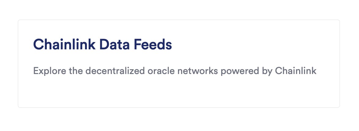
Typography
CSS classes that match the Product Design team’s text styles within Figma.
- By importing the CLDS, the Typography component file will assign styles to all headings, paragraphs and spans
- To override or apply classes to any other HTML tags, add the class to the tag
- This will provide the tag: font-family, font-weight, color, and line-height
- If needing to change the font-weight, apply using inline styles.
<h2 className="heading-600" style={{ marginBottom: 'var(--space-12x)' }}>
  Example
</h2>
List all typography classes:
| Name | Intended use 📱 | Automatically applied to: | | ------------- | -------------------------------- | ------------------------- | | display-400 | Marketing headers and titles | | | display-500 | | | | display-600 | | | | heading-100 | Headers and titles | h6 | | heading-200 | | h5 | | heading-300 | | h4 | | heading-400 | | h3 | | heading-500 | | h2 | | heading-600 | | h1 | | paragraph-100 | Multi-line text block (2+ lines) | | | paragraph-200 | | body, p | | paragraph-300 | | | | text-100 | Single lines of text (1 line) | | | text-200 | | span | | text-300 | | | | label | Form labels, table headers | |
Modules
More complex components that rely on a tag hierarchy and may have variants. Module components are responsive.
In order to use, import each component:
const component = require('@chainlink/design-system/component.module.css')or
import component from '@chainlink/design-system/component.module.css'Module components are module.css files. You can read this guide if your app does not support module.css files out of the box.
Button
Import
import button from '@chainlink/design-system/button.module.css'Variants
- primary
- secondary
- tertiary
- tag
- reset
Structure
<button href="#" className={button.variant}>
  Button label
</button>
Tertiary button accepts an svg image:
<button className={button.tertiary}>
  <svg />
  Button label
</button>
Usage
<button href="#" className={button.primary}>
    Primary
</button>

<a href="#" className={button.secondary}>
    Secondary
</a>

<button className={button.tertiary}>
  <svg
    width="16"
    height="16"
    viewBox="0 0 16 16"
    fill="none"
    xmlns="http://www.w3.org/2000/svg"
  >
    <path d="M8 0C6.41775..." fill="currentColor" />
  </svg>
 Tertiary
</button>

<button className={button.tag}>Tag</button>

<li className={button.reset}>Reset</li>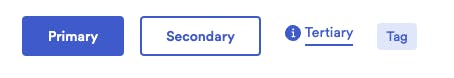
Hero
Import
import hero from '@chainlink/design-system/hero.module.css'Usage
Place the hero.container class in the components's parent element.
Structure
<section className={hero.container}>
<h1>
Hero Title
{/* Optional */}
<button className={button.primary}>Actions button</button>
</h1>
{/* Optional */}
<p>Description</p>
{/* Optional. May be a button or a. */}
<button className={button.primary}>Button 1</button>
{/* Optional. May be a button or a. */}
<a href="#" className={button.secondary}>
Button 2
</a>
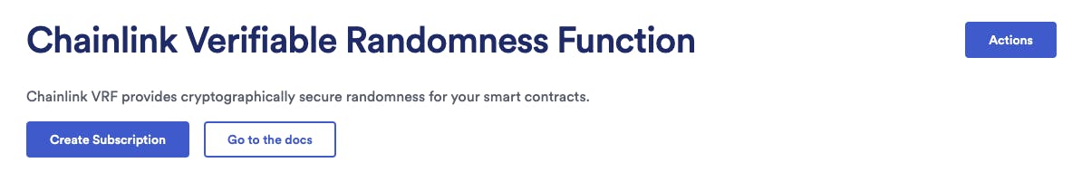
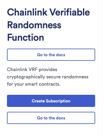
</section>Usage
<section className={hero.container}>
  <h1>
    Chainlink Verifiable Randomness Function
    <button className={button.primary}>Actions</button>
  </h1>
  <p>
    Chainlink VRF provides cryptographically secure randomness for your smart
    contracts.
  </p>
  <button className={button.primary}>Create Subscription</button>
  <a
    href="https://docs.chain.link/docs/chainlink-vrf/"
    className={button.secondary}
  >
    Go to the docs
  </a>
</section>
Desktop:
Mobile:
A stripped down version of the Hero might look like this:
<section className={hero.container}>
  <h1>Chainlink Verifiable Randomness Function</h1>
  <p>
    Chainlink VRF provides cryptographically secure randomness for your smart
    contracts.
  </p>
  <a
    href="https://docs.chain.link/docs/chainlink-vrf/"
    className={button.secondary}
  >
    Go to the docs
  </a>
</section>
Header banner
Import
import headerbanner from '@chainlink/design-system/headerbanner.module.css'Structure
<div className={headerbanner.container}>
  {/* Optional*/}
  <div className={headerbanner.count}>
    <span>NEW</span>
  </div>
  <p>
    Description
    {/* Optional*/}
    <a href="#">Link Text</a>
  </p>
</div>
Usage example
<div className={headerbanner.container}>
  <div className={headerbanner.count}>
    <span>NEW</span>
  </div>
  <p>
    Join the global Web3 community at SmartCon 2022.{' '}
    <a href="https://smartcon.chain.link/?utm_medium=referral&utm_source=data-chain-link&utm_campaign=FY22Q3-smartcon-2022">
      Learn more
    </a>
  </p>
</div>