
@cicciosgamino/progress-ring
v1.0.1
Published
Simple progress ring customElement dev with Lit!
Maintainers
 cicciosgamino
Readme

🪐 <progress-ring>
Simple customizable progress ring 🪐!
Example One
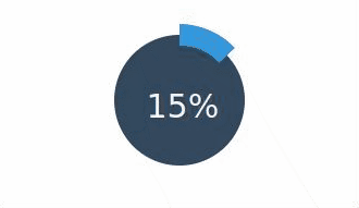
progress-ring {
  --progress-from-bottom: 10%;
  --progress-from-left: 50%;
  --bk-color: #34495e;
  --progress-stroke-color: #3598dc;
  --progress-opacity: 1;
  --progress-font-family: 'Roboto', sans-serif;
  --progress-font-size: 3rem;
  --progress-font-color: whitesmoke;
}
<progress-ring stroke="20" radius="80" progress="0"></progress-ring>Example Two
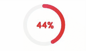
progress-ring {
  --progress-from-bottom: 10%;
  --progress-from-left: 50%;
  --bk-color: transparent;
  --footprint-stroke-color: grey;
  --footprint-opacity: .1;
  --progress-stroke-color: #e9008d;
  --progress-stroke-gradient-color: #dc0030ff;
  --progress-stroke-linecap: round;
  --progress-font-family: 'Jua', sans-serif;
  --progress-font-size: 3rem;
  --progress-font-color: #dc0030ff;
  --progress-font-weight: 600;
}
<progress-ring stroke="13" radius="80" progress="10" ></progress-ring>Example Three
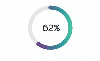
progress-ring {
  --progress-from-bottom: 5%;
  --progress-from-left: 50%;

  --bk-color: transparent;

  --progress-stroke-color: purple;
  --progress-stroke-gradient-color: #00bc9b;
  --progress-stroke-linecap: round;
  --progress-opacity: .9;

  --footprint-stroke-color: grey;
  --footprint-opacity: .2;

  --progress-font-family: 'Mitr', sans-serif;
  --progress-font-size: 3rem;
  --progress-font-weight: 700;
  --progress-font-color: #232323;
}
<progress-ring stroke="13" radius="80" progress="0"></progress-ring>Example Four

progress-ring {
  --progress-from-bottom: 10%;
  --progress-from-left: 50%;
  --title-from-top: 10%;
  --title-from-left: 50%;

  --bk-color: transparent;

  --progress-stroke-color: OrangeRed ;
  --progress-stroke-gradient-color: salmon;
  --progress-stroke-linecap: round;
  --progress-opacity: .9;

  --footprint-stroke-color: grey;
  --footprint-opacity: .2;

  --progress-font-family: 'Roboto', sans-serif;
  --progress-font-size: 2rem;
  --progress-font-weight: 700;
  --progress-font-color: salmon;

  --title-font-size: 4rem;
}
<progress-ring title="🍣" stroke="10" radius="80" progress="0"></progress-ring>🚀 Usage
- Install package
npm install --save @cicciosgamino/progress-ring- Import
<!-- Import Js Module -->
<script type="module">
  // Importing this module registers <progress-ring> as an element that you
  // can use in this page.
  //
  // Note this import is a bare module specifier, so it must be converted
  // to a path using a server such as @web/dev-server.
  import '@cicciosgamino/progress-ring'
</script>- Place in your HTML
<progress-ring title="🍣" stroke="10" radius="80" progress="0"></progress-ring>🐝 API
📒 Properties/Attributes
| Name | Type | Default | Description
| ------------- | ------------- | ------------ | --------------
| title | String | '' | Brief string to place inside the progress ring component space
| radius | Number | 60 | Radius of the ring
| progress | Number | 0 | Percent number passed to the component
| stroke | Number | 10 | Stroke width, this rapresent the progress line
Methods
None
Events
None
🧁 CSS Custom Properties
| Name | Default | Description
| -------------------------- | ----------- | --------------------
| --progress-from-bottom | 10% | Absolute positioning the progress number from bottom
| --progress-from-left | 50% | Absolute positioning the progress number from left
| --title-from-top | 40% | Absolute positioning the title from top
| --title-from-left | 50% | Absolute positioning the title from left
| --bk-color |transparent| Background color inside the circle
| --progress-stroke-color | #e9008d | Progress stroke color
| --progress-stroke-gradient-color | '' | Progress stroke stop-color if you want a gradient effect
| --progress-stroke-linecap| butt | SVG stroke linecap ( butt | round | square )
| --progress-opacity | .9 | Opacity on progress stroke
| --footprint-stroke-color |transparent| Track under the progress stroke can be visible or transparent
| --footprint-opacity | 0 | Opacity on footprint stroke
| --progress-font-family |sans-serif | Font family for the progress counter
| --progress-font-size | 2rem | Font size for the progress counter
| --progress-font-weight | 400 | Font weight for the progress counter
| --progress-font-color | #000 | Font color for the progress counter
| --title-font-family |sans-serif | Font family for the title
| --title-font-size | 1.2rem | Font size for the title
| --title-font-color | #000 | Font color for the title
🤖 Write HTML and JavaScript
Import the component's JavaScript module, use the component in your HTML, and control it with JavaScript, just like you would with a built-in element such as <button>:
<!doctype html>
<html>
  <head>
    <meta charset="utf-8">
    <title>My Example App</title>

    <!-- Add support for Web Components to older browsers. -->
    <script src="./node_modules/@webcomponents/webcomponentsjs/webcomponents-loader.js"></script>

  </head>
  <body>
    <!-- Use Web Components in your HTML like regular built-in elements. -->
    <progress-ring id="myProgress" title="🍣" stroke="10" radius="80" progress="0"></progress-ring>

    <!-- The Material Web Components use standard JavaScript modules. -->
    <script type="module">

      // Importing this module registers <progress-ring> as an element that you
      // can use in this page.
      //
      // Note this import is a bare module specifier, so it must be converted
      // to a path using a server such as @web/dev-server.
      import '@cicciosgamino/progress-ring'

      // Standard DOM APIs work with Web Components just like they do for
      // built-in elements.
      const p = document.querySelector('progress-ring')
      let count = 0
      setInterval(() => {
        p.setAttribute('progress', `${(count+=1) % 100}`)
      }, 100)
    </script>
  </body>
</html>
🚀 Serve
Serve your HTML with any server or build process that supports bare module specifier resolution (see next section):
# use globally instelled
npm install -g @web/dev-server

# install the project dev-dependencies and npm run
npm install
npm run serve
Bare module specifiers
All @cicciosgamino Lit components JavaScript modules that use bare module specifiers. Bare module specifiers are not yet supported by browsers, so it is necessary to use a tool that transforms
them to a path (for example from @cicciosgamino/progress-ring to ./node_modules/@cicciosgamino/progress-ring/progress-ring.js).
Two great choices for tools that do this are:
- During local development, use open-wc's
@web/dev-serverwith the--node-resolveflag. - For your production deployment, build your application with Rollup using the
rollup-plugin-node-resolveplugin.
Contributing
Got something interesting you'd like to share? Learn about contributing.
Author
|  |
|:------------------------------------------------------------------------------------------: |
| @cicciosgamino |
|
|:------------------------------------------------------------------------------------------: |
| @cicciosgamino |
Support
Reach out to me at one of the following places:
Donate
Donate help and contibutions!
License

- Copyright © @cicciosgamino.
CSS encapsulation
The elements HTML structure is initialized in a Shadow DOM, so it is impossible to apply CSS to it. If you need to change the element's default style for any reason, you should open up a new issue (or a pull request!), describing your use case, and we'll work with you on solving the problem.
Browser support
Browsers without native custom element support require a polyfill. Legacy browsers require various other polyfills. See [examples/index.html][example] for details.
- Chrome
- Firefox
- Safari
- Microsoft Edge