
@circa-input/web-component
v0.3.0
Published
Web Component implementation of circa-input (<circa-input> tag)
Maintainers
 imotako-pum
Readme
@circa-input/web-component


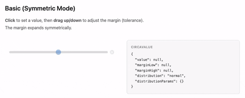
One input. One action. Value + ambiguity. A Web Component that captures not just a number, but how fuzzy that number is — in a single gesture. Works with any framework or plain HTML.
No more wiring up two sliders, a min/max pair, or a number field plus tolerance. One <circa-input> tag replaces them all.
Live Demo · React? Use @circa-input/react
Install
npm install @circa-input/web-componentQuick Start
With a bundler
<script type="module">
  import "@circa-input/web-component";
</script>

<circa-input min="0" max="100"></circa-input>

<script>
  document.querySelector("circa-input")
    .addEventListener("change", (e) => {
      console.log(e.detail);
      // { value: 42, marginLow: 5, marginHigh: 5, distribution: "normal", distributionParams: {} }
    });
</script>
Via CDN (no build tools)
<script src="https://unpkg.com/@circa-input/web-component"></script>
<circa-input min="0" max="24" step="1" tick-interval="6"></circa-input>
Attributes
| Attribute | Type | Default | Description |
|-----------|------|---------|-------------|
| min | number | 0 | Minimum value |
| max | number | 100 | Maximum value |
| value | number | — | Center value (controlled) |
| margin-low | number | — | Lower margin (controlled) |
| margin-high | number | — | Upper margin (controlled) |
| default-value | number | — | Initial value (uncontrolled) |
| default-margin-low | number | — | Initial lower margin (uncontrolled) |
| default-margin-high | number | — | Initial upper margin (uncontrolled) |
| step | number | "any" | "any" | Value granularity |
| margin-max | number | — | Max margin size |
| asymmetric | boolean | false | Independent low/high margins |
| initial-margin | number | null | null | Margin applied on first click. Default: (max - min) / 10. Set to 0 to disable. |
| name | string | — | Form field name |
| required | boolean | false | Form validation |
| tick-interval | number | — | Tick mark interval |
| no-clear | boolean | false | Hide clear button |
| disabled | boolean | false | Disable interaction |
Events
| Event | Type | When |
|-------|------|------|
| change | CustomEvent<CircaValue> | On interaction end |
| input | CustomEvent<CircaValue> | During interaction |
CSS Customization
Style with 14 CSS Custom Properties:
circa-input {
  --circa-track-height: 8px;
  --circa-track-color: #e0e0e0;
  --circa-track-radius: 4px;
  --circa-value-color: #1976d2;
  --circa-margin-color: rgba(25, 118, 210, 0.2);
  --circa-handle-size: 20px;
  --circa-handle-color: #1976d2;
  --circa-clear-color: #bbb;
  --circa-clear-hover-color: #888;
  --circa-tick-height: 6px;
  --circa-tick-width: 1px;
  --circa-tick-color: #999;
  --circa-tick-label-size: 10px;
  --circa-tick-label-color: #666;
}
Form Integration
<form>
  <circa-input name="delivery_time" min="9" max="21" required></circa-input>
  <button type="submit">Submit</button>
</form>
FormData contains the CircaValue as a JSON string.
Full Documentation
See the circa-input monorepo for keyboard shortcuts, auto-margin details, and more examples.
License
MIT