
@cloudvisionapps/react-ui
v1.0.3
Published
A comprehensive React UI component library

Readme
@cloudvisionapps/react-ui

A React component library built with TypeScript and Tailwind CSS. Use it to build consistent UIs across applications with minimal setup.
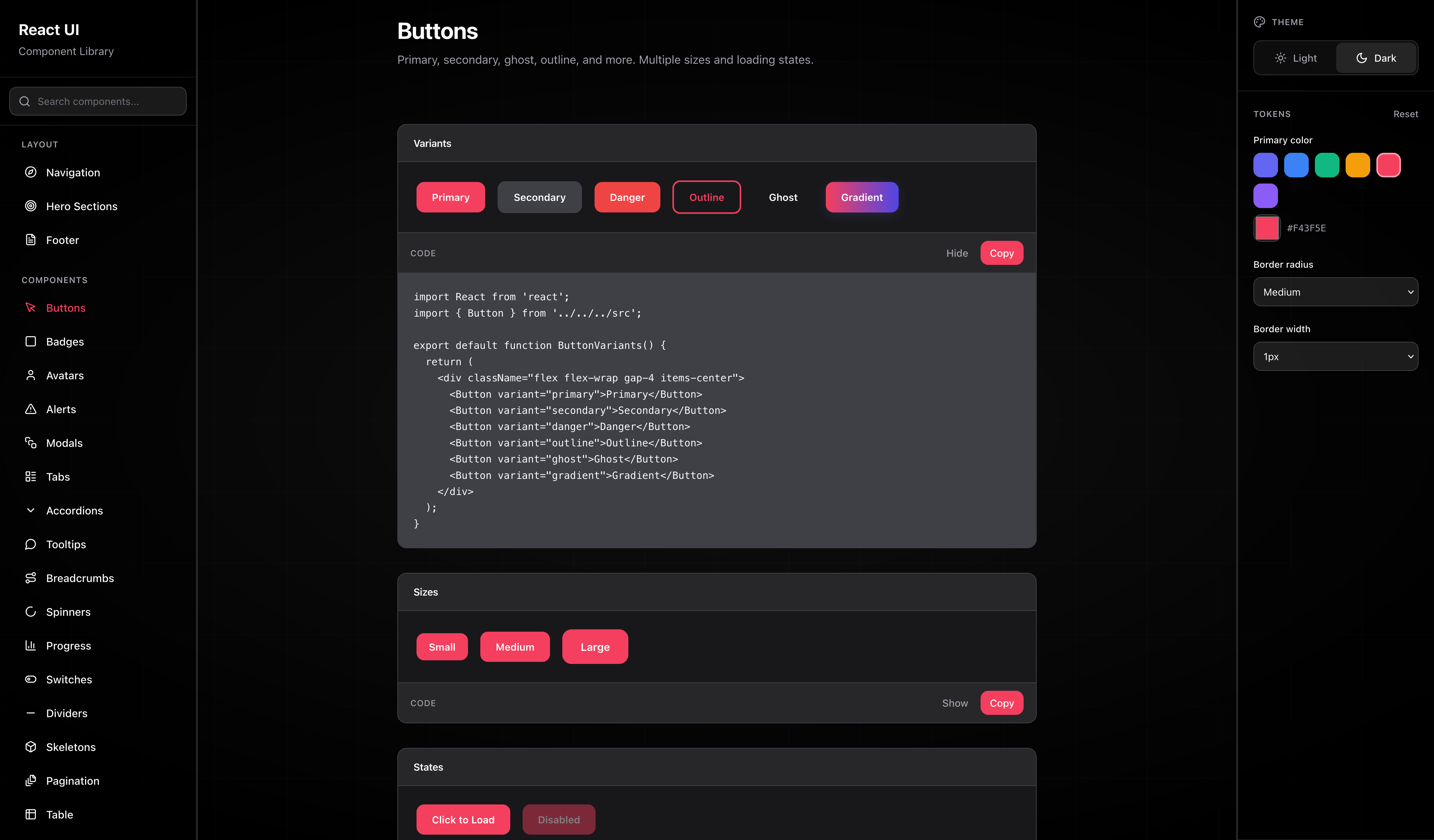
Screenshots
Requirements
- React 18+
- React DOM 18+
Installation
npm install @cloudvisionapps/react-uiyarn add @cloudvisionapps/react-uipnpm add @cloudvisionapps/react-uiQuick Start
Import components and include the library styles in your app (e.g. in your root layout or main.tsx):
import { Button, Card, Input } from '@cloudvisionapps/react-ui';
import '@cloudvisionapps/react-ui/styles';

function App() {
  return (
    <Card title="Welcome" footer={<Button>Submit</Button>}>
      <Input label="Email" placeholder="Enter your email" />
      <Button variant="primary">Submit</Button>
    </Card>
  );
}
Components
| Component | Description | |-----------|-------------| | Accordion | Collapsible content sections | | Alert | Inline messages and notifications | | Avatar | User or entity image/initials | | Badge | Labels and status indicators | | Breadcrumb | Navigation path | | Button | Actions with variants and loading state | | Card | Container with optional title and footer | | Checkbox | Boolean form control | | Divider | Visual separator | | EmptyState | Placeholder when there is no content | | Footer | Page footer with links and columns | | Hero | Hero / landing section | | Input | Text input with label and validation | | Link | Styled link | | Modal | Dialog overlay | | Navigation | Top or side navigation | | Pagination | Page navigation controls | | Progress | Progress bar | | Radio | Single choice from a group | | Select | Dropdown selection | | Skeleton | Loading placeholder | | Spinner | Loading indicator | | Switch | Toggle control | | Table | Table with TableHead, TableBody, TableRow, TableHeader, TableCell | | Tabs | Tabbed content (Tabs, TabPanel) | | Textarea | Multi-line text input | | Tooltip | Hover/popover hint |
All components are typed (TypeScript) and accept standard HTML attributes where relevant.
Example: Button
<Button variant="primary" size="medium" isLoading={false}>
  Save
</Button>- variant:
'primary' | 'secondary' | 'danger' | 'outline' - size:
'small' | 'medium' | 'large' - isLoading:
boolean
Example: Input
<Input
  label="Email"
  placeholder="[email protected]"
  error="Invalid email"
  helperText="We never share your email."
/>
Example: Table
import { Table, TableHead, TableBody, TableRow, TableHeader, TableCell } from '@cloudvisionapps/react-ui';

<Table>
  <TableHead>
    <TableRow>
      <TableHeader>Name</TableHeader>
      <TableHeader>Status</TableHeader>
    </TableRow>
  </TableHead>
  <TableBody>
    <TableRow>
      <TableCell>Alice</TableCell>
      <TableCell>Active</TableCell>
    </TableRow>
  </TableBody>
</Table>
Development
# Install dependencies
npm install

# Build the library
npm run build

# Type check
npm run type-check

# Run component preview (dev server)
npm run preview:dev
The preview app runs at http://localhost:3000 so you can try all components and variants.
Watch mode (rebuild on change):
npm run devPreview production build:
npm run build && npm run previewUsing the library in another project (local)
From this repo:
npm linkFrom your app:
npm link @cloudvisionapps/react-uiPublishing
Bump the version in package.json, then build and publish. With the GitHub workflow, push to trigger publish using the NPM_TOKEN secret.
Manual publish:
npm run build
npm publish
License
MIT