
@code4bones/react-tree-menu-property-grid
v1.0.3
Published
Tree Menu with Property Grid
Maintainers
 code4bones
Readme
TreeMenu / PropertyGrid


System default / Custom theme

|feature|sample|
|-------|------|
|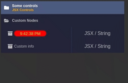 |
|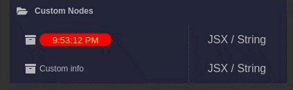 |
|
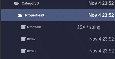 |
|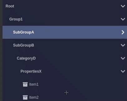 |
|
clone, samples available via yarn storybook
Brief
yarn add @code4bones/react-tree-menu-property-grid
import  {TreeMenu, TreeMenuActions,TreeMenuItem }  from "@code4bones/react-tree-menu-property-grid";
import "@code4bones/react-tree-menu-property-grid/build/styles.css";

const ITEMS : TreeMenuItem[] = [{
  id:"item1",
  title:"Item 1",
  // other TreeMenuItem's props
    childs:[{
     id:"sub",
     title:"Subitem 1",
   }]
}];

// if your need to use exponsed actions
const ref = createRef<TreeMenuActions>();

<TreeMenu
  ref={ref}
  items={ITEMS}
  onClick={onClick}
/>
Properties
type RenderFn = (item:MenuItem) => React.ReactElement | undefined | null;
type RenderType = RenderFn | React.ReactElement;
| Propery name | Description | Signature
| ------------- | ------------------------------ | ---- |
| treeID | tree id | string |
| propertyGrid | property grid mode | boolean |
| items[] | tree menu items array | TreeMenuItem[] |
| ref | handle to TreeMenu methods | TreeMenuActions |
| initialCollapsed | initial tree state | boolean |
| initialSelected | initial selected item | item's id : string|
| theme | theme override class name | dark, light, custom name |
| classPrefix | container global prefix | string |
| enableRotate | Rotate collapse / expand icon| boolean |
| infoStyle | global custom style | boolean |
| titleStyle | global custom style | boolean |
| infoReveal | global info display modes | "always" | "vertical" | "horizontal" |
| badgeVisible | display badge | boolean |
| groupIconLeft | group icon position | boolean |
| onClick | item click handler | onClick?:(item:TreeMenuItem) => void|
| onToggle | collapse / expand | onToggle?:(id?:string,collapsed?:boolean) => void;|
| renderBadge | item click handler | RenderType |
| renderIcon | Left side element of item | RenderType |
| renderGroupState | Group indicator | RenderType |
TreeMenuItem
    id:string;
    title:string | React.ReactElement;
    info?:string | React.ReactElement;
    badge?:string | React.ReactElement;
    control?:string | JSX.Element;
    infoReveal?:InfoReveal;
    icon?:React.ReactElement;
    badge?:string | React.ReactElement;
    disabled?:boolean;
    unselectable?:boolean;
    titleClass?:string;
    infoClass?:string;
    style?:React.CSSProperties;
    titleStyle?:React.CSSProperties;
    infoStyle?:React.CSSProperties;
TreeMenuActions ( use ref )
    enable:(id:string,disable?:boolean) => void;
    getItem:(id:string) => TreeMenuItem | null;
    collapse:(id:string,collapsed?:boolean) => void;
    select:(id:string) => void;
	  invalidate:() => void;
	  rebuild:(items:TreeMenuItem[]) => void;
Sample
Sample available via storybook yarn storybook