@cola-js/postcss-flexbox
v1.0.3
Published
Flexbox layouts made easy with PostCSS
Downloads
11
Readme
postcss-flexbox
PostCSS Flexbox provides an easy to use option for using CSS3 Flexbox layouts. This is supported by IE 10+ and all evergreen browsers.
Installation
npm install postcss-flexbox
Dependencies
Please add autoprefixer after postcss-flexbox. This will ensure all the appropriate vendor prefixes are added. Flexbox is not supported without these prefixes in some browsers yet. Please refer here for detailed information.
Usage
CSS3 Flexbox lets you set the layout for container divs: horizontal alignment of children or vertical. The children can in turn choose the space they occupy in the container and the alignment as well. Below are examples to show how this works. Here is a detailed blogpost I wrote on building using Flexbox in Coursera's tech blog
postcss-flexbox offers 2 props to set on a selector:
box : This is to make a HTML element a flexbox Below are the values it can take. Please provide these values separated by a empty space. Provide a combination of these values and see the wonders of Flexbox working effortlessly.
One of the following options is necessary to specify the direction of laying things out:
- horizontal
- horizontal-reverse
- vertical
- vertical-reverse
Here are the rest of the options which will apply based on the direction:
- top
- bottom
- left
- right
- middle (vertical center)
- center (horizontal center)
- space-around
- space-between
- wrap
- wrap-reverse
box-item : This is to align or adjust size of elements within a flexbox. Here are the list of options. Please specify them with a space between. You can provide the alignment option like top or right along with the size option like flex-1. Use a combination of these.
- top
- bottom
- right
- left
- middle
- center
- stretch
- flex-auto
- flex-1 ... flex-12
- flex-none
Horizontal box
.horizontal-box {
  box: horizontal;
}
Horizontal box + items centered
.horizontal-box.align-items-center {
   box: horizontal center;
}
Horizontal box + items centered at the bottom
.horizontal-box.align-items-bottom-center {
   box: horizontal bottom center;
}
Horizontal box + items with space between
.horizontal-box.align-items-space-between {
  box: horizontal space-between;
}
Horizontal box + space around items
.horizontal-box.align-items-space-around {
  box: horizontal space-around;
}
Horizontal Box + align items bottom right
.horizontal-box.align-items-bottom-right {
  box: horizontal bottom right;
}
Horizontal Box with items in the ratio 1:2:auto
.horizontal-box {
  box: horizontal;
}

.first {
  box-item: flex-1;
}

.second {
  box-item: flex-2;
}
Horizontal Box : align items individually
.horizontal-box{
  box: horizontal;
}
.first, .second, .third, .fourth {
  box-item: flex-1;
}
.first {
  box-item: top;
}
.second {
  box-item: center;
}
.third {
  box-item: stretch;
}
.fourth {
  box-item: bottom;
}
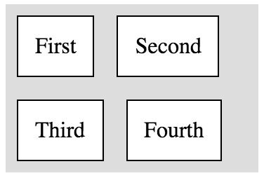
Horizontal box wrap items
.horizontal-box {
  box: horizontal wrap;
}
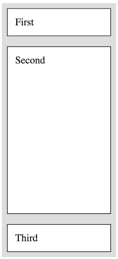
Vertical box with items in ratio auto:1:auto
.vertical-box {
  box: vertical;
}
.second {
  box-item: flex-1;
}
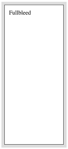
Vertical box with fullbleed item
.vertical-box {
  box: vertical;
}

.fullbleed {
  box-item: flex-1;
}
