
@convo-lang/tui
v0.9.8
Published
A resource efficient, zero dependency terminal user interface library for building feature rich TUI interfaces in TypeScript.

Readme
@convo-lang/tui
A resource efficient, zero dependency terminal user interface library for building feature rich TUI interfaces in TypeScript.
@convo-lang/tui gives you a compact sprite-based UI model for terminal apps: screens, layout, focus navigation, input, mouse events, scrolling, rich text, colors, borders, images, and custom renderers. The library is designed for low overhead rendering while still supporting modern interface patterns.
Installation
npm install @convo-lang/tuiQuick start
import { ConvoTuiCtrl } from '@convo-lang/tui/ConvoTuiCtrl';
import type { SpriteDef, TuiConsole, TuiTheme } from '@convo-lang/tui/tui-types';

const theme:TuiTheme={
    foreground:'#d7d7d7',
    background:'#111111',
    panel:'#1c1c1c',
    accent:'#60a5fa',
    active:'#facc15',
    danger:'#ef4444',
};

const root:SpriteDef={
    id:'root',
    layout:'column',
    bg:'background',
    children:[
        {
            id:'title',
            text:' My TUI App ',
            color:'accent',
            bg:'panel',
            textAlign:'center',
        },
        {
            id:'body',
            text:'Press Tab to focus the button, then Enter to quit.',
            flex:1,
            textAlign:'center',
            vTextAlign:'center',
        },
        {
            id:'quit',
            text:' Quit ',
            border:'danger',
            activeColor:'background',
            activeBg:'danger',
            onClick:evt=>evt.ctrl.dispose(),
        },
    ],
};

const tuiConsole:TuiConsole={
    stdout:process.stdout,
    stdin:process.stdin,
};

const ctrl=new ConvoTuiCtrl({
    console:tuiConsole,
    theme,
    defaultScreen:'home',
    screens:[
        {
            id:'home',
            defaultSprite:'quit',
            root,
        },
    ],
});

process.on('exit',()=>ctrl.dispose());
process.on('SIGTERM',()=>{
    ctrl.dispose();
    process.exit(0);
});

ctrl.init();
High level overview
@convo-lang/tui uses a declarative model:
- A controller owns the terminal, input stream, screen list, theme, and render loop.
- A screen represents a full terminal view.
- A sprite represents a UI element.
- Sprites can render inline text, rich text, images, custom renderer output, or child sprites.
- Layout is calculated from sprite properties such as
layout,flex,width,height,margin,padding,gap, andgridCols. - Interactive sprites can be focused, clicked, linked, typed into, scrolled, or updated at runtime.
Features
- Zero runtime dependencies
- Efficient terminal screen buffer rendering
- Multiple screens
- Screen lifecycle callbacks
- Sprite-based UI tree
- Inline, row, column, and grid layouts
- Flex sizing
- Fixed width and height sizing
- Margin, padding, and gaps
- Absolute positioning
- Plain text rendering
- Rich text spans
- Text wrapping, hard wrapping, clipping, and ellipses
- Horizontal and vertical text alignment
- Theme variables and direct hex colors
- Foreground and background colors
- Active foreground, background, and border styles
- Borders with multiple styles
- Links between screens and sprites
- Keyboard focus navigation
- Buttons
- Text inputs
- Mouse release, drag, and wheel events
- Scrollable containers
- Custom inline renderers
- Timed renderer intervals for animations
- Image rendering from encoded image data
- Runtime sprite updates
- Mutable screen and sprite state
- Custom console stream support
Screens
Screens represent top-level terminal views. Each screen has an id, a root sprite, and an optional defaultSprite that receives focus the first time the screen is shown.
import { ConvoTuiCtrl } from '@convo-lang/tui/ConvoTuiCtrl';
import type { SpriteDef } from '@convo-lang/tui/tui-types';

const homeRoot:SpriteDef={
    id:'home-root',
    layout:'column',
    children:[
        {
            text:'Home screen',
            textAlign:'center',
        },
        {
            id:'open-settings',
            text:' Open settings ',
            link:'settings',
            border:'accent',
        },
    ],
};

const settingsRoot:SpriteDef={
    id:'settings-root',
    layout:'column',
    children:[
        {
            text:'Settings screen',
            textAlign:'center',
        },
        {
            id:'back-home',
            text:' Back home ',
            link:'home',
            border:'accent',
        },
    ],
};

const ctrl=new ConvoTuiCtrl({
    console:{
        stdout:process.stdout,
        stdin:process.stdin,
    },
    defaultScreen:'home',
    screens:[
        {
            id:'home',
            defaultSprite:'open-settings',
            root:homeRoot,
        },
        {
            id:'settings',
            defaultSprite:'back-home',
            root:settingsRoot,
        },
    ],
});

ctrl.init();
Screen lifecycle
Screens can run callbacks when activated or deactivated.
import type { SpriteDef } from '@convo-lang/tui/tui-types';

const root:SpriteDef={
    id:'root',
    text:'Lifecycle example',
};

const screen={
    id:'dashboard',
    root,
    onActivate:evt=>{
        evt.ctrl.updateSprite('status',sprite=>{
            sprite.text='Dashboard active';
        });
    },
    onDeactivate:evt=>{
        evt.ctrl.log?.('Dashboard closed');
    },
};
Use transient:true to clear a screen state each time it is deactivated.
const modalScreen={
    id:'modal',
    transient:true,
    root:{
        id:'modal-root',
        text:'Temporary screen state',
    },
};
Sprites
A sprite is the basic UI element. It can contain text, colors, borders, sizing, layout, event handlers, data, state, and children.
import type { SpriteDef } from '@convo-lang/tui/tui-types';

const card:SpriteDef={
    id:'profile-card',
    layout:'column',
    border:'accent',
    bg:'panel',
    padding:1,
    children:[
        {
            text:'Ada Lovelace',
            color:'accent',
        },
        {
            text:'Mathematician and programmer',
            color:'muted',
        },
    ],
};
Inline layout
The default sprite layout is inline. Inline sprites render their text, richText, image, or custom inline renderer.
import type { SpriteDef } from '@convo-lang/tui/tui-types';

const label:SpriteDef={
    id:'label',
    text:'This is an inline sprite',
    color:'accent',
    border:'muted',
};
Row layout
Row layout places children horizontally.
import type { SpriteDef } from '@convo-lang/tui/tui-types';

const toolbar:SpriteDef={
    id:'toolbar',
    layout:'row',
    gap:1,
    children:[
        {
            text:' New ',
            border:'accent',
        },
        {
            text:' Save ',
            border:'accent',
        },
        {
            text:' Close ',
            border:'danger',
        },
    ],
};
Column layout
Column layout places children vertically.
import type { SpriteDef } from '@convo-lang/tui/tui-types';

const panel:SpriteDef={
    id:'panel',
    layout:'column',
    border:'accent',
    children:[
        {
            text:'Header',
            bg:'panel',
            color:'accent',
            textAlign:'center',
        },
        {
            text:'Body content',
            flex:1,
        },
        {
            text:'Footer',
            color:'muted',
        },
    ],
};
Grid layout
Grid layout places children in columns defined by gridCols.
Column units:
cr: fixed character widthfr: fractional remaining width
import type { SpriteDef } from '@convo-lang/tui/tui-types';

const grid:SpriteDef={
    id:'settings-grid',
    layout:'grid',
    gridCols:['16cr','1fr'],
    border:'accent',
    children:[
        {
            text:'Name',
            color:'accent',
        },
        {
            text:'Convo TUI',
        },
        {
            text:'Theme',
            color:'accent',
        },
        {
            text:'Dark',
        },
        {
            text:'Status',
            color:'accent',
        },
        {
            text:'Ready',
            color:'success',
        },
    ],
};
Flex sizing
flex distributes remaining space between siblings in row and column layouts.
import type { SpriteDef } from '@convo-lang/tui/tui-types';

const splitView:SpriteDef={
    id:'split-view',
    layout:'row',
    children:[
        {
            id:'sidebar',
            text:'Sidebar',
            width:24,
            border:'muted',
        },
        {
            id:'main',
            text:'Main content gets remaining width',
            flex:1,
            border:'accent',
        },
        {
            id:'details',
            text:'Details',
            flex:1,
            border:'muted',
        },
    ],
};
Fixed sizing
Use width and height to request a discrete size.
import type { SpriteDef } from '@convo-lang/tui/tui-types';

const fixedBox:SpriteDef={
    id:'fixed-box',
    text:'30 x 6',
    width:30,
    height:6,
    border:'accent',
    textAlign:'center',
    vTextAlign:'center',
};
Margin, padding, and gap
Spacing can be a single number or per-side values.
import type { SpriteDef } from '@convo-lang/tui/tui-types';

const spaced:SpriteDef={
    id:'spaced',
    layout:'column',
    gap:{
        y:1,
    },
    padding:{
        top:1,
        bottom:1,
        left:2,
        right:2,
    },
    children:[
        {
            text:'First item',
            margin:{
                bottom:1,
            },
            border:'muted',
        },
        {
            text:'Second item',
            border:'muted',
        },
    ],
};
Absolute positioning
Absolute sprites are removed from normal layout and positioned relative to the terminal.
import type { SpriteDef } from '@convo-lang/tui/tui-types';

const root:SpriteDef={
    id:'root',
    layout:'column',
    children:[
        {
            text:'Normal layout content',
            flex:1,
        },
        {
            id:'floating-panel',
            layout:'column',
            absolutePosition:{
                left:4,
                top:3,
                right:4,
                height:8,
            },
            border:'accent',
            bg:'panel',
            children:[
                {
                    text:'Floating panel',
                    color:'accent',
                    textAlign:'center',
                },
                {
                    text:'This sprite overlays the normal layout.',
                    flex:1,
                    textAlign:'center',
                    vTextAlign:'center',
                },
            ],
        },
    ],
};
Text rendering
Inline sprites render text by default.
import type { SpriteDef } from '@convo-lang/tui/tui-types';

const message:SpriteDef={
    text:'Hello from the terminal',
    color:'accent',
};
Text alignment
Use textAlign for horizontal alignment and vTextAlign for vertical alignment.
import type { SpriteDef } from '@convo-lang/tui/tui-types';

const centered:SpriteDef={
    text:'Centered',
    width:40,
    height:7,
    border:'accent',
    textAlign:'center',
    vTextAlign:'center',
};
Text wrapping and clipping
textWrap controls wrapping behavior.
Supported values:
wrap: wrap at whitespace when possiblewrap-hard: wrap exactly at the available widthclip: clip overflowing text
textClipStyle controls clipped text.
Supported values:
ellipsesnone
import type { SpriteDef } from '@convo-lang/tui/tui-types';

const wrappingExamples:SpriteDef={
    id:'wrapping-examples',
    layout:'column',
    children:[
        {
            text:'This text wraps at whitespace when possible and hard wraps long words.',
            textWrap:'wrap',
            border:'muted',
        },
        {
            text:'This text ignores word boundaries and wraps exactly at the available width.',
            textWrap:'wrap-hard',
            border:'muted',
        },
        {
            text:'This line is too long and will be clipped with an ellipses marker.',
            textWrap:'clip',
            textClipStyle:'ellipses',
            border:'muted',
        },
    ],
};
Rich text
Use richText for inline spans with per-span foreground and background colors.
import type { SpriteDef } from '@convo-lang/tui/tui-types';

const rich:SpriteDef={
    id:'rich-message',
    richText:[
        {
            text:'Build ',
        },
        {
            text:'colorful',
            color:'accent',
        },
        {
            text:' terminal ',
        },
        {
            text:'interfaces',
            color:'background',
            bg:'success',
        },
        {
            text:' with rich text.',
        },
    ],
    border:'muted',
};
Themes and colors
Colors can be direct hex colors or theme variable names.
import type { SpriteDef, TuiTheme } from '@convo-lang/tui/tui-types';

const theme:TuiTheme={
    foreground:'#d7d7d7',
    background:'#111111',
    panel:'#1c1c1c',
    accent:'#60a5fa',
    success:'#22c55e',
    danger:'#ef4444',
};

const themedButton:SpriteDef={
    id:'themed-button',
    text:' Save ',
    color:'accent',
    bg:'panel',
    border:'accent',
    activeColor:'background',
    activeBg:'success',
    activeBorder:'success',
};
Borders
Sprites can draw borders using a theme color, hex color, or per-side border object.
import type { SpriteDef } from '@convo-lang/tui/tui-types';

const bordered:SpriteDef={
    id:'bordered',
    text:'Bordered content',
    border:'accent',
    borderStyle:'rounded',
};
Per-side borders:
import type { SpriteDef } from '@convo-lang/tui/tui-types';

const sideBorders:SpriteDef={
    text:'Only selected sides',
    border:{
        top:'accent',
        bottom:'accent',
        left:'muted',
    },
};
Border styles:
import type { SpriteDef } from '@convo-lang/tui/tui-types';

const borderStyles:SpriteDef={
    layout:'column',
    children:[
        {
            text:'Normal',
            border:'accent',
            borderStyle:'normal',
        },
        {
            text:'Thick',
            border:'accent',
            borderStyle:'thick',
        },
        {
            text:'Rounded',
            border:'accent',
            borderStyle:'rounded',
        },
        {
            text:'Double',
            border:'accent',
            borderStyle:'double',
        },
        {
            text:'Classic',
            border:'accent',
            borderStyle:'classic',
        },
    ],
};
Focus and active styles
Interactive sprites can become active. Active sprites can use activeColor, activeBg, and activeBorder.
import type { SpriteDef } from '@convo-lang/tui/tui-types';

const button:SpriteDef={
    id:'focus-button',
    text:' Focus me ',
    border:'accent',
    activeColor:'background',
    activeBg:'accent',
    activeBorder:'active',
    onClick:evt=>{
        evt.ctrl.updateSprite('status',sprite=>{
            sprite.text='Button clicked';
        });
    },
};
Links
A sprite with link can move focus to another sprite or activate another screen.
import type { SpriteDef } from '@convo-lang/tui/tui-types';

const nav:SpriteDef={
    id:'nav',
    layout:'column',
    children:[
        {
            id:'home-link',
            text:' Home ',
            link:'home',
            border:'accent',
        },
        {
            id:'settings-link',
            text:' Settings ',
            link:'settings',
            border:'accent',
        },
    ],
};
Link resolution checks:
- Local sprites in the current screen
- Screens
- Sprites in all screens
Buttons
A sprite with onClick automatically behaves like a button. You can also set isButton:true.
import type { SpriteDef } from '@convo-lang/tui/tui-types';

const saveButton:SpriteDef={
    id:'save',
    text:' Save ',
    border:'success',
    activeColor:'background',
    activeBg:'success',
    onClick:evt=>{
        evt.ctrl.updateSprite('status',sprite=>{
            sprite.text='Saved';
            sprite.color='success';
        });
    },
};
Text inputs
A sprite with isInput:true behaves like a text input. The current input value is stored in sprite.state.inputValue.
import type { SpriteDef } from '@convo-lang/tui/tui-types';

const input:SpriteDef={
    id:'name-input',
    text:'Type your name',
    border:'accent',
    activeBorder:'active',
    isInput:true,
    onInput:evt=>{
        evt.ctrl.updateSprite('preview',sprite=>{
            sprite.text=`Hello, ${evt.value || 'stranger'}`;
        });
    },
};
Mouse events
Sprites can listen for mouse release, drag, and wheel events.
import type { SpriteDef, SpriteMouseEvtBase } from '@convo-lang/tui/tui-types';

const formatMouse=(evt:SpriteMouseEvtBase)=>{
    const modifiers=[
        evt.modifiers.shift?'shift':undefined,
        evt.modifiers.alt?'alt':undefined,
        evt.modifiers.ctrl?'ctrl':undefined,
    ].filter(Boolean).join('+') || 'none';

    return `${evt.x},${evt.y} modifiers=${modifiers}`;
};

const mousePad:SpriteDef={
    id:'mouse-pad',
    layout:'column',
    flex:1,
    border:'accent',
    activeBorder:'active',
    isButton:true,
    onMouseRelease:evt=>{
        evt.ctrl.updateSprite('mouse-status',sprite=>{
            sprite.text=`release ${evt.button} at ${formatMouse(evt)}`;
        });
    },
    onMouseDrag:evt=>{
        evt.ctrl.updateSprite('mouse-status',sprite=>{
            sprite.text=`drag ${evt.button} at ${formatMouse(evt)}`;
        });
    },
    onMouseWheel:evt=>{
        evt.ctrl.updateSprite('mouse-status',sprite=>{
            sprite.text=`wheel ${evt.direction} deltaY=${evt.deltaY} at ${formatMouse(evt)}`;
        });
    },
    children:[
        {
            text:'Drag, release, or wheel over this panel.',
            textAlign:'center',
        },
    ],
};
Scrolling
Set scrollable:true to allow a sprite's children to scroll when content is larger than the available layout area.
import type { SpriteDef } from '@convo-lang/tui/tui-types';

const scrollPanel:SpriteDef={
    id:'scroll-panel',
    layout:'column',
    flex:1,
    scrollable:true,
    isButton:true,
    border:'accent',
    activeBorder:'active',
    children:Array.from({length:30},(_,i)=>({
        text:`Row ${String(i+1).padStart(2,'0')} - scroll with arrow keys or mouse wheel.`,
        border:'muted',
    })),
};
Custom inline renderers
Use inlineRenderer to draw custom content inside an inline sprite.
import type { SpriteDef } from '@convo-lang/tui/tui-types';

const custom:SpriteDef={
    id:'custom-renderer',
    text:'----------',
    inlineRenderer:{
        render:ctx=>{
            ctx.setChar(0,0,'Custom','accent');
            ctx.setChar(7,0,'UI','success');
        },
        overlayContent:true,
    },
};
The renderer receives a bounded drawing area. Attempts to draw outside the area are ignored.
Animations
Set inlineRenderer.intervalMs to redraw custom inline content at an interval while the screen is active.
import type { SpriteDef } from '@convo-lang/tui/tui-types';

const frames=['|','/','-','\\'];

const spinner:SpriteDef={
    id:'spinner',
    text:' Loading',
    inlineRenderer:{
        render:ctx=>{
            const frame=frames[ctx.ivCount%frames.length]??' ';
            ctx.setChar(0,0,frame,'accent');
            ctx.setChar(2,0,'Loading','foreground');
        },
        intervalMs:120,
        overlayContent:true,
    },
};
Progress bar example:
import type { SpriteDef } from '@convo-lang/tui/tui-types';

const progress:SpriteDef={
    id:'progress',
    text:'[                              ]',
    border:'muted',
    inlineRenderer:{
        render:ctx=>{
            const width=Math.max(3,ctx.width);
            const innerWidth=width-2;
            const value=ctx.ivCount%(innerWidth+1);

            ctx.setChar(0,0,'['+' '.repeat(innerWidth)+']','muted');
            ctx.setChar(1,0,'='.repeat(value),'success');

            if(value<innerWidth){
                ctx.setChar(value+1,0,'>','active');
            }
        },
        intervalMs:80,
        overlayContent:true,
    },
};
Images
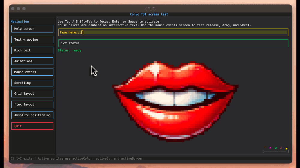
Sprites can display encoded image data using the image property on SpriteDef.
import type { SpriteDef } from '@convo-lang/tui/tui-types';
import { logoSrc } from './logo.js';

const logo:SpriteDef={
    id:'logo',
    image:logoSrc,
    textAlign:'center',
    vTextAlign:'center',
    imageOptions:{
        width:80,
        cleanEdges:true,
    },
};
imageOptions can set target width, target height, and cleanEdges.
Runtime updates
Use the controller to update sprites at runtime.
import type { SpriteDef } from '@convo-lang/tui/tui-types';

const status:SpriteDef={
    id:'status',
    text:'Ready',
    color:'success',
};

const refreshButton:SpriteDef={
    id:'refresh',
    text:' Refresh ',
    border:'accent',
    onClick:evt=>{
        evt.ctrl.updateSprite('status',sprite=>{
            sprite.text='Refreshed';
            sprite.color='accent';
        });
    },
};
You can also update by passing a sprite update object.
evt.ctrl.updateSprite({
    id:'status',
    text:'Updated from object',
    color:'success',
});
Sprite controllers
Use ctrl to attach behavior to a sprite when it is loaded. The controller receives a sprite context with the current sprite, the TUI controller, and a scoped update function. The scoped update function updates the controller sprite when no id is supplied, or a descendant sprite when an id is supplied.
A controller can also return a cleanup function that runs when the sprite is unmounted.
import type { SpriteDef } from '@convo-lang/tui/tui-types';

const counterButton:SpriteDef={
    text:' Count: 0 ',
    border:'accent',
    activeColor:'background',
    activeBg:'accent',
    ctrl:({sprite,update})=>{
        let count=0;

        sprite.onClick=()=>{
            update({text:` Count: ${++count} `});
        }

        const iv=setInterval(()=>{
            update({text:` Count: ${++count} `});
        },2000);

        return ()=>{
            clearInterval(iv);
        };
    }
};
State
Screens and sprites expose mutable state objects.
Sprite state includes:
activeinputValueinputCaretscrollXscrollY
import type { SpriteDef } from '@convo-lang/tui/tui-types';

const input:SpriteDef={
    id:'search',
    isInput:true,
    border:'accent',
    onInput:evt=>{
        const value=evt.sprite.state?.inputValue ?? '';
        evt.ctrl.updateSprite('summary',sprite=>{
            sprite.text=`Search length: ${value.length}`;
        });
    },
};
Screen state includes the currently active sprite id.
const screen={
    id:'search-screen',
    defaultSprite:'search',
    root:{
        id:'root',
        text:'Search',
    },
    onActivate:evt=>{
        evt.screen.state ??={};
        evt.screen.state.activeSpriteId='search';
    },
};
Custom console streams
@convo-lang/tui can target any console-like object that provides compatible input and output streams.
import { ConvoTuiCtrl } from '@convo-lang/tui/ConvoTuiCtrl';
import type { TuiConsole } from '@convo-lang/tui/tui-types';

const tuiConsole:TuiConsole={
    stdout:process.stdout,
    stdin:process.stdin,
};

const ctrl=new ConvoTuiCtrl({
    console:tuiConsole,
    defaultScreen:'home',
    screens:[
        {
            id:'home',
            root:{
                id:'root',
                text:'Custom console stream example',
            },
        },
    ],
});

ctrl.init();
Recommended app structure
For larger apps, define screens as modules and compose them in one controller.
import { ConvoTuiCtrl } from '@convo-lang/tui/ConvoTuiCtrl';
import type { ScreenDef } from '@convo-lang/tui/tui-types';

const homeScreen:ScreenDef={
    id:'home',
    defaultSprite:'open-settings',
    root:{
        id:'home-root',
        layout:'column',
        children:[
            {
                text:'Home',
                color:'accent',
            },
            {
                id:'open-settings',
                text:' Settings ',
                link:'settings',
                border:'accent',
            },
        ],
    },
};

const settingsScreen:ScreenDef={
    id:'settings',
    defaultSprite:'back-home',
    root:{
        id:'settings-root',
        layout:'column',
        children:[
            {
                text:'Settings',
                color:'accent',
            },
            {
                id:'back-home',
                text:' Back ',
                link:'home',
                border:'accent',
            },
        ],
    },
};

const screens:ScreenDef[]=[
    homeScreen,
    settingsScreen,
];

const ctrl=new ConvoTuiCtrl({
    console:{
        stdout:process.stdout,
        stdin:process.stdin,
    },
    defaultScreen:'home',
    screens,
});

ctrl.init();
Keyboard behavior
Common keyboard behavior:
Tab: move focus forwardShift+Tab: move focus backwardEnter: activate active button or linkSpace: activate buttons and links, or insert a space into inputsBackspace: edit active input- Arrow keys: scroll the active scrollable sprite
Ctrl+C: dispose the controller