
@corinovate/react-data-table
v0.1.0
Published
Lightweight React data table with search, sorting, pagination, themes, dark mode and responsive card view. Zero dependencies, TypeScript, accessible.

Maintainers
 corinovate
Readme
@corinovate/react-data-table
A beautiful, lightweight React data table for business apps. Simple by default. Powerful when needed.



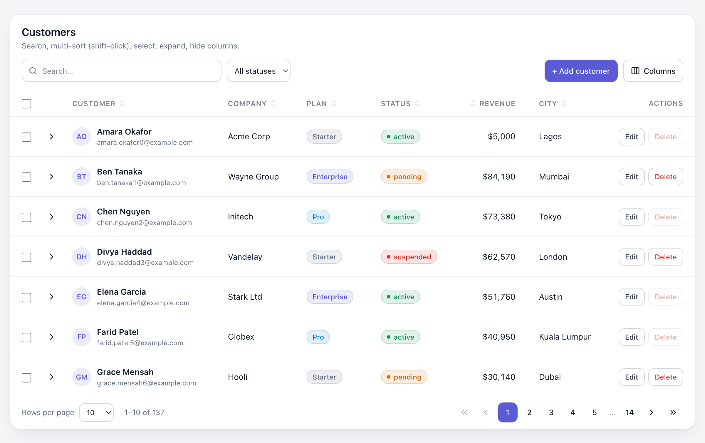
<DataTable data={users} columns={columns} />That one line gives you search, sorting, pagination, a column menu, loading/empty/error states, keyboard navigation and a polished, theme-able look.
- Zero dependencies. About 13 KB JS + 3 KB CSS (min + gzip).
- 6 built-in themes (
default,minimal,modern,compact,dark,glass) pluscreateTheme()for your brand. - Dark mode for every theme:
light,darkor follow the OS withsystem. - Responsive: horizontal scroll, compact rows, or automatic card view on phones.
- Business features: multi-column sort, row selection with bulk actions, row actions, expandable rows, sticky header, status badges.
- Server-side ready: one
onQueryChangecallback for pagination, search and sorting. - Accessible: semantic
<table>,aria-sort, keyboard row navigation, screen-reader announcements. - TypeScript-first, but plain JavaScript works the same.
Built for admin dashboards, CRMs, LMS and MLM platforms, property and resident management, reporting and customer management systems.
Contents
- Installation
- Quick start
- Basic example
- Column configuration
- Search
- Sorting
- Pagination
- Selection
- Row actions
- Custom cells
- Expandable rows
- Loading, empty and error states
- Themes
- Dark mode
- Responsive behavior
- Server-side data
- Customization
- Accessibility
- API reference
- Examples
- Troubleshooting
- About
Installation
npm install @corinovate/react-data-table
# or
yarn add @corinovate/react-data-table
# or
pnpm add @corinovate/react-data-table
Requires React 18 or newer. Import the stylesheet once in your app, for example in main.tsx, _app.tsx or app/layout.tsx:
import '@corinovate/react-data-table/styles.css';Quick start
import { DataTable } from '@corinovate/react-data-table';
import '@corinovate/react-data-table/styles.css';

const users = [
  { id: 1, name: 'Amara Okafor', email: '[email protected]', role: 'Admin' },
  { id: 2, name: 'Ben Tanaka', email: '[email protected]', role: 'Member' },
];

export default function Users() {
  return <DataTable data={users} />;
}
With no columns, they are inferred from the first row (firstName becomes "First name").
Basic example
import { DataTable, renderBadge } from '@corinovate/react-data-table';

const columns = [
  { key: 'name', header: 'Name' },
  { key: 'email', header: 'Email' },
  {
    key: 'status',
    header: 'Status',
    render: renderBadge({ active: 'success', pending: 'warning', banned: 'danger' }),
  },
  {
    key: 'actions',
    header: 'Actions',
    render: (_, row) => (
      <button className="cdt-btn cdt-btn--sm" onClick={() => editUser(row)}>
        Edit
      </button>
    ),
  },
];

<DataTable title="Users" data={users} columns={columns} theme="modern" selectable />;
Columns that don't map to data (like actions above) are automatically excluded from sorting and search.
Column configuration
interface Column<T> {
  key: string;            // property name or dot path: 'address.city'
  header?: ReactNode | (ctx) => ReactNode;  // default: humanized key
  label?: string;         // plain-text name for the column menu, card view and screen readers
  accessor?: (row) => any;                  // computed value
  render?: (value, row, ctx) => ReactNode;  // custom cell
  sortable?: boolean;     // default: true when the column has data
  compare?: (a, b) => number;               // custom sort
  searchable?: boolean;   // default: true when the column has data
  searchValue?: (row) => string;            // custom search text
  hidden?: boolean;       // start hidden (can be shown from the column menu)
  hideable?: boolean;     // appear in the column menu (default true)
  hideOnMobile?: boolean; // hide below the responsive breakpoint
  primary?: boolean;      // card title in card view (default: first column)
  align?: 'left' | 'center' | 'right';
  width?: number | string;
  minWidth?: number | string;
  className?: string | (row) => string;
  headerClassName?: string;
}
Computed and nested values:
const columns = [
  { key: 'fullName', header: 'Name', accessor: (u) => `${u.firstName} ${u.lastName}` },
  { key: 'company.name', header: 'Company' },
  { key: 'revenue', align: 'right', render: (v) => `$${v.toLocaleString()}` },
];
Default cell formatting: empty values show a muted —, booleans show Yes/No, dates use toLocaleDateString(), arrays are joined with commas.
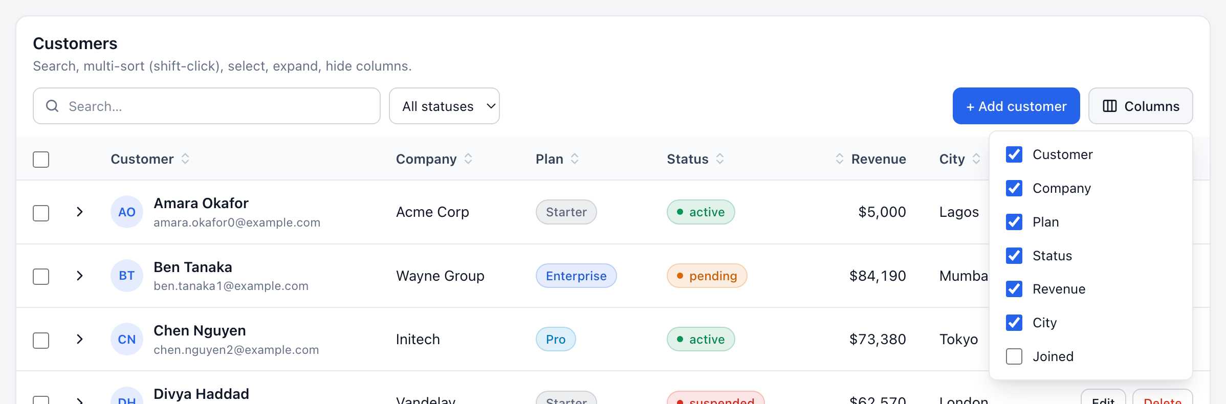
Users can show and hide columns from the built-in Columns menu. Columns with hidden: true start unchecked; hideable: false keeps a column out of the menu, and columnToggle={false} removes the menu entirely.
Search
Search is on by default and matches every word across all searchable columns, case-insensitively ("jane admin" finds Jane in the Admin role).
<DataTable data={users} searchPlaceholder="Search users…" />
<DataTable data={users} searchable={false} />

// Your own matching logic
<DataTable data={users} searchFn={(row, query) => row.email.startsWith(query)} />

// Controlled
const [search, setSearch] = useState('');
<DataTable data={users} search={search} onSearchChange={setSearch} />
searchDebounce (ms) delays filtering while typing. It defaults to 0 for client data and 300 with serverSide.
Sorting
Click a header to sort ascending, again for descending, a third time to clear. Shift-click (or Shift+Enter) adds more columns for multi-column sorting; a small number shows each column's priority.
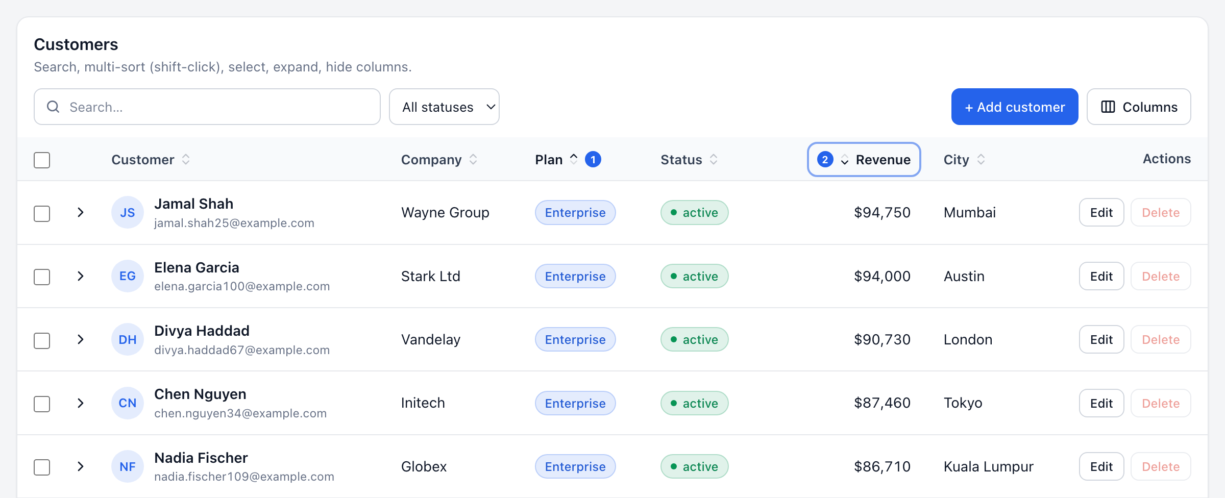
<DataTable data={users} defaultSort={[{ key: 'createdAt', direction: 'desc' }]} />
<DataTable data={users} multiSort={false} />
<DataTable data={users} sortable={false} />

// Per column
{ key: 'priority', compare: (a, b) => rank[a.priority] - rank[b.priority] }
{ key: 'notes', sortable: false }

// Controlled
<DataTable data={users} sort={sort} onSortChange={setSort} />
Strings sort naturally (item 9 before item 10), numbers and dates numerically, and empty values always go last.
Pagination
Pagination is on by default with 10 rows per page.
<DataTable data={users} defaultPageSize={25} pageSizeOptions={[25, 50, 100]} />
<DataTable data={users} pagination={false} />
<DataTable data={users} pageSizeOptions={[]} />  {/* hide the "rows per page" picker */}

// Controlled (page is 1-based)
<DataTable data={users} page={page} onPageChange={setPage} pageSize={size} onPageSizeChange={setSize} />
Custom pagination:
<DataTable
  data={users}
  renderPagination={({ page, pageCount, canNextPage, setPage, from, to, totalRows }) => (
    <div>
      Showing {from}–{to} of {totalRows}
      <button disabled={!canNextPage} onClick={() => setPage(page + 1)}>Load more</button>
    </div>
  )}
/>
The built-in <Pagination> component is also exported if you want to place it elsewhere.
Selection
<DataTable
  data={users}
  selectable                      // or "single"
  onSelectionChange={(keys, rows) => console.log(keys, rows)}
  isRowSelectable={(row) => row.role !== 'Owner'}
  bulkActions={(rows, { clearSelection }) => (
    <>
      <button className="cdt-btn cdt-btn--sm" onClick={() => exportCsv(rows)}>Export</button>
      <button
        className="cdt-btn cdt-btn--sm cdt-btn--danger"
        onClick={async () => { await deleteUsers(rows); clearSelection(); }}
      >
        Delete {rows.length}
      </button>
    </>
  )}
/>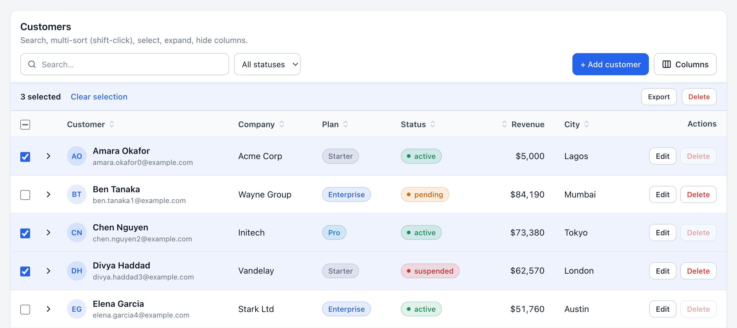
- The header checkbox selects the current page. A "Select all N" link then selects every matching row (client-side data).
- A bar with the selected count, Clear selection and your
bulkActionsappears while rows are selected. - Selection is stored by row key, so it survives sorting, paging and refetching. Rows get keys from
rowKey(a property name or function), falling back torow.id, then the index. - Controlled:
selectedKeys+onSelectionChange.
Row actions
The fastest way is the rowActions prop, which adds a right-aligned Actions column:
<DataTable
  data={users}
  rowActions={[
    { label: 'Edit', onClick: (row) => openEditor(row) },
    { label: 'Delete', variant: 'danger', onClick: (row) => remove(row), disabled: (row) => row.isOwner },
    { label: 'Impersonate', icon: <UserIcon />, iconOnly: true, hidden: (row) => !isAdmin, onClick: impersonate },
  ]}
/>
Variants: default, primary, danger, ghost. For full control, pass a function: rowActions={(row) => <MyMenu row={row} />}, or use a regular column with render as in the basic example.
Clicks on buttons, links and inputs inside a row never trigger onRowClick.
Custom cells
render(value, row, ctx) receives the cell value, the whole row and { rowKey, rowIndex, column }.
import { Badge } from '@corinovate/react-data-table';

const columns = [
  {
    key: 'name',
    render: (_, user) => (
      <div style={{ display: 'flex', gap: 8, alignItems: 'center' }}>
        <img src={user.avatar} alt="" width={28} height={28} style={{ borderRadius: 999 }} />
        <div>
          <strong>{user.name}</strong>
          <div style={{ color: 'var(--cdt-text-muted)' }}>{user.email}</div>
        </div>
      </div>
    ),
    searchValue: (user) => `${user.name} ${user.email}`,
  },
  { key: 'plan', render: (plan) => <Badge tone={plan === 'Pro' ? 'accent' : 'neutral'}>{plan}</Badge> },
];
Badges follow the active theme. Tones: neutral, accent, success, warning, danger, info. renderBadge(map, { dot, fallback, format }) builds a status column renderer in one line.
Custom headers: header accepts a node or a function of { column, sortDirection, sortIndex }:
{ key: 'revenue', header: () => <span title="Last 12 months">Revenue (12m)</span> }Expandable rows
<DataTable
  data={orders}
  renderExpanded={(order) => <OrderLines items={order.items} />}
  isRowExpandable={(order) => order.items.length > 0}
/>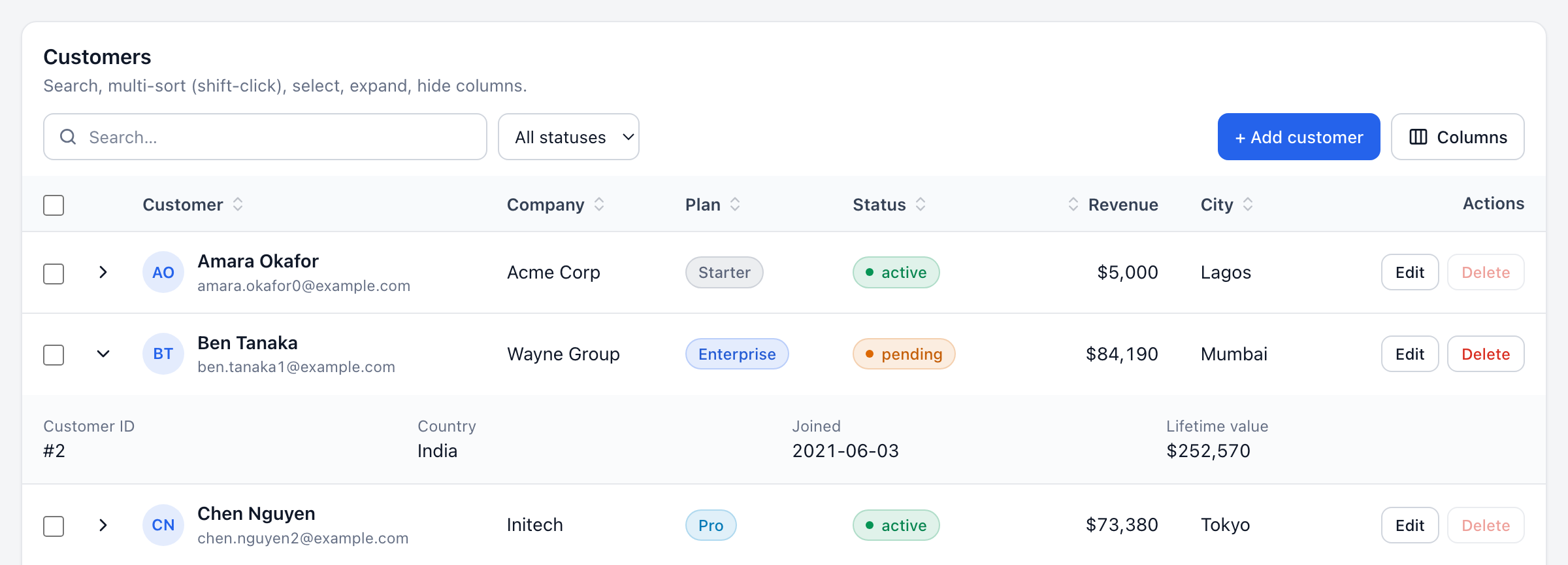
Rows can also be expanded from the keyboard with Enter or the right arrow. Controlled: expandedKeys + onExpandedChange.
Loading, empty and error states
<DataTable
  data={users}
  loading={isLoading}           // skeleton rows on first load; progress bar while reloading
  error={error}                 // Error, string, or true
  onRetry={refetch}             // shows a "Try again" button
  emptyState={<EmptyUsers onInvite={invite} />}
  loadingState={<Spinner />}    // replaces the skeleton
  errorState={(err) => <MyError error={err} />}
/>
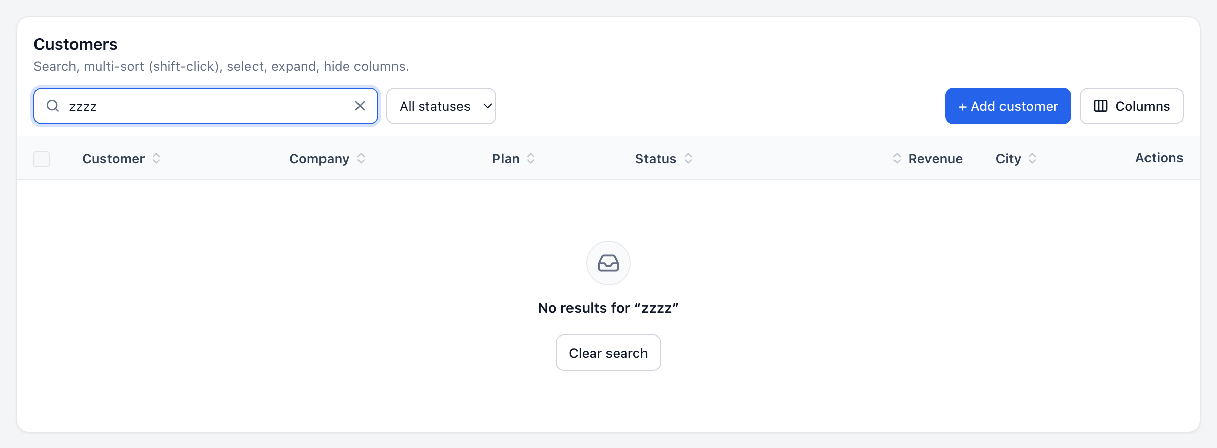
When a search has no results, the table shows "No results for …" with a Clear search button.
Themes
<DataTable data={users} theme="modern" />| Theme | Looks like |
| --------- | ------------------------------------------------------------------- |
| default | Clean, neutral business look that fits anywhere |
| minimal | No card, airy rows, small uppercase headers, monochrome accent |
| modern | Large radius, soft shadow, generous spacing, indigo accent |
| compact | Dense spreadsheet-like rows with grid lines, for reports |
| dark | A dedicated deep-navy dark theme (always dark) |
| glass | Frosted translucent surfaces; best on colorful or image backgrounds |
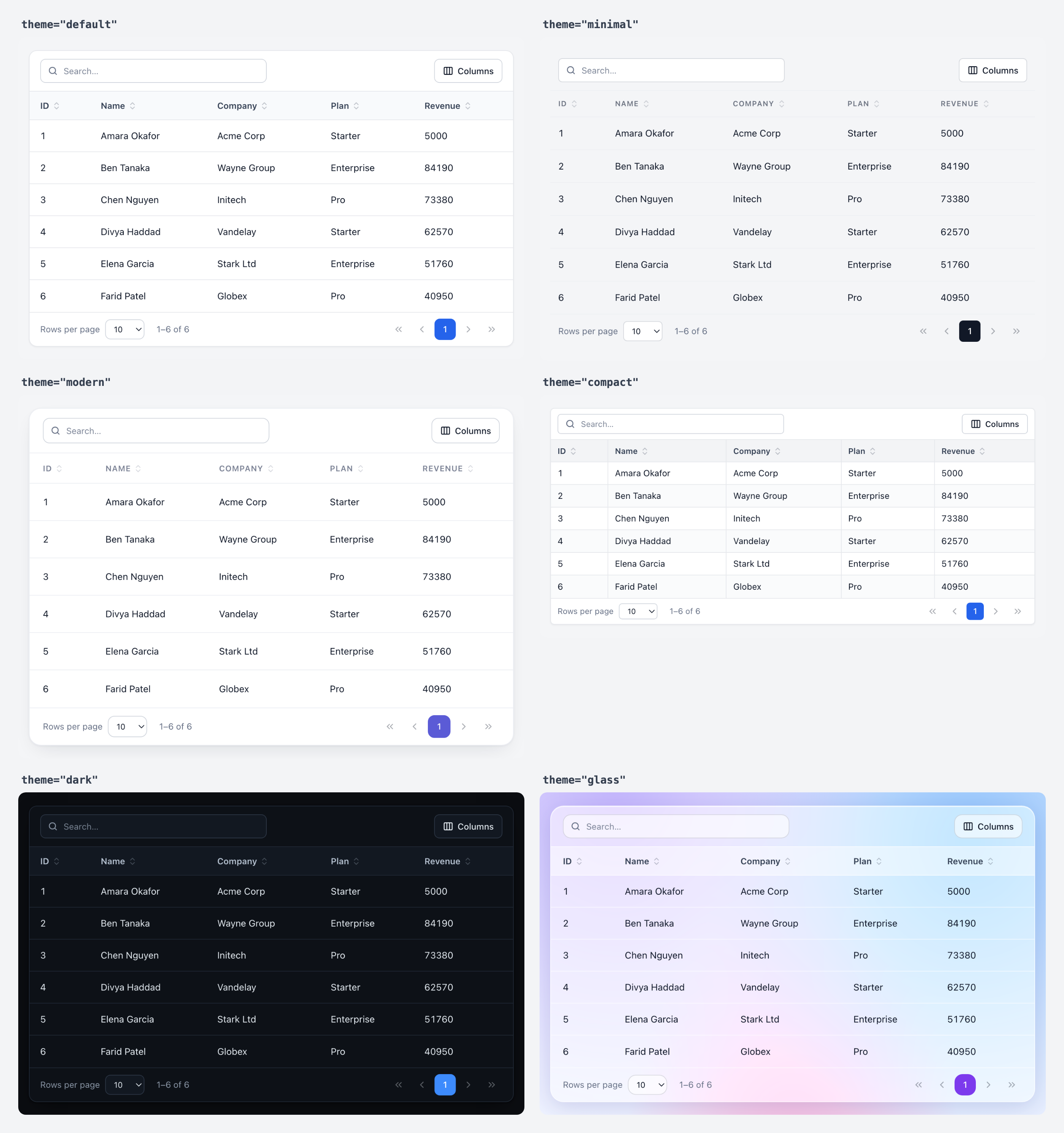
Themes control more than colors: border radius, spacing, row height, typography, header style, borders, hover and stripe colors, shadows, buttons, badges, pagination and overall density. They are design tokens applied as CSS variables.
Create your own theme
import { createTheme } from '@corinovate/react-data-table';

const brand = createTheme({
  extends: 'modern',              // start from any preset
  name: 'acme',
  tokens: {
    accent: '#0f766e',
    radius: '10px',
    fontFamily: '"Inter", sans-serif',
    headerTextTransform: 'none',
  },
  darkTokens: { accent: '#2dd4bf', accentText: '#042f2e' },
});

<DataTable data={users} theme={brand} colorMode="system" />;
| Group | Tokens |
| ---------- | ------ |
| Colors | background, headerBackground, rowHoverBackground, rowStripeBackground, rowSelectedBackground, expandedBackground, controlBackground, popoverBackground, border, borderStrong, text, textMuted, headerText, accent, accentText, success, warning, danger, info, focusRing, skeleton |
| Shape | radius, controlRadius, badgeRadius, borderWidth, rowBorderWidth, columnBorderWidth, shadow, popoverShadow, backdropFilter |
| Density | cellPaddingX, cellPaddingY, headerPaddingY, rowHeight, controlHeight, gap |
| Typography | fontFamily, fontSize, lineHeight, headerFontSize, headerFontWeight, headerTextTransform, headerLetterSpacing, titleFontSize |
| Motion | transition |
Each token becomes a CSS variable: rowHoverBackground → --cdt-row-hover-background.
Plain CSS works too
Every token is a CSS variable, so you can override them from your stylesheet. The root element also exposes data-cdt-theme and data-cdt-mode attributes.
.my-table {
  --cdt-accent: #e11d48 !important;
}
.cdt[data-cdt-mode='dark'] {
  --cdt-border: #333 !important;
}(!important is needed because theme variables are set inline. Prefer createTheme when you can.)
Dark mode
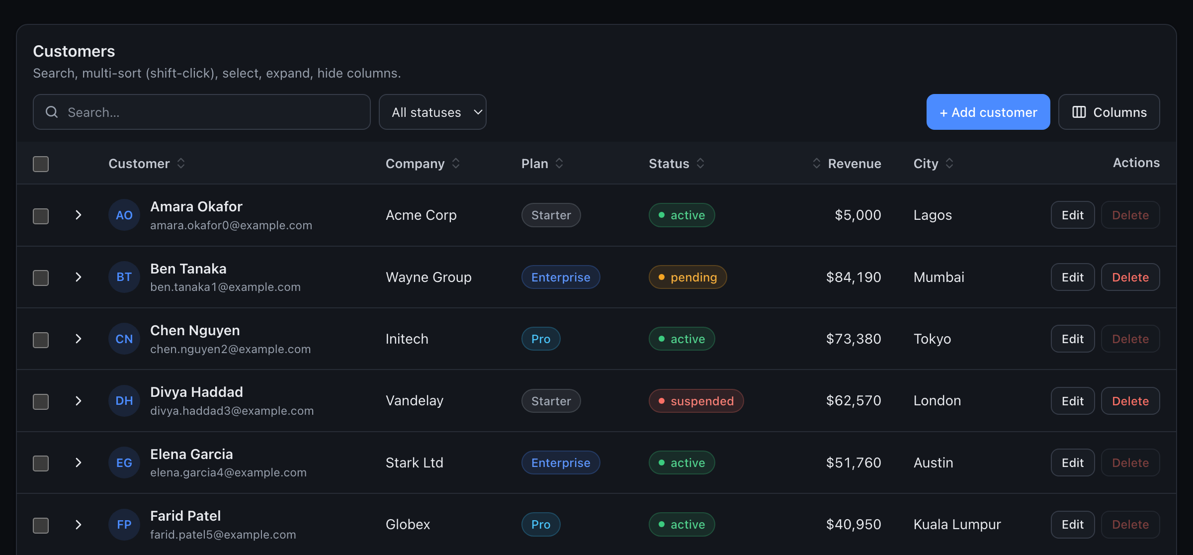
Every theme has a dark variant.
<DataTable data={users} colorMode="dark" />
<DataTable data={users} colorMode="system" />            {/* follows the OS, live */}
<DataTable data={users} colorMode={isDark ? 'dark' : 'light'} />  {/* your app's toggle */}
colorMode defaults to light. The dark theme is always dark regardless of colorMode.
Responsive behavior
The table responds to its own width (not the viewport), so it behaves correctly inside sidebars, modals and grid layouts.
<DataTable data={users} responsive="cards" breakpoint={640} />| responsive | Below the breakpoint |
| ------------------ | ------------------------------------------------------------------------- |
| scroll (default) | Full table that scrolls horizontally |
| compact | Tighter rows and padding, still scrollable |
| cards | Each row becomes a card with label/value pairs; a "Sort by" menu appears |
In every mode, columns with hideOnMobile: true are hidden below the breakpoint, and pagination switches to a compact "Page X of Y" layout. In card view, the column with primary: true (or the first column) becomes the card title.
Sticky header: stickyHeader keeps the header visible while the body scrolls inside maxHeight (default 70vh).
<DataTable data={logs} stickyHeader maxHeight={480} />Server-side data
Add serverSide, give it the current page of data and the total, and fetch whenever onQueryChange fires. It fires on mount and whenever the page, page size, search (debounced) or sort changes, and the page resets to 1 when search or sort change.
import { useEffect, useState } from 'react';
import { DataTable, type TableQuery } from '@corinovate/react-data-table';

function Customers() {
  const [query, setQuery] = useState<TableQuery | null>(null);
  const [result, setResult] = useState({ rows: [], total: 0 });
  const [loading, setLoading] = useState(true);
  const [error, setError] = useState<Error | null>(null);

  useEffect(() => {
    if (!query) return;
    const params = new URLSearchParams({
      page: String(query.page),
      limit: String(query.pageSize),
      q: query.search,
      sort: query.sort.map((s) => `${s.key}:${s.direction}`).join(','),
    });
    setLoading(true);
    fetch(`/api/customers?${params}`)
      .then((r) => r.json())
      .then((json) => { setResult({ rows: json.data, total: json.total }); setError(null); })
      .catch(setError)
      .finally(() => setLoading(false));
  }, [query]);

  return (
    <DataTable
      serverSide
      data={result.rows}
      totalRows={result.total}
      loading={loading}
      error={error}
      onQueryChange={setQuery}
      columns={columns}
    />
  );
}
With React Query / SWR, use the query as part of the key:
const [query, setQuery] = useState<TableQuery>({ page: 1, pageSize: 10, search: '', sort: [] });
const { data, isFetching, error } = useQuery({ queryKey: ['customers', query], queryFn: () => api.list(query), placeholderData: keepPreviousData });

<DataTable serverSide data={data?.rows ?? []} totalRows={data?.total} loading={isFetching} error={error} onQueryChange={setQuery} />
While loading, existing rows stay visible (dimmed, with a progress bar) so the layout doesn't jump.
Filters: render your own filter controls through filters and include them in your fetch. To return to page 1 when a filter changes, control the page:
<DataTable
  serverSide
  page={page}
  onPageChange={setPage}
  filters={<StatusSelect value={status} onChange={(s) => { setStatus(s); setPage(1); }} />}
  ...
/>
Customization
| What | How |
| ------------------ | --- |
| Cells | column.render, column.className, column.align |
| Headers | column.header (node or function), column.headerClassName |
| Rows | rowClassName, onRowClick |
| Actions | rowActions (array or function), bulkActions |
| Toolbar | title, description, filters, toolbarActions, columnToggle, searchable |
| Empty / loading / error | emptyState, loadingState, errorState |
| Pagination | renderPagination, pageSizeOptions, or the exported <Pagination> |
| Theme | theme, createTheme, CSS variables |
| Text / i18n | labels |
| CSS classes | className, classNames, style |
Class names for each part:
<DataTable
  classNames={{ root: 'shadow-xl', toolbar: 'px-6', th: 'uppercase', tr: 'group', td: 'py-4', pagination: 'gap-2' }}
/>
Slots: root, header, toolbar, search, bulkBar, container, table, thead, th, tbody, tr, td, card, footer, pagination.
Built-in button styles can be reused in your own cells and toolbar: cdt-btn, plus modifiers cdt-btn--primary, cdt-btn--danger, cdt-btn--ghost, cdt-btn--sm, cdt-btn--icon. cdt-select and cdt-input style form controls.
Translations:
<DataTable
  labels={{
    searchPlaceholder: 'Buscar…',
    rowsPerPage: 'Filas por página',
    empty: 'Sin datos',
    rangeInfo: (from, to, total) => `${from}–${to} de ${total}`,
    selectedCount: (n) => `${n} seleccionados`,
  }}
/>
See defaultLabels for the full list.
Headless use: useDataTable(options) exposes the same engine (rows, sorting, pagination, selection, expansion) for a completely custom UI.
const table = useDataTable({ data, columns });
table.rows.map(({ row, key }) => …);
table.toggleSort('name'); table.setPage(2); table.toggleRowSelection(key);
Accessibility
- Semantic
<table>,<thead>,<th scope="col">, witharia-sorton sorted columns. Sort controls are real<button>s. - The table's accessible name comes from
title,ariaLabelorcaption. - Keyboard: Tab reaches every control. When rows are interactive (selectable, clickable or expandable), Tab enters the rows once and then:
- ↑ ↓ Home End move between rows
- Space selects the row
- Enter runs
onRowClick(or toggles expansion) - → / ← expand / collapse
- Shift+Enter on a header adds it to a multi-column sort
- Sort changes, search result counts and loading are announced through a polite live region.
- Checkboxes, expand toggles, icon-only actions and pagination buttons all have labels; the current page uses
aria-current. - Visible
:focus-visiblerings use the theme accent; animations respectprefers-reduced-motion. - Paginated tables set
aria-rowcount/aria-rowindex, so screen readers announce "row 12 of 58".
API reference
<DataTable> props
Data
| Prop | Type | Default | Description |
| --- | --- | --- | --- |
| data | T[] | [] | Rows to display |
| columns | Column<T>[] | inferred | Column definitions |
| rowKey | string \| (row, index) => string \| number | row.id → index | Stable row identity |
Search
| Prop | Type | Default |
| --- | --- | --- |
| searchable | boolean | true |
| search / defaultSearch / onSearchChange | string / string / (s) => void | |
| searchPlaceholder | string | "Search…" |
| searchDebounce | number (ms) | 0 (client), 300 (server) |
| searchFn | (row, query) => boolean | |
Sorting
| Prop | Type | Default |
| --- | --- | --- |
| sortable | boolean | true |
| multiSort | boolean | true |
| sort / defaultSort / onSortChange | SortItem[] | [] |
Pagination
| Prop | Type | Default |
| --- | --- | --- |
| pagination | boolean | true |
| page / defaultPage / onPageChange | number (1-based) | 1 |
| pageSize / defaultPageSize / onPageSizeChange | number | 10 |
| pageSizeOptions | number[] | [10, 25, 50, 100] |
| renderPagination | (props: PaginationRenderProps) => ReactNode | |
Selection & rows
| Prop | Type | Default |
| --- | --- | --- |
| selectable | boolean \| 'single' \| 'multiple' | false |
| selectedKeys / defaultSelectedKeys / onSelectionChange | RowKey[] / … / (keys, rows) => void | |
| isRowSelectable | (row) => boolean | |
| bulkActions | (rows, { selectedKeys, clearSelection }) => ReactNode | |
| rowActions | RowAction<T>[] \| (row) => ReactNode | |
| onRowClick | (row, event) => void | |
| rowClassName | string \| (row, index) => string | |
| renderExpanded | (row) => ReactNode | |
| isRowExpandable | (row) => boolean | |
| expandedKeys / defaultExpandedKeys / onExpandedChange | RowKey[] | |
Columns
| Prop | Type | Default |
| --- | --- | --- |
| columnToggle | boolean | true |
| hiddenColumns / defaultHiddenColumns / onHiddenColumnsChange | string[] | from column.hidden |
Server-side
| Prop | Type | Description |
| --- | --- | --- |
| serverSide | boolean | Don't search/sort/paginate locally |
| totalRows | number | Total rows on the server |
| onQueryChange | (query: TableQuery) => void | { page, pageSize, search, sort }; fires on mount and on change |
States
| Prop | Type |
| --- | --- |
| loading | boolean |
| error | unknown (Error, string, true) |
| onRetry | () => void |
| loadingState / emptyState | ReactNode |
| errorState | ReactNode \| (error) => ReactNode |
Appearance & layout
| Prop | Type | Default |
| --- | --- | --- |
| theme | ThemeName \| Theme | 'default' |
| colorMode | 'light' \| 'dark' \| 'system' | 'light' |
| responsive | 'scroll' \| 'cards' \| 'compact' | 'scroll' |
| breakpoint | number (px) | 640 |
| stickyHeader | boolean | false |
| maxHeight | number \| string | '70vh' |
| title / description | ReactNode | |
| filters / toolbarActions | ReactNode | |
| className / classNames / style | | |
| ariaLabel / caption | string / ReactNode | |
| labels | Partial<DataTableLabels> | |
Other exports
| Export | Description |
| --- | --- |
| useDataTable(options) | Headless engine behind <DataTable> |
| createTheme(options) | Build a theme from a preset + token overrides |
| themes | The built-in theme objects |
| resolveTheme(theme, mode) | Get the full token set / CSS variables for a theme |
| Badge, renderBadge | Theme-aware status badges |
| Pagination | The built-in pagination bar |
| defaultLabels | All UI strings |
| sortRows, searchRows, getValue | The pure helpers used internally |
Types: Column, DataTableProps, RowAction, SortItem, TableQuery, Theme, ThemeTokens, RowKey, PaginationRenderProps, and more.
Examples
CRM contacts with a filter and an "Add" button
<DataTable
  title="Contacts"
  data={contacts.filter((c) => stage === 'all' || c.stage === stage)}
  columns={columns}
  theme="modern"
  responsive="cards"
  filters={
    <select className="cdt-select" value={stage} onChange={(e) => setStage(e.target.value)} aria-label="Stage">
      <option value="all">All stages</option>
      <option value="lead">Lead</option>
      <option value="customer">Customer</option>
    </select>
  }
  toolbarActions={<button className="cdt-btn cdt-btn--primary" onClick={openNew}>+ New contact</button>}
  rowActions={[{ label: 'Open', onClick: (c) => navigate(`/contacts/${c.id}`) }]}
/>
Dense financial report
<DataTable
  data={transactions}
  theme="compact"
  stickyHeader
  maxHeight={600}
  defaultPageSize={50}
  defaultSort={[{ key: 'date', direction: 'desc' }]}
  columns={[
    { key: 'date', width: 110 },
    { key: 'reference' },
    { key: 'member.name', header: 'Member' },
    { key: 'amount', align: 'right', render: (v) => currency.format(v) },
  ]}
/>
Network-marketing downline with expandable rows
<DataTable
  data={distributors}
  columns={[
    { key: 'name' },
    { key: 'rank', render: renderBadge({ Diamond: 'accent', Gold: 'warning', Silver: 'neutral' }) },
    { key: 'personalVolume', header: 'PV', align: 'right' },
    { key: 'groupVolume', header: 'GV', align: 'right' },
  ]}
  renderExpanded={(d) => <CommissionBreakdown distributor={d} />}
/>
Try it live: the online demo shows every theme, dark mode, card view and a simulated server. To run the same playground locally, clone the repo, then npm install and npm run dev.
Troubleshooting
The table has no styles.
Import @corinovate/react-data-table/styles.css once in your app.
Selections get mixed up after sorting or on the next page.
Rows need stable keys. Add an id field or pass rowKey="uuid" / rowKey={(row) => row.email}.
My actions column has a sort button.
A column is sortable when its key has data in the rows. Add sortable: false (and searchable: false) if your rows happen to contain that key.
Next.js: "useState only works in Client Components".
The package ships with "use client", so you can render <DataTable> from a Server Component. Functions you pass (like render) must live in a Client Component file, because functions can't cross the server/client boundary.
The sticky header doesn't stick.
The header sticks inside the table's own scroll area. Make sure stickyHeader is set and adjust maxHeight.
Clicking a button inside a cell also triggers onRowClick.
Buttons, links, inputs and labels are ignored automatically. For other custom elements, add the data-cdt-no-row-click attribute.
The card view never appears.
Card view depends on the table's own width, not the screen's. Check that the container is narrower than breakpoint (default 640px) and that responsive="cards" is set.
Server-side: the table fetches twice in development. React StrictMode runs effects twice in development. Duplicate identical queries are suppressed, but if your fetch runs in your own effect, cancel stale requests (see the server-side example).
Glass theme looks flat. Glass is translucent; it needs a colorful or image background behind it to show the frosted effect.
Contributing
npm install
npm run dev        # playground at http://localhost:5173
npm test           # unit + component tests
npm run typecheck
npm run build
See ARCHITECTURE.md for how the code is organized.
About
Built and maintained by Corinovate. If you're building an MLM / network-marketing platform and need more than a data table — commissions, replicated sites, a full back office — check out our product Core MLM Software.
License
MIT © Corinovate