
@creativecreate/react-footnotes
v1.0.18
Published
A React component library for managing footnotes with citation and special symbol support
Maintainers
 creativecreate
Readme
@creativecreate/react-footnotes
A React component library for managing footnotes with citation and special symbol support.
Maintaining footnotes with proper numbering across different components and pages can be challenging — you need to manually track footnote order, handle duplicates, manage navigation between references and content, and ensure consistency throughout your application. Additionally, maintaining footnote content becomes difficult when footnotes are scattered across multiple files, making it hard to update or manage them centrally. This package tackles these challenges by providing a context-aware, automatic numbering system that handles everything for you. Use footnotes freely across any component without worrying about order or duplicates; the library automatically coordinates numbering, detects duplicates, and provides smart bidirectional navigation. With flexible content management through a centralized messages file, callback functions, or inline children, you can easily maintain and update footnote content regardless of where your components are located.
Features
- 📝 Support for both citation (numbered) and special (symbol) footnotes
- 🔄 Context-aware coordination and auto numbering: use footnotes freely across different components without manually tracking the order — the library handles everything automatically
- 🔁 Smart duplicate detection: multiple references to the same footnote automatically share the same number, preventing duplicate entries
- 🔗 Smart bidirectional navigation: navigate between footnote references and content, with intelligent tracking that traces back to the current reference location even when duplicate references exist
- 🎯 Flexible content sources: provide footnote content via messages file, callback function (
getContent), or inline children — choose the approach that fits your needs - 🌐 Framework-agnostic: Compatible with Next.js App Router (see integration guide), Remix, Vite, and other React frameworks
- ♿ Web accessibility compatible: built with ARIA attributes, semantic HTML, keyboard navigation support, and screen reader compatibility following WAI-ARIA best practices
- 🎨 Fully customizable with custom CSS to match your design style, with built-in responsive design support for all device sizes
- 📦 TypeScript support
- 🔄 Route-aware footnote reset for SPA navigation
Installation
npm install @creativecreate/react-footnotesNext.js App Router
⚠️ Important for Next.js Users: This package uses React Context and requires a
pathnameprop, which means it requires client components. If you're using Next.js App Router, you may encounter server/client boundary errors. See our Next.js Integration Guide for detailed instructions on:
- Setting up
FootnoteProviderin layouts with automatic pathname handling- Handling server/client component boundaries
- Managing the required
pathnameprop with Next.js hooks- Common errors and solutions (like
createContext is not a function,usePathname() can only be used in Client Components)- Best practices for preserving server-side rendering
Quick Fix: If you see createContext is not a function errors, mark components using Footnote with 'use client' or extract the UI into a separate client component. For the pathname prop, use Next.js usePathname() and useSearchParams() hooks in a client component. See the Next.js guide for complete examples.
Basic Usage
1. Create your messages file
The package includes a messages.json file as a guideline/template. You should copy it to your project (e.g., to your src directory) and customize it with your own footnote content. You cannot import it directly from the package module.
Step 1: Copy messages.json from the package to your project (e.g., src/messages.json)
Step 2: Customize it with your footnote content:
{
"footnotes": {
"citation": {
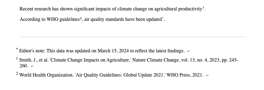
"smith-2023-study": "Smith, J., et al. 'Climate Change Impacts on Agriculture.' Nature Climate Change, vol. 13, no. 4, 2023, pp. 245-260.",
"who-guidelines": "World Health Organization. 'Air Quality Guidelines: Global Update 2021.' WHO Press, 2021.",
"johnson-research": "Johnson, M. 'Sustainable Energy Solutions.' Renewable Energy Journal, vol. 45, 2023, pp. 112-128."
},
"special": {
"editor-note": "Editor's note: This data was updated on March 15, 2024 to reflect the latest findings.",
"methodology-note": "Methodology: Survey conducted across 50 countries with a sample size of 10,000 participants."
}
}
}Step 3: Import it from your project:
import messagesData from './messages.json'; // Import from your project, not from the package

// Extract footnotes from the messages structure
const messages = messagesData.footnotes;
2. Wrap your app with FootnoteProvider and provide messages
import { useState, useEffect } from 'react';
import { FootnoteProvider } from '@creativecreate/react-footnotes';
import messagesData from './messages.json'; // Your custom messages file from your project

// Extract footnotes from the messages structure
const messages = messagesData.footnotes;

function App() {
  const [pathname, setPathname] = useState('');

  useEffect(() => {
    // Only access window on client-side
    setPathname(`${window.location.pathname}${window.location.search}`);
  }, []);

  return (
    <FootnoteProvider
      messages={messages}
      // Alternative: see section - using React Router (recommended for SPAs)
      pathname={pathname}
    >
      {/* Your app content */}
    </FootnoteProvider>
  );
}
3. Add footnote references in your content
import { Footnote } from '@creativecreate/react-footnotes';

function MyComponent() {
  return (
    <div>
      <p>
        Recent research has shown significant impacts of climate change on agricultural productivity<Footnote id="smith-2023-study" type="citation" />.
      </p>
      <p>
        According to WHO guidelines<Footnote id="who-guidelines" type="citation" />, air quality standards have been updated<Footnote id="editor-note" type="special" />.
      </p>
    </div>
  );
}
4. Render the footnote list
import { FootnoteList } from '@creativecreate/react-footnotes';

function Footer() {
  return (
    <footer>
      {/* render footnote list */}
      <FootnoteList />
    </footer>
  );
}
5. Add styling
You have two options for styling the footnotes:
Option A: Use the default stylesheet from the package
Import the default stylesheet to get pre-styled footnotes:
import '@creativecreate/react-footnotes/footnotes.css';Add this import in your main entry file (e.g., main.tsx, index.tsx, or _app.tsx for Next.js).
Option B: Use your own CSS with the available class names
If you prefer to style the footnotes yourself, you can target the following CSS classes in your own stylesheet:
/* Footnote reference button (the clickable superscript in text) */
.footnote-ref { }
/* Footnote symbol (the number or symbol inside the button) */
.footnote-symbol { }
/* Footnote list (ordered list) */
.footnote-list { }
/* Individual footnote list item */
.footnote-list-item { }
/* Symbol in the list item */
.footnote-list-item__symbol { }
/* Footnote content in the list item */
.footnote-list-item__content { }
/* Back to reference link button */
.footnote-list-item__back-link { }
/* Back link icon */
.footnote-list-item__back-link-icon { }
You can also use the className props on components to apply your own custom classes (see Customizing Styles section for details).
Example output:
Advanced Usage
Using getContent prop for dynamic footnotes
The getContent prop allows you to provide footnote content programmatically, overriding messages from the provider. This is useful for dynamic content or when you want to generate footnotes based on component state or props:
import { Footnote } from '@creativecreate/react-footnotes';
import { useState, useEffect } from 'react';

function MyComponent() {
  const [dynamicCitations, setDynamicCitations] = useState<{
    citation?: { [key: string]: string };
    special?: { [key: string]: string };
  }>({});

  useEffect(() => {
    // Fetch citations asynchronously
    fetchCitations().then(setDynamicCitations);
  }, []);

  // Custom function to generate footnote content
  const getContent = (id: string, type: 'citation' | 'special') => {
    if (type && id) {
      return dynamicCitations[type]?.[id];
    }
    return null;
  };

  return (
    <div>
      <p>
        This text has a dynamic footnote
        <Footnote id="dynamic_citation_1" type="citation" getContent={getContent} />.
      </p>
      <p>
        And another one
        <Footnote id="dynamic_special_1" type="special" getContent={getContent} />.
      </p>
    </div>
  );
}
When to use getContent:
- When footnote content depends on component state or props
- When you need to fetch content from an API or external source
- When you want to override provider messages for specific footnotes
- When content needs to be computed dynamically
Using children prop for inline footnote content
The children prop provides the highest priority for footnote content and allows you to pass content directly, including formatted text or React components:
import { Footnote } from '@creativecreate/react-footnotes';
import {Link} from '~/components/Link';

function MyComponent() {
  return (
    <div>
      <p>
        You can also include formatted content
        <Footnote id="inline-2" type="special">
          <strong>Bold text</strong> and <em>italic text</em> work in children prop.
        </Footnote>.
      </p>
      <p>
        Or even React components
        <Footnote id="inline-3" type="citation">
          Visit <Link href="https://example.com">example.com</Link> for more info.
        </Footnote>.
      </p>
    </div>
  );
}
When to use children:
- When you want to provide footnote content directly inline
- When you need to include formatted text or React components
- When content is specific to a single footnote instance
- When you want the highest priority (overrides both
getContentand messages)
Priority order:
childrenprop (highest priority)getContentprop- Messages from
FootnoteProvider(lowest priority)
Customizing FootnoteList styling
import { FootnoteList } from '@creativecreate/react-footnotes';

function MyPage() {
  return (
    <FootnoteList
      className="my-custom-list-class"           // Class for the <ol> wrapper
      itemClassName="my-item-class"              // Class for each <li> item
      itemSupClassName="my-sup-class"            // Class for the <sup> symbol in items
      itemContentClassName="my-content-class"    // Class for the content <span> in items
      itemBackLinkClassName="my-back-link-class" // Class for the back link <button>
      itemBackLinkIconClassName="my-icon-class"  // Class for the back link icon <small>
      order="citation-first"                      // Show citations before special footnotes
    />
  );
}
Customizing Footnote styling
import { Footnote } from '@creativecreate/react-footnotes';

function MyComponent() {
  return (
    <div>
      <p>
        This text has a customized footnote
        <Footnote
          id="example1"
          type="citation"
          className="my-footnote-ref-class"      // Class for the footnote reference <button>
          supClassName="my-footnote-sup-class"   // Class for the <sup> element
        />.
      </p>
    </div>
  );
}
Using with React Router
When using React Router, pass the pathname prop using useLocation() to enable automatic footnote reset on route changes:
import { BrowserRouter, Routes, Route, useLocation } from 'react-router-dom';
import { FootnoteProvider } from '@creativecreate/react-footnotes';

function AppContent() {
  const location = useLocation();

  return (
    <FootnoteProvider
      messages={messages}
      pathname={`${location.pathname}${location.search}`}
    >
      {/* Your routes */}
    </FootnoteProvider>
  );
}

function App() {
  return (
    <BrowserRouter>
      <AppContent />
    </BrowserRouter>
  );
}
How it works:
- The
pathnameprop tracks the current route - When the route changes, footnotes are automatically reset and renumbered
- This ensures footnote numbering starts fresh on each page (1, 2, 3...)
- The
location.searchis included to handle query parameters
API Reference
FootnoteProvider
The context provider that manages footnote state.
Props:
children: ReactNode- Your app contentmessages?: FootnoteMessages- Optional messages object containing footnote content{ citation?: { [id: string]: ReactNode }, special?: { [id: string]: ReactNode } }pathname: string- Required. Current pathname string for route-based footnote reset. When the pathname changes, footnotes are automatically reset and renumbered.- For React Router:
`${location.pathname}${location.search}` - For simple cases:
`${window.location.pathname}${window.location.search}`
- For React Router:
Footnote
Component for rendering a footnote reference.
Props:
id: string- Unique identifier for the footnote (must exist in messages)type: 'citation' | 'special'- Type of footnote (required)getContent?: (id: string, type: 'citation' | 'special') => ReactNode- Optional function to override messageschildren?: ReactNode- Optional direct content (overrides messages and getContent)className?: string- Optional className to override default styles (default:'footnote-ref')supClassName?: string- Optional className for the<sup>element (default:'footnote-symbol')
FootnoteList
Component for rendering all registered footnotes.
Props:
className?: string- ClassName for the ordered list (default:'footnote-list')itemClassName?: string- Optional className for list itemsitemSupClassName?: string- Optional className for the<sup>element in itemsitemContentClassName?: string- Optional className for the content element in itemsitemBackLinkClassName?: string- Optional className for the back link buttonitemBackLinkIconClassName?: string- Optional className for the back link iconorder?: 'special-first' | 'citation-first'- Order of footnotes (default:'special-first')'special-first'- Special footnotes appear first, then citations'citation-first'- Citations appear first, then special footnotes
FootnoteListItem
Component for rendering an individual footnote list item (used internally by FootnoteList).
Props:
id: string- Unique identifier for the footnotetype?: 'citation' | 'special'- Type of footnotesymbol: string- The symbol or number to displaychildren?: ReactNode- The footnote contentclassName?: string- Optional className for the list item (default:'footnote-list-item')supClassName?: string- Optional className for the<sup>element (default:'footnote-list-item__symbol')contentClassName?: string- Optional className for the content (default:'footnote-list-item__content')backLinkClassName?: string- Optional className for the back link button (default:'footnote-list-item__back-link')backLinkIconClassName?: string- Optional className for the back link icon (default:'footnote-list-item__back-link-icon')
useFootnotes
Hook to access footnote context.
Returns:
registerFootnote: (footnote: FootnoteProps) => void- Register a footnotecitationList: FootnoteProps[]- List of citation footnotesspecialList: FootnoteProps[]- List of special footnotesclickHandler: (e: React.MouseEvent<HTMLButtonElement>) => void- Click handler for navigationgetContent: (id: string, type: FootnotesCategory) => ReactNode | null- Function to get content from messages
Styling
The components use generic CSS class names that you can style with any CSS framework or custom CSS. The package doesn't require Tailwind CSS or any other specific styling library.
Default Styles
Import the default stylesheet (optional):
import '@creativecreate/react-footnotes/footnotes.css';Or copy the styles from footnotes.css to your own CSS file.
CSS Class Names
The package uses the following BEM-style class names that you can override:
.footnote-ref- The footnote reference button (clickable superscript).footnote-symbol- The symbol/number inside the reference button.footnote-list- The footnote list ordered list element.footnote-list-item- Individual footnote list item.footnote-list-item__symbol- The symbol in the list item.footnote-list-item__content- The footnote content.footnote-list-item__back-link- The "back to reference" button.footnote-list-item__back-link-icon- The back link icon
Customizing Styles
You can customize styles in several ways:
Override with your own CSS:
.footnote-ref {
  color: #your-color;
  margin-left: 0.5rem;
}
Use className props:
<Footnote
  id="smith-2023-study"
  type="citation"
  className="my-custom-class"
  supClassName="my-sup-class"
/>
<FootnoteList
  className="my-list-class"
  itemClassName="my-item-class"
  order="citation-first"
/>
Use CSS modules or styled-components:
import styles from './footnotes.module.css';
<Footnote id="smith-2023-study" type="citation" className={styles.footnote} />
TypeScript
The package is written in TypeScript and includes type definitions. All types are exported from the main entry point.
License
MIT