
@daykeep/calendar-quasar
v1.0.0-beta.3
Published
A full display calendar for the Quasar Vue.js framework
Downloads
132

Maintainers
 stormseed
Readme
Daykeep Calendar
An event display calendar for the Quasar framework.
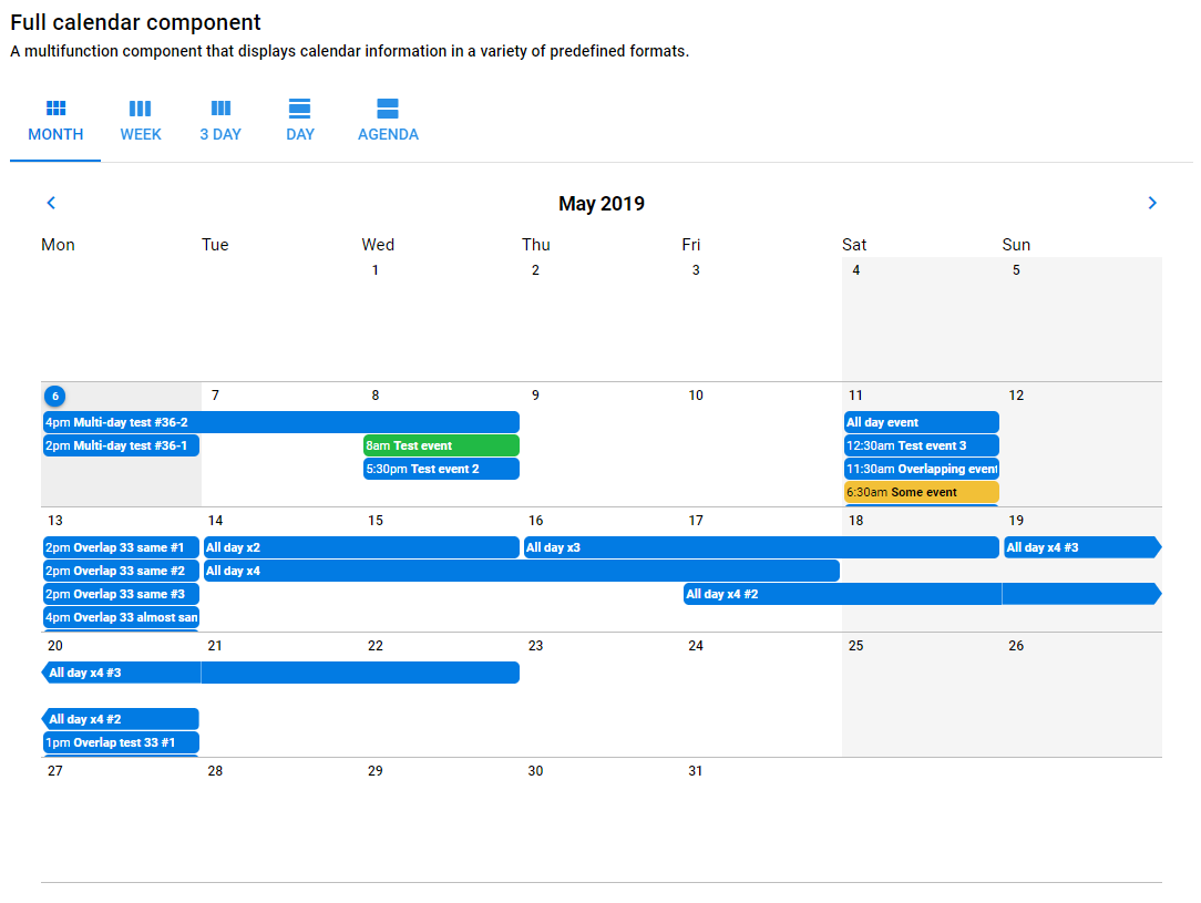
Formerly known as Quasar Calendar, Daykeep Calendar for Quasar is a Quasar-flavored Vue.js calendar component.
Demo
You can see a demo of the calendar components with event data at:
Daykeep Calendar for Quasar demo
Setup
Version 1.0.x of Daykeep Calendar is intended to be used with Quasar Framework v1. For legacy versions of Quasar, you should use v0.3.x of Quasar Calendar.
yarn add @daykeep/calendar-quasarAdd Daykeep Calendar to your .vue page similar to a Quasar component
import { DaykeepCalendar } from '@daykeep/calendar-quasar'or import individual components
import {
  DaykeepCalendarMonth,
  DaykeepCalendarAgenda,
  DaykeepCalendarMultiDay
} from '@daykeep/calendar-quasar'
In your template, you can just put in a calendar viewer using the current date as the start date
<daykeep-calendar />Or you can pass in parameters to customize
<daykeep-calendar-month
  :start-date="Date('2019-01-01')"
  :event-array="someEventObject"
  :sunday-first-day-of-week="true"
  calendar-locale="fr"
  calendar-timezone="Europe/Paris"
  :allow-editing="false"
  :render-html="true"
/>
Event data format
The event data format is meant to be a subset of the Google Calendar v3 API (this is still a work in progress). Events should be passed in as an array of objects. Each object can have elements like in this example:
[
  {
    id: 1,
    summary: 'Test event',
    description: 'Some extra info goes here',
    location: 'Office of the Divine Randomness, 1232 Main St., Denver, CO',
    start: {
      dateTime: '2018-02-16T14:00:00', // ISO 8601 formatted
      timeZone: 'America/New_York' // Timezone listed as a separate IANA code
    },
    end: {
      dateTime: '2018-02-16T16:30:00',
      timeZone: 'American/New_York'
    },
    color: 'positive',
    attendees: [
      {
        id: 5,
        email: '[email protected]',
        displayName: 'John Q. Public',
        organizer: false,
        self: false,
        resource: false
      }
    ]
  },
  {
    id: 2,
    summary: 'Test all-day event',
    description: 'Some extra info goes here',
    start: {
      date: '2018-02-16' // A date variable indicates an all-day event
    },
    end: {
      date: '2018-02-19'
    }
  },
    {
      id: 3,
      summary: 'Some other test event',
      description: 'Some extra info goes here',
      start: {
        dateTime: '2018-02-17T10:00:00+0500', // timezone embedded in dateTime
      },
      end: {
        dateTime: '2018-02-17T12:30:00+0500',
      },
    },
]
Each object needs to have a unique ID. The date time should be in ISO 8601 format. A value in the optional timeZone field will override the timezone.
Calendar event referencing
Each calendar is given a random reference string so that we can distinguish between multiple calendars on a page. You can override this and pass in a string so that you can listen for events from that calendar. In this case, if we pass in the string MYCALENDAR, the Vue.js event click-event-MYCALENDAR would fire on the global event bus when a calendar event is clicked on.
Custom event detail handling
By default we use our own event detail popup when an event is clicked. You can override this and use your own by doing a few things:
- Pass in an event reference string
- Prevent the default event detail from showing up
- Listen for a click event to trigger your own detail content
So to implement, be sure to have prevent-event-detail and event-ref set when you embed a calendar component:
<daykeep-calendar
  event-ref="MYCALENDAR"
  :prevent-event-detail="true"
  :event-array="someEventObject"
/>
And then somewhere be sure to be listening for a click event on that calendar:
this.$root.$on(
  'click-event-MYCALENDAR',
  function (eventDetailObject) {
    // do something here
  }
)
Event editing
Starting with v0.3 we are setting up the framework to allow for editing individual events. By default this functionality is turned off, but you can pass a value of true into the allow-editing parameter on one of the main calendar components. The functionality if very limited to start but we expect to be adding more features in the near future.
When an event is edited, a global event bus message in the format of update-event-MYCALENDAR is sent with the updated event information as the payload. You can listen for this to trigger a call to whatever API you are using for calendar communication. Right now when an update is detected the passed in eventArray array is updated and the array is parsed again.
Only a subset of fields are currently editable:
- Start / end time and date
- Is an all-day event
- Summary / title
- Description
Calendar Month Day Click Events
The DaykeepCalendarMonth component triggers a "click-day-{eventRef}" event when a calendar cell is clicked. The event data is an object describing the day, with a day, month, and year property each set to the appropriate value for the selected day.
So for a <daykeep-calendar-month> component with a "MYCALENDAR" event-ref:
this.$root.$on(
  'click-day-MYCALENDAR',
  function (day) {
    // do something here
  }
)
Individual Vue components
The usable components of DaykeepCalendar, DaykeepCalendarMonth, DaykeepCalendarMultiDay and DaykeepCalendarAgenda share the following properties:
| Vue Property | Type | Description |
| --- | --- | --- |
| start-date | JavaScript Date or Luxon DateTime | A JavaScript Date or Luxon DateTime object that passes in a starting display date for the calendar to display. |
| sunday-first-day-of-week | Boolean | If true this will force month and week calendars to start on a Sunday instead of the standard Monday. |
| calendar-locale | String | A string setting the locale. We use the Luxon package for this and they describe how to set this here. This will default to the user's system setting. |
| calendar-timezone | String | Manually set the timezone for the calendar. Many strings can be passed in including UTC or any valid IANA zone. This is better explained here. |
| event-ref | String | Give the calendar component a custom name so that events triggered on the global event bus can be watched. |
| prevent-event-detail | Boolean | Prevent the default event detail popup from appearing when an event is clicked in a calendar. |
| allow-editing | Boolean | Allows for individual events to be edited. See the editing section. |
| render-html | Boolean | Event descriptions render HTML tags and provide a WYSIWYG editor when editing. No HTML validation is performed so be sure to pass the data passed in does not present a security threat. |
| day-display-start-hour | Number| Will scroll to a defined start hour when a day / multi-day component is rendered. Pass in the hour of the day from 0-23, the default being 7. Current has no effect on the CalendarAgenda component. |
In addition, each individual components have the following properties:
DaykeepCalendar
| Vue Property | Type | Description |
| --- | --- | --- |
| tab-labels | Object | Passing in an object with strings that will override the labels for the different calendar components. Set variables for month, week, threeDay, day and agenda. Eventually we will replace this with language files and will use the calendar-locale setting. |
DaykeepCalendarMultiDay
| Vue Property | Type | Description |
| --- | --- | --- |
| num-days | Number | The number of days the multi-day calendar. A value of 1 will change the header to be more appropriate for a single day. |
| nav-days | Number | This is how many days the previous / next navigation buttons will jump. |
| force-start-of-week | Boolean | Default is false. This is appropriate if you have a week display (7 days) that you want to always start on the first day of the week. |
| day-cell-height | Number | Default is 5. How high in units (units defined below) an hour should be. |
| day-cell-height-unit | String | Default is rem. When combined with the day-cell-height above, this will determine the CSS-based height of an hour in a day. |
| show-half-hours | Boolean | Default is false. Show ticks and labels for half hour segments. |
DaykeepCalendarAgenda
| Vue Property | Type | Description |
| --- | --- | --- |
| num-days | Number | The number of days to initially display and also the number of additional days to load up when the user scrolls to the bottom of the agenda. |
| scroll-height | String | Defaults to 200px, this is meant to define the size of the "block" style. |