
@dev-tech/react-form-builder
v1.0.2
Published
Google Forms-inspired React form builder — TypeScript + Vite
Maintainers
 crawford30
Readme
react-form-builder
A Google Forms-inspired drag-and-drop form builder for React, built with TypeScript + Vite + Ant Design.
Demo
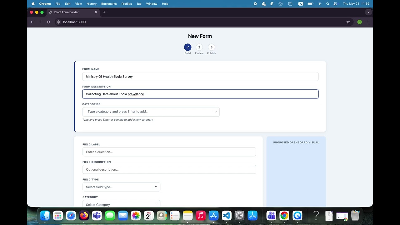
Features
- ✅ 12 field types: Yes/No, Male/Female, Multiple Choice, Checkboxes, Dropdown, Numeric, Alphanumeric, Table, Date, Time, Location, Picture
- ✅ Ant Design Select for categories (tags mode — type & press Enter to create new ones)
- ✅ Ant Design Select for per-field category picker (searchable)
- ✅ Ant Design Select for conditional logic dropdowns (searchable)
- ✅ Working conditional visibility in preview — fields hide/show based on responses
- ✅ Editable text/number inputs in preview
- ✅ Drag-to-reorder fields and options within each field
- ✅ Inline option editing (click to rename any option)
- ✅ Table field with typed columns (Text, Numeric, Date, Time, Dropdown)
- ✅ Dashboard visual preview (pie / bar chart per field type)
- ✅ Beautiful custom delete confirmation modal
- ✅ Publish flow with color picker and form preview
- ✅ Save as draft
- ✅ Zero key collisions — every option/column has a stable
uid - ✅ Fully typed TypeScript API
Usage
import { FormBuilder } from "@dev-tech/react-form-builder";
import "@dev-tech/react-form-builder/styles";
// antd styles must also be imported in your app:
import "antd/dist/reset.css";

function App() {
  return (
    <FormBuilder
      onSaveAsDraft={(form) => saveToServer(form)}
      onPublish={(form) => publishToServer(form)}
      accentColor="#1f419a"
    />
  );
}
You can also seed initial categories via the categories prop:
<FormBuilder
  categories={["GENERAL", "HEALTH", "FINANCIAL"]}
  onPublish={handlePublish}
/>
Props
| Prop | Type | Description |
| --------------- | --------------------------------- | -------------------------------------- |
| initialForm | Partial<FormDefinition> | Load existing form for editing |
| categories | string[] | Seed category list (user can add more) |
| onSaveAsDraft | (form) => void \| Promise<void> | Called on "Save & Complete Later" |
| onPublish | (form) => void \| Promise<void> | Called on "Publish & Finish" |
| accentColor | string | Override accent color (CSS hex) |
| className | string | Extra class on root element |
Categories
Categories are fully user-driven. The form header has an Ant Design Select in tags mode:
- Type a category name and press Enter or comma to create it
- Remove categories by clicking the
×on their tag chip - Field-level category picker is searchable
Conditional Logic (Preview)
When you set conditions on a field (via the ⚙ icon), those conditions are evaluated live in the preview modal:
- Select a source question, a response value, and
Is Selected/Is Not Selected - The conditional field will hide or show dynamically as the user fills in answers
- Multiple conditions use AND logic (all must pass for the field to show)
Headless hook
import { useFormBuilder } from "@dev-tech/react-form-builder";

function CustomUI() {
  const {
    formName,
    setFormName,
    fields,
    addField,
    updateField,
    getFormDefinition,
  } = useFormBuilder();
  // render your own UI
}
Peer Dependencies
{
  "react": ">=18.0.0",
  "react-dom": ">=18.0.0",
  "antd": ">=5.0.0"
}
Install antd in your project:
npm install antdAnd import the reset CSS once in your app root:
import "antd/dist/reset.css";FormDefinition output shape
{
  name: string;
  description: string;
  color: string;
  categories: string[];
  fields: Array<{
    id: number;
    position: number;
    label: string;
    description: string;
    category: string;
    fieldType: FieldType | null;
    fieldOptions: FieldOption[] | TableColumn[];
    fieldInputName: string;
    isRequired: boolean;
    conditions: FieldCondition[];
  }>;
}
License
MIT