
@devvie/bottom-sheet
v0.5.0
Published
The 😎smart , 📦tiny , and 🎗flexible bottom sheet your app craves 🚀

Maintainers
 stanleyugwu
Readme
React Native Bottom Sheet 💖






The smart 😎, tiny 📦, and flexible 🎗 bottom sheet your app craves 🚀
👉🏾 👈🏾
Android & iOS Preview

Web Preview
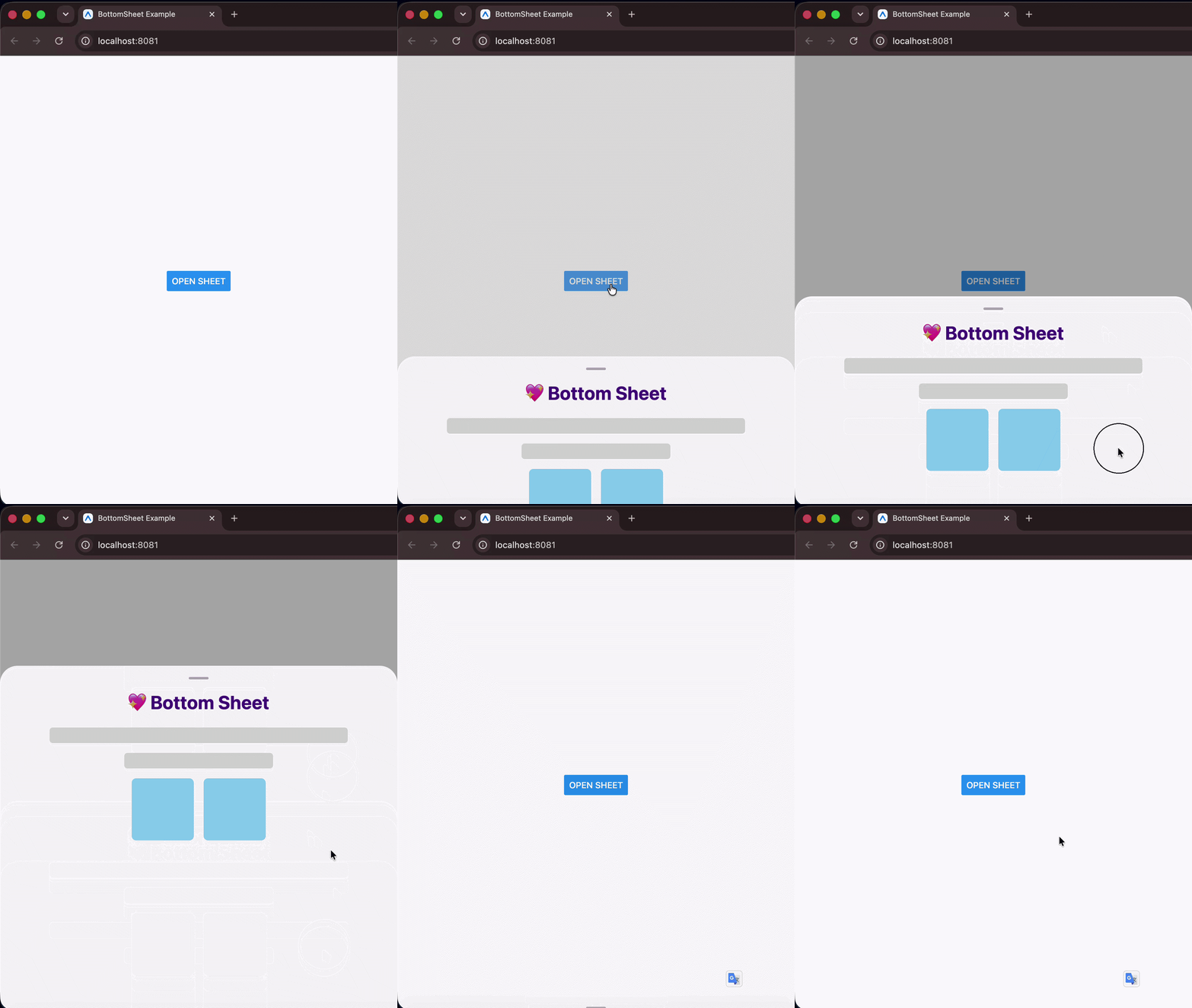
💻 Installation
npm install @devvie/bottom-sheet
# or
yarn add @devvie/bottom-sheet
🤔 Why this bottom sheet?
🚀 Plug and play — npm install and you're done. Zero third-party dependencies, no Babel plugins, no pod install. Built entirely on React Native's own APIs.
⌨️ Keyboard intelligence — The sheet auto-detects the keyboard mode (adjustPan / adjustResize), measures its own live position on screen, and animates to a safe height when a text input is focused — all without any configuration or wrapper components.
📦 Tiny footprint — ~4 KB minzipped. Extremely lightweight and fast, leaving virtually no impact on your bundle size.
🎯 Snap points — Define resting positions with a mix of % and px values. Snap points are automatically sorted in ascending order internally, meaning index 0 always represents the smallest/collapsed position. The sheet snaps to the nearest point on release with velocity-aware physics, and exposes snapToIndex, expand, and collapse for full programmatic control.
📟 Live prop updates — Dynamically change height, snapPoints, or containerHeight at any time and the sheet re-syncs its layout, clamps its active index, and fires callbacks automatically.
🌐 Truly cross-platform — iOS, Android, Web, and Expo, all from pure React Native primitives. No native modules required.
🎞 3 animation types — Choose between slide, spring, and fade out of the box, or supply your own custom easing function. Animation durations are fully configurable for both open and close transitions.
📜 Nested scrolling — Works with FlatList, SectionList, and ScrollView inside the sheet. Drag the handle to move the sheet; scroll the list to scroll its content — no gesture conflicts.
🎨 Custom components — Swap the drag handle or backdrop with your own animated components. Both receive the sheet's animated height value for interpolation, so you can build rich interactive handles and scrims.
✨ Modal & non-modal — Use as a full modal with backdrop mask, or as a lightweight inline sheet with elevation shadow. Supports custom backdrop components positioned above or behind the sheet.
✅ TypeScript-first — Fully typed props with compile-time safety. height and snapPoints are enforced as mutually exclusive at the type level.
📱 Basic Example
Opening and closing the bottom sheet is done imperatively. Pass a ref to the bottom sheet and call the open() or close() methods.
1. Single height (default)
import React, { useRef } from 'react';
import BottomSheet, { BottomSheetMethods } from '@devvie/bottom-sheet';
import { Button, Text, View } from 'react-native';

const App = () => {
  const sheetRef = useRef<BottomSheetMethods>(null);
  return (
    <View style={{ flex: 1, justifyContent: 'center', alignItems: 'center' }}>
      <Button title="Open Sheet" onPress={() => sheetRef.current?.open()} />
      <BottomSheet ref={sheetRef} height={300}>
        <Text>
          The smart 😎, tiny 📦, and flexible 🎗 bottom sheet your app craves 🚀
        </Text>
      </BottomSheet>
    </View>
  );
};

export default App;
2. With snap points (multi-height)
import React, { useRef } from 'react';
import BottomSheet, { BottomSheetMethods } from '@devvie/bottom-sheet';
import { Button, Text, View } from 'react-native';

const App = () => {
  const sheetRef = useRef<BottomSheetMethods>(null);
  return (
    <View style={{ flex: 1, justifyContent: 'center', alignItems: 'center' }}>
      <Button title="Open Sheet" onPress={() => sheetRef.current?.open()} />
      <BottomSheet
        ref={sheetRef}
        snapPoints={['30%', 450, '90%']}
        index={0}
        onSnap={(index) => console.log('snapped to', index)} // index 0..2, or -1 on close
      >
        <Text>Drag me between snap points 🎯</Text>
      </BottomSheet>
    </View>
  );
};

export default App;
⚠ Warning
The bottom sheet component uses and handles pan gestures internally, so to avoid scroll/pan misbehavior with its container, DO NOT put it inside a container that supports panning e.g ScrollView. You can always put it just next to the ScrollView and use React Fragment or a View to wrap them and everything should be okay.
❌ Don't do this
<ScrollView>
  <BottomSheet>...</BottomSheet>
</ScrollView>
✅ Do this
<>
  <ScrollView>...</ScrollView>

  <BottomSheet>...</BottomSheet>
</>
🛠 Props
The bottom sheet is highly configurable via props. All props works for both Android and iOS except those prefixed with android_ and ios_, which works for only Android and iOS respectively.
| Property | Type | Default | Description | Required |
| --------------------------------- | --------------------------------------------------------------------------------------- | ---------------------- | ------------------------------------------------------------------------------------------------------------------------------------------------- | -------- |
| android_backdropMaskRippleColor | string \| OpaqueColorValue | | Color of the ripple effect when backdrop mask is pressed (Android Only). | No |
| android_closeOnBackPress | boolean | true | Determines whether the sheet will close when the device back button is pressed (Android Only). | No |
| animationType | 'slide' \| 'spring' \| 'fade' \| ANIMATIONS | 'slide' | Animation to use when opening and closing the bottom sheet. | No |
| backdropMaskColor | string \| OpaqueColorValue | '#00000052' | Color of the scrim or backdrop mask. | No |
| children | ViewProps['children'] \| React.FunctionComponent<{_animatedHeight: Animated.Value}> | null | Contents of the bottom sheet. | Yes |
| closeDuration | number | 500 | Duration for sheet closing animation. | No |
| closeOnBackdropPress | boolean | true | Determines whether the bottom sheet will close when the scrim or backdrop mask is pressed. | No |
| closeOnDragDown | boolean | true | Determines whether the bottom sheet will close when dragged down. | No |
| containerHeight | ViewStyle['height'] | DEVICE SCREEN HEIGHT | Height of the bottom sheet's overall container. | No |
| customBackdropComponent | React.FunctionComponent<{_animatedHeight: Animated.Value}> | null | Custom component for sheet's scrim or backdrop mask. | No |
| customBackdropPosition | "top" \| "behind" | 'behind' | Determines the position of the custom scrim or backdrop component. 'behind' puts it behind the keyboard and 'top'`` puts it atop the keyboard. | No |
| customDragHandleComponent |React.FC<{_animatedHeight: Animated.Value}> | | Custom drag handle component to replace the default bottom sheet's drag handle. | No |
|customEasingFunction |AnimationEasingFunction |ANIMATIONS.SLIDE | Custom easing function for driving sheet's animation. | No |
|disableBodyPanning |boolean |false | Prevents the bottom sheet from being dragged/panned down on its body. | No |
|disableDragHandlePanning |boolean |false | Prevents the bottom sheet from being panned down by dragging its drag handle. | No |
|dragHandleStyle |ViewStyle | | Extra styles to apply to the drag handle. | No |
|height |number | string |'50%' | Height of the bottom sheet when opened. Relative tocontainerHeightprop | No |
|hideDragHandle |boolean |false | When true, hides the sheet's drag handle. | No |
|index |number |0 | Snap point index the sheet opens to (whensnapPointsis set).0is the smallest point. Initial position only (not reactive). | No |
|modal |boolean |true | Determines whether the sheet is a modal. A modal sheet has a scrim or backdrop mask, while a standard (non-modal) sheet doesn't. | No |
|onSnap |(index: number) => void | | Called when the sheet settles on a snap point (drag or programmatic);-1on close. | No |
|openDuration |number |500 | Duration for sheet opening animation. | No |
|snapPoints |(number | string)[] |undefined | Resting positions, a mix of px numbers and'%'strings e.g.['30%', 600]. Takes precedence over height. Snap via drag or ref methods. | No |
| style |Omit<ViewStyle, 'height' | 'minHeight' | 'maxHeight' | 'transform:[{translateY}]'>` | | Extra styles to apply to the bottom sheet. | No |
Ref methods
The sheet's ref exposes the following methods:
| Method | Description |
| -------------------- | --------------------------------------------------------------------------------------------- |
| open() | Open the bottom sheet (to the index prop if snapPoints is provided, otherwise height). |
| close() | Close the bottom sheet. |
| snapToIndex(index) | Animate to the snap point at index (clamped). -1 closes; opens the sheet if it is closed. |
| expand() | Animate to the largest snap point. |
| collapse() | Animate to the smallest snap point. |
sheetRef.current?.open(); // open sheet
sheetRef.current?.close(); // close sheet
sheetRef.current?.snapToIndex(2); // jump to the 3rd (largest) point
sheetRef.current?.expand(); // largest point
sheetRef.current?.collapse(); // smallest point
When
snapPointsis not provided these methods resolve to the singleheight, so they're always safe to call.
Examples
Flexibility is a focus for this bottom sheet, these few examples shows certain behaviors of the bottom sheet and what can be achieved by tweaking its props.
1️⃣ Smart response to keyboard pop ups and orientation changes (default behavior)
| Android | iOS |
| :----------------------------------------------------------------------------------------: | :------------------------------------------------------------------------------------: |
|  |
|  |
|
2️⃣ Handles deeply nested list and scroll views interactions (default behavior)
| Android | iOS |
| :----------------------------------------------------------------------------------: | :----------------------------------------------------------------------------: |
|  |
|  |
|
3️⃣ Auto adjusts layout when height and containerHeight props change (default behavior)
4️⃣ Extend sheet height when its content is scrolled
5️⃣ Use as SnackBar
6️⃣ Custom Drag Handle Animation Interpolation
7️⃣ Custom Scrim/Backdrop Mask
More examples coming soon...
Contributing
See the contributing guide to learn how to contribute to the repository and the development workflow.
License
MIT
see LICENSE
Support
</> with 💖 by Devvie ✌