
@dgithiomi/sbui-web
v1.0.6
Published
The web specific UI component library
Downloads
782

Readme
SB UI — Sport Betting Component Library
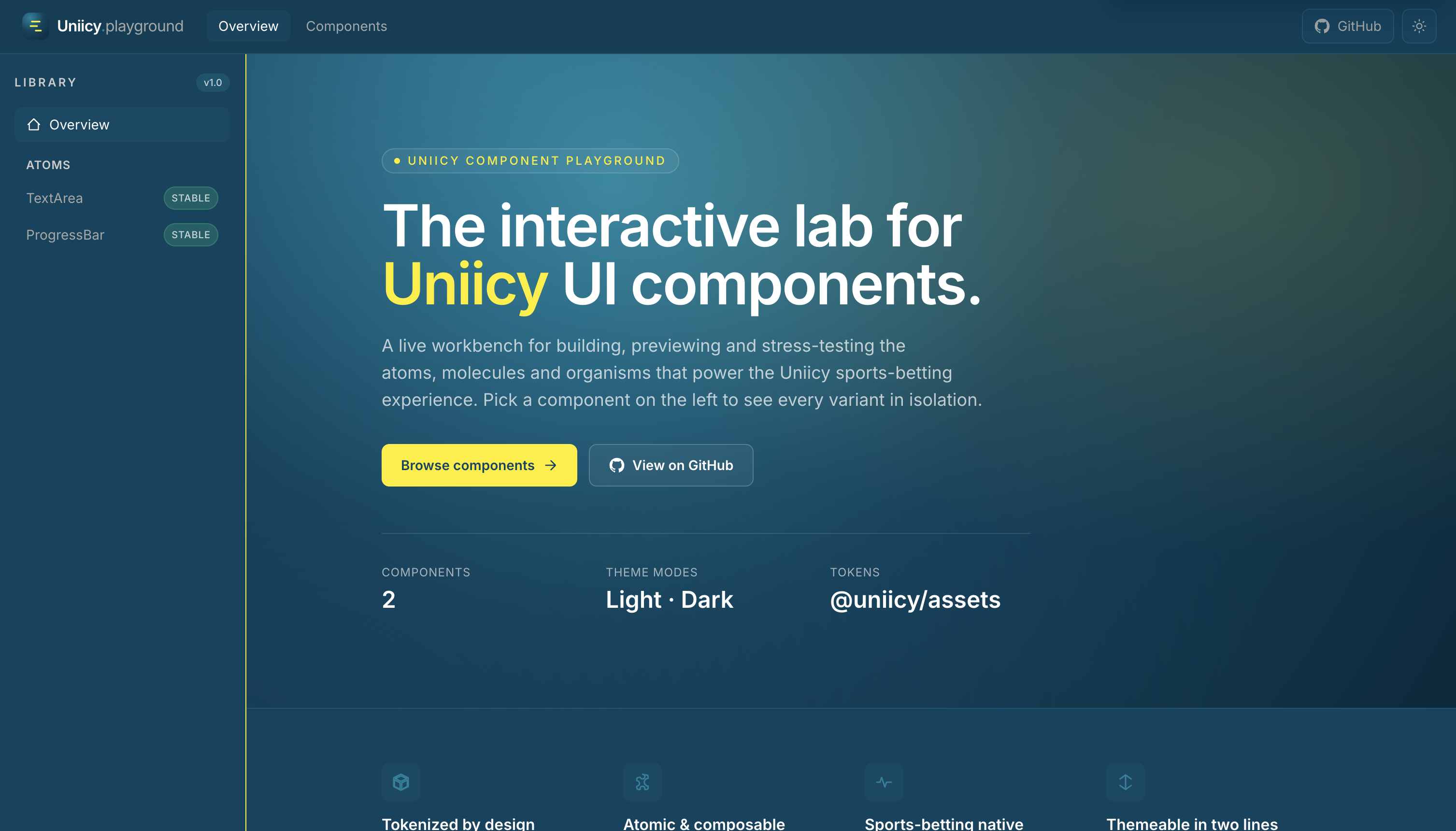
A React component library and interactive playground for building, previewing, and stress-testing UI used in the Uniicy sports-betting experience. The repo is a Bun + Turborepo monorepo: design tokens and shared utilities live in packages/, publishable web components live in components/web, and the playground in apps/playground is the live workbench for developers and QA.
What’s in this repo
| Area | Path | Role |
| ------------------ | ---------------------------------------------------------------------------- | ------------------------------------------------------------------------------------------------------------- |
| Web components | components/web | Atomic React components (TextArea, Tooltip, …), built with tsup, shipped as @dgithiomi/sbui-web |
| Playground | apps/playground | Vite app to browse variants, API tables, and theme modes |
| Design tokens | packages/assets | Color primitives, themes (light/dark), shared token source |
| Icons | packages/icons | Shared SVG icon components (@uniicy/icons) |
| Utilities | packages/libs | Shared helpers (e.g. cn() via classnames + tailwind-merge) |
| Core | packages/core | Shared hooks and utilities for apps in the monorepo |
| Consumer docs | docs/consumer-integration-guide.md | Full guide for teams integrating the library in React or Next.js |
Features
- Atomic design — Components organized as atoms (molecules/organisms planned as the library grows).
- Token-driven theming — Colors from
@uniicy/assetsbecome CSS variables and Tailwind utilities (text-fg,bg-surface,border-outline, …). - Light & dark — Theme variables follow
prefers-color-schemeand a.darkclass for manual toggling. - Shipped stylesheet — One import (
@dgithiomi/sbui-web/styles.css) gives consumers tokens, Tailwind utilities, and component CSS (e.g. tooltip animations). - TypeScript-first — Props documented in
.types.tsfiles; declarations published indist/. - Interactive playground — Sidebar navigation, variant sections, props tables, and status badges for each component.
Repository structure
sb-component-library/
├── apps/
│   └── playground/          # Vite + React docs / demo app
├── components/
│   └── web/                 # @dgithiomi/sbui-web — publishable component library
│       ├── src/atoms/       # TextArea, Tooltip, …
│       ├── scripts/         # build-styles.ts (Tailwind → dist/styles.css)
│       └── dist/            # Built JS + styles.css (after build)
├── packages/
│   ├── assets/              # Design tokens (colors, themes)
│   ├── icons/               # @uniicy/icons
│   ├── libs/                # @uniicy/libs (cn, etc.)
│   └── core/                # Shared hooks
├── docs/
│   ├── consumer-integration-guide.md
│   └── images/              # README & doc assets
├── turbo.json
└── package.json
Components (web)
| Component | Status | Description | | ------------ | ------ | --------------------------------------------------------------------------------------------- | | TextArea | Stable | Controlled multi-line input with status, character count, clear, addons, and optional tooltip | | Tooltip | Stable | Accessible overlay with placement, triggers, variants, and animations |
More atoms will appear in the playground sidebar as they are added.
Prerequisites
- Bun
1.3+(package manager for this monorepo — usebun install, notnpm install, because ofworkspace:*dependencies) - Node.js 20+ (for tooling compatibility)
Getting started (contributors & testers)
1. Clone and install
git clone https://github.com/githiomi/sb-ui.git
cd sb-component-library   # or your local folder name
bun install
2. Run the playground and library in dev mode
From the repository root:
bun run devThis uses Turborepo to:
- Build workspace dependencies (
@dgithiomi/sbui-web, icons, etc.) - Start
@dgithiomi/sbui-webin watch mode (tsup --watch) - Start the playground Vite dev server
Open the URL Vite prints (typically http://localhost:5173). Use the sidebar to open TextArea (and other components as they are added), try variants, and read the API reference at the bottom of each page.
3. Build everything
bun run build4. Build only the component library
cd components/web
bun run build          # JS + types (styles rebuilt via tsup onSuccess)
bun run build:styles   # stylesheet only, when needed
How the web library is built
Understanding this helps when debugging styling or publishing.
- JavaScript —
components/web/tsup.config.tsbundlesindex.tstodist/index.mjs/.cjsand generatesdist/index.d.ts. - Styles —
components/web/scripts/build-styles.ts:- Prepends auto-generated CSS variables (light/dark) from tokens
- Processes
src/styles.csswith PostCSS (postcss-import, Tailwind, Autoprefixer) - Inlines per-component CSS (e.g.
Tooltip.css) - Writes
dist/styles.css
- Watch —
tsup --watchrunsbuild-styleson success sodist/styles.cssis not left missing after a clean rebuild.
Adding component CSS: create src/atoms/<Component>/<Component>.css and add @import "./atoms/<Component>/<Component>.css"; in src/styles.css.
Using the library in your app (consumers)
The published npm package name is @dgithiomi/sbui-web (configurable before publish). Consumers need:
- Install the package and React peers
- Import the stylesheet once at the app root
- Import components from
"@dgithiomi/sbui-web" - (Optional) Add
@dgithiomi/sbui-web/tailwind-presetif their app uses the same Tailwind tokens
Quick start
bun add @dgithiomi/sbui-web react react-dom
# or: npm install @dgithiomi/sbui-web react react-dom
// main.tsx or app/layout.tsx — import once
import "@dgithiomi/sbui-web/styles.css";
// Your component file
import { TextArea } from "@dgithiomi/sbui-web";
import { useState } from "react";
export function Notes() {
const [value, setValue] = useState("");
return (
<TextArea
id="notes"
value={value}
onChange={setValue}
placeholder="Add a note…"
/>
);
}Next.js (App Router): put interactive usage in a "use client" file and import @dgithiomi/sbui-web/styles.css in app/layout.tsx.
For React + Vite, Next.js Pages/App Router, Tailwind preset setup, dark mode, troubleshooting, and a pre-publish checklist, see:
docs/consumer-integration-guide.md
Global provider usage (recommended)
SbuiProvider is the single top-level wrapper for library features that require React context (Toast now, more features later).
Why enableToastProvider exists
enableToastProvideris an optional boolean prop onSbuiProvider.- Default is
true, so Toast context is mounted automatically. - You only set
enableToastProvider={false}for advanced cases (for example: tests, custom host-level toast system, or temporarily disabling Toast behavior). - In normal consumer apps, you should not set it; keep default behavior.
One-wrapper setup
// main.tsx / app root
import { SbuiProvider } from "@dgithiomi/sbui-web";
import "@dgithiomi/sbui-web/styles.css";

export function Root() {
    return (
        <SbuiProvider>
            <App />
        </SbuiProvider>
    );
}
Triggering Toast from components
import { useToast } from "@dgithiomi/sbui-web";

export function SaveButton() {
    const { showToast } = useToast();

    return (
        <button
            onClick={() =>
                showToast({
                    variant: "success",
                    title: "Saved",
                    message: "Your changes were saved.",
                    duration: "short",
                })
            }
        >
            Save
        </button>
    );
}
If enableToastProvider={false}, useToast() will throw unless you provide ToastProvider yourself.
Package exports (@dgithiomi/sbui-web)
| Import | Description |
| ------------------------------------- | ----------------------------------- |
| @dgithiomi/sbui-web | React components + TypeScript types |
| @dgithiomi/sbui-web/styles.css | Global stylesheet (required) |
| @dgithiomi/sbui-web/tailwind-preset | Tailwind v3 preset for host apps |
Peer dependencies: react, react-dom (^19). tailwindcss (^3.4) is optional if the host app uses the preset.
Playground
The playground (apps/playground) is not published to npm. It exists to:
- Preview every variant of each component in isolation
- Document props via shared tables (
PropsTable) - Validate light/dark theming and design tokens end-to-end
- Give QA a stable URL to regression-test UI before release
To run only the playground (after a root install and build):
cd apps/playground
bun run dev
Theming & tokens
- Source of truth:
packages/assets/colors.ts - Tailwind mapping:
components/web/tailwind-theme.ts - Semantic utilities:
text-fg,text-link,bg-surface,bg-canvas,border-outline, etc. - Primitives:
primary,accent,success,error,warning,neutral(with shades)
Prefer semantic classes in components so light/dark switches without changing JSX.
Scripts (root)
| Command | Description |
| --------------- | ---------------------------------------------- |
| bun run dev | Start library watch + playground (Turbo) |
| bun run build | Build all packages and apps |
| bun run test | Placeholder — add tests as the library matures |
Publishing (maintainers)
Before publishing @dgithiomi/sbui-web to npm:
- Run
bun run buildincomponents/weband verifydist/includes JS, types, andstyles.css. - Confirm the package tarball has no
workspace:*dependencies withnpm pack --dry-run. - Publish from
components/webusingnpm publish --access public. - Install
@dgithiomi/sbui-webin a separate React/Next.js app and import@dgithiomi/sbui-web/styles.cssonce.
See the Before publishing section in docs/consumer-integration-guide.md.
Roadmap
- Additional atoms, molecules, and organisms
- Native component package (
components/native) - Storybook or visual regression tests
- Automated npm publish workflow
License
ISC — see package.json for author and repository links.
Links
- Repository: github.com/githiomi/sb-ui
- Issues: github.com/githiomi/sb-ui/issues
- Integration guide: docs/consumer-integration-guide.md