
@dhtmlx/calendar
v9.3.5
Published
DHTMLX Calendar - JavaScript date picker library. GPL v2 edition for GPL-compatible open-source projects; commercial licenses are available for proprietary and production use.


Readme
DHTMLX Calendar — JavaScript Date Picker (GPL Edition)
@dhtmlx/calendar is a JavaScript date picker and date range selector component with three navigation views, a built-in timepicker, date highlighting, localization, and fully customizable UI.
It is a framework-agnostic widget that works with plain JavaScript and integrates with React, Angular, Vue, and Svelte.
It is ideal for prototyping, embedding in open-source projects, and evaluating DHTMLX Calendar's core features under the GPL v2 license.
License
This edition of DHTMLX Calendar is licensed under the GNU General Public License v2.0 (GPL v2).
You can redistribute this package and/or modify it under the terms of the GPL v2.
GPL v2 requires that any project using this package also be open source under a GPL-compatible license.
You may NOT use this package in closed-source, proprietary, or commercial applications without a separate commercial license. For commercial use, please obtain a commercial license of DHTMLX Calendar.
This package is distributed in the hope that it will be useful, but WITHOUT ANY WARRANTY; without even the implied warranty of MERCHANTABILITY or FITNESS FOR A PARTICULAR PURPOSE. See the GPL v2 for more details.
Using DHTMLX Calendar in a commercial or closed-source project?
You need a commercial license. DHTMLX offers Individual, Commercial, Enterprise, and Ultimate license tiers.
- Compare licenses and pricing
- Download a free 30-day trial of DHTMLX Calendar
- Download 30-day trial versions of all DHTMLX components
- Contact us regarding licensing: [email protected]
Copyright © 2026 XB Software Ltd.
What is DHTMLX Calendar
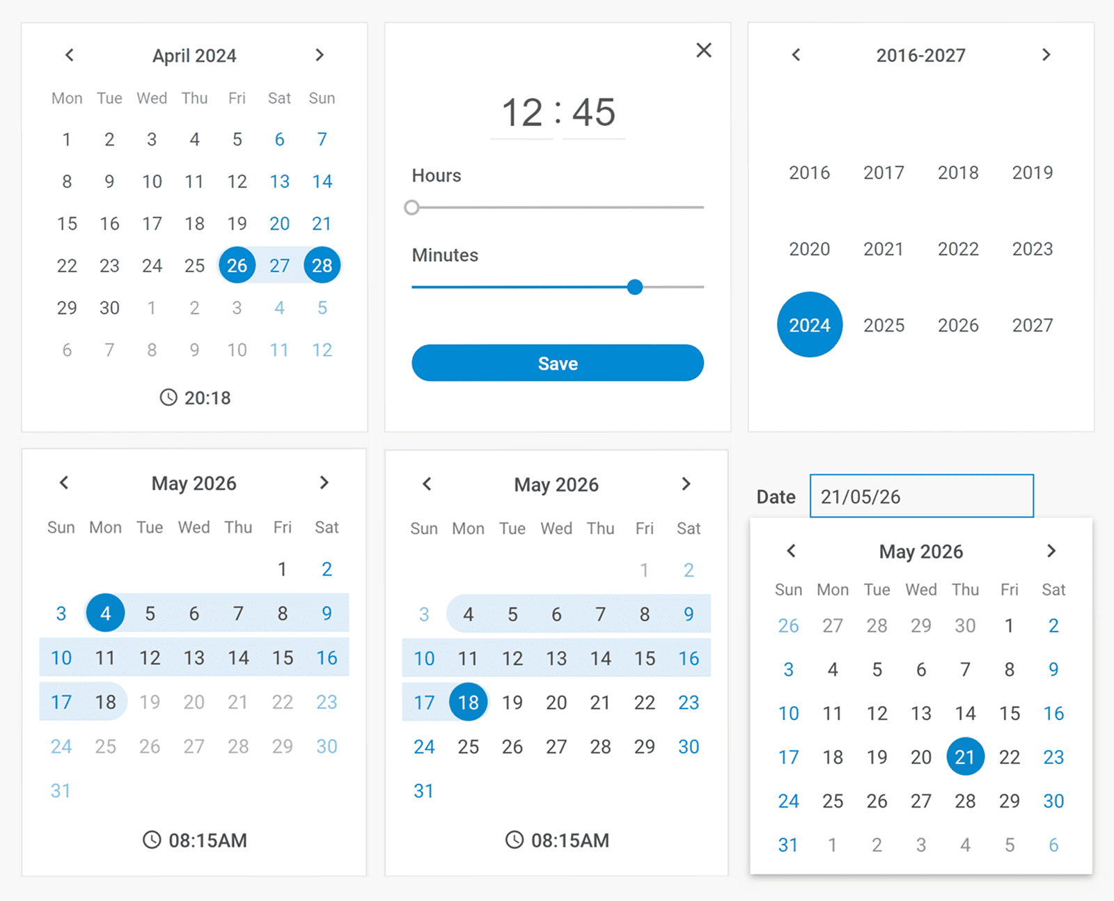
DHTMLX Calendar is a JavaScript date picker and date range selection widget for web applications. It provides three built-in navigation views (days, months, years), an optional timepicker for time selection, and support for date ranges via two linked calendars. Developers can block or highlight specific dates, configure date formats, set week start day, and fully customize the appearance via CSS.
This is the GPL (open source) edition of DHTMLX Calendar, distributed as the @dhtmlx/calendar npm package. It is part of the DHTMLX Suite family of UI components and can be used standalone or alongside other Suite widgets such as DHTMLX Grid.
Use this GPL edition when you want to prototype with DHTMLX Calendar, integrate it into an open-source project, or evaluate its features before obtaining a commercial license.
Quick Start
Install the package, import the styles, and initialize the calendar in a container element.
Install
npm install @dhtmlx/calendarInclude in your project
import { Calendar } from "@dhtmlx/calendar";
import "@dhtmlx/calendar/calendar.css";
Or via CDN as part of DHTMLX Suite:
<link rel="stylesheet" href="https://cdn.dhtmlx.com/suite/edge/suite.css" />
<script type="text/javascript" src="https://cdn.dhtmlx.com/suite/edge/suite.js"></script>
Or with script tags pointing to local files:
<script src="path/to/calendar.js"></script>
<link rel="stylesheet" href="path/to/calendar.css">
The CSS import is required for default calendar styling and layout.
Initialize
import { Calendar } from "@dhtmlx/calendar";
import "@dhtmlx/calendar/calendar.css";

const calendar = new Calendar("calendar_container", {
    css: "dhx_widget--bordered",
    value: new Date(),
    dateFormat: "%d/%m/%Y",
    weekStart: "monday"
});
Add a container element to your HTML:
<div id="calendar_container"></div>Basic Usage — DHTMLX Calendar
Date picker attached to an input field
Attach DHTMLX Calendar to a popup and display the selected date in an input field:
<label for="date_input">
    Date
    <input readonly type="text" id="date_input">
</label>
import { Calendar, Popup } from "@dhtmlx/calendar";
import "@dhtmlx/calendar/calendar.css";
const popup = new Popup();
const calendar = new Calendar(null, {
value: new Date(),
dateFormat: "%d/%m/%Y",
weekStart: "monday",
timePicker: true
});
popup.attach(calendar);
document.getElementById("date_input").addEventListener("click", function(e) {
popup.show(e.target);
});
calendar.events.on("change", function() {
document.getElementById("date_input").value = calendar.getValue();
popup.hide();
});Date range on a single calendar
Enable range mode to let users select a start and end date on one calendar:
import { Calendar, Popup } from "@dhtmlx/calendar";
import "@dhtmlx/calendar/calendar.css";

const calendar = new Calendar("calendar_container", {
    css: "dhx_widget--bordered",
    range: true,
    value: ["01/06/25", "15/06/25"],
    dateFormat: "%d/%m/%y"
});

// Get the selected range
const [from, to] = calendar.getValue(true); // returns [Date, Date]
Disabled dates
Disable weekends using a function rule:
import { Calendar, Popup } from "@dhtmlx/calendar";
import "@dhtmlx/calendar/calendar.css";

const calendar = new Calendar("calendar_container", {
    css: "dhx_widget--bordered",
    disabledDates: function(date) {
        const day = date.getDay();
        return day === 0 || day === 6; // disable Sunday (0) and Saturday (6)
    }
});
The disabledDates function receives a Date object for each day and returns true to dim and block that date.
DHTMLX Calendar Features
DHTMLX Calendar includes the following features in the GPL edition.
| Feature | Details |
| --- | --- |
| Three navigation views | Switch between day, month, and year views for fast date navigation |
| Date range selection | Place two linked calendars side by side to let users pick a start and end date |
| Timepicker | Optional hour/minute selector with 12-hour or 24-hour format |
| Date picker mode | Attach the calendar to a popup and display the selected value in an input field |
| Disabled dates | Block specific dates or date ranges to prevent selection |
| Highlighted dates | Apply custom CSS classes to mark holidays, events, or other special dates |
| Date format configuration | Specify any date format string; defaults to %d/%m/%Y |
| Week start day | Set the first day of the week to any weekday |
| Week numbers | Optionally display ISO week numbers in the calendar grid |
| Localization | Built-in support for multiple languages; switch locale at runtime |
| Customizable UI | Modify colors, borders, and widths via CSS variables |
| Themes and high-contrast mode | Multiple built-in themes including high-contrast for accessibility |
| Accessibility | WCAG-compliant; full keyboard navigation support |
| Event system | API events for change, dateMouseOver, beforeChange, and more |
This table highlights key features. For the complete and up-to-date feature list, see the DHTMLX Calendar documentation.
Framework Integration
DHTMLX Calendar works with popular front-end frameworks including React, Angular, Vue, and Svelte. These integration guides apply to both the GPL edition and commercial editions of DHTMLX Calendar.
Documentation and Resources
- Product page – overview, screenshots, and key features.
- Documentation – getting started, guides, and configuration options.
- API reference – full JavaScript API.
- Live demos and samples – interactive examples of DHTMLX Calendar features.
- Support forum – community Q&A and discussions for DHTMLX Suite.