
@dhtmlx/suite
v9.3.5
Published
DHTMLX Suite - modular set of JavaScript UI components. GPL v2 edition for GPL-compatible open-source projects; commercial licenses are available for proprietary and production use.


Readme
DHTMLX Suite — JavaScript UI Widget Library (GPL Edition)
@dhtmlx/suite is a JavaScript UI widget library with 20+ components for building data-intensive web applications – including a high-performance data grid, charts, forms, navigation controls, layout management, and data display widgets – all sharing a common API, theming system, and data layer.
It is a framework-agnostic library that works with plain JavaScript and integrates with React, Angular, Vue, and Svelte.
It is ideal for prototyping complex data-driven interfaces, building enterprise dashboards and admin panels in open-source projects, and evaluating DHTMLX Suite's core widgets under the GPL v2 license.
License
This edition of DHTMLX Suite is licensed under the GNU General Public License v2.0 (GPL v2).
You can redistribute this package and/or modify it under the terms of the GPL v2.
GPL v2 requires that any project using this package also be open source under a GPL-compatible license.
You may NOT use this package in closed-source, proprietary, or commercial applications without a separate commercial license. For commercial use, please obtain a commercial license of DHTMLX Suite (PRO edition).
This package is distributed in the hope that it will be useful, but WITHOUT ANY WARRANTY; without even the implied warranty of MERCHANTABILITY or FITNESS FOR A PARTICULAR PURPOSE. See the GPL v2 for more details.
Using DHTMLX Suite in a commercial or closed-source project?
You need a commercial license. DHTMLX offers Individual, Commercial, Enterprise, and Ultimate license tiers.
- Compare licenses and pricing
- Download a free 30-day trial of DHTMLX Suite
- Download 30-day trial versions of all DHTMLX components
- Contact us regarding licensing: [email protected]
The commercial PRO edition includes additional features per widget – such as TreeGrid mode in Grid, column drag-and-drop, and autoHeight for Grid headers/footers.
Copyright © 2026 XB Software Ltd.
What is DHTMLX Suite
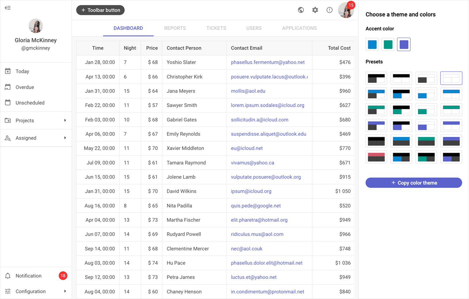
DHTMLX Suite is a JavaScript UI widget library of 20+ components for building data-intensive web and mobile applications. Its widgets cover data display (Grid with TreeGrid mode, Chart, DataView, List, Tree, Pagination), user input (Form with 15+ controls, ComboBox, ColorPicker, Slider, TimePicker, Calendar), layout and navigation (Layout, Tabbar, Toolbar, Ribbon, Menu, Sidebar, Popup, Window), and utility components (Message). All widgets share a unified DataCollection and TreeCollection API for loading, filtering, sorting, and manipulating data, four built-in themes (Light, Light Contrast, Dark, Dark Contrast), and a consistent event system and configuration pattern across the library.
This is the GPL (open source) edition of DHTMLX Suite, distributed as the @dhtmlx/suite npm package. Some widgets – Calendar, Chart, Grid, and Tree – can be used as standalone components. All other widgets are tightly integrated with the Suite library and cannot be used outside of it.
Use this GPL edition when you want to prototype a data-intensive dashboard or admin panel, build a multi-widget application in an open-source project, or evaluate DHTMLX Suite's core components before obtaining a commercial license.
Quick Start
Install the package, import the styles, and initialize any Suite widget in a container element.
Install
npm install @dhtmlx/suiteInclude in your project
import { Grid, Chart, Layout, Toolbar } from "@dhtmlx/suite";
import "@dhtmlx/suite/suite.css";
Or via CDN:
<link rel="stylesheet" href="https://cdn.dhtmlx.com/suite/edge/suite.css" />
<script type="text/javascript" src="https://cdn.dhtmlx.com/suite/edge/suite.js"></script>
Or with script tags pointing to local codebase files:
<script type="text/javascript" src="./codebase/suite.js"></script>
<link rel="stylesheet" href="./codebase/suite.css">
The CSS import is required for default Suite widget styling and layout.
Initialize a widget
All Suite widgets follow the same constructor pattern:
import { Grid } from "@dhtmlx/suite";
import "@dhtmlx/suite/suite.css";

const grid = new Grid("grid_container", {
    columns: [
        { id: "name",  header: [{ text: "Name" }],  width: 200 },
        { id: "role",  header: [{ text: "Role" }],  width: 150 },
        { id: "score", header: [{ text: "Score" }], width: 100 }
    ],
    data: [
        { id: "1", name: "Alice Johnson", role: "Engineer", score: 92 },
        { id: "2", name: "Bob Smith",     role: "Designer", score: 87 }
    ]
});
<div id="grid_container" style="width: 100%; height: 400px;"></div>Basic Usage — DHTMLX Suite
Building a layout with multiple widgets
Use Layout to arrange widgets in rows and columns, then attach Suite components to each cell:
import { Grid, Layout, Toolbar, Tree } from "@dhtmlx/suite";
import "@dhtmlx/suite/suite.css";

const layout = new Layout("layout_container", {
    rows: [
        { id: "toolbar", height: "content" },
        { id: "main",    cols: [
            { id: "sidebar", width: 220 },
            { id: "grid" }
        ]}
    ]
});

// Attach a Toolbar to the top row
const toolbar = new Toolbar(null, {
    data: [
        { type: "button", id: "add",    value: "Add",    icon: "dxi dxi-plus" },
        { type: "button", id: "export", value: "Export", icon: "dxi dxi-download" }
    ]
});
layout.getCell("toolbar").attach(toolbar);

// Attach a Tree to the sidebar
const tree = new Tree(null, {});
tree.data.parse([
    { id: "1", value: "Reports",   items: [
        { id: "1.1", value: "Q1" },
        { id: "1.2", value: "Q2" }
    ]},
    { id: "2", value: "Settings" }
]);
layout.getCell("sidebar").attach(tree);

// Attach a Grid to the main area
const grid = new Grid(null, {
    columns: [
        { id: "name",   header: [{ text: "Name" }] },
        { id: "status", header: [{ text: "Status" }] }
    ],
    data: []
});
layout.getCell("grid").attach(grid);
Sharing data between widgets
Suite widgets share the DataCollection API. Load data once and bind it to multiple widgets:
import { Grid, Chart, DataCollection } from "@dhtmlx/suite";
import "@dhtmlx/suite/suite.css";

// other configuration (columns, series, etc.)
const data = new DataCollection();
data.load("/api/sales");

const grid = new Grid("grid_container", { columns, data });
const chart = new Chart("chart_container", {
    type: "bar",
    series,
    data
});
Form with validation
Initialize a Form with multiple control types and validate before submit:
import { Form } from "@dhtmlx/suite";
import "@dhtmlx/suite/suite.css";

const form = new dhx.Form("form_container", {
    rows: [
        { type: "input",    name: "name",  label: "Full name", required: true },
        { type: "input",    name: "email", label: "Email",     inputType: "email", required: true },
        { type: "select",   name: "role",  label: "Role",
          options: [
              { value: "admin",  content: "Admin" },
              { value: "editor", content: "Editor" }
          ]
        },
        { type: "checkbox", name: "agree", label: "I agree to terms", required: true },
        { type: "button",   text: "Submit", view: "flat", color: "primary" }
        }
    ]
});
DHTMLX Suite Widgets
Data display
| Widget | Description |
|:---|:---|
| Grid | High-performance data grid with sorting, filtering, inline editing, virtual scrolling, and data export to Excel, CSV, PDF, and PNG |
| Grid with TreeGrid mode | Hierarchical expandable/collapsible rows in Grid enabled via type: "tree" — PRO only |
| Chart | 13 chart types (line, bar, pie, donut, scatter, radar, area, heatmap, treemap, and more) with mixed series |
| DataView | Card-based display of data items with custom HTML templates per item |
| List | Vertical list with inline editing, drag-and-drop reordering, filtering, and sorting |
| Tree | Hierarchical tree view with checkboxes, drag-and-drop, inline editing, and lazy loading |
| Pagination | Page navigation control that connects to Grid, DataView, or List to page large datasets |
User input
| Widget | Description | |:---|:---| | Form | Configurable form with 15+ control types: Input, Textarea, Select, Combo, Checkbox, RadioGroup, DatePicker, TimePicker, ColorPicker, Slider, Toggle, SimpleVault (file upload), and more | | ComboBox | Searchable dropdown with grouping, multi-select, custom item templates, and remote data loading | | Calendar | Date and date range picker with timepicker, disabled dates, localization, and three display modes | | TimePicker | Standalone hour and minute selector with 12-hour and 24-hour formats | | ColorPicker | Color selection widget with hex, RGB, and HSV input modes and custom color palettes | | Slider | Range slider with tick marks, custom labels, and vertical/horizontal orientation |
Layout and navigation
| Widget | Description | |:---|:---| | Layout | Flexible row/column layout manager; attach any Suite widget to any layout cell | | Tabbar | Tab container; attach any Suite widget to each tab panel | | Toolbar | Top navigation bar with buttons, dropdowns, separators, and custom controls | | Ribbon | Office-style ribbon with grouped button blocks and nested controls | | Menu | Context and navigation menu with nested submenus and keyboard navigation | | Sidebar | Collapsible vertical sidebar with items and nested submenus | | Popup | Floating popup container; attach any Suite widget or custom HTML to a Popup | | Window | Movable, resizable modal and non-modal windows |
Utility
| Widget | Description | |:---|:---| | Message | Toast, alert, and confirm dialog messages |
DHTMLX Suite Library Features
| Feature | Details | |:---|:---| | Unified DataCollection API | Load, parse, filter, sort, and manipulate data across all widgets with a shared API | | TreeCollection API | Hierarchical data management for Tree, TreeGrid, and Sidebar | | Dynamic data loading | Lazy-load data on demand; virtual scrolling for large datasets in Grid and List | | DataDrivers | Parse data from JSON, CSV, or XML into any widget | | Four built-in themes | Light, Light Contrast, Dark, and Dark Contrast; switch theme at runtime | | CSS variable theming | Customize every aspect of widget appearance via CSS variables | | TypeScript support | Bundled TypeScript type definitions for all widgets and APIs | | WAI-ARIA accessibility | WCAG-compliant; full keyboard navigation and screen reader support across all widgets | | Touch support | Native touch events for mobile and tablet devices | | Optimus micro-framework | Optional DHTMLX Optimus framework for building structured multi-widget apps with reusable views | | Export modules | Export Grid, Chart, and DataView data to Excel, CSV, PDF, and PNG | | Uploader API | File upload helper shared by Form's SimpleVault control and standalone use | | Resizer | Drag handle for resizing adjacent layout panels | | Event system | Consistent event model across all widgets |
Framework Integration
DHTMLX Suite works with popular front-end frameworks including React, Angular, Vue, and Svelte. These integration guides apply to both the GPL edition and the commercial editions of DHTMLX Suite.
Documentation and Resources
- Product page – overview, live demos, and key features.
- Documentation – getting started guides and API references for all 20+ widgets.
- Live demos and samples – interactive code examples for every Suite widget.
- Demo applications – real-world app templates built with Suite widgets.
- Support forum – community Q&A and discussions for DHTMLX Suite.