
@divypandya/time-aware-theme
v0.4.1
Published
Time-aware theme resolver, DOM controller, React adapter, and test utilities.

Maintainers
 divypandya
Readme
@divypandya/time-aware-theme





A theme that shifts with the time of day: a pure resolver that maps a minute of the day to interpolated OKLCH tokens, a framework-free DOM controller that applies them, a React adapter, and deterministic testing utilities for simulating the clock.
Interpolating a palette across a day has a trap in it — when a light-on-dark stop moves toward a dark-on-light one, the two tokens cross and text goes briefly invisible. This package makes that a build error rather than something a user finds at dusk, and ships four palettes certified against it.
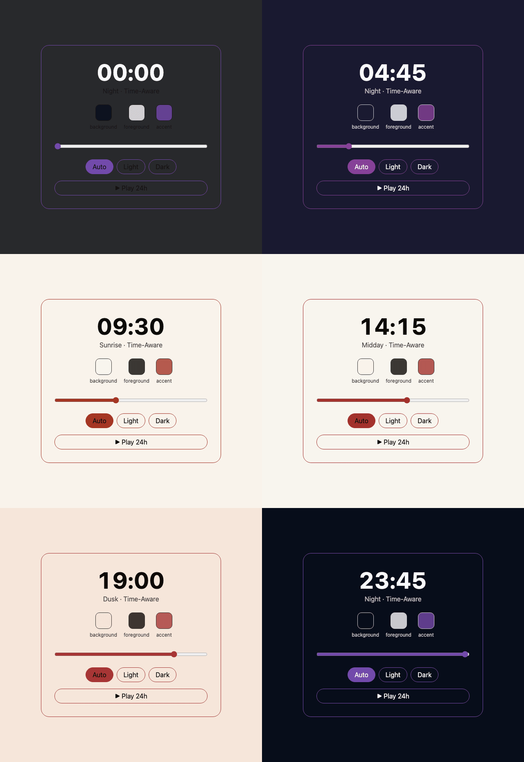
Recording of examples/vanilla-dom: dragging the
time-of-day slider (or hitting Play 24h) calls the real
createThemeController, which writes the --tat-* custom properties you see
updating live — this isn't a mockup. Every frame is captured from a headless
browser running the shipped controller (npm run demo:gif), so the animation
cannot drift from what the package actually resolves. Its background steps
0.024 at the switch, the same as the presets — through 0.4.0 this recording
stepped 0.770, and the front page was demonstrating the lurch the rest of the
page had just stopped doing.
Stats
| | |
| ---------------------- | -------------------------------------------------------------------------- |
| Runtime dependencies | 0 |
| Core entry (gzip) | ~5.7 KB incl. shared chunks, budget 6 KB |
| DOM entry (gzip) | ~5.6 KB, budget 6.5 KB |
| React UI entry (gzip) | ~4.9 KB, budget 9 KB |
| Preset entry (gzip) | ~4.5 KB each, budget 7 KB |
| Tailwind entry (gzip) | ~0.6 KB, budget 2 KB |
| Resolver performance | median < 1 ms, p95 < 3 ms per resolve (benchmark) |
| Contrast certification | 86,400-sample WCAG sweep, blocking (certify) |
| Node.js | >=24 <27 |
Sizes are the transitive cost of each entry — the entry plus every shared
chunk it imports, which is what a consumer actually downloads. WCAG and sRGB
conversion maths lives only in the testing, inspect and solve entries
and never reaches core, dom, or the presets.
Bundle sizes are enforced in CI on every push via npm run size
(scripts/size-check.mjs); resolver performance is
checked via npm run bench (scripts/benchmark.mjs);
every shipped schedule is contrast-certified via npm run certify
(scripts/certify.mjs).
See CHANGELOG.md for release notes.
Playground
divypandya.github.io/time-aware-theme — all ten presets, scrubbable across a day, with every declared contrast pair computed live as you drag. Source in playground/.
Installation
npm install @divypandya/time-aware-themeReact is an optional peer dependency — install it only if you use the
/react entry point.
Quick start
Define a theme system once: static light/dark fallbacks plus a series of time-of-day stops. Tokens between stops are interpolated automatically.
import { defineThemeSystem, holdThenSnap } from '@divypandya/time-aware-theme';

const night = {
  background: 'oklch(0.14 0.02 260 / 1)',
  foreground: 'oklch(0.96 0.01 260 / 1)'
};
const dawn = {
  background: 'oklch(0.97 0.015 75 / 1)',
  foreground: 'oklch(0.25 0.05 55 / 1)'
};
const dusk = {
  background: 'oklch(0.93 0.02 60 / 1)',
  foreground: 'oklch(0.24 0.04 55 / 1)'
};

const system = defineThemeSystem({
  name: 'app-theme',
  staticThemes: {
    light: {
      background: 'oklch(0.97 0.01 250 / 1)',
      foreground: 'oklch(0.17 0.03 250 / 1)'
    },
    dark: {
      background: 'oklch(0.13 0.02 250 / 1)',
      foreground: 'oklch(0.96 0.01 250 / 1)'
    }
  },
  // Declare which tokens must stay legible against each other.
  roles: {
    pairs: [{ bg: 'background', fg: 'foreground', min: 'AA' }]
  },
  stops: [
    { minute: 0, appearance: 'dark', phase: 'night', tokens: night },
    // Each light/dark swap happens in one minute, so the foreground and
    // background never cross while both are on screen. See "Contrast-safe
    // role swaps" below for why this matters.
    ...holdThenSnap({
      at: 360,
      from: night,
      to: dawn,
      fromAppearance: 'dark',
      toAppearance: 'light',
      phase: 'night',
      nextPhase: 'dawn'
    }),
    ...holdThenSnap({
      at: 1080,
      from: dusk,
      to: night,
      fromAppearance: 'light',
      toAppearance: 'dark',
      phase: 'dusk',
      nextPhase: 'night'
    })
  ]
});
Create and start the DOM controller before mounting React so the first paint
already reflects the correct theme. The controller writes tokens as CSS custom
properties, toggles the .dark class, and updates color-scheme. It only
touches the DOM once you pass it document/window explicitly — without
them it stays inert (safe to construct during SSR).
import { createRoot } from 'react-dom/client';
import { createThemeController } from '@divypandya/time-aware-theme/dom';
import { TimeAwareThemeProvider } from '@divypandya/time-aware-theme/react';

const controller = createThemeController({ system, document, window });
controller.start();

createRoot(document.getElementById('root')!).render(
  <TimeAwareThemeProvider controller={controller}>
    <App />
  </TimeAwareThemeProvider>
);
Read the resolved theme and switch modes from inside the tree:
import { useTimeAwareTheme } from '@divypandya/time-aware-theme/react';

function ThemeToggle() {
  const { mode, appearance, phase, setMode } = useTimeAwareTheme();

  return (
    <button
      onClick={() => setMode(mode === 'time-aware' ? 'dark' : 'time-aware')}
    >
      {appearance} · {phase} ({mode})
    </button>
  );
}
Contrast-safe role swaps
When a stop with a dark background and light text interpolates toward a stop with a light background and dark text, both tokens travel through OKLCH space and cross each other partway. At the crossing their lightness is identical, so text becomes invisible — for as long as the interval is wide.
Declare which tokens form a foreground/background pair, and the crossing becomes a build-time error instead of something a user notices at dusk:
defineThemeSystem({
  staticThemes: {/* ... */},
  roles: {
    pairs: [
      { bg: 'background', fg: 'foreground', min: 'AA' }, // 4.5:1
      { bg: 'background', fg: 'accent', min: 'AA-large' }, // 3:1
      { bg: 'background', fg: 'border', min: 'non-text' } // 3:1
    ]
  },
  stops: [/* ... */]
});
Roles never change interpolation — they only say which pairs must stay legible.
A crossing cannot be smoothed away — the readable region genuinely has two
disconnected halves, and any continuous path between them passes through
unreadable. So the schedule declares where it steps instead. Mark a stop
jumpAfter: true and its tokens hold until the next stop, then change at once:
stops: [
  { minute: 0, appearance: 'dark', phase: 'night', tokens: nightTokens },
  {
    minute: 331,
    appearance: 'dark',
    phase: 'dawn',
    tokens: lastLegibleNightTokens,
    jumpAfter: true // hold here, then change instantly at 332
  },
  { minute: 332, appearance: 'light', phase: 'dawn', tokens: firstDayTokens }
];
Before 0.3 this safety came from the resolver truncating to whole minutes, so two stops a minute apart had no sampleable interior. That worked and was brittle: sampling any finer reintroduced the bug, and it did — 38 of 61 seconds between two such stops fell below AA once we looked. A declared jump holds at any resolution, which is why the resolver can now be asked for a fractional minute.
holdThenSnap() still writes the pair for you:
import { holdThenSnap } from '@divypandya/time-aware-theme';

stops: [
  { minute: 0, appearance: 'dark', phase: 'night', tokens: nightTokens },
  ...holdThenSnap({
    at: 6 * 60, // hold the night palette until 06:00
    from: nightTokens,
    to: dawnTokens, // then switch at 06:01
    fromAppearance: 'dark',
    toAppearance: 'light',
    phase: 'night',
    nextPhase: 'dawn'
  })
];
Check a whole schedule in your own test suite:
import { assertContrast } from '@divypandya/time-aware-theme/testing';

it('stays legible all day', () => {
  assertContrast(system); // samples all 1,440 minutes
});
Failures name the minute, the pair, and the interval responsible:
Contrast below AA on 90 sample(s) between 15:49 and 17:18.
  Worst: 1.00:1 at 16:33 ("foreground" on "background", needs 4.5:1)
  Interval: afternoon -> dusk at t=0.51
  Smallest fix: "foreground" darker, L 0.573 -> 0.209 (-0.364)
  If the pair swaps sides here, mark the earlier stop `jumpAfter: true` ...
The suggested lightness is in the same units the stops are written in, so it can be typed straight into the offending one. It is rounded away from the boundary rather than to it, because a value rounded on the way back in would otherwise fail by a hair. Where a token is shared with another pair, the message says so — a background darkened to rescue body text can push a caption the other way, and the number is computed for one pair in isolation.
Sample sub-minute when you want a sharper sweep:
import {
  PER_SECOND,
  assertContrast
} from '@divypandya/time-aware-theme/testing';

assertContrast(system, { stepMinutes: PER_SECOND }); // 86,400 samples
assertContrast proves every resolved moment is legible. It says nothing about
the frames a CSS transition paints on the way between them — with
transition: background-color .35s the browser fades straight through a
crossing, and our own demo painted 1.02:1 for roughly 100ms while every gate
stayed green. assertRenderedPath(system) checks those frames, skipping
declared jumps because nothing is blended across them.
Smooth transitions
appearance stays binary because it drives the .dark class and
color-scheme. To crossfade rather than snap at the boundary, read progress
and nextAppearance from a resolved snapshot:
const { appearance, nextAppearance, progress, phase, nextPhase } =
  resolveThemeAt(system, minute);
progress runs 0→1 through the current stop interval and resets at each stop,
so you can drive an opacity crossfade, or render "dusk in 12 min" from
nextPhase. Respect prefers-reduced-motion when you do.
Transitions across a jump
If you animate your custom properties — and you should, the glide looks far
better for it — the browser will happily animate across a declared jump too,
painting exactly the frames the jump exists to skip. The controller sets
data-theme-flip on the target element for the frame in which that happens, so
a stylesheet can opt out:
[data-theme-flip] * {
  transition: none !important;
}
tailwindCss() includes this rule; transitionCss() emits it alone, and both
accept a different attribute name if data-theme-flip collides with something.
The controller's flipAttribute option must match. Pass null to switch it
off entirely, in which case animate nothing, or animate and accept the frames.
Scoped previews
Point a controller at any element to theme a subtree without touching the rest of the page — a settings-panel preview swatch, or side-by-side comparisons:
createThemeController({ system, document, target: previewEl });Scoped instances are display-only: they don't persist mode, don't attach window
listeners, and don't write color-scheme. For a one-off with no lifecycle at
all, use applySnapshotTo(element, snapshot, { tokenKeys }).
CSS variable naming
| cssVariablePrefix | Emits | Use when |
| ------------------- | -------------------- | -------------------------------------- |
| 'tat' (default) | --tat-background | Namespace safety |
| 'color' | --color-background | Tailwind v4 — no @theme inline remap |
| null | --background | You own the namespace |
Interpolation notes
- Achromatic endpoints. When one endpoint is a pure grey (
c: 0, huenone) and the other is chromatic, the grey has no hue to contribute, so the chromatic endpoint's hue is used throughout. Fades to neutral therefore keep their colour cast rather than drifting toward an arbitrary hue. - Hue takes the shortest path around the colour circle, so 350° → 10° crosses 0° rather than travelling backwards through 180°.
- Fractional minutes resolve.
normalizeMinuteno longer truncates, soresolveThemeAt(system, 331.5)is a real answer and the controller ticks sub-minute where a schedule needs it. What makes a jump exact is that the stop declares it, not that time was rounded.
Resolve a snapshot directly, without the DOM controller, for server-side rendering or previews:
import { resolveThemeAt } from '@divypandya/time-aware-theme';

const snapshot = resolveThemeAt(system, 9 * 60); // 09:00
snapshot.appearance; // 'light'
snapshot.phase; // 'dawn'
snapshot.progress; // 0.42 - part-way to the next stop
snapshot.nextPhase; // 'morning'
snapshot.cssText; // '--background: oklch(...); --foreground: oklch(...);'
Test time-dependent behavior deterministically with the manual clock instead
of mocking Date and timers by hand:
import { createManualClock } from '@divypandya/time-aware-theme/testing';
import { createThemeController } from '@divypandya/time-aware-theme/dom';

const clock = createManualClock({ now: new Date('2026-08-12T06:00:00Z') });
const controller = createThemeController({ system, clock });

controller.start();
clock.advanceBy(60 * 60_000); // fast-forward one hour
controller.getSnapshot().phase;
Presets
Ten ready-made schedules, each certified per second of the day in CI. Import one granularly so you never bundle the others:
import dawnToDusk from '@divypandya/time-aware-theme/presets/dawn-to-dusk';

const controller = createThemeController({ system: dawnToDusk, document });
| Preset | Level | Character |
| ---------------- | ------- | ------------------------------------------------------------ |
| dawn-to-dusk | AA | Warm arc — indigo night, amber sunrise, ember dusk |
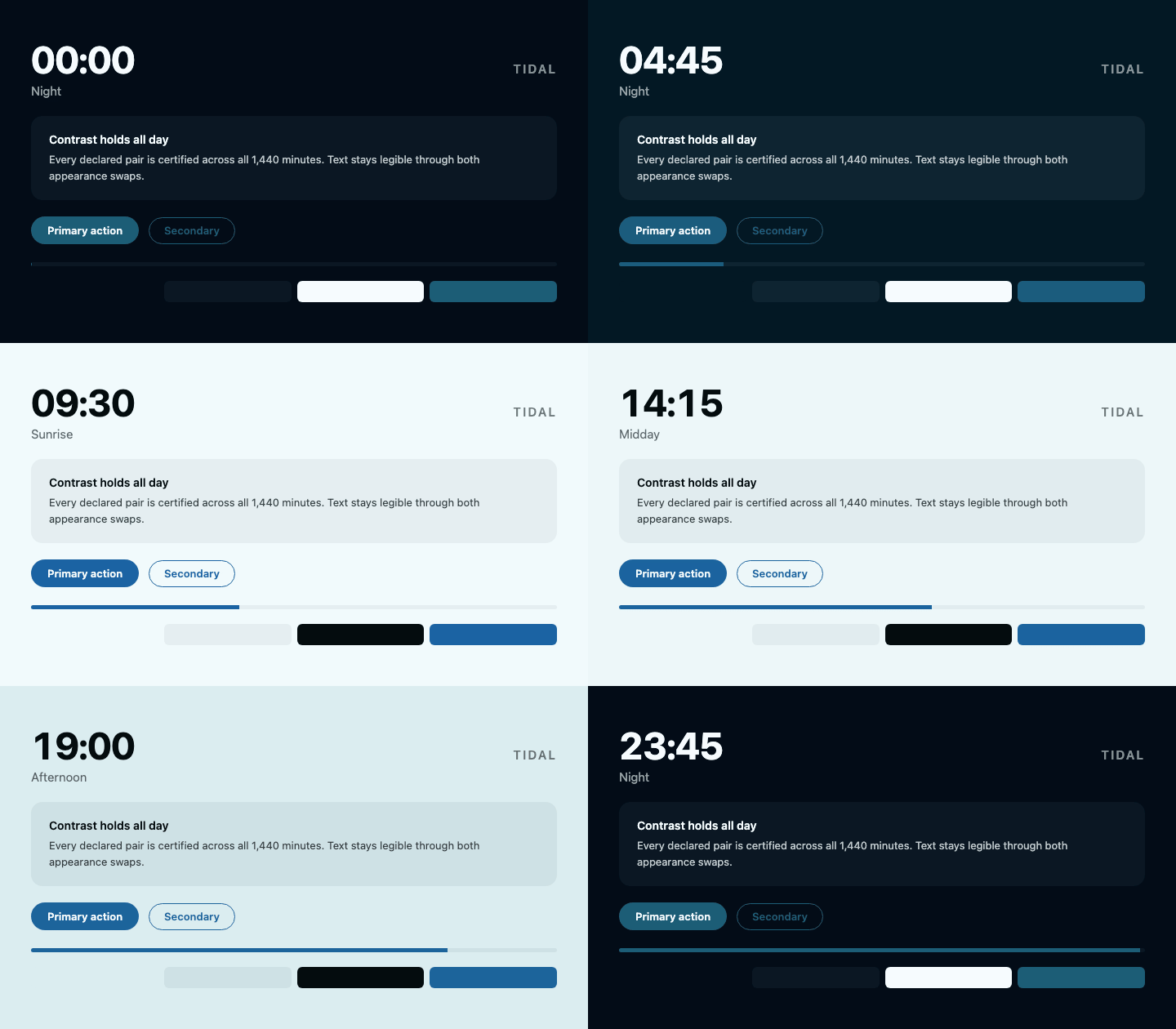
| tidal | AA | Cool arc — cyan through slate, no warm hues |
| paper | AA | Near-achromatic surfaces, one chromatic accent |
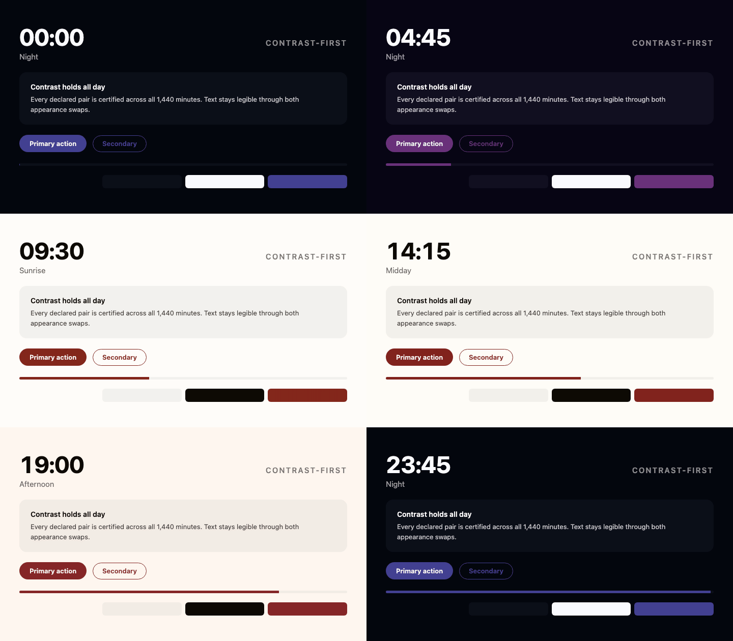
| contrast-first | AAA | 7:1 everywhere; time expressed via hue, not lightness |
| nocturne | AA | Eye-comforting — warm dim night, midday short of paper white |
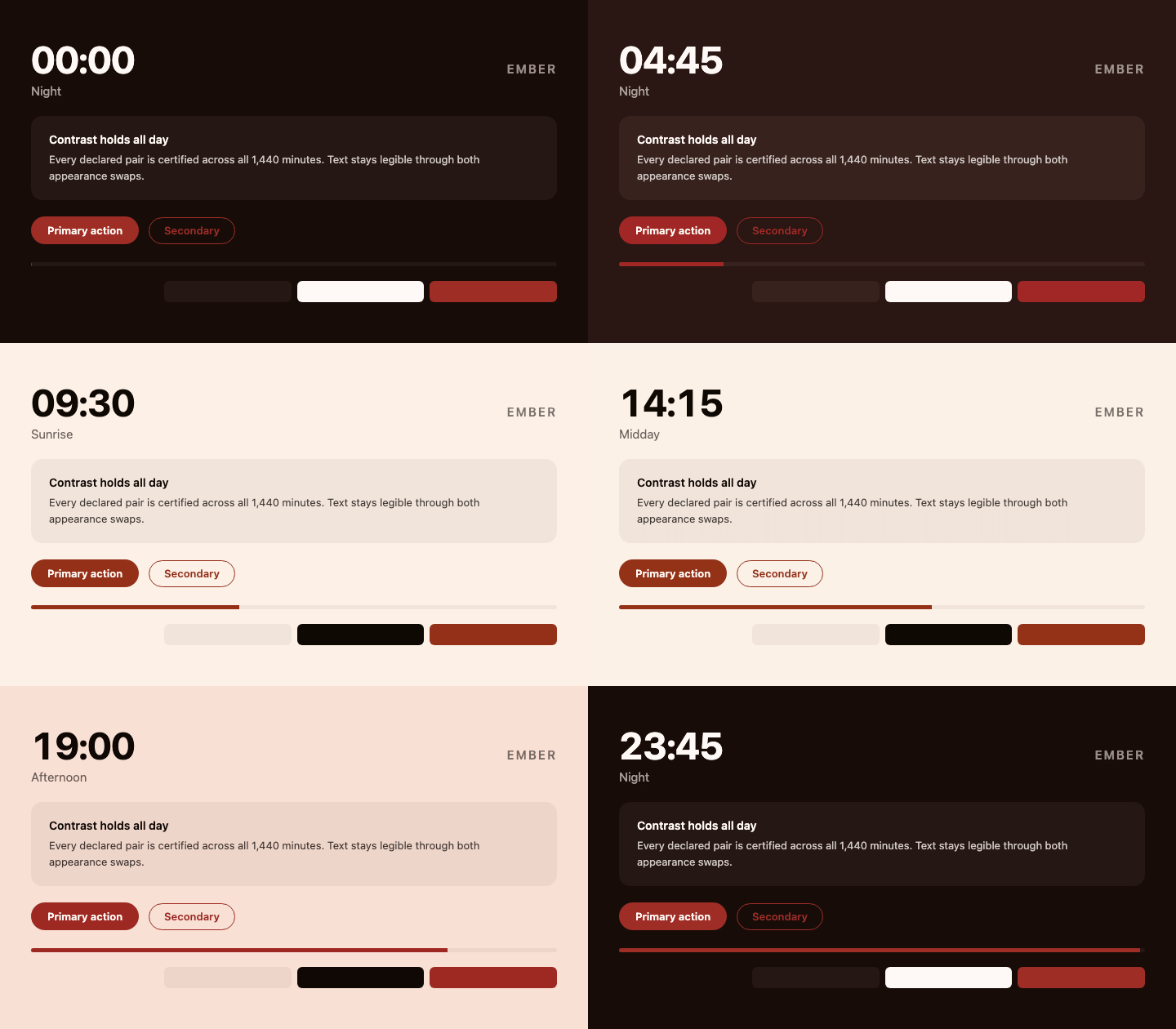
| ember | AA | Deep amber throughout; lamplight rather than daylight |
| forest | AA | Muted green and moss, low chroma |
| meridian | AA | Neutral and quiet; hue barely moves, only the light does |
| blossom | AA | Soft rose and plum; lightest by day, tinted at night |
| slate | AA | Cool blue-grey, restrained accent, for dense interfaces |
Each ships background, foreground, surface, surfaceForeground, accent
and accentForeground, with all three pairs declared as roles.
How much they step
Every one of these has to change polarity once in the morning and once in the evening — that is what a light/dark day is, and the readable region has two disconnected halves. What varies is how much the page lurches when it happens:
| Preset | Background step at the switch |
| -------------------------------------- | ----------------------------- |
| nocturne | 0.024 |
| paper, forest, meridian, slate | 0.026 – 0.032 |
| tidal, blossom | 0.032 |
| ember | 0.031 – 0.036 |
| dawn-to-dusk | 0.032 – 0.038 |
| contrast-first | 0.264 – 0.265 |
For scale, the background travels about 0.84 in lightness across a day, so a 0.03 step is under 4% of that — the page glides through a grey dawn rather than cutting from night to morning. The text still inverts instantly, and always will: gliding it would take it through mid-grey while the page is mid-grey.
contrast-first is an order of magnitude worse and cannot be fixed. The gap
between the two halves closes only when the required ratio squared is at most
21; AA is 20.25 and fits, AAA is 49 and does not. Choose it when 7:1 matters
more than the transition, and one of the others when it does not.
What the small step costs
A step this small is bought by walking the background right up to the edge of legibility instead of jumping over it, so the AA presets spend a few minutes a day near their floor rather than comfortably above it:
| Preset | Worst ratio | Time under 5:1 |
| ---------------- | ----------- | -------------- |
| dawn-to-dusk | 4.61:1 | 12.2 min/day |
| nocturne | 4.53:1 | 16.1 min/day |
| contrast-first | 7.26:1 | none |
Every one of those is above AA at every second of the day — that is what
npm run certify checks, and nothing ships that fails it. But "above AA" and
"comfortable" are different claims, and the minutes either side of a switch are
the former. If your content needs headroom rather than compliance,
contrast-first buys it with the step it keeps.
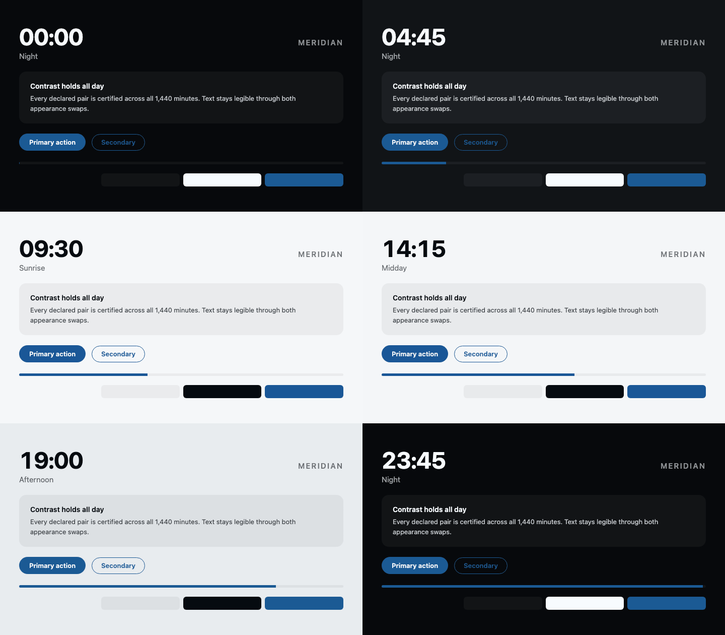
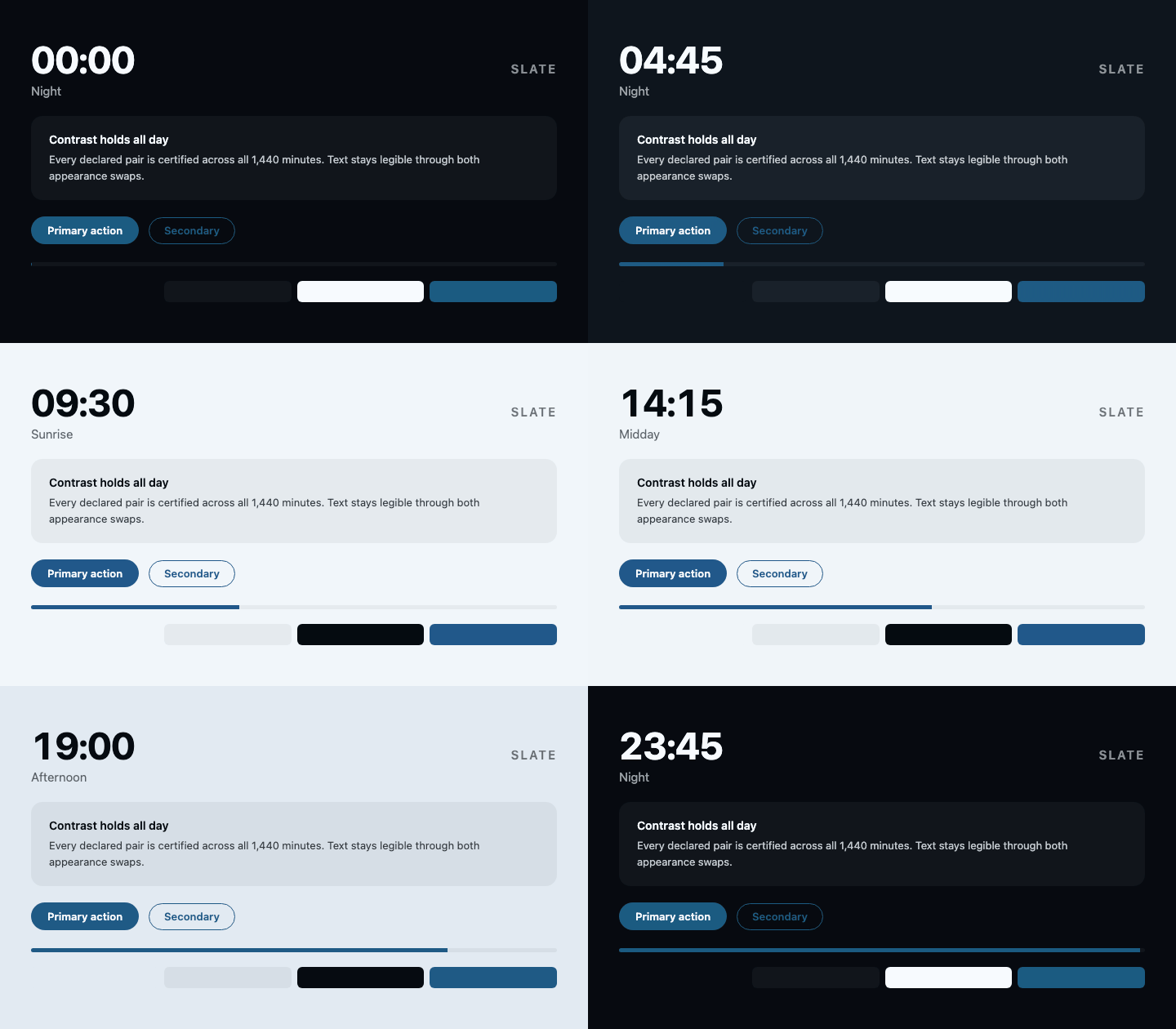
A full day of each, one frame per 15 minutes:
| | |
| ----------------------------------------------------------------------------------------------------------------------------------------------------------------------- | ----------------------------------------------------------------------------------------------------------------------------------------------------------------------------------- |
| dawn-to-dusk — warm arc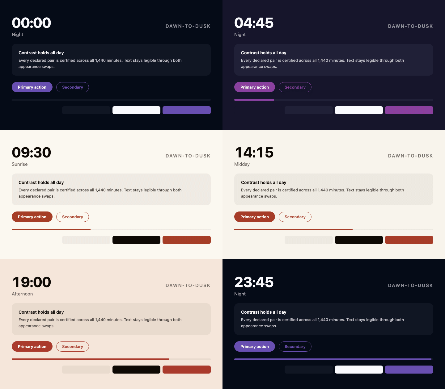 | tidal — cool arc
 |
| paper — near-achromatic
|
| paper — near-achromatic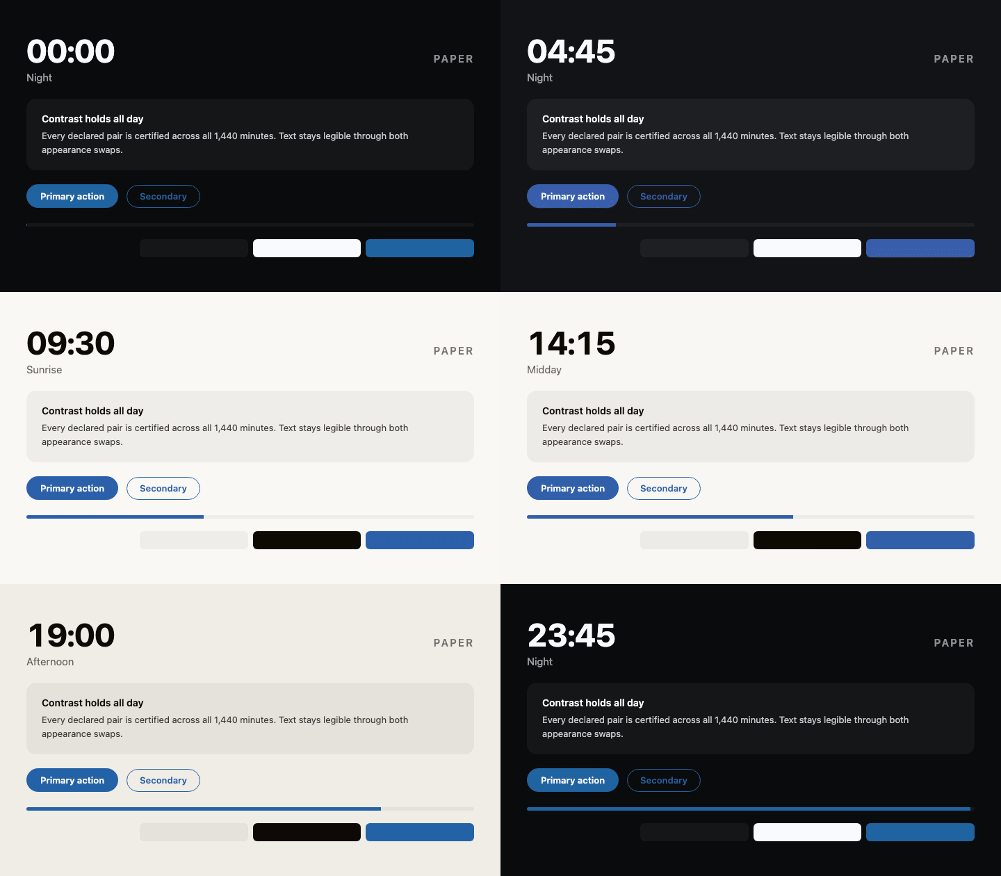 | contrast-first — AAA everywhere
 |
| nocturne — eye-comforting
|
| nocturne — eye-comforting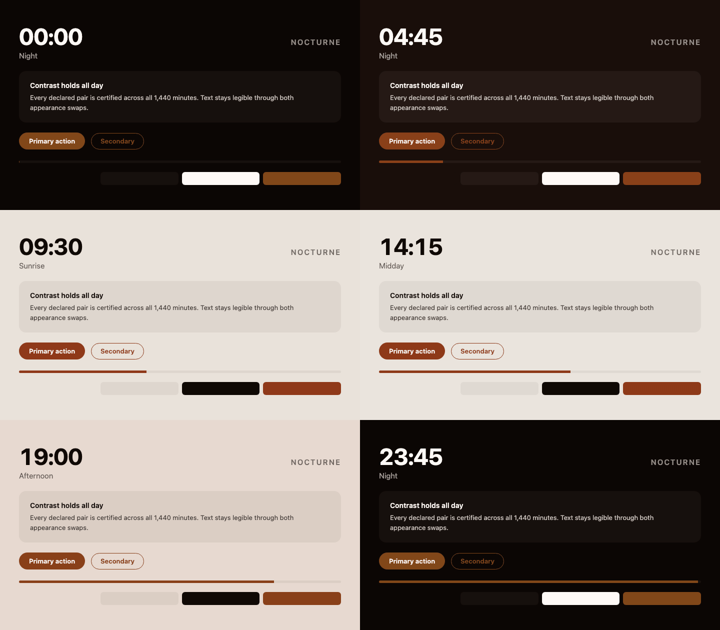 | ember — lamplight
 |
| forest — muted green
|
| forest — muted green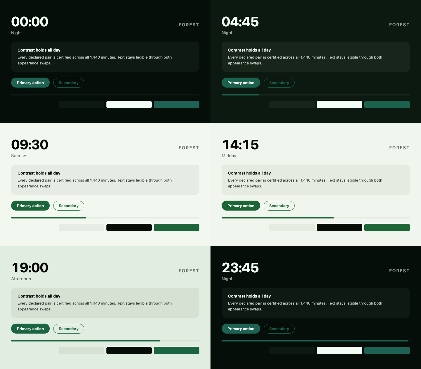 | meridian — neutral
 |
| blossom — rose and plum
|
| blossom — rose and plum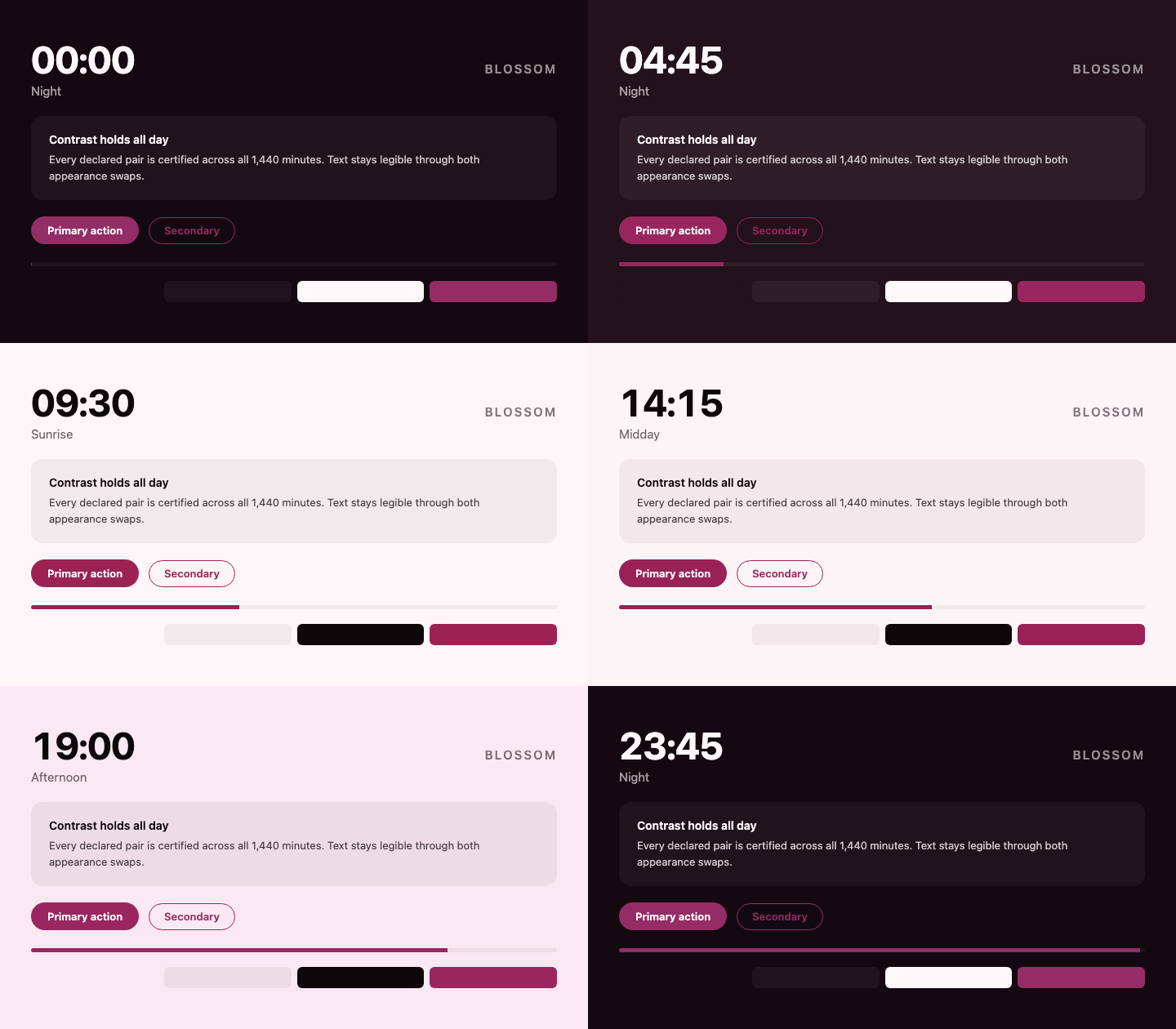 | slate — cool blue-grey
 |
|
Note how contrast-first barely changes lightness across the day — it carries
time of day in hue and chroma instead, because lightness is the budget contrast
spends.
Preset colours are public API. Through 0.3.0 the rule here was that changing a value is breaking and new arcs ship under new names; 0.4.0 broke that rule deliberately and re-tuned all four original presets, because they shipped with a step half the size of the background's entire daily range and leaving that in place to protect the rule would have been the wrong trade. Pin an exact version if you depend on specific values. The rule stands again from here.
Backgrounds and accent hues are authored by hand; every other value — text lightness, surface lightness, accent lightness, and where the theme switches — is solved and clamped into the sRGB gamut by scripts/generate-presets.mjs, which refuses to emit anything it cannot certify.
Solving and extending
Where a theme changes polarity is not a design decision — it is whatever the
contrast maths allows, and people are bad at it in a specific way. Placing the
switch by hand gave every shipped preset a dusk phase one minute long, and
made every switch 2.0–2.5× wider than it needed to be. solveSchedule takes a
plain curve with no appearance and works out both:
import { solveSchedule } from '@divypandya/time-aware-theme/solve';

const { system, switches } = solveSchedule({
  staticThemes: { light, dark },
  roles: { pairs: [{ bg: 'background', fg: 'foreground', min: 'AA' }] },
  curve: [
    { minute: 0, phase: 'night', tokens: night },
    { minute: 420, phase: 'sunrise', tokens: day },
    { minute: 1200, phase: 'dusk', tokens: evening }
  ]
});

switches[0].minute; // 331
switches[0].widestJump; // 0.412 — in OKLCH lightness
Backgrounds glide the whole way; foregrounds hold and change once, at the last minute the outgoing set is still legible. The output is ordinary stops, so the resolver is unchanged and hand-written schedules keep working.
extendPreset adds tokens to a schedule that has already been certified,
without dropping them outside that guarantee:
import { extendPreset } from '@divypandya/time-aware-theme/solve';
import dawnToDusk from '@divypandya/time-aware-theme/presets/dawn-to-dusk';

export const themed = extendPreset(dawnToDusk, {
  tokens: {
    // Brand identity is the hue and chroma; lightness is whatever stays visible.
    brand: { on: 'background', min: 'non-text', hue: 265, chroma: 0.14 },
    // Solved against `brand` at every stop, and declares its own role pair.
    brandForeground: { on: 'brand', min: 'AA' },
    // An arc you supply, riding the preset's own day curve.
    shadow: {
      light: 'oklch(0.2 0.02 265 / 0.12)',
      dark: 'oklch(0 0 none / 0.5)',
      decorative: true
    }
  }
});
Supplied arcs must appear in a role or be marked decorative: true. That is
the whole point: a preset that says "certified" should stay true of every token
in it, including the ones added after it shipped. Supplied colours are checked,
never adjusted — quietly repainting a brand colour to reach a ratio would be
worse than saying it does not reach one — so a failure names the arc and leaves
it alone:
extendPreset() could not certify the tokens it was given.
  "brandForeground" on "brand" reaches only 4.47:1 near minute 1225, needs 4.5:1.
  No text colour works: "brand" spans L 0.500..0.585 while the theme is light,
  which straddles the band where neither black nor white clears AA. White
  bottoms out at 4.28:1 at 20:30; black bottoms out at 3.39:1 at 12:00.
Both run at build time and pull in luminance maths that is deliberately kept out of the shipped bundle. Call them at module scope, not per request.
Two things worth knowing. Solved foregrounds pick their direction once per polarity region, never per stop — a token free to choose stop by stop would cross mid-interval and open an undeclared jump in a schedule certified without one. And they are free to run opposite to the page: a light accent needs dark text even while the page around it is dark, which is what the shipped presets themselves do.
Tailwind v4
Generate the @theme inline mapping and static fallbacks instead of
hand-writing them:
import { tailwindCss } from '@divypandya/time-aware-theme/tailwind';

console.log(tailwindCss(system)); // paste into your stylesheet
If you set cssVariablePrefix: 'color' on the controller, the variables are
already in Tailwind's namespace and no @theme inline block is needed at all.
Diagnostics
import {
  inspect,
  formatInspection,
  inspectSchedule
} from '@divypandya/time-aware-theme/inspect';

console.log(formatInspection(inspect(system, 16 * 60 + 33)));
16:33 afternoon -> dusk t=0.512 light
stops 15:00 (afternoon) -> 18:00 (dusk), 87 min to go
tokens
background oklch(0.573 0.015 118 / 1)
foreground oklch(0.573 0.028 96 / 1)
contrast
foreground on background 1.00:1 / 4.5:1 FAILinspectSchedule(system) summarises a whole day, collapsing failures into
windows so a broken schedule reads as one window with a worst case rather than
ninety near-identical lines. It also reports where the schedule stops gliding
and steps — on a passing schedule too, because a switch in the wrong place or a
step wider than the maths needs shows up here and nowhere else:
PASS  1440 minutes, no contrast or gamut problems
  holds (2)
    05:31-05:32  dawn -> dawn  appearance flips, step 0.659 L in "accentForeground"
    20:30-20:31  dusk -> dusk  appearance flips, step 0.672 L in "accentForeground"
The step quoted is the widest across all tokens rather than the background's. In every warm preset a foreground on an accent moves further than the page does, so quoting the background alone understates what is visible.
React UI
Unstyled, structured components — no CSS ships with this package. State is
exposed through data-* attributes, so Tailwind's data-[state=on]: variants
or plain CSS attribute selectors are enough to style them:
import { ThemeSelector } from '@divypandya/time-aware-theme/react-ui';

<ThemeSelector />;ThemeModeSelect, TimePreviewSlider and PhaseLabel are also exported
individually. The mode selector is a proper radio group with roving tabindex,
the slider announces a wall-clock time rather than a bare number, and the phase
label is an aria-live region because the phase changes on its own.
Examples
Runnable demo apps live under examples/, each with its own README covering setup:
- examples/vanilla-dom — zero-build, plain DOM +
createThemeController, the source of the recording above. Its schedule is hand-authored but its switch is solved, which is the combination most applications want. - examples/react — Vite + React app using
TimeAwareThemeProvider/useTimeAwareThemeand the shipped/react-uicontrols, with all ten presets switchable at runtime and live contrast for every declared pair read from/inspect. Consumes the package the same way a real installer would (file:../..dependency, not a relativesrcimport).
Entry points
@divypandya/time-aware-theme@divypandya/time-aware-theme/dom@divypandya/time-aware-theme/react@divypandya/time-aware-theme/react-ui@divypandya/time-aware-theme/testing@divypandya/time-aware-theme/inspect@divypandya/time-aware-theme/solve(build-time)@divypandya/time-aware-theme/tailwind@divypandya/time-aware-theme/presets/{dawn-to-dusk,tidal,contrast-first,paper,nocturne,ember,forest,meridian,blossom,slate}
Public surface
. — defineThemeSystem, holdThenSnap, resolveThemeAt,
resolveThemeSnapshot, serializeOklch, parseOklch, normalizeMinute,
MINUTES_PER_DAY (plus createThemeController and applySnapshotTo,
re-exported from /dom)
/dom — createThemeController, applySnapshotTo
/react — TimeAwareThemeProvider, useTimeAwareTheme
/react-ui — ThemeSelector, ThemeModeSelect, TimePreviewSlider
(uncontrolled, or controlled via minute / onMinuteChange), PhaseLabel,
formatMinute
/testing — createManualClock, sampleSchedule, assertContrast,
findContrastViolations, assertRenderedPath, findRenderedPathViolations,
PER_SECOND, contrastRatio, contrastThreshold, meetsContrast,
meetsWcagAA, relativeLuminance, isOutOfSrgbGamut, maxChromaInGamut,
clampChromaToGamut, GAMUT_CHROMA_SAFETY
/solve — solveSchedule, extendPreset
/inspect — inspect, inspectSchedule, formatInspection,
formatScheduleReport
/tailwind — tailwindCss, themeInlineCss, staticFallbackCss,
transitionCss
/presets/* — each preset is a default export plus a named export
(dawnToDusk, tidal, contrastFirst, paper, nocturne, ember,
forest, meridian, blossom, slate)
Runtime notes
- No runtime dependencies.
- React is an optional peer for the adapter entry point.
- The DOM controller is safe to construct without
windowordocument; it simply becomes inert. - The controller writes resolved theme tokens as CSS custom properties, toggles the
.darkclass, and updatescolor-scheme. - WCAG and sRGB conversion maths lives only in the
/testing,/inspectand/solveentries, so it never reaches core, dom, or the presets. - Every schedule this repo ships passes an 86,400-sample WCAG sweep in CI — one
per second of the day — plus a check of the frames a CSS transition would
paint between them (
npm run certify).
Non-goals
- No location access.
- No weather-based or network-driven theming.
- No user-defined schedules yet.
- No React-driven minute ticking.