
@dizzy_yakov/vue-gantt
v1.10.0
Published
Headless, composable Gantt chart components for Vue 3

Maintainers
 yakov_dragon
Readme
vue-gantt







A headless, composable Gantt chart for Vue 3. It ships only structural
layout — every colour, size and font is a CSS variable — so it drops into any
design system. One runtime dependency (date-fns), fully typed.
📖 Live docs & interactive demo → — every component and feature, explorable in Storybook.
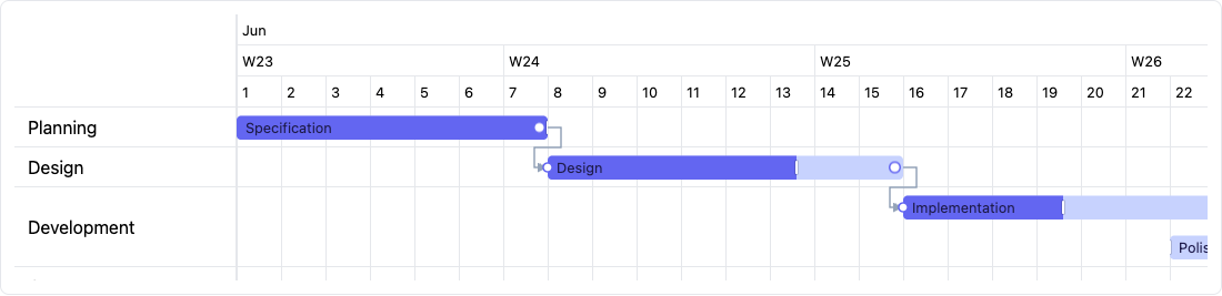
Features
- ⏱️ Multi-tier time axis (year · quarter · month · week · day · hour ·
minute) — show any subset via
tiers. - 📊 Task bars with progress, milestones, finish-to-start dependency arrows, baselines (planned vs actual), and a live "today" line.
- 🧩 Two APIs — a prop-driven
<Gantt :rows>or composable primitives. - 🗂️ Collapsible row groups with rolled-up summary bars, and a deep
row tree (WBS) via
parentIdwith per-parent rollup bars. - 🏷️ Row decoration — an add-on
row-suffixslot for badges, plus ameta→data-*passthrough for CSS-only row highlighting. - ✋ Drag interactions (all opt-in, controlled): move, resize an edge, set progress, create/edit dependencies, and drag out a new task on an empty row — with a live, formattable tooltip and edge auto-scroll to reach drop targets off-screen.
- 🧊 Frozen header + sidebar, sticky period labels, row/column
virtualization (kicks in whenever the scroll viewport is height-constrained —
by a
heightcap or a fixed-height parent). The scrolling body is its own stacking context, so bars/dependency arrows never paint over the frozen sidebar/header while scrolling. - ⌨️ Keyboard & a11y (opt-in via
keyboard) — focusable bars/milestones with ARIA labels, a visible focus ring, Enter/Space activation, roving arrow-key navigation between bars, Shift/Alt+arrow keyboard move/resize, and an accessible sidebar (tree/listroles, arrow-key row navigation, expand/collapse). - 🎨 Themeable through
--gantt-*CSS variables; ships typed.d.ts.
Install
bun add @dizzy_yakov/vue-ganttnpm install @dizzy_yakov/vue-ganttpnpm add @dizzy_yakov/vue-ganttyarn add @dizzy_yakov/vue-gantt
vue^3.5is a peer dependency.
Optionally import the default theme (CSS variables); skip it to style from scratch:
import '@dizzy_yakov/vue-gantt/styles'Quick start
Data is two-level: rows are the sidebar entries and each row contains a list of tasks plotted on its band (so a row can hold several bars).
<script setup lang="ts">
import {
  Gantt,
  applyMove,
  type GanttRowData,
  type GanttMoveEvent,
} from '@dizzy_yakov/vue-gantt'
import { ref } from 'vue'
import '@dizzy_yakov/vue-gantt/styles'

const rows = ref<GanttRowData[]>([
  {
    id: 'planning',
    name: 'Planning',
    tasks: [
      {
        id: 'spec',
        name: 'Spec',
        start: '2026-06-01',
        end: '2026-06-08',
        progress: 100,
      },
      {
        id: 'ship',
        name: 'Ship',
        type: 'milestone',
        start: '2026-06-16',
        dependencies: ['design'],
      },
    ],
  },
  {
    id: 'design',
    name: 'Design',
    tasks: [
      {
        id: 'design',
        name: 'Design',
        start: '2026-06-08',
        end: '2026-06-16',
        progress: 70,
        dependencies: ['spec'],
      },
    ],
  },
])

// Drag & drop is controlled — apply the event to your data with the helpers.
const onMove = (e: GanttMoveEvent) => (rows.value = applyMove(rows.value, e))
</script>

<template>
  <Gantt
    :rows="rows"
    :tiers="['month', 'week', 'day']"
    :height="480"
    draggable
    row-movable
    @move="onMove"
  />
</template>
Two ways to provide data
1. Prop-driven wrapper
Pass rows to <Gantt>; it renders the full standard layout and exposes named
slots for overriding any part. Every slot is scoped — its props give you the same
(virtualized) data the default renderer uses, so an override stays in sync.
Section slots replace a whole band of the layout:
| Slot | Scoped props | Replaces |
| -------------- | --------------------------------- | ----------------------------------- |
| corner | { config } | the sidebar/header corner cell |
| timeline | { config, visibleColumnsFor } | <GanttTimeline> (the axis header) |
| sidebar | { rows, groups } | <GanttTaskList> (the row labels) |
| grid | { columns, rows } | <GanttGrid> (the body grid) |
| non-working | { bands } | <GanttNonWorking> (calendar shading) |
| period-bands | { periods } | <GanttPeriods> (sprint bands) |
| bars | { tasks } | the task bar / milestone layer |
| group-bars | { groups } | <GanttGroupBar> (group rollups) |
| summary-bars | { rows } | <GanttSummaryBar> (row-tree WBS rollups) |
| conflicts | { conflicts } | <GanttConflicts> |
| baselines | { tasks } | <GanttBaselines> (planned bars) |
| slack | { slack } | <GanttSlack> (free-float bars) |
| deadlines | { tasks } | <GanttDeadlines> (deadline lines) |
| dependencies | { tasks } | <GanttDependencies> |
| marker-lines | { markers } | <GanttMarkers> (reference marker lines) |
| today | { today, dateToX } | <GanttToday> |
| body-extra | { contentWidth, contentHeight } | (extra layer over the body) |
visibleColumnsFor is (tier: GanttUnit) => GanttColumn[] (windowed), dateToX
is (date: Date \| string \| number) => number, rows/groups are the visible
ResolvedRow[] / ResolvedGroup[], columns are the visible base-unit
GanttColumn[], periods is the resolved ResolvedPeriod[] (empty unless the
periods prop is set), bands is the resolved ResolvedNonWorkingBand[] (empty
unless the nonWorking prop is set), tasks are ResolvedTask[] (all of them for
dependencies, the plotted/visible ones for bars, baselines and deadlines),
today is the configured reference Date, conflicts is GanttConflict[] (empty
unless overlap: 'conflict'), markers is the resolved ResolvedMarker[] (empty
unless the markers prop is set), and slack is a Map<string, number> of
free-float days by task id (empty unless slack is on).
Leaf slots customize a single repeated item: row
({ row, index, depth, collapsed, hasChildren, toggle }), row-suffix
(same scope minus toggle — an add-on rendered after the row name without
replacing row; see Row decoration), group
({ group, collapsed, toggle }), groupBar ({ group, collapsed, left, width }),
summaryBar ({ row, collapsed, left, width } — a WBS parent row, see
row tree), column
({ column, tier }), period ({ period }), marker ({ marker } — a
ResolvedMarker, see Reference markers), bar
({ task, progress, resources }), milestone
({ task, resources, labelMaxWidth }), tooltip ({ task }), rowEditor
({ row, value, commit, cancel }) and taskEditor
({ task, value, commit, cancel }). resources is the task's assigned
ResolvedResource[] (resolved from resourceIds, unknown ids dropped; empty
unless resources is set) — see Resources. labelMaxWidth is
the adaptive gap in px to the next item on the same row — bind it as an inline
style (:style="{ maxWidth: labelMaxWidth + 'px' }") on a .gantt-milestone__label
element rendered in the milestone slot to ellipsize a label instead of
letting it overlap a neighbouring milestone.
Per-variant item slots. Tag an item with a free-form variant and the
prop-driven render picks a slot by it: a bar looks for task-${variant}
({ task, progress, resources }), a marker for milestone-${variant}
({ task, resources }). When no such slot is provided it falls back to the
generic bar / milestone slot, then to the built-in default — so variants are
purely additive. Handy for rendering
categories (design vs. dev bars, release vs. checkpoint markers) differently:
<Gantt :rows="rows">
  <!-- rows include e.g. { id, start, end, variant: 'design' } and a { type: 'milestone', variant: 'release' } -->
  <template #task-design="{ task }">🎨 {{ task.name }}</template>
  <template #milestone-release="{ task }">🚀 {{ task.name }}</template>
  <template #bar="{ task }">{{ task.name }}</template> <!-- fallback for un-tagged / other bars -->
</Gantt>
The rowEditor / taskEditor slots replace the built-in inline <input> (see
Inline editing) with your own editor — a <select>, a masked
field, etc. They render only while that row/task is being edited (editable
must be on). value is the current name; call commit(newValue) to save (fires
row-edit / task-edit) or cancel() to discard.
The tooltip slot overrides the content of the opt-in hover tooltip shown on
bars and milestones; providing it also enables the tooltip (you don't need
the tooltip prop too). Its task is the resolved task under the pointer. When
the tooltip is enabled without the slot, the default content is the name plus
start – end (and progress%) for a bar, or the name plus the date for a
milestone. The tooltip is hidden while a drag is in progress. Both the hover
tooltip and the live drag label flip to sit below the bar/milestone instead of
above it when there isn't enough room above — e.g. a task on the first row,
where "above" would slide under the sticky timeline header.
<Gantt :rows="rows" :tiers="['month', 'week', 'day']" :height="480">
  <!-- the `today` slot gets the reference date + a positioning helper -->
  <template #today="{ today, dateToX }">
    <div class="my-today" :style="{ left: `${dateToX(today)}px` }" />
  </template>
</Gantt>
2. Declarative composition
<GanttRoot> provides the shared scale/config; drop the feature components into
its slots. <GanttRow> declares a row and the <GanttTask> / <GanttMilestone>
inside it register into that row.
<GanttRoot :tiers="['month', 'week', 'day']">
  <GanttTimeline />
  <GanttTaskList />
  <GanttGroup id="be" name="Backend">
    <GanttRow id="api" name="API">
      <GanttTask id="spec" name="Spec" start="2026-06-01" end="2026-06-08" :progress="100" />
      <GanttMilestone id="ship" name="Ship" start="2026-06-16" :dependencies="['spec']" />
    </GanttRow>
  </GanttGroup>
  <GanttGroupBar />
  <GanttDependencies />
  <GanttToday />
</GanttRoot>
Components
Every component is exported from the package entry. <Gantt> and <GanttRoot>
take the full configuration props and emit
every chart event; the rest are the building blocks.
| Component | Props | Emits |
| --------------------- | ------------------------------------------------ | ------------------------------------------------ |
| <Gantt> | GanttRootProps + height?: number \| string | all events · exposes scrollTo* |
| <GanttRoot> | GanttRootProps | all events · exposes scrollTo* |
| <GanttView> | height?: number \| string | — |
| <GanttTimeline> | — | column-click |
| <GanttTaskList> | — | row-click · row-dblclick · row-contextmenu |
| <GanttGroup> | id · name? · collapsed? · meta? | — (toggle bubbles as group-toggle on the root) |
| <GanttGroupBar> | — | — |
| <GanttRow> | id · name? · tasks? · groupId? · parentId? · collapsed? · meta? | — (toggle bubbles as row-toggle on the root) |
| <GanttSummaryBar> | — | — |
| <GanttTask> | GanttItemProps | click · dblclick · contextmenu |
| <GanttMilestone> | GanttItemProps | click · dblclick · contextmenu |
| <GanttGrid> | tier?: GanttUnit (slot create-hint { row }, see drag-to-create) | cell-click · cell-dblclick |
| <GanttNonWorking> | — (default slot { band }) | — |
| <GanttDependencies> | — | dependency-click |
| <GanttConflicts> | — | — |
| <GanttSlack> | — (default slot { taskId, slack }) | — |
| <GanttDeadlines> | — (default slot { taskId, deadline }) | — |
| <GanttBaselines> | — (default slot { task }) | — |
| <GanttPeriods> | — (default slot { period }) | — |
| <GanttMarkers> | — (default slot { marker }) | — |
| <GanttWorkload> | — (slots label { resource, workload } · default { workload, peak, bars }) | — |
| <GanttToday> | interval?: number (ms, default 1000) | — |
| <GanttZoom> | — (reads context; default slot for custom UI) | — (calls setZoom/zoomIn/zoomOut on root) |
The leaf components emit short names for declarative use (<GanttTask @click>).
The same interactions are re-emitted, namespaced, on <GanttRoot> / <Gantt>
(task-click, milestone-click, …) so prop-driven consumers can listen at
the root — see Events.
height (<Gantt> / <GanttView>) — a number is treated as pixels, a
string is used verbatim. When set, it caps the scroll viewport (max-height)
and enables vertical scrolling + row virtualization. When omitted, the chart
fills its parent's height (height: 100%): a height-constrained parent gives
scrolling + virtualization without an explicit height, while an auto-height
parent collapses to the content height and simply grows to fit (as before).
Configuration props (GanttRootProps)
| Prop | Type | Default | Description |
| ----------------------- | ------------------------------------------------- | --------------- | ------------------------------------------------------------------------------------------------------------------------------------------------------------------------------------------------------------------------------------------------------------- |
| rows | GanttRowData[] | — | Prop-driven data source (omit for declarative <GanttRow>). |
| groups | GanttGroupData[] | — | Group labels + initial collapsed, keyed by id. |
| unit | GanttUnit | 'day' | Base granularity when tiers is omitted. |
| tiers | GanttUnit[] | [unit] | Header rows, coarse → fine, e.g. ['month','week','day']. |
| columnWidth | number | 40 | Width of one base-unit cell, px. |
| zoomLevels | GanttZoomLevel[] | DEFAULT_ZOOM_LEVELS | Named view-mode presets the zoom prop / GanttZoom switch between; each bundles tiers + columnWidth (year → hour). |
| periods | GanttPeriod[] | — | Custom timeline periods (sprints): a background band over the body + a labelled header row. Build a cadence with sprintPeriods or pass your own list. See Timeline period bands. |
| resources | GanttResource[] | — | Flat lookup table of resources (people/equipment) tasks can be assigned to via resourceIds. See Resources. |
| markers | GanttMarker[] | — | Reference markers: labelled full-height vertical lines at arbitrary dates (quarter boundaries, release dates). Purely decorative — never extends the axis or adds a header row. See Reference markers. |
| nonWorking | boolean \| NonWorkingCalendar | — | Working calendar: shade non-working time (weekends/holidays/custom off periods) as a background band. true shades Sat/Sun. Purely decorative — never extends the axis or adds a header row. See Non-working calendar. |
| zoom | string | — | Active zoom level id; supports v-model:zoom. When set, the matching level's tiers/columnWidth override those props. Omit for the classic tiers/columnWidth/unit behavior. |
| rowHeight | number | 36 | Row height, px. |
| headerRowHeight | number | 28 | Height of one timeline tier row, px. |
| groupHeaderHeight | number | 36 | Group header band height, px. |
| sidebarWidth | number | 200 | Frozen task-list width, px. |
| overlap | 'lanes' \| 'overlap' \| 'cascade' \| 'conflict' | 'lanes' | How time-overlapping tasks in a row are shown. |
| summaryStyle | 'bracket' \| 'bar' | 'bracket' | How rolled-up rows (WBS tree parents, row groups) draw their summary. bracket: expanded → a thin span line with downward end caps (no progress fill); collapsed → a filled accent bar. bar (legacy): a filled progress bar in both states. |
| draggable | boolean | false | Drag bars along their row to change start/end. |
| rowMovable | boolean | false | Drag a task into another row (implies draggable). |
| resizable | boolean | false | Resize bars by dragging an edge (sides flip past each other). |
| progressDraggable | boolean | false | Edit progress by dragging a handle on the bar. |
| editable | boolean | false | Inline-edit the row name (sidebar) and task name (bar label) on double-click (or a long-press on touch). Enter/blur commits, Esc cancels; empty/unchanged is ignored. Surfaces row-edit/task-edit (and syncs v-model:rows). |
| tooltip | boolean | false | Show a hover tooltip on bars/milestones — a tap toggles it on touch (override its content via the tooltip slot). |
| touchTargets | boolean | false | Enlarge interactive hit areas (resize/progress/connector handles, milestones, dependency handles) for touch. Coarse pointers get the larger targets automatically via @media (pointer: coarse); this forces them on regardless (adds data-touch to the root). Sizes stay overridable via the --gantt-* tokens. |
| criticalPath | boolean | false | Highlight the tasks on the critical path (data-critical on their bars/markers; styled via --gantt-critical-*). |
| slack | boolean | false | Draw each task's free-float slack as a translucent bar after its end (the <GanttSlack> overlay; styled via --gantt-slack-*). |
| linkable | boolean | false | Create/edit dependencies by dragging between tasks. |
| keyboard | boolean | false | Make task bars and milestones keyboard-operable via a roving tab stop: role="button", a descriptive aria-label, a visible focus ring, Enter/Space activation (fires the same task-click/milestone-click as a mouse click), arrow-key navigation (Left/Right/Up/Down/Home/End) between bars, and Shift/Alt+Left/Right keyboard move/resize (gated by draggable/resizable). Also makes the sidebar an accessible tree/list with its own roving row navigation. The chart root also gets a labelled landmark. See Keyboard & accessibility. |
| ariaLabel | string | 'Gantt chart' | Accessible name for the chart landmark (used when keyboard is on). |
| cellCreatable | boolean | false | Create a task by dragging across an empty grid row (emits create). Below the drag threshold a plain click still falls through to cell-click. Lives in the default <GanttGrid> — a custom grid slot takes over creation yourself. |
| dependencyShape | (tail, head) => string | elbowPath | Connector path builder. Pass elbowPath/straightPath/bezierPath or your own. |
| arrowHead | () => ArrowHeadShape \| null | triangleArrow | Arrowhead builder. Pass triangleArrow/openArrow/noArrow or your own (null = no head). |
| snapToGrid | boolean | false | Snap dragged dates to the base unit (off = full precision). |
| autoSchedule | boolean | false | On a move/resize or a dependency create/update, push finish-to-start successors forward so none starts before a predecessor ends (MS-Project style), preserving each task's duration. Effective only with v-model:rows (or prop-driven rows). |
| dragLabelFormat | string | 'd MMM HH:mm' | date-fns format for the live drag tooltip. |
| dragLabel | (info: GanttDragLabelInfo) => string | — | Override the drag tooltip text (move/resize/progress). |
| startDate / endDate | Date \| string \| number | auto | Explicit axis bounds (auto-derived from tasks otherwise). |
| timelineMode | 'fixed' \| 'infinite' | 'fixed' | Edge behaviour. infinite auto-extends the range by one screen when you scroll to an edge (anchoring the scroll on the left). Both modes emit range-change at an edge — see Timeline range. |
| today | Date \| string \| number | now | The "today" reference. |
| labelFormat | GanttLabelFormat | per tier | Column label formatting. A date-fns string (base unit only — other tiers keep defaults), a per-tier map Partial<Record<GanttUnit, string>>, or a (date, tier) => string function (full control). E.g. { month: 'LLLL yyyy', week: "'W'w", day: 'd' }. |
| locale | Locale (date-fns) | English | date-fns locale for all date labels (headers, drag labels, tooltips). See Localization. |
| weekStartsOn | Day (date-fns, 0–6) | from locale, else 0 | First day of the week (0=Sunday … 6=Saturday). Overrides the locale's own week start. Affects week-tier column boundaries, the week w number label, and week snapping. See Localization. |
Item props (GanttItemProps, for <GanttTask> / <GanttMilestone>)
Declarative fields — the item registers into the enclosing <GanttRow>:
| Prop | Type | Description |
| -------------- | -------------------------- | ---------------------------------------------- |
| id | string | Stable id (used by dependencies). |
| name | string | Bar/marker label (falls back to id). |
| start | Date \| string \| number | Start date (YYYY-MM-DD is parsed local). |
| end | Date \| string \| number | End date (ignored for milestones). |
| progress | number | Completion 0–100. |
| dependencies | string[] | Ids of predecessors (finish-to-start). |
| variant | string | Free-form category → per-variant slot (above). |
| segments | GanttSegment[] | Work spans with paused gaps (a "split" task). |
| deadline | Date \| string \| number | Target date (drawn as a line; flags overdue). |
| constraint | GanttConstraint | Scheduling constraint ({ type, date }). |
| baselineStart| Date \| string \| number | Planned start (baseline). Needs baselineEnd. |
| baselineEnd | Date \| string \| number | Planned end (baseline). Needs baselineStart. |
| meta | Record<string, unknown> | Arbitrary data forwarded to slots. |
| rowId | string | Explicit row id (overrides the enclosing row). |
<GanttTask :task>/<GanttMilestone :task>also accept an already-resolved task — this is how<Gantt>renders bars internally.
Split tasks (segments)
A task can carry segments — an array of { start, end } work spans. When set,
the bar renders as those spans with paused gaps between them (a "split" task):
a thin connecting line bridges the gaps, and each span is drawn as its own segment
inside the single bar. The task's own start/end still define the overall
extent; the segments are drawn within it.
<GanttTask
  id="build"
  name="Build"
  start="2026-06-01"
  end="2026-06-20"
  :progress="55"
  :segments="[
    { start: '2026-06-01', end: '2026-06-06' },
    { start: '2026-06-10', end: '2026-06-14' },
    { start: '2026-06-17', end: '2026-06-20' },
  ]"
/>
Prop-driven, the same field lives on the task:
{ id: 'build', name: 'Build', start: '2026-06-01', end: '2026-06-20', progress: 55,
  segments: [
    { start: '2026-06-01', end: '2026-06-06' },
    { start: '2026-06-10', end: '2026-06-14' },
    { start: '2026-06-17', end: '2026-06-20' },
  ] }
Progress on a split bar is cumulative: the task's overall progress is spread
across the segments' combined working duration, so the fill "flows" through the
work spans — earlier segments fill first (MS-Project style). Drag/resize still move
the whole task (its start/end); the segments are purely visual. The raw
GanttSegment and coerced ResolvedSegment ({ start: Date; end: Date }) types
are both exported. Style the split bits with the --gantt-split-*
variables.
While a drag is in progress (move/resize via
draggable/rowMovable/resizable, or linking vialinkable), the viewport auto-scrolls on both axes when the pointer nears an edge of the scroll container — so you can drop a bar or land a dependency arrow on a target outside the current view. The preview (ghost / drop target / draft arrow) keeps following the content, and scrolling stops on release. This is automatic; there are no extra props.
Drag-to-create tasks
With cellCreatable, dragging across an empty grid row (left mouse button) draws
a translucent ghost preview with a live start → end label (formatted via
dragLabelFormat/locale, same as a move/resize drag) and emits create on
release — the chart stays controlled, so you add the task yourself (e.g. with the
addTask utility). Since an empty row has no bar to grab, <GanttGrid>
also renders a "Drag to create" hint across each empty leaf row's band as an
affordance; customize or replace it via the create-hint slot ({ row }):
<script setup>
import { ref } from 'vue'
import { Gantt, addTask } from '@dizzy_yakov/vue-gantt'

const rows = ref(initialRows)

function onCreate({ row, start, end }) {
  rows.value = addTask(rows.value, row.id, { id: crypto.randomUUID(), name: 'New task', start, end })
}
</script>

<template>
  <Gantt :rows="rows" cell-creatable @create="onCreate" />
</template>
Below the drag threshold (same 3px mouse / 8px touch slop as draggable) the
press is read as a plain click, so cell-click still fires as before. snapToGrid
snaps the drafted start/end like any other drag. Style the ghost via
--gantt-create-preview-bg (falls back to --gantt-bar-bg) plus the shared
--gantt-bar-height / --gantt-bar-radius / --gantt-ghost-opacity tokens; style
the hint via --gantt-create-hint-color / --gantt-create-hint-border /
--gantt-create-hint-opacity.
cell-click/cell-dblclickand drag-to-create both live in the default<GanttGrid>; overriding thegridslot on<GanttView>/<Gantt>replaces it entirely, so creation (and cell clicks) become your responsibility.
Deadlines & constraints
Give a task a deadline (a target date) or a scheduling constraint and the
chart reflects both automatically:
deadline—<GanttDeadlines>(rendered by default; override via thedeadlinesslot) draws a vertical line at the date across the task's band. When the task'sendpasses the deadline the bar is flagged overdue (data-overdue), tinted and outlined via the--gantt-overdue-*/--gantt-deadline-colortokens.constraint— a{ type, date }wheretypeis aGanttConstraintType:'start-no-earlier-than','start-no-later-than','finish-no-earlier-than','finish-no-later-than','must-start-on'or'must-finish-on'. Lower-bound types (*-no-earlier-than,must-*-on) are honored byautoSchedule, which pushes the task's start so the bound is met (duration preserved). Upper bounds can't be enforced by the forward-only scheduler, so a breach is surfaced instead: the bar getsdata-constraint-violation(dashed--gantt-constraint-*outline).
const rows = [
  {
    id: 'delivery',
    name: 'Delivery',
    tasks: [
      {
        id: 'build',
        name: 'Build',
        start: '2026-06-01',
        end: '2026-06-20',
        deadline: '2026-06-15', // end > deadline → overdue bar + line
        constraint: { type: 'start-no-earlier-than', date: '2026-06-03' },
      },
    ],
  },
]
The pure detectors isOverdue(task) (end > deadline) and
violatesConstraint(task) (upper/exact bound breached) are exported
so you can flag or filter tasks yourself; they take a ResolvedTask (or the
matching end/deadline / start/end/constraint subset).
Events
All drag events are controlled: the chart emits an intent, you apply it to your data (the utilities make this one-liners).
| Event | Payload | Fired when |
| ------------------------------ | -------------------------------------------- | ------------------------------------------------------ |
| move | GanttMoveEvent | a bar is dragged (start/end, possibly a new row). |
| resize | GanttResizeEvent | a bar edge is dragged. |
| progress | GanttProgressEvent | the progress handle is dragged. |
| task-edit | GanttTaskEditEvent | a bar label is inline-edited (editable). |
| row-edit | GanttRowEditEvent | a sidebar row name is inline-edited (editable). |
| update:rows | GanttRowData[] | a task/dependency change is applied (v-model:rows). |
| update:zoom | string | the active zoom level changes (v-model:zoom). |
| zoom-change | GanttZoomEvent | the active zoom level changes (carries the level). |
| range-change | GanttRangeChangeEvent | a scroll reaches a timeline edge (both timelineModes). |
| group-toggle | GanttGroupToggleEvent | a group is collapsed/expanded. |
| row-toggle | GanttRowToggleEvent | a tree row's (WBS) subtree is collapsed/expanded. |
| dependency-create | GanttDependencyChange | a link is dragged from one task to another. |
| dependency-update | GanttDependencyUpdate | an arrow endpoint is re-routed (carries previous). |
| dependency-remove | GanttDependencyChange | an arrow is clicked (when linkable). |
| task-* / milestone-* | GanttTaskEvent { task, event } | click / dblclick / contextmenu on a bar/marker. |
| row-* | GanttRowEvent { row, event } | click / dblclick / contextmenu on a sidebar row. |
| cell-click / cell-dblclick | GanttCellEvent { row, date, event } | an empty body cell is clicked. |
| create | GanttCreateEvent { row, start, end, event } | a new task is dragged out of an empty row (cellCreatable). |
| column-click | GanttColumnEvent { column, tier, event } | a timeline header cell is clicked. |
| dependency-click | GanttDependencyEvent { from, to, event } | an arrow is clicked. |
Payload shapes (all exported as types):
interface GanttMoveEvent {
  id: string
  start: Date
  end: Date
  fromRowId: string
  toRowId: string
  task: ResolvedTask
}
interface GanttResizeEvent {
  id: string
  start: Date
  end: Date
  task: ResolvedTask
}
interface GanttProgressEvent {
  id: string
  progress: number
  task: ResolvedTask
}
interface GanttTaskEditEvent {
  id: string
  patch: Partial<GanttTask> // changed fields to merge (e.g. `{ name }`)
  task: ResolvedTask
}
interface GanttRowEditEvent {
  id: string
  patch: Partial<GanttRow> // changed fields to merge (e.g. `{ name }`)
  row: ResolvedRow
}
interface GanttGroupToggleEvent {
  id: string
  collapsed: boolean
}
interface GanttRowToggleEvent {
  id: string
  collapsed: boolean
}
interface GanttDependencyChange {
  from: string
  to: string
}
interface GanttDependencyUpdate extends GanttDependencyChange {
  previous: GanttDependencyChange
}
interface GanttDragLabelInfo {
  mode: 'move' | 'resize' | 'progress'
  task: ResolvedTask
  start: Date
  end: Date
  progress: number
}
interface GanttZoomLevel {
  id: string // stable id; also the v-model:zoom value
  label?: string // control label (defaults to id)
  tiers: GanttUnit[] // timeline tiers, coarse → fine
  columnWidth: number // base-unit cell width, px
}
interface GanttZoomEvent {
  id: string
  level: GanttZoomLevel
}
interface GanttRangeChangeEvent {
  side: 'start' | 'end'
  start: Date
  end: Date
}
Two-way binding (v-model:rows)
v-model:rows is a convenience layer over the controlled events on <Gantt> and
<GanttRoot>. It pairs the existing rows prop with an update:rows emit: when
a drag change (move / resize / progress), an inline edit (row-edit /
task-edit via editable) or a dependency edit (dependency-create /
dependency-remove / dependency-update) happens, the component applies it to
your data with the same immutable utilities (applyMove /
updateTask / updateRow / addDependency / removeDependency) and emits
update:rows with the new array — so the chart stays in sync without a manual
handler.
<Gantt v-model:rows="rows" draggable resizable progress-draggable editable linkable />This works only in prop-driven mode (when rows is passed); in declarative
mode (<GanttRow> without rows) there is nothing to update, so update:rows
is not emitted. group-toggle is not part of the model — it is a view-state
change, not a task-data change.
The plain controlled events (@move, @resize, @progress, @row-edit,
@task-edit, @dependency-*) are still emitted alongside update:rows. Choose
one approach: use v-model:rows for automatic sync, or the manual events to
apply changes yourself (updateRow / updateTask for the inline edits) —
combining both double-applies each change.
Undo / redo (useGanttHistory)
useGanttHistory(rows) adds undo/redo over the same rows ref you bind to
v-model:rows. Every reassignment is recorded as a snapshot — each drag / resize /
progress / link edit goes through one update:rows, so one user action is one
history entry. It returns { undo, redo, canUndo, canRedo, clear }.
<script setup>
import { ref } from 'vue'
import { Gantt, useGanttHistory } from '@dizzy_yakov/vue-gantt'

const rows = ref(initialRows)
const { undo, redo, canUndo, canRedo } = useGanttHistory(rows)
</script>

<template>
  <button :disabled="!canUndo" @click="undo">Undo</button>
  <button :disabled="!canRedo" @click="redo">Redo</button>
  <Gantt v-model:rows="rows" draggable resizable progress-draggable linkable />
</template>undo()/redo()restore a snapshot back into the ref without recording it; a fresh edit after an undo drops the redo tail.canUndo/canRedoareComputedRef<boolean>— wire them to your buttons':disabled.clear()drops all history, keeping the current value as the only entry.useGanttHistory(rows, { limit })caps the stack size, dropping the oldest snapshots (default: unlimited).
Snapshots are cheap: the edit utilities are immutable, so entries
share structure — no deep clone. The composable is pure and context-free (no
GanttRoot, SSR-safe). Keyboard shortcuts are yours to wire — e.g. bind Ctrl+Z /
Ctrl+Shift+Z to undo / redo.
Auto-scheduling
The autoSchedule prop turns the chart into an MS-Project-style scheduler: when
you move or resize a task, or create / re-route a dependency, every finish-to-start
successor is pushed forward so none starts before its predecessor ends — each
task's duration is preserved. It cascades transitively (a → b → c), so dragging
a later also shifts b and c.
<Gantt v-model:rows="rows" auto-schedule draggable resizable linkable />It is built on top of the exported autoSchedule(rows, changedId?)
utility, applied to the emitted update:rows. So it is effective only in
prop-driven / v-model:rows mode; in the purely event-driven flow (@move +
your own applyMove, no v-model) and in declarative mode (<GanttRow> children)
the prop is a no-op — call autoSchedule yourself where you apply the change.
dependency-remove and progress edits do not trigger the cascade. The live
drag preview (ghost) does not show the cascade; successors snap into place on
release.
The editable prop turns on inline renaming: double-click a row name in the
sidebar or a bar's label in the body to open an inline <input>. Enter or
blur commits, Esc cancels; an empty or unchanged value is ignored. Like
every other interaction the edit is controlled — the chart emits an intent and
you apply it:
row-edit→GanttRowEditEvent { id, patch: Partial<GanttRow>, row }task-edit→GanttTaskEditEvent { id, patch: Partial<GanttTask>, task }
With v-model:rows the patch is applied for you (via updateRow / updateTask)
and re-emitted through update:rows; without it, listen and apply the patch
yourself.
<script setup>
import { ref } from 'vue'
import { Gantt, updateRow, updateTask } from '@dizzy_yakov/vue-gantt'

const rows = ref(initialRows)
</script>

<template>
  <!-- automatic sync -->
  <Gantt v-model:rows="rows" editable />

  <!-- or apply the patches yourself -->
  <Gantt
    :rows="rows"
    editable
    @row-edit="e => (rows = updateRow(rows, e.id, e.patch))"
    @task-edit="e => (rows = updateTask(rows, e.id, e.patch))"
  />
</template>
Replace the built-in input with your own editor via the rowEditor
({ row, value, commit, cancel }) / taskEditor ({ task, value, commit, cancel })
slots — render your control, then call commit(newValue) to save or cancel() to
discard:
<Gantt v-model:rows="rows" editable>
  <template #rowEditor="{ value, commit, cancel }">
    <input :value="value" @keydown.enter="commit($event.target.value)" @keydown.esc="cancel" />
  </template>
</Gantt>
Style the default input with the --gantt-edit-* variables
(class .gantt-edit-input).
Imperative methods
<Gantt> / <GanttRoot> expose scroll and zoom helpers via a template ref:
const chart = useTemplateRef('chart')
chart.value?.scrollToToday()
chart.value?.scrollToTask('spec', { align: 'center' })
chart.value?.scrollToDate('2026-06-10')

chart.value?.setZoom('week') // activate a level by id
chart.value?.zoomIn() // step to the next finer level
chart.value?.zoomOut() // step to the next coarser level
<GanttRoot> additionally exposes activeZoom (the active level id, or
undefined).
Utilities
Pure, tree-shakeable helpers over your rows/tasks — apply controlled events,
edit data, query dependencies, validate:
import {
  applyMove,
  updateTask,
  updateRow, // patch a task / row by id (immutable; use with row-edit / task-edit)
  addTask,
  removeTask, // edits (immutable)
  addDependency,
  removeDependency, // dependency edits
  flattenTasks,
  findTask,
  findRow,
  tasksExtent, // lookups
  sortRows,
  filterRows, // reorder / filter rows (immutable; pass the result back as `rows`)
  getDependents,
  detectCycles,
  topologicalOrder,
  criticalPath,
  slack, // longest finish-to-start chain · free-float days per task
  autoSchedule, // honors lower-bound constraints when shifting starts
  isOverdue,
  violatesConstraint, // deadline / constraint detectors
  rollupProgress,
  validateRows,
  sprintPeriods, // build a run of equal-length timeline periods (sprints; see SprintPeriodsOptions)
  nonWorkingBands, // compute non-working (weekend/holiday/off-period) bands over a range
  resourceWorkload, // sweep-line concurrent-load histogram per resource (see Resource workload; types: WorkloadSegment, ResourceWorkload, WorkloadOptions)
  toCSV,
  downloadCSV, // serialize tasks to CSV / trigger a browser download (see Export)
  toExcel,
  downloadExcel, // serialize tasks to a SpreadsheetML (.xls) workbook / trigger a download (see Export)
} from '@dizzy_yakov/vue-gantt'
criticalPath(rows) returns the ids on the longest finish-to-start chain (by total
duration), and slack(rows) returns a Map<string, number> of each task's
free float in days — how far its finish can slip before it hits the start of its
nearest successor (tasks with no successors, or no positive gap, are absent). These
back the matching criticalPath / slack props: the prop visualizes what the
utility computes, so you can also call the utility directly (e.g. to label or report
the schedule).
Export (CSV / Excel)
toCSV(rows, options?) serializes the tasks of your rows to an RFC-4180 CSV
string — one line per task, with its owning row's id/name as leading columns. It's
pure and framework-free (accepts raw GanttRow[] or the resolved rows from the
context). downloadCSV(rows, filename?, options?) wraps it and triggers a browser
download (filename defaults to 'gantt.csv').
import { toCSV, downloadCSV } from '@dizzy_yakov/vue-gantt'

downloadCSV(rows, 'schedule.csv')

// Custom columns / delimiter / date format:
const csv = toCSV(rows, {
  delimiter: ';',
  dateFormat: 'dd.MM.yyyy',
  columns: [
    { header: 'ID', value: (task) => task.id },
    { header: 'Owner', value: (task) => String(task.meta?.owner ?? '') },
    { header: 'Start', value: (task) => (task.start instanceof Date ? task.start.toISOString() : task.start) },
  ],
})
Default columns: Row Id, Row, Task Id, Task, Type, Start, End,
Progress, Dependencies, Deadline. Options: columns, delimiter (,),
dateFormat (yyyy-MM-dd), locale, header (true), eol (\r\n).
toExcel(rows, options?) serializes the same tasks to a SpreadsheetML 2003
workbook string — the .xls XML dialect Excel opens directly. It's pure,
framework-free and zero-dependency (no xlsx/exceljs), and cells are
typed: dates are real Excel dates (ss:Type="DateTime") and progress is a
ss:Type="Number" cell, so Excel sorts/filters them correctly instead of
treating everything as text. downloadExcel(rows, filename?, options?) wraps
it and triggers a browser download (filename defaults to 'gantt.xls', MIME
application/vnd.ms-excel).
import { toExcel, downloadExcel } from '@dizzy_yakov/vue-gantt'

downloadExcel(rows, 'schedule.xls')
<button @click="downloadExcel(rows, 'schedule.xls')">Export to Excel</button>// Custom columns / sheet name — a Number/DateTime `type` drives the cell's
// SpreadsheetML data type (defaults to 'String'):
const xls = toExcel(rows, {
sheetName: 'Schedule',
columns: [
{ header: 'ID', value: (task) => task.id },
{ header: 'Start', type: 'DateTime', value: (task) => task.start },
{ header: 'Progress %', type: 'Number', value: (task) => task.progress ?? 0 },
],
})Default columns: same as CSV — Row Id, Row, Task Id, Task, Type,
Start (DateTime), End (DateTime), Progress (Number),
Dependencies, Deadline (DateTime). Options: columns, sheetName
('Tasks'), header (true).
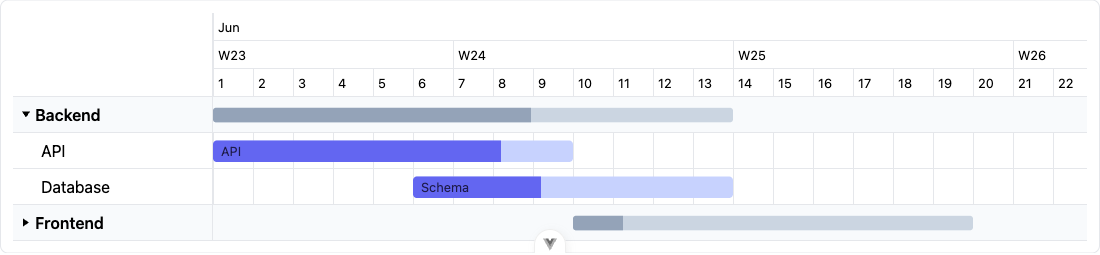
Row grouping
Rows that reference the same groupId render under a collapsible header band
with a rolled-up summary bar. Provide group labels via the groups prop (or the
declarative <GanttGroup>). The summaryStyle root prop controls how that
rollup renders — see Row tree (WBS) for details (it applies to
both groups and tree parents).
Row tree (WBS)
Set GanttRow.parentId to nest a row under another, building a collapsible tree
of arbitrary depth (a work-breakdown structure). Rows must be given in
pre-order — a parent immediately before its subtree, same as groupId
members must be contiguous — and a dataset mixes one or the other, never both
(parentId and groupId are mutually exclusive across the same rows). A
parent row keeps its own tasks (if any) and shows a rolled-up summary
bar spanning the earliest start to the latest end across its whole subtree,
with duration-weighted aggregate progress. The sidebar indents each row by
depth * --gantt-row-indent and gives rows with children a chevron toggle.
Collapse is uncontrolled: GanttRow.collapsed seeds the initial state,
clicking the chevron (or calling ctx.toggleRow(id)) flips it, and
row-toggle fires with the new state. Collapsing a parent recursively hides
its descendants (excluded from layout/render, no vertical space) while its
summary bar keeps covering the full (still collapsed) subtree extent.
<Gantt :rows="rows" />const rows: GanttRowData[] = [
{ id: 'project', name: 'Project' },
{
id: 'phase-design',
name: 'Design',
parentId: 'project',
tasks: [{ id: 'design', start: '2026-06-01', end: '2026-06-10', progress: 80 }],
},
{
id: 'phase-build',
name: 'Build',
parentId: 'project',
collapsed: true, // starts folded; its summary bar still shows the rolled-up span
tasks: [{ id: 'build', start: '2026-06-10', end: '2026-06-24', progress: 20 }],
},
]Declaratively, nest <GanttRow>s — the inner row inherits parentId from the
enclosing one (like <GanttTask> inherits its row):
<GanttRoot>
  <GanttTaskList />
  <GanttRow id="project" name="Project">
    <GanttRow id="phase-design" name="Design">
      <GanttTask id="design" start="2026-06-01" end="2026-06-10" :progress="80" />
    </GanttRow>
    <GanttRow id="phase-build" name="Build">
      <GanttTask id="build" start="2026-06-10" end="2026-06-24" :progress="20" />
    </GanttRow>
  </GanttRow>
  <GanttSummaryBar />
</GanttRoot>
The rollup bar is rendered by <GanttSummaryBar> (auto-mounted by
<GanttView> / <Gantt>; override it via the summary-bars section slot, or
just its rollup content via the summaryBar leaf slot,
{ row, collapsed, left, width }). Customize the sidebar row itself —
chevron, indent, name — via the row slot
({ row, index, depth, collapsed, hasChildren, toggle }). Style with the
--gantt-row-indent / --gantt-summary-bar-* / --gantt-summary-bracket-*
variables.
The summaryStyle root prop ('bracket' default, or 'bar' for the legacy
look) controls how both this summary bar and <GanttGroupBar>'s group rollup
render: bracket draws an expanded parent/group as a thin span line with
downward end caps toward its children (no progress fill — the children carry
the detail), and a collapsed one as a filled accent bar with progress,
same as bar always renders in both states.
Row decoration
Two lightweight, additive hooks let you mark up a sidebar row without overriding its whole render:
row-suffixslot — rendered after the row name ({ row, index, depth, collapsed, hasChildren }, same scope asrowminustoggle). Use it to append a badge/marker while keeping the default name rendering (and therowslot, if you also use one) untouched:<Gantt :rows="rows"> <template #row-suffix="{ row }"> <span v-if="row.meta.ppr" class="badge">PPR</span> </template> </Gantt>meta→data-*passthrough — primitive (string/number/boolean) entries of a row'smetaare forwarded asdata-<key>attributes on its.gantt-task-list__rowelement, so you can highlight/mark the row with plain CSS, no slot needed:const rows: GanttRowData[] = [{ id: 'task', name: 'Task', meta: { ppr: true } }].gantt-task-list__row[data-ppr] { background: var(--gantt-critical-color, #ef4444); }Only primitive values are forwarded (objects/arrays are skipped), and the reserved
data-id/data-group/data-depth/data-has-children/data-collapsedattributes are never overwritten bymeta.
Baselines (planned vs actual)
Give a task both baselineStart and baselineEnd to draw its baseline — the
planned interval — as a thin "shadow" bar at the bottom of the task's row band,
under the actual (start/end) bar. It makes slippage visible at a glance: a
task running late has its actual bar sitting to the right of / longer than its
baseline. Both fields are required for the shadow to draw; a baseline is always an
interval (never collapsed like a milestone's end).
<Gantt :rows="rows" />const rows = [
{
id: 'dev',
name: 'Development',
tasks: [
{
id: 'build',
name: 'Implementation',
start: '2026-06-18',
end: '2026-06-30', // actual — running late
baselineStart: '2026-06-16',
baselineEnd: '2026-06-26', // planned
progress: 40,
},
],
},
]Declaratively it's <GanttTask baseline-start="…" baseline-end="…" />. The layer
is rendered by <GanttBaselines> (auto-mounted by <GanttView> / <Gantt>;
override it via the baselines section slot). <GanttBaselines> exposes a
default slot { task } to render each baseline segment yourself. Style the shadow
bars with the --gantt-baseline-* variables.
Timeline period bands (sprints)
Custom periods group the time axis (unlike row groups, which
group rows). Each period renders a faint full-height band over the chart body
plus a labelled row in the timeline header — ideal for sprints, phases or
release windows. Pass a periods list (uneven spans + custom labels are fine); the
periods also extend the auto date range so a period before the first task stays
visible.
<script setup>
import { Gantt, sprintPeriods } from '@dizzy_yakov/vue-gantt'

// A regular cadence…
const periods = sprintPeriods({ from: '2026-06-01', every: 2, unit: 'week', count: 6 })
// …or your own: [{ id: 's1', start: '2026-06-01', end: '2026-06-15', label: 'Sprint 1' }, …]
</script>

<template>
  <Gantt :rows="rows" :periods="periods" :tiers="['month', 'week', 'day']" />
</template>
sprintPeriods({ from, every, unit: 'day' | 'week', count, label?, id? }) builds a
contiguous run of equal-length periods. The bands are rendered by <GanttPeriods>
(auto-mounted; override via the period-bands section slot for the body band, or
the period slot for the header label). Style with the --gantt-period-*
variables.
Resources
Assign a task to one or more resources (people/equipment) via its
resourceIds (an array of ids), and pass the flat lookup table to the
resources prop. The library resolves each task's assigned resources and
surfaces them into its bar/milestone slots as resources
(ResolvedResource[]) — rendering (a badge, an avatar, initials) is entirely up
to you; resources don't add their own swimlane.
<script setup>
import { Gantt } from '@dizzy_yakov/vue-gantt'

const resources = [
  { id: 'alice', name: 'Alice', color: '#6366f1' },
  { id: 'bob', name: 'Bob', color: '#f59e0b' },
]

const rows = [
  {
    id: 'dev',
    name: 'Development',
    tasks: [
      { id: 'build', name: 'Build', start: '2026-06-01', end: '2026-06-10', resourceIds: ['alice', 'bob'] },
    ],
  },
]
</script>

<template>
  <Gantt :rows="rows" :resources="resources">
    <template #bar="{ task, progress, resources }">
      {{ task.name }}
      <span v-for="r in resources" :key="r.id" class="resource-badge" :style="{ background: r.color }">
        {{ r.name }}
      </span>
    </template>
  </Gantt>
</template>
A GanttResource is { id, name?, color?, meta? } (name falls back to id);
the resolved ResolvedResource always has name/meta filled in. resourceIds
isn't (yet) an individual GanttItemProps field, so declarative composition
assigns it via the presentational <GanttTask :task> / <GanttMilestone :task>
mode rather than a dedicated prop. In the shared context, ctx.resources holds
every resolved resource and ctx.resourcesFor(task) resolves one task's
assignees (unknown ids dropped).
Resource workload
<GanttWorkload> is a standalone, headless load histogram you mount BELOW
the chart body — one row per resource showing how many of its assigned tasks run
concurrently over time. It reads the shared context, so it must be a descendant
of GanttRoot, but it is not part of GanttView's layout (no dedicated slot
there): place it as a sibling underneath, inside the same GanttRoot.
<script setup>
import { GanttRoot, GanttView, GanttWorkload } from '@dizzy_yakov/vue-gantt'

const resources = [
  { id: 'alice', name: 'Alice', color: '#6366f1' },
  { id: 'bob', name: 'Bob', color: '#f59e0b' },
]

const rows = [
  {
    id: 'dev',
    name: 'Development',
    tasks: [
      { id: 'spec', name: 'Spec', start: '2026-06-01', end: '2026-06-12', resourceIds: ['alice'] },
      { id: 'build', name: 'Build', start: '2026-06-08', end: '2026-06-20', resourceIds: ['alice', 'bob'] },
    ],
  },
]
</script>

<template>
  <GanttRoot :rows="rows" :resources="resources">
    <GanttView height="240" />
    <GanttWorkload />
  </GanttRoot>
</template>
Resources come from the resources prop + each task's resourceIds — same data
as Resources. Its label gutter is the same width as
--gantt-sidebar-width and its track mirrors the chart body's horizontal scroll
via viewport.scrollLeft (a transform: translateX), so bars stay aligned with
the timeline above as you scroll — the sync is one-directional (the strip
follows the chart, not the other way around); mount its container at the same
width as the chart above it.
Rendering is driven by the exported sweep-line helper resourceWorkload(tasks,
options?) (in src/layout.ts): for each resource it returns a { resourceId,
segments, peak } where segments are the piecewise { start, end, count }
intervals where 1+ of its tasks overlap (milestones ignored) and peak is the
highest concurrent count — used to scale