@djangocfg/ui-tools
v2.1.358
Published
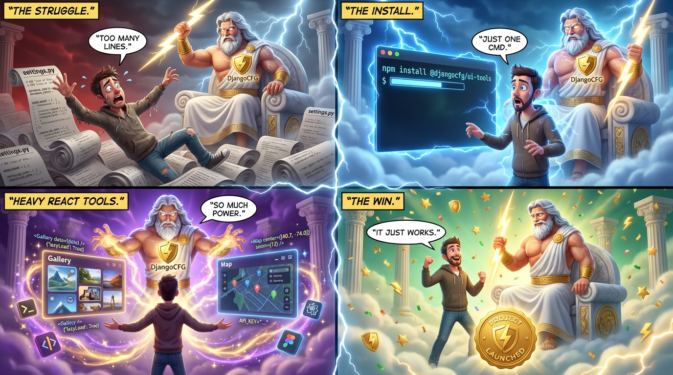
Heavy React tools with lazy loading - for Electron, Vite, CRA, Next.js apps
Maintainers
Readme

@djangocfg/ui-tools
Heavy React tools with lazy loading (React.lazy + Suspense).
No Next.js dependencies — works with Electron, Vite, CRA, and any React environment.
Part of DjangoCFG — modern Django framework for production-ready SaaS applications.
Install
pnpm add @djangocfg/ui-toolsWhy ui-tools?
This package contains heavy components that are loaded lazily to keep your initial bundle small. Each tool is loaded only when used.
| Package | Use Case |
|---------|----------|
| @djangocfg/ui-core | Lightweight UI components (60+ components) |
| @djangocfg/ui-tools | Heavy tools with lazy loading |
| @djangocfg/ui-nextjs | Next.js apps (extends ui-core) |
Tools (16)
| Tool | Bundle Size | Description |
|------|-------------|-------------|
| Map | ~800KB | MapLibre GL maps with markers, clusters, layers. See Map/README.md. |
| Mermaid | ~800KB | Diagram rendering with declarative builders |
| CodeEditor | ~550KB | Monaco-based code editor with diff view |
| PrettyCode | ~500KB | Code syntax highlighting (read-only) |
| OpenapiViewer | ~400KB | OpenAPI schema viewer & playground |
| JsonForm | ~300KB | JSON Schema form generator |
| MarkdownEditor | ~200KB | WYSIWYG markdown editor with Tiptap, @-mentions (auto-flip popup), customizable markdown serialization via presets |
| LottiePlayer | ~200KB | Lottie animation player |
| Chat | ~150KB | Decomposed, transport-agnostic chat — streaming (SSE), tool calls, attachments, sources, mobile-ready. Reuses MarkdownMessage. See Chat/README.md. |
| AudioPlayer | ~80KB | WebView-safe audio player (v6) — static peaks waveform + clip-path playhead |
| VideoPlayer | ~150KB | Professional video player with Vidstack |
| MarkdownMessage | ~120KB | Read-only chat-tuned markdown renderer — GFM + soft line breaks + smart typography + emoji shortcodes + sanitized HTML + syntax-highlighted code fences + mermaid + declarative linkRules for custom URL schemes. See MarkdownMessage/README.md for the plugin pipeline. |
| JsonTree | ~100KB | JSON visualization with modes (full/compact/inline) |
| Gallery | ~50KB | Image/video gallery with carousel, grid, lightbox |
| ImageViewer | ~50KB | Image viewer with zoom/pan/rotate/flip and gallery navigation |
| CronScheduler | ~15KB | Cron expression builder with intuitive UI |
Tree-Shakeable Imports
For better bundle optimization, use subpath imports:
// Only loads Gallery (~50KB instead of full package)
import { Gallery, GalleryLightbox } from '@djangocfg/ui-tools/gallery';
// Only loads Map (~800KB)
import { MapContainer, MapMarker } from '@djangocfg/ui-tools/map';
// Mermaid builders (no heavy Mermaid dependency until render)
import { FlowDiagram, SequenceDiagram, JourneyDiagram } from '@djangocfg/ui-tools/mermaid';Exports
| Path | Content |
|------|---------|
| @djangocfg/ui-tools | All tools with lazy loading |
| @djangocfg/ui-tools/code-editor | Monaco editor, diff editor, hooks |
| @djangocfg/ui-tools/gallery | Gallery components & hooks |
| @djangocfg/ui-tools/map | Map components & utilities |
| @djangocfg/ui-tools/mermaid | Mermaid component & declarative builders |
| @djangocfg/ui-tools/styles | Tailwind source CSS (for Tailwind apps) |
| @djangocfg/ui-tools/dist.css | Pre-compiled CSS (for plain Vite/webpack apps without Tailwind) |
Gallery
Full-featured image/video gallery with carousel, grid view, and fullscreen lightbox.
import { Gallery } from '@djangocfg/ui-tools/gallery';
const images = [
{ id: '1', src: '/photo1.jpg', alt: 'Photo 1' },
{ id: '2', src: '/photo2.jpg', alt: 'Photo 2' },
{ id: '3', src: '/video.mp4', alt: 'Video', type: 'video' },
];
function PhotoGallery() {
return (
<Gallery
images={images}
previewMode="carousel" // or "grid"
showThumbnails
enableLightbox
aspectRatio={16 / 9}
/>
);
}Gallery Components
| Component | Description |
|-----------|-------------|
| Gallery | Complete gallery with carousel/grid + lightbox |
| GalleryCompact | Minimal carousel for cards |
| GalleryGrid | Grid layout with "show more" badge |
| GalleryLightbox | Fullscreen lightbox viewer |
| GalleryCarousel | Embla-based carousel |
| GalleryThumbnails | Thumbnail strip navigation |
Gallery Hooks
| Hook | Description |
|------|-------------|
| useGallery | Gallery state management |
| useSwipe | Touch swipe gestures |
| usePinchZoom | Pinch-to-zoom for mobile |
| usePreloadImages | Image preloading |
Map
MapLibre GL maps with React components for markers, clusters, popups, and custom layers.
import { MapContainer, MapMarker, MapPopup } from '@djangocfg/ui-tools/map';
const markers = [
{ id: '1', lat: 37.7749, lng: -122.4194, title: 'San Francisco' },
{ id: '2', lat: 34.0522, lng: -118.2437, title: 'Los Angeles' },
];
function LocationMap() {
return (
<MapContainer
initialViewport={{ latitude: 36, longitude: -119, zoom: 5 }}
style="streets"
>
{markers.map((m) => (
<MapMarker key={m.id} latitude={m.lat} longitude={m.lng}>
<MapPopup>{m.title}</MapPopup>
</MapMarker>
))}
</MapContainer>
);
}Map Components
| Component | Description |
|-----------|-------------|
| MapContainer | Main map container with controls |
| MapMarker | Custom marker with React children |
| MapPopup | Popup attached to marker |
| MapCluster | Clustered markers with spiderfy |
| MapSource / MapLayer | Custom GeoJSON layers |
| MapControls | Navigation controls |
| MapLegend | Map legend component |
| LayerSwitcher | Toggle map layers |
| DrawControl | Drawing tools (optional) |
| GeocoderControl | Search/geocoding (optional) |
Overlapping Markers
When multiple markers are at the same location, use offsetOverlappingMarkers to spread them out before rendering:
import { MapCluster } from '@djangocfg/ui-tools/map';
import { offsetOverlappingMarkers } from '@djangocfg/ui-tools/map';
// Pre-process data to offset overlapping points
const processedData = useMemo(() => {
const markers = geojson.features.map((f, i) => ({
id: f.properties?.id || `point-${i}`,
longitude: f.geometry.coordinates[0],
latitude: f.geometry.coordinates[1],
data: f.properties,
}));
const offsetMarkers = offsetOverlappingMarkers(markers, {
spiralRadius: 0.0003, // ~30m spread
});
return {
type: 'FeatureCollection',
features: offsetMarkers.map((m) => ({
type: 'Feature',
properties: m.data,
geometry: { type: 'Point', coordinates: [m.longitude, m.latitude] },
})),
};
}, [geojson]);
<MapCluster sourceId="points" data={processedData} />| Utility | Description |
|---------|-------------|
| offsetOverlappingMarkers(markers, options) | Spread overlapping markers using Fermat spiral |
| hasOverlappingMarkers(markers) | Check if any markers overlap |
| getOverlapStats(markers) | Get statistics about overlapping markers |
Map Hooks
| Hook | Description |
|------|-------------|
| useMap | Access map instance |
| useMapControl | Programmatic map control |
| useMarkers | Marker management |
| useMapEvents | Map event handlers |
| useMapViewport | Viewport state |
| useMapLayers | Layer management |
Map Styles
import { MAP_STYLES, getMapStyle } from '@djangocfg/ui-tools/map';
// Available styles: streets, satellite, dark, light, terrain
<MapContainer style="dark" />Layer Utilities
import {
createClusterLayers,
createPointLayer,
createPolygonLayer,
createLineLayer,
} from '@djangocfg/ui-tools/map';Video Player
import { VideoPlayer } from '@djangocfg/ui-tools';
<VideoPlayer
src="https://example.com/video.mp4"
poster="/thumbnail.jpg"
autoplay={false}
/>Audio Player
WebView-safe v6 player. Single component, two layouts (default / compact),
container-query auto-switching, waveform doubles as the seek bar. Designed for
60 fps in WKWebView (Wails / Electron) and Tauri-style WebView2.
import { LazyAudioPlayer } from '@djangocfg/ui-tools';
<LazyAudioPlayer
src="/audio/track.mp3"
title="Track Title"
artist="Artist"
cover="/cover.jpg"
/>Highlights:
- Static peaks waveform by default (decoded once, cached per
src); zero canvas paints during playback — playhead animates viaclip-path+ a single CSS variable on the GPU thread. - Five waveform modes:
peaks(default),live(AnalyserNode),bars(CSS-only decoration),progress(plain scrubber, no animation),none. Decode failure quietly degradespeaks→progress. - Slot composition: drop
<PlayerProvider>+ import the parts you need (Cover,Title,Waveform,PlayButton, …) to build any custom layout. - Click on the waveform = seek + play (configurable via
seekStartsPlayback); drag to scrub. - One active player at a time by default —
exclusiveprop, coordinated same-tab + cross-tab viaBroadcastChannel. - Persistent volume / mute in
localStorage, synced across all uncontrolled players (and tabs). PassinitialVolume/mutedto opt out per-player. - Mobile-aware: auto-switches to
compacton phone viewports, volume popover toggles on tap, hover affordances disabled on touch, iOS Safari hides the volume slider (read-only there). - Keyboard: Space/K toggle, ←/→ seek 5s, ↑/↓ volume, M mute, L loop. Active only when focus is in the player.
- Selector hooks —
usePlayerState,usePlayerControls,usePlayerLevels,useActivePlayer,useLastActivePlayer,useIsActivePlayer,usePlayerPreferences— for custom toolbars / "now playing" UIs.
See AudioPlayer/README.md for the full API
and the docs at @dev/@refactoring6-audioplayer/ for architecture / ADRs.
Mermaid Diagrams
Render Mermaid diagrams with fullscreen zoom support and type-safe declarative builders.
Basic Usage
import { LazyMermaid } from '@djangocfg/ui-tools';
<LazyMermaid chart={`
graph TD
A[Start] --> B{Decision}
B -->|Yes| C[Action]
B -->|No| D[End]
`} />Props
| Prop | Type | Default | Description |
|------|------|---------|-------------|
| chart | string | - | Mermaid diagram syntax |
| className | string | '' | Additional CSS classes |
| isCompact | boolean | false | Compact rendering mode |
| fullscreen | boolean | true | Enable fullscreen button with pinch-zoom |
Declarative Builders
Type-safe builders for creating Mermaid diagrams programmatically:
import { LazyMermaid } from '@djangocfg/ui-tools';
import {
FlowDiagram,
SequenceDiagram,
JourneyDiagram,
useStylePresets,
useBoxColors,
} from '@djangocfg/ui-tools/mermaid';
function MyDiagram() {
const presets = useStylePresets();
const boxes = useBoxColors();
// Flow diagram with type-safe nodes
type Nodes = 'start' | 'check' | 'success' | 'finish';
const flow = FlowDiagram<Nodes>({ direction: 'TB' });
flow.node('start').rect('Start');
flow.node('check').rhombus('Is it working?');
flow.node('success').rect('Great!');
flow.node('finish').stadium('End');
flow.edge('start').to('check').solid();
flow.edge('check').to('success').solid('Yes');
flow.edge('check').to('finish').solid('No');
flow.edge('success').to('finish').solid();
// Apply theme-aware styles
flow.style.define('success', presets.success);
flow.style.apply('success', 'success', 'finish');
return <LazyMermaid chart={flow.toString()} />;
}Available Builders
| Builder | Description |
|---------|-------------|
| FlowDiagram<Nodes> | Flowcharts with nodes, edges, subgraphs |
| SequenceDiagram | Sequence diagrams with participants, messages |
| JourneyDiagram | User journey diagrams with sections, tasks |
Theme Hooks
| Hook | Description |
|------|-------------|
| useThemePalette() | Full palette from CSS variables |
| useStylePresets() | Pre-built style configs (success, warning, etc.) |
| useBoxColors() | Colors for sequence diagram boxes |
FlowDiagram API
const flow = FlowDiagram<'A' | 'B' | 'C'>({ direction: 'TB' });
// Nodes
flow.node('A').rect('Rectangle');
flow.node('B').round('Rounded');
flow.node('C').rhombus('Diamond');
flow.node('D').stadium('Stadium');
flow.node('E').cylinder('Database');
flow.node('F').hexagon('Hexagon');
// Edges
flow.edge('A').to('B').solid();
flow.edge('A').to('B').solid('with label');
flow.edge('A').to('B').dotted();
flow.edge('A').to('B').thick();
// Subgraphs
flow.subgraph('Group Name', (sub) => {
sub.direction('LR');
sub.node('X').rect('Inside');
});
// Styles
flow.style.define('myStyle', { fill: '#f00', stroke: '#000' });
flow.style.apply('myStyle', 'A', 'B');SequenceDiagram API
Static API (type-safe, for known participants):
const { d, rect, alt, loop, toString } = SequenceDiagram({
User: 'actor',
App: 'participant',
API: 'participant',
}, { autoNumber: true });
// Messages (type-safe chain)
d.User.sync.App.msg('Click button');
d.App.async.API.msg('Fetch data');
d.API.asyncReply.App.msg('Response');
// Blocks
rect('#rgba(0,100,200,0.2)', () => {
d.User.sync.App.msg('Login');
});
alt('Success', () => {
d.App.syncReply.User.msg('Welcome!');
}).else('Failure', () => {
d.App.syncReply.User.msg('Error');
});
loop('Every 5s', () => {
d.App.async.API.msg('Heartbeat');
});
return toString();Dynamic API (for runtime participant names):
// Participants from API/database
const characters = ['Alice', 'Bob', 'Charlie'];
const participants: Record<string, 'participant'> = {};
characters.forEach(c => { participants[c] = 'participant'; });
const seq = SequenceDiagram(participants, { autoNumber: true });
// Dynamic methods - no type assertions needed
seq.message('Alice', 'Bob', 'Hello!');
seq.message('Bob', 'Alice', 'Hi!', 'syncReply');
seq.message('Alice', 'Charlie', 'Ping', 'async');
// Notes
seq.noteOver('Alice', 'Thinking...');
seq.noteOverSpan('Alice', 'Bob', 'Discussion');
seq.noteLeft('Charlie', 'Waiting');
seq.noteRight('Charlie', 'Done');
// Blocks work the same
seq.rect('rgba(100,200,255,0.2)', () => {
seq.message('Alice', 'Bob', 'Secret message');
});
return seq.toString();| Dynamic Method | Description |
|----------------|-------------|
| message(from, to, text, arrow?) | Send message (arrow: sync, syncReply, async, asyncReply, solid, dotted, cross) |
| noteOver(participant, text) | Note over one participant |
| noteOverSpan(p1, p2, text) | Note spanning two participants |
| noteLeft(participant, text) | Note left of participant |
| noteRight(participant, text) | Note right of participant |
JourneyDiagram API
const journey = JourneyDiagram({ title: 'User Onboarding' });
journey.section('Discovery')
.task('Visit landing page', 5, 'User')
.task('Read features', 4, 'User');
journey.section('Sign Up')
.task('Click Sign Up', 5, 'User')
.task('Fill form', 2, 'User')
.task('Verify email', 4, ['User', 'System']);
return journey.toString();Code Editor
Monaco-based code editor with full IDE features: syntax highlighting, IntelliSense, diff view, multi-file support.
import { Editor, DiffEditor } from '@djangocfg/ui-tools';
// or tree-shakeable: import { Editor } from '@djangocfg/ui-tools/code-editor';
// Basic editor
<Editor
value="const x = 42;"
language="typescript"
onChange={(value) => console.log(value)}
options={{ fontSize: 14, minimap: false }}
/>
// Diff view
<DiffEditor
original="const x = 1;"
modified="const x = 42;"
language="typescript"
/>Context & Hooks
import {
EditorProvider,
useEditorContext,
useMonaco,
useEditor,
useLanguage,
} from '@djangocfg/ui-tools/code-editor';
// Multi-file editor with shared state
<EditorProvider onSave={async (path) => { /* save file */ }}>
<FileTree />
<Editor />
</EditorProvider>Code Highlighting
Read-only syntax highlighting (lighter than Monaco — use when editing not needed):
import { LazyPrettyCode } from '@djangocfg/ui-tools';
// Default "card" variant — border, background, hover copy toolbar.
<LazyPrettyCode
data={`const hello = "world";`}
language="typescript"
/>
// "plain" variant — chrome-less, no internal scroll. Use when
// embedding inside another scroll container so the parent surface
// owns chrome and scroll (e.g. a panel that already has its own
// ScrollArea and copy button).
<LazyPrettyCode
data={htmlResponseBody}
language="markup"
variant="plain"
/>JSON Form
import { JsonSchemaForm } from '@djangocfg/ui-tools';
const schema = {
type: 'object',
properties: {
name: { type: 'string', title: 'Name' },
email: { type: 'string', format: 'email', title: 'Email' },
},
};
<JsonSchemaForm
schema={schema}
onSubmit={(data) => console.log(data)}
/>Chat
Decomposed, transport-agnostic chat. Streaming-aware, markdown-native, mobile-ready. Sits on top of MarkdownMessage (no second markdown stack).
import { ChatRoot, createHttpTransport } from '@djangocfg/ui-tools';
const transport = createHttpTransport({
baseUrl: '/api/chat',
getAuthHeader: () => ({ Authorization: `Bearer ${getToken()}` }),
});
export function MyChat() {
return (
<div className="h-[600px]">
<ChatRoot transport={transport} config={{ greeting: 'How can I help?' }} />
</div>
);
}Three usage levels — pick the smallest one that fits:
// 1) One-line preset
<ChatRoot transport={transport} />
// 2) Composition — bring your own layout, reuse the parts
<ChatProvider transport={transport}>
<MyHeader />
<MessageList renderEmpty={() => <EmptyState greeting="Custom" />} />
<Composer composer={composer} />
</ChatProvider>
// 3) Headless — just hooks
const chat = useChat({ transport });
const composer = useChatComposer({ onSubmit: chat.sendMessage });Built-in transports:
createHttpTransport— fetch + SSE streaming (default for web)createMockTransport— scripted in-memory replies for tests/stories
Custom hosts (Wails RPC, WebSocket, gRPC) implement the ChatTransport interface.
What's exported: types (ChatMessage, ChatToolCall, ChatAttachment, ChatSource, ChatTransport, ChatStreamEvent, …), pure core (reducer, createId, createTokenBuffer), hooks (useChat, useChatComposer, useChatScroll, useChatHistory, useChatLayout), context (ChatProvider, useChatContext), and components (ChatRoot, MessageList, MessageBubble, MessageActions, Composer, Sources, ToolCalls, Attachments, EmptyState, ErrorBanner, JumpToLatest, StreamingIndicator).
Highlights:
- Token coalescing (~16ms) → ≤1 render per frame during fast streams.
- Plain-text rendering during stream, full markdown on done.
- Memoized bubbles by
(id, content, isStreaming, version, toolCalls, sources, attachments). 100dvh, safe-area inset, 16px textarea (no iOS focus-zoom).role="log"+aria-live="polite",aria-busyon streaming bubbles,role="alert"errors.- Cancel keeps partial text with
[cancelled]marker. - Tool calls — auto-open while running, auto-close on completion. Pluggable payload renderers via
dispatchToolPayload(matchers, fallback). - Personas —
config.user+config.assistantfor avatar/name,message.senderfor per-message overrides (multi-user chats). - Attachments —
AttachmentsGrid(thumbs) +AttachmentsList(rich renderers); per-type registry{ image, audio, video, file }plusonAttachmentOpenfor host-side lightbox. - Audio triggers — optional sounds on send / receive / stream start / error / mention. iOS unlock + cross-tab persisted volume / mute. Off by default.
- Slots —
header,footer,banner,empty,composerToolbarStart/End,composerAttachmentTray,jumpToLatest(plus render-prop variants). - Helpers —
useChatLightbox,collectImageAttachmentsfor swapping in<LazyImageViewer>host-side.
Heavy renderers stay opt-in subpath imports — ui-tools/Chat doesn't pull AudioPlayer/ImageViewer/Map/JsonTree into its dep graph.
Full docs in src/tools/Chat/README.md. Implementation plan in @dev/@refactoring7-chat/.
Markdown Message
Read-only markdown renderer tuned for chat / agent transcripts. Built
on react-markdown + remark-gfm + rehype-sanitize, with a few
chat-specific affordances on top:
- Syntax-highlighted code blocks with a hover-revealed Copy button
(delegates to
PrettyCodefrom this package). - Mermaid diagram rendering for
```mermaidfences. - Plain-text fast path: when content has no markdown syntax we skip
ReactMarkdown entirely and just render the string with
whitespace: pre-line. Cheaper, identical visual. - Optional collapsible "Read more..." for long messages.
- User vs assistant styling modes (
isUserprop). linkRulesAPI — declarative handling of custom URL schemes (e.g.cmdop://machine/<uuid>→ render as a chip;obsidian://→ open in a viewer). One prop replaces the per-consumer custom-a/sanitize/urlTransform boilerplate.
import { MarkdownMessage } from '@djangocfg/ui-tools';
<MarkdownMessage
content="# Hello\n\nThis is **bold** text and `inline code`."
isCompact={false}
/>
// Chat user message — primary-tinted bubble styling
<MarkdownMessage content={msg} isUser />
// Long content with "Read more..."
<MarkdownMessage
content={longText}
collapsible
maxLength={300}
maxLines={5}
/>Custom URL schemes — linkRules
For any chat that emits its own URL schemes — cmdop://machine/<uuid>
mention chips, obsidian://open?path=… deep-links, custom file
viewers — the recommended approach is linkRules:
import { MarkdownMessage, type LinkRule } from '@djangocfg/ui-tools';
const machineMention: LinkRule = {
name: 'machine-mention',
protocols: ['cmdop'],
// Optional: rewrite the source markdown before render. Useful when
// your composer adds a decorative `@` outside the link
// (`@[label](href)`) — the chip itself reads as the mention
// indicator, so rendering "@<chip>" looks like "@@label".
preprocess: (source) =>
source.replace(
/(^|[^A-Za-z0-9_])@(\[[^\]]+\]\(cmdop:\/\/machine\/[^)\s]+\))/g,
'$1$2',
),
// Predicate against the resolved href.
match: (href) => href.startsWith('cmdop://machine/'),
// Render whatever you want. `children` is the link's React label.
render: ({ href, children, isUser }) => {
const id = href.slice('cmdop://machine/'.length);
return <MentionChip id={id} isUser={isUser}>{children}</MentionChip>;
},
};
<MarkdownMessage
content="Talk to @[Vps-audi](cmdop://machine/abc-123) about deployment."
linkRules={[machineMention]}
/>Why linkRules and not just customComponents.a
Three concerns have to be aligned for a custom URL scheme to make it
intact to your renderer, and customComponents alone covers only one
of them:
| Concern | What goes wrong without help |
|---|---|
| Sanitize whitelist | rehype-sanitize strips href values for any protocol it doesn't recognise — your renderer receives href={undefined}. |
| urlTransform | react-markdown's default urlTransform runs before sanitize and blanks unrecognised schemes the same way — sanitize whitelist is moot if this layer already nuked the href. |
| Source preprocess | Your composer might emit a shape like @[label](cmdop://...); the leading @ lives outside the link and needs to be stripped before render or the chip ends up next to a literal @. |
linkRules collapses all three into a single declaration:
protocolsis unioned into the sanitize schema.- The same protocol opts in the
urlTransform. preprocessruns ahead of render.match+renderreplace the per-rule<a>.
You can still pass customComponents and extraHrefProtocols
alongside; rules win on URLs they match, everything else falls
through to your customComponents.a (or the built-in chat anchor).
Anatomy
The component lives at src/components/markdown/MarkdownMessage/:
MarkdownMessage/
├── MarkdownMessage.tsx # composition only
├── types.ts # MarkdownMessageProps + LinkRule
├── sanitize.ts # buildSchema + buildUrlTransform
├── components.tsx # createMarkdownComponents (h/p/ul/a/pre/...)
├── CodeBlock.tsx # code block with copy button + fallback
├── CollapseToggle.tsx # "Read more..." button
├── linkRules.ts # rule application helpers
├── plainText.ts # hasMarkdownSyntax + extractTextFromChildren
└── index.ts # public re-exportsDecomposed in 2.1.299 to keep concerns flat and reviewable. Public
contract (MarkdownMessage, MarkdownMessageProps, LinkRule,
extractTextFromChildren) re-exported from
@djangocfg/ui-tools directly.
Components
| Component | Description |
|-----------|-------------|
| MarkdownMessage | Read-only markdown renderer with custom-URL-scheme support via linkRules (see above) |
| Markdown | Generic markdown renderer with GFM support |
Stores
| Store | Description |
|-------|-------------|
| useMediaCacheStore | Media caching for video/audio players |
Cron Scheduler
Compact cron expression builder with intuitive UI. Supports Daily, Weekly, Monthly schedules and custom cron expressions.
import { CronScheduler } from '@djangocfg/ui-tools';
<CronScheduler
value="0 9 * * 1-5"
onChange={(cron) => console.log(cron)}
showPreview
allowCopy
/>Props
| Prop | Type | Default | Description |
|------|------|---------|-------------|
| value | string | - | Cron expression (Unix 5-field format) |
| onChange | (cron: string) => void | - | Callback when schedule changes |
| defaultType | 'daily' \| 'weekly' \| 'monthly' \| 'custom' | 'daily' | Initial schedule type |
| showPreview | boolean | true | Show human-readable preview |
| showCronExpression | boolean | true | Show cron expression in preview |
| allowCopy | boolean | false | Enable copy to clipboard |
| timeFormat | '12h' \| '24h' | '24h' | Time display format |
| disabled | boolean | false | Disable all interactions |
Context Hooks
For custom compositions, use the context hooks:
import {
CronSchedulerProvider,
useCronType,
useCronTime,
useCronWeekDays,
useCronMonthDays,
useCronPreview,
} from '@djangocfg/ui-tools';Utilities
import {
buildCron, // State → Cron expression
parseCron, // Cron → State
humanizeCron, // Cron → Human description
isValidCron, // Validate cron syntax
} from '@djangocfg/ui-tools';Image Viewer
Image viewer with zoom, pan, rotate, flip and gallery navigation.
import { ImageViewer } from '@djangocfg/ui-tools';
// Single image
<div className="w-full h-[500px]">
<ImageViewer
images={[{ file: { name: 'photo.jpg', path: '/images/photo.jpg' }, src: '/images/photo.jpg' }]}
/>
</div>
// Gallery — pass multiple images, keyboard ←/→ navigation enabled automatically
<div className="w-full h-[500px]">
<ImageViewer
images={[
{ file: { name: 'Photo 1', path: 'p1' }, src: 'https://example.com/1.jpg' },
{ file: { name: 'Photo 2', path: 'p2' }, src: 'https://example.com/2.jpg' },
{ file: { name: 'Photo 3', path: 'p3' }, src: 'https://example.com/3.jpg' },
]}
initialIndex={0}
/>
</div>Props
| Prop | Type | Default | Description |
|------|------|---------|-------------|
| images | ImageItem[] | required | Array of images to display |
| initialIndex | number | 0 | Index of the image to show first |
| inDialog | boolean | false | Hide expand button (for nested usage) |
Keyboard Shortcuts
| Key | Action |
|-----|--------|
| + / = | Zoom in |
| - | Zoom out |
| 0 | Reset to fit |
| R | Rotate 90° |
| ← | Previous image (gallery) |
| → | Next image (gallery) |
JSON Tree
JSON visualization with three display modes:
import { LazyJsonTree } from '@djangocfg/ui-tools';
// Full mode (default) - with toolbar (Expand All, Copy, Download)
<LazyJsonTree data={obj} mode="full" />
// Compact mode - no toolbar, subtle border
<LazyJsonTree data={obj} mode="compact" />
// Inline mode - minimal, no border, for embedding
<LazyJsonTree data={obj} mode="inline" />| Mode | Toolbar | Border | Use Case |
|------|---------|--------|----------|
| full | Yes | Yes | Standalone viewer |
| compact | No | Subtle | Cards, panels |
| inline | No | No | Embedded in lists, logs |
Lazy Loading
All heavy tools have unified lazy-loaded versions with built-in Suspense fallbacks:
import {
LazyMapContainer, // ~800KB
LazyMermaid, // ~800KB
LazyPrettyCode, // ~500KB
LazyOpenapiViewer, // ~400KB
LazyJsonSchemaForm, // ~300KB
LazyLottiePlayer, // ~200KB
LazyAudioPlayer, // ~80KB — WebView-safe v6 player
LazyVideoPlayer, // ~150KB
LazyJsonTree, // ~100KB
LazyImageViewer, // ~50KB
LazyCronScheduler, // ~15KB
} from '@djangocfg/ui-tools';
// Just use them - no Suspense wrapper needed!
<LazyMermaid chart={diagram} />
<LazyMapContainer initialViewport={viewport} />
<LazyVideoPlayer src="/video.mp4" />Custom Lazy Components
Create your own lazy components with createLazyComponent:
import { createLazyComponent, CardLoadingFallback } from '@djangocfg/ui-tools';
const LazyMyComponent = createLazyComponent(
() => import('./MyHeavyComponent'),
{
displayName: 'LazyMyComponent',
fallback: <CardLoadingFallback title="Loading..." minHeight={200} />,
}
);Loading Fallbacks
Built-in fallback components for different use cases:
| Component | Use Case |
|-----------|----------|
| LoadingFallback | Generic spinner with optional text |
| CardLoadingFallback | Card-styled loading with title |
| MapLoadingFallback | Map-specific with location icon |
| Spinner | Simple spinning loader |
| LazyWrapper | Suspense wrapper with configurable fallback |
Requirements
- React >= 18 or >= 19
- Tailwind CSS >= 4
- Zustand >= 5
- @djangocfg/ui-core (peer dependency)
Optional Dependencies (for Map)
# For drawing tools
pnpm add @mapbox/mapbox-gl-draw
# For geocoding/search
pnpm add @maplibre/maplibre-gl-geocoderLicense
MIT
