
@easyv/tabs
v11.12.0
Published
基于rc-tabs定制化修改抖动问题


Readme
rc-tabs
React Tabs component.


Screenshot
Example
http://localhost:8000/examples
online example: https://tabs.react-component.now.sh/
install
Feature
Keyboard
- left and up: tabs to previous tab
- right and down: tabs to next tab
Usage
import Tabs, { TabPane } from 'rc-tabs';

var callback = function(key) {};

React.render(
  <Tabs defaultActiveKey="2" onChange={callback}>
    <TabPane tab="tab 1" key="1">
      first
    </TabPane>
    <TabPane tab="tab 2" key="2">
      second
    </TabPane>
    <TabPane tab="tab 3" key="3">
      third
    </TabPane>
  </Tabs>,
  document.getElementById('t2'),
);
API
Tabs
| name | type | default | description |
| --- | --- | --- | --- |
| activeKey | string | - | current active tabPanel's key |
| animated | boolean | { inkBar: boolean, tabPane: boolean } | { inkBar: true, tabPane: false } | config animation |
| defaultActiveKey | string | - | initial active tabPanel's key if activeKey is absent |
| destroyInactiveTabPane | boolean | false | whether destroy inactive TabPane when change tab |
| direction | 'ltr' | 'rlt' | 'ltr' | Layout direction of tabs component |
| editable | { onEdit(type: 'add' | 'remove', info: { key, event }), showAdd: boolean, removeIcon: ReactNode, addIcon: ReactNode } | - | config tab editable |
| locale | { dropdownAriaLabel: string, removeAriaLabel: string, addAriaLabel: string } | - | Accessibility locale help text |
| moreIcon | ReactNode | - | collapse icon |
| tabBarGutter | number | 0 | config tab bar gutter |
| tabBarPosition | 'left' | 'right' | 'top' | 'bottom' | 'top' | tab nav 's position |
| tabBarStyle | style | - | tab nav style |
| tabBarExtraContent | ReactNode | { left: ReactNode, right: ReactNode } | - | config extra content |
| renderTabBar | (props, TabBarComponent) => ReactElement | - | How to render tab bar |
| prefixCls | string | 'rc-tabs' | prefix class name, use to custom style |
| onChange | (key) => void | - | called when tabPanel is changed |
| onTabClick | (key) => void | - | called when tab click |
| onTabScroll | ({ direction }) => void | - | called when tab scroll |
TabPane
| name | type | default | description | | --- | --- | --- | --- | | key | string | - | corresponding to activeKey, should be unique | | forceRender | boolean | false | forced render of content in tabs, not lazy render after clicking on tabs | | tab | ReactNode | - | current tab's title corresponding to current tabPane | | closeIcon | ReactNode | - | Config close icon |
Development
npm install
npm start
Test Case
npm test
npm run chrome-test
Coverage
npm run coverageopen coverage/ dir
License
rc-tabs is released under the MIT license.
FAQ
Resposive Tabs
There are 3 cases when handling resposive tabs:
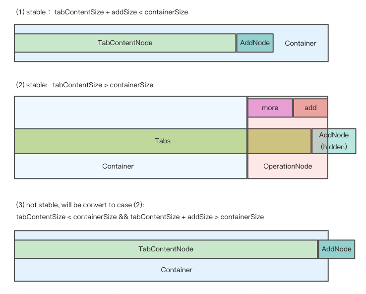
We get hidden tabs through useVisibleRange.ts.
If enconter the third case, in order to make tabs responsive, some tabs should be hidden.
So we minus addSize when calculating basicSize manully, even though there's no addNode in container.
In this way, case 3 turns to case 2, tabs become stable again.