
@elementa/core
v0.0.1-alpha.3
Published
Elementa is a Vue.js component style guide, built with Vue for Vue projects

Readme
Elementa Style Guide
Elementa is a Vue.js component style guide, built with Vue for Vue projects.
Warning: this project is in a very early phase. You should not use it except to experiment with it, or if you want to contribute.
Quick start
npm install --save-dev @elementa/core- Create an Elementa Element file.
- Run
npx elementato start the Elementa development server.
Live reloading does not work when adding new Element files, restart Elementa after adding a new Element.
Configuration
If you want to change the default configuration, you can create an elementa.config.js file in the root directory of your project.
// elementa.config.js
module.exports = {
  // Add custom webpack configuration.
  // See: https://github.com/vuejs/vue-cli/blob/dev/docs/webpack.md
  configureWebpack: {},
  elementSuffix: 'elm',
  // Define your navigation schema.
  navigationSchema: {
    components: {
      title: 'Components',
      children: {
        // If you want to add an element as child of `App`
        // you must define its parent as `components.app`.
        app: {
          title: 'App',
        },
      },
    },
  },
  paths: {
    root: process.cwd(),
    // The `<rootDir>` placeholder is automatically
    // replaced by the path you've specified above.
    src: '<rootDir>/src',
  },
};
Elements
Elements are the pages of your style guide. Every Element describes one, or a group of similar components.
src
├── App.vue
└── components
    ├── AppButton.elm.vue
    └── AppButton.vue
Every file inside your src directory which ends with .elm.vue (this can be changed in the configuration) is automatically detected as an Element and added to the style guide.
<template>
<elementa-element>
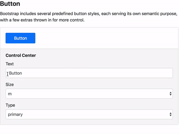
<template slot="title">Button</template>
<p>Bootstrap includes several predefined button styles, each serving its
own semantic purpose, with a few extras thrown in for more control.</p>
<elementa-demo :controls="controls">
<app-button
:size="controls.size.value"
:type="controls.type.value"
>
{{ controls.text.value }}
</app-button>
</elementa-demo>
</elementa-element>
</template>
<script>
/* elementa-metadata
parent: components
slug: button
title: Button
*/
import AppButton from './AppButton.vue';
import ElementaDemo from '@elementa/core/src/components/ElementaDemo.vue';
import ElementaElement from '@elementa/core/src/components/ElementaElement.vue';
export default {
name: 'Button',
components: {
AppButton,
ElementaDemo,
ElementaElement,
},
data() {
return {
// Controls make it possible to manipulate the data
// of your component directly in the style guide.
controls: {
text: {
label: 'Text',
type: 'text',
value: 'Button',
},
size: {
label: 'Size',
type: 'select',
value: 'm',
options: ['m', 'l', 'xl'],
},
type: {
label: 'Type',
type: 'select',
value: 'primary',
options: ['primary', 'success', 'danger'],
},
},
};
},
};
</script>Metadata
Use a metadata block at the beginning of the <script> section of your component, to define to which parent the Element belongs, which slug to use for the URL and which title to use in the navigation. You must provide all three properties.
// Default
/* elementa-metadata
parent: components
slug: button
title: Button
*/

// Nested parent
/* elementa-metadata
parent: components.app
slug: button
title: Button
*/
Do not forget to add the new parent item to your navigationSchema property in the configuration when defining a new nested parent in a metadata block.
You have to restart Elementa after modifying the metadata of an Element for the changes to take effect.
Demo
Controls
Currently only Controls of type text and select are supported, more to come.
Theming
Elementa themes are basically regular Vue components which contain all the CSS styles of the style guide app. If you want to change the layout or the style of your style guide, you can create your own Elementa theme and tell Elementa, in the elementa.config.js configuration file, to use your custom theme instead of the default one.
// elementa.config.js
module.exports = {
  theme: `./src/components/MyElementaTheme.vue`,
};
Theme template
Here you can see a minimal implementation of an Elementa custom theme. If you want to only make minor changes to the default theme, you can also copy the default theme and work your way from there.
<template>
  <div class="MyElementaTheme">
    <div class="MyElementaTheme__sidebar">
      <elementa-nav></elementa-nav>
    </div>
    <main class="MyElementaTheme__main">
      <slot></slot>
    </main>
  </div>
</template>

<script>
import ElementaNav from '@elementa/core/src/components/ElementaNav.vue';

export default {
  name: `MyElementaTheme`,
  components: {
    ElementaNav,
  },
};
</script>

<style>
/* This is the place for your custom styles. */
</style>
About
Author
Markus Oberlehner
Website: https://markus.oberlehner.net
Twitter: https://twitter.com/MaOberlehner
PayPal.me: https://paypal.me/maoberlehner
License
MIT