
@etchteam/storybook-addon-status
v8.1.0
Published
Add component status to the storybook UI


Readme
Storybook Addon Status
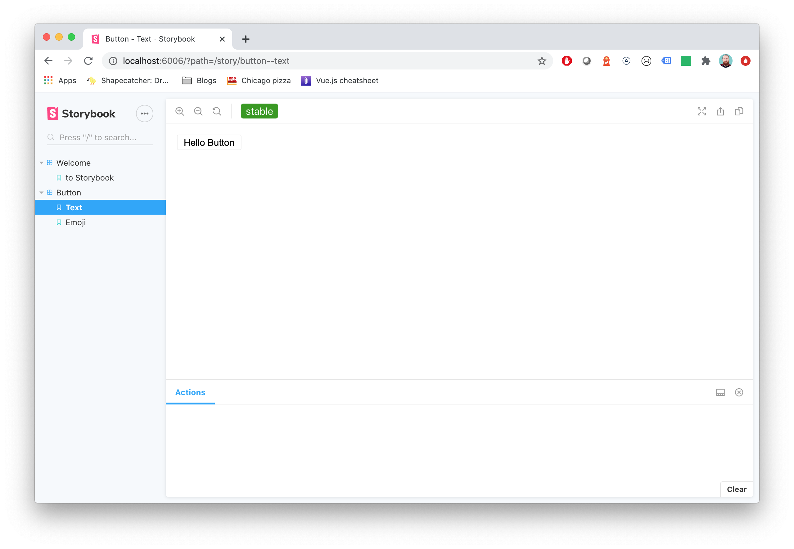
Storybook Status Addon can be used to add a component status label in Storybook.
Installation
npm install @etchteam/storybook-addon-status --save-devConfiguration
Then create a file called main.js in your storybook config.
Add the following content to it:
export default {
  addons: ['@etchteam/storybook-addon-status'],
};
In manager.js you can globally configure custom status configurations, or overwrite the built in "beta", "deprecated", "stable" & "releaseCandidate". You can also change how statuses appear in the sidebar with the sidebarDots and sidebarTags props.
import { addons } from "storybook/manager-api";

addons.setConfig({
  status: {
    statuses: {
      released: {
        background: '#0000ff',
        color: '#ffffff',
        description: 'This component is stable and released',
      },
    },
    sidebarDots: 'single', // 'single' | 'multiple' | 'none'. 'single' is the default
    sidebarTags: 'single', // 'single' | 'multiple' | 'none'. When set, overrides sidebarDots and renders full status tags in the sidebar instead of dots.
  },
});
By default the sidebar shows a small coloured dot next to each story. Setting sidebarTags to 'single' or 'multiple' switches the sidebar to render the full status tag — the same colour and label as the toolbar tag, but slightly smaller. sidebarTags: 'none' hides the indicator entirely (and overrides sidebarDots). When sidebarTags is not set, sidebarDots keeps its existing behaviour.
Note: Status URLs are intentionally not used by sidebar tags — clicking a story row in the sidebar should always navigate to that story. Use the toolbar tag (which still renders as a link) to follow the URL.
IMPORTANT: The addon was previously configured using parameters in preview.js. This will still work as before, however newer features such as sidebar dot customisation are not available.
NOTE: Each key will be used as the label for the status and will convert camelCase to words.
Story Usage
There are two ways to add statuses to your stories:
- Tags (new, recommended)
- Story parameters (legacy)
You can also use both methods together to get the benefits of both at once.
Tags
Storybook's built-in tag system can now be used to add statuses to your stories.
Just add an array of status names to the tags property:
export default {
  title: 'BetterSoftwareLink',
  tags: ['beta'],  // 'beta' | 'stable' | 'deprecated' | 'releaseCandidate' | your own custom status
};
This can be used for the built-in statuses, as well as any custom statuses defined in manager.js. Only these tags will appear as statuses - if they are not built-in or have a definition in manager.js, they will be ignored by the addon. This means that status tags can be used alongside tags for other purposes.
Using tags to define statuses means that stories can also be filtered by status.
Component vs story level tags
Tags can be set at two levels in a CSF file:
- Component level (
export default { tags: [...] }) — applies to the component as a whole and is inherited by every story underneath it. - Story level (
Story.tags = [...]ortagson the story object) — applies to that one story, merged with the component-level tags. A story can negate an inherited tag by prefixing it with!.
export default {
  title: 'Example/Button',
  tags: ['beta'],
};

// Resolved tags: ['beta'] — inherited from the component.
export const Default = Template.bind({});

// Resolved tags: ['stable'] — negates 'beta' and adds 'stable'.
export const Stable = Template.bind({});
Stable.tags = ['!beta', 'stable'];

// Resolved tags: ['beta', 'deprecated'] — adds on top of the component.
export const SoonGone = Template.bind({});
SoonGone.tags = ['deprecated'];
The sidebar dot next to a story reflects that story's resolved tag set.
The sidebar dot next to a component (or any parent folder) only appears for statuses that every story underneath shares. In the example above, Stable drops 'beta', so the component shows no dot.
Story parameters
The alternative (legacy) way to add statuses to stories is to add them to the status property of the story parameters:
export default {
  title: 'BetterSoftwareLink',
  parameters: {
    status: {
      type: 'beta', // 'beta' | 'stable' | 'deprecated' | 'releaseCandidate'
      url: 'http://www.url.com/status', // Optional: will make the tag a link
      statuses: {...} // Optional: add custom status configurations for this story here
    }
  },
};
type also accepts an object with name and url keys, or an array of strings and/or objects for multiple statuses.
If not specifically set, every status uses status.url as the linked Url.
export default {
  parameters: {
    status: {
      type: [
        'beta',
        'released',
        'myCustomStatus',
        {
          name: 'stable',
          url: 'http://www.url.com/stable'
        }
      ],
      url: 'http://www.url.com/status'
    },
  },
}
Setting statuses via the story parameters allows more customisation on a story-by-story basis, but at the expense of sidebar filtering. Additionally, using this method means that the status dot(s) in the sidebar only shows for the story that is currently being viewed - this is a known limitation of the way Storybook works.
Combined method
For the best of both worlds, tag and story parameter statuses can be used together. This gives you the ability to filter by status in the sidebar, see sidebar dots for all stories at once, and to customise statuses within a story.
To do this, add all the statuses for the story to the tags array in the story definition. Then, add any statuses that need customisation (e.g. for a URL or custom style) to the story parameters' status property.
Both sets of statuses will be combined and de-duplicated.
export default {
  title: 'BetterSoftwareLink',
  tags: ['beta', 'customStoryStatus']
  parameters: {
    status: {
      type: {
        name: 'customStoryStatus',
        url: 'http://www.url.com/custom',
      },
      url: 'http://www.url.com/status',
      statuses: {
        customStoryStatus: {
          background: '#0000ff',
          color: '#ffffff',
          description: 'This is a custom status configuration for this story only',
        }
      }
    },
  },
};
NOTE: The sidebar dot(s) for a status with custom styles added in a particular story will only work while you are viewing that story. This is a known limitation of the way Storybook works. We recommend defining custom status styles globally in preview.js wherever possible instead.
Migration guide
Need to update your major version?
Made with ☕ at Etch