
@fast-form-designer/vue
v0.1.3
Published
A visual form designer based on Vue 3 and Element Plus.
Maintainers
 lywuhan
Readme
@fast-form-designer/vue
简单、快速、实用的、基于 Vue 3 和 Element Plus 的可视化表单设计器。
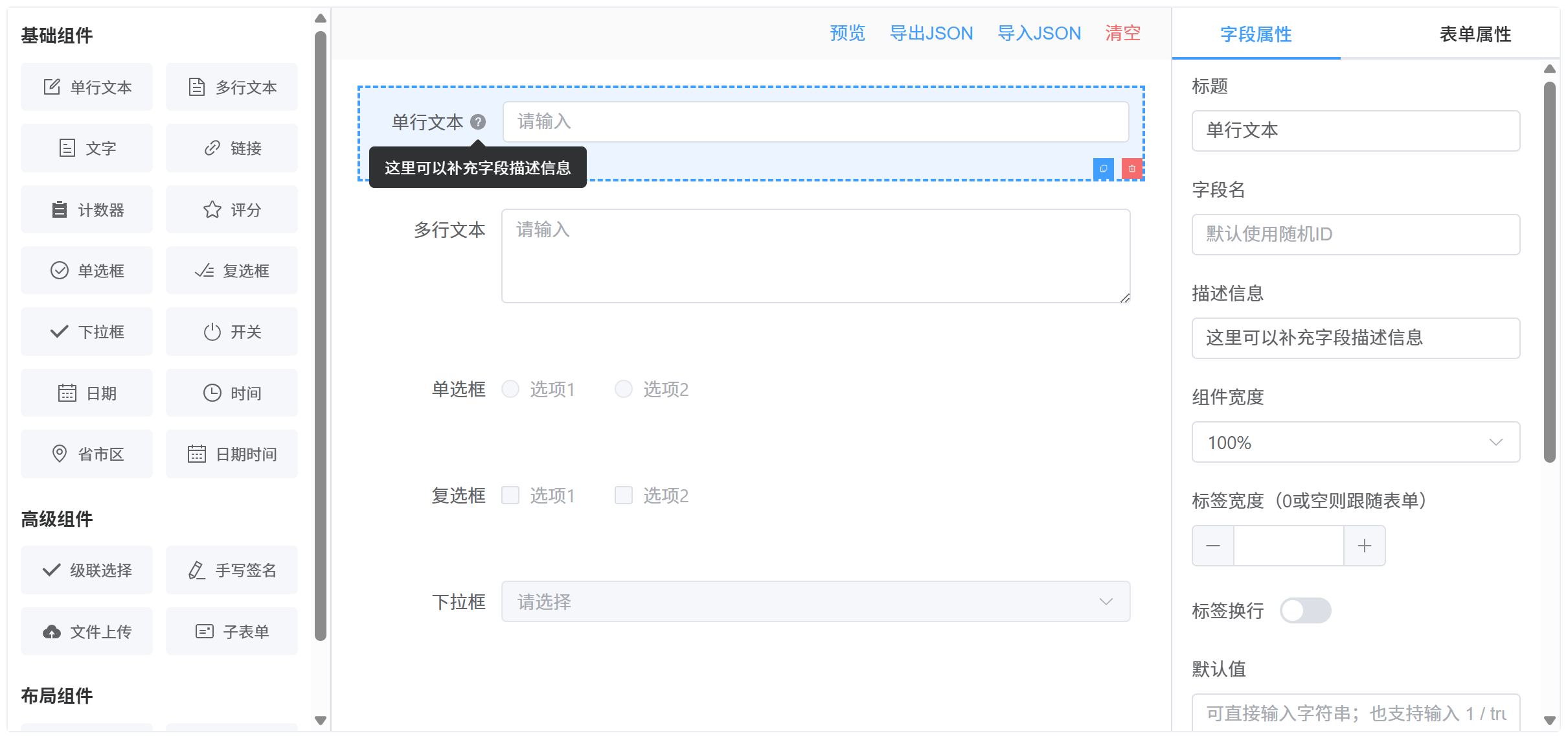
特性
- 可视化设计:通过拖拽组件快速构建表单
- 丰富组件:支持 20+ 种表单组件,涵盖基础输入、选择、布局等类型
- 属性配置:可配置组件属性、校验规则、布局样式
- 表单配置:支持全局表单设置(标签位置、尺寸等)
- 条件显隐:支持基于字段值的动态显示/隐藏规则
- 实时预览:即时预览设计效果
- JSON 导入/导出:保存和加载表单设计
- 表单渲染器:独立的渲染组件,可根据 JSON 配置生成可交互表单
组件清单
基础组件
| 组件类型 | 说明 | 主要特性 |
| -------------- | -------- | --------------------- |
| input | 单行文本 | 占位符、可清空、禁用 |
| textarea | 多行文本 | 行数设置、占位符 |
| text | 文字展示 | 静态文本显示 |
| link | 链接 | URL、打开方式、下划线 |
| input-number | 计数器 | 数值输入 |
| rate | 评分 | 最大值、半星、可清空 |
| radio | 单选框 | 静态/远程选项 |
| checkbox | 复选框 | 静态/远程选项、多选 |
| select | 下拉框 | 可筛选、虚拟化、多选 |
| switch | 开关 | 布尔值切换 |
| date | 日期选择 | 日期格式 |
| time | 时间选择 | 时间格式 |
| datetime | 日期时间 | 日期时间组合 |
| pca | 省市区 | 省/市/区三级联动 |
高级组件
| 组件类型 | 说明 | 主要特性 |
| ----------- | -------- | -------------------------- |
| cascader | 级联选择 | 多级联动、可任选层级 |
| signature | 手写签名 | 画布高度、线宽、颜色 |
| upload | 文件上传 | 多文件、自动上传、列表类型 |
| sub-form | 子表单 | 嵌套表单、行索引、操作按钮 |
布局组件
| 组件类型 | 说明 | 主要特性 |
| ---------- | -------- | ------------------ |
| group | 分组 | 表单分组容器 |
| grid | 栅格布局 | 多列布局、间距设置 |
| grid-col | 栅格列 | 列宽(span)配置 |
安装
# npm
npm install @fast-form-designer/vue element-plus @element-plus/icons-vue

# pnpm
pnpm add @fast-form-designer/vue element-plus @element-plus/icons-vue

# yarn
yarn add @fast-form-designer/vue element-plus @element-plus/icons-vue
环境要求
- Node.js:
^20.19.0或>=22.12.0 - Vue:
^3.5.26 - Element Plus:
^2.13.1 - @element-plus/icons-vue:
^2.3.2
快速开始
1. 全局注册 Element Plus
// main.ts
import { createApp } from 'vue'
import ElementPlus from 'element-plus'
import 'element-plus/dist/index.css'
import App from './App.vue'

createApp(App).use(ElementPlus).mount('#app')
2. 使用设计器组件
<template>
  <FastFormDesigner />
</template>

<script setup lang="ts">
import FastFormDesigner from '@fast-form-designer/vue'
import '@fast-form-designer/vue/style.css'
</script>
3. 使用表单渲染器
<template>
  <FormRenderer
    ref="rendererRef"
    v-model="formData"
    :schema="formSchema"
    :disabled="false"
    @change="handleChange"
  />
  <el-button @click="handleValidate">校验</el-button>
  <el-button @click="handleReset">重置</el-button>
</template>

<script setup lang="ts">
import { ref } from 'vue'
import { FormRenderer } from '@fast-form-designer/vue'
import '@fast-form-designer/vue/style.css'
import type { FormSchema, FormElement } from '@fast-form-designer/vue'

const formSchema: FormSchema = {
  config: {
    labelPosition: 'right',
    labelWidth: 100,
    size: 'default',
  },
  list: [
    {
      id: 'name',
      type: 'input',
      props: {
        label: '姓名',
        field: 'name',
        placeholder: '请输入姓名',
        required: true,
        clearable: true,
      },
    },
    {
      id: 'gender',
      type: 'radio',
      props: {
        label: '性别',
        field: 'gender',
        required: true,
        optionsSource: 'static',
        options: [
          { label: '男', value: 'male' },
          { label: '女', value: 'female' },
        ],
      },
    },
  ],
}

const formData = ref({})

const rendererRef = ref<{
  validate: () => Promise<boolean>
  resetFields: () => void
} | null>(null)

const handleChange = (element: FormElement, data: Record<string, unknown>) => {
  console.log('字段变更:', element, data)
}

const handleValidate = async () => {
  try {
    await rendererRef.value?.validate()
    ElMessage.success('校验通过')
  } catch {
    ElMessage.error('校验失败')
  }
}

const handleReset = () => {
  rendererRef.value?.resetFields()
}
</script>
预览
API 参考
FastFormDesigner Props
| 属性名 | 类型 | 默认值 | 说明 |
| ----------------- | ------------------ | ------------ | ---------------------- |
| componentGroups | ComponentGroup[] | 内置组件列表 | 自定义左侧组件面板分组 |
| toolbarActions | ToolbarAction[] | 内置操作按钮 | 自定义顶部工具栏按钮 |
ToolbarAction 类型
interface ToolbarAction {
  key: string // 唯一标识
  label: string // 按钮文字
  type?: 'primary' | 'success' | 'warning' | 'danger' | 'info'
  link?: boolean // 是否为链接样式
  disabled?: boolean // 是否禁用
  visible?: boolean // 是否显示
  onClick?: (ctx: DesignerActionContext) => void // 点击回调
}

interface DesignerActionContext {
  schema: FormSchema // 当前表单 schema
  formList: FormElement[] // 表单元素列表
  formConfig: FormConfig // 表单全局配置
  openPreview: () => void // 打开预览对话框
  openImport: () => void // 打开导入对话框
  exportJson: () => void // 导出 JSON 到剪贴板
  clearCanvas: () => void // 清空画布
}
FormRenderer Props
| 属性名 | 类型 | 默认值 | 说明 |
| ------------ | --------------------- | ------- | ------------------------ |
| schema | FormSchema | 必填 | 表单结构定义 |
| modelValue | Record<string, any> | {} | 表单数据(支持 v-model) |
| disabled | boolean | false | 是否禁用整个表单 |
FormRenderer Events
| 事件名 | 参数 | 说明 |
| ------------------- | ---------------------------------------------------- | -------------------- |
| update:modelValue | (value: Record<string, any>) | 表单数据更新时触发 |
| change | (element: FormElement, value: Record<string, any>) | 任意字段值变更时触发 |
FormRenderer Expose
| 方法名 | 类型 | 说明 |
| ------------- | ------------------------ | ------------ |
| validate | () => Promise<boolean> | 触发表单校验 |
| resetFields | () => void | 重置表单字段 |
省市区数据工具函数
省市区(PCA)数据采用动态导入,仅在使用省市区组件时按需加载,减少主包体积。
import { loadPcaData, setPcaData, getPcaOptions, type PcaNode } from '@fast-form-designer/vue'loadPcaData
动态加载内置省市区数据,返回原始数据结构。
const loadPcaData: () => Promise<PcaNode[]>

// 示例
const pcaData = await loadPcaData()
console.log(pcaData) // [{ code: '11', name: '北京市', children: [...] }, ...]
setPcaData
注入自定义省市区数据,用于替换内置数据或在 SSR 场景下预加载。
const setPcaData: (data: PcaNode[]) => void

// 示例:使用自定义数据
const customData: PcaNode[] = [
  { code: '11', name: '北京市', children: [{ code: '1101', name: '市辖区', children: [...] }] }
]
setPcaData(customData)
getPcaOptions
获取指定深度的省市区选项数据,返回格式化后的 OptionItem[]。
const getPcaOptions: (depth: 1 | 2 | 3) => Promise<OptionItem[]>

// depth 参数说明:
// 1 = 仅省份
// 2 = 省份 + 城市
// 3 = 省份 + 城市 + 区县

// 示例
const provinceOptions = await getPcaOptions(1)    // 省份列表
const cityOptions = await getPcaOptions(2)        // 省市两级
const districtOptions = await getPcaOptions(3)   // 省市区三级
PcaNode 类型
interface PcaNode {
  code: string        // 行政区划代码
  name: string        // 名称
  children?: PcaNode[] // 下级区划
}
类型定义
FormSchema
interface FormSchema {
  config: FormConfig
  list: FormElement[]
}
FormConfig
interface FormConfig {
  labelPosition: 'left' | 'right' | 'top' // 标签位置
  labelWidth: number // 标签宽度(px)
  size: 'large' | 'default' | 'small' // 表单尺寸
  visibilityRules?: FieldVisibilityRule[] // 字段显隐规则
}
FormElement
interface FormElement {
  id: string // 元素唯一标识
  type: ComponentType // 组件类型
  props: ComponentProps // 组件属性
  children?: FormElement[] // 子元素(用于布局组件)
}
ComponentProps(常用属性)
interface ComponentProps {
  label: string // 标签文字
  field?: string // 数据字段名
  defaultValue?: unknown // 默认值
  placeholder?: string // 占位文字
  description?: string // 提示信息(Tooltip)
  width?: '25%' | '33.33%' | '50%' | '66.66%' | '75%' | '100%'
  required?: boolean // 是否必填
  disabled?: boolean // 是否禁用
  clearable?: boolean // 是否可清空
  rules?: ValidationRule[] // 校验规则
  options?: OptionItem[] // 选项数据(选择类组件)
  optionsSource?: 'static' | 'remote' // 选项数据来源
  remoteOptions?: RemoteOptionsConfig // 远程选项配置
  // ...更多组件特定属性
}
ValidationRule
interface ValidationRule {
  type: 'required' | 'email' | 'phone' | 'url' | 'ip' | 'regexp'
  message: string // 校验失败提示
  pattern?: string // 正则表达式(type 为 regexp 时)
  trigger: 'blur' | 'change'
}
FieldVisibilityRule(条件显隐)
interface FieldVisibilityRule {
  id: string
  logic: 'all' | 'any' // 条件逻辑:全部满足 / 任一满足
  conditions: FieldVisibilityCondition[]
  actions: FieldVisibilityAction[]
}

interface FieldVisibilityCondition {
  id: string
  field: string // 依赖的字段
  operator: FieldVisibilityOperator // 比较操作符
  value?: FieldVisibilityValue // 比较值
}

type FieldVisibilityOperator =
  | 'eq'
  | 'neq' // 等于 / 不等于
  | 'gt'
  | 'gte'
  | 'lt'
  | 'lte' // 大于 / 大于等于 / 小于 / 小于等于
  | 'contains'
  | 'not_contains' // 包含 / 不包含
  | 'in'
  | 'not_in' // 在列表中 / 不在列表中
  | 'is_empty'
  | 'not_empty' // 为空 / 不为空

interface FieldVisibilityAction {
  id: string
  field: string // 受控字段
  action: 'show' | 'hide' // 显示 / 隐藏
}
远程选项配置
对于 select、radio、checkbox、cascader 等选择类组件,支持从远程 API 加载选项数据。
interface RemoteOptionsConfig {
  url: string // 请求地址
  method: 'GET' | 'POST' // 请求方法
  paramsJson?: string // 请求参数(JSON 字符串)
  headersJson?: string // 请求头(JSON 字符串)
  dataPath?: string // 数据路径(如 'data.list')
  labelKey: string // 选项文本字段名
  valueKey: string // 选项值字段名
  childrenKey?: string // 子选项字段名(级联选择)
}
主题定制
组件使用 CSS 变量实现主题定制,可通过覆盖以下变量自定义样式:
:root {
  --ffd-primary: var(--el-color-primary);
  --ffd-primary-hover: var(--el-color-primary-light-3);
  --ffd-primary-light: var(--el-color-primary-light-9);
  --ffd-danger: var(--el-color-danger);
  --ffd-danger-light: var(--el-color-danger-light-5);
  --ffd-border: var(--el-border-color);
  --ffd-border-light: var(--el-border-color-lighter);
  --ffd-text: var(--el-text-color-primary);
  --ffd-text-secondary: var(--el-text-color-regular);
  --ffd-text-tertiary: var(--el-text-color-secondary);
  --ffd-bg: var(--el-bg-color);
  --ffd-panel-bg: var(--el-bg-color);
  --ffd-canvas-bg: var(--el-fill-color-lighter);
  --ffd-hover-bg: var(--el-fill-color-light);
  --ffd-muted-bg: var(--el-fill-color-light);
  --ffd-drag-bg: #c8ebfb;
  --ffd-empty-text: var(--el-text-color-placeholder);
}
开发
# 安装依赖
pnpm install

# 启动开发服务器
pnpm dev

# 类型检查
pnpm type-check

# 代码检查与修复
pnpm lint

# 格式化代码
pnpm format
构建
# 构建库(生成 dist 目录)
pnpm build

# 仅构建类型声明
pnpm build:types

# 仅构建打包产物
pnpm build:bundles