
@folo/layout
v1.0.2
Published
> React CSS Grid Components
Downloads
108
Maintainers
 jimmy02020
Readme
📋 @folo/layout
React CSS Grid Components


Installation
npm install @folo/layoutUsage
import { Grid, GridItem } from "@folo/layout";
const MyGrid = () => (
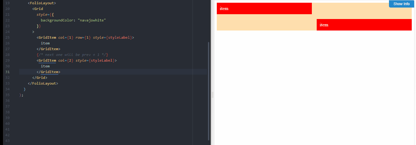
<Grid>
<GridItem col={4} row={1}>
item
</GridItem>
<GridItem col={3} row={2}>
item
</GridItem>
<GridItem col={2} row={3}>
item
</GridItem>
<GridItem col={1} row={5}>
item
</GridItem>
<GridItem col={4} row={10}>
item
</GridItem>
</Grid>
);Components
import { Grid, GridItem } from "@folo/layout";Components Props
All components accept custom props.
Grid
| property | type | description | default |
| ------------- | ------------- | ------------------------- | ------- |
| component | node/function | custom render-component | div |
| col | number | number of columns in grid | |
| colWidth | string | fixed column width | |
| colMinWidth | string | column minimum width | auto |
| colMaxWidth | string | column maximum width | 1fr |
| row | number | number of rows in grid | |
| rowWidth | string | fixed row width | |
| rowMinWidth | string | row minimum width | auto |
| rowMaxWidth | string | row maximum width | 1fr |
GridItem
Used for implicit grid layout.
| property | type | description | default |
| -------------- | ------------- | ------------------------- | ------- |
| component | node/function | custom render-component | div |
| row | number | number of columns in grid | |
| toRow | number | column width | |
| col | number | column minimum width | 0 |
| toCol | number | column maximum width | |
| isCenter | Boolean | number of rows in grid | false |
| isHorizontal | Boolean | | true |
Contribution 😇
If you have ideas to improve this package or issues don't hesitate. You are always welcome.
License
This project is licensed under the MIT License