
@formbricks/survey-ui
v1.0.4
Published
React UI components for building surveys and forms - includes NPS, rating scales, multi-select, file upload, and more. Built with Radix UI and Tailwind CSS.


Readme
@formbricks/survey-ui
React UI components for building surveys and forms. Includes NPS, rating scales, multi-select, file upload, and more.
Installation
npm install @formbricks/survey-uiRequirements: React 19 (react@^19.0.0)
Quick Start
import { OpenText, Rating } from "@formbricks/survey-ui";
import "@formbricks/survey-ui/styles";
function Survey() {
return (
<div id="fbjs">
<OpenText
elementId="name"
headline="What's your name?"
inputId="name-field"
placeholder="Enter your name"
onChange={(value) => console.log(value)}
/>
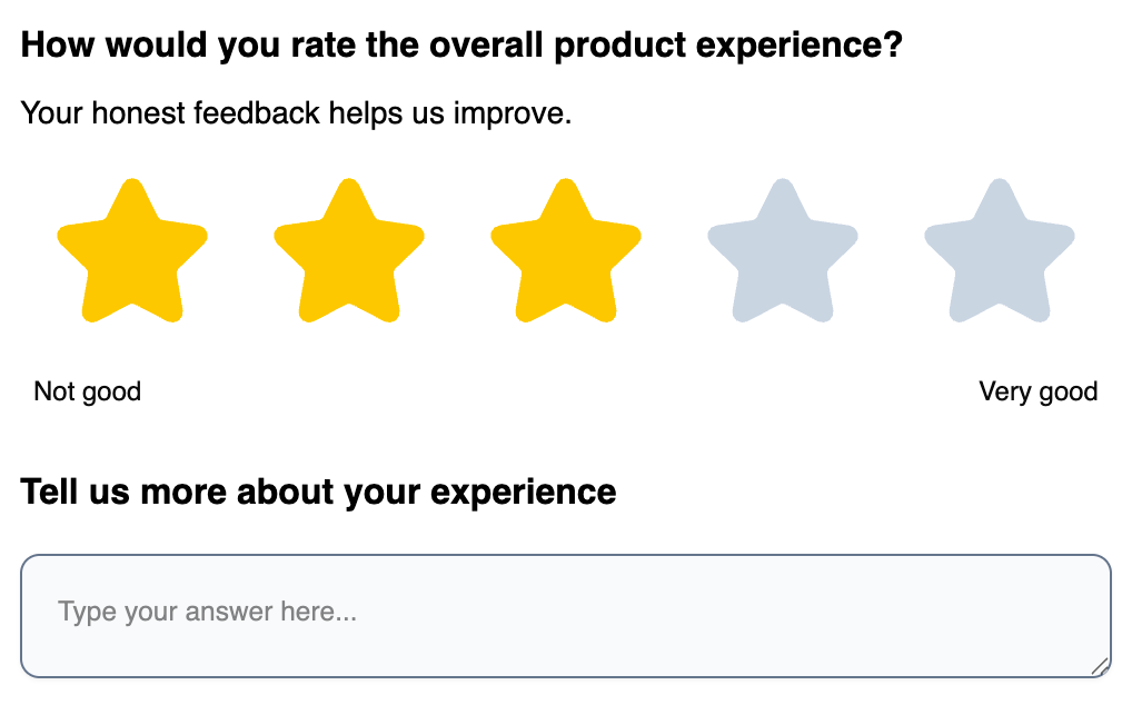
<Rating
elementId="rating"
headline="Rate your experience"
inputId="rating-field"
scale="star"
range={5}
onChange={(value) => console.log(value)}
/>
</div>
);
}Important: Components must be wrapped in
<div id="fbjs">for styles to work.
Components
Survey Elements
| Component | Description |
|-----------|-------------|
| OpenText | Text input (single or multi-line) |
| SingleSelect | Radio button selection |
| MultiSelect | Checkbox selection |
| Rating | Star, number, or smiley rating |
| NPS | Net Promoter Score (0-10) |
| Matrix | Table/grid selection |
| Ranking | Drag-and-drop ranking |
| DateElement | Date picker |
| FileUpload | File upload with preview |
| PictureSelect | Image-based selection |
| Consent | Checkbox with label |
| CTA | Call-to-action button |
| FormField | Generic form field wrapper |
General Components
| Component | Description |
|-----------|-------------|
| Button | Button with variants: default, outline, ghost, destructive |
| Input | Text input |
| DropdownMenu | Dropdown menu (Radix UI) |
| ElementHeader | Question headline + description |
| ElementMedia | Image/video display |
Theming
Customize the appearance by overriding CSS variables inside #fbjs:
#fbjs {
  /* Brand color - affects focus rings, selections */
  --fb-survey-brand-color: #3b82f6;

  /* Buttons */
  --fb-button-bg-color: #3b82f6;
  --fb-button-text-color: #ffffff;
  --fb-button-border-radius: 8px;

  /* Inputs & Options */
  --fb-input-bg-color: #ffffff;
  --fb-input-border-radius: 8px;
  --fb-input-height: 44px;

  /* Typography */
  --fb-element-headline-font-size: 18px;
  --fb-element-headline-font-weight: 600;
  --fb-element-headline-color: #111827;
}
All CSS Variables
Brand & Accent
| Variable | Default | Description |
|----------|---------|-------------|
| --fb-survey-brand-color | #64748b | Primary accent color |
| --fb-accent-background-color | #e2e8f0 | Accent background |
| --fb-accent-background-color-selected | #f1f5f9 | Selected accent background |
Buttons
| Variable | Default | Description |
|----------|---------|-------------|
| --fb-button-bg-color | #1e293b | Button background |
| --fb-button-text-color | #f8fafc | Button text |
| --fb-button-border-radius | 10px | Button corners |
| --fb-button-height | 36px | Button height |
| --fb-button-font-size | 14px | Button text size |
| --fb-button-font-weight | 500 | Button text weight |
| --fb-button-padding-x | 16px | Horizontal padding |
| --fb-button-padding-y | 8px | Vertical padding |
Inputs
| Variable | Default | Description |
|----------|---------|-------------|
| --fb-input-bg-color | #f8fafc | Input background |
| --fb-input-border-color | #64748b | Input border (uses brand color) |
| --fb-input-border-radius | 10px | Input corners |
| --fb-input-height | 40px | Input height |
| --fb-input-color | #0a0a0a | Input text color |
| --fb-input-font-size | 14px | Input text size |
| --fb-input-placeholder-opacity | 0.5 | Placeholder opacity |
| --fb-input-padding-x | 16px | Horizontal padding |
| --fb-input-padding-y | 16px | Vertical padding |
| --fb-input-shadow | 0 1px 2px rgba(0,0,0,0.05) | Input shadow |
Options (Radio/Checkbox)
| Variable | Default | Description |
|----------|---------|-------------|
| --fb-option-bg-color | #f8fafc | Option background |
| --fb-option-label-color | #0a0a0a | Option text color |
| --fb-option-border-radius | 10px | Option corners |
| --fb-option-padding-x | 16px | Horizontal padding |
| --fb-option-padding-y | 16px | Vertical padding |
| --fb-option-font-size | 14px | Option text size |
Headlines & Descriptions
| Variable | Default | Description |
|----------|---------|-------------|
| --fb-element-headline-font-size | 16px | Headline size |
| --fb-element-headline-font-weight | 400 | Headline weight |
| --fb-element-headline-color | #000000 | Headline color |
| --fb-element-description-font-size | 14px | Description size |
| --fb-element-description-color | #000000 | Description color |
Progress Bar
| Variable | Default | Description |
|----------|---------|-------------|
| --fb-progress-track-height | 8px | Track height |
| --fb-progress-track-bg-color | rgba(30,41,59,0.2) | Track background |
| --fb-progress-indicator-bg-color | #1e293b | Indicator background |
Theme Examples
Blue Theme:
#fbjs {
  --fb-survey-brand-color: #2563eb;
  --fb-button-bg-color: #2563eb;
  --fb-button-text-color: #ffffff;
}
Green Theme:
#fbjs {
  --fb-survey-brand-color: #16a34a;
  --fb-button-bg-color: #16a34a;
  --fb-button-text-color: #ffffff;
}
Rounded Theme:
#fbjs {
  --fb-input-border-radius: 9999px;
  --fb-button-border-radius: 9999px;
  --fb-option-border-radius: 16px;
}
TypeScript
All components export their prop types:
import {
  OpenText, type OpenTextProps,
  Rating, type RatingProps,
  SingleSelect, type SingleSelectProps, type SingleSelectOption
} from "@formbricks/survey-ui";
License
MIT — Formbricks