@frankhoodbs/pagination-cmp
v5.0.0
Published
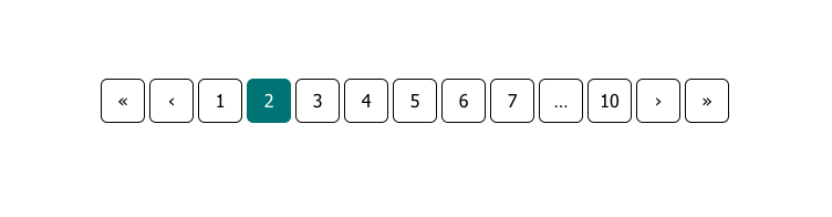
Pagination component


Keywords
Readme
Pagination Component
Component that displays data in paged format and provides navigation between pages.
Componente che visualizza dati in un formato paginato e fornisce una navigazione tra le pagine.


API Reference
Props
| Name | Type | Description |
|:---------------------|:----------|:-----------------------------------------------------------------------------------------------------------------------------------------------------------------------|
| data-aria-label | string | The aria label of the pagination nav element. |
| data-page | number | The controlled value of the current page. |
| data-pages-total | number | Total number of pages in your pagination. |
| data-sibling-count | number | How many sibling should be shown around the current page. |
| data-show-edges | boolean | When true indicates that the pagination always show first page, last page, and add ellipsis if needed,eventually in addition to the data-sibling-count parameter. |
| data-disabled | boolean | When true indicates that the entire pagination is disabled. |
Emit
| Name | Value | Description |
|:-----------|:---------------|:--------------------------------------------------|
| @update | page: number | Event handler called when the page value changes. |
Slots
| Name | Description |
|:-------------|:-------------------------------------------------------------------------------------------------------------------------------------------------------------------------------------------------------------------------------------------------|
| page-first | Scoped slot for an icon used to navigate to the first page. |
| page-prev | Scoped slot for an icon used to navigate to the previous page. |
| page | Required. Scoped slot used for render the navigable pages rendered based on the configuration in input. Should slot a tag a or a tag button if you want the navigation through keyboard to work, you can also slot a router-link |
| page-next | Scoped slot for an icon used to navigate to the next page. |
| page-last | Scoped slot for an icon used to navigate to the last page. |
CSS variables
| Name | default | Description |
|:------------------------------------------------|:--------------|:---------------------------------------------------------------------------|
| --pagination-page-item-gap | 0.25rem | Gap between page-item. |
| --pagination-page-item-width | 2.5rem | Value of page-item width. |
| --pagination-page-item-height | 2.5rem | Value of page-item height. |
| --pagination-page-item-bg-color | transparent | Value of page-item background-color. |
| --pagination-page-item-color | #000000 | Value of page-item color. |
| --pagination-page-item-border-width | 1px | Value of page-item border-width. |
| --pagination-page-item-border-style | solid | Value of page-item border-style. |
| --pagination-page-item-border-color | #000000 | Value of page-item border-color. |
| --pagination-page-item-border-radius | 0.375rem | Value of page-item border-radius. |
| --pagination-page-item-transition-duration | 0.15s | Value of page-item transition-duration. |
| --pagination-page-item-active-border-width | 1px | Value of page-item border-width when the page-item has class active. |
| --pagination-page-item-active-border-style | solid | Value of page-item border-style when the page-item has class active. |
| --pagination-page-item-active-border-color | #000000 | Value of page-item border-color when the page-item has class active. |
| --pagination-page-item-active-bg-color | transparent | Value of page-item background-color when the page-item has class active. |
| --pagination-page-item-active-color | #000000 | Value of page-item color when the page-item has class active. |
| --pagination-page-item-disabled-border-width | 1px | Value of page-item border-width when the page-item has class disabled. |
| --pagination-page-item-disabled-border-style | solid | Value of page-item border-style when the page-item has class disabled. |
| --pagination-page-item-disabled-border-color | #000000 | Value of page-item border-color when the page-item has class disabled. |
| --pagination-page-item-disabled-bg-color | transparent | Value of page-item background-color when the page-item has class disabled. |
| --pagination-page-item-disabled-color | #000000 | Value of page-item color when the page-item has class disabled. |
| --pagination-page-item-disabled-cursor | not-allowed | Value of page-item cursor when the page-item has class disabled. |
| --pagination-page-item-disabled-opacity | 0.333 | Value of page-item opacity when the page-item has class disabled. |
| --pagination-page-item-hover-border-width | 1px | Value of page-item border-width when the page-item is in hover status. |
| --pagination-page-item-hover-border-style | solid | Value of page-item border-style when the page-item is in hover status. |
| --pagination-page-item-hover-border-color | #000000 | Value of page-item border-color when the page-item is in hover status. |
| --pagination-page-item-hover-bg-color | transparent | Value of page-item background-color when the page-item is in hover status. |
| --pagination-page-item-hover-color | #000000 | Value of page-item color when the page-item is in hover status. |
| --pagination-page-item-hover-opacity | 1 | Value of page-item opacity when the page-item is in hover status. |
Usage/Examples
<pagination-cmp
:data-page="page"
data-pages-total="10"
@update="page = $event"
>
<template #page-first="{ disabled }">
<a
href="#"
aria-label="First page"
:tabindex="disabled ? -1 : undefined"
>
<span aria-hidden="true">«</span>
</a>
</template>
<template #page-prev="{ disabled }">
<a
href="#"
rel="prev"
aria-label="Previous page"
:tabindex="disabled ? -1 : undefined"
>
<span aria-hidden="true">‹</span>
</a>
</template>
<template #page="{ pageN, current, disabled }">
<a
href="#"
:aria-current="current ? 'page' : undefined"
:tabindex="disabled ? -1 : undefined"
>
{{ pageN }}
</a>
</template>
<template #page-next="{ disabled }">
<a
href="#"
rel="next"
aria-label="Next page"
:tabindex="disabled ? -1 : undefined"
>
<span aria-hidden="true">›</span>
</a>
</template>
<template #page-last="{ disabled }">
<a
href="#"
aria-label="Last page"
:tabindex="disabled ? -1 : undefined"
>
<span aria-hidden="true">»</span>
</a>
</template>
</pagination-cmp>Screenshots