
@glitchlab/accessify
v0.2.5
Published
A lightweight, framework-agnostic accessibility widget for the web. Drop it in to give users font size, contrast, dyslexia, color blind, keyboard navigation, and screen reader controls — with zero dependencies and first-class React, Vue 3, and Svelte bind
Downloads
2,832
Maintainers
 glitchlab
Readme
@glitchlab/accessify


A lightweight, framework-agnostic accessibility widget for the web. Drop it into any site to give users control over font size, contrast, color filters, dyslexia aids, and more — with zero runtime dependencies.
Works as a plain JavaScript class or with first-class bindings for React, Vue 3, and Svelte.
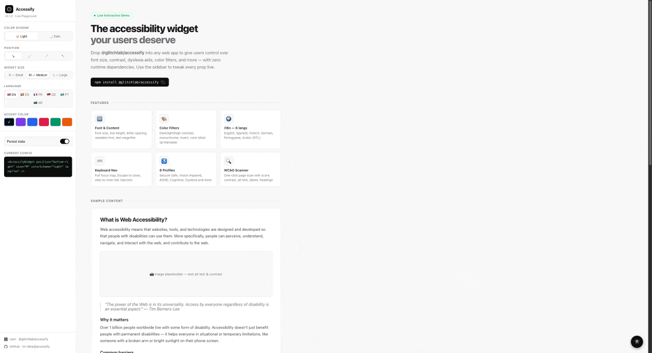
Features
- 8 accessibility profiles — Seizure Safe, Vision Impaired, ADHD Friendly, Cognitive Disability, Keyboard Navigation, Screen Reader, Color Blind, Dyslexia
- Content adjustments — font size, content scale, line height, letter spacing, text alignment, readable font, text magnifier, reading lens, title/link highlighting
- Color adjustments — dark contrast, light contrast, high contrast, monochrome, invert colors, color blind (protanopia filter)
- Dark mode — light by default, opt in with
colorScheme: 'dark' - Keyboard navigation — full focus trap in panel, Escape to close, skip-to-main link injection
- i18n — built-in translations for English, Spanish, French, German, Portuguese, Arabic (RTL supported)
- WCAG page scanner — one-click analysis with score and categorised issues (contrast, alt text, labels, headings, etc.)
- 3 widget sizes — S / M / L
- State persistence via
localStorage(opt-out available) - DOM isolation — all effects are scoped to the host page; the widget UI is never affected
- Themeable — override primary, background, and text colors
- No dependencies — core package is pure TypeScript/DOM
Installation
npm install @glitchlab/accessify
# or
pnpm add @glitchlab/accessify
# or
yarn add @glitchlab/accessify
Quick Start
Vanilla JS / TypeScript
import { Accessify } from '@glitchlab/accessify'

const widget = new Accessify({
  position: 'bottom-right',
  size: 'M',
  colorScheme: 'light', // 'light' | 'dark'
  lang: 'en',          // 'en' | 'es' | 'fr' | 'de' | 'pt' | 'ar'
})

widget.mount()
React
import { AccessifyWidget } from '@glitchlab/accessify/react'

export default function App() {
  return (
    <>
      <YourApp />
      <AccessifyWidget position="bottom-right" size="M" colorScheme="light" lang="en" />
    </>
  )
}
Vue 3
<script setup>
import { AccessifyWidget } from '@glitchlab/accessify/vue'
</script>

<template>
  <AccessifyWidget position="bottom-right" size="M" />
</template>
Svelte
<script>
  import { accessifyStore } from '@glitchlab/accessify/svelte'
  accessifyStore.mount()
</script>
Configuration
All config options are optional.
interface AccessifyConfig {
  /** Widget trigger position. Default: 'bottom-right' */
  position?: 'bottom-right' | 'bottom-left' | 'top-right' | 'top-left'

  /** Panel size. Default: 'M' */
  size?: 'S' | 'M' | 'L'

  /** Color scheme for the widget UI. Default: 'light' */
  colorScheme?: 'light' | 'dark'

  /**
   * Trigger button color preset.
   * - 'auto'  — matches colorScheme (default)
   * - 'dark'  — black background, white icon
   * - 'light' — white background, dark icon
   */
  triggerScheme?: 'auto' | 'dark' | 'light'

  /** Panel language. Default: 'en' */
  lang?: 'en' | 'es' | 'fr' | 'de' | 'pt' | 'ar'

  /** Override default theme colors */
  theme?: {
    primary?: string     // panel header background. Default: '#0c0c0c'
    background?: string  // panel body background. Default: '#ffffff'
    text?: string        // panel body text. Default: '#0c0c0c'
  }

  /** Persist state to localStorage. Default: true */
  persistence?: boolean

  onOpen?: () => void
  onClose?: () => void
  onReset?: () => void
}
Core API
import { Accessify } from '@glitchlab/accessify'

const widget = new Accessify(config?)
| Method | Description |
|---|---|
| mount() | Inject widget into DOM (appended to document.body) |
| destroy() | Remove widget and all applied effects |
| open() | Open the settings panel |
| close() | Close the settings panel |
| toggle() | Toggle the panel open/closed |
| reset() | Reset all settings to defaults |
| setSize(size) | Change widget size at runtime ('S', 'M', 'L') |
| setLang(lang) | Change language at runtime |
| setColorScheme(scheme) | Change color scheme at runtime ('light' or 'dark') |
| setTriggerScheme(scheme) | Change trigger button color at runtime ('auto', 'dark', or 'light') |
| getState() | Returns a copy of the current AccessifyState |
| getIsOpen() | Returns whether the panel is open |
Dark Mode
The widget is light by default. Pass colorScheme: 'dark' to enable dark mode:
// Light (default)
new Accessify({ colorScheme: 'light' })

// Dark
new Accessify({ colorScheme: 'dark' })

// Change at runtime
widget.setColorScheme('dark')
widget.setColorScheme('light')
Trigger button color
The trigger button (the small circle in the corner that opens the panel) follows colorScheme by default — a light page gets a light trigger, a dark page gets a dark trigger. Pin it to a specific color with triggerScheme:
// Default: trigger follows colorScheme
new Accessify({ colorScheme: 'dark' })            // → black trigger, white icon
new Accessify({ colorScheme: 'light' })           // → white trigger, dark icon

// Force a specific trigger regardless of colorScheme
new Accessify({ colorScheme: 'light', triggerScheme: 'dark' })  // dark trigger on a light page
new Accessify({ colorScheme: 'dark', triggerScheme: 'light' })  // light trigger on a dark page

// Change at runtime
widget.setTriggerScheme('dark')
widget.setTriggerScheme('auto')   // back to following colorScheme
| triggerScheme | Result |
|---|---|
| 'auto' (default) | Matches colorScheme — light page → light trigger, dark page → dark trigger |
| 'dark' | Black background + white icon, regardless of colorScheme |
| 'light' | White background + dark icon, regardless of colorScheme |
Internationalisation (i18n)
All panel text is translated. Pass the lang config option or call setLang() at runtime:
new Accessify({ lang: 'fr' })

// Change at runtime
widget.setLang('ar') // also applies RTL layout
| Code | Language |
|---|---|
| en | English (default) |
| es | Spanish |
| fr | French |
| de | German |
| pt | Portuguese |
| ar | Arabic (RTL) |
Keyboard Navigation
The widget panel itself is fully keyboard accessible:
- Tab / Shift+Tab — cycles focus within the open panel (focus trap)
- Escape — closes the panel and returns focus to the trigger button
The trigger button exposes aria-expanded and the panel has role="dialog" with aria-modal="true".
Keyboard Navigation profile
When the user activates the Keyboard Navigation profile, the widget enhances keyboard usability across the entire host page:
- Strong focus rings — every focused element (links, buttons, inputs,
[tabindex],[role=button|link], summaries) gets a 3px solid blue outline with a 6px soft glow so the active element is always clearly visible - Hover outlines — links and buttons show a dashed blue outline on hover as a secondary visual cue
- Skip-to-main link — a hidden "Skip to main content" link is injected at the top of the page. Press Tab once when the page loads and it appears; press Enter to jump directly to
<main>(or any element matching[role="main"],#main,#content, or#main-content)
Screen Reader profile
The Screen Reader profile reinforces page structure for users relying on assistive tech and makes the semantic landmarks visible to sighted users testing accessibility:
- Dashed outlines and visible labels (
MAIN,NAV,HEADER,FOOTER,ASIDE,SECTION,ARTICLE,FORM) on every semantic region - Forced underlines on all links so they're distinguishable from regular text
- Red outline + ⚠ warning on any
<img>missingalttext - Minimum 32×32 px tap targets for buttons and links
- Skip-to-main link injection (same as Keyboard Navigation)
Reading Tools
Two complementary toggles help users with low vision or reading difficulty read what's on screen. Both live under Content Adjustments in the widget panel.
Text Magnifier
A tooltip-style helper. Hover any element on the page and a high-contrast box shows the element's text content at ~20px, regardless of the source font size. Best for inspecting small body text, fine print, or buttons with tiny labels.
new Accessify({ /* ... */ })  // user enables it from the panel
// or programmatically:
widget.getState() // → { textMagnifier: false, ... }
Reading Lens
A circular zoom lens (260 px diameter) that follows the cursor and shows a live 2.75× zoom of whatever is underneath it. Best for scanning pages with mixed content (charts, images, paragraphs) at higher magnification than a tooltip can express.
- Smooth motion —
requestAnimationFrameloop with eased interpolation,translate3don both lens shell and inner clone so the compositor drives the animation on its own layer (60 fps, no layout per frame) - Live content sync — a
MutationObserveron#accessify-hostre-snapshots ~150 ms after any DOM change (debounced so a burst of mutations from a framework re-render becomes one redraw). A 400 ms safety poll catches things observers don't fire on (video frames, CSS transitions). - Form state mirrored —
<input>,<textarea>, and<select>values are copied onto the clone so typed text and selected options appear inside the lens (cloneNode normally only copies the initial attribute, not the live IDL value). - Hides over the widget — the lens disappears when the cursor enters the widget UI to avoid recursion.
- Magnifies the applied state — page-level effects like contrast and font size also magnify, so the user sees the post-adjustment view at zoom.
When to use which
| Need | Use | |---|---| | Read small text labels clearly | Text Magnifier | | Inspect images, charts, or layout details | Reading Lens | | Both at once | Yes — they're independent toggles |
WCAG Page Scanner
Click Analyze Page inside the widget to run a live accessibility scan. The scanner checks:
| Check | Severity |
|---|---|
| Images missing alt text | Fail |
| Form inputs without labels | Fail |
| Buttons with no accessible name | Fail |
| Links with no accessible text | Fail |
| Missing lang attribute on <html> | Fail |
| iframes missing title | Fail |
| Text with insufficient color contrast | Fail |
| Skipped heading levels (e.g. h1 → h3) | Warning |
| Interactive elements smaller than 24×24px | Warning |
| No skip-to-main link | Warning |
Results include a score (0–100), issue count, and per-issue element selectors.
React
<AccessifyWidget />
import { AccessifyWidget } from '@glitchlab/accessify/react'

<AccessifyWidget
  position="bottom-right"
  size="M"
  colorScheme="dark"
  lang="en"
  theme={{ primary: '#6d28d9' }}
  persistence={true}
  onOpen={() => {}}
  onClose={() => {}}
  onReset={() => {}}
/>
The colorScheme, triggerScheme, lang, and size props are reactive — changing them after mount will update the widget at runtime. Other props (position, theme, persistence) only take effect at construction; remount the widget (e.g. via a React key) to change them.
useAccessify(config?)
import { useAccessify } from '@glitchlab/accessify/react'

function MyComponent() {
  const { open, close, toggle, reset, state, isOpen } = useAccessify({
    position: 'top-right',
    lang: 'fr',
  })

  return (
    <button onClick={toggle}>
      {isOpen ? 'Close' : 'Open'} Accessibility
    </button>
  )
}
| Return value | Type | Description |
|---|---|---|
| open | () => void | Open the panel |
| close | () => void | Close the panel |
| toggle | () => void | Toggle the panel |
| reset | () => void | Reset all settings |
| state | AccessifyState \| null | Current accessibility state |
| isOpen | boolean | Whether the panel is open |
Vue 3
<AccessifyWidget />
<script setup>
import { AccessifyWidget } from '@glitchlab/accessify/vue'
</script>

<template>
  <AccessifyWidget position="bottom-right" size="M" :persistence="true" />
</template>
useAccessify(config?)
<script setup>
import { useAccessify } from '@glitchlab/accessify/vue'

const { open, close, toggle, reset, state, isOpen } = useAccessify({ lang: 'de' })
</script>
AccessifyPlugin
import { createApp } from 'vue'
import { AccessifyPlugin } from '@glitchlab/accessify/vue'

const app = createApp(App)
app.use(AccessifyPlugin, { position: 'bottom-right', lang: 'es' })
Svelte
accessifyStore
<script>
  import { accessifyStore } from '@glitchlab/accessify/svelte'
  accessifyStore.mount()
</script>

<button on:click={accessifyStore.toggle}>Toggle</button>
createAccessifyStore(config?)
import { createAccessifyStore } from '@glitchlab/accessify/svelte'

const widget = createAccessifyStore({ lang: 'pt', colorScheme: 'dark' })
widget.mount()
Accessibility State
interface AccessifyState {
  profile: AccessibilityProfile | null

  // Numeric adjustments (0 = default)
  fontSize: number        // range: -5 to +10
  contentScale: number    // range: -5 to +5
  lineHeight: number      // range: -2 to +6
  letterSpacing: number   // range: -2 to +6

  textAlignment: 'left' | 'center' | 'right' | 'default'

  // Content toggles
  readableFont: boolean
  highlightTitles: boolean
  highlightLinks: boolean
  textMagnifier: boolean
  readingLens: boolean

  // Color toggles (dark/light/high/monochrome/invert are mutually exclusive)
  darkContrast: boolean
  lightContrast: boolean
  highContrast: boolean
  monochrome: boolean
  invertColors: boolean
  colorBlind: boolean
}

type AccessibilityProfile =
  | 'seizure-safe'
  | 'vision-impaired'
  | 'adhd-friendly'
  | 'cognitive-disability'
  | 'keyboard-navigation'
  | 'screen-reader'
  | 'color-blind'
  | 'dyslexia'
Accessibility Profiles
| Profile | Applied settings |
|---|---|
| seizure-safe | Light contrast, monochrome |
| vision-impaired | Font size +4, content scale +2, line height +2 |
| adhd-friendly | Highlight links, highlight titles, readable font |
| cognitive-disability | Highlight links, highlight titles, readable font, line height +2 |
| keyboard-navigation | Strong blue focus rings on every focusable element, hover outlines, skip-to-main link |
| screen-reader | Dashed outlines + visible labels on all semantic landmarks (main, nav, header, etc.), underlined links, alt-text warnings on images, larger tap targets, skip-to-main link |
| color-blind | Protanopia SVG filter |
| dyslexia | Readable font, letter spacing +2, line height +2 |
Selecting an active profile a second time resets all settings to defaults.
DOM Isolation
All effects are scoped to a #accessify-host wrapper that contains the host page content. The widget UI is a sibling of this wrapper and is never affected by filters or contrast changes.
Development
pnpm install

# Build
pnpm --filter @glitchlab/accessify build

# Watch
pnpm --filter @glitchlab/accessify dev

# Test
pnpm --filter @glitchlab/accessify test

# Watch mode
pnpm --filter @glitchlab/accessify test:watch

# Coverage
pnpm --filter @glitchlab/accessify test:coverage
License
MIT © GlitchLab