
@golden-passport/ds-patternfly
v0.7.0
Published
Brandable React design system built on PatternFly 6, for BPM/automation projects.

Maintainers
 g-pass
Readme
@golden-passport/ds-patternfly

A brandable React design system built on PatternFly 6, designed to accelerate front-end work for BPM/automation projects (e.g. KIE).
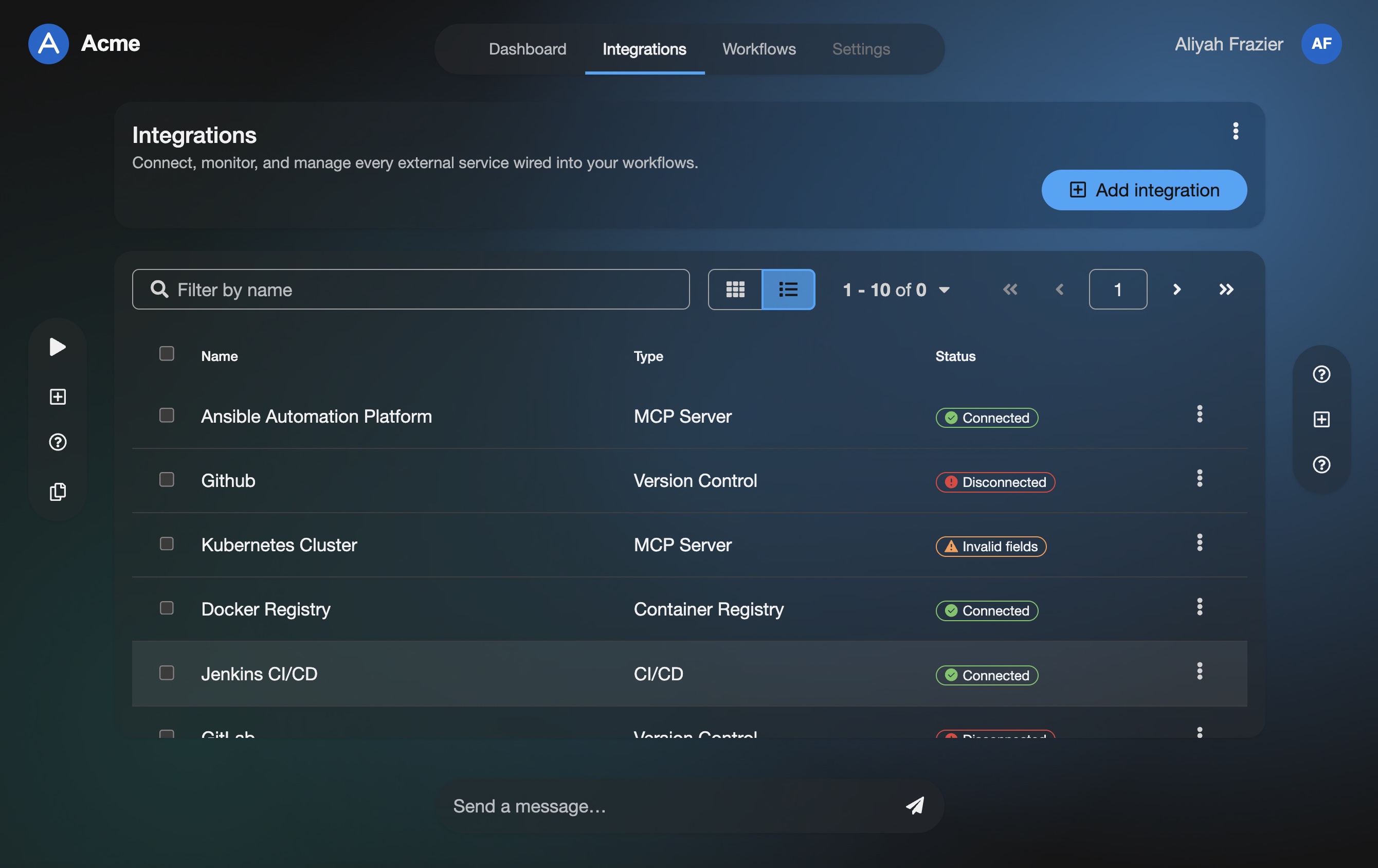
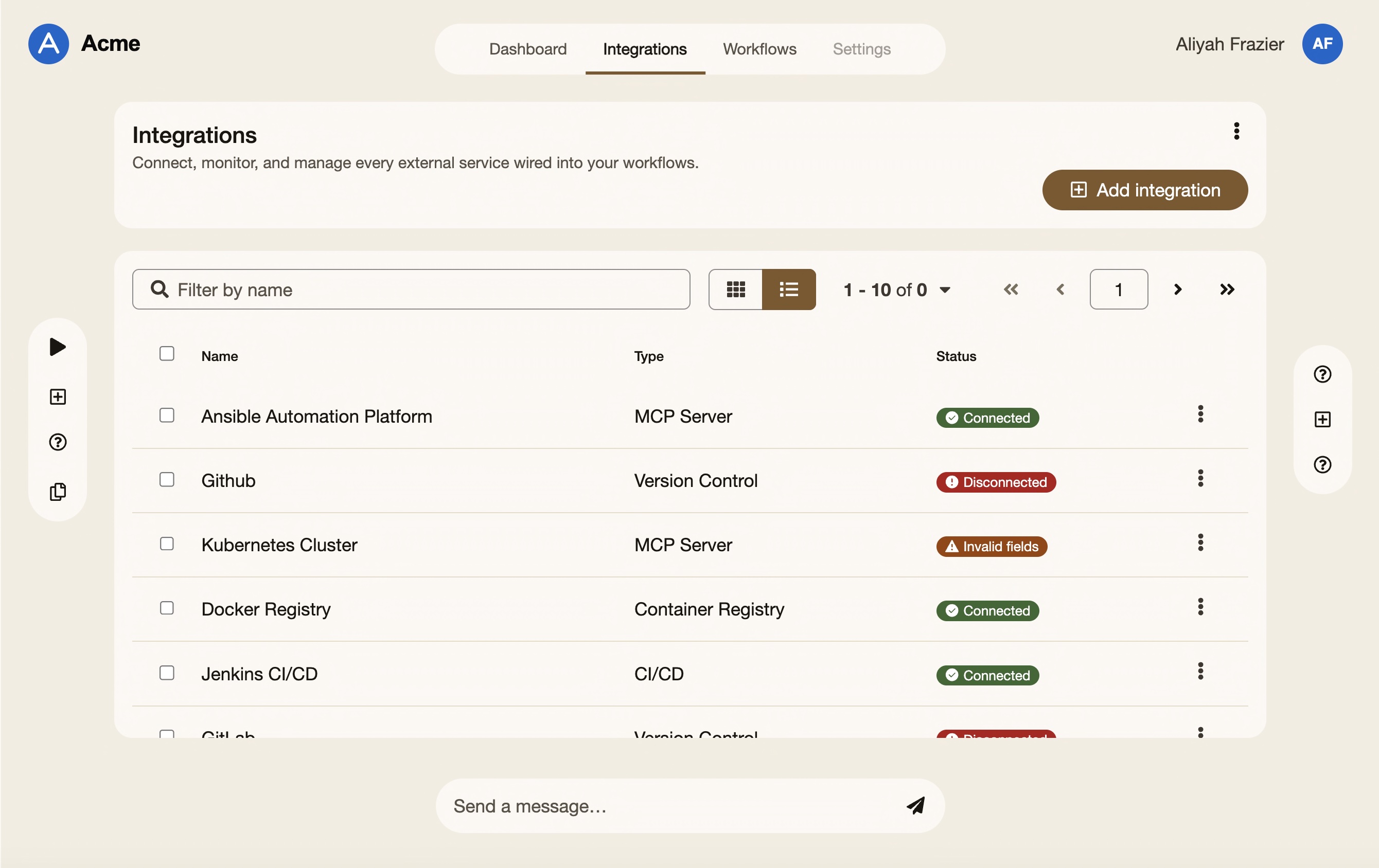
Install
pnpm add @golden-passport/ds-patternfly @patternfly/react-core @patternfly/react-icons@patternfly/react-core and @patternfly/react-icons are peer dependencies.
Usage
import "@patternfly/react-core/dist/styles/base.css"; // PF6 base first
import "@golden-passport/ds-patternfly/styles";       // lib styles last

import {
  ThemeProvider,
  Shell,
  PrimaryDetailLayout,
  goldenPassport,
  primaryDetailLayoutEnLabels,
  shellEnLabels,
} from "@golden-passport/ds-patternfly";

export default function App() {
  return (
    <ThemeProvider brand={goldenPassport}>
      <Shell labels={shellEnLabels} brandLogo={<img src="/logo.svg" alt="" />}>
        <PrimaryDetailLayout
          items={items}
          selectedId={selectedId}
          onSelect={setSelectedId}
          renderListItem={(i) => i.name}
          renderDetail={(i) => <div>{i.description}</div>}
          labels={primaryDetailLayoutEnLabels}
        />
      </Shell>
    </ThemeProvider>
  );
}
Components
The library ships two layers. Base components (Button, Card,
Table, …) are thin PatternFly 6 wrappers under the brand dials — the
building material. DS "lego block" components are the focus: exported,
out-of-the-box-configurable pieces for whole jobs (app chrome, validated
forms, data views, feedback states), each composing base components,
applying the design tokens + brand styling, and adding the TS logic
(validation, slots, labels). Reach for a DS block first; drop to base
wrappers when nothing fits.
| Component | Category | What it does | Import |
| --- | --- | --- | --- |
| CompassShell | Layouts | the full-viewport PatternFly Compass page frame: a header band, an optional left nav rail (sidebarStart) and right rail (sidebarEnd), the main content, and a docked footer (the CompassMessageBar slot — e.g. | import { CompassShell } from "@golden-passport/ds-patternfly" |
| DashboardShell | Layouts | the page scaffold for an ops dashboard: a titled header band (title + optional description + right-aligned actions/toolbar), an optional built-in KPI strip, then a padded content region you fill with charts and status cards. | import { DashboardShell } from "@golden-passport/ds-patternfly" |
| PrimaryDetailLayout | Layouts | Two-pane Primary–Detail layout (modeled on patternfly.org/patterns/primary-detail). | import { PrimaryDetailLayout } from "@golden-passport/ds-patternfly" |
| Shell | Layouts | Top-level application shell: SkipToContent + Masthead + (optional) Sidebar + main. | import { Shell } from "@golden-passport/ds-patternfly" |
| ActionButton | Navigation | the brandable button lego block: the base Button plus a shape prop (default / square / rounded / strong / pill / circle). | import { ActionButton } from "@golden-passport/ds-patternfly" |
| AppFooter | Navigation | the branded site footer: an optional logo + tagline, optional columns of link groups, and a bottom bar with copyright + inline legal links. | import { AppFooter } from "@golden-passport/ds-patternfly" |
| AppHeader | Navigation | the branded application masthead: an optional sidebar-toggle, a brand/logo slot, and a right-aligned actions slot (search, help, user menu). | import { AppHeader } from "@golden-passport/ds-patternfly" |
| CompassProfileMenu | Navigation | the user-profile dropdown for the Compass header: a name + avatar toggle on desktop that collapses to an avatar-only toggle when isCompact. | import { CompassProfileMenu } from "@golden-passport/ds-patternfly" |
| CompassRail | Navigation | Group consecutive actions sharing a groupId; undefined = standalone. | import { CompassRail } from "@golden-passport/ds-patternfly" |
| CompassTabsNav | Navigation | Mobile: called when an item is chosen or the drawer is closed. | import { CompassTabsNav } from "@golden-passport/ds-patternfly" |
| Hyperlink | Navigation | Inline-friendly hyperlink wrapping a real <a>. | import { Hyperlink } from "@golden-passport/ds-patternfly" |
| MenuButton | Navigation | the action-menu lego block. | import { MenuButton } from "@golden-passport/ds-patternfly" |
| PageHeader | Navigation | the standard top-of-page header: a title row (optional icon + status label + right-aligned actions), an optional subtitle, an optional breadcrumb above, and an optional tabs strip below. | import { PageHeader } from "@golden-passport/ds-patternfly" |
| TabbedView | Navigation | a declarative tabbed container over a tabs array: each entry is { key, title, content, … }. | import { TabbedView } from "@golden-passport/ds-patternfly" |
| TreeNavigation | Navigation | a controlled hierarchical navigation tree from a nested data array. | import { TreeNavigation } from "@golden-passport/ds-patternfly" |
| DateField | Forms | the date picker lego block. | import { DateField } from "@golden-passport/ds-patternfly" |
| FormScaffold | Forms | the standard form frame: your fields as children, then a branded submit / cancel ActionGroup. | import { FormScaffold } from "@golden-passport/ds-patternfly" |
| InlineEditField | Forms | a read-by-default value that switches to an editable control on demand. | import { InlineEditField } from "@golden-passport/ds-patternfly" |
| ListTransfer | Forms | the "dual list selector": two side-by-side lists with controls for moving items between an Available pane and a Chosen pane (select-some / move-all, both directions). | import { ListTransfer } from "@golden-passport/ds-patternfly" |
| SelectableToggleGroup | Forms | a pill row of toggleable options (view switcher, inline radio / checkbox set). | import { SelectableToggleGroup } from "@golden-passport/ds-patternfly" |
| StepperInput | Forms | a numeric field with increment / decrement controls, built from primitives so the steppers inherit the brand's tertiary icon-button styling instead of PF6's stock grey control chip. | import { StepperInput } from "@golden-passport/ds-patternfly" |
| TimeField | Forms | the time-of-day picker lego block. | import { TimeField } from "@golden-passport/ds-patternfly" |
| ValidatedSelect | Forms | a labelled, validated single-select built on the base FormSelect. | import { ValidatedSelect } from "@golden-passport/ds-patternfly" |
| ValidatedTextArea | Forms | the multi-line sibling of ValidatedTextField. | import { ValidatedTextArea } from "@golden-passport/ds-patternfly" |
| ValidatedTextField | Forms | a labelled, validated single-line text field. | import { ValidatedTextField } from "@golden-passport/ds-patternfly" |
| AccordionPanel | Data | the accordion lego block: vertically stacked, expandable sections from an items array. | import { AccordionPanel } from "@golden-passport/ds-patternfly" |
| BulkSelectToolbar | Data | the "select many, act on many" toolbar: a split checkbox + dropdown (select all / page / none) on the left, a derived "{n} selected" status, and contextual bulk actions that appear once a selection exists. | import { BulkSelectToolbar } from "@golden-passport/ds-patternfly" |
| CardGrid | Data | a responsive gallery of cards from a data array. | import { CardGrid } from "@golden-passport/ds-patternfly" |
| CodeSnippet | Data | a fenced code surface with a built-in copy-to-clipboard action (with "Copied!" feedback), an optional Run action, and optional collapse-after-N-lines expansion. | import { CodeSnippet } from "@golden-passport/ds-patternfly" |
| DataTable | Data | a declarative table over columns + rows, with optional toolbar and pagination slots and built-in loading / empty states. | import { DataTable } from "@golden-passport/ds-patternfly" |
| ExpandableCard | Data | a card whose body collapses behind a toggle in the header. | import { ExpandableCard } from "@golden-passport/ds-patternfly" |
| FilterToolbar | Data | the standard filter bar: a search field, faceted multi-select facets, removable filter chips, and one-click clear-all. | import { FilterToolbar } from "@golden-passport/ds-patternfly" |
| ListManager | Data | the page scaffold for a managed collection: an optional header, a toolbar row (filters and/or bulk-select on the left, pagination on the right), the list body (a Table, a Gallery of Cards, …), and an optional footer pagination. | import { ListManager } from "@golden-passport/ds-patternfly" |
| ListView | Data | a selectable list of rows from an items array, each with a title, optional description, extra content, and per-row actions. | import { ListView } from "@golden-passport/ds-patternfly" |
| SelectableCard | Data | a card that acts as a radio (single) or checkbox (multiple) tile. | import { SelectableCard } from "@golden-passport/ds-patternfly" |
| ConfirmModal | Feedback | a small controlled confirmation dialog: title, body, and a confirm / cancel footer. | import { ConfirmModal } from "@golden-passport/ds-patternfly" |
| EmptyStatePanel | Feedback | the "nothing here yet" panel: an icon, a title, optional body text, and a primary call-to-action that gets the user started (plus optional secondary actions). | import { EmptyStatePanel } from "@golden-passport/ds-patternfly" |
| LoadingOverlay | Feedback | a full-page blocking overlay: a dimming Backdrop with a centered spinner card, for operations that must finish before the user continues. | import { LoadingOverlay } from "@golden-passport/ds-patternfly" |
| StatusBanner | Feedback | a page- / app-level status strip. | import { StatusBanner } from "@golden-passport/ds-patternfly" |
| StatusPanel | Feedback | the one lego block for every full-panel "state" screen: empty results, an error, unauthorized access, or maintenance. | import { StatusPanel } from "@golden-passport/ds-patternfly" |
| ToastStack | Feedback | the floating, live-region stack of transient Alerts in a corner of the app. | import { ToastStack } from "@golden-passport/ds-patternfly" |
| AiAssistant | AI | a brandable AI prompt bar plus the surfaces it grows into: a transient "recent chat" popover, and a repositionable, resizable, searchable full-conversation panel (a modal on narrow viewports). | import { AiAssistant } from "@golden-passport/ds-patternfly" |
Design principles
- Brandable: every brand is a
BrandTokensobject that overrides PatternFly 6 CSS variables. Switch by changing thebrandprop onThemeProvider. - Accessible by design: WCAG 2.2 AA target. ARIA props are required where semantically necessary; brand color contrast is validated by tests.
- i18n-ready, not bundled: every user-facing string is a prop. English defaults are exported as opt-in objects (e.g.
primaryDetailLayoutEnLabels,shellEnLabels). - Strict TypeScript: full
.d.tsshipped with both ESM and CJS builds. - No Tailwind: PatternFly 6 only.
Development
This package lives in the GoldenPassport/ds-patternfly monorepo under packages/ds-patternfly. Storybook is the primary dev surface:
pnpm install
pnpm storybook          # interactive component workshop
pnpm build              # build the lib (outputs ./dist)
pnpm typecheck
pnpm test               # Node unit + browser-mode story tests
pnpm test:storybook     # story-level axe a11y scan (CI-friendly subset)
License
Apache License 2.0 — chosen to align with PatternFly, KIE, and the broader Red Hat ecosystem this lib targets. See LICENSE and NOTICE.